Add Item
227
Facilitate growth with intuitive SaaS 'Add' UI patterns. From 'Plus' buttons to multi-step creation modals, discover how to make adding new data or resources a frictionless experience.

An add-item interaction expands a collection with another object, value, or relationship. It may create a task, append a form row, select an existing tag, or invite a person. The visible plus sign is only the entry point. The interface must explain what is being added, where it belongs, and when the addition becomes part of the saved product state.
These distinctions matter because “add” can mean several operations. Creating a new team differs from attaching an existing team to a project. Adding another editable row differs from saving a completed record. A good design makes the operation's scope clear and gives the user a predictable path from intention to result.
Start by defining the object model and persistence rule. Decide whether the action creates an empty draft, opens a form, inserts a default value, or selects an existing item. Then design the entry point, feedback, validation, and recovery around that behavior. The pattern succeeds when users understand the new item without reconstructing hidden state changes.
Café's captured team setup shows a list of team-name inputs with a plus control beneath them. The page explains that people can join one or more teams and connects the team structure to navigation in the people directory. This supplies context for the collection before asking the administrator to expand it.
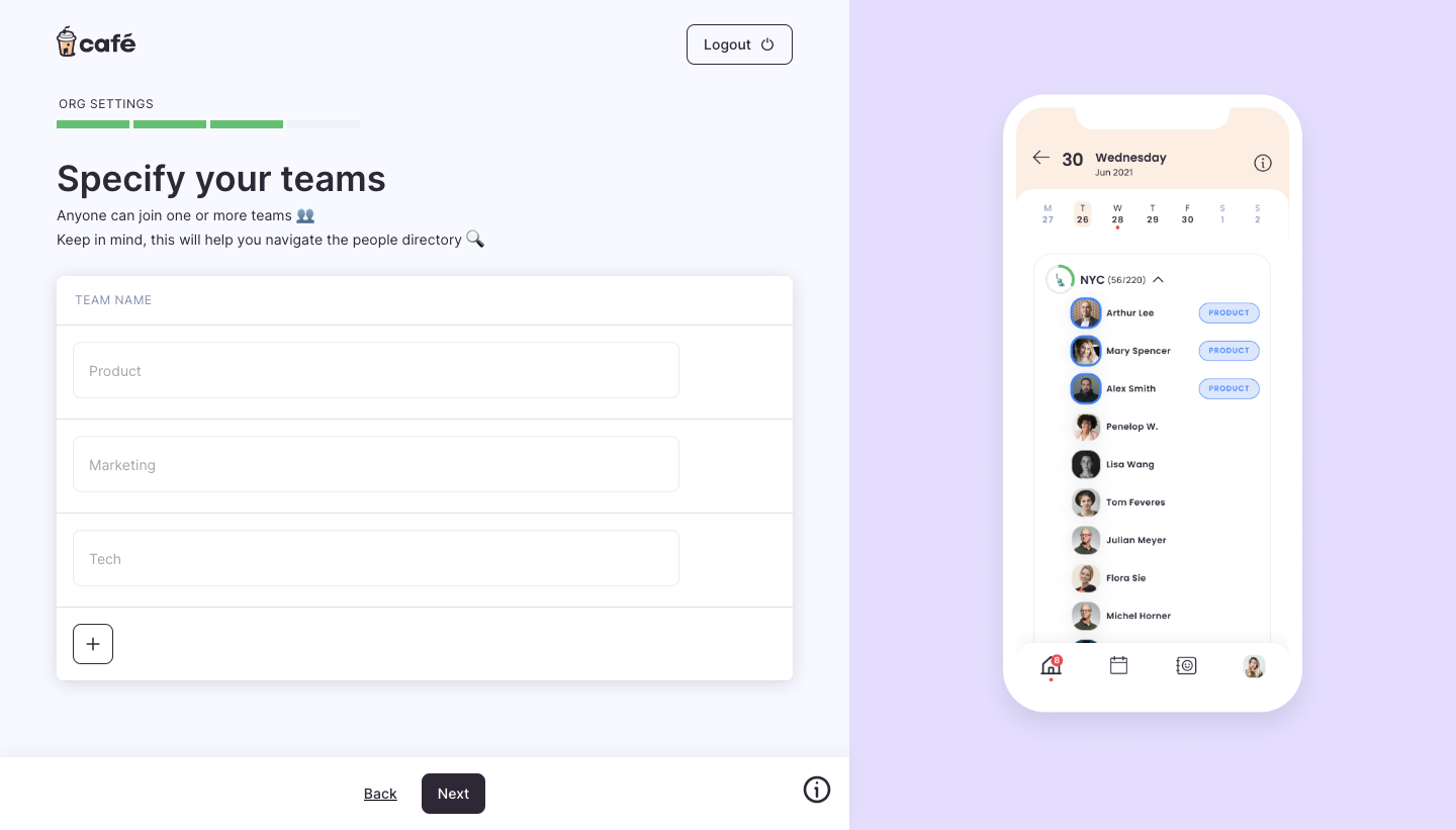
The plus control's position makes the likely scope recognizable: another team entry in the current list. That is more specific than a global plus icon in the page header, which could create a different type of object. The surrounding heading and column label help explain what the repeated fields represent.
The screenshot does not prove what appears after activation or when the data is saved. An implementation should make those steps explicit. If clicking adds an empty field, place focus where typing can begin. If it opens a separate creation flow, identify the destination and return the user to the collection after completion.
A second Café capture shows the team fields filled and individual removal controls beside them. The page still includes the plus control and a Next action below the setup area. This illustrates a collection that can be edited within a larger onboarding step, rather than assuming each added row is a completed independent object.
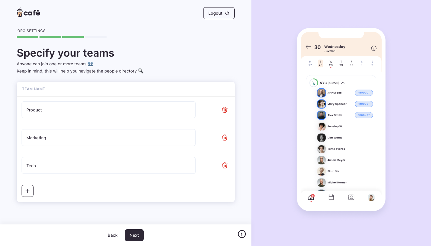
The distinction between local editing and persistence needs a clear rule. A user may assume that a visible team name has already been created, while the product may only save it when moving to the next step. Conversely, an autosaving product may create records immediately. Communicate the actual behavior and handle navigation accordingly.
Do not let a progress button become the only clue about saving. A status message, explicit action label, or reliable save behavior can help. If leaving the step discards unsaved entries, make that consequence understandable at the relevant moment. If entries persist automatically, do not present them as merely temporary placeholders.
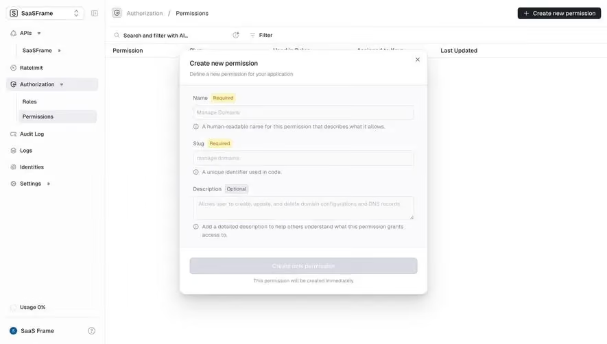
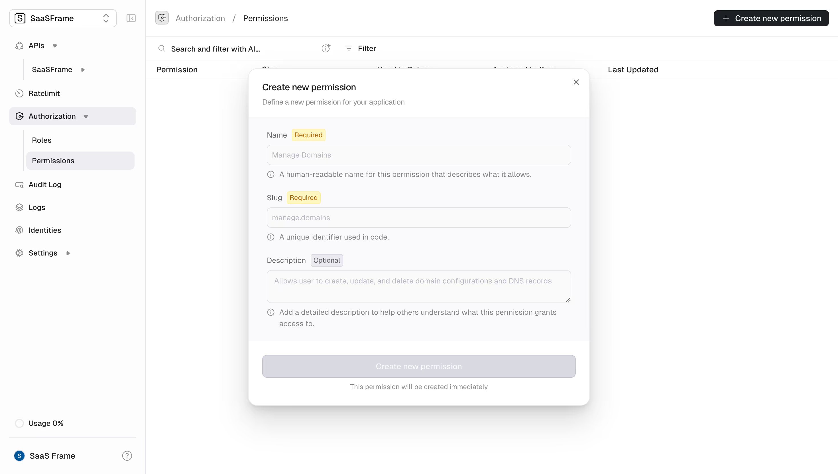
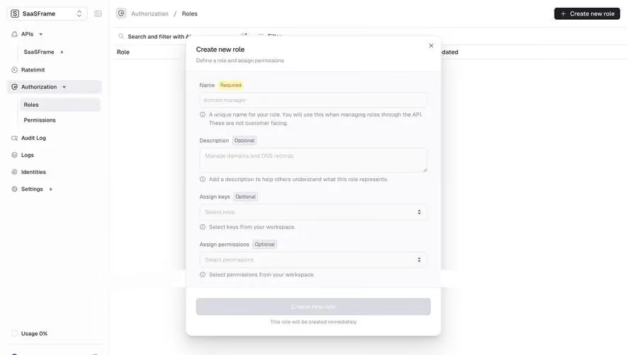
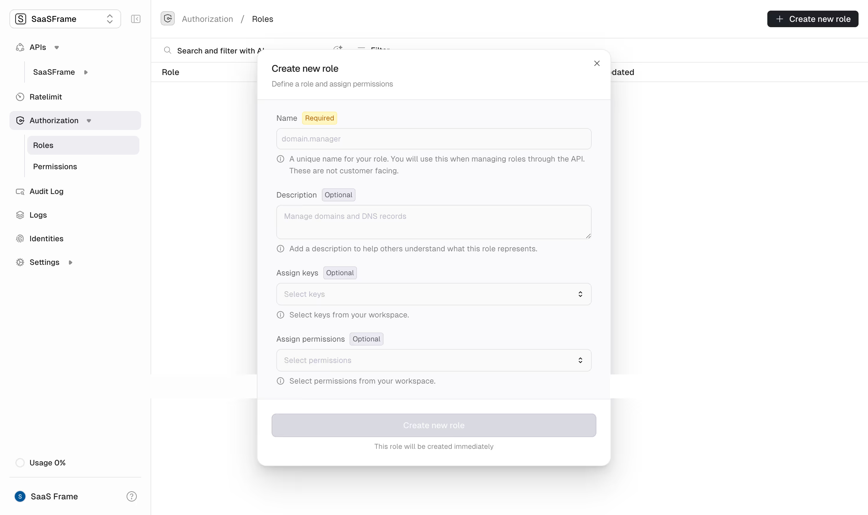
Inline addition works well when a new item requires little information and belongs clearly to the current collection. A dialog can support a compact set of fields without leaving the page. A dedicated page may be appropriate when creation involves several decisions, relationships, or a substantial editing task.
Choose the surface around complexity rather than a preference for fewer clicks. An inline row can become unwieldy if it needs permissions, billing, attachments, and dependencies. A large creation page can feel excessive for a single name. The user should be able to understand and complete the new object without losing the context that motivated it.
For adding an existing object, use a selection flow rather than pretending it is creation. Search, recent items, and clear existing-item labels can help users avoid duplicates. If creation is available from the same picker, distinguish “Create” from “Add existing” and explain how the resulting object differs from a selected relationship.
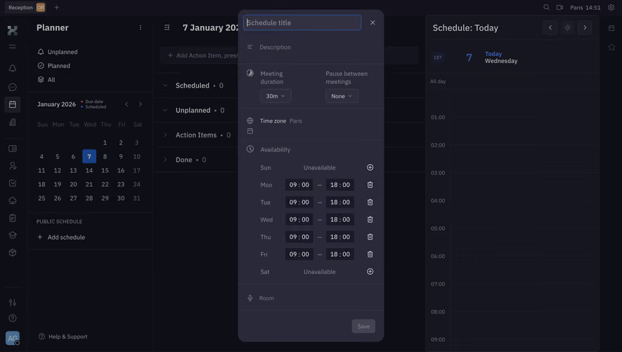
A plus symbol is compact but needs a meaningful accessible name and sufficient surrounding context. “Add team,” “Add task,” and “Add another interval” describe different outcomes. Use visible text when the context is not strong enough to make the object obvious. An icon-only control should not require discovery through trial and error.
Scope matters when several collections appear on one page. An add action near a workspace could create a workspace member, project, or folder. Place it within the relevant section and identify the result. If it affects the organization rather than a local view, communicate that scope before commitment.
Keep vocabulary consistent after activation. A control labeled Add team should not open a form titled Create group unless the relationship is clear. The resulting item should appear under the same terminology. Consistent language reduces the effort of understanding a new state and helps users verify that the intended operation occurred.
Defaults can reduce effort when they reflect a common, low-risk starting point. A new row might inherit the current project, selected category, or date. Make inherited values visible when they affect the item's meaning. Users should be able to inspect and change them before saving where the workflow requires it.
Avoid defaults that appear to be user-entered data. Placeholder examples should remain distinguishable from actual values. An automatically generated title can be useful, but it should not conceal that the user still needs to name the object. For repeated entries, decide whether the previous row is copied or a blank row is created and make that behavior predictable.
Validate the new item in context. Duplicate names, unavailable relationships, and collection limits may require different feedback from a missing required field. Preserve entered information when validation fails. If a default becomes invalid because another setting changed, explain the conflict rather than silently substituting another value.
After creation or attachment, users need confirmation that the result exists in the expected place. An inline item may appear immediately in the collection. A dialog may close and highlight the new row. A dedicated flow may open the created object. Choose the transition around what the user is likely to do next.
Sorting and filtering can hide a new item even when creation succeeds. If the current view excludes it, explain where to find it or offer a direct route. Do not show a generic success message while leaving the user to wonder whether the action worked. The result should identify the object and its destination.
Keep temporary and confirmed states distinct. An optimistic row can make the interface feel responsive, but it needs a pending state and recovery if persistence fails. Do not make an unsaved item indistinguishable from established records. If the product uses a local draft, identify that status until the item becomes committed.
Adding items is often repetitive. Define what happens when users activate the control several times quickly, create multiple rows, or retry after a slow response. Prevent accidental duplication where appropriate, but do not block legitimate repeated additions without explanation. The behavior should fit the collection's normal use.
If a request fails, retain the entered data and explain whether anything was created. A timeout does not always establish that the underlying action failed. Provide a way to reconcile the result before another request creates a duplicate. For multi-item additions, report which items succeeded and which need correction.
Preserve unrelated edits when one addition fails. A form with several team rows should not reset every row because one name is invalid. Attach feedback to the affected item and maintain the user's place. Test connection loss, server validation, and concurrent collection changes rather than only the successful path.
When adding an inline row, focus should move in a way that supports the next action. If a new text field is ready for entry, make it reachable and labeled. If a dialog opens, manage focus within it and return to a sensible place after cancellation. Avoid leaving focus on a control that disappears during the transition.
Repeated rows need labels that remain understandable without visual position. A screen reader should be able to distinguish the new item's name field and associated controls. A count or ordinal can help where relevant, but it should not replace the object label. Removal controls must also identify which item they affect.
Review the collection with one item, many items, and narrow layouts. The add control should remain findable, while the new item should appear in a predictable location. Long collections may need scrolling or another creation route, but avoid moving the action arbitrarily as the collection grows.
Ask users to add an item, correct a duplicate, cancel a partial addition, and find the resulting object. Include a filtered view and a failed save. Observe whether they understand the difference between an editable row and a completed record. A successful click on the plus control is not enough to establish task completion.
Measure creation success and duplicate correction alongside speed. For relationship additions, verify that users understand whether they created a new object or attached an existing one. Review abandonment after the entry point; it may indicate that the creation surface demands unexpected information.
Use this checklist:
No. Inline creation works for simple additions, while more complex objects may need a dialog or dedicated page. Choose the surface around the information required and the context users need to retain.
Only when its scope is clear and it has a meaningful accessible name. Use a visible object label when several additions are possible or the action's result could be ambiguous.
Use a rule appropriate to the workflow and communicate it. An onboarding row may remain editable until the step is submitted, while a direct creation flow may save immediately. Distinguish temporary and committed states.
Browse the SaaSFrame add-item examples to compare inline additions, creation controls, and the feedback that makes new objects understandable.