.webp)

FlowMapp




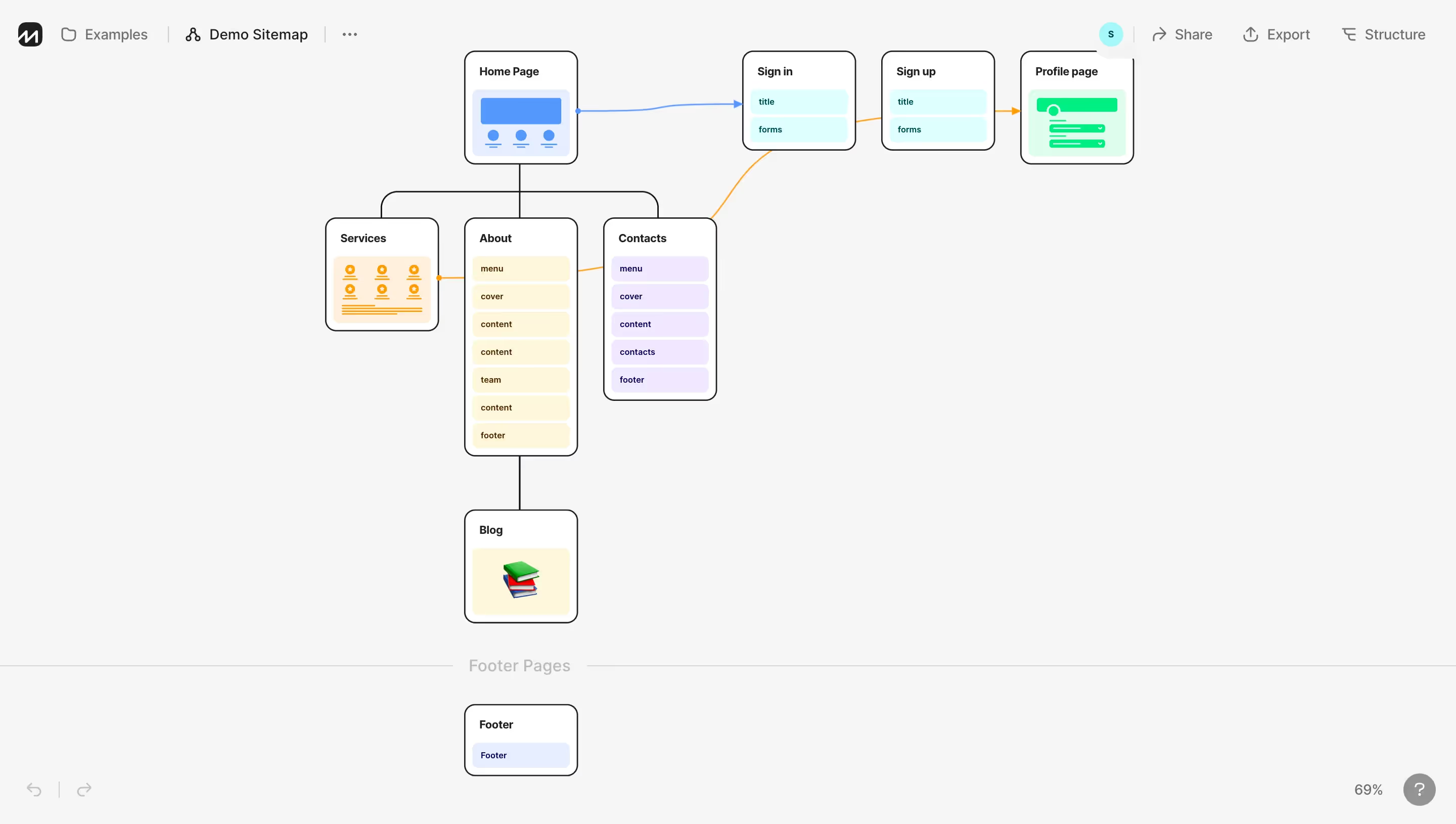






Stack
FlowMapp's marketing site is built on Webflow (assets served from cdn.prod.website-files.com). No custom framework is detected on the public-facing pages. The product app at app.flowmapp.com is a separate SPA. SVG assets are used extensively for icons, illustrations, and feature diagrams. Images are served as .webp for performance.
Typography
The site uses a clean sans-serif system. Based on visual analysis and Webflow conventions, the primary typeface is a geometric sans-serif (likely Inter or a similar neutral grotesque) for body copy and UI. Headings are set in a heavier weight of the same family, creating a cohesive typographic stack. Key characteristics:
- Hero headline: ~56–72px, bold (700–800 weight), tight letter-spacing
- Section headings (h2): ~36–48px, semibold (600–700)
- Card/subheadings (h3): ~20–24px, semibold
- Body copy: 16–18px, regular (400), ~1.6 line-height
- UI labels / nav: 14–16px, medium (500)
- Small / captions: 12–14px
Color Philosophy
FlowMapp uses a dark-first design for its marketing site. The palette is built around a near-black background with vivid accent colors — primarily a warm electric blue/violet and bright amber/yellow for CTAs. Supporting neutrals are cool grays. Accent glows and radial gradient halos (visible in the hero section) add depth and a sense of energy without using photography-heavy backgrounds.
- Background: Deep near-black (~#0D0D10 / #111114)
- Surface: Slightly elevated dark card surface (~#1A1A1F / #1E1E24)
- Primary accent: Electric indigo/blue-violet (~#5B6EF5 / #6C7FFF)
- CTA / highlight: Warm amber-yellow (~#F5C518 / #FFD040)
- Text primary: Near-white (#F0F0F5 / #FFFFFF)
- Text secondary: Muted gray (#8C8C9E / #A0A0B0)
- Border / divider: Subtle dark stroke (~#2A2A35)
- Success / positive: Soft green (~#34C78A)
Spacing
The spacing system follows an 8px base grid. Sections use generous vertical padding (80–120px on desktop). Cards and inner containers use 24–32px padding. Component gaps are 16–24px. The layout feels airy despite the dark theme, with deliberate whitespace (dark-space) between content blocks.
- Base unit: 8px
- Section vertical padding: 80px / 120px
- Card padding: 24px / 32px
- Component gap: 16px / 24px
- Inline element spacing: 8px / 12px
Component Defaults
- Buttons: Rounded pill shape (border-radius ~100px for CTAs), solid fill for primary, ghost/outlined for secondary. Primary CTA uses the amber/yellow accent. Secondary uses white or indigo outline.
- Cards: Dark surface with subtle border (1px ~#2A2A35), border-radius 12–16px, soft inner shadow or glass effect on feature cards.
- Navigation: Transparent/frosted top bar with logo left, links center-right, CTA button far right. Dropdown menus for Features and Use Cases.
- Tags/Badges: Small pill labels (e.g. "STEP 1", "UI design") with colored backgrounds and 100px border-radius.
- Avatars: Circular, stacked with overlap (used in social proof section).
- FAQ: Accordion pattern with arrow icon rotation.
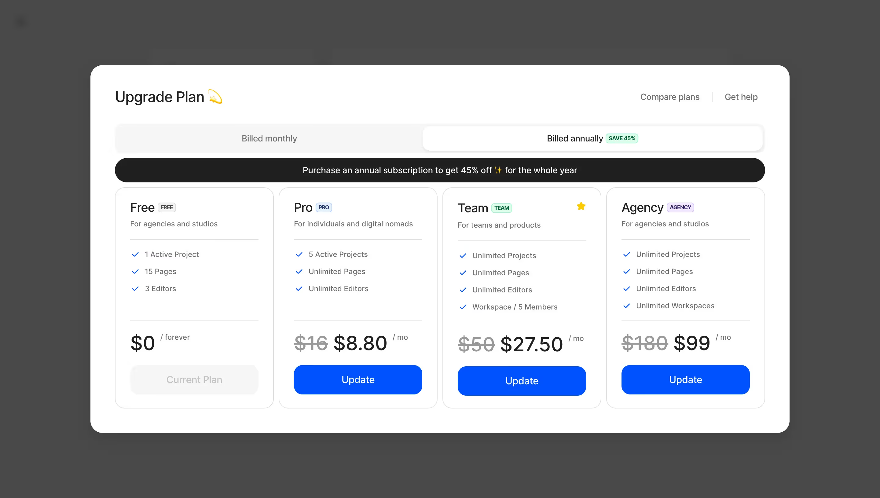
- Pricing cards: Grid layout, active/featured card has distinct border or background highlight.
Layout
The layout is a centered max-width container (~1200–1280px) with full-bleed dark sections. The grid is 12-column on desktop, collapsing to single-column on mobile. Feature sections alternate between full-width hero panels and 2–3 column card grids. The hero uses layered SVG eclipse/glow decorative elements for visual depth. The "ticker" marquee pattern is used for the rotating audience label. Footer is a dense multi-column grid on dark background.
:root {
  /_ === COLORS === _/

  /_ Backgrounds _/
  --color-bg-base:        #0D0D10;
  --color-bg-elevated:    #1A1A1F;
  --color-bg-card:        #1E1E24;
  --color-bg-overlay:     rgba(30, 30, 36, 0.85);

  /_ Brand / Accent _/
  --color-accent-primary: #6C7FFF;   /_ electric indigo-blue _/
  --color-accent-hover:   #5B6EF5;
  --color-accent-cta:     #FFD040;   /_ amber-yellow CTA _/
  --color-accent-cta-hover: #F5C518;
  --color-accent-glow:    rgba(108, 127, 255, 0.25);

  /_ Text _/
  --color-text-primary:   #F0F0F5;
  --color-text-secondary: #A0A0B0;
  --color-text-muted:     #6B6B7E;
  --color-text-inverse:   #0D0D10;

  /_ Borders / Strokes _/
  --color-border-subtle:  #2A2A35;
  --color-border-default: #3A3A48;
  --color-border-strong:  #5A5A6E;

  /_ Semantic _/
  --color-success:        #34C78A;
  --color-success-bg:     rgba(52, 199, 138, 0.12);
  --color-warning:        #FFD040;
  --color-error:          #FF5C5C;

  /_ === TYPOGRAPHY === _/
  --font-family-base:     'Inter', -apple-system, BlinkMacSystemFont, 'Segoe UI', sans-serif;
  --font-family-mono:     'JetBrains Mono', 'Fira Code', monospace;

  --font-size-xs:         0.75rem;   /_ 12px _/
  --font-size-sm:         0.875rem;  /_ 14px _/
  --font-size-base:       1rem;      /_ 16px _/
  --font-size-md:         1.125rem;  /_ 18px _/
  --font-size-lg:         1.25rem;   /_ 20px _/
  --font-size-xl:         1.5rem;    /_ 24px _/
  --font-size-2xl:        2rem;      /_ 32px _/
  --font-size-3xl:        2.5rem;    /_ 40px _/
  --font-size-4xl:        3rem;      /_ 48px _/
  --font-size-hero:       4rem;      /_ 64px _/

  --font-weight-regular:  400;
  --font-weight-medium:   500;
  --font-weight-semibold: 600;
  --font-weight-bold:     700;
  --font-weight-extrabold:800;

  --line-height-tight:    1.2;
  --line-height-snug:     1.375;
  --line-height-base:     1.6;
  --line-height-relaxed:  1.75;

  --letter-spacing-tight: -0.03em;
  --letter-spacing-normal: 0em;
  --letter-spacing-wide:  0.05em;
  --letter-spacing-wider: 0.1em;

  /_ === SPACING === _/
  --space-1:   4px;
  --space-2:   8px;
  --space-3:   12px;
  --space-4:   16px;
  --space-5:   20px;
  --space-6:   24px;
  --space-8:   32px;
  --space-10:  40px;
  --space-12:  48px;
  --space-16:  64px;
  --space-20:  80px;
  --space-24:  96px;
  --space-30:  120px;

  /_ === BORDER RADIUS === _/
  --radius-sm:   4px;
  --radius-md:   8px;
  --radius-lg:   12px;
  --radius-xl:   16px;
  --radius-2xl:  24px;
  --radius-pill: 100px;
  --radius-full: 9999px;

  /_ === SHADOWS === _/
  --shadow-sm:    0 1px 3px rgba(0, 0, 0, 0.4);
  --shadow-md:    0 4px 16px rgba(0, 0, 0, 0.5);
  --shadow-lg:    0 8px 32px rgba(0, 0, 0, 0.6);
  --shadow-glow-primary: 0 0 40px rgba(108, 127, 255, 0.3);
  --shadow-glow-cta:     0 0 30px rgba(255, 208, 64, 0.25);
  --shadow-card:  0 2px 12px rgba(0, 0, 0, 0.45), inset 0 1px 0 rgba(255,255,255,0.05);

  /_ === LAYOUT === _/
  --container-max-width: 1280px;
  --container-padding:   24px;
  --nav-height:          68px;
  --grid-columns:        12;
  --grid-gap:            24px;

  /_ === TRANSITIONS === _/
  --transition-fast:     150ms ease;
  --transition-base:     250ms ease;
  --transition-slow:     400ms ease;
  --transition-spring:   300ms cubic-bezier(0.34, 1.56, 0.64, 1);
}

/\* Dark mode is the default — no separate dark override needed.
   Light surfaces appear only as card elevations within the dark canvas. \*/

@media (prefers-color-scheme: light) {
  /\* FlowMapp's marketing site does not expose a public light mode.
     The app (app.flowmapp.com) may implement its own light theme. \*/
  :root {
    --color-bg-base:        #F5F5F8;
    --color-bg-elevated:    #FFFFFF;
    --color-bg-card:        #FFFFFF;
    --color-text-primary:   #111114;
    --color-text-secondary: #4A4A5A;
    --color-text-muted:     #8C8C9E;
    --color-border-subtle:  #E0E0EB;
    --color-border-default: #C8C8D8;
    --shadow-card: 0 2px 12px rgba(0, 0, 0, 0.08);
  }
}
Color Tokens
| Token | Value | Usage |
|---|---|---|
color.bg.base | #0D0D10 | Page background, darkest surface |
color.bg.elevated | #1A1A1F | Elevated panels, hero overlays |
color.bg.card | #1E1E24 | Feature cards, pricing cards |
color.accent.primary | #6C7FFF | Links, icon highlights, active states |
color.accent.cta | #FFD040 | Primary CTA buttons, key highlights |
color.text.primary | #F0F0F5 | Headings, primary body text |
color.text.secondary | #A0A0B0 | Subheadings, descriptive copy |
color.text.muted | #6B6B7E | Captions, meta info, disabled text |
color.border.subtle | #2A2A35 | Card borders, dividers |
color.success | #34C78A | Checkmarks, positive indicators |
color.error | #FF5C5C | Errors, destructive actions |
Spacing Tokens
| Token | Value | Usage |
|---|---|---|
space.2 | 8px | Base unit, icon padding, tight gaps |
space.4 | 16px | Inline component spacing |
space.6 | 24px | Card inner padding, grid gap |
space.8 | 32px | Card padding (large), section dividers |
space.12 | 48px | Section sub-divisions |
space.20 | 80px | Section vertical padding (mobile) |
space.30 | 120px | Section vertical padding (desktop) |
Typography Tokens
| Token | Value | Usage |
|---|---|---|
font.size.hero | 64px / 4rem | Hero headline |
font.size.4xl | 48px / 3rem | Section headings (h1) |
font.size.3xl | 40px / 2.5rem | Large section titles (h2) |
font.size.2xl | 32px / 2rem | Sub-section headings (h2 secondary) |
font.size.xl | 24px / 1.5rem | Card headings (h3) |
font.size.lg | 20px / 1.25rem | Large body, feature labels |
font.size.base | 16px / 1rem | Body copy, nav links |
font.size.sm | 14px / 0.875rem | UI labels, captions, tags |
font.weight.bold | 700 | Headings |
font.weight.semibold | 600 | Sub-headings, button labels |
font.weight.medium | 500 | Nav links, card titles |
font.weight.regular | 400 | Body copy |
font.family.base | Inter, system-ui, sans-serif | All text |
Border Radius Tokens
| Token | Value | Usage |
|---|---|---|
radius.sm | 4px | Input fields, small tags |
radius.md | 8px | Badges, icon containers |
radius.lg | 12px | Cards, modals |
radius.xl | 16px | Large feature cards |
radius.pill | 100px | CTA buttons, nav pills, step badges |
Shadow Tokens
| Token | Value | Usage |
|---|---|---|
shadow.sm | 0 1px 3px rgba(0,0,0,0.4) | Subtle elevation for small elements |
shadow.md | 0 4px 16px rgba(0,0,0,0.5) | Card hover states |
shadow.lg | 0 8px 32px rgba(0,0,0,0.6) | Modals, dropdowns |
shadow.glow.primary | 0 0 40px rgba(108,127,255,0.3) | Hero accent glow, active element halos |
shadow.glow.cta | 0 0 30px rgba(255,208,64,0.25) | CTA button glow effect |
shadow.card | 0 2px 12px rgba(0,0,0,0.45), inset 0 1px 0 rgba(255,255,255,0.05) | Standard card with inner highlight |
Framework: The FlowMapp marketing site (flowmapp.com) is built entirely on Webflow, identifiable by the CDN domain cdn.prod.website-files.com and the Webflow-standard CSS/asset naming conventions. The product app (app.flowmapp.com) is a separate SPA, likely React or Vue-based, with its own design system that is not publicly inspectable.
Theme Support: The marketing site is dark-only. No prefers-color-scheme light mode is implemented on the public site. The dark canvas is intentional — it positions FlowMapp as a modern, professional tool and provides strong contrast for product screenshots and UI previews displayed throughout the page.
Data Confidence:
- High confidence: Dark background palette, amber/yellow CTA color, indigo-blue accent, Webflow platform, pill-shaped buttons, large section padding, card border-radius range, grid-based layout with ~1280px container.
- Medium confidence: Exact color hex values (derived from visual analysis; actual Webflow variables may differ by 1–2 shades). Font family identified as Inter-like geometric sans-serif — Webflow defaults and common SaaS choices strongly suggest Inter.
- Lower confidence: Precise font-size scale (estimated from visual proportions); exact shadow values; any tokens for the product app UI.
Notable Patterns:
- Glow / halo decoratives: SVG radial eclipse shapes are layered behind hero content to create atmospheric depth — a contemporary SaaS marketing pattern.
- Amber CTA contrast: The warm yellow CTA (#FFD040) creates a deliberate warm/cool contrast against the cool indigo accent and dark background, maximizing button visibility.
- Step / badge labels: Pill-shaped badges with bold uppercase step numbers ("STEP 1", "+15% IN SALES") use the same pill radius as buttons, maintaining visual consistency.
- Marquee ticker: The rotating audience-type animation (agencies, studios, UX/UI designers, freelancers…) is implemented as a CSS marquee, common in modern Webflow builds.
- Social proof stacking: Avatar circles with overlap (-8px margin) are used in the hero and testimonial sections — a trust-building pattern emphasizing community size ("400,000 users").
- Feature icon system: Consistent SVG feature icons in a 40–48px container with a dark rounded background appear throughout feature lists, reinforcing visual consistency across all feature sections.
- No custom web fonts loaded via Google Fonts detected in the fetched markup — fonts are likely self-hosted via Webflow's font hosting or loaded via a Webflow font embed that was not present in the static HTML response.
Biggest SaaS library.


.webp)


.webp)

Desktop & mobile versions.


Access the Figma files.


Advanced filtering.
Let it flow.





Save design inspirations.
research




How do you process payment?
SaaSFrame subscriptions are sold on Lemon Squeezy, a secured online selling platform for creators.
What about future updates and versions?
SaaSFrame gets updated all the time! Every new update and version will immediately be made available to all SaaSFrame users.
Can you send me an invoice?
You can generate an invoice on your Lemon Squeezy portal once you purchased SaaSFrame. You will find the link in the order confirmation email.
How can I cancel my membership subscription?
You can cancel your membership subscription at any moment on your profile page.
Can I get a refund?
If you're not satisfied, you can ask for a refund within 7 days. Just send me an email at antoine[at]unmake[dot]io
I have another question.
You can send me an email at antoine[at]unmake[dot]io, I'll be happy to help with any questions.