 SaaSFrame

 Cloudflare
 Webflow
Websites 9
All websites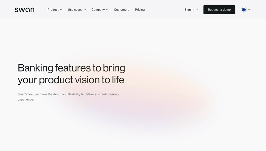
Index of all 9 Swan websites examples
Website sections 4


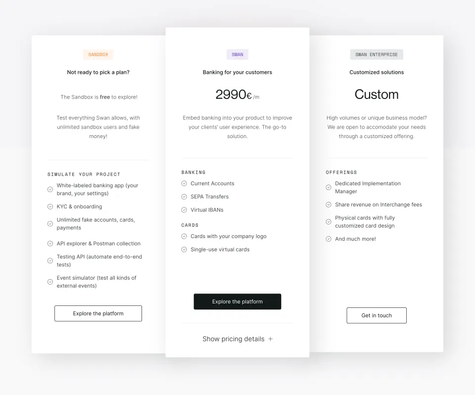
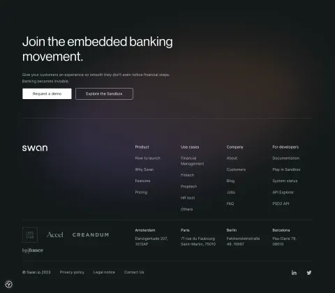
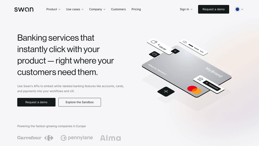
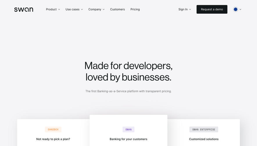
Design reference
Swan — design reference
Source: https://www.swan.io/. Extracted 2026-10-14. Scope: public marketing website CSS; declared styles, not computed browser values. This is an observed inventory, not an official internal design system.
Typography
font-family: Arial,sans-serif— selectorbodyfont-family: Inter,Arial,sans-serif— selectorbodyfont-family: Inter Tight,Arial,sans-serif— selectorh1font-family: Space Mono,Impact,sans-serif— selector.tab**titlefont-family: Lato,sans-serif— selector.modal**text-wrapfont-family: Oswald,sans-serif— selector.modal**headingfont-family: Exo,sans-serif— selector.text-block-17font-size: 15px— selector.plyr**menu**containerfont-size: var(--plyr-font-size-base,15px)— selector.plyr**menu**containerfont-size: 13px— selector.plyr**menu**container .plyr**controlfont-size: var(--plyr-font-size-menu,var(--plyr-font-size-small,13px))— selector.plyr**menu**container .plyr**controlfont-size: var(--plyr-font-size-time,var(--plyr-font-size-small,13px))— selector.plyr**preview-thumb**time-container spanfont-size: 2em— selectorh1font-size: 14px— selectorbodyfont-weight: 400— selector.plyr**menu**container .plyr**control--backfont-weight: var(--plyr-font-weight-regular,400)— selector.plyr**menu**container .plyr**control--backfont-weight: 700— selectorh1,h2,h3,h4,h5,h6font-weight: 300— selectorbodyfont-weight: 500— selectorh1font-weight: 600— selector.modal**headingline-height: 20px— selectorbodyline-height: 44px— selectorh1line-height: 36px— selectorh2line-height: 30px— selectorh3line-height: 24px— selectorh4line-height: 18px— selectorh6line-height: 32px— selectorbodyletter-spacing: 2px— selector.tab**titleletter-spacing: -2px— selector.heading-2.purple.dobby.nl-beletter-spacing: 1px— selector.submit-buttonletter-spacing: .7px— selector.modal**text-wrapletter-spacing: 6px— selector.modal**headingletter-spacing: 0— selector.v2_h3_blog_cardletter-spacing: normal— selector.textes-t1-body.text-whiteletter-spacing: -1.4px— selector.flowbase-heading
Colors and surfaces
color: #4a5464— selector.plyrmenucontainercolor: var(--plyr-menu-color,#4a5464)— selector.plyrmenucontainercolor: #fff— selector.plyrpreview-thumbtime-container spancolor: #333— selectorbodycolor: var(--neutral400)— selectorbodybackground-color: rgba(0,0,0,.55)— selector.plyrpreview-thumbtime-container spanbackground-color: #0000— selectorabackground-color: #fff— selectorbody
Components and layout
border-radius: 4px— selector.plyrmenucontainerborder-radius: 100%— selector.plyrmenucontainer .plyrcontrol[role=menuitemradio]::after,.plyrmenucontainer .plyrcontrol[role=menuitemradio]::beforeborder-radius: calc(3px - 1px)— selector.plyrpreview-thumbimage-containerborder-radius: calc(var(--plyr-tooltip-radius,3px) - 1px)— selector.plyrpreview-thumbimage-containerborder-radius: 0 0 .28em .28em— selector.styleguidetext-color-swatchborder-radius: 12px— selector.tabsuc-card-single.outlinesborder-radius: 500px— selector.fs-cc-manager_buttonbox-shadow: 0 1px 2px rgba(0,0,0,.15)— selector.plyr**menu**containerbox-shadow: var(--plyr-menu-shadow,0 1px 2px rgba(0,0,0,.15))— selector.plyr**menu**containerbox-shadow: 0 1px 0 #fff— selector.plyr**menu**container .plyr**control--back::beforebox-shadow: 0 1px 0 var(--plyr-menu-back-border-shadow-color,#fff)— selector.plyr**menu**container .plyr**control--back::beforebox-shadow: -1px 24px 64px #14191a24— selector.flexbox.container--dropdownbox-shadow: -6px 23px 64px #14191a0a— selector.flexbox.container--requestbox-shadow: 17px 17px 64px #14191a24— selector.pricing-card**singlebox-shadow: 0 24px 64px #14191a0a— selector.contact-us**cardmax-width: 100px— selector.nav**uc-text-item.\_2lines-fixmax-width: none— selector.plyr**preview-thumb**image-container imgmax-width: 400px— selector.flexbox.container--dropdown.is--sign-inmax-width: 696px— selector.is--paragraph2.is--text-color-neutral100.is--max-width496.is--margin16max-width: 560px— selector.is--paragraph2.is--developers-resources-headingpadding: 0 16px— selector.containerpadding: calc(10px _ .7)— selector.plyr**menu**container [role=menu]padding: calc(var(--plyr-control-spacing,10px) _ .7)— selector.plyr**menu**container [role=menu]padding: 3px 6px— selector.plyr**preview-thumb**time-container spanpadding: 0— selectorbutton::-moz-focus-inner,input::-moz-focus-innertransition: height .35s cubic-bezier(.4,0,.2,1),width .35s cubic-bezier(.4,0,.2,1)— selector.plyr**menu**container>divtransition: all .3s ease— selector.plyr**menu**container .plyr**control[role=menuitemradio]::beforetransition: transform .3s ease,opacity .3s ease— selector.plyr**menu**container .plyr**control[role=menuitemradio]::aftertransition: color .25s ease-in-out,background-color .25s ease-in-out— selector.buttontransition: color .2s ease-in-out,border-color .2s ease-in-out— selector.footer**nav-link.is--label.is--text-color-neutral200transition: border-color .2s— selector.tab_rich-text atransition: box-shadow .2s— selector.features_cardtransition: all .2s— selector.blog-post**rtb a
Responsive rules
only screen and (max-width: 1412px) and (min-width: 991px)
only screen and (max-width: 1277px) and (min-width: 992px)
only screen and (max-width: 768px)
(min-width:480px)
(min-width:768px)
(max-width:calc(768px - 1))
(min-width:1024px)
screen and (max-width:991px)
screen and (max-width:767px)
screen and (max-width:479px)
screen and (min-width:1440px)