 SaaSFrame
🥊 Comparison Page
Win the "Alternative To" search battle with high-intent SaaS comparison page designs. Compare features, pricing, and performance against competitors using clear tables and "us vs. them" checklists. Perfect for capturing users in the final decision stage of the buying journey.
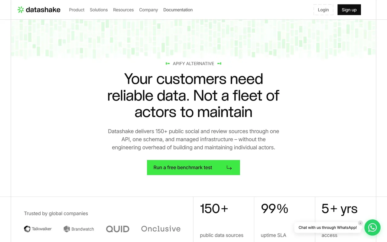

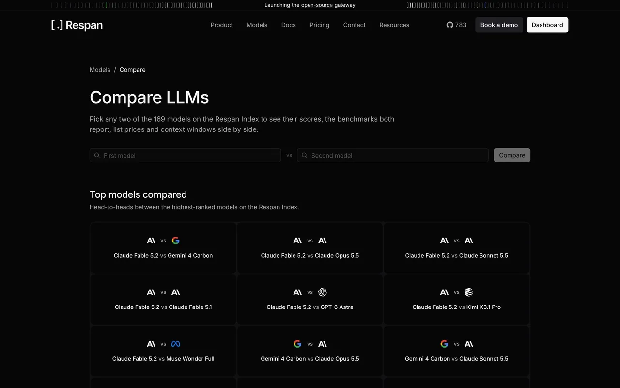

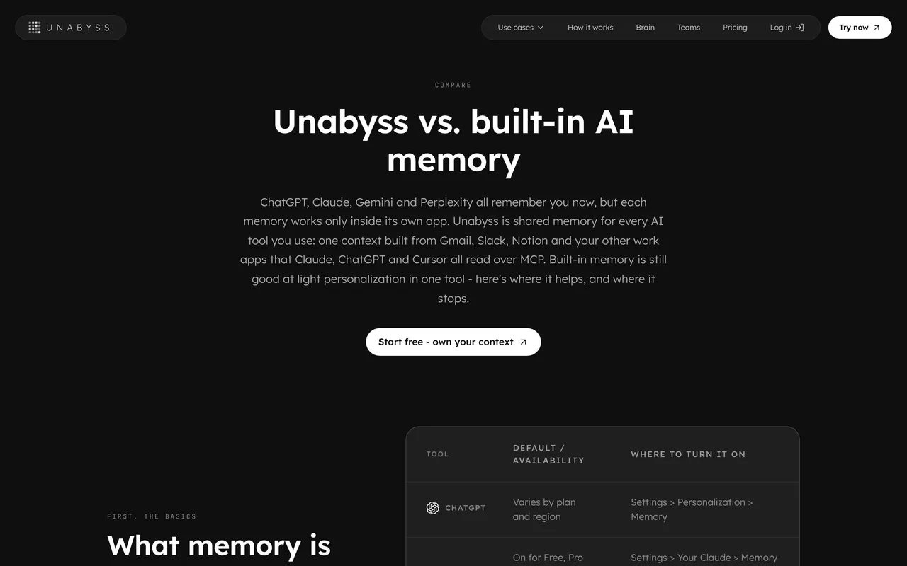

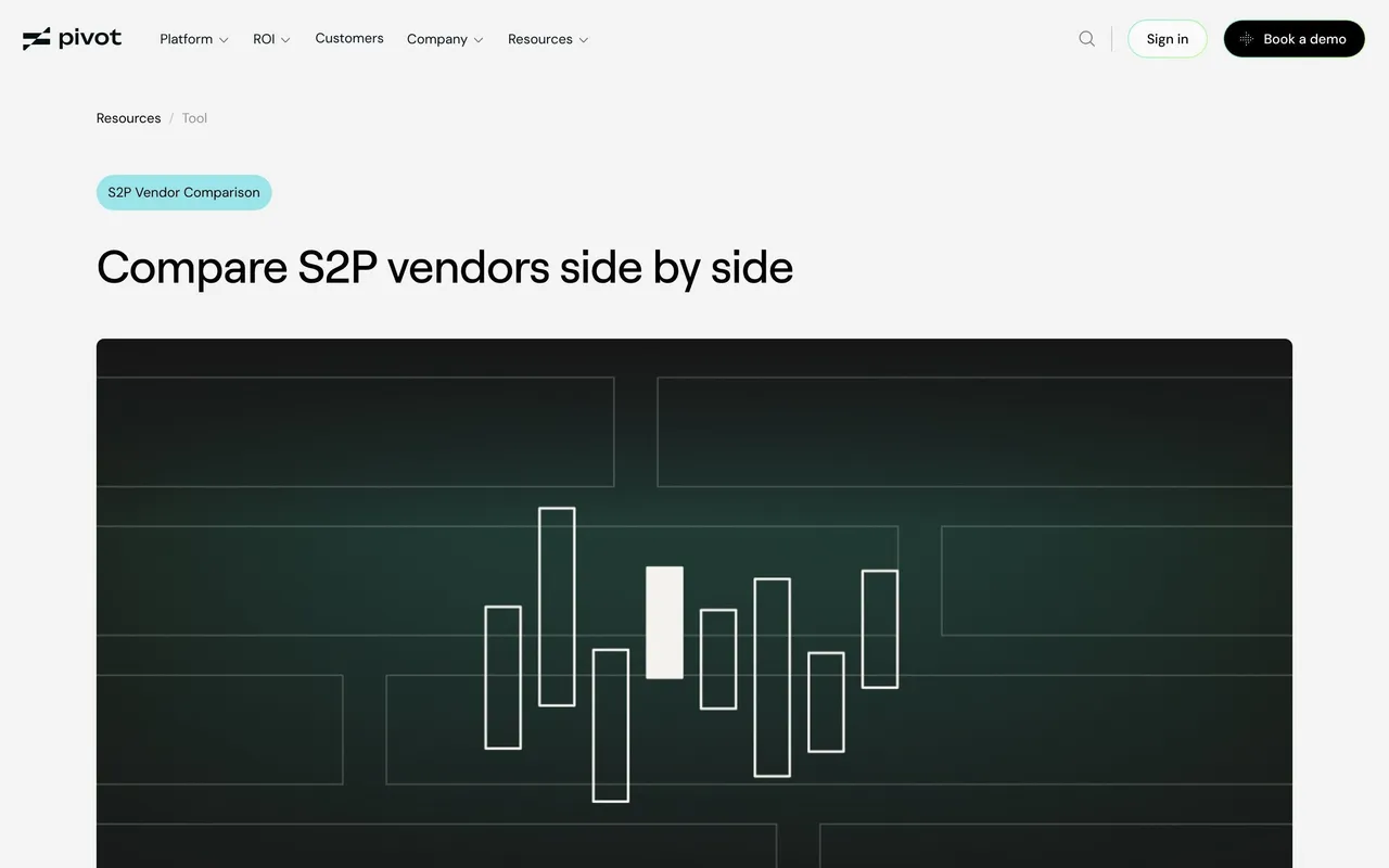

Index of all 59 Comparison Page examples
- Pivot Comparison Page
- Context.dev Comparison Page
- Dust Comparison Page
- Searchable Comparison Page
- Hyperline Comparison Page
- ParityDeals Comparison Page
- Composer Comparison Page
- Prelude Comparison Page
- Visitors Comparison Page
- Paddle Comparison Page
- Customer.io Comparison Page
- Tailscale Comparison Page
- Copperx Comparison Page
- June Comparison Page
- Formcarry Comparison Page
- Alloy Comparison Page
- Zeda.io Comparison Page
- Routine Comparison Page
- Cake Equity Comparison Page
- Arc Comparison Page
- Blobr Comparison Page
- Contractbook Comparison Page
- Folio Comparison Page
- Height Comparison Page
- Zencal Comparison Page
- Better Stack Comparison Page
- Framer Comparison Page
- Pitch Comparison Page
- Sketch Comparison Page
- MentionFunnel Comparison Page
- Senja Comparison Page
- Butter Comparison Page
- Folk Comparison Page
- Rally Comparison Page
- Copy.ai Comparison Page
- SavvyCal Comparison Page
- Swell Comparison Page
- Air Comparison Page
- Shortcut lubhouse Comparison Pages
- MailerLite Comparison Page
- Notion Comparison Page
- Webflow Comparison Page
- Sendinblue Comparison Page
- PandaDoc Comparison Page
- Figma Comparison Page
- Drip Comparison Page
- ConvertKit Compared to Mailchimp
- Mangools Compared to Ahrefs
- Guru compared to Confluence
- Hiver Compared to Front
- Clearbit compared to Data.com
- Twist compared to Slack
- Avocode Compared to Zeplin
- Slate Compared to Google Calendar
- Livestorm Comparison Page
- Slite compared to Google Doc
🥊 Comparison Page: design guide
Short answer
A SaaS comparison page helps visitors evaluate one product against an alternative for a specific workflow. Frame the comparison around a task, compare on dimensions buyers use, use a table for lookup and prose for meaning, explain what switching involves and attribute every piece of proof.
In the libraryas of November 2026
- Screens
- 59
- SaaS products
- 59
- Last added
- Nov 2026
Common patternsComparison 12Testimonial 3Call to Action 2Tabs 2Awards & Recognition 1
Recently addedDatashakeRespanUnabyssPivotContext.dev
A SaaS comparison page helps visitors evaluate an alternative in relation to a specific workflow. Its design should explain meaningful differences, the conditions behind them, and the practical implications of switching rather than relying on an unsupported winner claim.
The SaaSFrame captures are historical marketing examples. Their competitor descriptions are not independently verified current product comparisons.
What task should the comparison be about?
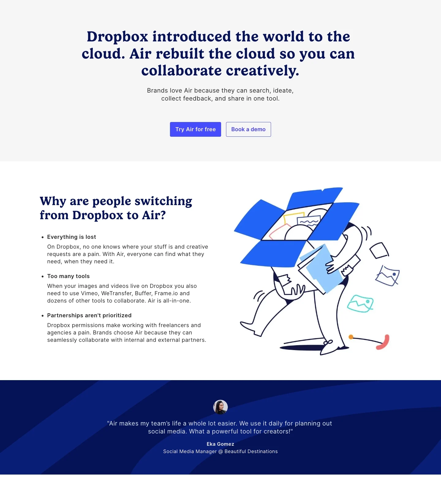
The Air reference positions the product against Dropbox through creative collaboration. It follows with reasons for switching, an attributed customer perspective, related feature material, and a trial route.
A task-led comparison can explain why a difference matters. The page should identify the audience and workflow instead of implying that one product is better for every possible use.
For your own page, verify each comparative statement against current primary information. A historical design reference supports analysis of structure, not copying its claims.
Define comparable dimensions
Choose criteria that answer the visitor's actual decision: workflow support, platform needs, collaboration, deployment, or another relevant factor.
Use consistent definitions for both products. A checkmark table becomes misleading when the same row measures different scopes on each side.
Explain partial support and conditions rather than forcing every criterion into yes or no. A short qualification can be more useful than an apparently decisive symbol.
Use a table for lookup and prose for meaning
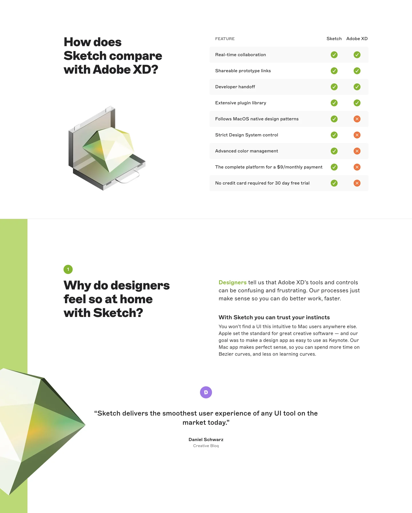
The Sketch reference combines a comparison table with a long sequence of questions about workflow, platforms, libraries, and collaboration. Customer material and a closing action follow.
The table supports quick inspection, while the questions give room to explain implications. Keep those layers aligned so the prose does not quietly qualify an overly broad table claim.
Dates, versions, and plan context matter where capabilities change. Make the comparison's scope assessable through maintained information.
Explain switching as a real process
A visitor may need to understand migration, existing assets, integrations, and team adoption. Give those concerns a useful route rather than presenting switching as a single click by default.
Distinguish starting a trial from moving an existing workflow. Each requires a different level of commitment and preparation.
If compatibility is partial, state the relevant boundary. Avoid implying that all existing work transfers without loss unless that is accurately supported.
Keep proof attributed and relevant
A customer quotation can explain why that organization switched. It does not establish that every visitor has the same requirements or will achieve the same result.
Use examples that relate to the comparison's task. Familiar logos alone add little if the reader cannot identify the similar problem.
Avoid inventing competitor limitations to make the narrative easier. A credible comparison can acknowledge where alternatives fit different needs.
Give visitors an appropriate evaluation route
A trial, migration guide, documentation route, or tailored conversation can follow the comparison. Choose the action that helps validate the stated difference.
Do not obscure the evaluation with repeated calls to declare a winner. The visitor needs enough evidence to make their own decision.
Review claims, definitions, source dates, and destinations whenever either offering changes.
Study comparison structure with SaaSFrame
Explore SaaSFrame's comparison-page references to compare task-led narratives and table-led evaluation. Borrow the information structure while independently verifying any current comparative claim.
Comparison page questions
Are checkmark tables enough?
No. Define criteria and explain meaningful conditions so the symbols remain accurate.
Can historical comparison copy be reused as fact?
No. Verify current capabilities and scope before publishing comparative statements.
What should follow the comparison?
Offer a route to test fit, inspect requirements, or understand migration according to the visitor's likely next decision.