 SaaSFrame
Testimonial
Convert with the voice of the customer using SaaS Testimonial patterns. Explore card-based quotes, video testimonials, and social media embeds that provide authentic social proof.
Website sections 90


Product screens 1

Testimonial: design guide
A testimonial section shows a customer's experience in their own words. Choose quotes that answer a visitor's concern, show name, role, company and photo, prefer specific experiences over generic praise, feature one strong quote and keep the rest scannable.
In the libraryas of November 2026
- Examples
- 91
- SaaS products
- 80
- Last added
- Nov 2026
Most common inLanding Page 68Pricing Page 8Comparison Page 3About Page 2Customers Page 2
Recently addedHumblyticsParallelCubeLightfieldDub
A SaaS testimonial section presents a person's experience in their own voice. Its usefulness depends on relevance, attribution, and context. A quote that addresses a visitor's actual concern can help them evaluate the product; a wall of generic praise may create visual activity without clarifying anything.
Albato and Cal.com show two different presentation styles. Albato uses tidy quote cards with names and roles. Cal.com combines a large featured quote with social-post-style cards of varied lengths. The examples illustrate how customer statements can be organized and read. They should not be treated as current service commitments or typical results for every user.
Which visitor concern should a testimonial answer?
Start with the questions a prospective user is trying to resolve. They may wonder whether the product is easy to adopt, whether it fits a particular workflow, or whether help is available when needed. Select statements that speak to those concerns with concrete experience.
A useful quote names something the person did, noticed, or changed. Broad enthusiasm can support a brand impression, but it rarely helps someone understand how the product would fit their work. Keep a small set of distinct messages rather than several quotes repeating the same adjective.
Match the selection to the surrounding page. A feature page benefits from a statement about that feature; an onboarding page benefits from adoption experience. Do not place a quote beside a claim it does not actually support. The customer's words and the company's interpretation need to remain distinguishable.
Make attribution visible and readable
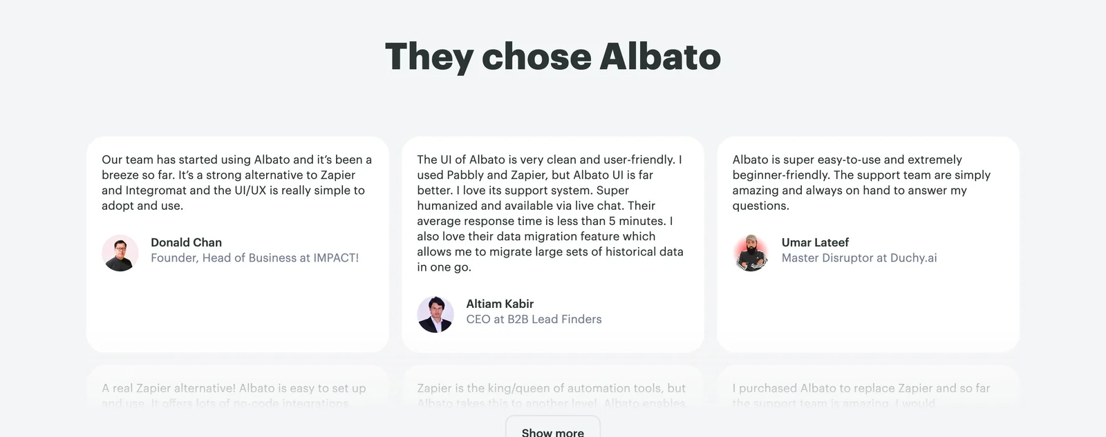
Albato places a portrait, name, and role below each quote. This gives the statement a recognizable speaker and provides some context about their work. The layout keeps the attribution close enough to the text that readers can connect the two without searching elsewhere in the section.
Use the information that is accurate and permitted: a name, role, organization, or other meaningful identifier. A portrait can support recognition, but the text attribution must remain useful without the image. Avoid inventing roles or adding a brand logo that implies a broader endorsement than the statement establishes.
Review attribution when the person's role changes. A historical quote can remain useful if its context is clear, but an outdated title presented as current may mislead readers. Keep the source and approved version so future editors can distinguish the original statement from later display changes.
Use specific experiences without turning them into guarantees
The visible Albato cards discuss usability, alternatives, support, and migration. These are concrete themes that prospective users might care about. One statement also describes a response-time experience, showing why testimonial content needs careful interpretation.
A customer's observation of a quick response is not the same as a service-level promise. Likewise, a statement about ease of use reflects that person's experience rather than every user's expected outcome. Keep the quote attributed and avoid turning its strongest phrase into an unqualified product headline.
If a statement includes a measurable result, retain the relevant context or link to a fuller story. Do not edit away conditions that change the meaning. The design should make the evidence accessible while preserving what kind of evidence it is: a person's account, rather than a universal specification.
Distinguish a featured quote from the wider collection
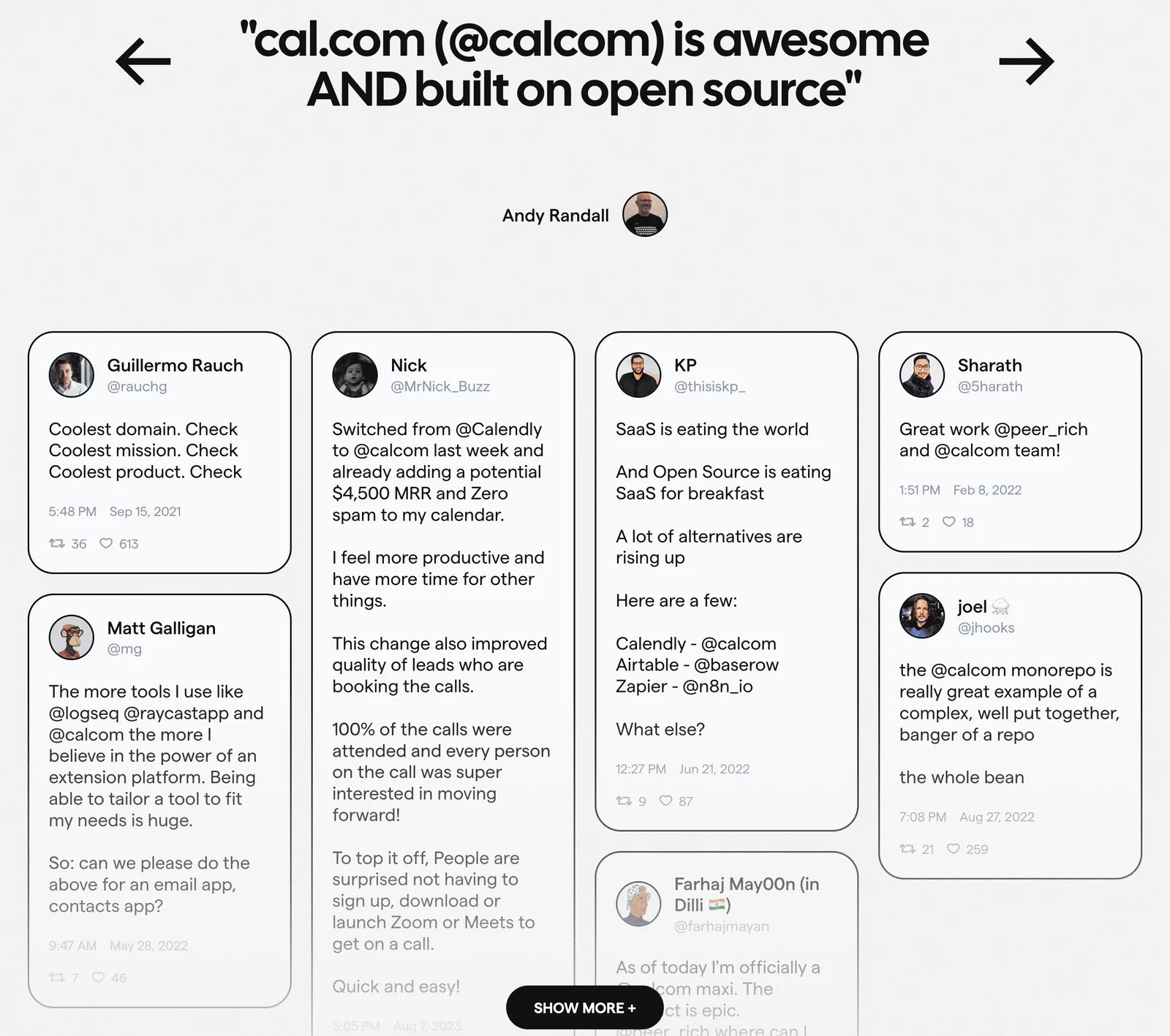
Cal.com gives one short statement substantial space at the top, with a speaker attribution and visible left and right arrows. Below it, a collection of social-style cards contains different lengths and topics. The featured tier creates immediate emphasis; the lower collection suggests a broader conversation.
This hierarchy can work when the short quote establishes a clear theme and the collection adds distinct detail. The risk is repetition or an overly long section that asks visitors to read many similar endorsements. Curate the selection instead of assuming volume alone makes the section more useful.
The arrows and Show more control are visible in the capture, but the image does not demonstrate their behavior. In a live design, those controls need clear labels, predictable results, and accessible operation. Do not rely on a screenshot's visual suggestion as proof that a carousel or expansion model works well.
Preserve the source context of social statements
Cal.com's cards include handles, timestamps, and social interaction details, giving the statements a familiar source format. This can help readers recognize them as posts rather than commissioned marketing copy. It also introduces extra visual information that may not all be necessary for the page's decision.
When presenting social content, retain the original meaning and provide a source destination where appropriate and available. A cropped fragment should not remove the context that makes the statement understandable. Avoid presenting an edited paraphrase inside quotation marks as if it were the original wording.
Choose how much platform detail to include. A date can help establish when the statement was made. Engagement counts may add clutter and can become stale. A handle can identify the speaker but may need a name or description for readers unfamiliar with the platform. The source treatment should support attribution rather than overshadow the experience described.
Keep quote length manageable without distorting meaning
Albato's cards have different text lengths within a regular row, while Cal.com's lower collection accommodates taller and shorter posts. These layouts offer different ways to handle natural variation. A tidy grid supports comparison; a varied-height collection preserves longer statements but can become harder to scan.
Select excerpts that communicate one clear idea. If shortening a quote, preserve its meaning and indicate omissions where needed. Do not splice unrelated phrases into a stronger endorsement. For a long account, a concise approved excerpt with a link to the full story can be more useful than shrinking the text to fit a fixed card.
Leave room for attribution and translated content. Fixed heights that clip statements or hide the speaker undermine the section's purpose. If a quote requires extensive context to avoid misunderstanding, it may belong in a case study rather than a compact testimonial card.
Make carousels and expansion controls predictable
A carousel can reduce the visible footprint of a collection, but it also hides content behind interaction. Keep an important quote visible without requiring several clicks. If content advances automatically, provide a way to pause it and avoid changing the text while someone is reading.
Use labeled controls with visible focus. Previous and next actions should have understandable boundaries or a clear cycling model. For Show more, reveal additional content in a predictable place and preserve the reader's position. Explain the expanded state if the control becomes Show less.
Do not depend only on swiping, hovering, or precise arrow clicks. Keyboard and touch users need equivalent access to the collection. If many testimonials exist, a dedicated page with clear organization may be more useful than an endlessly expanding wall on the homepage.
Design for readability rather than decorative density
Quotes need readable line length, sufficient contrast, and separation from attribution. Large type can make a short statement memorable, but an oversized multi-line quote may dominate the page without adding depth. Balance prominence with the role of the surrounding content.
On mobile, review both the featured tier and the collection. A four-column desktop arrangement can become a long sequence, and a dense social wall may require substantial scrolling. Preserve the most relevant statements early and keep any expansion control reachable.
Use a logical document order even when the visual layout varies in height. Keyboard focus should not jump unpredictably between columns. Portraits and platform icons need appropriate alternatives, and decorative quotation marks should not interfere with reading. The statement and speaker must remain clear if styling or images are unavailable.
Review relevance, accuracy, and permissions
- Does each statement address a distinct visitor concern?
- Is the speaker clearly identified?
- Does the excerpt preserve the original meaning?
- Are measurable results and service experiences kept in context?
- Does placement avoid implying an unsupported claim?
- Are source links and dates useful where included?
- Can longer text fit without clipping?
- Are carousel and expansion controls usable by keyboard and touch?
- Is the mobile collection focused enough to read?
- Is there an approved source and owner for each testimonial?
Maintain testimonials as content, not permanent decoration. Keep track of the approved wording, associated assets, and permission to display them. When a product capability changes, review whether an old statement still supports the page accurately. If necessary, move the quote into a historical story with context or replace it with a more relevant experience.
Evaluate the section by asking visitors what concern it helped resolve. A memorable speaker or enthusiastic phrase does not necessarily indicate understanding. Look for whether people can connect the quote to their own situation without interpreting it as a guarantee. That distinction helps select stronger evidence and improve placement.
Consider the balance between breadth and similarity. Several statements from the same audience can support a focused page, but they may not address the concerns of a different buyer. Use categories or a curated selection when the product serves distinct roles. A relevant small collection is often more informative than a large collection assembled only to signal popularity.
Frequently asked questions about testimonials
Should testimonials always include a portrait?
No. A clear name and accurate contextual attribution can be enough. Use portraits when they are available, appropriate, and permitted. Do not let the absence of a photograph lead to invented identity details or make an otherwise useful statement unreadable.
Is a testimonial carousel better than a grid?
A grid exposes several statements at once and supports scanning. A carousel uses less space but hides content and requires interaction. Choose according to the amount of evidence and the page's purpose, then verify that the controls work for keyboard, touch, and reduced-motion needs.
Can testimonials include quantified results?
They can when the statement is accurate, approved, and presented with enough context. A fuller case study may be better for explaining the baseline, timeframe, and product contribution. Keep an individual result distinct from a promise about every customer's outcome.
Browse SaaS testimonial examples on SaaSFrame to compare attribution, quote hierarchy, social-source treatment, and accessible collection layouts.