Text Input
919
Design accessible SaaS Input fields. From text boxes to search bars, explore how to use labels, placeholders, and focus states to create a high-quality form-filling experience.

A text input turns a user's intention into information the product can use. That may be an email address, a project name, a search query, or a message. The visual control is simple, but the interaction carries several questions: what belongs here, what format is accepted, who will see the value, and what happens after submission?
Design begins with the expected value and its consequence. A short field for inviting a colleague needs a different structure from a multiline customer reply. Both accept text, but one identifies a recipient and the other creates communication. Treating them as the same generic box can hide important context about scope, audience, or validation.
A useful input provides enough guidance before an error occurs, preserves work when something fails, and makes the resulting action understandable. Its label, supporting text, state, and submission control should work together. A polished border cannot compensate for unclear expectations or an unexpected consequence.
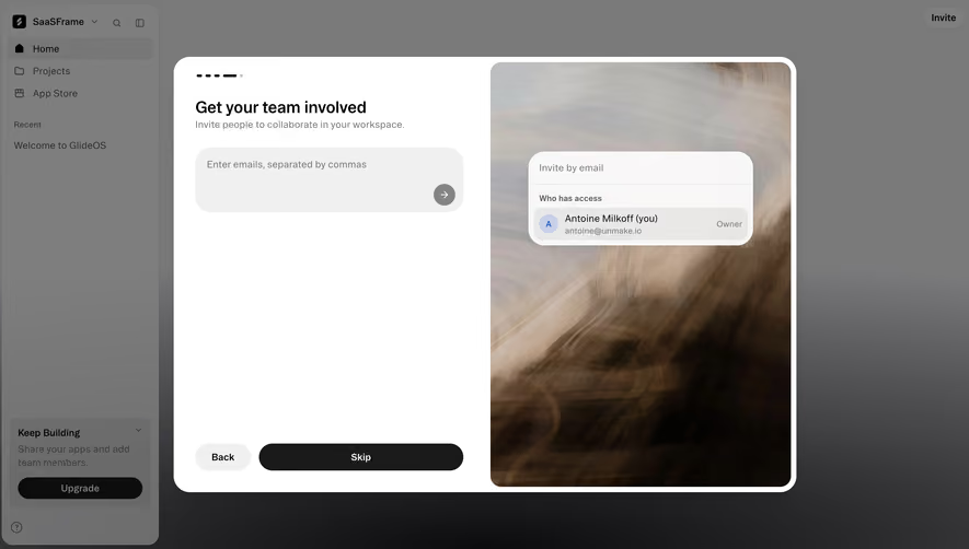
Fernand's captured team settings place an email-address input beside a role selector and an Invite button. Existing members appear above, including a pending invitation. This makes the relationship between the entered address, proposed access, and resulting action visible in one row.
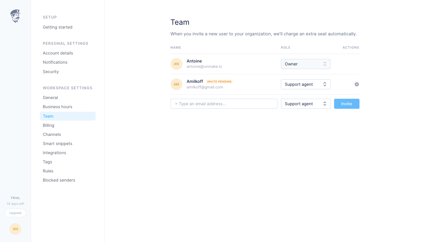
The page also states that inviting a user adds a seat charge. The screenshot is historical and does not establish present pricing, but it demonstrates a useful placement principle: explain a material consequence near the task rather than expecting the administrator to remember it from another page. The field is part of a workflow, not an isolated collection point.
When adapting this arrangement, review whether the email field has a persistent, accessible label. Placeholder text can demonstrate the expected value, but it disappears during entry. A returning administrator or someone reviewing a populated field still needs to identify what the value means. Keep the label available even if the visual layout is compact.
Fernand's conversation capture shows Reply and Note choices above the composer. Supporting text invites writing or inserting a saved reply, while a Send action appears at the lower right. The editor sits beneath the conversation, preserving the relationship between the message being read and the response being written.
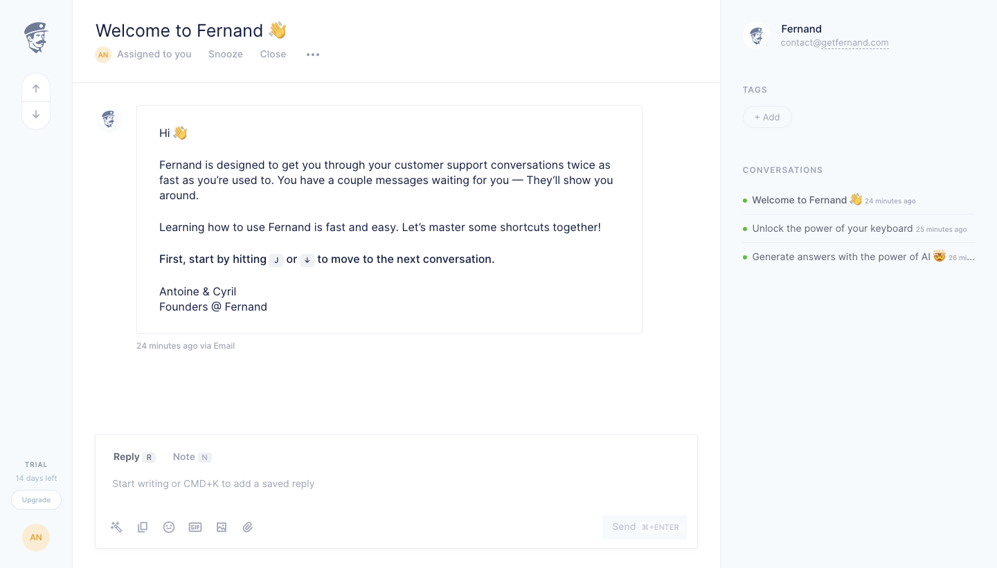
The difference between Reply and Note matters because the same text can have different audiences. The selected mode should remain obvious during writing and at submission. Do not rely only on a subtle color change to communicate whether a message is internal. Use labels, recipient context, and action wording that agree.
The static capture shows the available modes and shortcut hints, but it does not prove what happens when modes change or when a message is sent. Test whether changing mode preserves the draft, how recipients are identified, and how the interface prevents an internal note from being mistaken for an external reply.
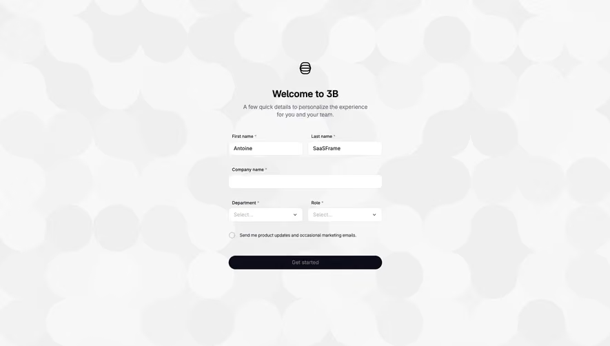
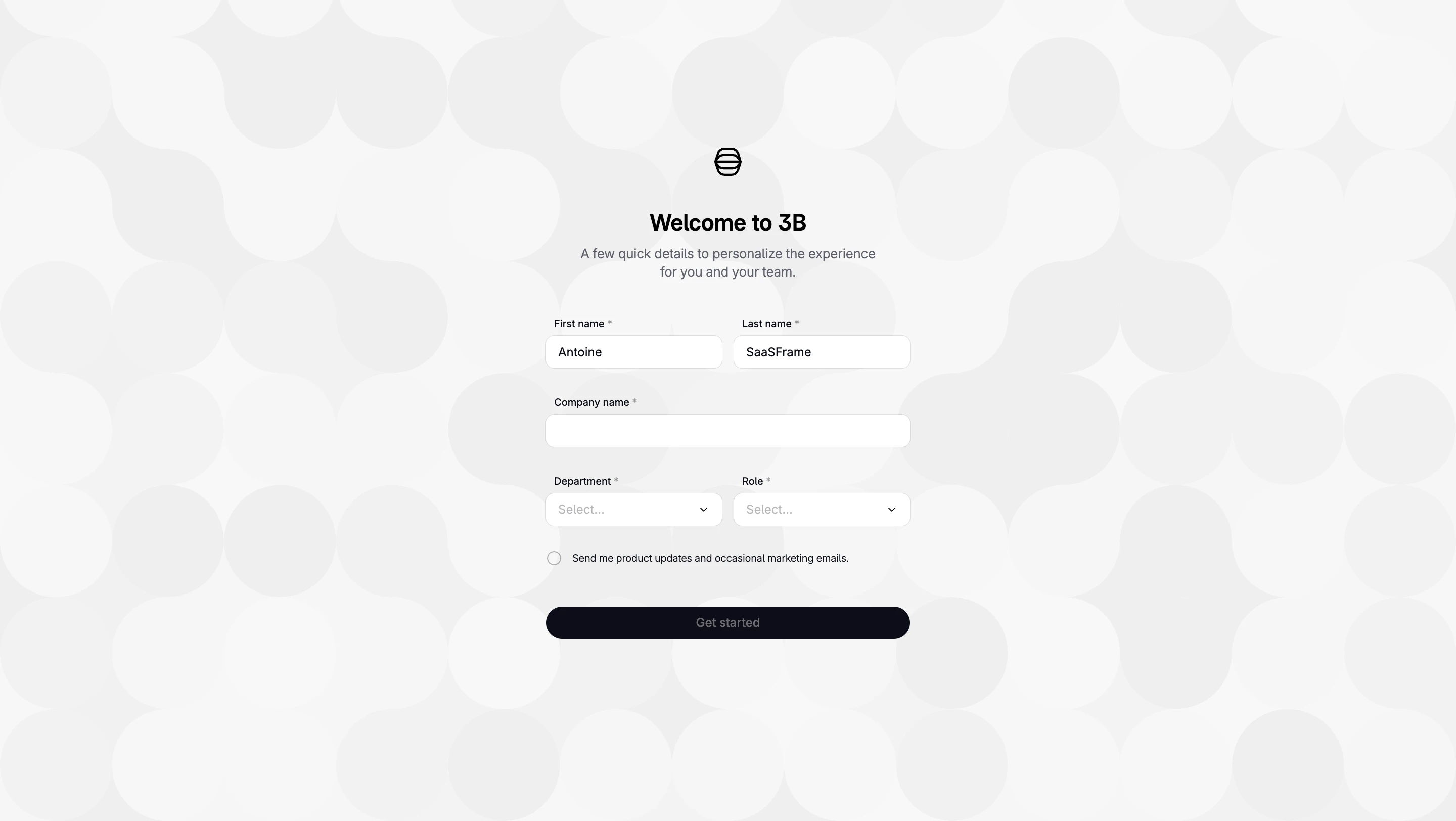
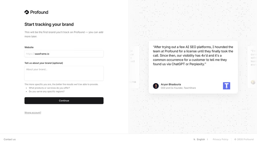
A label identifies the requested information. Helper text explains format, limits, or consequences. A placeholder can provide an example or a starting cue. These roles should not collapse into one disappearing sentence. In a form with several fields, persistent labels also support review after values have been entered.
Write helper text around likely uncertainty. An email field may need to explain whether multiple recipients are supported. A name field may need to distinguish an internal label from a public title. A message field may need to identify the audience. Avoid adding instructions that repeat the label without resolving a question.
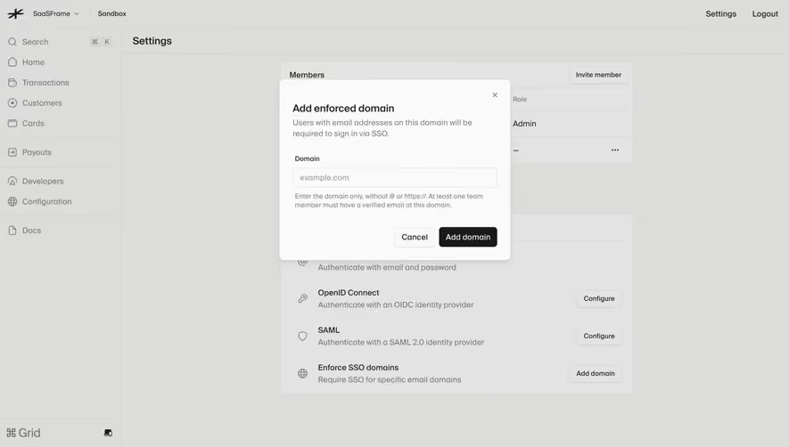
Place relevant guidance close to the field and connect it accessibly. A distant paragraph may be missed when someone navigates directly between controls. Essential constraints should be available before submission, especially if violating them would require rewriting a substantial amount of text. Keep the interface useful when an example placeholder has disappeared.
Single-line inputs work for short values and queries. Multiline editors support longer prose, but require decisions about height, formatting, and expansion. Choose the control around the content rather than the available space. A long message in a single-line field is hard to review; a large editor for a short identifier can make a simple task feel heavier than necessary.
Use an appropriate input type where the value has a recognizable structure, while avoiding assumptions that reject legitimate values. Do not impose a narrow name format simply because the design example uses one. Define whether whitespace is meaningful, how pasted content is handled, and whether formatting is preserved.
For rich text, make the supported capabilities understandable. Formatting, attachments, mentions, and saved replies change what the user can create. Expose the options that serve the task and keep the primary writing surface clear. Fernand's composer shows several utility icons; the screenshot does not establish their complete behavior or accessible labels.
Validation should explain a real problem without interrupting ordinary entry unnecessarily. A partially typed email address is not yet a completed invalid submission. Consider when the product has enough information to give useful feedback, and avoid showing an error merely because the person has started typing.
Messages should identify the problem and the correction. “Enter an email address” is more useful than “Invalid” when the expected value is missing. If an invitation cannot be created because the address already belongs to a member, explain that state rather than treating it as a format error. Different causes need different recovery paths.
Keep errors near the affected field and preserve the submitted value. In a longer form, a summary can help users locate several issues, but it should not replace local explanations. Test server-side failures as well as client-side format checks. A value can be structurally valid and still fail because of permissions, unavailable data, or a changed account state.
Writing can take time. Protect the draft when a request fails, the user changes context, or a temporary connection problem occurs. Decide whether drafts are local, account-based, or shared, and communicate persistence where users need to rely on it. A silent reset after a failed send is a substantial workflow failure.
Make submission distinct from adding a new line. Shortcut hints can help experienced users, but the visible action should remain available and its label should describe the result. Test keyboard conventions with the actual editor, including composition input and assistive technology, rather than assuming a shortcut works safely in every context.
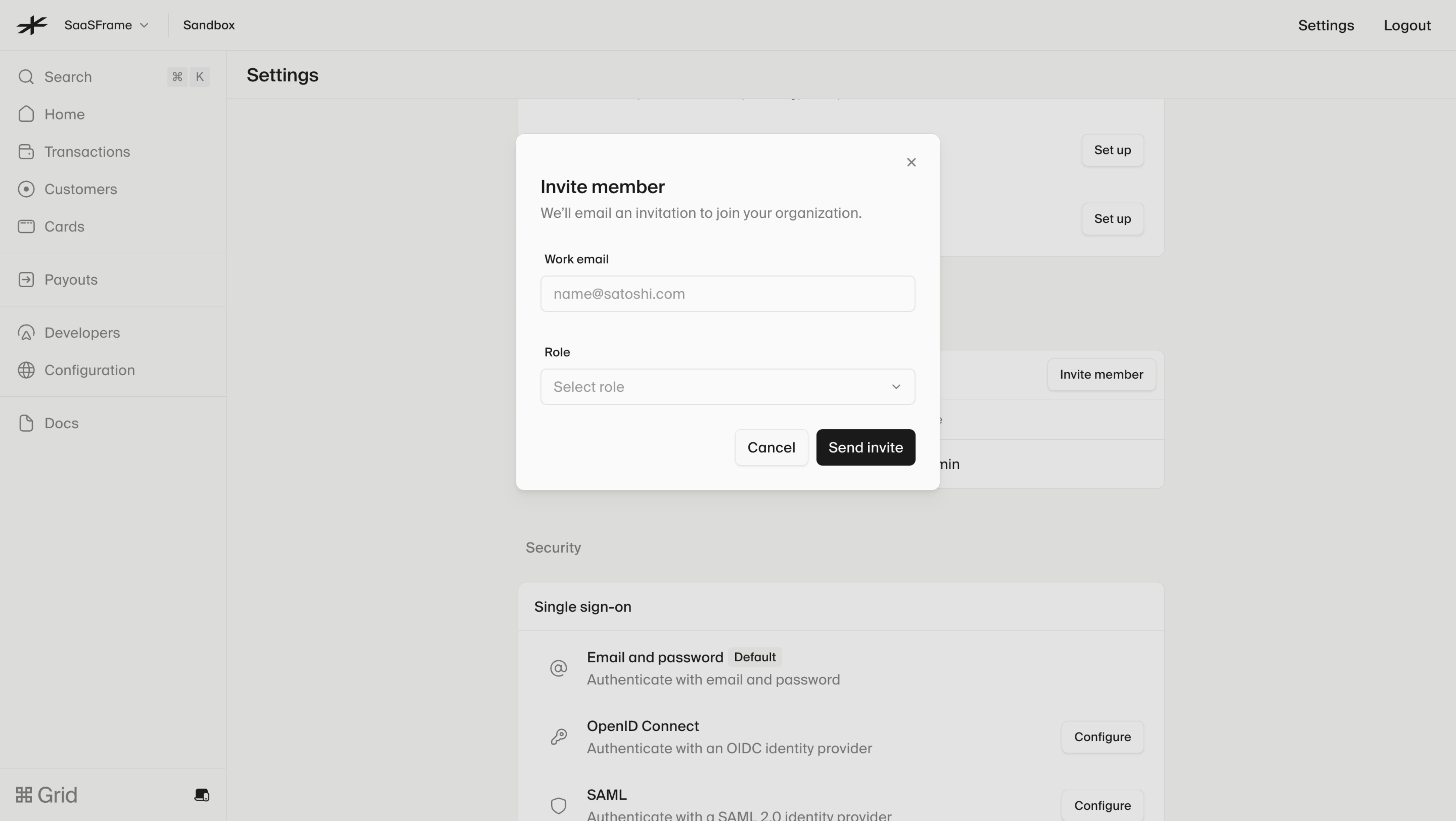
During submission, acknowledge the request and handle repeated activation predictably. If a message is pending, do not show it as successfully delivered before the relevant operation completes. If an invitation fails, leave the entered address and role available for correction or retry. Avoid creating uncertainty about whether a second click will duplicate the action.
Users need to locate the field, understand its label and state, enter text, and reach the next control. Focus styling should remain visible against the surrounding surface. Disabled and read-only fields should be distinguishable, with an explanation when the reason affects the task. A control that cannot be used should not look like an unexplained broken field.
Connect helper and error text to the input's accessible description. Use native form semantics where appropriate and review the accessible name of icon-only editor controls. A placeholder is not a sufficient replacement for a label. If the editor has a toolbar, its keyboard navigation should not trap the user or obscure how to return to writing.
Test text enlargement, browser zoom, and narrow layouts. The field's value should remain reviewable, and labels should not be clipped by fixed heights. The supplied desktop screenshots establish layout examples, not accessibility conformance. Verify the implementation rather than drawing behavioral conclusions from a static image.
Define any length limit around the product's actual requirements and explain it where it matters. A remaining-character indicator can help for genuinely constrained content, but it adds unnecessary noise when the limit is unlikely to affect ordinary work. If text is rejected for length, preserve it so the user can edit rather than start again.
Distinguish an empty required value from an optional field that has intentionally been left blank. If a field becomes unavailable after another selection, explain the relationship and decide what happens to its previous value. Do not silently discard text when a dependent control changes unless the consequence is clear and recoverable.
For sensitive values, provide the appropriate visibility and handling controls without making ordinary entry confusing. Avoid placing private content in placeholder examples or logging it through incidental interface behavior. The field should communicate the information needed for the user's decision, while the underlying implementation respects the product's actual data boundaries.
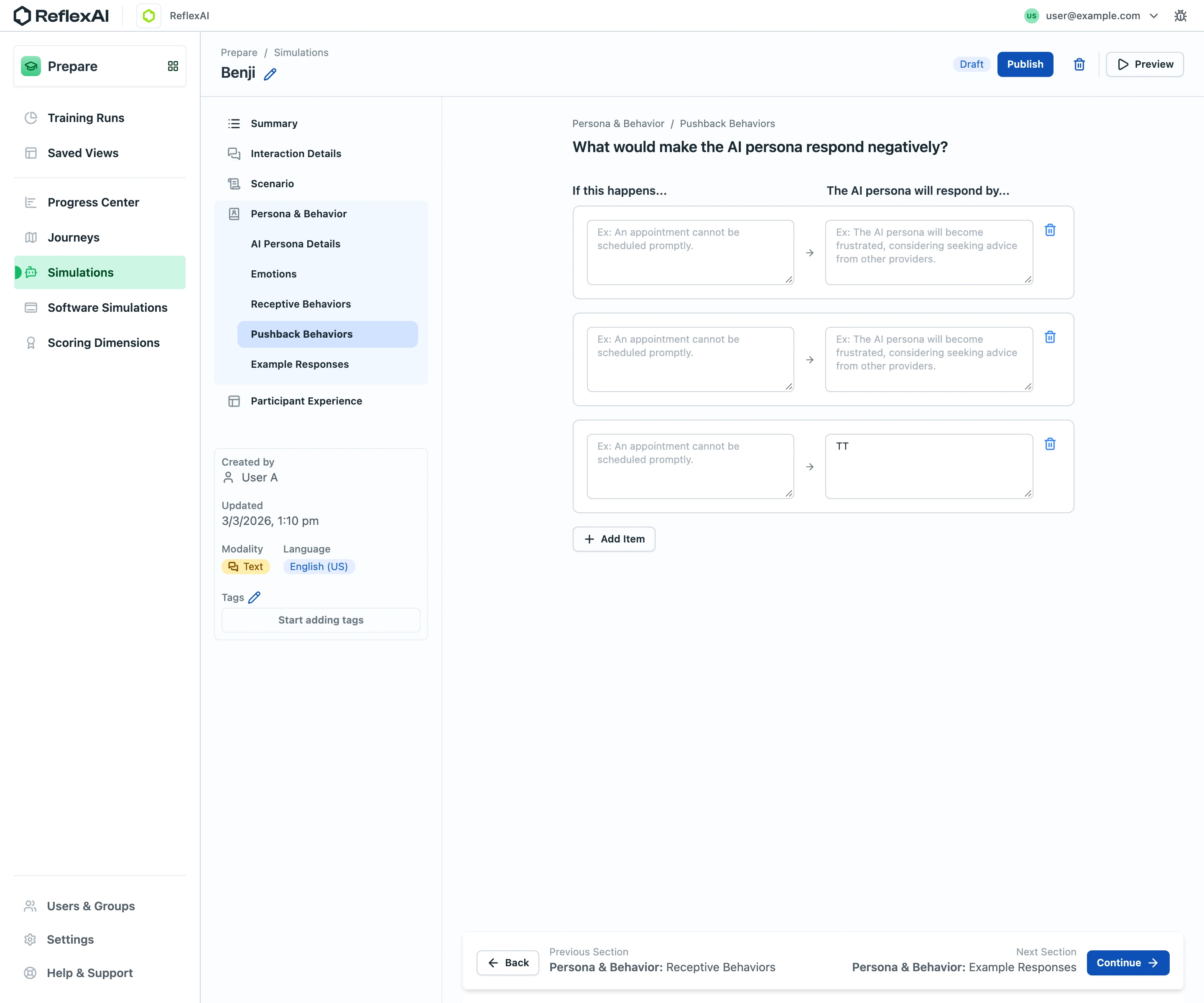
Test with realistic text, including pasted values, long names, multiline content, duplicate recipients, and incomplete input. Ask participants to explain what they expect after submission. Observe whether they understand the field before entering anything and whether error messages help them recover without losing work.
Measure correction effort and successful completion alongside submission counts. A high number of attempts may indicate confusing validation rather than engagement. For communication fields, include audience recognition in testing. Sending a syntactically valid message to the wrong audience is still a design failure.
Use this checklist:
It should not be the only identification. Placeholders disappear during entry and do not support review of populated fields. Use a persistent label and treat the placeholder as an optional example or starting cue.
When it can help the person correct a meaningful problem without interrupting normal entry. Timing depends on the field and workflow. Test partial entry, leaving the field, submission, and server-side failure rather than choosing one rule for every input.
No. Multiline writing requires a way to add line breaks, and shortcut conventions need explicit treatment. Keep a visible submission action, explain useful shortcuts, and test behavior with the actual editor and input methods.
Explore the SaaSFrame text input examples to compare short fields, message composers, and the context that makes text entry understandable.