 SaaSFrame
👽 404 Page
Turn lost traffic into a brand-building opportunity with these creative 404 error page examples. From humorous illustrations to strategic "back to home" CTAs, discover how top SaaS brands use custom 404 designs to reduce bounce rates and maintain a seamless user experience even when a link fails.
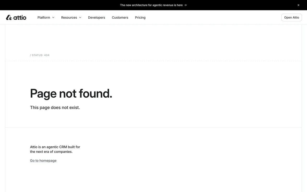

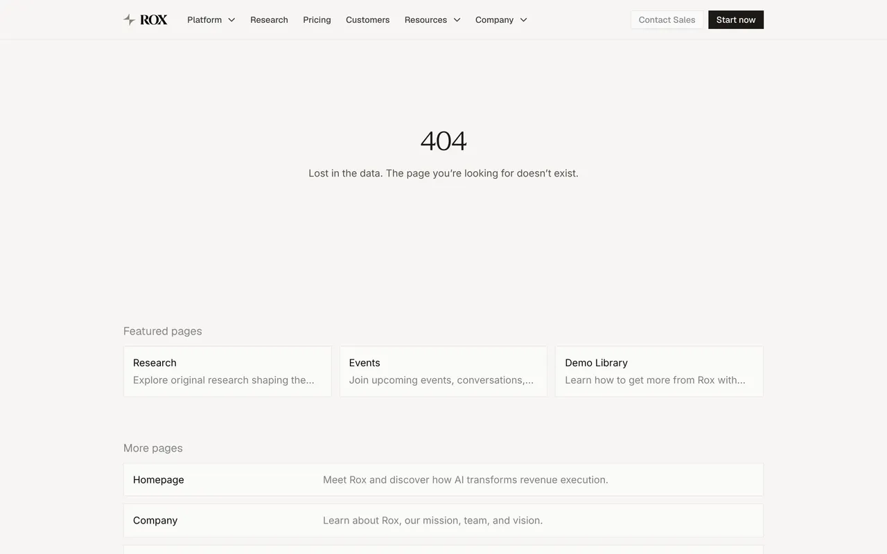

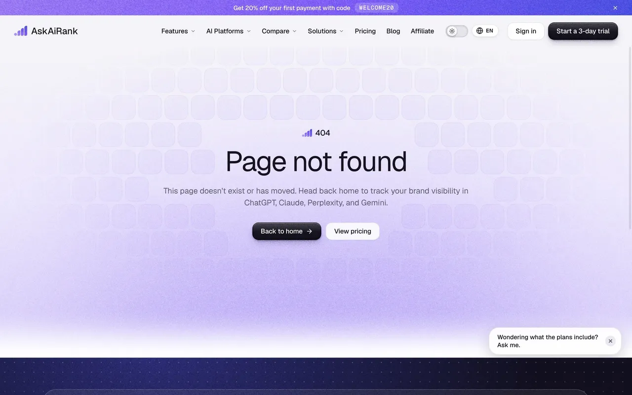

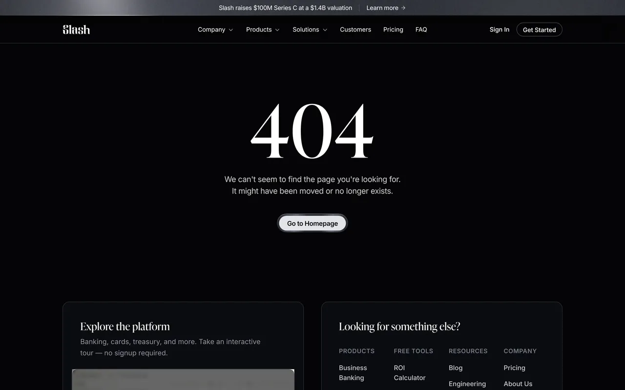
Index of all 54 404 Page examples
- Slash 404 Page
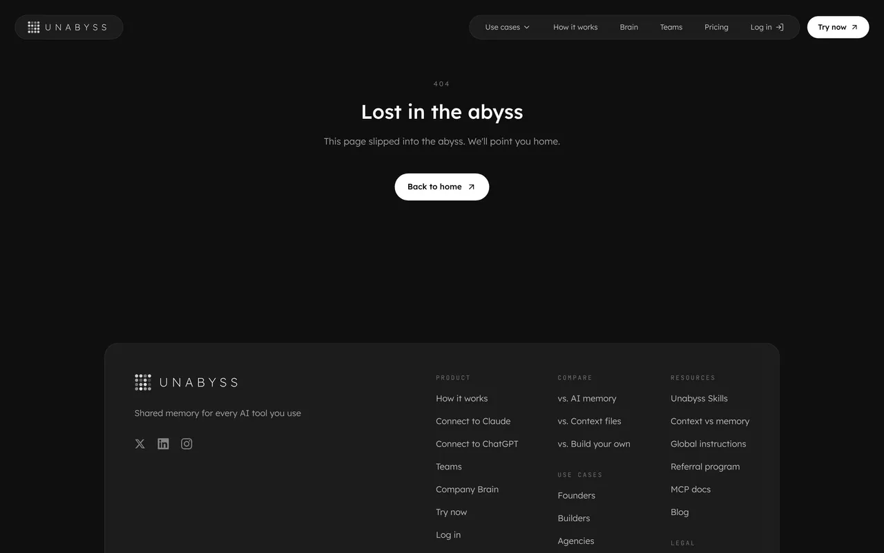
- Unabyss 404 Page
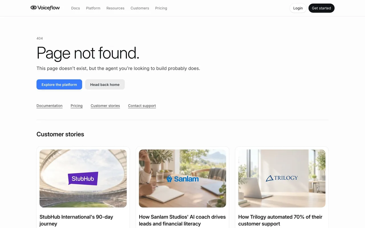
- Voiceflow 404 Page
- Respan 404 Page
- Datashake 404 Page
- Privy 404 Page
- Pivot 404 Page
- Searchable 404 Page
- Composer 404 Page
- Clutch 404 Page
- Remote 404 Page
- Arc 404 Page
- Makelog 404 Page
- Copperx 404 Page
- Sellx 404 Page
- Threads 404 Page
- Hopscotch 404 Page
- Conduktor 404 Page
- Artboard Studio 404 Page
- Senja 404 Page
- Surfer SEO 404 Page
- Surfe 404 Page
- Vowel 404 Page
- Kinsta 404 Page
- Pitch 404 Page
- Guru 404 Page
- Hiver 404 Page
- Baremetrics 404 Page
- Spendesk 404 Page
- Payfit ayFit 404 Page
- Zapier 404 Page
- PandaDoc 404 Page
- Station 404 Page
- Zendesk 404 Pages
- Buffer 404 Page
- Avocode 404 Page
- Weglot 404 Page
- Airtable 404 Page
- ConvertKit 404 Page
- Mangools 404 Page
- Mixpanel 404 Page
- Hugo 404 Page
- Drip 404 Page
- Front 404 Page
- Phantombuster hatombuster 404 Page
- Workable 404 Page
- Fullstory 404 Page
- Specify 404 Page
- Help Scout 404 Pages
- Acquire 404 Page
- Asana 404 Page
👽 404 Page: design guide
Short answer
A SaaS 404 page tells visitors the page they asked for does not exist and gets them back on a useful route. State the problem plainly, offer recovery links that match likely intent (home, search, docs, popular pages), keep brand humour short, and distinguish a missing page from an outage or a permission error.
A SaaS 404 page tells visitors that the requested page could not be found and helps them recover a useful route. Its purpose is navigation recovery, even when the visual treatment includes humor or brand personality.
What should a SaaS 404 page say first?
Use understandable language alongside the error code. Not every visitor knows what 404 means, and a playful headline alone can obscure the problem.
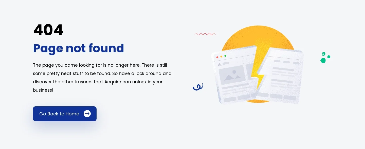
The Acquire reference pairs the code with a page-not-found heading, a short explanation, and a prominent home route. An illustration adds personality while the practical action remains identifiable.
This keeps the core task compact. Visitors should understand that the URL did not lead to an available page, not infer that their account or the entire product is unavailable.
Offer recovery that fits likely intent
A home link is broadly useful, but visitors may have been looking for pricing, help, or a specific resource. Provide a small number of relevant destinations when they improve recovery.
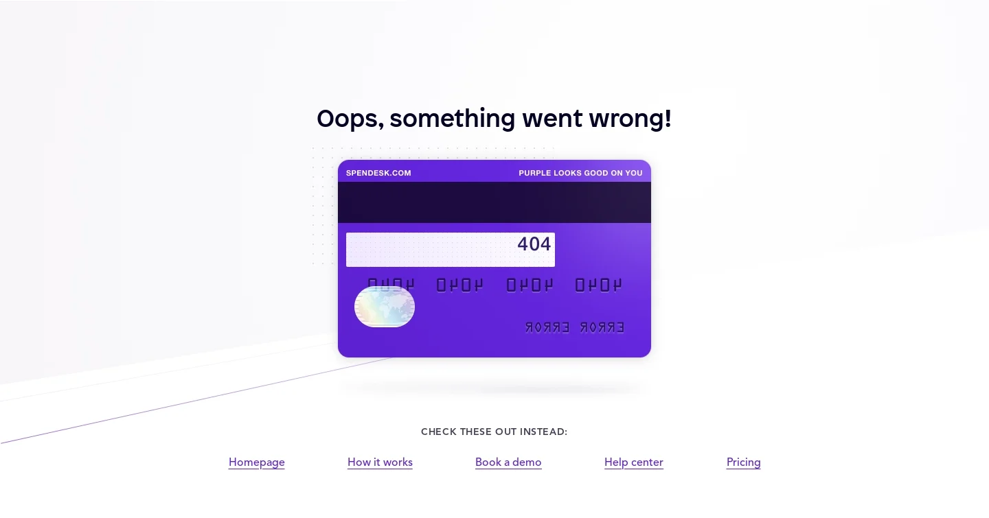
The Spendesk capture uses a branded illustration and a row of alternative routes, including the homepage, product explanation, demo, help centre, and pricing.
This gives visitors several recognizable choices without reproducing the entire website map. Select routes according to likely navigation needs and keep their labels explicit.
Use personality without delaying the task
A distinctive illustration can make the error less abrupt. It should not consume so much space that the explanation and recovery actions become hard to reach.
Avoid humor that blames visitors or suggests an unrelated failure. The system's job is to explain the state and provide a useful route.
Keep essential meaning in text. An illustration containing the error code should not be the only accessible indication that the page is missing.
Distinguish missing content from other failures
Authentication, permissions, temporary service errors, and removed content may require different messages and actions. Do not use one decorative error screen for every unsuccessful request.
If content moved, provide an appropriate route when the destination is known. A generic home link is less useful than a valid continuation to the intended resource.
Do not claim that a page was permanently removed unless that state is established. A missing route and an unavailable service are different conditions.
Preserve trustworthy navigation
Keep the page's visible links and branding consistent with the site. A visitor arriving through an external link needs confidence that recovery stays within the expected product.
If search is available, make its scope clear and show useful no-result feedback. Do not offer an apparently active control that cannot help find site content.
Avoid automatically redirecting so quickly that visitors cannot understand what happened. Recovery should be predictable.
Review real broken routes
Test unknown URLs, old links, nested routes, and mobile layout. Verify that recovery destinations are valid and the implementation preserves the correct error behavior.
Explore SaaSFrame's 404-page references to compare concise explanations and alternative navigation. Choose a design that helps visitors resume their task.
404 page questions
Does the page need a joke or illustration?
No. Personality is optional; a clear missing-page explanation and useful recovery are essential.
Is a home link enough?
Sometimes. Add a few relevant routes or search when visitors commonly need to recover a specific resource.
Should all errors use the 404 page?
No. Permissions, authentication, and temporary failures require messages that match their actual state.