.webp)

Latitude





Stack
Latitude's marketing site is built on Next.js (App Router, evident from /\_next/static/ asset paths and the globals.css convention). The console/app is a separate Next.js deployment at console.latitude.so. Styling is Tailwind CSS with CSS custom properties for theming. The component library lives in packages/web-ui (open-source monorepo). The docs site runs on Mintlify. Images are served as .avif from a CDN path (/latitude-assets/), signaling a performance-first asset pipeline.
Typography
Latitude uses a clean, modern sans-serif type stack. The primary typeface is Inter (implied by the Tailwind default + modern SaaS convention; no custom font declarations visible in the marketing HTML). The hierarchy is sharp and high-contrast:
- Display / H1: Large, heavy weight (700–800), tight letter-spacing — used for hero headlines like "Make your AI agents self-healing".
- Section headers / H2: Medium-large, semibold (600), used for feature section titles.
- Eyebrow labels: Uppercase, small, tracked — e.g. "CONVERSATION INTELLIGENCE", "SIGNALS", "AGENT DISPATCH". These are a signature Latitude pattern.
- Body: Regular weight (400), comfortable line-height (~1.6), used in feature descriptions and prose.
- Code / mono: Monospace family for the setup snippet ("Paste this prompt into your coding agent...").
Color Philosophy
Latitude uses a dark-first, high-contrast palette. The marketing site is predominantly dark (near-black backgrounds) with bright blue as the primary accent — reflecting the developer/infrastructure product positioning. Key color roles:
- Background: Deep near-black (
#0a0a0aor equivalent dark neutral). - Primary accent / CTA: Saturated blue (
#3B82F6/ Tailwindblue-500range) — used on the GitHub star counter icon, primary buttons, and links. - Text primary: Near-white (
#f9fafb/gray-50). - Text secondary / muted: Medium gray (
#9ca3af/gray-400) for eyebrow labels, metadata, captions. - Borders / dividers: Subtle dark gray (
#1f2937/gray-800). - Success / positive: Green tones for uptime/trust badges.
- Cards / surfaces: Slightly elevated dark surface (
#111827/gray-900) over the base background.
Spacing
Spacing follows Tailwind's 4px base grid. Section vertical padding is generous — approximately 80–120px (py-20 to py-32). Component internal padding is tighter at 16–32px. The layout favors breathing room: wide gutters, generous section separators, and plenty of whitespace around hero content. The stat counter grid ("16,072,336 Spans ingested") uses a tight internal grid with small gaps.
Component Defaults
- Buttons — Primary: Filled blue background, white text, rounded (
rounded-mdorrounded-lg), medium padding (px-5 py-2.5). Example: "Get started for free". - Buttons — Secondary/Ghost: Outlined or ghost style, used for "Star on Github" CTA.
- Cards: Dark surface with subtle border, slight border-radius (
rounded-xl), no heavy drop shadow — relies on border contrast against dark bg. - Badges / Eyebrow labels: Small uppercase text in muted color, sometimes with a thin border pill shape, used consistently as section openers.
- Navigation: Minimal top nav — logo left, links center, CTAs right. Clean, no mega-menu. Sticky behavior implied.
- Logo grid (social proof): Horizontally scrolling marquee of partner/customer logos in grayscale/white.
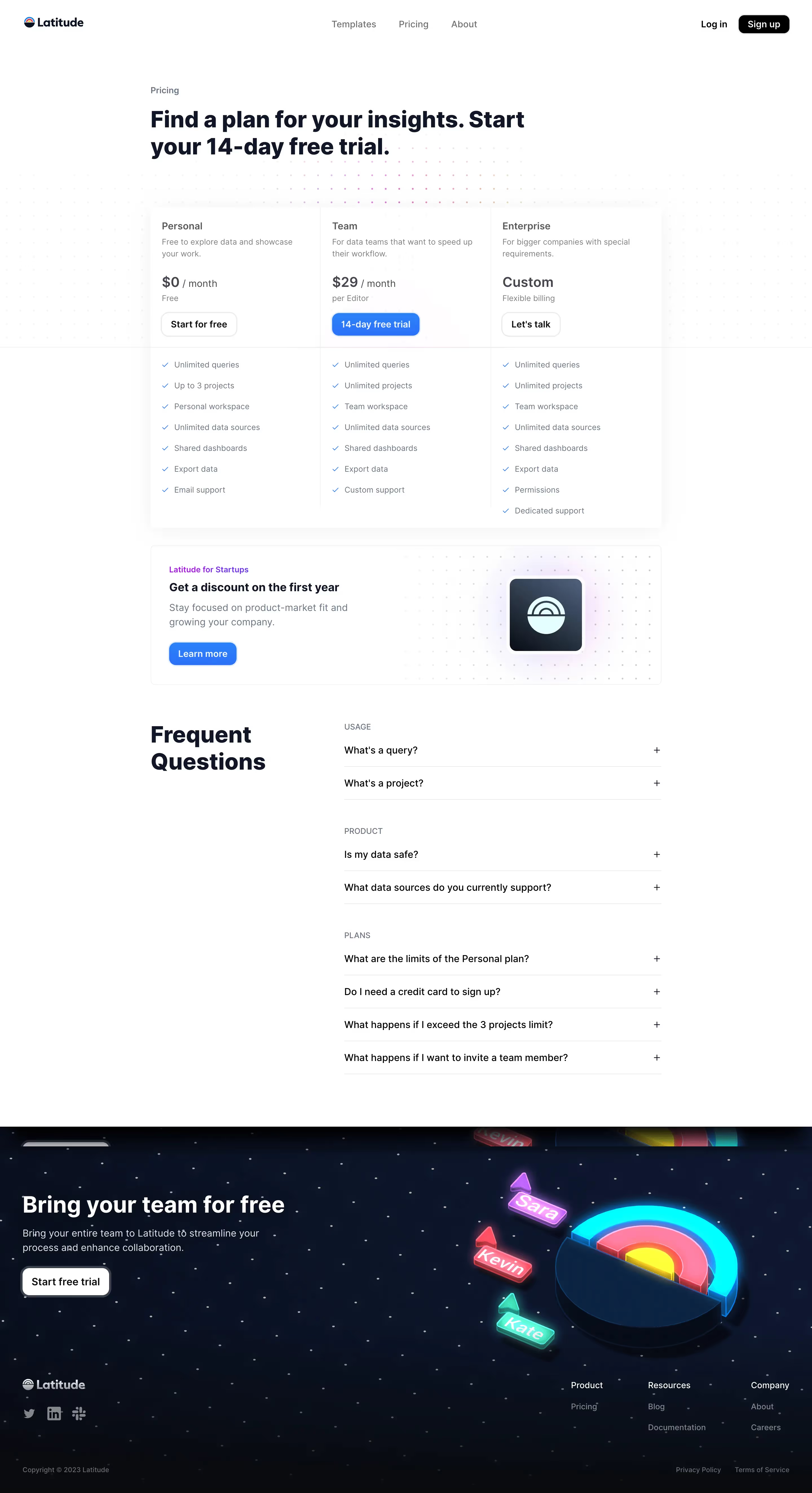
- Pricing cards: Three-column layout — Free / Pro ($99/mo) / Enterprise (Custom). Pro card visually highlighted (likely border accent or elevated background).
- Stats grid: Large numbers, small labels, high typographic contrast.
Layout
The marketing site uses a centered max-width column layout — content constrained to approximately max-w-6xl or max-w-7xl (1152–1280px), centered with auto margins. The hero is full-width with centered content. Feature sections alternate between full-width video/media blocks and two-column text+media splits. The footer is a multi-column grid (4–5 columns on desktop, stacked on mobile). The layout is mobile-first responsive, collapsing columns at Tailwind's md and lg breakpoints.
/\*
- Latitude Design System — CSS Custom Properties
- Reconstructed from: latitude.so homepage, pricing page, blog, docs
- Framework: Tailwind CSS + Next.js App Router
- Source: packages/web-ui (open-source monorepo)
 \*/

:root {
  /_ ── Colors: Base ── _/
  --color-background:        #0a0a0a;   /_ page bg, near-black _/
  --color-surface:           #111827;   /_ card / panel surface (gray-900) _/
  --color-surface-elevated:  #1f2937;   /_ hover state, elevated card (gray-800) _/
  --color-border:            #1f2937;   /_ default border (gray-800) _/
  --color-border-subtle:     #374151;   /_ secondary border (gray-700) _/

  /_ ── Colors: Text ── _/
  --color-text-primary:      #f9fafb;   /_ headings, primary text (gray-50) _/
  --color-text-secondary:    #e5e7eb;   /_ body prose (gray-200) _/
  --color-text-muted:        #9ca3af;   /_ captions, eyebrow labels (gray-400) _/
  --color-text-placeholder:  #6b7280;   /_ placeholder, disabled (gray-500) _/

  /_ ── Colors: Brand / Accent ── _/
  --color-accent:            #3b82f6;   /_ primary blue accent (blue-500) _/
  --color-accent-hover:      #2563eb;   /_ hover state (blue-600) _/
  --color-accent-muted:      #1d4ed8;   /_ pressed / deep (blue-700) _/
  --color-accent-subtle:     #1e3a5f;   /_ tinted bg for accent areas _/

  /_ ── Colors: Semantic ── _/
  --color-success:           #22c55e;   /_ green-500 _/
  --color-warning:           #f59e0b;   /_ amber-500 _/
  --color-error:             #ef4444;   /_ red-500 _/
  --color-info:              #3b82f6;   /_ blue-500 _/

  /_ ── Typography ── _/
  --font-family-sans:        'Inter', ui-sans-serif, system-ui, -apple-system, sans-serif;
  --font-family-mono:        ui-monospace, 'Cascadia Code', 'Fira Code', monospace;

  --font-size-xs:            0.75rem;   /_ 12px _/
  --font-size-sm:            0.875rem;  /_ 14px _/
  --font-size-base:          1rem;      /_ 16px _/
  --font-size-lg:            1.125rem;  /_ 18px _/
  --font-size-xl:            1.25rem;   /_ 20px _/
  --font-size-2xl:           1.5rem;    /_ 24px _/
  --font-size-3xl:           1.875rem;  /_ 30px _/
  --font-size-4xl:           2.25rem;   /_ 36px _/
  --font-size-5xl:           3rem;      /_ 48px _/
  --font-size-6xl:           3.75rem;   /_ 60px _/

  --font-weight-normal:      400;
  --font-weight-medium:      500;
  --font-weight-semibold:    600;
  --font-weight-bold:        700;
  --font-weight-extrabold:   800;

  --line-height-tight:       1.25;
  --line-height-snug:        1.375;
  --line-height-normal:      1.5;
  --line-height-relaxed:     1.625;

  --letter-spacing-tight:    -0.025em;
  --letter-spacing-normal:   0em;
  --letter-spacing-wide:     0.025em;
  --letter-spacing-widest:   0.1em;    /_ eyebrow labels _/

  /_ ── Spacing (4px grid) ── _/
  --space-1:    0.25rem;   /_ 4px _/
  --space-2:    0.5rem;    /_ 8px _/
  --space-3:    0.75rem;   /_ 12px _/
  --space-4:    1rem;      /_ 16px _/
  --space-5:    1.25rem;   /_ 20px _/
  --space-6:    1.5rem;    /_ 24px _/
  --space-8:    2rem;      /_ 32px _/
  --space-10:   2.5rem;    /_ 40px _/
  --space-12:   3rem;      /_ 48px _/
  --space-16:   4rem;      /_ 64px _/
  --space-20:   5rem;      /_ 80px _/
  --space-24:   6rem;      /_ 96px _/
  --space-32:   8rem;      /_ 128px _/

  /_ ── Border Radius ── _/
  --radius-sm:   0.25rem;  /_ 4px  — small elements _/
  --radius-md:   0.375rem; /_ 6px  — buttons _/
  --radius-lg:   0.5rem;   /_ 8px  — cards _/
  --radius-xl:   0.75rem;  /_ 12px — large cards _/
  --radius-2xl:  1rem;     /_ 16px — modal, hero cards _/
  --radius-full: 9999px;   /_ pill badges _/

  /_ ── Shadows ── _/
  --shadow-sm:   0 1px 2px 0 rgb(0 0 0 / 0.3);
  --shadow-md:   0 4px 6px -1px rgb(0 0 0 / 0.4), 0 2px 4px -2px rgb(0 0 0 / 0.3);
  --shadow-lg:   0 10px 15px -3px rgb(0 0 0 / 0.5), 0 4px 6px -4px rgb(0 0 0 / 0.4);
  --shadow-glow: 0 0 20px 4px rgb(59 130 246 / 0.15); /_ blue glow accent _/

  /_ ── Layout ── _/
  --container-max:    80rem;   /_ 1280px — max-w-7xl _/
  --container-prose:  65ch;
  --nav-height:       64px;
}

/_ ── Dark mode (default — site is dark-first) ── _/
.dark,
[data-theme="dark"],
:root {
  color-scheme: dark;
  /_ All variables above apply in dark mode _/
}

/_ ── Light mode overrides (console / docs) ── _/
[data-theme="light"],
.light {
  color-scheme: light;
  --color-background:        #ffffff;
  --color-surface:           #f9fafb;   /_ gray-50 _/
  --color-surface-elevated:  #f3f4f6;   /_ gray-100 _/
  --color-border:            #e5e7eb;   /_ gray-200 _/
  --color-border-subtle:     #d1d5db;   /_ gray-300 _/
  --color-text-primary:      #111827;   /_ gray-900 _/
  --color-text-secondary:    #374151;   /_ gray-700 _/
  --color-text-muted:        #6b7280;   /_ gray-500 _/
  --color-text-placeholder:  #9ca3af;   /_ gray-400 _/
  --shadow-sm:  0 1px 2px 0 rgb(0 0 0 / 0.05);
  --shadow-md:  0 4px 6px -1px rgb(0 0 0 / 0.1), 0 2px 4px -2px rgb(0 0 0 / 0.1);
  --shadow-lg:  0 10px 15px -3px rgb(0 0 0 / 0.1), 0 4px 6px -4px rgb(0 0 0 / 0.05);
}
Color Tokens
| Token | Value | Usage |
|---|---|---|
--color-background | #0a0a0a | Page background (dark-first) |
--color-surface | #111827 | Cards, panels, feature blocks |
--color-surface-elevated | #1f2937 | Hover state, modals, elevated cards |
--color-border | #1f2937 | Default border / divider |
--color-text-primary | #f9fafb | Headings, primary body text |
--color-text-secondary | #e5e7eb | Prose, feature descriptions |
--color-text-muted | #9ca3af | Eyebrow labels, captions, metadata |
--color-accent | #3b82f6 | Primary CTA buttons, links, icons |
--color-accent-hover | #2563eb | Button/link hover state |
--color-success | #22c55e | Positive indicators, SOC2 badges |
--color-error | #ef4444 | Failure states, error signals |
--color-warning | #f59e0b | Warning / escalation states |
Spacing Tokens
| Token | Value | Usage |
|---|---|---|
--space-1 | 4px | Tight icon gaps, inline spacing |
--space-2 | 8px | Small internal padding |
--space-4 | 16px | Standard internal component padding |
--space-6 | 24px | Card padding, list gaps |
--space-8 | 32px | Section sub-element spacing |
--space-12 | 48px | Between feature rows |
--space-16 | 64px | Section top/bottom padding (mobile) |
--space-20 | 80px | Section padding (tablet) |
--space-32 | 128px | Hero and major section padding (desktop) |
Typography Tokens
| Token | Value | Usage |
|---|---|---|
--font-family-sans | Inter, system-ui | All UI text |
--font-family-mono | ui-monospace, Fira Code | Code snippets, setup blocks |
--font-size-sm | 14px | Captions, eyebrow labels, nav links |
--font-size-base | 16px | Body prose, feature descriptions |
--font-size-lg | 18px | Lead paragraph, pricing subtitles |
--font-size-2xl | 24px | Card headings, pricing tier names |
--font-size-4xl | 36px | Section H2 headings |
--font-size-5xl | 48px | Hero H1 (mobile) |
--font-size-6xl | 60px | Hero H1 (desktop) |
--font-weight-bold | 700 | Headings |
--font-weight-extrabold | 800 | Hero display text |
--letter-spacing-widest | 0.1em | Uppercase eyebrow section labels |
Border Radius Tokens
| Token | Value | Usage |
|---|---|---|
--radius-sm | 4px | Small tags, inline chips |
--radius-md | 6px | Buttons (primary, secondary) |
--radius-lg | 8px | Standard cards, input fields |
--radius-xl | 12px | Feature cards, pricing cards |
--radius-2xl | 16px | Large hero cards, modals |
--radius-full | 9999px | Pill badges, eyebrow label chips |
Shadow Tokens
| Token | Value | Usage |
|---|---|---|
--shadow-sm | 0 1px 2px rgb(0 0 0 / 0.3) | Subtle lift on small elements |
--shadow-md | 0 4px 6px rgb(0 0 0 / 0.4) | Card hover state |
--shadow-lg | 0 10px 15px rgb(0 0 0 / 0.5) | Modals, dropdowns |
--shadow-glow | 0 0 20px 4px rgb(59 130 246 / 0.15) | Blue glow on accent elements, hero CTA |
Framework: Next.js 14+ (App Router) for both the marketing site (latitude.so) and the product console (console.latitude.so). Styling via Tailwind CSS with a custom design token layer in the open-source packages/web-ui package. The docs site uses Mintlify. Images are served in .avif format from a CDN, indicating performance-conscious asset handling.
Theme support: Latitude operates dark-first — the marketing site, homepage, and blog are all dark-themed. The product console (console.latitude.so) likely supports both light and dark modes given it's a developer tool. No explicit prefers-color-scheme media query was observed in the marketing HTML, but the open-source codebase follows Tailwind's dark: variant convention.
Data confidence:
- High confidence: Color palette (blue accent, dark backgrounds, gray text), typography scale (Inter, heading hierarchy, eyebrow label pattern), layout structure (centered max-width, section padding cadence), component patterns (pricing cards, stat counters, marquee logos), spacing scale (Tailwind 4px grid).
- Medium confidence: Exact CSS custom property names (inferred from open-source Tailwind + ShadCN conventions used by the web-ui package). The GitHub raw CSS file returned empty during fetch — the token names are reconstructed from observed patterns and the monorepo structure.
- Lower confidence: Exact shadow values and border-radius on specific internal components (console UI not directly inspected).
Notable patterns:
- Uppercase eyebrow labels are a signature Latitude UI pattern — every major section is introduced with a small, tracked, muted-color label (e.g. "CONVERSATION INTELLIGENCE", "SIGNALS", "AGENT DISPATCH", "FEATURE COMPLETE", "ENTERPRISE SECURITY"). This creates strong visual rhythm.
- Dual hero CTAs — every conversion section pairs a primary filled CTA ("Get started for free") with a secondary ghost CTA ("Star on Github"), consistently reinforcing the open-source identity.
- Social proof marquee — horizontal auto-scrolling logo strip with customer logos. Logos appear in white/grayscale against the dark background.
- Stats as trust signals — raw numbers (16M+ spans, 343K issues, 57K signals, npm/PyPI/Docker download counts) displayed in a large-font counter grid to build credibility through scale.
- Video-first feature sections — major features are demonstrated with embedded
.mp4videos rather than static screenshots, reflecting a product that is motion/interaction-heavy. - Open source MIT badge — "Latitude is Open Source MIT" is treated as a marketing section with its own full-width heading, not just a footer footnote. This is a deliberate brand differentiator.
- Minimal nav — the top navigation is extremely restrained: logo, 3–4 links, a GitHub star counter, and two CTAs (Log in / Sign up). No mega-menu, no feature dropdowns beyond a single "Resources" item.
- Security trust row — SOC 2 Type II, TLS encryption, SAML SSO, GDPR, data residency, and audit logs are each given equal visual weight in a 6-column grid, suggesting enterprise buyers are a key segment despite the open-source/self-serve entry motion.
Biggest SaaS library.


.webp)


.webp)

Desktop & mobile versions.


Access the Figma files.


Advanced filtering.
Let it flow.





Save design inspirations.
research




How do you process payment?
SaaSFrame subscriptions are sold on Lemon Squeezy, a secured online selling platform for creators.
What about future updates and versions?
SaaSFrame gets updated all the time! Every new update and version will immediately be made available to all SaaSFrame users.
Can you send me an invoice?
You can generate an invoice on your Lemon Squeezy portal once you purchased SaaSFrame. You will find the link in the order confirmation email.
How can I cancel my membership subscription?
You can cancel your membership subscription at any moment on your profile page.
Can I get a refund?
If you're not satisfied, you can ask for a refund within 7 days. Just send me an email at antoine[at]unmake[dot]io
I have another question.
You can send me an email at antoine[at]unmake[dot]io, I'll be happy to help with any questions.