 SaaSFrame
How It Works
Simplify complex processes with 'How It Works' patterns for SaaS. Use numbered steps, icons, and progressive disclosure to explain your onboarding or product workflow in seconds.



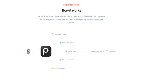
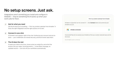
How It Works: design guide
A SaaS how-it-works section explains the product's mechanism through a concrete task. It helps visitors understand what they provide, what the product does, and what result they can expect to inspect. The pattern is most useful when it reveals a relationship that a feature name or broad benefit cannot explain on its own.
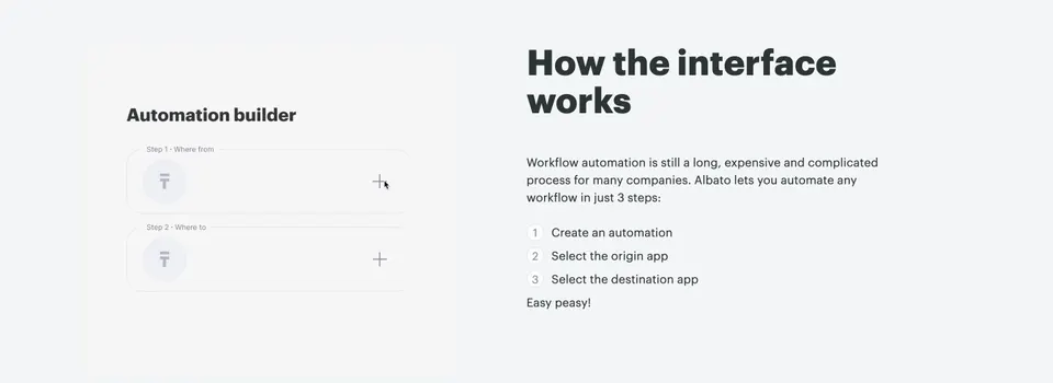
Albato and Glide show two different interaction models: selecting the source and destination of an automation, and asking an AI-oriented interface to connect a service for a task. Both use a short sequence with a supporting interface illustration. The captures explain the marketing presentation, not verified live behavior or current capabilities.
Explain the mechanism rather than only the benefit
Start with a representative job. The visitor should understand the input, the product's contribution, and the output or continuation. A promise of saving time may motivate interest, but it does not explain how the software participates in the work.
Choose a task familiar enough to follow without extensive product knowledge. If the example needs several unfamiliar terms, define them or select a simpler starting point. The section should provide orientation before deeper documentation or a full demonstration.
Keep the example representative without implying it covers every workflow. A short explanation can show the core model and point to requirements or advanced options. Avoid a broad claim that any task is possible merely because one example is easy to illustrate.
Use source and destination to clarify a data flow
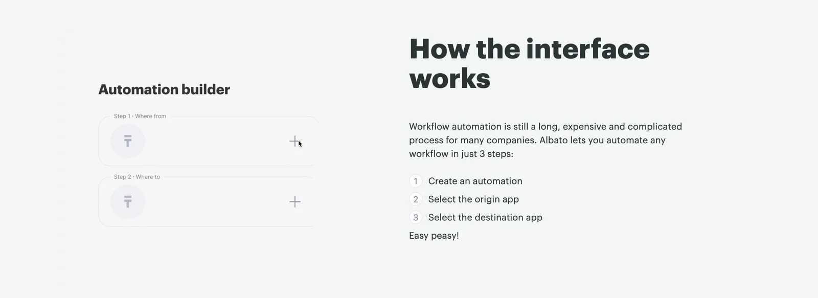
Albato pairs a simplified automation builder with a numbered explanation: create an automation, select an origin app, and select a destination app. The visual includes Where from and Where to slots, making the direction of the relationship recognizable.
This structure helps a visitor understand that the product connects two services within a workflow. The illustration and text reinforce the same conceptual model rather than showing unrelated interface detail.
The short sequence does not demonstrate every configuration requirement. Authentication, field mapping, triggers, and handling of failures may need separate explanation in the relevant product materials. Use the overview to establish the model, then make the complete setup path discoverable.
Show the user's request and the system's next action
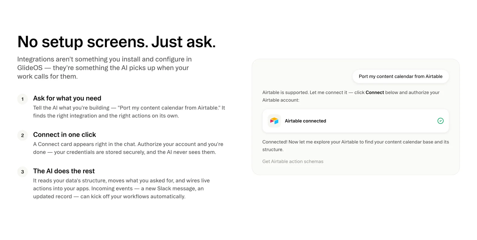
Glide presents a conversational request about bringing a content calendar from Airtable. The illustration then shows an authorization explanation and a connected-state card. The adjacent steps distinguish asking, connecting, and the system's subsequent work.
This is a useful way to explain a conversational model: the user states a goal, an explicit connection step appears, and the interface continues with the relevant task. It gives the visitor a concrete example rather than relying entirely on a broad AI claim.
The capture contains statements about automated behavior and credential handling. Those are displayed product claims, not conclusions verified by the screenshot. Keep current technical details tied to maintained official information and do not imply that an illustrative connected state proves the whole workflow succeeded.
Distinguish user actions from product actions
A how-it-works explanation should make responsibility clear. The visitor may select an app, authorize access, provide data, or review a result. The system may then retrieve information, apply a rule, or produce an output. These are different parts of the mechanism.
Use headings and copy that preserve the distinction. A stage named Connect can identify the user's authorization, while the following description can explain what the product does afterward. Avoid compressing both into a vague statement that the software does everything.
When an action has consequences, show the relevant confirmation or review point in the explanation. A request to read information differs from a request to change or send it. The section can remain concise while helping visitors understand where their input or approval matters.
Choose interface detail that earns its space
Use a focused crop, composition, or stable demo that supports the mechanism. Albato's source and destination slots explain the flow. Glide's request and connection card explain the conversation and authorization. Neither example needs every navigation item from the full application to establish its main idea.
Remove secondary detail that makes the illustration difficult to read, but keep context that affects interpretation. A result with no preceding input can look magical; an input with no continuation can leave the outcome unclear. The visual should show enough of the relationship to make the text credible.
Keep important information in real text. Interface labels inside an image may become small on mobile or unavailable to assistive technology. The adjacent explanation should communicate the core mechanism even when the visual is not visible.
Set realistic expectations for setup and limitations
A marketing explanation often simplifies the first encounter with a product. That can be helpful, but it should not conceal requirements that materially affect the visitor's evaluation. Name the relevant prerequisites or provide a clear route to them.
If the task depends on a supported service, account permissions, data structure, or plan, make that scope discoverable. If the product produces a suggestion that needs review, distinguish it from a final action. If the example represents a specific configuration, do not present it as a universal workflow.
Use plain language about the route instead of unsupported absolutes. A short sequence can be approachable without claiming that every process is instant or effortless. Honest scope helps visitors decide whether to explore the product further.
Connect the overview to a useful next destination
After understanding the model, a visitor may want a detailed demo, a setup guide, an example workflow, or a trial. Choose the next action according to the audience and the page's stage of explanation.
Preserve the example's context in the destination. Someone exploring an app-to-app automation should find a relevant guide or template, not a generic directory with no connection to the task. Someone exploring a conversational workflow should understand how to begin the same kind of request.
Use action labels that predict the experience. Watch a demo, Explore templates, and Start setup are different promises. Do not add an action merely to complete the section's visual pattern if there is no useful next step.
Use animation or interaction carefully
A short animated transition can explain how an input becomes a result. It should be paced for comprehension and provide a stable view when motion is reduced. Do not require visitors to wait through a loop to read essential text.
If the section includes a live demo, make its controls recognizable and its boundaries clear. Visitors should know whether they are experimenting in a sample, changing real data, or simply navigating an explanation. Keep keyboard access and focus visible.
Provide a useful fallback if the demo fails to load. A static explanation should still establish the mechanism. Avoid visual controls that imply interaction on a purely decorative screenshot, and do not let a demo interrupt the page's ordinary navigation.
Review the explanation for accurate understanding
For AI-oriented explanations, describe observable stages rather than leaving a large gap under a phrase such as the system does the rest. A visitor may need to understand what information is read, what proposal is produced, and where an action is reviewed. The section can introduce that relationship without overwhelming the page with implementation detail.
Choose one result to make the example complete. A connection card confirms a relationship, but it is not necessarily the outcome of the original task. If the task concerns importing a calendar, a relevant output preview or linked demonstration can show what happens after connection. Keep intermediate success distinct from completion of the broader request.
Also check the example's failure boundary. The overview does not need to show every error, but a useful destination should explain what happens when an app cannot be connected or the input does not fit. That support route makes the simplified explanation more credible.
- Does the section explain a representative task?
- Are input, product action, and result clear?
- Do the text and illustration describe the same mechanism?
- Are user and system responsibilities distinguished?
- Are authorization and review points understandable?
- Are prerequisites and scope discoverable?
- Do current technical claims have maintained sources?
- Does the next destination preserve context?
- Can the explanation work without motion or images?
- Does mobile layout keep related content together?
Ask visitors to explain what they would provide and what the product would do next. If they infer that a connection automatically completes a broader workflow, clarify the intermediate work and result. If they cannot identify the input, choose a more concrete example or improve its labels.
Maintain the example as the product changes. A redesigned connection flow, new authorization requirement, or changed output can make the old composition misleading. Review the copy, visual, and linked destination together. A familiar illustration should not remain unchanged solely because it is easy to reuse.
Consider whether the task branches. A linear overview can establish a common path, while a short qualification can acknowledge alternatives. If choices fundamentally change the mechanism, show separate examples or provide a deeper workflow page. Do not flatten meaningful differences into one universal explanation.
Frequently asked questions about how-it-works sections
How is this different from a feature section?
A feature section introduces a capability and its value. A how-it-works section explains the relationship between input, product behavior, and result for a task. The two can support each other when their roles are clear.
Does a how-it-works section need numbered steps?
No. A diagram, input-and-output example, or focused demonstration can explain the mechanism. Use numbering when order matters and helps the visitor follow the task. Choose the format according to the relationship being explained.
Should the example include every setup detail?
Include the details needed for realistic understanding and make important requirements discoverable. Keep complete instructions in a relevant maintained destination. A concise overview should simplify presentation without changing the meaning of the workflow.
Browse SaaS how-it-works examples on SaaSFrame to compare workflow inputs, product actions, connection states, and contextual next steps.