.webp)

Claude


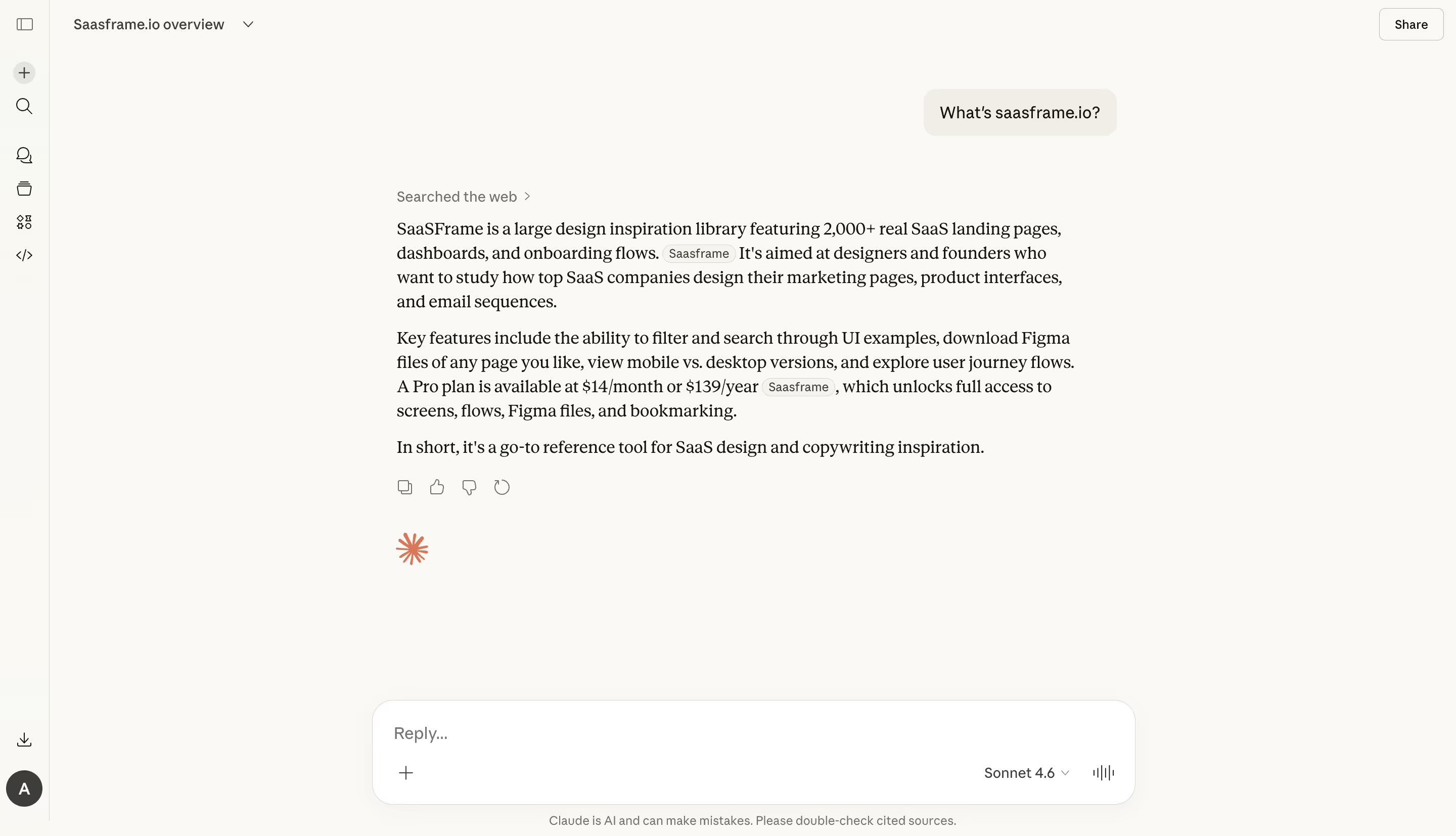
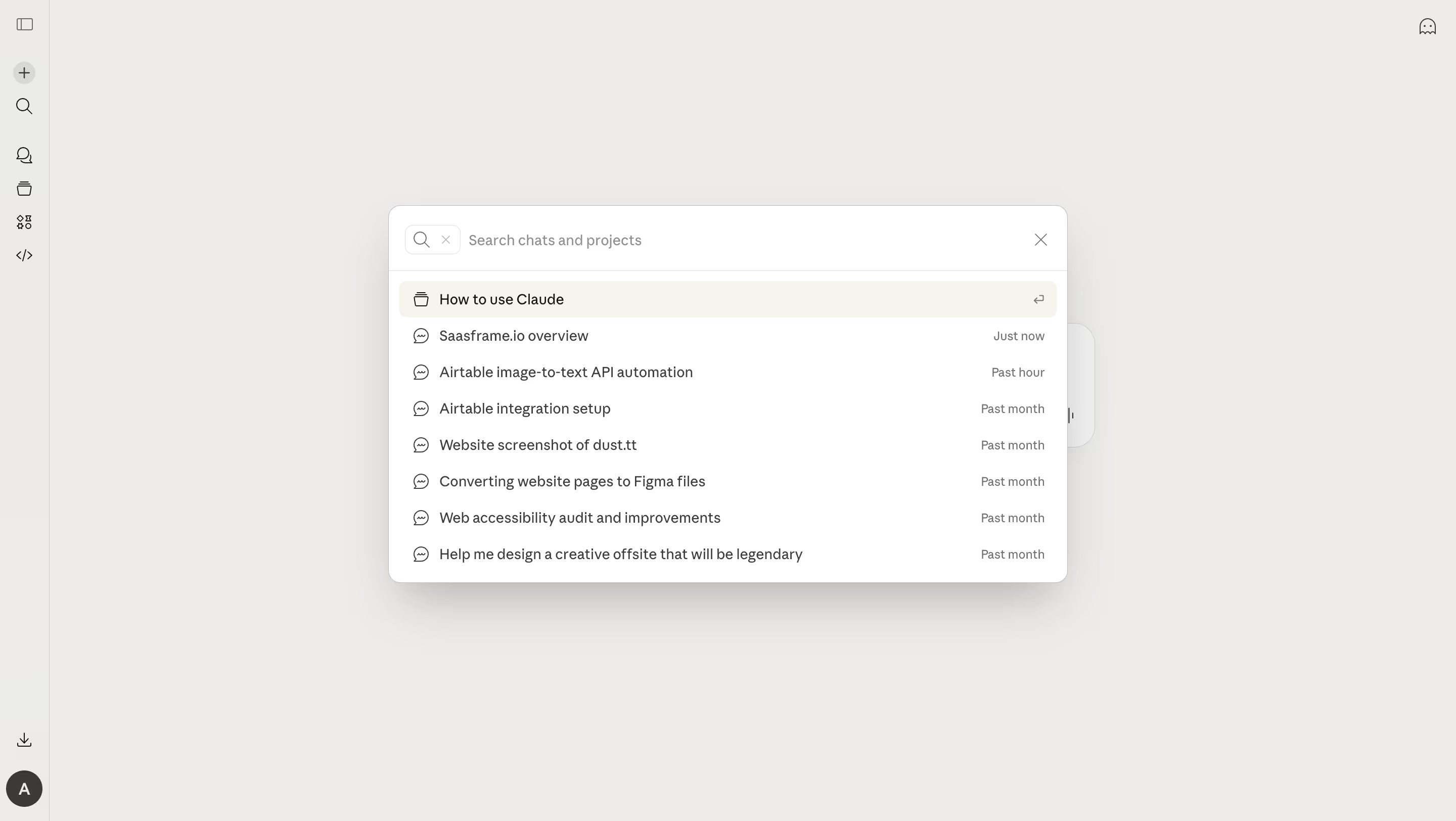
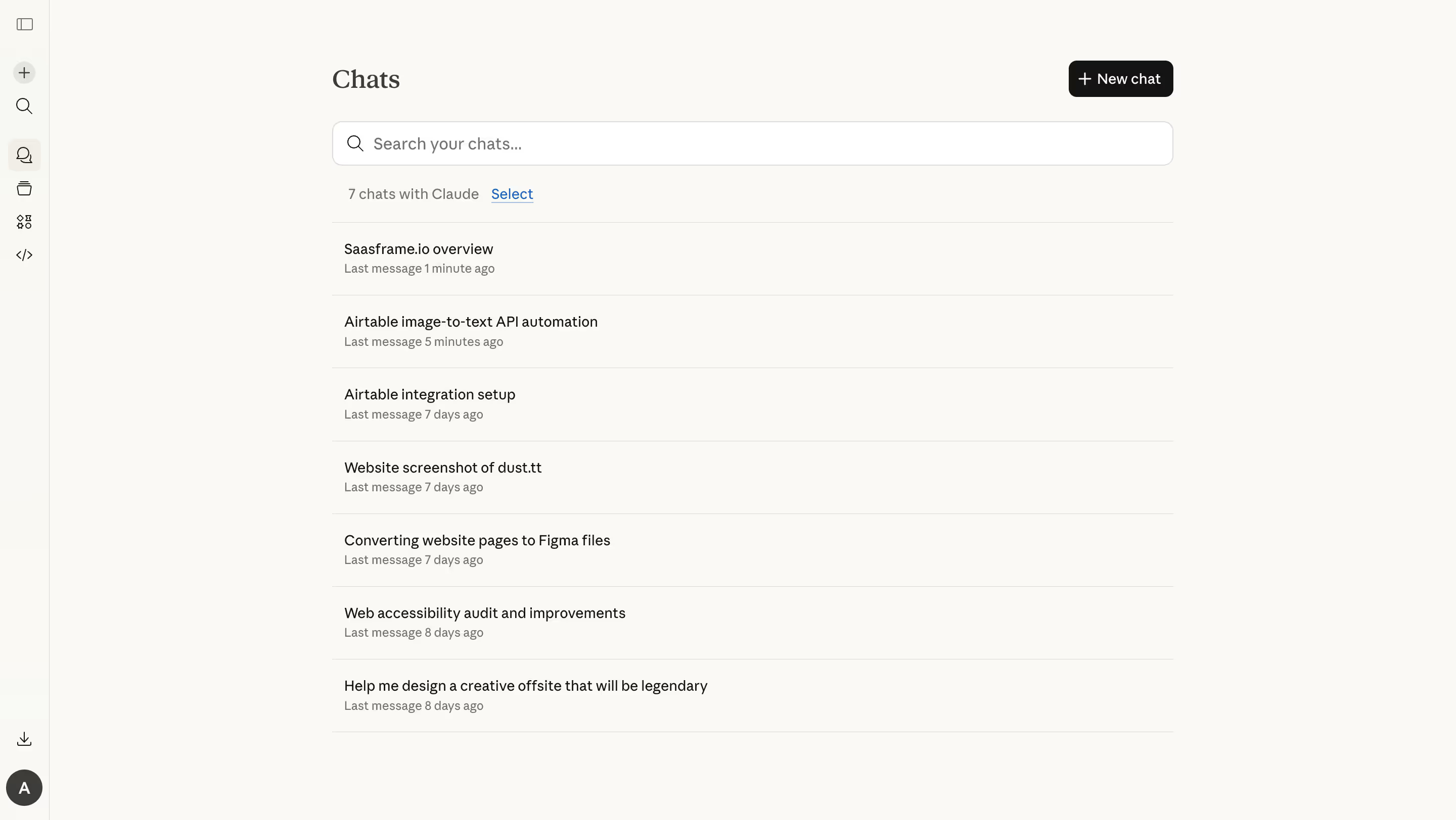


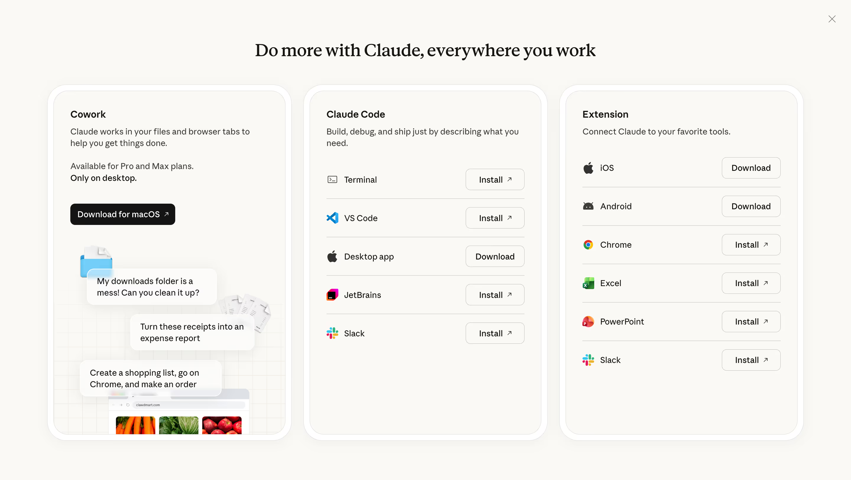

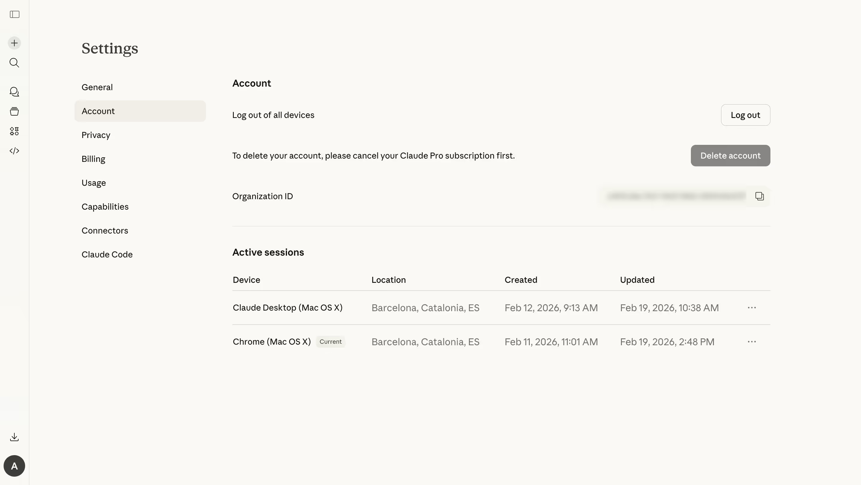
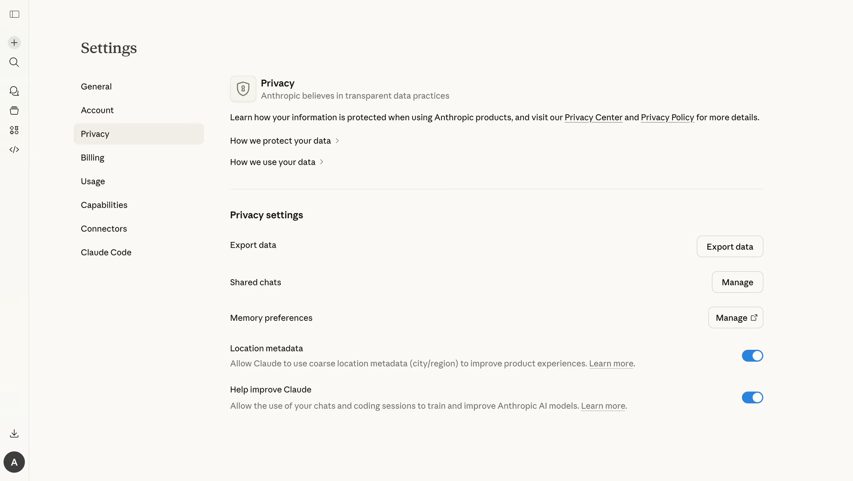
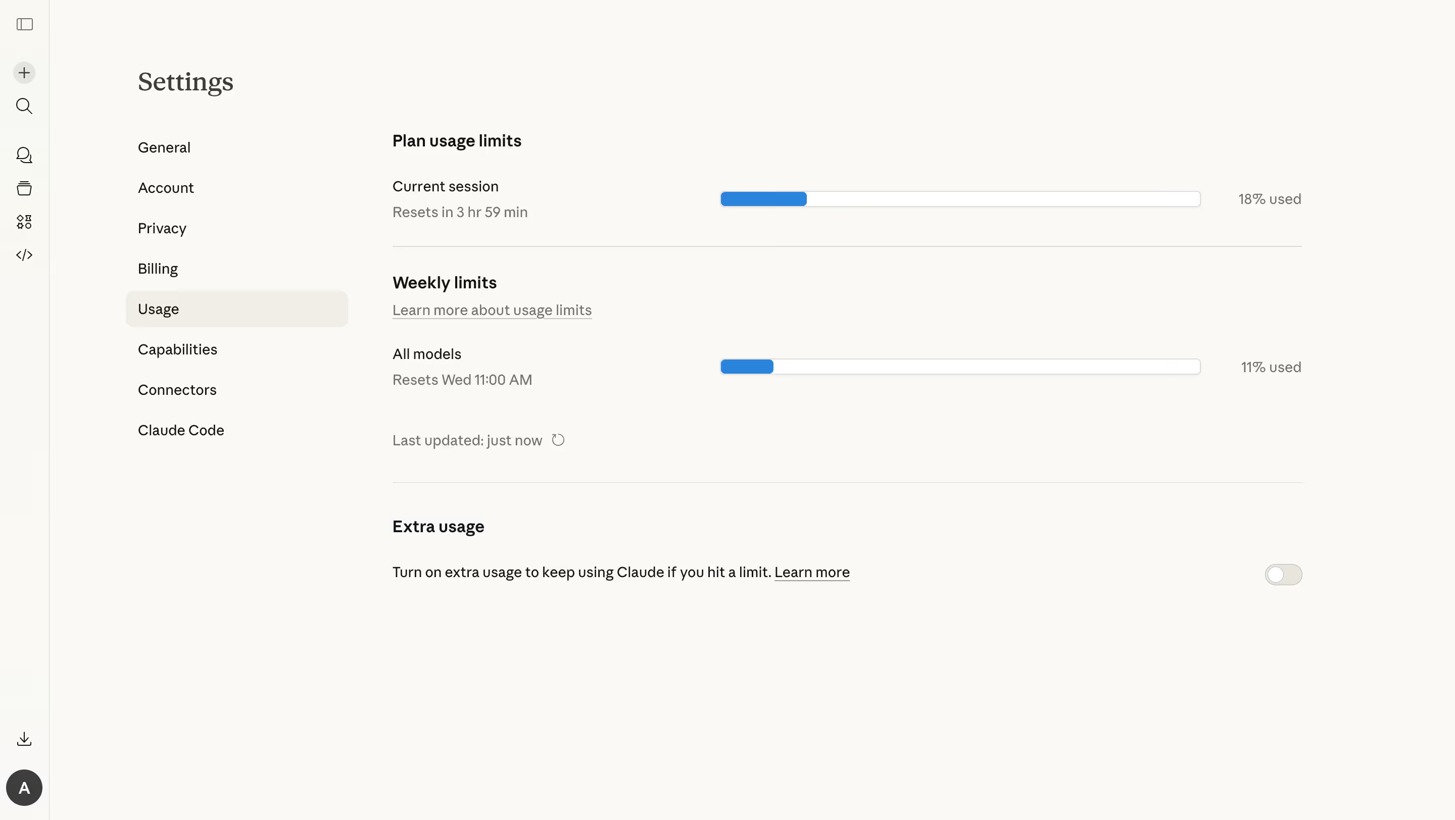
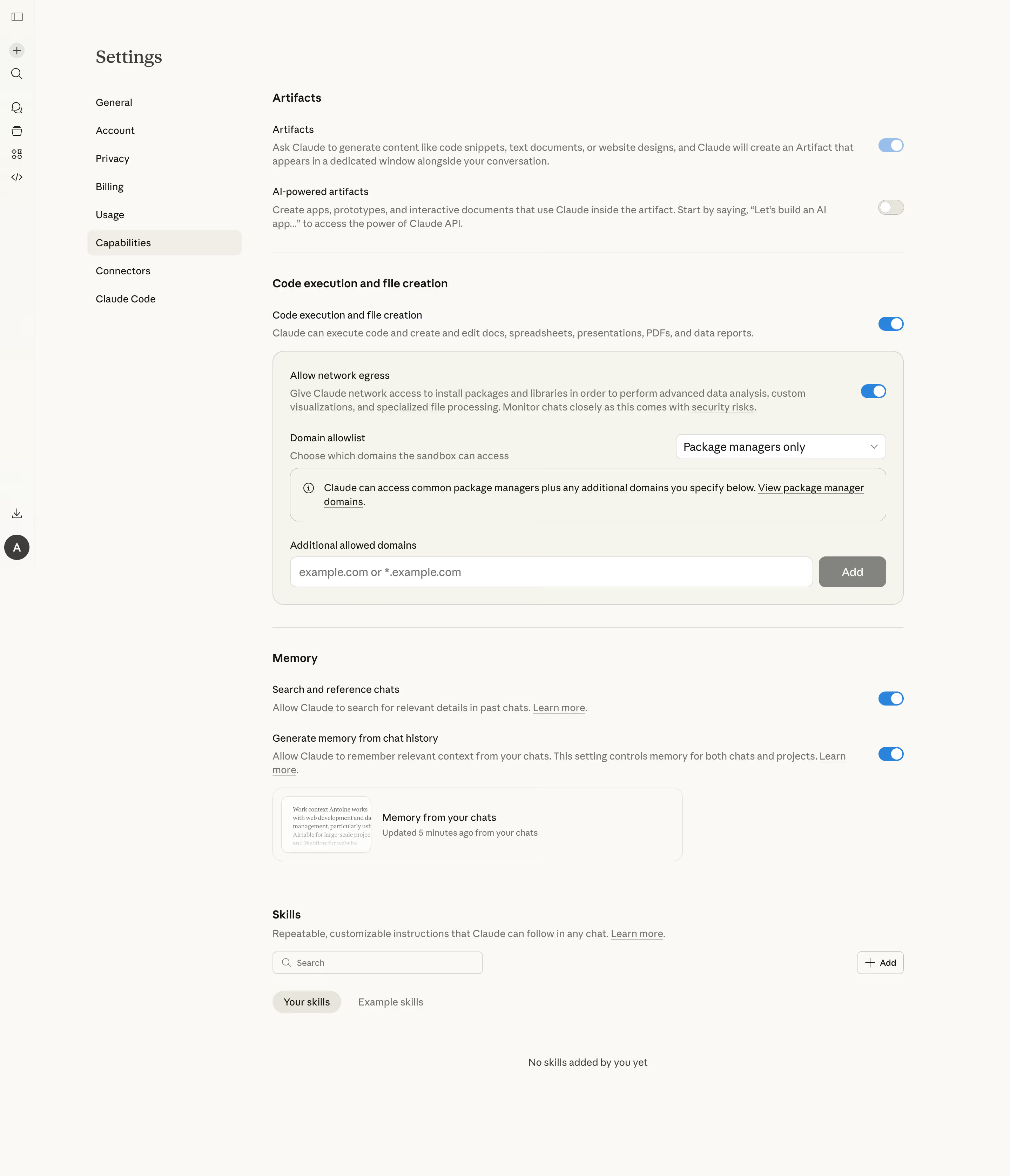




Claude.ai — Design System Overview
Source: Observable UI characteristics from claude.ai and claude.com (closed-source product; values are approximations)
Typography \- Primary sans-serif: Styrene A, Styrene B (Klim Type Foundry) — used for UI chrome, body copy, and navigation \- Accent/display serif: Tiempos Text or Tiempos Headline (Klim Type Foundry) — used sparingly for hero and marketing copy on anthropic.com \- Monospace (code): Berkeley Mono or system ui-monospace fallback \- Base size: 16px; line-height: 1.5–1.6; letter-spacing: −0.01em for headings
Color Philosophy \- Warm off-white/cream backgrounds (#FAF9F6 light, #F5F0E8 warm variant) \- Near-black text (#1A1A18) for maximum legibility with warmth \- Coral/terra-cotta accent (#D4763B / #C96A2A) — the primary brand CTA color \- Muted warm grays for secondary surfaces and borders \- Dark mode inverts to deep warm charcoal (#1C1B19) backgrounds
Spacing System \- Base unit: 4px; scale: 4 / 8 / 12 / 16 / 24 / 32 / 48 / 64 / 96px \- Component padding typically 12–16px vertical, 16–24px horizontal \- Chat bubbles: 16px padding, 24px gap between turns
Border Radius \- Small (inputs, chips): 8px \- Medium (cards, panels): 12px \- Large (modals, message bubbles): 16–20px \- Full pill (buttons): 9999px
Shadows \- Subtle elevation (cards): 0 1px 3px rgba(0,0,0,0.08), 0 1px 2px rgba(0,0,0,0.06) \- Modal/overlay: 0 8px 24px rgba(0,0,0,0.12)
Layout \- Max content width: 768px (chat thread), 1200px (marketing pages) \- Sidebar: 260px fixed; collapses to icon-only at narrow viewports \- Mobile breakpoint: 768px
Component Defaults \- Buttons: pill shape, 40px height (md), 36px (sm); coral primary, ghost secondary \- Inputs: 8px radius, 1px warm-gray border, focus ring in coral tint \- Transitions: 150ms ease for hover states, 200ms ease for panel open/close
:root { / ===================== TYPOGRAPHY ===================== / --font-family-base: 'Styrene A', 'Styrene B', ui-sans-serif, system-ui, -apple-system, sans-serif; --font-family-display: 'Tiempos Headline', 'Tiempos Text', Georgia, 'Times New Roman', serif; --font-family-mono: 'Berkeley Mono', ui-monospace, 'Cascadia Code', 'Fira Code', monospace;
--font-size-xs: 0.75rem; / 12px / --font-size-sm: 0.875rem; / 14px / --font-size-base: 1rem; / 16px / --font-size-md: 1.0625rem; / 17px / --font-size-lg: 1.125rem; / 18px / --font-size-xl: 1.25rem; / 20px / --font-size-2xl: 1.5rem; / 24px / --font-size-3xl: 2rem; / 32px /
--font-weight-regular: 400; --font-weight-medium: 500; --font-weight-semibold: 600; --font-weight-bold: 700;
--line-height-tight: 1.25; --line-height-snug: 1.4; --line-height-base: 1.55; --line-height-relaxed: 1.7;
--letter-spacing-tight: -0.02em; --letter-spacing-normal: -0.01em; --letter-spacing-wide: 0.02em;
/ ===================== SPACING ===================== / --space-1: 0.25rem; / 4px / --space-2: 0.5rem; / 8px / --space-3: 0.75rem; / 12px / --space-4: 1rem; / 16px / --space-5: 1.25rem; / 20px / --space-6: 1.5rem; / 24px / --space-8: 2rem; / 32px / --space-10: 2.5rem; / 40px / --space-12: 3rem; / 48px / --space-16: 4rem; / 64px / --space-24: 6rem; / 96px /
/ Semantic aliases / --space-xs: var(--space-1); --space-sm: var(--space-2); --space-md: var(--space-4); --space-lg: var(--space-6); --space-xl: var(--space-8); --space-2xl: var(--space-12);
/ ===================== COLORS — Light theme ===================== / / Backgrounds / --color-bg-base: #FAF9F6; / warm off-white, main canvas / --color-bg-warm: #F5F0E8; / slightly deeper cream, sidebar/panels / --color-bg-surface: #FFFFFF; / pure white for elevated cards / --color-bg-subtle: #F0EDE6; / hover states, input fill / --color-bg-overlay: rgba(26, 26, 24, 0.4); / modal scrim /
/ Foregrounds / Text / --color-fg-base: #1A1A18; / near-black, primary text / --color-fg-muted: #5A5750; / secondary text, placeholders / --color-fg-subtle: #9B9690; / tertiary, disabled text / --color-fg-inverse: #FAF9F6; / text on dark surfaces /
/ Brand / Accent / --color-accent: #D4763B; / coral/terra-cotta — primary CTA / --color-accent-hover: #C06228; / darker on hover / --color-accent-light: #F5E6D8; / tinted bg for accent badges / --color-accent-muted: #E8A87C; / softer accent for illustrations /
/ Borders / --color-border: #E2DDD6; / default border, warm gray / --color-border-strong: #C9C3BB; / input focus ring, dividers / --color-border-subtle: #EDE9E3; / subtle separators /
/ Semantic / --color-success: #2D7D52; --color-success-bg: #EBF5EF; --color-warning: #B45309; --color-warning-bg: #FEF3C7; --color-error: #C0392B; --color-error-bg: #FDEEEE; --color-info: #1D5FA6; --color-info-bg: #EBF3FC;
/ ===================== BORDER RADIUS ===================== / --radius-xs: 4px; --radius-sm: 8px; --radius-md: 12px; --radius-lg: 16px; --radius-xl: 20px; --radius-2xl: 24px; --radius-full: 9999px;
/ ===================== SHADOWS ===================== / --shadow-xs: 0 1px 2px rgba(26, 26, 24, 0.06); --shadow-sm: 0 1px 3px rgba(26, 26, 24, 0.08), 0 1px 2px rgba(26, 26, 24, 0.06); --shadow-md: 0 4px 12px rgba(26, 26, 24, 0.10), 0 2px 4px rgba(26, 26, 24, 0.06); --shadow-lg: 0 8px 24px rgba(26, 26, 24, 0.12), 0 4px 8px rgba(26, 26, 24, 0.08); --shadow-xl: 0 20px 48px rgba(26, 26, 24, 0.16), 0 8px 16px rgba(26, 26, 24, 0.10); --shadow-focus: 0 0 0 3px rgba(212, 118, 59, 0.30); / coral focus ring /
/ ===================== TRANSITIONS ===================== / --transition-fast: 100ms ease; --transition-default: 150ms ease; --transition-slow: 200ms ease; --transition-panel: 250ms cubic-bezier(0.4, 0, 0.2, 1);
/ ===================== LAYOUT ===================== / --sidebar-width: 260px; --sidebar-width-collapsed: 56px; --chat-max-width: 768px; --content-max-width: 1200px; --header-height: 56px; --input-height-sm: 36px; --input-height-md: 40px; --input-height-lg: 48px; --z-sidebar: 100; --z-header: 200; --z-dropdown: 300; --z-modal: 400; --z-toast: 500; }
/ ===================== DARK THEME ===================== / [data-theme='dark'] { / Backgrounds / --color-bg-base: #1C1B19; / deep warm charcoal / --color-bg-warm: #232220; / sidebar / panels / --color-bg-surface: #2A2927; / elevated cards / --color-bg-subtle: #302F2C; / hover states / --color-bg-overlay: rgba(0, 0, 0, 0.55);
/ Foregrounds / Text / --color-fg-base: #EDE9E3; / warm near-white / --color-fg-muted: #A09A92; / secondary text / --color-fg-subtle: #6B6560; / tertiary, disabled / --color-fg-inverse: #1C1B19;
/ Brand / Accent / --color-accent: #E08A55; / slightly lighter coral in dark / --color-accent-hover: #F09A65; --color-accent-light: #3D2A1A; --color-accent-muted: #B06030;
/ Borders / --color-border: #3A3835; --color-border-strong: #4E4B47; --color-border-subtle: #2E2D2B;
/ Semantic / --color-success: #4ABA7A; --color-success-bg: #1A3326; --color-warning: #F5A623; --color-warning-bg: #332508; --color-error: #E05C4A; --color-error-bg: #3A1A18; --color-info: #5B9FE0; --color-info-bg: #172640;
/ Shadows (less spread in dark mode) / --shadow-sm: 0 1px 3px rgba(0, 0, 0, 0.3), 0 1px 2px rgba(0, 0, 0, 0.2); --shadow-md: 0 4px 12px rgba(0, 0, 0, 0.4), 0 2px 4px rgba(0, 0, 0, 0.2); --shadow-lg: 0 8px 24px rgba(0, 0, 0, 0.5), 0 4px 8px rgba(0, 0, 0, 0.3); --shadow-focus: 0 0 0 3px rgba(224, 138, 85, 0.35); }
Claude.ai — Design Tokens Reference
All values are approximations derived from observable UI. Claude.ai is a closed-source product.
Color Tokens
Backgrounds | Token | Light | Dark | Usage | |---|---|---|---| | --color-bg-base | #FAF9F6 | #1C1B19 | Main app canvas | | --color-bg-warm | #F5F0E8 | #232220 | Sidebar, secondary panels | | --color-bg-surface | #FFFFFF | #2A2927 | Elevated cards, dropdowns | | --color-bg-subtle | #F0EDE6 | #302F2C | Hover states, input fill |
Text / Foreground | Token | Light | Dark | Usage | |---|---|---|---| | --color-fg-base | #1A1A18 | #EDE9E3 | Primary text | | --color-fg-muted | #5A5750 | #A09A92 | Secondary / metadata | | --color-fg-subtle | #9B9690 | #6B6560 | Placeholders, disabled | | --color-fg-inverse | #FAF9F6 | #1C1B19 | Text on contrasting bg |
Brand Accent (Coral / Terra-cotta) | Token | Light | Dark | Usage | |---|---|---|---| | --color-accent | #D4763B | #E08A55 | Primary CTA buttons | | --color-accent-hover | #C06228 | #F09A65 | Hover state of accent | | --color-accent-light | #F5E6D8 | #3D2A1A | Badge/chip backgrounds |
Borders | Token | Light | Dark | Usage | |---|---|---|---| | --color-border | #E2DDD6 | #3A3835 | Default borders | | --color-border-strong | #C9C3BB | #4E4B47 | Input borders, dividers | | --color-border-subtle | #EDE9E3 | #2E2D2B | Section separators |
Semantic | Token | Purpose | |---|---| | --color-success / --color-success-bg | Confirmation, copy success | | --color-warning / --color-warning-bg | Rate-limit warnings | | --color-error / --color-error-bg | Form errors, failed requests | | --color-info / --color-info-bg | Informational callouts |
Spacing Tokens
| Token | Value | px equiv | Typical use |
|---|---|---|---|
| --space-1 | 0.25rem | 4px | Icon gap, tight padding |
| --space-2 | 0.5rem | 8px | Inline padding, badge padding |
| --space-3 | 0.75rem | 12px | Button vertical padding |
| --space-4 | 1rem | 16px | Standard block padding |
| --space-6 | 1.5rem | 24px | Section gap, chat turn gap |
| --space-8 | 2rem | 32px | Section margin |
| --space-12 | 3rem | 48px | Large section gap |
| --space-16 | 4rem | 64px | Page-level vertical rhythm |
| --space-24 | 6rem | 96px | Hero padding |
Typography Tokens
| Token | Value |
|---|---|
| --font-family-base | 'Styrene A', 'Styrene B', ui-sans-serif, system-ui, sans-serif |
| --font-family-display | 'Tiempos Headline', 'Tiempos Text', Georgia, serif |
| --font-family-mono | 'Berkeley Mono', ui-monospace, 'Fira Code', monospace |
| --font-size-base | 1rem (16px) |
| --font-size-sm | 0.875rem (14px) |
| --font-size-lg | 1.125rem (18px) |
| --font-size-xl | 1.25rem (20px) |
| --line-height-base | 1.55 |
| --letter-spacing-normal | -0.01em |
Border Radius Tokens
| Token | Value | Usage |
|---|---|---|
| --radius-xs | 4px | Tiny tags, tooltips |
| --radius-sm | 8px | Inputs, chips, inline code |
| --radius-md | 12px | Cards, panels, dropdowns |
| --radius-lg | 16px | Message bubbles, modals |
| --radius-xl | 20px | Large floating panels |
| --radius-full | 9999px | Pill buttons, avatars |
Shadow Tokens
| Token | Value | Usage |
|---|---|---|
| --shadow-xs | 0 1px 2px rgba(26,26,24,.06) | Barely-there lift |
| --shadow-sm | 0 1px 3px rgba(26,26,24,.08), 0 1px 2px rgba(26,26,24,.06) | Cards, sidebar items |
| --shadow-md | 0 4px 12px rgba(26,26,24,.10), 0 2px 4px rgba(26,26,24,.06) | Dropdowns, tooltips |
| --shadow-lg | 0 8px 24px rgba(26,26,24,.12), 0 4px 8px rgba(26,26,24,.08) | Modals, command palette |
| --shadow-focus | 0 0 0 3px rgba(212,118,59,.30) | Keyboard focus ring |
Transition Tokens
| Token | Value | Usage |
|---|---|---|
| --transition-fast | 100ms ease | Button active state |
| --transition-default | 150ms ease | Hover, color changes |
| --transition-slow | 200ms ease | Expand/collapse |
| --transition-panel | 250ms cubic-bezier(0.4,0,0.2,1) | Sidebar slide, modals |
Implementation Notes — Claude.ai Design System
Source Disclaimer Claude.ai is a closed-source product. All design tokens and values in this record are approximations derived from: \- Direct DOM/CSS observation of claude.ai and claude.com (as of July 2026) \- Klim Type Foundry documentation (Styrene A/B, Tiempos families) \- Anthropic brand assets visible in OG images and marketing pages \- General knowledge of the product's visual characteristics
No proprietary source files were accessed. Values should be verified against the live product before production use.
UI Framework \- React (Next.js) — claude.com uses /\_next/static/ asset paths \- Tailwind CSS is likely in use (utility-first class patterns observed on claude.com) \- claude.ai (the chat app) uses a custom React SPA bundled with Vite or similar \- No public design system package or Storybook has been published by Anthropic
Theme Support \- Claude.ai supports light and dark modes, toggled via OS preference and a manual toggle in settings \- Dark mode appears implemented via a data-theme='dark' attribute on or
, or via prefers-color-scheme media query \- The warm off-white in light mode and warm charcoal in dark mode are intentional brand choices — avoid using pure #FFFFFF / #000000Typography Notes \- Styrene A / Styrene B (Klim Type Foundry) are licensed, non-system fonts. Web font delivery is via fonts.anthropic.com or bundled in the app. \- Fallback stacks should use ui-sans-serif, system-ui to preserve warmth on devices without the custom font loaded. \- Berkeley Mono is used in the chat interface for code blocks — a distinctive visual identity marker. \- Display serif (Tiempos) is used on marketing/landing pages; the chat UI predominantly uses Styrene for body and UI text.
Notable Patterns \- Coral accent (#D4763B) is the single primary interactive color — used for primary buttons, links, and focus rings. Avoid using it decoratively. \- Warm neutrals throughout — the palette deliberately avoids cool grays; all neutral shades have a warm (slightly yellow/orange) undertone. \- Message bubbles use --radius-lg (16px) with no hard border, relying on background fill to distinguish assistant vs. user messages. \- Sidebar is 260px wide, collapsible to icon-only at 56px; collapse is animated with --transition-panel. \- Input area at the bottom of chat is a multi-line