 SaaSFrame
⚖️ Plans
Drive upgrades with effective in-app SaaS Plan and Tier selection UI. See how to present 'Current Plan' status alongside upgrade paths, feature comparison badges, and clear pricing callouts to boost expansion revenue.
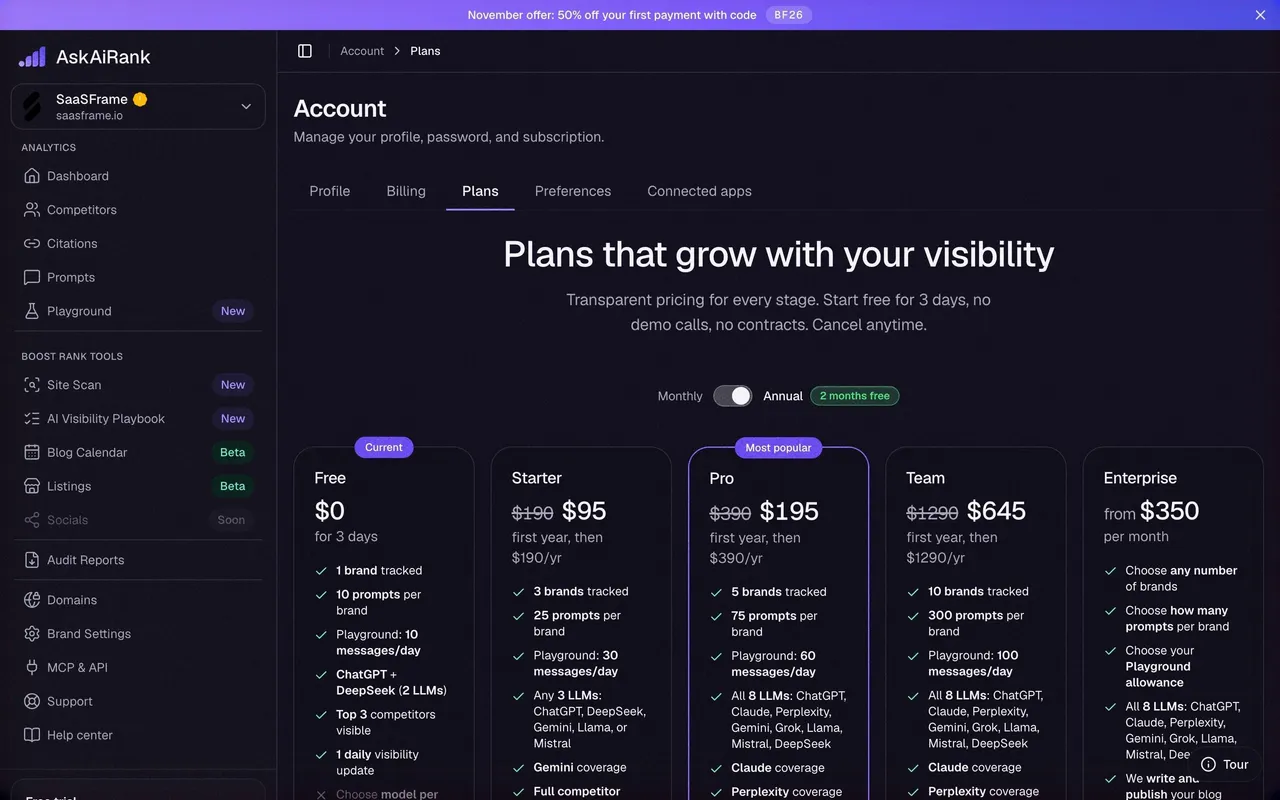

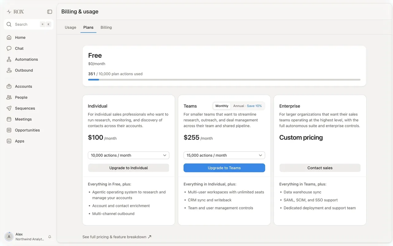

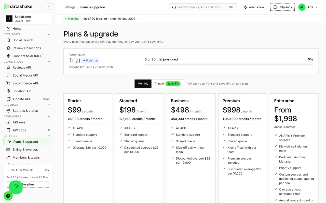

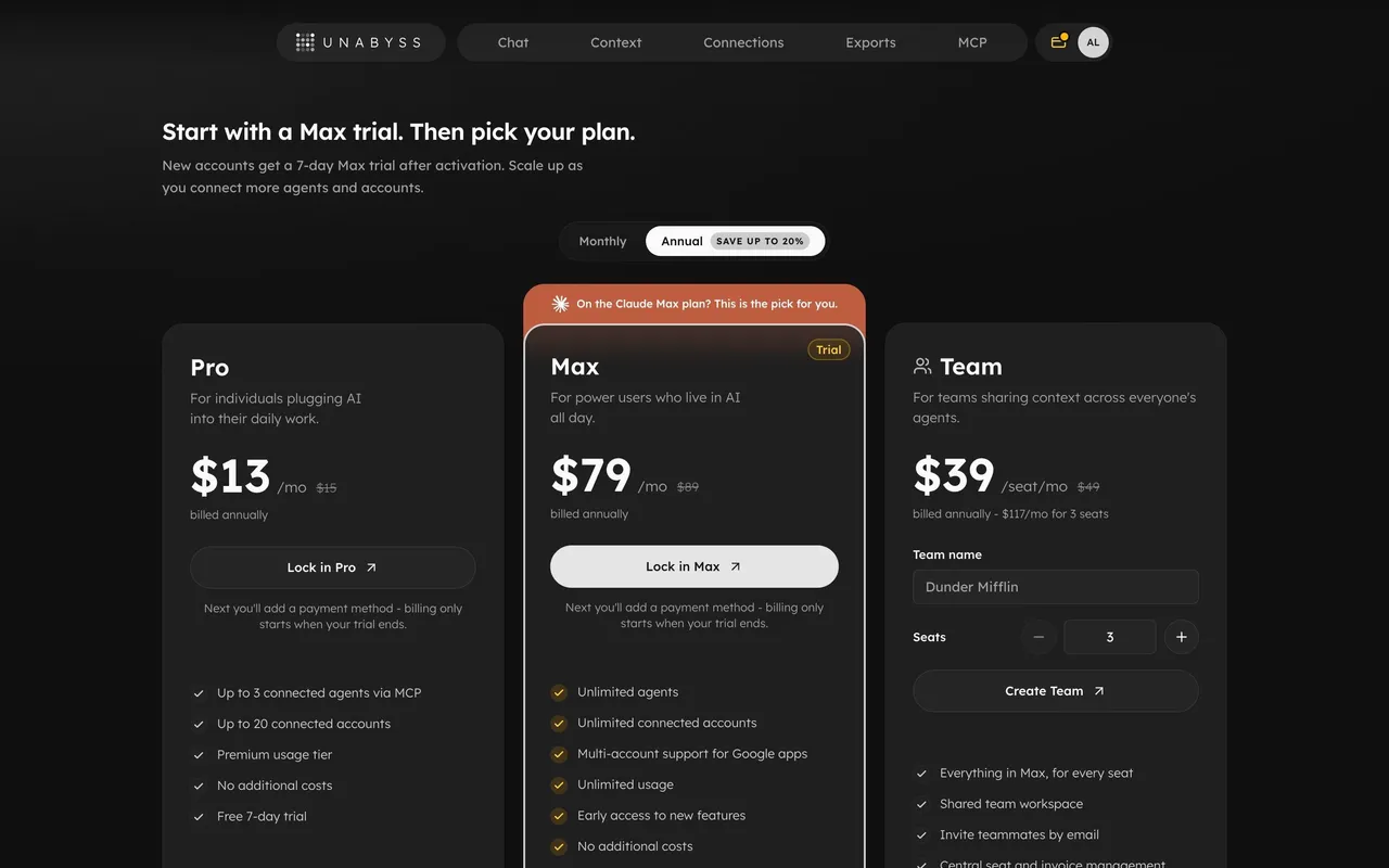
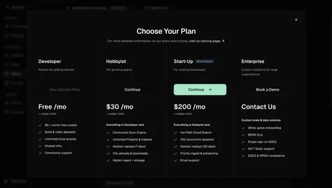
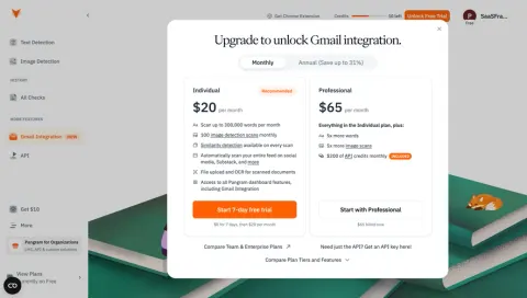
Index of all 31 Plans examples
- Unabyss Plans
- Moss Compare subscription plans
- Pangram Gmail integration plans
- EigenPal Billing plans and upgrade
- NewsCatcher Plans and billing
- Dust Plans
- Pitch Plans
- Wiza Plans
- Mintlify Plans
- Uvodo Plans
- Dock Plan & Billing
- Audienceful Select A Plan
- Vidzflow Plan Choice
- Rise Plans & Billing
- Albato Plans
- Meiro Plans
- Livestorm Billing Interface
- Folio Billing Settings
- Resend Billing
- Phantombuster Billing
- SavvyCal Billing
- Surfe Billing
- Better Stack etter Uptime Billing Page
- Numbro Upgrading Flow
- PlayPlay Upgrading
- Maze Upgrading
- Sprout Social Upgrading Page
- Viral Loops Upgrading Page
⚖️ Plans: design guide
Short answer
A SaaS plans screen, inside the product, shows the current subscription and what other plans would unlock. Start from the current plan, compare entitlements in the user's language, use a table when several limits vary, separate included capacity from add-ons and make selecting distinct from committing.
In the libraryas of November 2026
- Screens
- 31
- SaaS products
- 31
- Last added
- Nov 2026
Common patternsUpgrade Prompt 10Billing & Subscription 8Badge 6Card 6Pricing Plan Comparison 3
A SaaS plans screen helps an existing account understand its current subscription and compare the access available under other options. It is an ongoing account-management surface, not just a marketing price comparison. Users may arrive to check an entitlement, estimate team capacity, or investigate why a capability is unavailable.
The SaaSFrame examples show current-plan summaries, feature matrices, and self-service versus sales-assisted options. Their captured prices and terms are historical design content. The transferable lesson is how the interface connects account state to a decision, rather than which amounts or plan names it displays.
Which plan is the account on today?
An account-level plans page should first orient the user. Show the active plan and its status, then distinguish the alternatives. Without that anchor, people may confuse a selected option in the interface with the subscription their account already has.
Trial, free, active paid, and scheduled-change states need recognizable labels. A pending downgrade should not appear as an already active tier. If a plan is no longer publicly offered but remains on the account, explain its identity rather than silently mapping it to a new name.
Place the workspace or organization context near the decision. Users managing several accounts need to know which subscription they are inspecting. A plan that applies to the whole workspace should not look like a personal purchase.
Study a compact current-plan summary
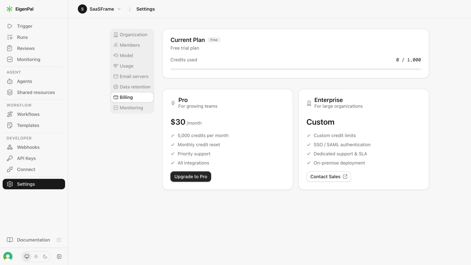
The EigenPal capture separates a current-plan card from Pro and Enterprise options. The card includes trial context and a used-credit measure, while the alternatives pair audience descriptions with their principal capabilities and next actions.
This structure provides an understandable hierarchy: current state first, possible changes second. It can work when a small number of options have a few meaningful differences. A current usage measure adds context without requiring the whole page to become a consumption report.
When adapting the model, keep plan and usage concepts distinct. An included credit allowance and the amount currently used answer related but different questions. Provide a route to the usage guide's kind of detailed breakdown when users need to explain consumption.
Compare entitlements in the user's language
A plan difference should describe something users can evaluate: active projects, published apps, monitoring frequency, collaboration access, or a supported integration. Abstract tier names need concrete explanations beside them.
Organize the comparison around the dimensions that determine fit. Long undifferentiated feature lists make users search for the one restriction affecting their work. Group related capabilities and keep the most consequential limits visible.
Be consistent about units. A seat, workspace member, and invited guest may have different meanings. If the product charges or restricts them differently, explain those definitions rather than combining them under a general users label.
Use a matrix when several limits vary together
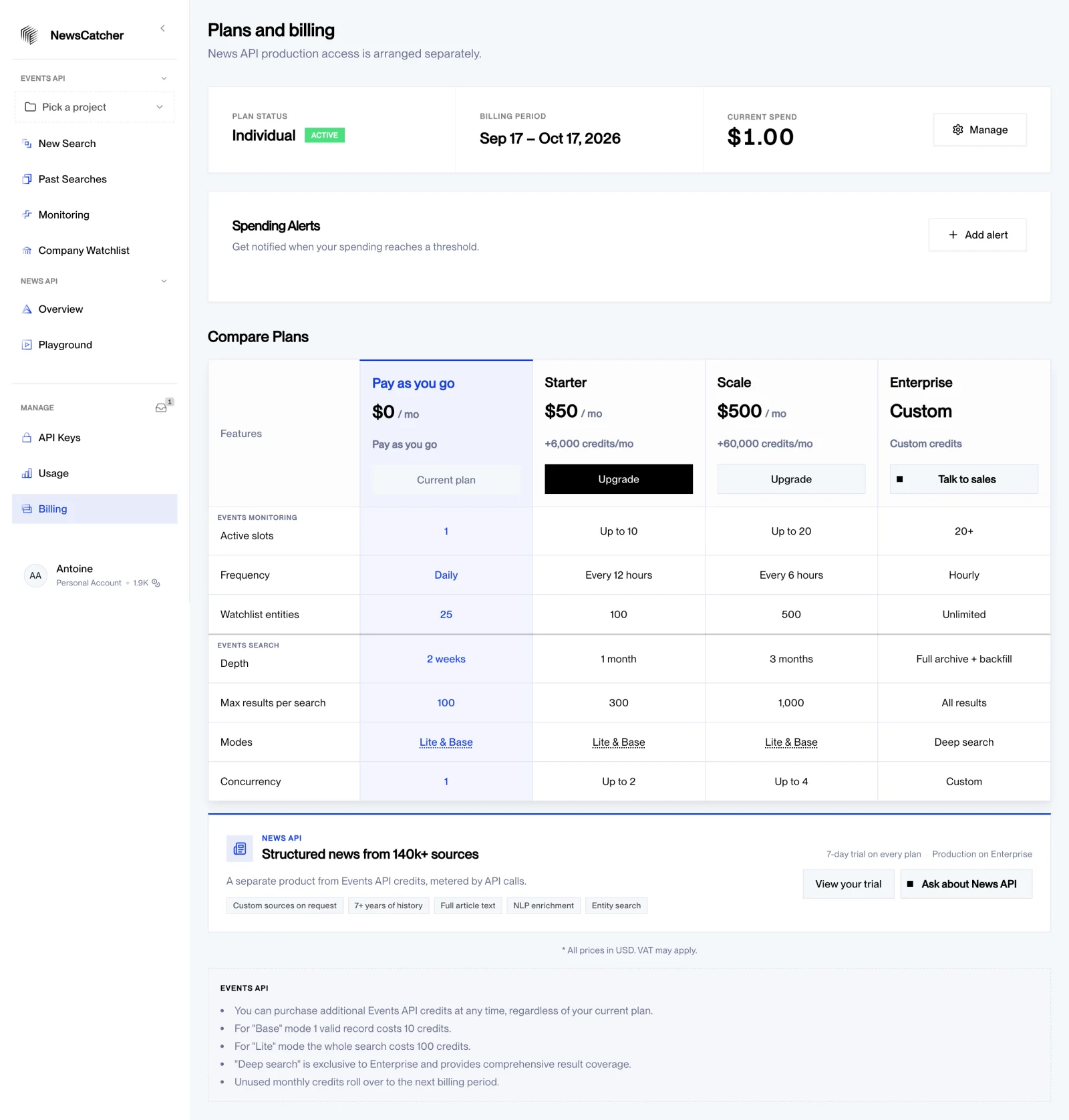
The NewsCatcher plans-and-billing capture combines an account summary, a billing period, spending-alert controls, and a plan comparison. Rows include operational limits such as monitoring slots, frequency, watchlist entities, search depth, and concurrency.
A matrix helps when users need to compare the same dimensions across several tiers. The highlighted current column establishes an account anchor. The page also distinguishes a separately arranged News API offer from the Events API credit model.
That distinction is important for products with several commercial systems. Explain which subscription covers which resources. A single billing destination can contain multiple products, but it should not imply that every allowance or entitlement belongs to the same plan.
Separate included capacity from additional purchases
A plan may include a recurring allowance while allowing additional credits or add-ons. Users need to know whether buying extra capacity changes their subscription, lasts for a defined period, or creates a separate balance.
Present base entitlements and optional additions with clear labels. A plan comparison that includes add-ons without identifying them can make an option appear more complete than it actually is. Similarly, an account balance should not suggest that the same amount is included every month.
Keep conditions discoverable near the relevant value. Reset, rollover, or expiry rules affect fit, especially when the workload varies between periods. The plans screen can summarize those rules and link to fuller detail without repeating an entire billing policy.
Show selection separately from commitment
Choosing a plan in a comparison is not necessarily the same as applying it. The interface should distinguish a temporary selection, a review stage, and a confirmed account change.
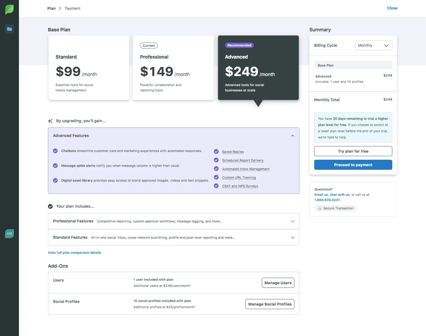
The Sprout Social capture marks a current plan and a recommended alternative while showing a summary with the billing cycle and selected base plan. It also presents expandable capability groups and an add-ons area before a payment route.
This lets a user connect the comparison to a more concrete order summary. The design challenge is to keep selected and current states visually distinct. A recommendation badge should not replace the account's actual status or imply that the highlighted plan has already been purchased.
Use recommendations with a reason
A recommended tier can reduce comparison effort when the recommendation reflects the account's needs. Explain the relevant fit, such as required capacity or collaboration capabilities, rather than relying only on a decorative badge.
Avoid presenting a commercial preference as an account-specific calculation. If the badge is the same for every account, its language should not suggest that the product analyzed the user's workload. The selected plan still needs to be evaluated on its actual conditions.
Let users inspect alternatives without losing their current configuration. Exploring a lower or higher plan should not change the account until a clearly communicated commitment stage.
Explain self-service and sales-assisted routes
A custom plan usually has a different next step from a self-service subscription. The PlayPlay capture illustrates two audience-based offers with separate actions and a longer FAQ below. A contact route can support evaluation when the offer depends on team requirements.
Set expectations about the contact process. Explain what the person should prepare or what the conversation will resolve when useful. Avoid using a generic purchase label for an option that only opens a sales form.
Keep commercial guidance useful for existing customers as well as new buyers. People on a custom agreement may need a support or account-management route rather than the same acquisition form used by visitors.
Account for changes in both directions
A plans screen should explain available downgrades as well as upgrades. Lower capacity may affect existing objects, integrations, or team access. Tell users which consequences must be resolved before a change can take effect.
Use specific timing for scheduled changes. If the current tier remains until the end of a period, display that state instead of immediately replacing its label. A user should be able to understand both today's access and the confirmed future plan.
If an option is unavailable, identify the reason where useful. Permissions, custom agreements, account state, and capacity constraints are different explanations. A disabled button without context does not help people proceed.
Keep dense comparison accessible
Plan matrices can become wide and repetitive. Preserve row labels and column context when users scroll, and offer a usable small-screen presentation. Do not reduce all text to fit four columns into a narrow viewport.
Distinguish included, unavailable, limited, and conditional access with text or accessible descriptions. A checkmark alone may not convey the entitlement. Important explanations should not depend exclusively on hover.
Keyboard users need access to billing controls, disclosure sections, and selection actions. After changing the billing interval, preserve focus and update the relevant summary consistently.
Test whether users can predict the result
Ask users to identify their current plan, select a suitable alternative, and explain what changes. Include a question about the account affected and the timing of the change. These tasks reveal more than a preference for one card design.
Test trial accounts, custom plans, non-admin members, add-ons, scheduled downgrades, and outdated public tiers. Verify that the UI's labels correspond to the underlying account state.
Review the handoff to upgrading and checkout. The selected entitlements, billing interval, and account context should remain consistent across the decision and commitment stages.
Frequently asked questions about SaaS plans screens
Is the plans page the same as public pricing?
It may reuse some commercial information, but it should add the current account state and available changes. Public pricing primarily serves visitors evaluating the offer.
Should all features appear in the comparison?
Prioritize the differences that determine fit. Group further detail or provide a complete comparison where necessary instead of making every capability equally prominent.
How should a pending plan change appear?
Identify the current access and the scheduled change separately, with the relevant effective timing. Do not show a future tier as active before it applies.