 SaaSFrame
FAQ
Address objections instantly with searchable SaaS FAQ patterns. Discover accordion-style layouts and categorized question lists that improve user experience and capture 'People Also Ask' SEO traffic.



FAQ: design guide
A SaaS FAQ section answers the questions that keep visitors from choosing a plan, starting a trial, or understanding how the product fits their needs. Its value comes from useful questions and specific answers, not from the accordion component alone. A polished list that repeats marketing claims can leave the same uncertainty in place.
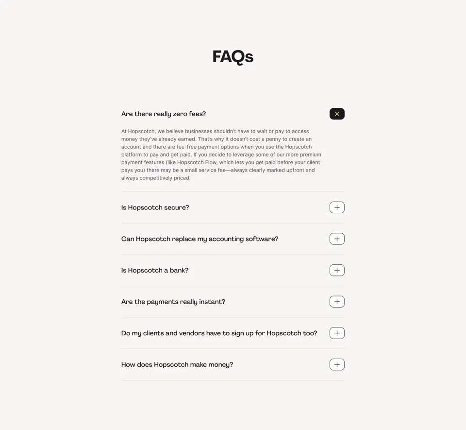
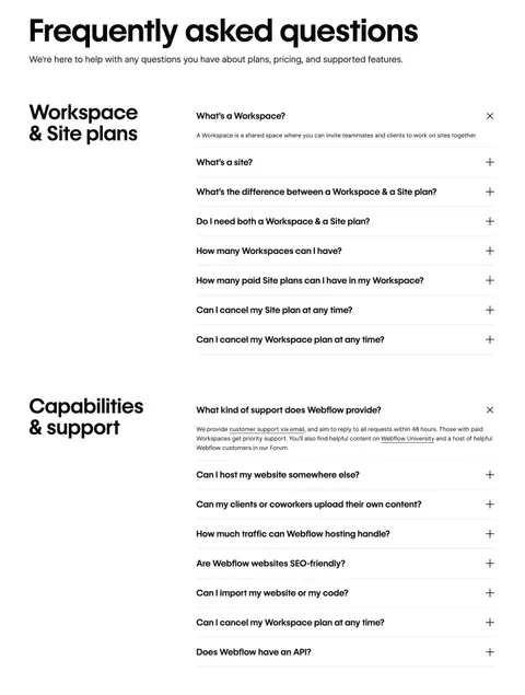
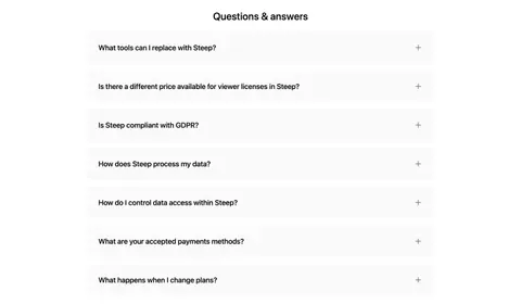
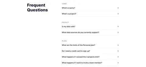
The Hopscotch and Webflow captures show two useful structures: a single list centered on payment-platform concerns, and categorized questions that distinguish subscription concepts from capabilities and support. These are historical design references. Their visible answers should not be treated as current pricing, financial, or support policies.
Choose questions that resolve a decision
Start with the questions people ask before taking the next step. Sales conversations, support requests, search terms, and usability sessions can reveal where product language creates uncertainty. A pricing FAQ often needs to explain what is charged, which plan is required, how cancellation works, or whether a capability is included.
Prioritize questions according to the page's purpose. A homepage may need product-fit questions; a pricing page may need plan and billing explanations. Do not paste the same generic list onto every page if the visitor's immediate decision is different.
Write questions in the vocabulary the visitor is likely to use. If your product has unfamiliar concepts, start with a definition before asking readers to compare them. Every question should lead to an answer that changes understanding. Remove items whose only response is another broad promise or a request to contact sales without any useful explanation.
Answer the most important objection directly
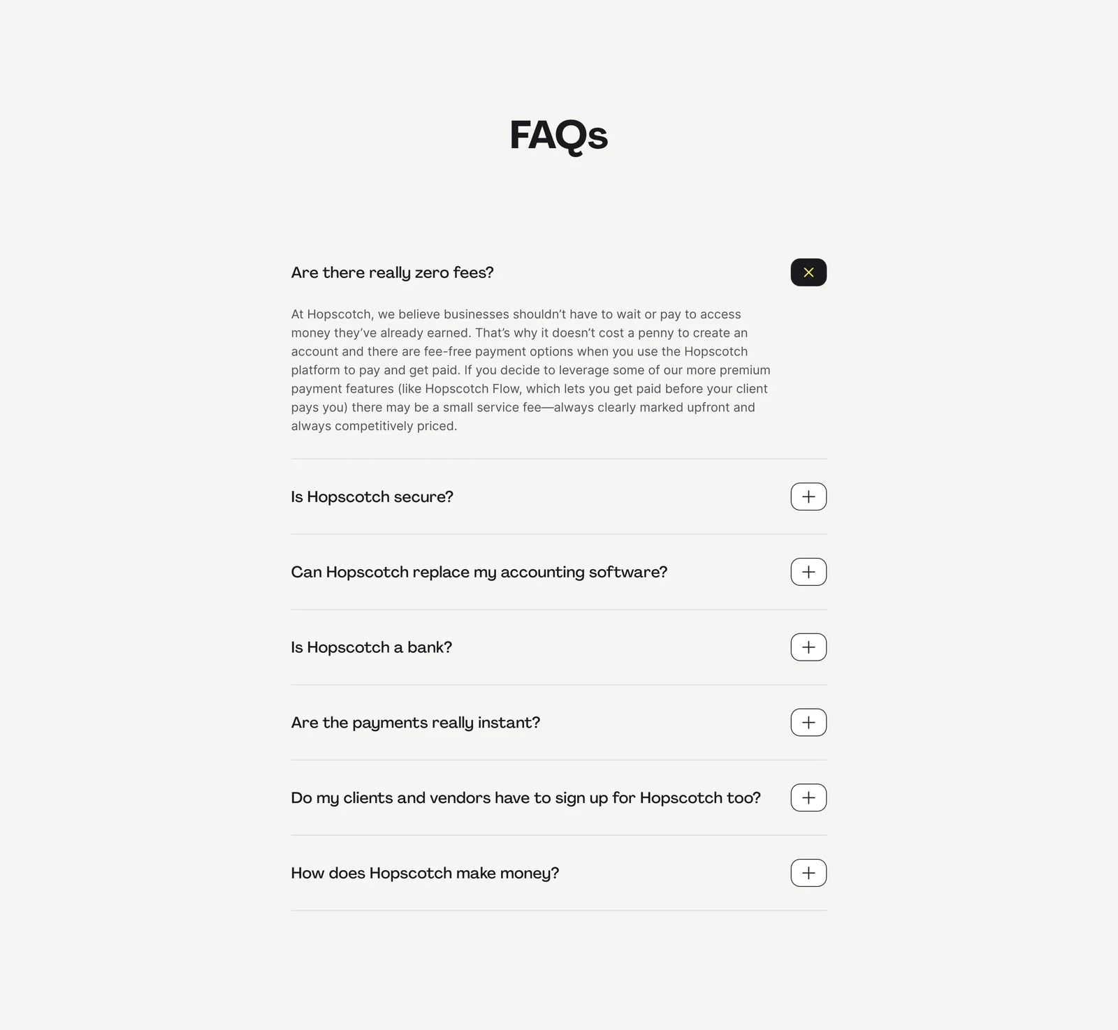
Hopscotch leads with a question about whether fees are really zero. The expanded answer distinguishes basic fee-free options from premium features that may carry a service fee. As a content structure, this is more useful than repeating a headline about free payments because it addresses the exception that prompted the question.
The remaining visible questions concern security, accounting software, the nature of the service, payment speed, recipient signup, and the business model. Together they reveal a decision-oriented selection: cost, trust, product boundaries, and practical use. The capture does not show the closed answers, so their content cannot be evaluated from this image.
Use this approach when a marketing claim could be interpreted too broadly. State the relevant distinction near the beginning of the answer, then explain its effect. Keep important conditions accessible from the main product or pricing content as well. A FAQ should clarify a promise, rather than serve as the only place a visitor can discover its limitations.
Group questions when the product has several concepts
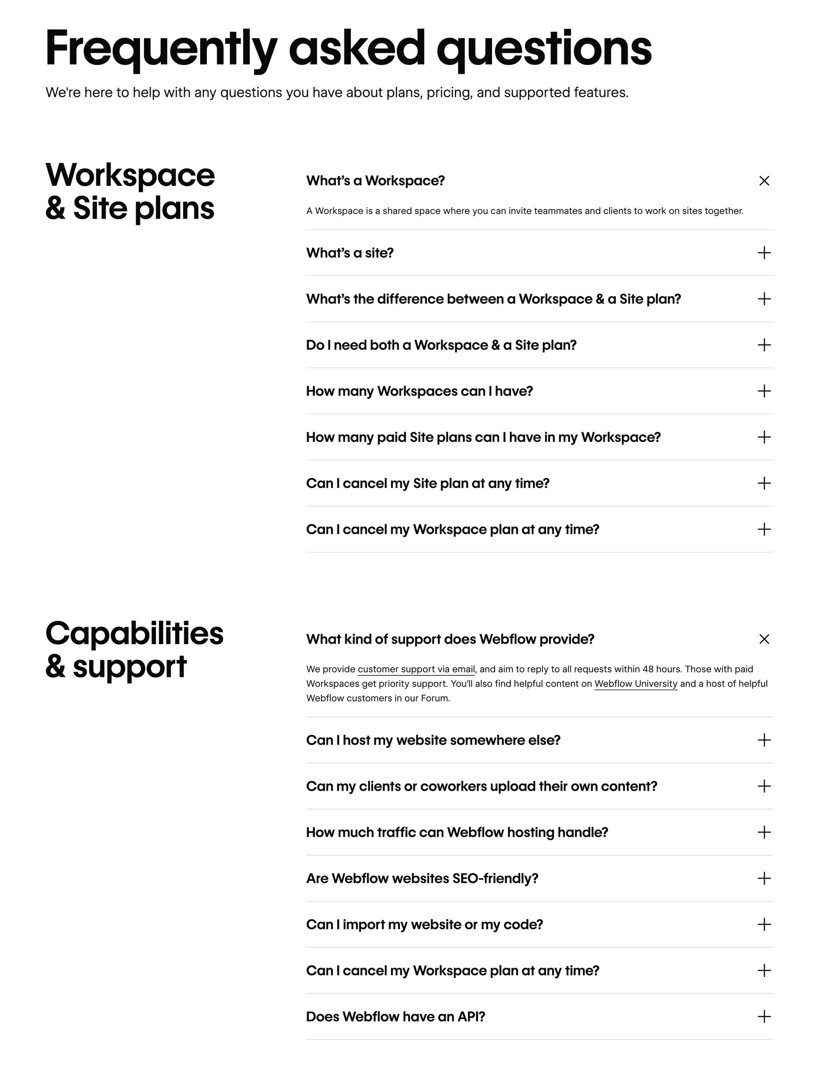
Webflow separates Workspace and Site plans from Capabilities and support. The first category begins by defining a workspace, then lists questions about sites, plan differences, whether both plans are needed, quantities, and cancellation. This sequence builds basic vocabulary before asking the visitor to reason about subscriptions.
The second category covers a different set of concerns, including support, hosting, content contribution, and traffic. The large category headings help readers find a relevant topic without scanning a single undifferentiated list. This becomes particularly useful when questions serve different audiences, such as buyers, administrators, and implementation teams.
Choose categories that represent visitor tasks rather than internal departments. Billing, setup, collaboration, and integrations are often more useful than a group named Operations. If categories become very long, provide a topic index or a path to a dedicated help resource instead of turning the landing page into an entire knowledge base.
Write answers with a clear first sentence
The first sentence should answer the question as directly as the facts allow. Follow it with the condition, consequence, or next step that makes the answer actionable. For a question about plan requirements, explain which requirement triggers which plan. For a question about cancellation, explain what the user should expect and link to maintained details when needed.
Keep answers concise enough to read in place, but long enough to resolve the uncertainty. A one-word response may omit an important qualification; a multi-paragraph essay may hide the answer. If the explanation requires substantial detail, summarize the decision in the FAQ and link to a dedicated page.
Avoid absolute claims that the product team cannot substantiate. Security, payment timing, availability, and contractual conditions deserve precise maintained wording. Design reviewers can evaluate clarity and placement, while the responsible subject-matter owner verifies the underlying claims. Do not infer the current truth of a claim from an attractive historical screenshot.
Choose an expansion model that fits comparison
The Hopscotch capture shows one answer open and other questions closed. The Webflow capture shows an open answer in each visible category. These states illustrate different reading arrangements, but a screenshot does not prove whether the interface permits multiple answers to remain open or automatically closes one when another is selected.
For a short list, allowing multiple open answers can help visitors compare related information. A single-open model keeps the section compact, but can require repeated reopening when questions depend on one another. Decide based on the relationship between answers and the available space.
Show the state of each question consistently. A plus sign can indicate an available expansion, while the open row should provide a recognizable collapse cue. Pair visual cues with the actual exposed control state. Do not assume an icon alone tells every reader whether content is expanded, loading, or unavailable.
Make accordion controls accessible and predictable
Use a real button for each disclosure heading, with an accessible name matching the question and an expanded state tied to its answer. Keep keyboard focus visible and make the entire heading row a comfortable target where appropriate. Opening an answer should not unexpectedly move focus to a different part of the page.
Maintain a sensible heading hierarchy around the section and its categories. The questions should be understandable in reading order, and hidden answers should not create confusing focus stops. Links inside open answers need their own clear focus appearance and meaningful text.
Test with keyboard navigation, zoomed text, and narrow layouts. Long questions should wrap without colliding with the expansion icon. The icon must remain visually associated with its question even when that question occupies several lines. Leave enough space between rows so a visitor can identify which control belongs to which answer.
Place the FAQ near the decision it supports
A FAQ is most useful when it answers a question at the point that question arises. Plan requirements belong near pricing; integration prerequisites belong near integration setup; migration concerns belong near a switching or onboarding offer. Placement can reduce the effort of leaving the page and finding the same explanation elsewhere.
Do not use the FAQ to compensate for an unclear main section. If nearly every visitor needs a definition or qualification, move that explanation into the primary content. The FAQ can then handle follow-up concerns instead of carrying the entire product model.
Provide a relevant fallback for questions that remain unanswered. A contact or support destination should explain what help is available, rather than offering an unlabeled generic button. Keep the fallback proportional to the page: a pricing question might warrant sales help, while an existing user's operational issue belongs in customer support.
Maintain answers and measure unresolved uncertainty
Assign an owner to each answer, especially when it discusses plans, billing, product limits, or service commitments. Review the FAQ when those underlying details change. Repeated answers across several pages can drift, so keep a shared source or a clear review process for content that needs to remain consistent.
Measure whether the section helps visitors finish their task. Expansion counts reveal interest, but do not prove that an answer was useful. A frequently opened question followed by repeated support requests may indicate that the answer remains unclear. A rarely opened question may be irrelevant, or its topic may already be explained well elsewhere.
Use feedback and task observation to interpret the data. Ask someone to choose the appropriate plan or explain a product boundary after reading the page. Their reasoning can reveal missing distinctions that click analytics cannot show. Update the questions when customer vocabulary changes rather than preserving an outdated list because its layout still fits.
Review the FAQ before publication
- Does each question reflect a real uncertainty on this page?
- Does the first sentence answer it directly?
- Are important conditions visible in the main offer as well?
- Do categories help readers find a topic?
- Are unfamiliar product concepts defined before comparison?
- Does the expansion model support reading related answers?
- Are controls usable by keyboard and identifiable to assistive technology?
- Can long questions wrap without overlapping icons?
- Do links lead to maintained details or appropriate help?
- Does every policy-sensitive answer have a responsible owner?
Review the question list without the design as a final editorial check. If a question sounds like a sales slogan or an answer would fit almost any product, replace it with something more specific. The section should reduce uncertainty that remains after the rest of the page has done its job.
Frequently asked questions about FAQ design
Should the first FAQ answer be open by default?
It can be useful when the first question is a major objection or defines an unfamiliar concept. A fully collapsed list is more compact and easier to scan. Choose based on the importance of that answer and test whether opening it improves understanding without hiding the remaining topics.
How many questions should a SaaS FAQ include?
Include the questions needed for the page's decision. A handful of specific questions can be more useful than a long generic list. When several distinct topics accumulate, introduce categories or move deeper explanations into a help resource.
Can a FAQ replace pricing or support documentation?
A FAQ can summarize key distinctions and link to authoritative details. It should not be the only source for complex plan rules, policies, or operational instructions. Keep essential offer information visible and use the FAQ to clarify the remaining questions.
Explore SaaS FAQ examples on SaaSFrame to compare question selection, category structure, open states, and the relationship between answers and the surrounding page.