 SaaSFrame
🤷♀️ Empty State
Turn dead ends into opportunities with creative SaaS Empty State designs. Discover how to use illustrations, 'Get Started' CTAs, and helpful tips to guide users when they haven't added data or encountered an empty results page.

Index of all 114 Empty State examples
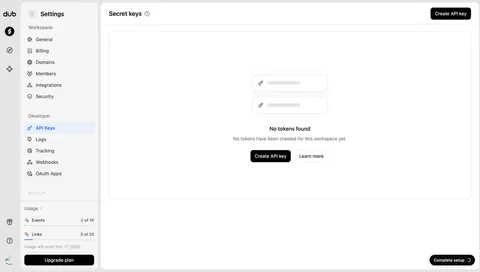
- Dub API keys empty state
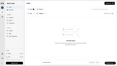
- Dub No links match the selected tag
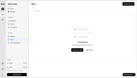
- Dub Tags empty state
- Dub Custom domains empty state
- Pangram Create your first API key
- Tines Empty Skills Library
- Tines Connector Request Monitoring
- Lightspark Cards Empty State
- Context.dev Batch scraping empty state
- Context.dev Watch a page or sitemap empty state
- EigenPal API keys empty state
- EigenPal Webhooks empty state
- EigenPal Triggers empty state
- EigenPal Document templates empty state
- EigenPal Workflows empty state
- EigenPal Agents empty state
- Hugging Face Empty storage overview
- Hugging Face Empty community discussions
- Close Call coaching overview
- NewsCatcher Company Watchlists
- NewsCatcher Empty Monitoring List
- Cloudflare Analytics Dashboards Empty
- Cloudflare Domain Registration
- Prelude Configure Numbers
- Prelude Verifications
- Unkey Roles
- Unkey Rate Limites Settings
- Hume AI Voice Conversion Playground
- Customer.io Empty People Table
- Checkout.com Empty Invoices Dashboard
- Checkout.com Empty New Board
- Checkout.com Empty Boards Dashboard
- Checkout.com Empty Reports Dashboard
- Superlist Empty Inbox
- Latitude Empty Dashboard
- Oku Empty Friends Feed
- Uvodo Empty Payout Dashboard
- Remote Empty Team Table
- Remote Empty Employee Table
- FlowMapp Empty Dashboard
- Hyperline Empty Customers Table
- Hyperline Empty Product Table
- Copperx Empty Payment Dashboard
- Cal.com Empty Bookings Dashboard
- Dock Empty Verification Templates Dashboad
- Dock Empty Credentials Dashboard
- Audienceful Empty Automation Table
- Audienceful Import People List
- Audienceful Empty People Table
- Sellx Empty Payments Dashboard
- Duffel Empty Orders Dashboard
- Meiro Empty Dashboard
- Zeda.io Empty Notifications Modal
- Routine Empty State
- Supabase Empty Project Dashboard
- Livestorm Empty Event Dashboard
- Cake Equity Empty Raise Dashboard
- Cake Equity Empty Notes Dashboard
- Cake Equity Pool Details
- Cake Equity Empty Options Dashboard
- Cake Equity Empty Valuation Dashboard
- Conduktor Empty State
- Conduktor Empty State
- Conduktor Empty State
- Clay Empty Notes
- WorkOS Empty Organizations Dashboard
- Resend Add A Webhook
- Front Empty Inbox
- Lettria Create A Dictionary
- Lettria Create A Dictionary
- Lettria Empty Label
- Lettria Empty Dashboard
- Supernotes Empty Dashboard
- Phantombuster Automation Setup
- Formcarry Empty Form Submissions
- Makelog Empty State
- Makelog Empty Dashboard
- Height Empty State
- Height Empty State
- Plain Empty State
- Olvy Empty State
- Olvy Empty State
- Olvy Empty State
- Pirsch Analytics Empty State
- Blobr Empty State
- Logbook Empty Dashboard
- Dub Empty Dashboard
- Cycle Empty State
- Folk Reminders Empty State
- Folk Comments Empty State
- Folk Interactions Empty State
- Folk Email Empty State
- Folk Contact Empty State
- Attio Company Notes
- Attio Company Tasks
- Attio Company Files
- Skiff Empty State
- Sidebird Empty State
- MentionFunnel Empty State
- The Org Create Job Offer
- Fernand Channel settings
- Crew Create automation
- Evervault Empty activity log
- Evervault Create app
- Wope Empty dashboard
- Logsnag Empty state dashboard
- Squeaky Empty state
- Narrative BI Dashboard
- Numbro Sign Up Flow
- Reply Sign Up Flow
- Supernotes Sign Up Flow
🤷♀️ Empty State: design guide
A SaaS empty state explains why a normally populated area has no content and helps users take the appropriate next action. It may appear in a new account, a filtered search, a quiet activity log, or a collection where every item was removed. Those situations should not share one generic illustration and button.
The SaaSFrame references show application setup, date-scoped logs, and an empty card inventory. They demonstrate how the reason for absence determines the message. An empty state is useful when it is truthful about the product state, not merely attractive.
Identify the reason for absence
No records yet, no matching records, and unavailable data are different conditions. The interface should establish which one the system can confirm. A failed request should not become a cheerful empty collection.
Keep the relevant scope visible. A log with no events in the last seven days may contain older activity. A workspace with no objects may be different from an account with no access to them.
Use the reason to choose the action. Create an object for a new collection, revise criteria for no matches, or recover a connection for unavailable data. The button should follow the state rather than a default commercial objective.
Turn a first-use state into a meaningful beginning
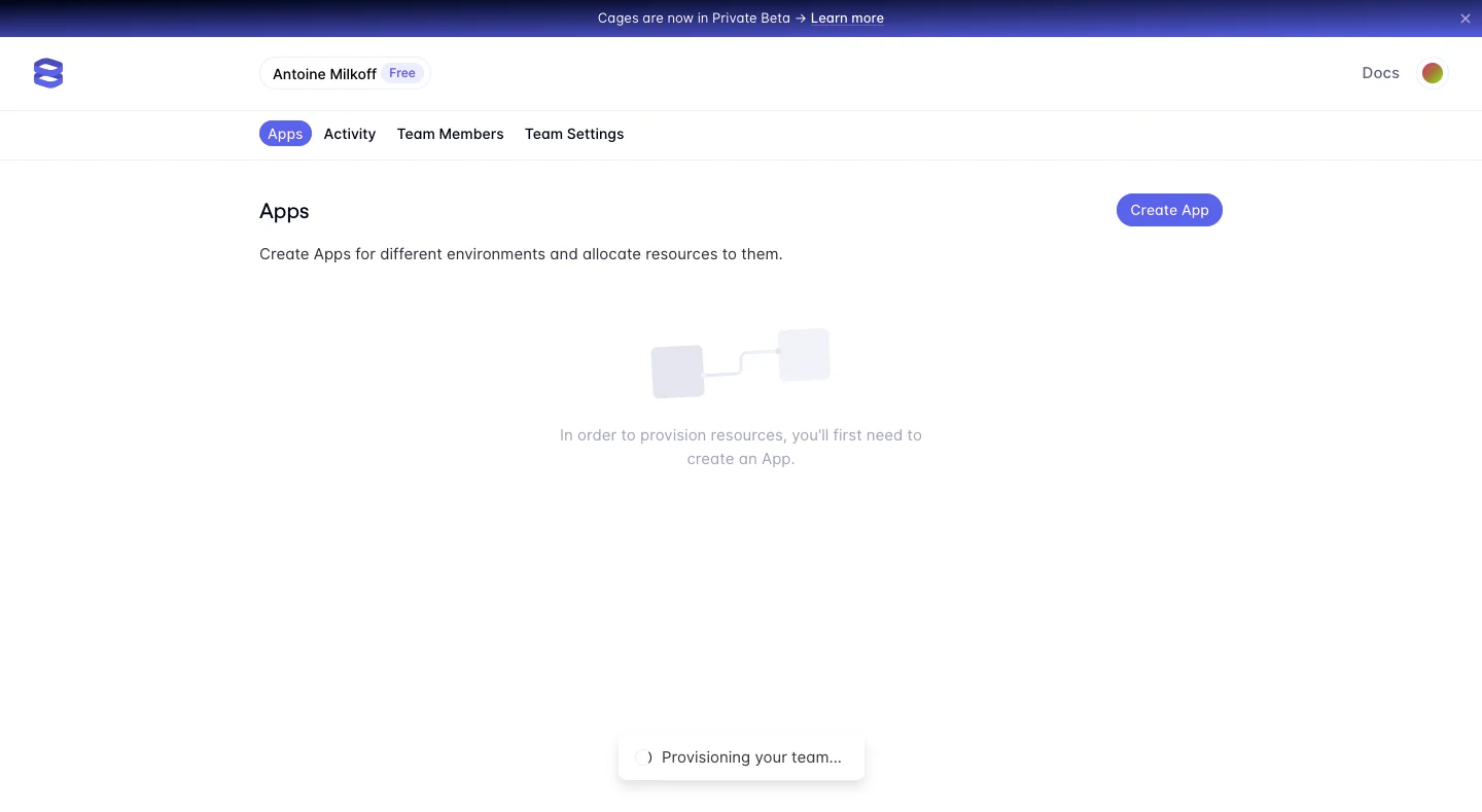
The Evervault application capture explains that an app must be created before resources can be provisioned. It presents a create-app action within the Apps area and keeps the surrounding team context visible.
This connects absence to a dependency. Users can understand why the area is empty and what the first object enables. The explanation is more useful than simply saying there is nothing here.
When adapting the structure, make the first action concrete. Creating an object should lead to a valid next state, and any further setup should be explained rather than hidden behind the initial creation success.
Distinguish filters from an empty account
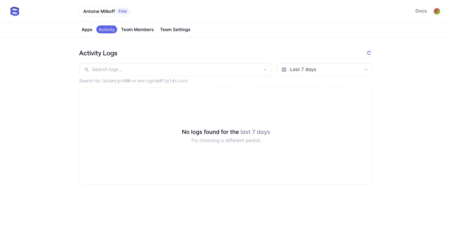
The Evervault activity-log capture retains search and a last-seven-days selector. Its message says no logs were found for that period and suggests choosing a different one.
This correctly connects the absence to a visible time scope. The user does not need to create a new object to solve a search boundary. Keeping the controls available supports the relevant recovery.
Use similarly specific language for other filters. If several criteria are active, show them and provide an understandable clear or broaden action. Do not erase the query before users can inspect why it produced no matches.
Keep object creation tied to the inventory
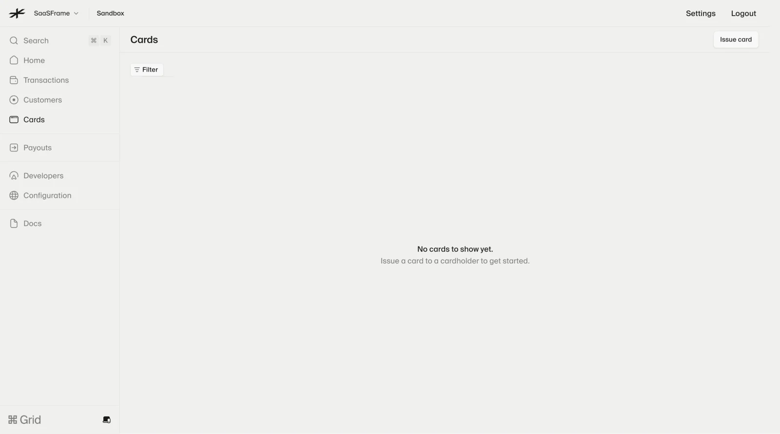
The Lightspark card capture identifies an empty card collection and offers an issue-card route within a sandbox account. The message connects the first card to a cardholder.
This establishes both object type and account context. The action is a specific beginning, not a generic get-started button. The sandbox label also prevents the shown inventory from being mistaken for a live account example.
When adapting a creation route, identify any prerequisite. If users need an existing cardholder, project, or administrator permission, explain it before sending them into a blocked form.
Preserve the surrounding product structure
An empty state should not remove the navigation and controls users need to understand the area. Search, filters, view choices, and relevant settings can remain useful even when there are no rows.
Keep the visual hierarchy proportionate. A large illustration may be appropriate in a new collection but excessive in a small filtered panel. The explanation and action should remain easy to find.
Use the same section identity as the populated state where practical. Users should recognize that they are still in the same product area, rather than feel redirected into a separate onboarding page.
Use sample content deliberately
Samples can demonstrate the kind of objects a collection will contain. They can also blur the boundary between user data and product examples. Label them clearly and explain whether they can be edited or removed.
Do not fill an empty area with realistic records merely to avoid blank space. Users may interpret them as their own account activity. The demonstration should serve learning without compromising trust.
If a template creates real objects, explain that commitment. Previewing a template and adding it to the workspace are different stages.
Make permission-limited states honest
A person may see no records because their role lacks access. Do not claim the workspace contains nothing when the system is only withholding content from that viewer.
Explain the relevant restriction without exposing confidential object names. Provide an appropriate administrator or access-request route where supported. A creation button should not be offered as the solution if the person cannot create the object.
Keep this state distinct from ordinary zero content. The user needs to understand whether they can proceed independently or need someone with different permissions.
Account for cleared and completed collections
A collection can become empty after deletion, archiving, or completion. The resulting message should fit that history. A new-user onboarding prompt can feel misplaced after a person finishes a queue.
For work queues, an empty state may communicate that no action is currently needed. A next recommendation can be useful, but it should not invent urgency merely to fill the screen.
Where accidental removal is possible, provide recovery according to the product's actual behavior. Do not show undo if the operation cannot be reversed, and do not hide a useful recently deleted route.
Separate loading from confirmed emptiness
Wait until the relevant data state is known before presenting an empty result. A brief empty message that flashes during every refresh can make users question whether their records disappeared.
If old content remains while refreshing, communicate the update. If a request fails, show the error or unavailable state rather than replacing the area with a zero-content explanation.
Partial data also needs careful wording. A source that is unavailable cannot support an account-wide claim that nothing exists. Identify the scope the system can confirm.
Keep the route forward accessible
Use meaningful text, visible focus, and clear action labels. Important state information should not depend only on an illustration or color. A no-results explanation needs the same accessibility as a form error.
On small screens, preserve relevant filters and the next action. Avoid oversized artwork pushing the corrective controls far below the message.
If the action opens a modal or navigates to setup, preserve the collection context on return. A user should be able to recognize the result of the first successful action.
Test the states separately
Test a new account, a date-filtered log, a no-match search, a restricted viewer, a completed queue, and a failed request. Confirm that each produces the correct explanation and action.
Ask users why the area is empty and what they should do next. Their answers reveal whether the message is specific enough to support recovery.
Measure successful continuation rather than clicks on the empty-state button alone. A high click rate can conceal a route that leads to missing prerequisites or another empty screen.
Frequently asked questions about empty states
Should all empty states have a creation button?
No. The correct action depends on the reason for absence. A filtered result may need broader criteria, while a completed queue may need no action.
Is an empty state an error?
Sometimes absence is normal. Loading failure and unavailable data are different conditions and should be labeled separately.
Should sample records fill a new account?
Only when they support learning and are unmistakably examples. Do not let them appear to be real account data.