.webp)

Checkout.com





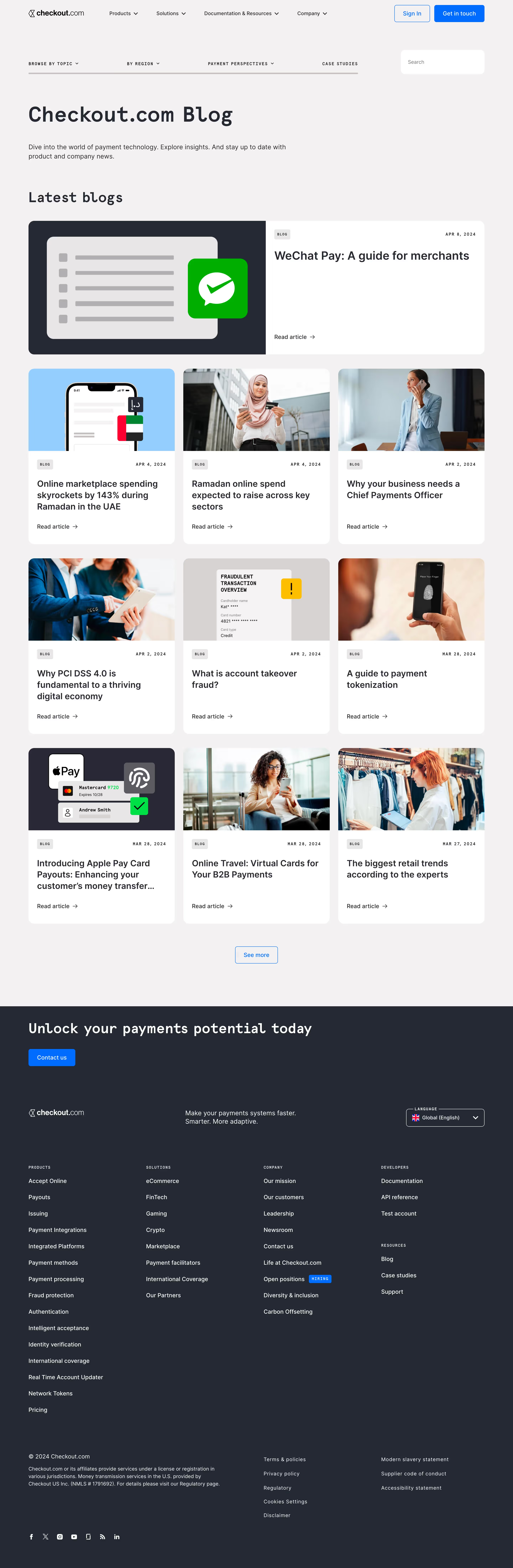








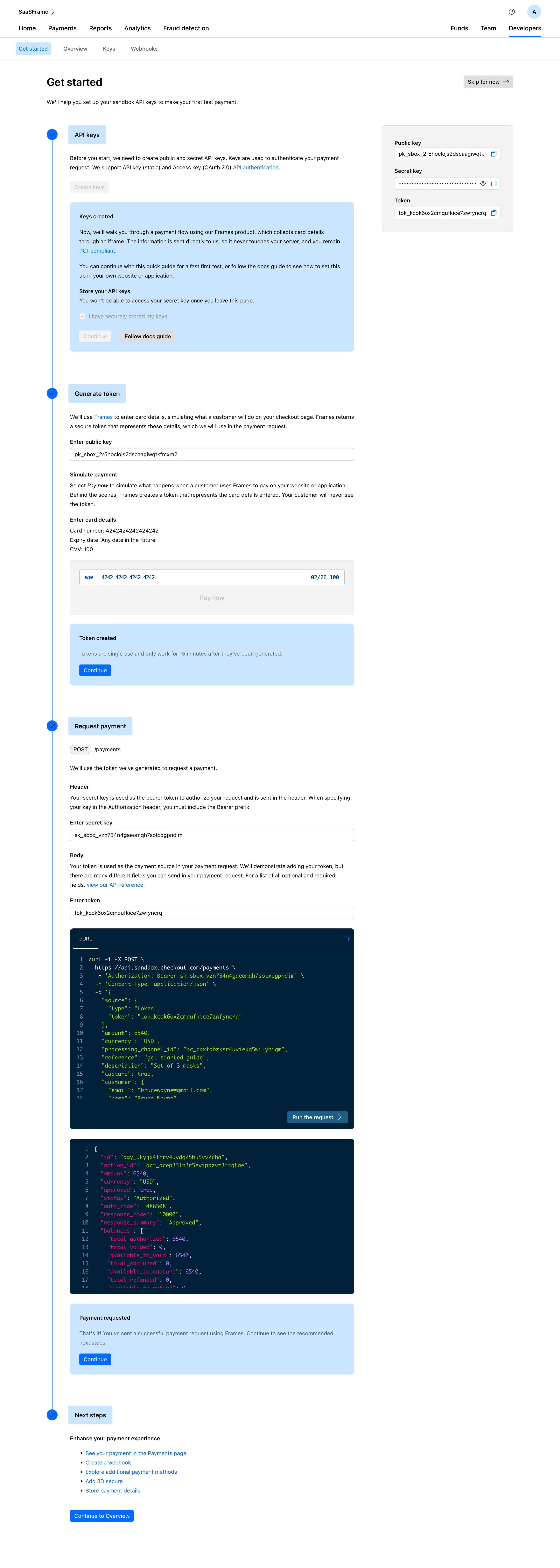
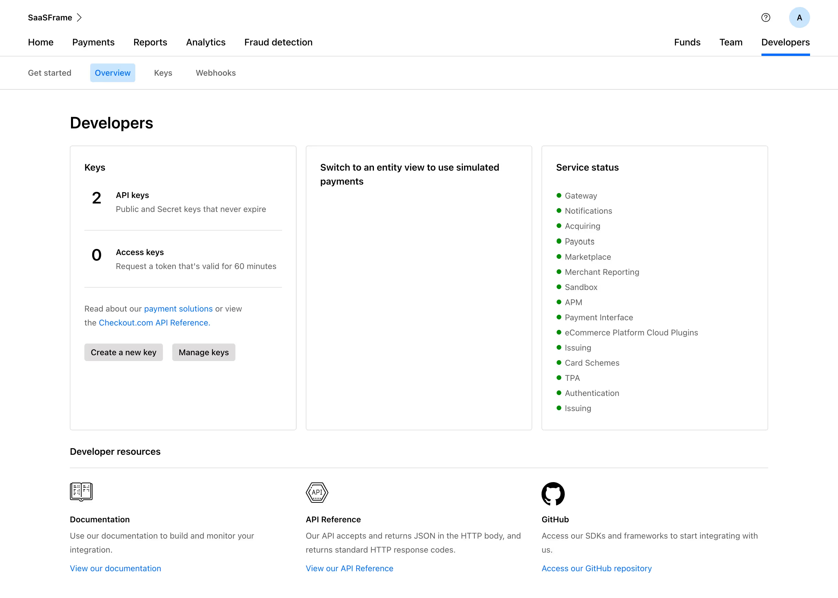


Checkout.com — Design System Overview
Stack \- Platform: Webflow (hosted on cdn.prod.website-files.com) \- CSS framework: Webflow-generated custom CSS (checkout-v5-2024.webflow.\*.min.css) \- No utility framework (no Tailwind/Bootstrap classes observed) \- JavaScript: Minimal; Webflow interactions + Google Tag Manager
Typography \- Primary font: Custom/brand sans-serif (likely "Neue Haas Grotesk" or similar geometric grotesque based on visual identity) \- Secondary: System fallback sans-serif stack \- Headings: Large, bold, uppercase accents on hero sections (e.g. "ACCEPT PAYMENTS. ACCESS SCALE.") \- Scale: Dramatic size contrast between H1 (60–96px) and body (16–18px) \- Letter-spacing: Wide tracking on uppercase labels and section tags \- Line-height: Tight on headings (~1.1), relaxed on body (~1.6)
Color Philosophy \- Dark navy primary: #00122C — deep trust-conveying financial brand color \- White: #FFFFFF — dominant background on light sections \- Black: #000000 — used for footer backgrounds and logo lockup \- Accent blue: Bright electric blue (~#0070FF or similar) for CTAs and highlights \- Neutral grey: Used for secondary text and borders \- Palette signals authority, performance, fintech trust
Spacing \- Generous section padding: 80–160px vertical \- Component gaps: 24–48px \- Grid gutters: 24–32px \- Max content width: ~1280px centered
Component Defaults \- Buttons: Pill/rounded with solid fill (primary) or outlined (secondary); uppercase or title-case labels \- Cards: White on dark or dark on white; subtle borders or shadows; rounded corners (~8–12px) \- Navigation: Full-width mega-menu with categorized columns; sticky on scroll \- Hero: Full-viewport height, dark navy background, bold headline, dual CTA buttons \- Icons: SVG line icons from Webflow assets, consistent stroke weight
Layout \- 12-column CSS grid \- Alternating light/dark sections throughout marketing pages \- Image-right / text-left alternating content blocks \- No sidebar layouts — full-width sections only \- Footer: multi-column link grid on dark background
:root { / ── Brand Colors ── / --color-navy: #00122C; / primary brand / dark bg / --color-black: #000000; / footer bg / logo on light / --color-white: #FFFFFF; / page background / --color-blue-accent: #0066FF; / CTA buttons, links, highlights / --color-blue-light: #E8F0FF; / tinted section backgrounds / --color-grey-100: #F5F5F5; / light section fills / --color-grey-200: #E8E8E8; / dividers, borders / --color-grey-500: #6B7280; / secondary body text / --color-grey-700: #374151; / primary body text on light bg / --color-text-on-dark: #FFFFFF; / text on navy/black backgrounds / --color-text-primary: #00122C; / default heading color / --color-text-muted: #6B7280; / captions, meta, secondary labels /
/ ── Typography ── / --font-family-primary: 'Neue Haas Grotesk', 'Helvetica Neue', Arial, sans-serif; --font-family-mono: 'JetBrains Mono', 'Fira Code', monospace; --font-size-xs: 12px; --font-size-sm: 14px; --font-size-base: 16px; --font-size-md: 18px; --font-size-lg: 24px; --font-size-xl: 32px; --font-size-2xl: 48px; --font-size-3xl: 64px; --font-size-hero: 80px; --font-weight-regular: 400; --font-weight-medium: 500; --font-weight-semibold: 600; --font-weight-bold: 700; --font-weight-black: 900; --line-height-tight: 1.1; --line-height-snug: 1.3; --line-height-normal: 1.6; --letter-spacing-wide: 0.08em; --letter-spacing-wider: 0.12em;
/ ── Spacing ── / --space-1: 4px; --space-2: 8px; --space-3: 12px; --space-4: 16px; --space-5: 20px; --space-6: 24px; --space-8: 32px; --space-10: 40px; --space-12: 48px; --space-16: 64px; --space-20: 80px; --space-24: 96px; --space-32: 128px; --space-40: 160px;
/ ── Border Radius ── / --radius-sm: 4px; --radius-md: 8px; --radius-lg: 12px; --radius-xl: 16px; --radius-pill: 999px; --radius-full: 50%;
/ ── Shadows ── / --shadow-sm: 0 1px 3px rgba(0, 18, 44, 0.08); --shadow-md: 0 4px 12px rgba(0, 18, 44, 0.12); --shadow-lg: 0 8px 32px rgba(0, 18, 44, 0.16); --shadow-xl: 0 16px 48px rgba(0, 18, 44, 0.20);
/ ── Layout ── / --container-max-width: 1280px; --container-padding: 32px; --grid-columns: 12; --grid-gap: 24px;
/ ── Transitions ── / --transition-fast: 150ms ease; --transition-base: 250ms ease; --transition-slow: 400ms ease; }
/ Dark sections (navy background) / [data-theme="dark"], .section--dark, .hero, .footer { --color-text-primary: #FFFFFF; --color-text-muted: rgba(255, 255, 255, 0.6); --color-bg: #00122C; --color-border: rgba(255, 255, 255, 0.12); --color-blue-accent: #4D9FFF; }
Color Tokens
| Token | Value | Usage |
|---|---|---|
| --color-navy | #00122C | Primary brand, hero bg, nav bg |
| --color-black | #000000 | Footer background, logo lockup |
| --color-white | #FFFFFF | Page background, text on dark |
| --color-blue-accent | #0066FF | CTAs, links, active states |
| --color-blue-light | #E8F0FF | Tinted section backgrounds |
| --color-grey-100 | #F5F5F5 | Alternate section fills |
| --color-grey-200 | #E8E8E8 | Borders, dividers |
| --color-grey-500 | #6B7280 | Secondary text, captions |
| --color-grey-700 | #374151 | Body text on light bg |
Spacing Tokens
| Token | Value | Usage |
|---|---|---|
| --space-2 | 8px | Icon gap, tight padding |
| --space-4 | 16px | Component inner padding |
| --space-6 | 24px | Card padding, grid gap |
| --space-8 | 32px | Section sub-gap |
| --space-12 | 48px | Content block gap |
| --space-20 | 80px | Section vertical padding (min) |
| --space-40 | 160px | Hero section padding |
Typography Tokens
| Token | Value | Usage |
|---|---|---|
| --font-family-primary | 'Neue Haas Grotesk', 'Helvetica Neue', Arial, sans-serif | All UI text |
| --font-size-base | 16px | Body text |
| --font-size-md | 18px | Lead paragraphs |
| --font-size-lg | 24px | Subheadings, card titles |
| --font-size-xl | 32px | H3 headings |
| --font-size-2xl | 48px | H2 headings |
| --font-size-3xl | 64px | H1 headings |
| --font-size-hero | 80px | Hero headline |
| --font-weight-bold | 700 | Headings |
| --font-weight-black | 900 | Hero text, impactful labels |
| --line-height-tight | 1.1 | Headlines |
| --line-height-normal | 1.6 | Body copy |
| --letter-spacing-wide | 0.08em | Uppercase section labels |
Border Radius Tokens
| Token | Value | Usage |
|---|---|---|
| --radius-sm | 4px | Tags, badges, small elements |
| --radius-md | 8px | Input fields, small cards |
| --radius-lg | 12px | Cards, panels |
| --radius-xl | 16px | Large cards, modals |
| --radius-pill | 999px | Buttons (primary pill shape) |
| --radius-full | 50% | Avatar/icon circles |
Shadow Tokens
| Token | Value | Usage |
|---|---|---|
| --shadow-sm | 0 1px 3px rgba(0,18,44,0.08) | Subtle lift, inputs |
| --shadow-md | 0 4px 12px rgba(0,18,44,0.12) | Cards, dropdowns |
| --shadow-lg | 0 8px 32px rgba(0,18,44,0.16) | Modals, popovers |
| --shadow-xl | 0 16px 48px rgba(0,18,44,0.20) | Floating panels |
Framework: Webflow — marketing site built with Webflow CMS and hosted on Webflow CDN (cdn.prod.website-files.com). CSS class naming follows Webflow conventions (BEM-lite, component-prefixed). No utility CSS framework detected.
Theme Support: No native dark/light toggle. Dark mode is implemented via hardcoded dark-background sections (navy #00122C) alternating with white sections — not a system-level prefers-color-scheme implementation. Brand tile color #00122C confirmed via meta-msapplication-TileColor.
Data Confidence: Medium-high. Core brand colors (#00122C navy, white/black) confirmed via meta tags and observed visual identity. Typography inferred from visual brand identity (geometric grotesque, likely Neue Haas Grotesk — Checkout.com's known brand font). Spacing and radius are estimated from visual inspection of layout patterns. No raw CSS variables were accessible (Webflow minified CSS returned empty from CDN).
Notable Patterns: \- Alternating dark navy / white sections create strong visual rhythm across all marketing pages \- Hero sections always use full-viewport dark navy with large white bold typography \- CTA buttons consistently use pill shape (border-radius: 999px) — primary filled blue, secondary outlined \- Uppercase section labels with wide letter-spacing used as eyebrow text above headings \- Mega-menu navigation with categorized product columns (Connect / Move / Protect / Boost / Manage) \- SVG illustrations and icons throughout — no raster icon library \- Strong typographic hierarchy with dramatic scale jumps (body 16px → hero 80px+) \- Performance/athlete metaphor drives design language: bold, direct, confident
Biggest SaaS library.


.webp)


.webp)

Desktop & mobile versions.


Access the Figma files.


Advanced filtering.
Let it flow.





Save design inspirations.
research




How do you process payment?
SaaSFrame subscriptions are sold on Lemon Squeezy, a secured online selling platform for creators.
What about future updates and versions?
SaaSFrame gets updated all the time! Every new update and version will immediately be made available to all SaaSFrame users.
Can you send me an invoice?
You can generate an invoice on your Lemon Squeezy portal once you purchased SaaSFrame. You will find the link in the order confirmation email.
How can I cancel my membership subscription?
You can cancel your membership subscription at any moment on your profile page.
Can I get a refund?
If you're not satisfied, you can ask for a refund within 7 days. Just send me an email at antoine[at]unmake[dot]io
I have another question.
You can send me an email at antoine[at]unmake[dot]io, I'll be happy to help with any questions.