 SaaSFrame
Side Panel
Maximize screen real estate with SaaS Side Panel and 'Drawer' patterns. These are perfect for displaying details, filters, or sub-tasks without losing context of the main screen.
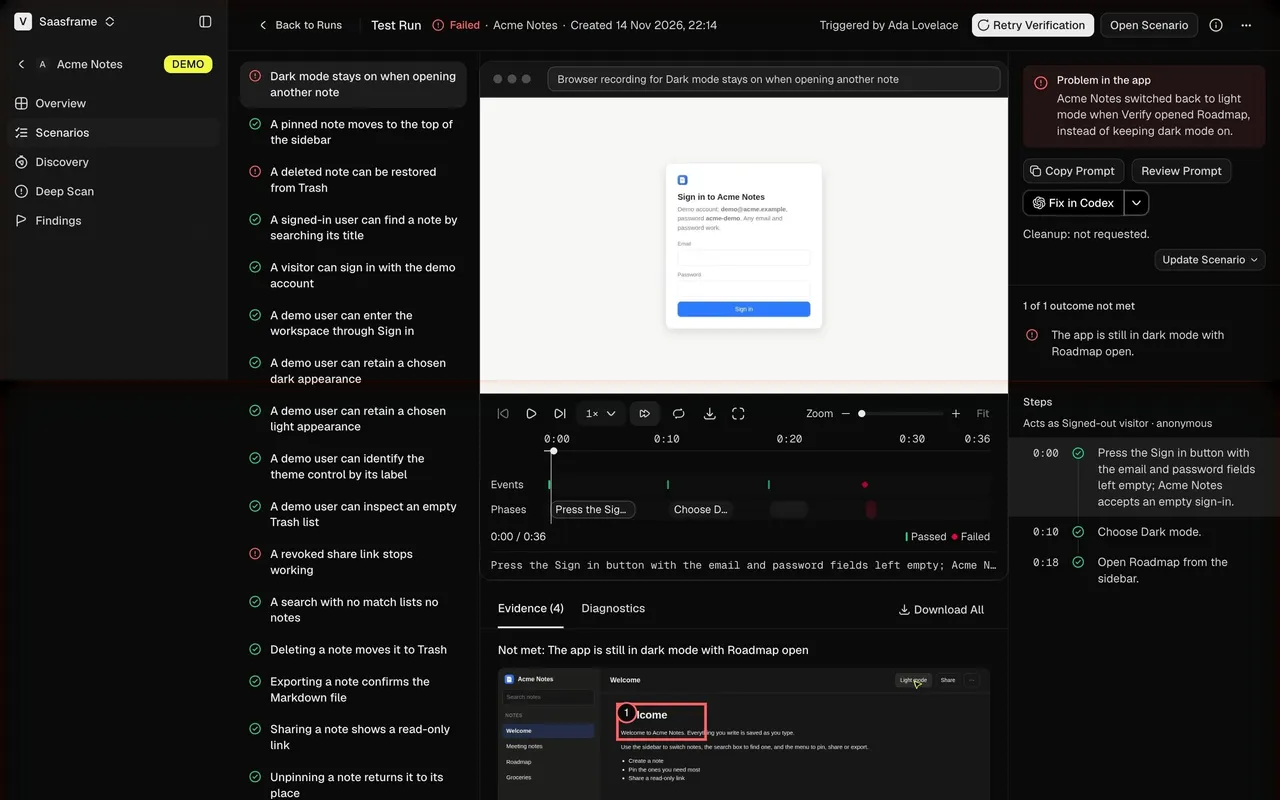

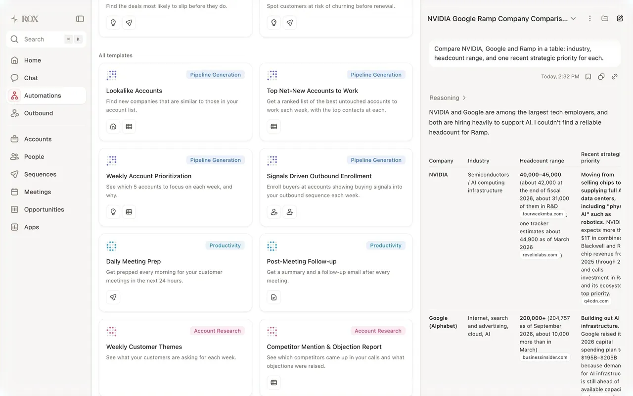

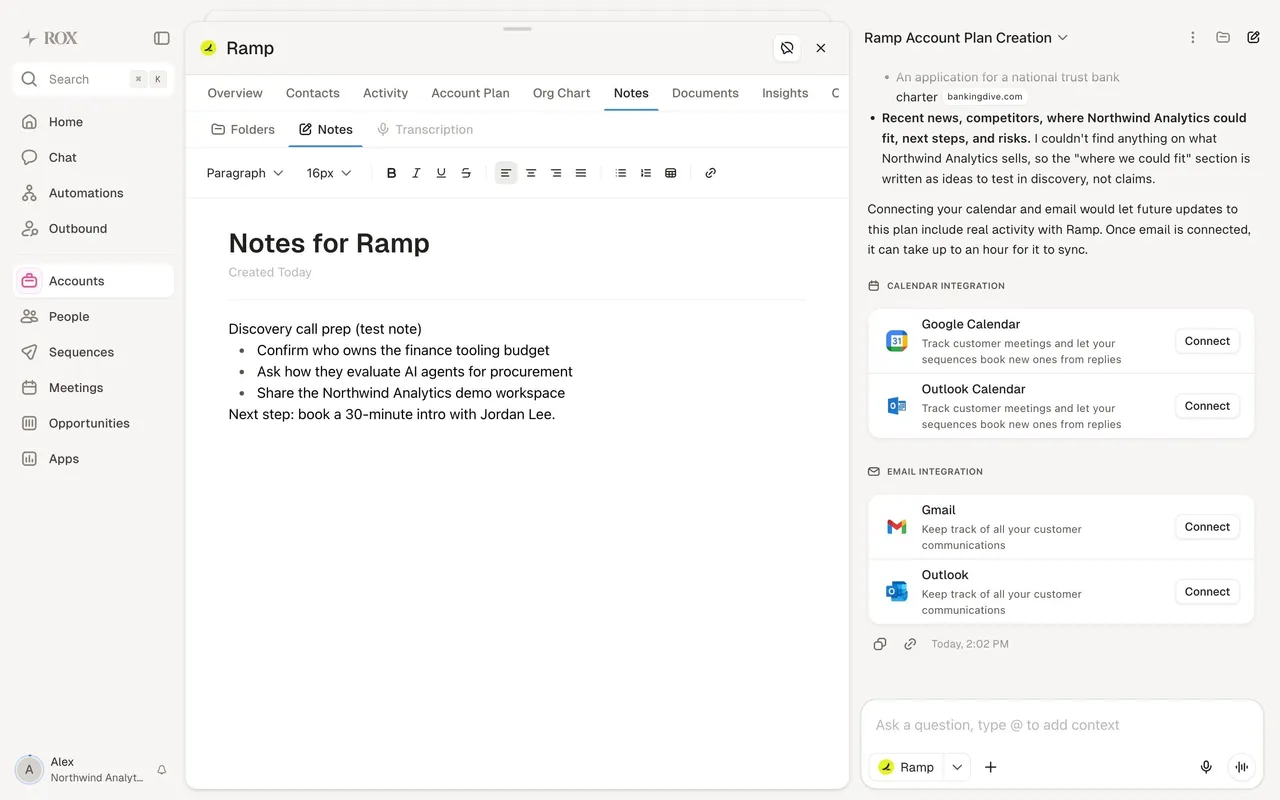

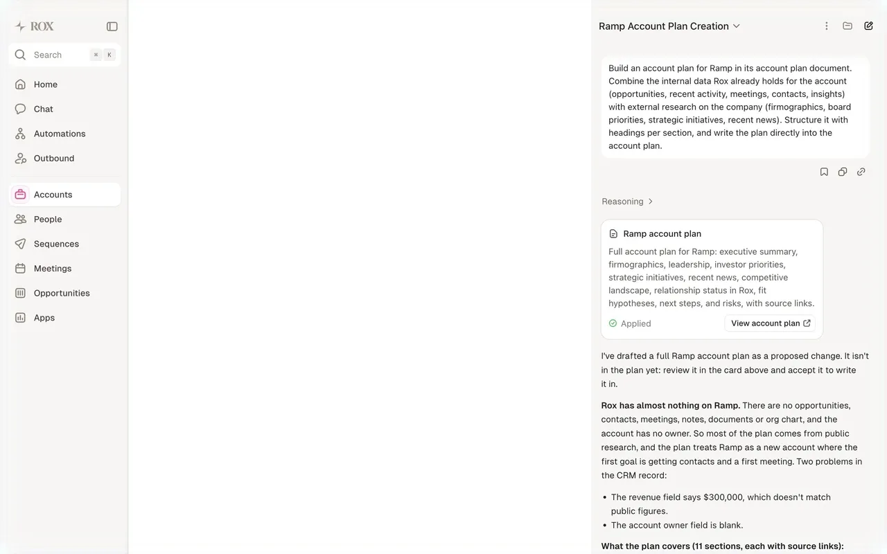
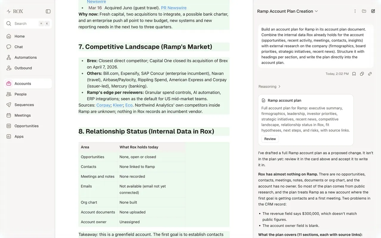
Index of all 98 Side Panel examples
- Rox Org Chart Contact Panel
- Rox Account Plan Editor
- Rox Review Account Plan Edits
- Rox Account Overview
- Rox Home
- Voiceflow Agent Test Run
- Voiceflow Playbooks Empty State
- Unabyss Export Document
- Pangram AI image detection heatmap
- Pangram Text detection results
- Lightspark Payout Amount & Details
- Lightspark Business Recipient Details
- Lightspark Recipient Type & Currency
- Lightspark Choose Payout Recipient
- Lightspark Add Account Funds
- Lightspark USD Account Details
- Context.dev Watched page details
- Context.dev Scrape brand results
- Context.dev Crawl Website results
- Context.dev Map URLs results
- Context.dev Scrape Anything results
- Context.dev Scrape Anything settings
- EigenPal Configure workflow output
- EigenPal Visual workflow builder
- EigenPal Test an AI agent conversation
- EigenPal Set up a new AI agent
- GraphCMS Project dashboard with updates panel
- GraphCMS AI content generation prompt
- Lightdash AI Analysis
- Claude Project Details
- Dust Invite new users
- Dust Data Sync in Progress
- Dust Manage Google Drive Connection
- Dust Connection Setup
- Huly Issue Tracker
- Huly Profile Details
- Huly Room Detail
- Hume AI Text to Speech Playground
- Atlas Healthcare Facilities Map
- Atlas Building Footprints Chart
- Atlas Melbourne 3D Building Map
- Atlas Melbourne Soil & Building Map
- Atlas New Map Project
- Pitch Presentation Comments Side Panel
- Pitch Presentation Animations Side Panel
- Pitch Presentation Design Side Panel
- Customer.io Campaign Workflow
- Checkout.com Strategy Builder
- Superlist Integration Connected
- Superlist Connect Integration
- Superlist Checklist
- Superlist User Onboarding
- Superlist User Onboarding
- OpenAI Create New Assistant
- OpenAI Create New Assistant
- Latitude Flowchart
- Intercom Set AI Chatbot Live
- Intercom Article Settings
- Intercom Content Details
- Intercom Automation Workflow
- Remote Hire Onboarding Progress
- Hyperline Invoices Dashboard
- Hyperline Assign New Subscription
- Dock Add Credential Recipiend
- Rise Event Details
- Expertpage Edit Profile
- Zeda.io Analytics Details
- Zeda.io Customer Details
- Zeda.io Create A Feedback
- Zeda.io Create A Feedback
- Zeda.io Feedback Details
- Zeda.io Feedback Details
- Zeda.io Feedback Details
- Supabase Copy Paste Import
- Supabase Copy Paste Import
- Supabase Import CSV File
- Livestorm Event Details
- Livestorm Create New Event
- Livestorm Create New Event
- Popwork Objective Details
- Popwork Add An Objective
- Popwork Add An Objective
- Assembly Post Details
- Assembly Post Details
- Clay Contact Details
- Height Details
- Plain Issues Details
- Olvy Create A Feedback
- Zencal Meeting Details
- Specify Destination app details
- Senja Dashboard
- Reveal Dashboard
- Narrative BI Analytics
- Narrative BI Analytics
- Narrative BI Analytics
Side Panel: design guide
Short answer
A side panel opens a focused workspace beside the current page to show details, create a record or edit without losing context. Use it when staying near the list helps, keep validation inside the panel, define whether the background stays interactive and give it enough width with its own scroll.
In the libraryas of November 2026
- Examples
- 98
- SaaS products
- 41
- Last added
- Nov 2026
Most common inDetails 31Add & Edit 26Flowchart 7Text Editor 7Analytics 5
A side panel opens a focused workspace beside the current page. It can show object details, collect a new record, or support a short editing task while preserving a visual connection to the collection behind it. SaaS products use this pattern when leaving the page would interrupt the user's workflow.
The pattern is useful only when that preserved context still helps. A narrow panel can become an awkward full-page form, and a dimmed background may remain visible without being usable. Decide whether the panel supports a related task, a temporary interruption, or ongoing comparison before choosing its behavior.
When should a task open in a side panel?
A person creating feedback from a feedback list can benefit from returning directly to that list. Someone inspecting several records can benefit from opening details without losing their place. These are different uses, but both connect a focused task to a parent collection.
A complex configuration requiring several sections may deserve its own page. If the panel needs nested navigation, multiple large editors, and extensive review, its compact placement may add friction without preserving meaningful context. The choice should follow the work, not the desire to avoid a page transition.
Distinguish a side panel from permanent navigation. A sidebar organizes the product; a task panel temporarily displays content related to the current view. Their different roles affect width, headings, close behavior, and keyboard interaction.
Zeda.io shows how a feedback form can stay attached to its collection
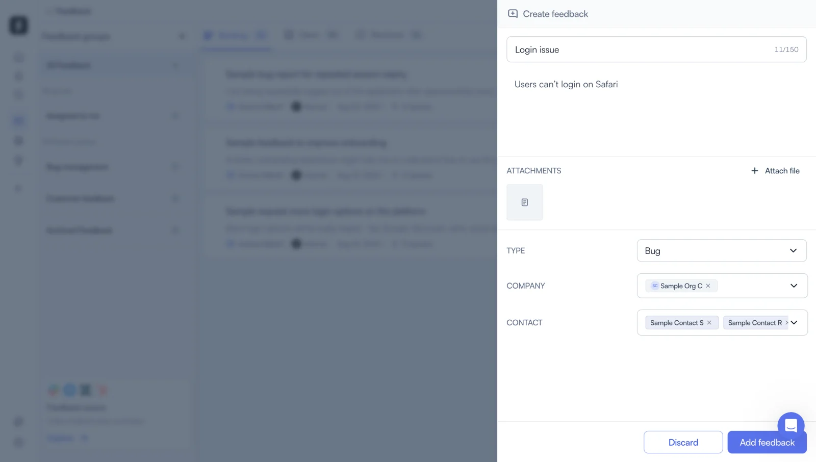
The Zeda.io screenshot shows a Create feedback panel on the right while the feedback workspace remains dimmed behind it. The filled form contains a title, description, attachment, Bug type, company selection, and contact selections. Discard and Add feedback actions sit at the bottom.
The fields connect a short narrative with structured context. The title and description explain the issue, while type, company, and contacts support its later handling. Keeping those elements in one panel can help the user complete a focused creation task without navigating away from the collection.
The fixed-looking footer visually separates completion actions from the form content. That can be useful in a long panel, but the screenshot alone does not prove how the footer behaves during scrolling. Test whether it remains reachable and whether it covers fields on smaller screens.
The background is visibly dimmed. This demonstrates visual emphasis on the active task, not evidence that users can continue interacting with the collection. Your own design needs an explicit decision about whether the panel is modal or allows work in the surrounding page.
Put validation inside the panel where users can correct it
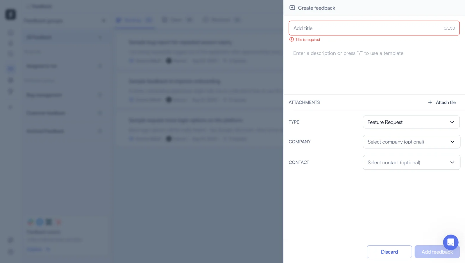
A second Zeda.io capture shows the empty title field outlined in red, with a required-title message underneath. A character counter appears at the field's right edge. The other form controls remain visible, and the Add feedback button has a pale treatment.
The error is close to the value that needs correction. Users do not have to interpret a global message and then search the panel for its cause. This placement is particularly useful in a constrained surface where a distant notification could be mistaken for a problem elsewhere in the product.
The capture does not establish when validation runs or whether the pale action is disabled. Those are implementation decisions. Specify whether errors appear after submission, after leaving a field, or during entry, and ensure that the action state matches the form's actual readiness.
Do not let the panel's narrowness force vague validation. A useful error still needs enough space to explain the correction. Test long translated messages, multiple simultaneous errors, and the first invalid field being outside the visible scroll area.
Livestorm reveals the complexity of nested save boundaries
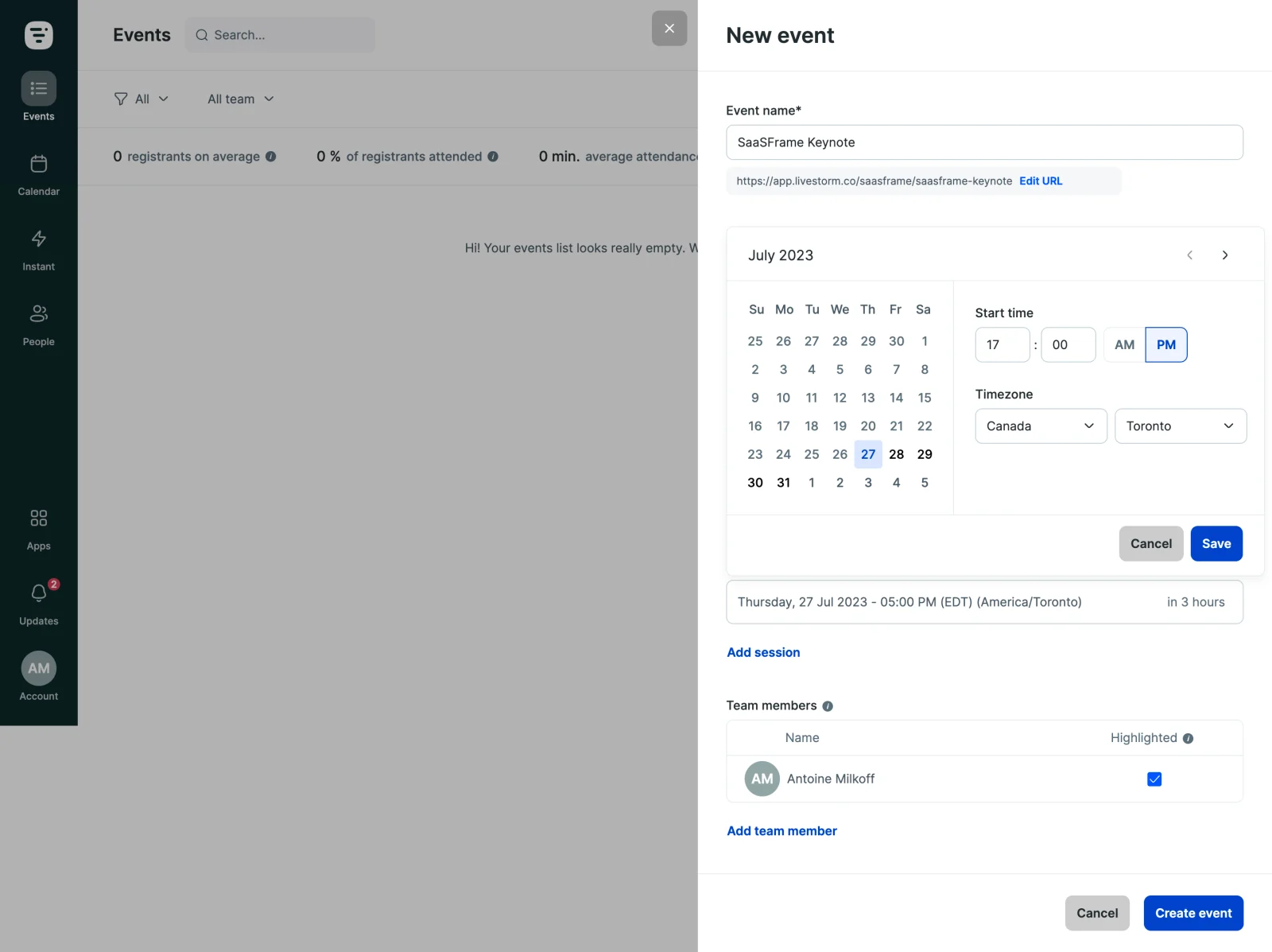
The Livestorm screenshot shows a New event panel with an event name, an editable URL area, and scheduling controls. The calendar section includes date, time, timezone, and local Cancel and Save buttons. The panel also has a final Create event action at its bottom.
This is a useful example of a task with more than one completion boundary. Saving a session's schedule is not visually the same action as creating the overall event. If users cannot distinguish those boundaries, they may believe they have completed the event when they have only confirmed one part of it.
The rendered schedule summary beneath the calendar can help connect local input with the event configuration. In your own panel, define what is pending, what is confirmed within the draft, and what becomes persistent after final submission. Labels and status should make that lifecycle understandable.
The screenshot also shows why width matters. A date grid, time controls, and timezone selectors need more room than a simple text field. A panel should be sized for its actual content rather than forced into one universal width across every task.
State whether the background remains interactive
A modal panel temporarily contains the user's task. A nonmodal panel allows interaction with the parent page, which can support comparison or browsing between records. Both approaches can work, but the interface must make the relationship clear.
Do not rely on a visual overlay to define behavior. If the background is unavailable, implement the corresponding focus and interaction rules. If it remains usable, avoid dimming it so heavily that users assume it is disabled. Test the behavior with keyboard navigation as well as pointer input.
For a nonmodal detail panel, decide what happens when the user chooses another object. The panel might update in place while preserving the collection position. If it contains unsaved edits, that transition needs a clear policy so that browsing does not accidentally discard work.
Give the panel enough width and a predictable scroll model
Panel width should follow content requirements. A concise details view can be narrow, while a scheduling form or rich-text editor may need substantially more space. If the task consumes almost the whole viewport, consider whether a dedicated page would provide a clearer experience.
Define which area scrolls: the panel body, the whole panel, or the page behind it. Unintended double scrolling can make headings and actions difficult to locate. Keep the title and completion controls discoverable without covering the content people need to read.
Test dropdowns, date pickers, tooltips, and menus opened from inside the panel. They should not be clipped by its boundaries or appear behind the overlay. A panel is often a container for other components, so its layering rules matter as much as its own appearance.
Make closing behavior reflect the state of the task
Provide an obvious close route. A close icon, Cancel action, and outside click may all be available, but they need coherent consequences. Users should not lose different amounts of work depending on which closing method they happened to choose.
Distinguish cancellation from completion. After a successful creation, return the user to a meaningful state in the parent collection and make the new object identifiable. Closing the panel without feedback can leave them unsure whether the action succeeded.
For unsaved edits, decide whether to preserve a draft, discard it, or ask before dismissal when the loss is meaningful. A confirmation is useful when it protects substantial work, but it should not interrupt every harmless inspection panel. Match the behavior to the task's actual state.
Keep focus, headings, and return navigation coherent
The panel needs a clear heading that identifies its purpose or object. Repeated generic labels such as Details can be insufficient when users open several records in sequence. Include enough identity to prevent editing the wrong object.
When the panel opens, direct attention to a sensible location. That may be the heading or the first relevant field, depending on the task. When it closes, return focus to the initiating control or another meaningful location if that control no longer exists.
Accessible behavior depends on whether the panel is modal. Define it accordingly and test the actual component with assistive technology. A right-side position does not determine semantics; the task and interaction relationship do.
Preserve the parent collection after the panel closes
The surrounding page should retain useful filters, sorting, selection, and scroll position. Otherwise, the panel has preserved visual context during the task but lost operational context afterward. Returning to the top of a long list can erase much of the pattern's benefit.
If the panel creates or changes an object that no longer matches the active filter, explain the outcome. A newly created item may be valid but invisible in the current collection. Users should not interpret that absence as a failed submission.
Consider URL and history behavior when deep linking matters. A detail panel may need a shareable object route, while a temporary create panel may not. Define browser-back behavior explicitly so that users can predict whether it closes the panel or leaves the parent page.
Adapt the task on small screens and test complete journeys
A side panel may become a full-screen surface on a narrow viewport. Preserve its heading, actions, validation, and return behavior. The change in placement should not introduce a different save model or remove necessary context.
Test opening, submitting, correcting an error, cancelling, and returning to the parent collection. Include a long form, an open nested menu, and a failed save. Observe whether users can explain what has been saved at each point, especially when the panel contains local and final actions.
- Confirm that parent context helps the task.
- Choose modal or nonmodal behavior deliberately.
- Size the panel for its real components.
- Define scrolling and layered-component behavior.
- Clarify local, draft, and final save boundaries.
- Preserve input and collection context.
- Test closing, focus return, and narrow-screen use.
Frequently asked questions about side panels
When should a side panel become a dedicated page?
Use a page when the task needs substantial space, several independent sections, or a long-lived destination. A panel is useful when it keeps a focused task connected to its parent context.
Should clicking outside close the panel?
It can suit a temporary inspection view. For a form with unsaved work, define a preservation or discard policy first. Closing methods should have consistent consequences.
Can users interact with the page behind a side panel?
They can in a nonmodal design. A modal design temporarily limits the task to the panel. Make the chosen relationship clear through both visual treatment and actual interaction behavior.
Browse side panel examples on SaaSFrame to compare in-context creation, validation, scheduling, and return paths across SaaS workflows.