.webp)

Outerbase


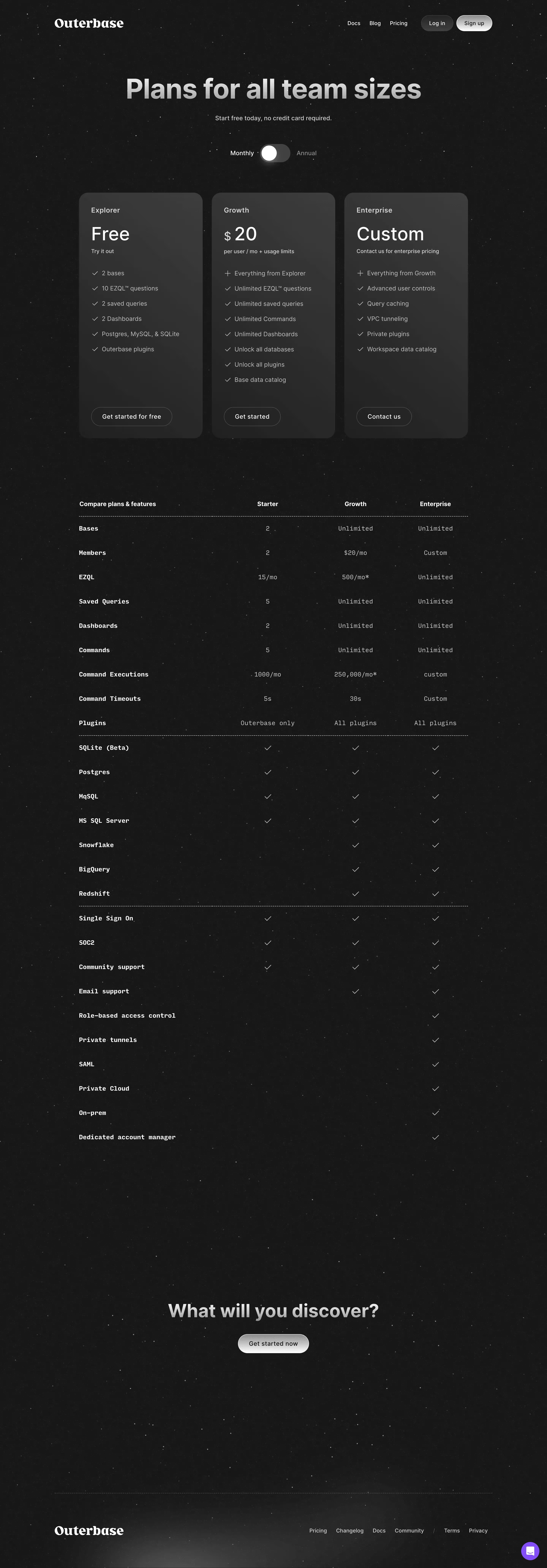

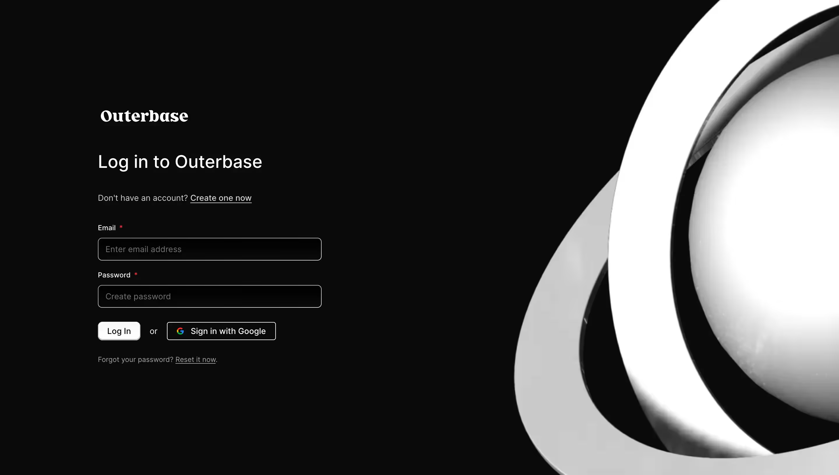
Stack
Outerbase Studio is built with Next.js 14 (App Router, RSC), TypeScript, and Tailwind CSS v4. Component primitives come from shadcn/ui ("new-york" style, slate base color, CSS variables mode). The internal design system is called Orbit, exposing semantic ob-\* utility classes and CSS custom properties. CodeMirror powers the SQL editor. The marketing site (outerbase.com) is also Next.js, deployed via Cloudflare Workers (open-next).
Typography
Primary font: Inter (self-hosted WOFF2, weights 400/500/600/700, font-display: swap). Falls back to Helvetica → ui-sans-serif → system-ui. Monospace stack: ui-monospace → SFMono-Regular → Menlo → Monaco → Consolas.
- xs: 10px / line-height ~2.0
- sm: 12px / line-height ~1.33
- base: 14px / line-height ~1.43 — default body size (compact for a data tool)
- Larger display sizes on the marketing site use standard Tailwind scale (xl, 2xl, 3xl…)
The scale is intentionally tight — optimised for information-dense database UIs, not editorial reading.
Color Philosophy
Outerbase uses a neutral-dominant, near-monochrome palette. Pure black (#000) and white (#fff) anchor the system. Accent color is almost absent — the primary brand action is rendered in dark charcoal (light mode) or near-white (dark mode), keeping the focus on user data rather than chrome. The only chromatic accent is a blue focus ring (oklch(0.707 0.165 254.624)) and red destructive states. SQL table names in the editor use a distinctive hot pink (#e84393 / #fd79a8 dark) — a deliberate pop of color as a code-syntax cue. OKLCH is used throughout the Orbit token palette for perceptually uniform steps.
Spacing
Tailwind CSS v4 default spacing scale (base unit 4px / 0.25rem). Key component heights are codified as Orbit size utilities:
- ob-size-sm: h-6.5 (26px), px-2, rounded
- ob-size-base: h-8 (32px), px-2.5, rounded-md
- ob-size-lg: h-9 (36px), px-3, rounded-md
Container max-width is 1400px with 2rem horizontal padding. Scrollbars are 6px wide/tall with transparent-until-hover thumbs.
Component Defaults
- Border radius (--radius): 0.5rem (8px) → lg. md = 6px, sm = 4px.
- Buttons: 4 semantic variants — primary (dark fill), secondary (white/light fill), ghost (no background), destructive (red fill). All require
.interactiveclass wrapper to enable hover/active states and cursor-pointer. - Focus:
.ob-focusapplies a 1px ring in--color-ob-focus(blue) via focus-visible, no outline flash. - Transitions: 100ms default (snappier than Tailwind's 150ms default). Custom bounce easing:
cubic-bezier(0.2, 0, 0, 1.5). - Accordion: 200ms ease-out height animation via Radix UI CSS variable.
- Shadows: shadow-xs on primary and secondary buttons.
- Scrollbars: Custom thin (6px) webkit scrollbars, visible only on parent hover.
Layout
The app uses a panel/window metaphor with tab-based navigation (.libsql-window-tab). The marketing site is a single-column scroll layout with full-width sections and a max-width container. Dark/light mode is toggled via the .dark class on a parent element (not prefers-color-scheme media query alone), enabling user-controlled switching. overscroll-behavior-x: none is applied globally to prevent horizontal pull-to-refresh.
/\* ============================================
   OUTERBASE / ORBIT DESIGN SYSTEM — CSS VARIABLES
   Source: github.com/outerbase/studio
   Framework: Tailwind CSS v4 + shadcn/ui (new-york)
   ============================================ \*/

:root {
  /_ ── Typography ── _/
  --font-sans: Inter, Helvetica, ui-sans-serif, system-ui, sans-serif,
               "Apple Color Emoji", "Segoe UI Emoji", "Segoe UI Symbol",
               "Noto Color Emoji";
  --font-mono: ui-monospace, SFMono-Regular, Menlo, Monaco, Consolas,
               "Liberation Mono", "Courier New", monospace;

  /_ Type scale (compact — data UI) _/
  --text-xs:   10px;   /_ line-height ≈ 2.0  _/
  --text-sm:   12px;   /_ line-height ≈ 1.33 _/
  --text-base: 14px;   /_ line-height ≈ 1.43 _/

  /_ ── Spacing / Radius ── _/
  --radius: 0.5rem;          /_ 8px  — lg _/
  /_ --radius-md = calc(var(--radius) - 2px) → 6px _/
  /_ --radius-sm = calc(var(--radius) - 4px) → 4px _/

  /_ ── Easing & Motion ── _/
  --ease-bounce: cubic-bezier(0.2, 0, 0, 1.5);
  --default-transition-duration: 100ms;

  /_ ── Semantic tokens (light mode) ── _/
  --background:           #fff;
  --foreground:           #444;
  --card:                 #fff;
  --card-foreground:      #444;
  --popover:              #fff;
  --popover-foreground:   #444;
  --primary:              #000;
  --primary-foreground:   #fff;
  --secondary:            #f5f5f5;
  --secondary-foreground: #444;
  --muted:                #eee;
  --muted-foreground:     #888;
  --accent:               #f1f5f9;
  --accent-foreground:    #444;
  --destructive:          #f1f5f9;
  --destructive-foreground: red;
  --border:               #e5e5e5;
  --input:                #e2e8f0;
  --ring:                 #ccc;
  --selected:             #e2e8f0;

  /_ Surface _/
  --color-surface:        #fff;
  --color-surface-hover:  #eee;

  /_ Scrollbars _/
  --scroll-bar:           #d4d4d4;
  --scroll-bar-hover:     #ccc;

  /_ Table grid & cell colors _/
  --color-table-grid:          #eee;
  --color-table-change:        #f6e58d;
  --color-table-cell-number:   #2980b9;
  --color-table-cell-code:     #95a5a6;
  --color-table-row-selected:  #e4e6f1;
  --color-table-row-removed:   #ff8b81;
  --color-table-row-new:       #7bed9f;

  /_ ── ORBIT base palette (light) ── _/
  --color-ob-base-100: #fff;                      /_ oklch(0.985 0 0) _/
  --color-ob-base-200: oklch(0.985 0 0);
  --color-ob-base-300: oklch(0.97 0 0);
  --color-ob-base-400: oklch(0.922 0 0);
  --color-ob-base-500: oklch(0.87 0 0);
  --color-ob-base-1000: oklch(0.205 0 0);

  --color-ob-border:        oklch(0.922 0 0);
  --color-ob-border-active: oklch(0.708 0 0);

  /_ ORBIT text _/
  --text-color-ob-base-100: oklch(0.556 0 0);
  --text-color-ob-base-200: oklch(0.439 0 0);
  --text-color-ob-base-300: oklch(0.205 0 0);
  --text-color-ob-destructive: oklch(0.577 0.245 27.325); /_ red-600 _/
  --text-color-ob-inverted: #fff;

  /_ ORBIT buttons (light) _/
  --color-ob-btn-primary-bg:             oklch(0.31 0 0);
  --color-ob-btn-primary-bg-hover:       oklch(0.23 0 0);
  --color-ob-btn-primary-border:         oklch(0.556 0 0);
  --color-ob-btn-primary-border-hover:   oklch(0.439 0 0);

  --color-ob-btn-secondary-bg:           #fff;
  --color-ob-btn-secondary-bg-hover:     oklch(0.985 0 0);
  --color-ob-btn-secondary-border:       oklch(0.922 0 0);
  --color-ob-btn-secondary-border-hover: oklch(0.87 0 0);

  --color-ob-btn-ghost-bg-hover:         oklch(0.96 0 0);

  --color-ob-btn-destructive-bg:         oklch(0.577 0.245 27.325);
  --color-ob-btn-destructive-bg-hover:   oklch(0.55 0.238 27.4);
  --color-ob-btn-destructive-border:     oklch(0.704 0.191 22.216); /_ red-400 _/
  --color-ob-btn-destructive-border-hover: oklch(0.645 0.246 16.439); /_ red-500 _/

  /_ Focus _/
  --color-ob-focus: oklch(0.707 0.165 254.624); /_ blue-400 _/
}

/_ ── Dark mode overrides ── _/
.dark {
  --background:           #0a0a0a;
  --foreground:           #aaa;
  --card:                 #222;
  --card-foreground:      #eee;
  --popover:              #111;
  --popover-foreground:   #eee;
  --primary:              #fff;
  --primary-foreground:   #000;
  --secondary:            #171717;
  --secondary-foreground: #eee;
  --muted:                #333;
  --muted-foreground:     #888;
  --accent:               #2a2d2e;
  --accent-foreground:    #eee;
  --destructive:          red;
  --destructive-foreground: #fff;
  --border:               #262626;
  --input:                #333;
  --ring:                 #444;
  --selected:             #222;

  --color-surface:        #000;
  --color-surface-hover:  #3f3f3f;
  --scroll-bar:           #353535;
  --scroll-bar-hover:     #444;

  /_ ORBIT dark overrides _/
  --color-ob-base-100: oklch(0.145 0 0);
  --color-ob-base-200: oklch(0.205 0 0);
  --color-ob-base-300: oklch(0.23 0 0);
  --color-ob-base-400: oklch(0.269 0 0);
  --color-ob-base-500: oklch(0.31 0 0);
  --color-ob-base-1000: oklch(0.985 0 0);

  --color-ob-border:        oklch(0.269 0 0);
  --color-ob-border-active: oklch(0.371 0 0);

  --text-color-ob-base-100: oklch(0.556 0 0);
  --text-color-ob-base-200: oklch(0.708 0 0);
  --text-color-ob-base-300: oklch(0.985 0 0);
  --text-color-ob-destructive: oklch(0.704 0.191 22.216); /_ red-400 _/
  --text-color-ob-inverted: oklch(0.205 0 0);

  --color-ob-btn-primary-bg:             oklch(0.87 0 0);
  --color-ob-btn-primary-bg-hover:       oklch(0.9 0 0);
  --color-ob-btn-primary-border:         oklch(0.97 0 0);
  --color-ob-btn-primary-border-hover:   #fff;

  --color-ob-btn-secondary-bg:           oklch(0.205 0 0);
  --color-ob-btn-secondary-bg-hover:     oklch(0.23 0 0);
  --color-ob-btn-secondary-border:       oklch(0.269 0 0);
  --color-ob-btn-secondary-border-hover: oklch(0.31 0 0);

  --color-ob-btn-ghost-bg-hover:         oklch(0.23 0 0);

  --color-ob-btn-destructive-bg:         oklch(0.424 0.199 265.638); /_ reuses blue-800 slot for red-800 _/
  --color-ob-btn-destructive-bg-hover:   oklch(0.46 0.195 27.2);
  --color-ob-btn-destructive-border:     oklch(0.396 0.141 25.723); /_ red-700 _/
  --color-ob-btn-destructive-border-hover: oklch(0.577 0.245 27.325);

  --color-ob-focus: oklch(0.424 0.199 265.638); /_ blue-800 _/
}
Color Tokens
| Token | Value (light) | Usage |
|---|---|---|
| --background | #fff | Page / app canvas |
| --foreground | #444 | Default body text |
| --primary | #000 | Primary button fill, strong text |
| --primary-foreground | #fff | Text on primary button |
| --secondary | #f5f5f5 | Secondary button background |
| --muted | #eee | Dividers, disabled backgrounds |
| --muted-foreground | #888 | Placeholder / hint text |
| --accent | #f1f5f9 | Hover highlights, subtle fills |
| --border | #e5e5e5 | Default borders |
| --ring | #ccc | Generic focus ring fallback |
| --destructive-foreground | red | Error / delete text |
| --color-ob-focus | oklch(0.707 0.165 254.6) — blue-400 | Keyboard focus ring (Orbit) |
| --color-table-cell-number | #2980b9 | Numeric cell values |
| --color-table-row-new | #7bed9f | Newly inserted rows |
| --color-table-row-removed | #ff8b81 | Deleted / staged-remove rows |
| --color-table-change | #f6e58d | Edited (unsaved) cells |
| .cm-table-name (SQL editor) | #e84393 / dark: #fd79a8 | Table name syntax highlight |
Spacing Tokens
| Token | Value | Usage |
|---|---|---|
| Base unit | 4px (0.25rem) | Tailwind spacing scale base |
| Container padding | 2rem (32px) | Horizontal page padding |
| Container max-width | 1400px | Marketing site cap |
| ob-size-sm height | h-6.5 = 26px | Small buttons, compact inputs |
| ob-size-base height | h-8 = 32px | Default button/input height |
| ob-size-lg height | h-9 = 36px | Large interactive elements |
| Scrollbar width/height | 6px | Custom webkit scrollbar |
Typography Tokens
| Token | Value | Usage |
|---|---|---|
| --font-sans | Inter, Helvetica, ui-sans-serif… | All UI text |
| --font-mono | ui-monospace, SFMono-Regular, Menlo… | Code, SQL, query editor |
| --text-xs | 10px / lh ~2.0 | Labels, badges, tiny metadata |
| --text-sm | 12px / lh ~1.33 | Secondary labels, captions |
| --text-base | 14px / lh ~1.43 | Primary body / UI text |
| Font weights used | 400, 500, 600, 700 | Regular → Bold (Inter) |
Border Radius Tokens
| Token | Value | Usage |
|---|---|---|
| --radius (lg) | 0.5rem (8px) | Cards, modals, larger panels |
| --radius-md | calc(--radius - 2px) = 6px | Buttons (base, lg), inputs |
| --radius-sm | calc(--radius - 4px) = 4px | Small buttons, chips |
| rounded-full | 9999px | Circular icon buttons (.circular) |
| Scrollbar thumb | 8px | Custom scrollbar rounding |
Shadow & Motion Tokens
| Token | Value | Usage |
|---|---|---|
| shadow-xs | Tailwind xs shadow | Primary & secondary buttons |
| --default-transition-duration | 100ms | All transition-colors (snappier than TW default) |
| --ease-bounce | cubic-bezier(0.2, 0, 0, 1.5) | Springy open/close motions |
| accordion-down/up | 0.2s ease-out (Radix height var) | Accordion expand/collapse |
| shake | 0.82s cubic-bezier(0.36, 0.07, 0.19, 0.97) | Error shake on invalid input |
| refresh spin | 0.5s ease-in-out infinite + scale(0.9) | Loading/refresh indicator |
| float | 5s linear infinite alternate, translate(5px,15px) | Marketing hero astronaut image |
Framework & tooling: Next.js 14 (App Router) + TypeScript + Tailwind CSS v4. shadcn/ui components in "new-york" style with CSS-variable mode enabled. The internal system is named Orbit — it surfaces as ob-_ prefixed CSS custom properties and utility classes (.ob-btn, .ob-focus, .ob-disable, .ob-size-_).
Theme support: Full light/dark mode via .dark class on a parent element. Both modes are fully specified — not just inverted. Dark mode is notably darker than most SaaS products: background is #0a0a0a (near-true black), card is #222, popover is #111. This suits a terminal/data-tool audience.
Data confidence: High — CSS extracted directly from the open-source repository (github.com/outerbase/studio, src/app/globals.css). The studio app and the marketing site share the same design system. Marketing site uses Next.js static output served from the same Cloudflare deployment.
- OKLCH throughout Orbit palette: All neutral steps use OKLCH for perceptual uniformity. Custom steps (150, 250, 450, 750, 850, 925) fill gaps in Tailwind's default scale — Outerbase extended the neutral ramp to 14 stops for fine-grained UI differentiation.
- Chromatic color is nearly absent: The only hues in the system are blue (focus ring), red (destructive), and hot pink (SQL syntax highlight). Everything else is achromatic neutral. This is a deliberate choice for a data-display tool — user data takes visual priority.
- Orbit button architecture: Buttons require two classes — the base
.ob-btnplus a variant (.btn-primary,.btn-secondary,.btn-ghost,.btn-destructive). Hover/active states are gated behind an.interactiveparent class, and toggle states via.toggle. Square and circular shape variants are via.square/.circularparents. This context-class pattern is unusual and worth noting for implementation. - Acquired by Cloudflare: As of 2025, Outerbase joined Cloudflare. The studio is deployable as a Cloudflare Worker (wrangler.jsonc present) and Cloudflare D1 is a first-class supported database. The design system may evolve toward alignment with Cloudflare's design language.
- Marketing site vs. app: The marketing site (outerbase.com) is a Next.js static/SSR site sharing the same token system, with larger display typography for hero sections and additional animated elements (floating astronaut, star background WebP). These are decorative only and not part of the Orbit system.
- CodeMirror SQL editor: Custom syntax token for table names (
.cm-table-name) uses hot pink — the only saturated color in the app UI layer — making it a recognisable brand-adjacent signature color for the product.
Biggest SaaS library.


.webp)


.webp)

Desktop & mobile versions.


Access the Figma files.


Advanced filtering.
Let it flow.





Save design inspirations.
research




How do you process payment?
SaaSFrame subscriptions are sold on Lemon Squeezy, a secured online selling platform for creators.
What about future updates and versions?
SaaSFrame gets updated all the time! Every new update and version will immediately be made available to all SaaSFrame users.
Can you send me an invoice?
You can generate an invoice on your Lemon Squeezy portal once you purchased SaaSFrame. You will find the link in the order confirmation email.
How can I cancel my membership subscription?
You can cancel your membership subscription at any moment on your profile page.
Can I get a refund?
If you're not satisfied, you can ask for a refund within 7 days. Just send me an email at antoine[at]unmake[dot]io
I have another question.
You can send me an email at antoine[at]unmake[dot]io, I'll be happy to help with any questions.