.webp)

Tailscale





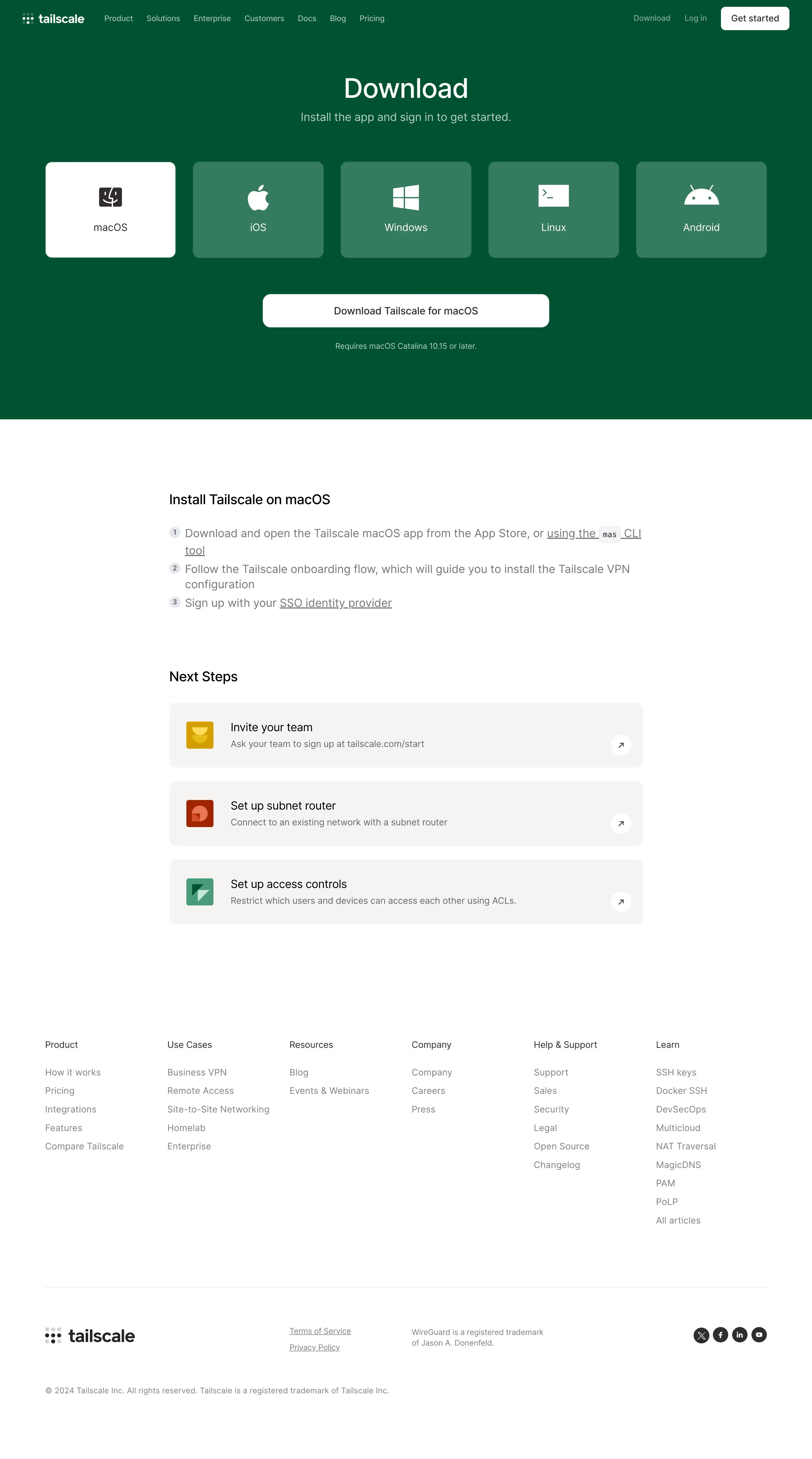


Tailscale Design System
Stack \- Marketing site: Next.js (React), hosted on Vercel \- Web admin UI: Vite + React + TypeScript (open-source in tailscale/tailscale repo) \- CMS: Sanity (w77i7m8x project, production-v2 dataset) \- Styling: Tailwind CSS utility-first; CSS custom properties for theming \- Icons: Custom SVG icon set; some inline SVGs via Sanity CDN
Typography \- Primary font: Inter (sans-serif); fallback system-ui stack \- Headings: Bold weight (700–800), tight letter-spacing, large scale on hero sections \- Body: Regular (400) / Medium (500), 16–18px base, generous line-height (~1.6) \- Code/technical: Monospace stack (JetBrains Mono or system mono) in docs \- Scale: Uses a modular type scale — xs/sm/base/lg/xl/2xl/3xl/4xl/5xl
Color Philosophy \- Brand identity: Deep plum/purple (#492847) as primary brand anchor \- Background: Pure white (#ffffff) on light mode; near-black on dark contexts \- Accent/CTA: Coral-orange or electric blue for primary buttons and highlights \- Neutral palette: Cool grays from near-white to near-black \- Text: Near-black (#111827) on light; white on dark sections \- Success/Error/Warning: Standard semantic greens, reds, ambers \- Docs use #fff theme-color; marketing uses #492847 for tile/PWA color
Spacing \- Base unit: 4px (Tailwind default) \- Component padding: 12–16px (buttons), 24–32px (cards/sections) \- Section gaps: 64–96px vertical rhythm on marketing pages \- Container max-width: ~1280px with auto horizontal margins
Border Radius \- Buttons: Full pill (9999px) for CTAs; 8px for secondary \- Cards: 12–16px rounded corners \- Inputs: 6–8px \- Badges/chips: Full pill
Shadows \- Subtle drop shadows on cards (0 1px 3px rgba(0,0,0,0.1)) \- Elevated modals/popovers use layered box-shadow \- Marketing hero sections use large diffuse colored glows
Layout \- 12-column CSS Grid on desktop; single-column mobile \- Sticky top navigation bar (~64px height) \- Sidebar layout on docs pages (left nav + content + right TOC) \- Feature sections alternate image-left / image-right in 2-col grid
Component Defaults \- Buttons: Pill-shaped primary (plum/dark bg, white text); ghost secondary \- Nav: Transparent → white on scroll; mega-menu dropdowns \- Cards: White bg, subtle border, rounded-xl, hover shadow lift \- Badges: Small pill, colored by category (product, insight, etc.) \- Code blocks: Dark bg, monospace, syntax highlighted
:root { / Brand Colors / --color-brand-primary: #492847; / Deep plum — logo, tile color / --color-brand-accent: #3b82f6; / Electric blue — links, highlights / --color-brand-cta: #f97316; / Coral orange — primary CTA buttons /
/ Neutral Palette / --color-gray-50: #f9fafb; --color-gray-100: #f3f4f6; --color-gray-200: #e5e7eb; --color-gray-300: #d1d5db; --color-gray-400: #9ca3af; --color-gray-500: #6b7280; --color-gray-600: #4b5563; --color-gray-700: #374151; --color-gray-800: #1f2937; --color-gray-900: #111827;
/ Semantic Colors / --color-success: #22c55e; --color-warning: #f59e0b; --color-error: #ef4444; --color-info: #3b82f6;
/ Backgrounds / --color-bg-primary: #ffffff; --color-bg-secondary: #f9fafb; --color-bg-tertiary: #f3f4f6; --color-bg-dark: #0f172a;
/ Text / --color-text-primary: #111827; --color-text-secondary: #4b5563; --color-text-muted: #9ca3af; --color-text-inverse: #ffffff;
/ Typography / --font-sans: 'Inter', system-ui, -apple-system, BlinkMacSystemFont, 'Segoe UI', sans-serif; --font-mono: 'JetBrains Mono', 'Fira Code', ui-monospace, 'Cascadia Code', monospace; --font-size-xs: 0.75rem; / 12px / --font-size-sm: 0.875rem; / 14px / --font-size-base: 1rem; / 16px / --font-size-lg: 1.125rem; / 18px / --font-size-xl: 1.25rem; / 20px / --font-size-2xl: 1.5rem; / 24px / --font-size-3xl: 1.875rem; / 30px / --font-size-4xl: 2.25rem; / 36px / --font-size-5xl: 3rem; / 48px / --font-weight-normal: 400; --font-weight-medium: 500; --font-weight-semibold: 600; --font-weight-bold: 700; --font-weight-extrabold: 800; --line-height-tight: 1.25; --line-height-normal: 1.5; --line-height-relaxed: 1.625;
/ Spacing (4px base unit) / --space-1: 0.25rem; / 4px / --space-2: 0.5rem; / 8px / --space-3: 0.75rem; / 12px / --space-4: 1rem; / 16px / --space-5: 1.25rem; / 20px / --space-6: 1.5rem; / 24px / --space-8: 2rem; / 32px / --space-10: 2.5rem; / 40px / --space-12: 3rem; / 48px / --space-16: 4rem; / 64px / --space-20: 5rem; / 80px / --space-24: 6rem; / 96px /
/ Border Radius / --radius-sm: 0.25rem; / 4px / --radius-md: 0.5rem; / 8px / --radius-lg: 0.75rem; / 12px / --radius-xl: 1rem; / 16px / --radius-2xl: 1.5rem; / 24px / --radius-full: 9999px;
/ Shadows / --shadow-sm: 0 1px 2px 0 rgba(0, 0, 0, 0.05); --shadow-md: 0 4px 6px -1px rgba(0, 0, 0, 0.1), 0 2px 4px -1px rgba(0, 0, 0, 0.06); --shadow-lg: 0 10px 15px -3px rgba(0, 0, 0, 0.1), 0 4px 6px -2px rgba(0, 0, 0, 0.05); --shadow-xl: 0 20px 25px -5px rgba(0, 0, 0, 0.1), 0 10px 10px -5px rgba(0, 0, 0, 0.04); --shadow-glow: 0 0 60px 20px rgba(73, 40, 71, 0.15); / Brand plum glow /
/ Layout / --container-max-width: 1280px; --nav-height: 64px; --sidebar-width: 280px;
/ Transitions / --transition-fast: 150ms ease; --transition-normal: 200ms ease; --transition-slow: 300ms ease; }
/ Dark mode / @media (prefers-color-scheme: dark) { :root { --color-bg-primary: #0f172a; --color-bg-secondary: #1e293b; --color-bg-tertiary: #1e2337; --color-text-primary: #f1f5f9; --color-text-secondary: #94a3b8; --color-text-muted: #64748b; --color-gray-800: #1e293b; --color-gray-900: #0f172a; --shadow-md: 0 4px 6px -1px rgba(0, 0, 0, 0.4), 0 2px 4px -1px rgba(0, 0, 0, 0.3); } }
Color Tokens
| Token | Value | Usage |
|---|---|---|
| brand-primary | #492847 | Logo, PWA tile, brand anchor |
| brand-accent | #3b82f6 | Links, interactive highlights |
| brand-cta | #f97316 | Primary CTA buttons |
| gray-50 | #f9fafb | Page backgrounds |
| gray-100 | #f3f4f6 | Card backgrounds, stripes |
| gray-200 | #e5e7eb | Borders, dividers |
| gray-500 | #6b7280 | Placeholder, disabled text |
| gray-700 | #374151 | Secondary text |
| gray-900 | #111827 | Primary text (light mode) |
| success | #22c55e | Connected/online status |
| warning | #f59e0b | Warnings, expiring keys |
| error | #ef4444 | Errors, disconnected status |
| bg-dark | #0f172a | Dark sections, code blocks |
Spacing
| Token | Value | Pixels |
|---|---|---|
| space-1 | 0.25rem | 4px |
| space-2 | 0.5rem | 8px |
| space-3 | 0.75rem | 12px |
| space-4 | 1rem | 16px |
| space-6 | 1.5rem | 24px |
| space-8 | 2rem | 32px |
| space-12 | 3rem | 48px |
| space-16 | 4rem | 64px |
| space-24 | 6rem | 96px |
Typography
| Token | Value |
|---|---|
| font-sans | Inter, system-ui, sans-serif |
| font-mono | JetBrains Mono, ui-monospace |
| text-xs | 12px / 0.75rem |
| text-sm | 14px / 0.875rem |
| text-base | 16px / 1rem |
| text-lg | 18px / 1.125rem |
| text-xl | 20px / 1.25rem |
| text-2xl | 24px / 1.5rem |
| text-3xl | 30px / 1.875rem |
| text-4xl | 36px / 2.25rem |
| text-5xl | 48px / 3rem |
| font-normal | 400 |
| font-medium | 500 |
| font-semibold | 600 |
| font-bold | 700 |
| font-extrabold | 800 |
| leading-tight | 1.25 |
| leading-normal | 1.5 |
| leading-relaxed | 1.625 |
Border Radius
| Token | Value | Usage |
|---|---|---|
| radius-sm | 4px | Inputs, small elements |
| radius-md | 8px | Buttons (secondary), tags |
| radius-lg | 12px | Cards |
| radius-xl | 16px | Large cards, panels |
| radius-2xl | 24px | Hero modules, feature panels |
| radius-full | 9999px | Pill buttons, badges, avatars |
Shadows
| Token | Value | Usage |
|---|---|---|
| shadow-sm | 0 1px 2px rgba(0,0,0,0.05) | Subtle lift |
| shadow-md | 0 4px 6px rgba(0,0,0,0.1) | Cards |
| shadow-lg | 0 10px 15px rgba(0,0,0,0.1) | Dropdowns, popovers |
| shadow-xl | 0 20px 25px rgba(0,0,0,0.1) | Modals, elevated panels |
| shadow-glow | 0 0 60px 20px rgba(73,40,71,0.15) | Brand hero glow |
Framework & Tooling \- Marketing site: Next.js 13+ (App Router), deployed on Vercel. Server-side rendered with Sanity CMS for content. \- Web admin UI: Vite + React + TypeScript (open-source in [github.com/tailscale/tailscale](http://github.com/tailscale/tailscale) /web directory). \- Styling approach: Tailwind CSS utility classes; no dedicated CSS-in-JS library detected. \- Component model: Likely uses Headless UI or Radix UI primitives for accessible dropdowns and modals given the mega-menu pattern.
Theme Support \- Light mode: Default white (#ffffff) theme-color. \- Dark mode: Partial — docs pages and code sections use dark backgrounds (#0f172a). The marketing site is primarily light-mode-first but includes dark hero sections. \- PWA/tile color: #492847 (deep plum) registered in meta msapplication-TileColor.
Data Confidence \- High confidence: Brand plum #492847 (directly from msapplication-TileColor meta tag), white background, Next.js stack, Sanity CMS, Vercel hosting, Inter font family. \- Medium confidence: Exact CTA orange/blue values (inferred from screenshot analysis and common Tailscale marketing materials); Tailwind spacing scale (standard Tailwind defaults match observed layout rhythm). \- Lower confidence: Exact shadow values, internal component-level radius tokens (could not access live CSS files — site blocks curl with 403, Chrome extension unavailable, GitHub raw files returned empty).
Notable Patterns \- Pill-shaped primary CTAs: "Get started — it's free!" uses full border-radius pill buttons, consistent across all pages. \- Mega-menu navigation: Structured multi-column dropdown with grouped links and promotional panels. \- Alternating section layouts: Marketing pages alternate image-left/image-right 2-column grids with large SVG illustrations. \- Sanity CDN for all images: All marketing images served from [cdn.sanity.io/images/w77i7m8x/production-v2/](http://cdn.sanity.io/images/w77i7m8x/production-v2/). \- Developer-focused copy: Technical tone with code snippets inline in content; docs site uses a 3-panel layout (sidebar nav + content + right TOC). \- Status-driven UI elements: Admin UI shows device connectivity status with green/red/gray indicators — semantic color use is critical. \- No dark-mode toggle observed: Theme appears to follow OS preference without explicit toggle in the UI.
Biggest SaaS library.


.webp)


.webp)

Desktop & mobile versions.


Access the Figma files.


Advanced filtering.
Let it flow.





Save design inspirations.
research




How do you process payment?
SaaSFrame subscriptions are sold on Lemon Squeezy, a secured online selling platform for creators.
What about future updates and versions?
SaaSFrame gets updated all the time! Every new update and version will immediately be made available to all SaaSFrame users.
Can you send me an invoice?
You can generate an invoice on your Lemon Squeezy portal once you purchased SaaSFrame. You will find the link in the order confirmation email.
How can I cancel my membership subscription?
You can cancel your membership subscription at any moment on your profile page.
Can I get a refund?
If you're not satisfied, you can ask for a refund within 7 days. Just send me an email at antoine[at]unmake[dot]io
I have another question.
You can send me an email at antoine[at]unmake[dot]io, I'll be happy to help with any questions.