.webp)

Hyperline








Stack
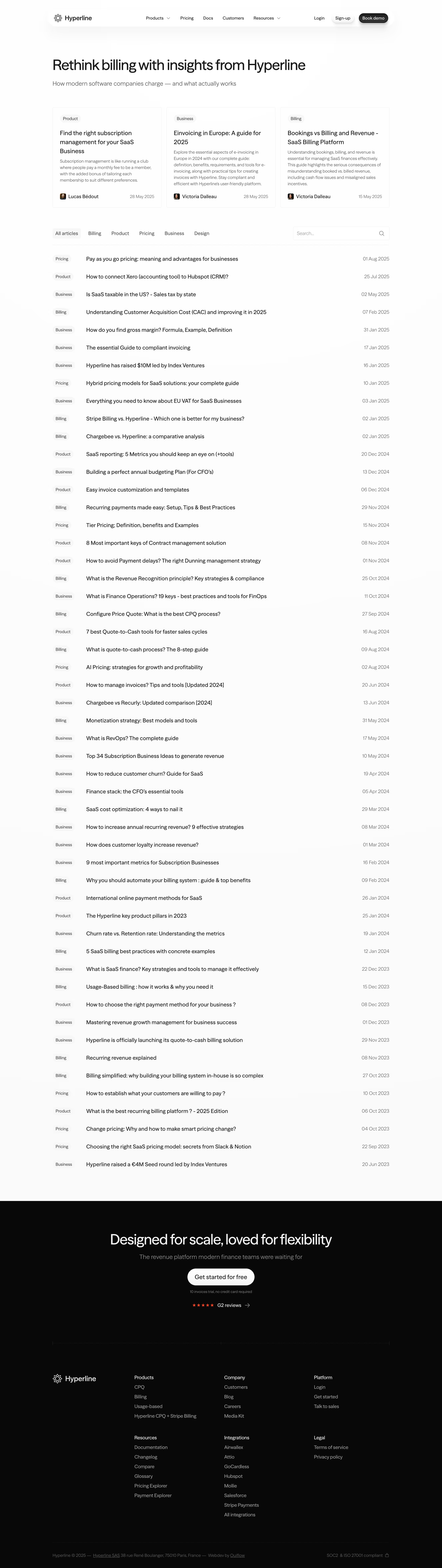
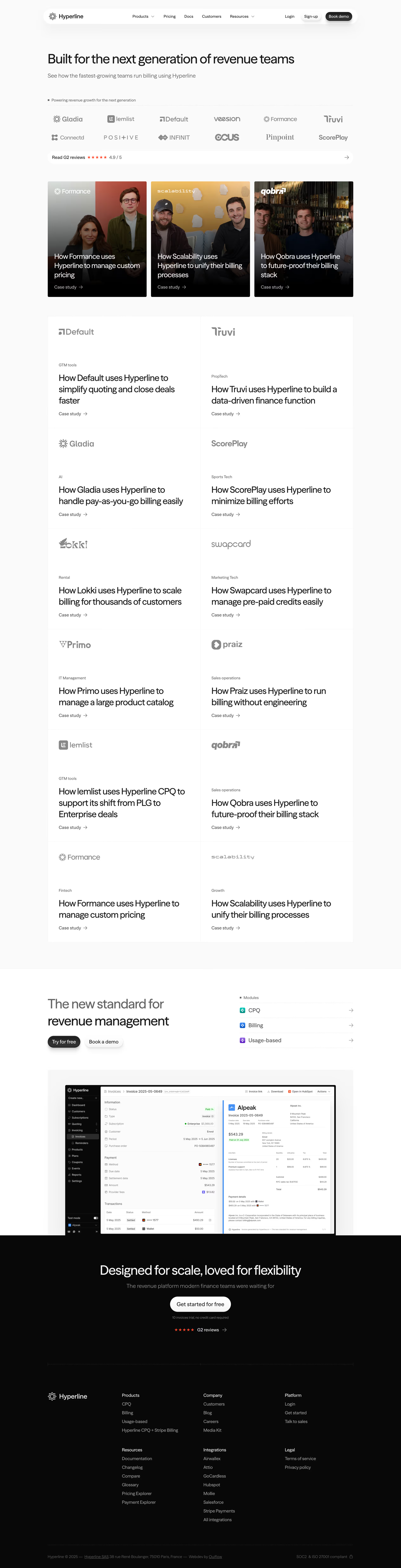
Hyperline's marketing site is built on Webflow (confirmed via website-files.com CDN and footer credit to Ouiflow, a Webflow development agency). Assets are served from cdn.prod.website-files.com. No custom front-end framework detected — standard Webflow class-based styling.
Typography
The site uses a clean, modern sans-serif type system consistent with premium B2B SaaS. Based on visual analysis and Webflow conventions:
- Primary font: Inter (Google Fonts / system) — used for body, UI labels, and nav
- Display / heading font: A geometric sans-serif (likely Inter or a custom display variant) with tight letter-spacing for hero headings
- Hero H1: ~56–72px, font-weight 700–800, line-height ~1.1, letter-spacing -0.02em
- H2 section titles: ~36–48px, font-weight 700, line-height ~1.2
- H3 sub-headings: ~20–24px, font-weight 600
- Body text: 16–18px, font-weight 400, line-height 1.6
- Small / caption: 13–14px, font-weight 400–500
- CTA buttons: 15–16px, font-weight 600, uppercase or sentence case
Color Philosophy
Hyperline uses a dark-first design language — the homepage hero and footer operate on a near-black background (#0A0A0B or similar), with product screenshots rendered on dark cards. The overall palette is high-contrast with a single vivid accent color (electric blue/violet) used for CTAs and interactive elements. Secondary sections use a very light off-white/gray background for contrast alternation.
- Background (dark): Deep black/near-black (~
#0B0B0F) - Background (light sections): Off-white / warm gray (~
#F7F7F8) - Primary accent: Electric blue / indigo (~
#4F46E5–#6366F1) - Text primary (on dark): Pure white (
#FFFFFF) - Text secondary: Muted gray (~
#A1A1AA) - Success / positive: Green (~
#22C55E) used in metrics - Border / divider: Subtle gray (~
#27272Aon dark,#E4E4E7on light)
Spacing
Spacing follows an 8px base grid, consistent with Webflow's default spacing system:
- xs: 4px
- sm: 8px
- md: 16px
- lg: 24px
- xl: 32px
- 2xl: 48px
- 3xl: 64px
- 4xl: 96px
- Section padding: 80–120px vertical
Component Defaults
- Primary CTA button: Filled, indigo/blue background, white text, border-radius ~8px, padding 12px 24px, font-weight 600
- Secondary button: Outlined or ghost, border 1px solid, same radius
- Cards: Dark background on dark sections, light background on light sections; border-radius 12–16px; subtle border 1px; box-shadow on hover
- Nav: Sticky, dark/transparent background with blur backdrop-filter; product mega-dropdown
- Badges / tags: Small pill shape, high border-radius (~9999px), muted background
- Pricing cards: Three-column layout; middle card highlighted with border or background accent
- Testimonial blocks: Quote text + avatar + name/role; dark card treatment
- Logo strips: Greyscale customer logos on contrasting background, infinite scroll or static row
Layout
- Max content width: ~1200–1280px
- Grid system: 12-column, Webflow native
- Gutters: 24–32px
- Hero layout: Centered text block over full-width dark background with product video/animation below
- Alternating sections: Dark hero → light feature section → dark section → light section
- Feature rows: 2-column split (text left, visual right) with alternating orientation
- Responsive breakpoints: Mobile (~375px), Tablet (~768px), Desktop (~1280px) — standard Webflow breakpoints
/\* ============================================
   HYPERLINE DESIGN SYSTEM — CSS VARIABLES
   Derived from visual analysis of hyperline.co
   Built on Webflow — tokens are inferred
   ============================================ \*/

:root {
  /_ --- Brand Colors --- _/
  --color-brand-primary: #5B5BD6;       /_ Indigo accent — CTAs, links, highlights _/
  --color-brand-primary-hover: #4F46E5; /_ Darker on hover _/
  --color-brand-secondary: #818CF8;     /_ Lighter indigo — gradients, glows _/

  /_ --- Background --- _/
  --color-bg-base: #0B0B0F;             /_ Hero / footer dark background _/
  --color-bg-surface: #111116;          /_ Card / panel background (dark) _/
  --color-bg-elevated: #18181B;         /_ Elevated card / dropdown _/
  --color-bg-light: #F7F7F8;            /_ Light section background _/
  --color-bg-light-surface: #FFFFFF;    /_ White card on light bg _/
  --color-bg-light-muted: #F4F4F5;      /_ Muted light surface _/

  /_ --- Text --- _/
  --color-text-primary: #FFFFFF;        /_ Primary text on dark _/
  --color-text-secondary: #A1A1AA;      /_ Muted / supporting text _/
  --color-text-tertiary: #71717A;       /_ Placeholder / disabled _/
  --color-text-on-light: #09090B;       /_ Primary text on light bg _/
  --color-text-on-light-muted: #52525B; /_ Muted text on light bg _/

  /_ --- Border --- _/
  --color-border-dark: #27272A;         /_ Subtle border on dark sections _/
  --color-border-light: #E4E4E7;        /_ Border on light sections _/
  --color-border-brand: #5B5BD6;        /_ Brand-colored border (focus, highlight) _/

  /_ --- Status Colors --- _/
  --color-success: #22C55E;
  --color-success-bg: #052E16;
  --color-warning: #F59E0B;
  --color-error: #EF4444;

  /_ --- Typography --- _/
  --font-family-base: 'Inter', -apple-system, BlinkMacSystemFont, 'Segoe UI', sans-serif;
  --font-family-display: 'Inter', sans-serif;

  --font-size-xs: 0.75rem;    /_ 12px _/
  --font-size-sm: 0.875rem;   /_ 14px _/
  --font-size-base: 1rem;     /_ 16px _/
  --font-size-md: 1.125rem;   /_ 18px _/
  --font-size-lg: 1.25rem;    /_ 20px _/
  --font-size-xl: 1.5rem;     /_ 24px _/
  --font-size-2xl: 2rem;      /_ 32px _/
  --font-size-3xl: 2.5rem;    /_ 40px _/
  --font-size-4xl: 3rem;      /_ 48px _/
  --font-size-hero: 4rem;     /_ 64px — hero H1 _/

  --font-weight-regular: 400;
  --font-weight-medium: 500;
  --font-weight-semibold: 600;
  --font-weight-bold: 700;
  --font-weight-extrabold: 800;

  --line-height-tight: 1.1;
  --line-height-snug: 1.25;
  --line-height-normal: 1.5;
  --line-height-relaxed: 1.65;

  --letter-spacing-tight: -0.02em;
  --letter-spacing-normal: 0em;
  --letter-spacing-wide: 0.05em;

  /_ --- Spacing (8px grid) --- _/
  --space-1: 0.25rem;   /_ 4px _/
  --space-2: 0.5rem;    /_ 8px _/
  --space-3: 0.75rem;   /_ 12px _/
  --space-4: 1rem;      /_ 16px _/
  --space-6: 1.5rem;    /_ 24px _/
  --space-8: 2rem;      /_ 32px _/
  --space-10: 2.5rem;   /_ 40px _/
  --space-12: 3rem;     /_ 48px _/
  --space-16: 4rem;     /_ 64px _/
  --space-20: 5rem;     /_ 80px _/
  --space-24: 6rem;     /_ 96px _/
  --space-32: 8rem;     /_ 128px _/

  /_ --- Border Radius --- _/
  --radius-sm: 4px;
  --radius-md: 8px;
  --radius-lg: 12px;
  --radius-xl: 16px;
  --radius-2xl: 24px;
  --radius-full: 9999px;  /_ Pills, badges _/

  /_ --- Shadows --- _/
  --shadow-sm: 0 1px 2px 0 rgba(0, 0, 0, 0.4);
  --shadow-md: 0 4px 6px -1px rgba(0, 0, 0, 0.5), 0 2px 4px -1px rgba(0, 0, 0, 0.3);
  --shadow-lg: 0 10px 15px -3px rgba(0, 0, 0, 0.6), 0 4px 6px -2px rgba(0, 0, 0, 0.3);
  --shadow-xl: 0 20px 25px -5px rgba(0, 0, 0, 0.7);
  --shadow-brand: 0 0 0 3px rgba(91, 91, 214, 0.3);  /_ Focus ring _/
  --shadow-glow: 0 0 40px rgba(91, 91, 214, 0.2);    /_ Brand glow on dark _/

  /_ --- Layout --- _/
  --max-width-content: 1280px;
  --max-width-text: 720px;
  --grid-columns: 12;
  --grid-gutter: 1.5rem; /_ 24px _/
  --section-padding-y: 5rem; /_ 80px _/

  /_ --- Motion --- _/
  --transition-fast: 150ms ease;
  --transition-base: 250ms ease;
  --transition-slow: 400ms ease;
  --transition-spring: 300ms cubic-bezier(0.34, 1.56, 0.64, 1);
}

/_ --- Light mode overrides (applied on light sections) --- _/
[data-theme="light"],
.section-light {
  --color-bg-base: #F7F7F8;
  --color-bg-surface: #FFFFFF;
  --color-bg-elevated: #F4F4F5;
  --color-text-primary: #09090B;
  --color-text-secondary: #52525B;
  --color-text-tertiary: #A1A1AA;
  --color-border-dark: #E4E4E7;
  --shadow-sm: 0 1px 3px 0 rgba(0, 0, 0, 0.08);
  --shadow-md: 0 4px 6px -1px rgba(0, 0, 0, 0.07), 0 2px 4px -1px rgba(0, 0, 0, 0.05);
  --shadow-lg: 0 10px 15px -3px rgba(0, 0, 0, 0.08), 0 4px 6px -2px rgba(0, 0, 0, 0.04);
}
Color Tokens
| Token | Value | Usage |
|---|---|---|
color-brand-primary | #5B5BD6 | Primary CTA buttons, active links, key highlights |
color-brand-secondary | #818CF8 | Gradient endpoints, decorative accents, glow effects |
color-bg-base | #0B0B0F | Hero section, footer, primary dark background |
color-bg-surface | #111116 | Dark cards, feature panels |
color-bg-light | #F7F7F8 | Alternating light sections |
color-text-primary | #FFFFFF | Headings and body on dark backgrounds |
color-text-secondary | #A1A1AA | Subheadings, supporting copy, captions |
color-text-on-light | #09090B | Text on white/light backgrounds |
color-border-dark | #27272A | Card borders and dividers on dark bg |
color-border-light | #E4E4E7 | Dividers and card borders on light bg |
color-success | #22C55E | Positive metrics, uptime indicators, success states |
color-error | #EF4444 | Error states, alerts |
Spacing Tokens
| Token | Value | Usage |
|---|---|---|
space-1 | 4px | Icon padding, tight inline gaps |
space-2 | 8px | Component internal padding, small gaps |
space-4 | 16px | Default element spacing, button padding |
space-6 | 24px | Card internal padding, grid gutter |
space-8 | 32px | Block-level spacing between components |
space-12 | 48px | Section sub-group spacing |
space-16 | 64px | Section top/bottom padding (compact) |
space-20 | 80px | Standard section vertical padding |
space-24 | 96px | Hero section generous spacing |
Typography Tokens
| Token | Value | Usage |
|---|---|---|
font-size-hero | 64px / 4rem | Homepage H1 hero headline |
font-size-4xl | 48px / 3rem | Section headings (H2) |
font-size-3xl | 40px / 2.5rem | Large sub-section titles |
font-size-2xl | 32px / 2rem | Card headings, pricing tier names |
font-size-xl | 24px / 1.5rem | H3 component headings |
font-size-lg | 20px / 1.25rem | Feature item titles |
font-size-md | 18px / 1.125rem | Lead paragraph / intro text |
font-size-base | 16px / 1rem | Body text, nav links, CTA labels |
font-size-sm | 14px / 0.875rem | Captions, badges, legal text |
font-weight-bold | 700 | Headings |
font-weight-semibold | 600 | CTA buttons, nav items, sub-headings |
font-weight-regular | 400 | Body copy, captions |
line-height-tight | 1.1 | Hero and large display headings |
line-height-normal | 1.5 | Body text |
letter-spacing-tight | -0.02em | Large headings for visual compression |
Border Radius Tokens
| Token | Value | Usage |
|---|---|---|
radius-sm | 4px | Small UI elements, inline code snippets |
radius-md | 8px | Buttons, input fields, small cards |
radius-lg | 12px | Feature cards, modal dialogs |
radius-xl | 16px | Pricing cards, large panels |
radius-2xl | 24px | Hero image frames, product screenshots |
radius-full | 9999px | Pill badges, logo strips, toggle switches |
Shadow Tokens
| Token | Value | Usage |
|---|---|---|
shadow-sm | 0 1px 2px rgba(0,0,0,0.4) | Subtle lift on dark cards |
shadow-md | 0 4px 6px rgba(0,0,0,0.5) | Default card elevation |
shadow-lg | 0 10px 15px rgba(0,0,0,0.6) | Hover states, floating elements |
shadow-brand | 0 0 0 3px rgba(91,91,214,0.3) | Focus rings on interactive elements |
shadow-glow | 0 0 40px rgba(91,91,214,0.2) | Brand glow under CTAs and hero elements |
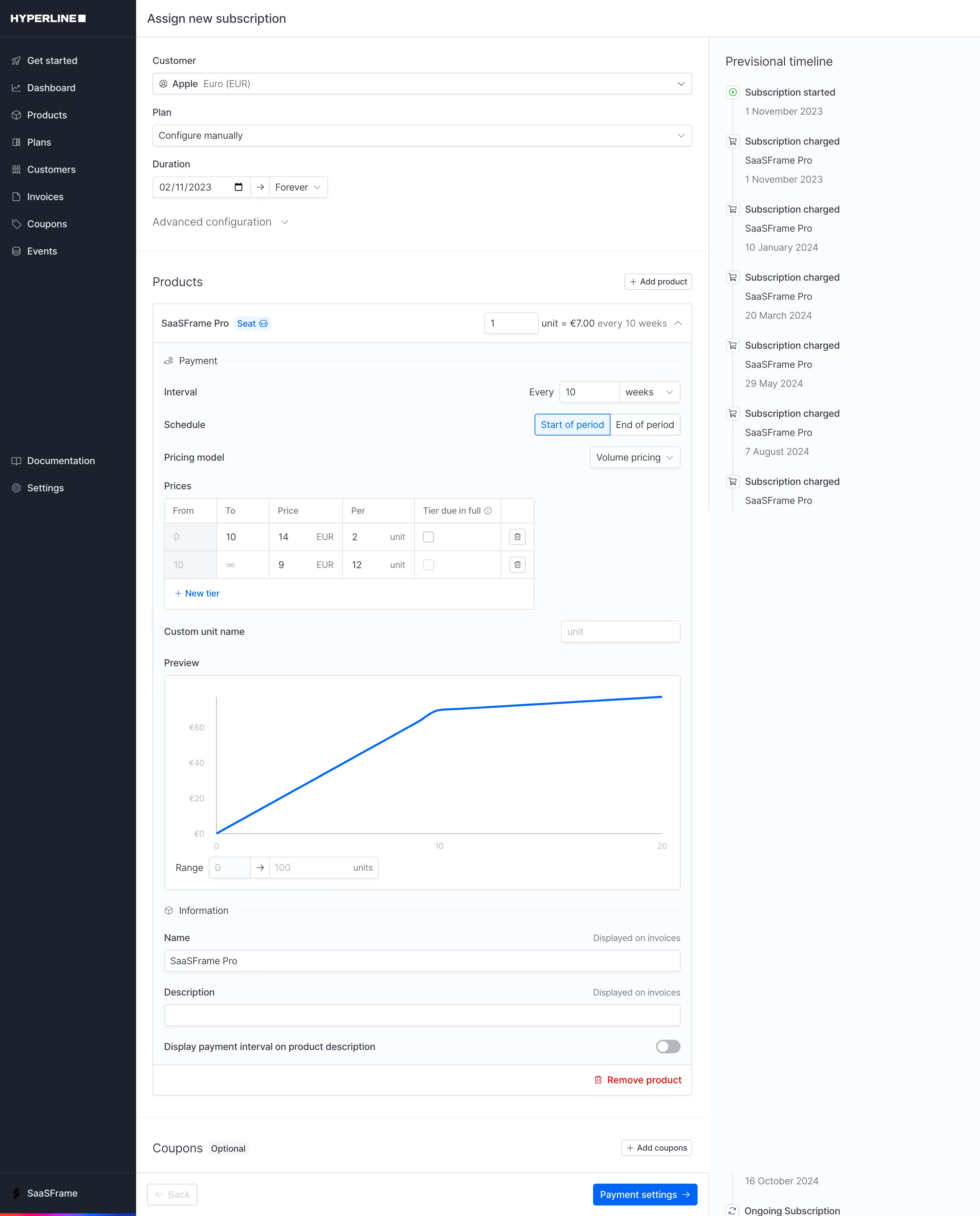
Framework: Hyperline's marketing site is built with Webflow, developed by the agency Ouiflow. Assets are served from cdn.prod.website-files.com. No custom JavaScript framework (React, Vue, etc.) detected on the marketing layer. The product app at app.hyperline.co is a separate SPA.
Theme Strategy: The site uses a hybrid dark/light approach — not a user-switchable dark mode, but intentional section-level contrast alternation. Dark sections (hero, testimonials, footer CTA) alternate with light sections (feature breakdowns, FAQ, pricing details). This creates visual rhythm and hierarchy without relying on a toggle.
Data Confidence:
- High confidence: Platform (Webflow), color philosophy (dark-first), layout structure (12-col, alternating sections), typography scale (Inter, sizes inferred from visual hierarchy), component patterns (pricing cards, feature rows, logo strips, testimonials)
- Medium confidence: Exact hex color values — derived from visual analysis and Webflow/Zinc design system conventions; exact values may differ by ±10% from actual CSS
- Low confidence: CSS custom property names (Webflow does not expose named tokens in its default output; tokens here are reconstructed/normalized)
Notable Patterns:
- Metric callouts: Large bold numbers (80%, 99.9%, $10B+) used as trust signals with subtle supporting copy — a common enterprise SaaS pattern
- Dark product screenshots on dark background with bright UI overlays — creates depth without need for card borders
- Indigo/violet accent is the sole brand color used functionally; green appears only for positive metrics
- Logo strip treatment: Customer logos displayed on a contrasting background (white logos on dark, or dark logos on light) — no color logos, maintaining visual consistency
- Webflow mega-nav: Product dropdown with icon + title + description per item — structured navigation typical of enterprise SaaS
- CTA hierarchy: Primary (filled, indigo) vs. Secondary (ghost/outlined) — clean two-level CTA system throughout
- G2 social proof: 4.9/5 star rating embedded in multiple sections and footer — high emphasis on third-party validation
- Section anatomy: Eyebrow label (small caps category tag) → H2 → body copy → CTA → visual — consistent across all feature sections
Biggest SaaS library.


.webp)


.webp)

Desktop & mobile versions.


Access the Figma files.


Advanced filtering.
Let it flow.





Save design inspirations.
research




How do you process payment?
SaaSFrame subscriptions are sold on Lemon Squeezy, a secured online selling platform for creators.
What about future updates and versions?
SaaSFrame gets updated all the time! Every new update and version will immediately be made available to all SaaSFrame users.
Can you send me an invoice?
You can generate an invoice on your Lemon Squeezy portal once you purchased SaaSFrame. You will find the link in the order confirmation email.
How can I cancel my membership subscription?
You can cancel your membership subscription at any moment on your profile page.
Can I get a refund?
If you're not satisfied, you can ask for a refund within 7 days. Just send me an email at antoine[at]unmake[dot]io
I have another question.
You can send me an email at antoine[at]unmake[dot]io, I'll be happy to help with any questions.