
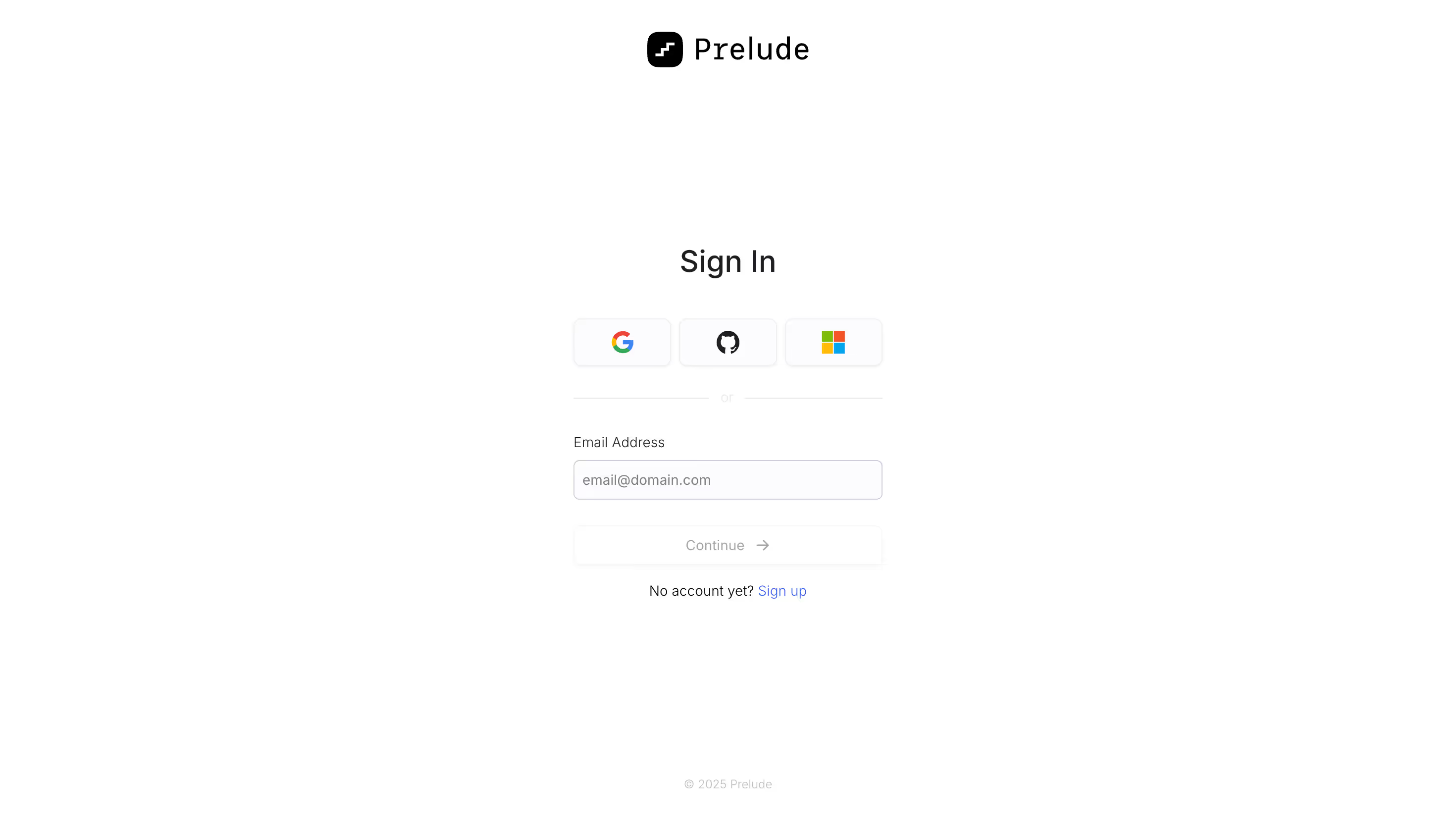
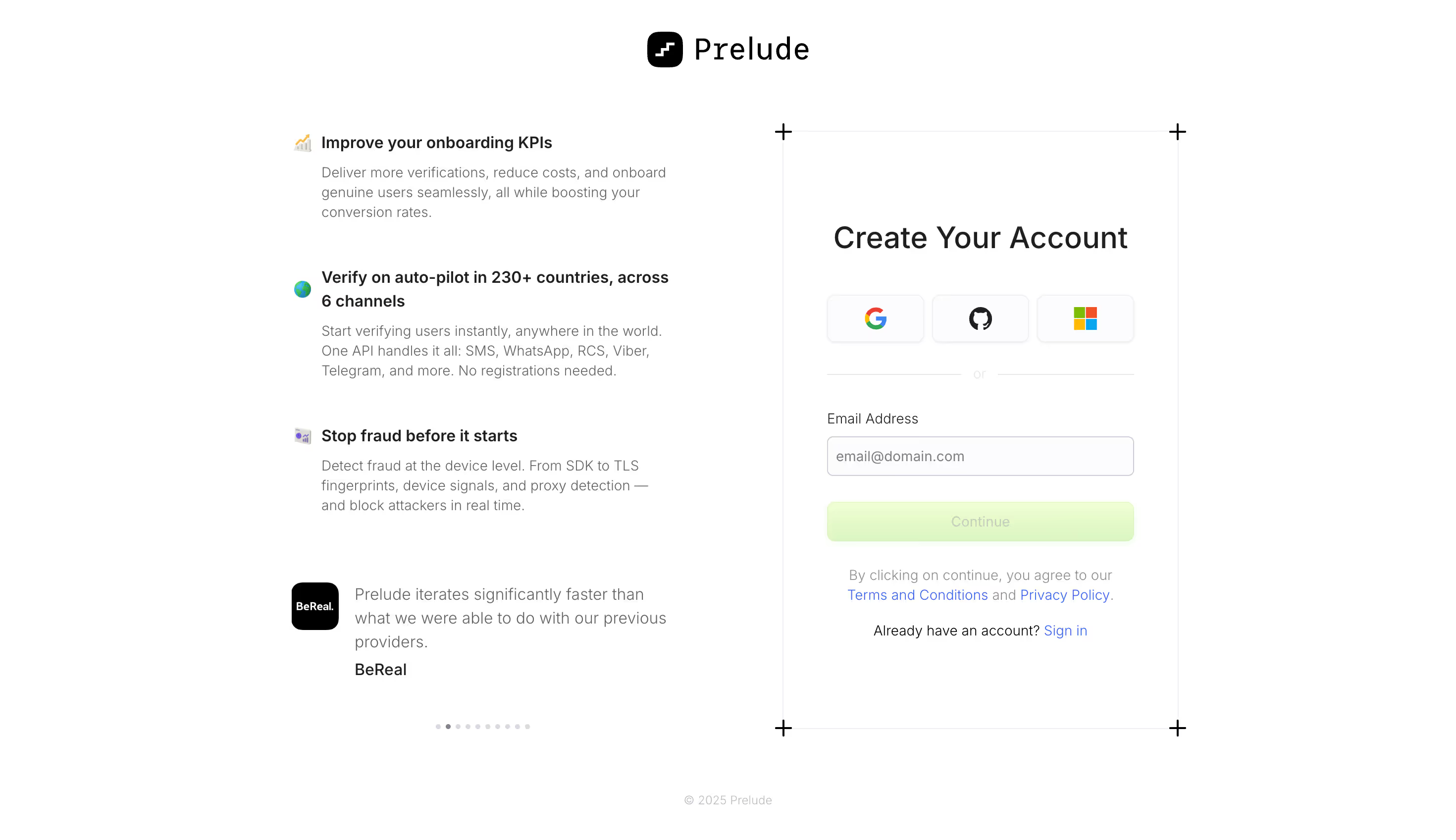
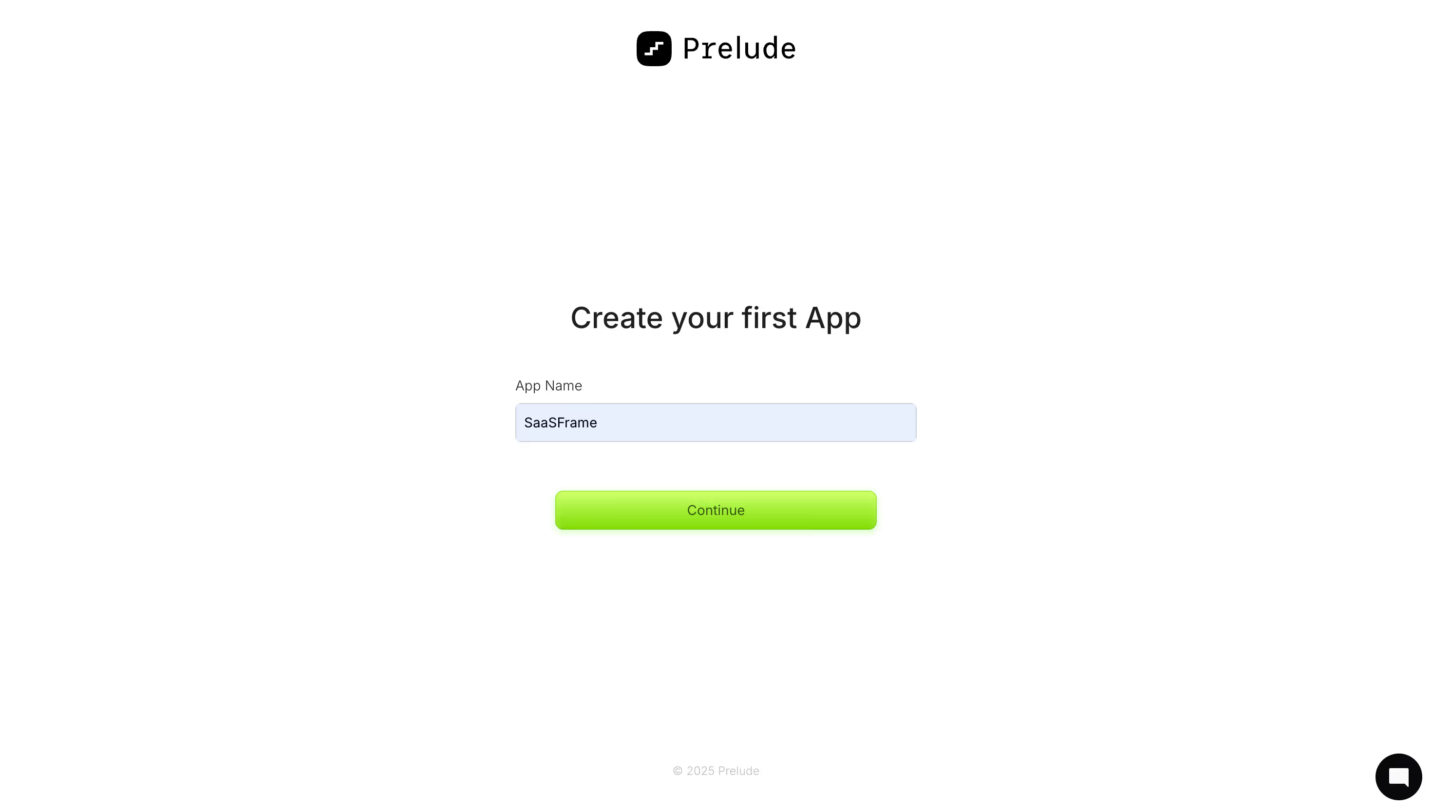
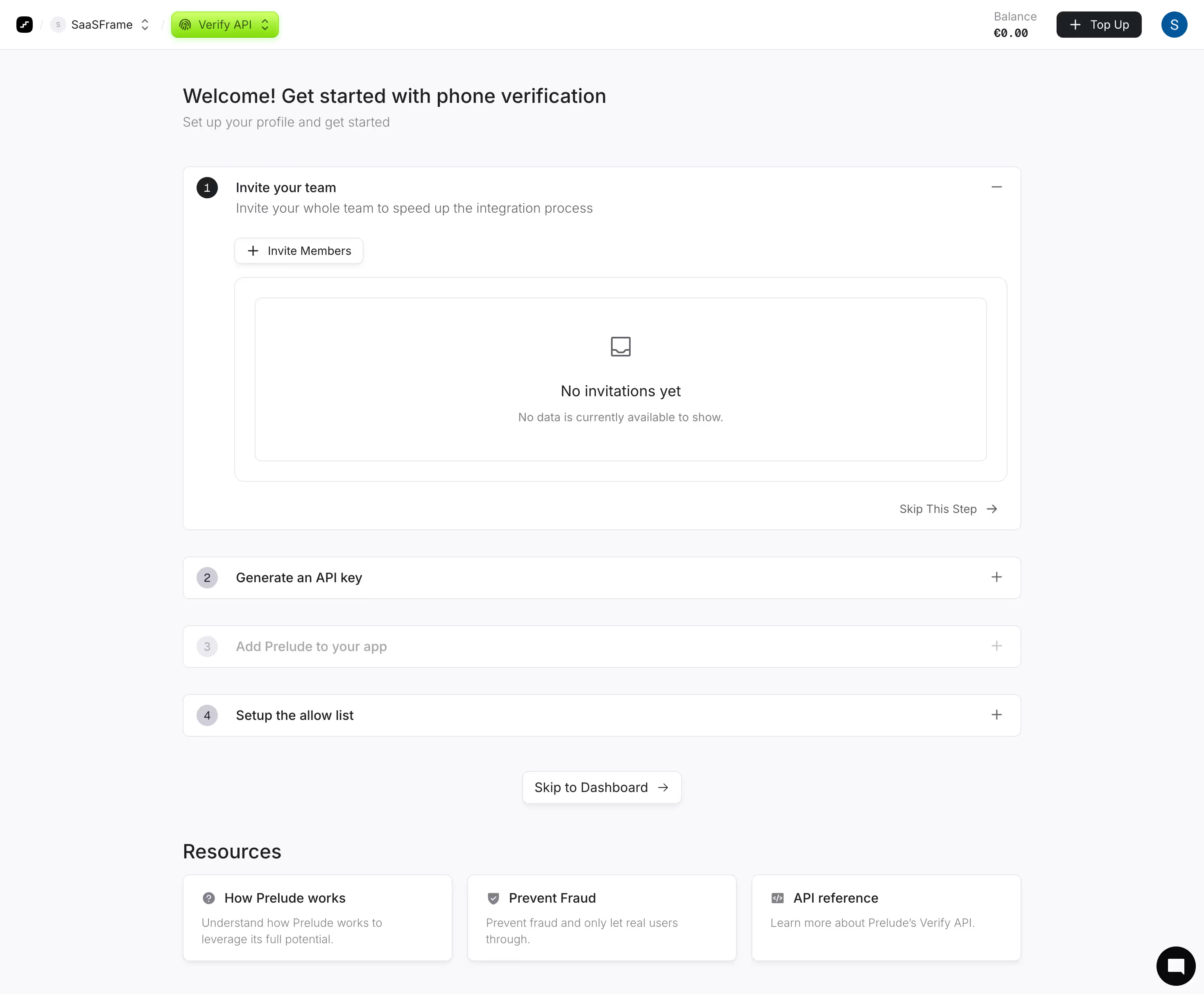
Prelude

Prelude

Send verification phone messages
Visit
Prelude

Marketing Pages

10
Abstract geometric logo composed of four colorful rounded shapes in red, pink, purple, blue, and green arranged in a stylized 'F'.
Figmaย fileย available
Abstract geometric logo composed of four colorful rounded shapes in red, pink, purple, blue, and green arranged in a stylized 'F'.
Figmaย fileย available
Abstract geometric logo composed of four colorful rounded shapes in red, pink, purple, blue, and green arranged in a stylized 'F'.
Figmaย fileย available
Abstract geometric logo composed of four colorful rounded shapes in red, pink, purple, blue, and green arranged in a stylized 'F'.
Figmaย fileย available
Abstract geometric logo composed of four colorful rounded shapes in red, pink, purple, blue, and green arranged in a stylized 'F'.
Figmaย fileย available
Abstract geometric logo composed of four colorful rounded shapes in red, pink, purple, blue, and green arranged in a stylized 'F'.
Figmaย fileย available
Abstract geometric logo composed of four colorful rounded shapes in red, pink, purple, blue, and green arranged in a stylized 'F'.
Figmaย fileย available
Abstract geometric logo composed of four colorful rounded shapes in red, pink, purple, blue, and green arranged in a stylized 'F'.
Figmaย fileย available
Abstract geometric logo composed of four colorful rounded shapes in red, pink, purple, blue, and green arranged in a stylized 'F'.
Figmaย fileย available
Abstract geometric logo composed of four colorful rounded shapes in red, pink, purple, blue, and green arranged in a stylized 'F'.
Figmaย fileย available
Abstract geometric logo composed of four colorful rounded shapes in red, pink, purple, blue, and green arranged in a stylized 'F'.
Figmaย fileย available
Abstract geometric logo composed of four colorful rounded shapes in red, pink, purple, blue, and green arranged in a stylized 'F'.
Figmaย fileย available
Abstract geometric logo composed of four colorful rounded shapes in red, pink, purple, blue, and green arranged in a stylized 'F'.
Figmaย fileย available

๐Ÿ”’ Get SaaSFrame Pro to see 7 more marketing pages from Prelude

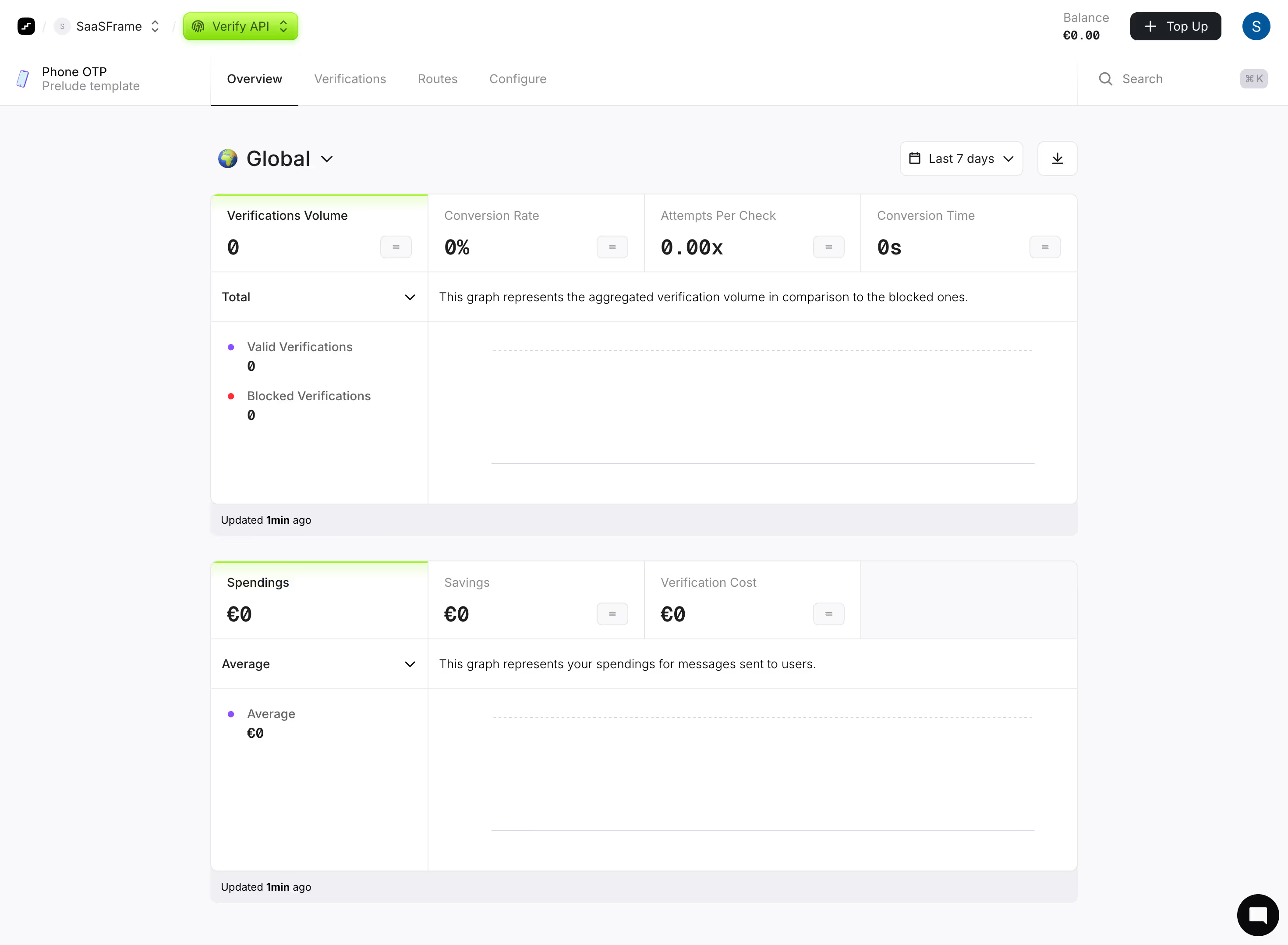
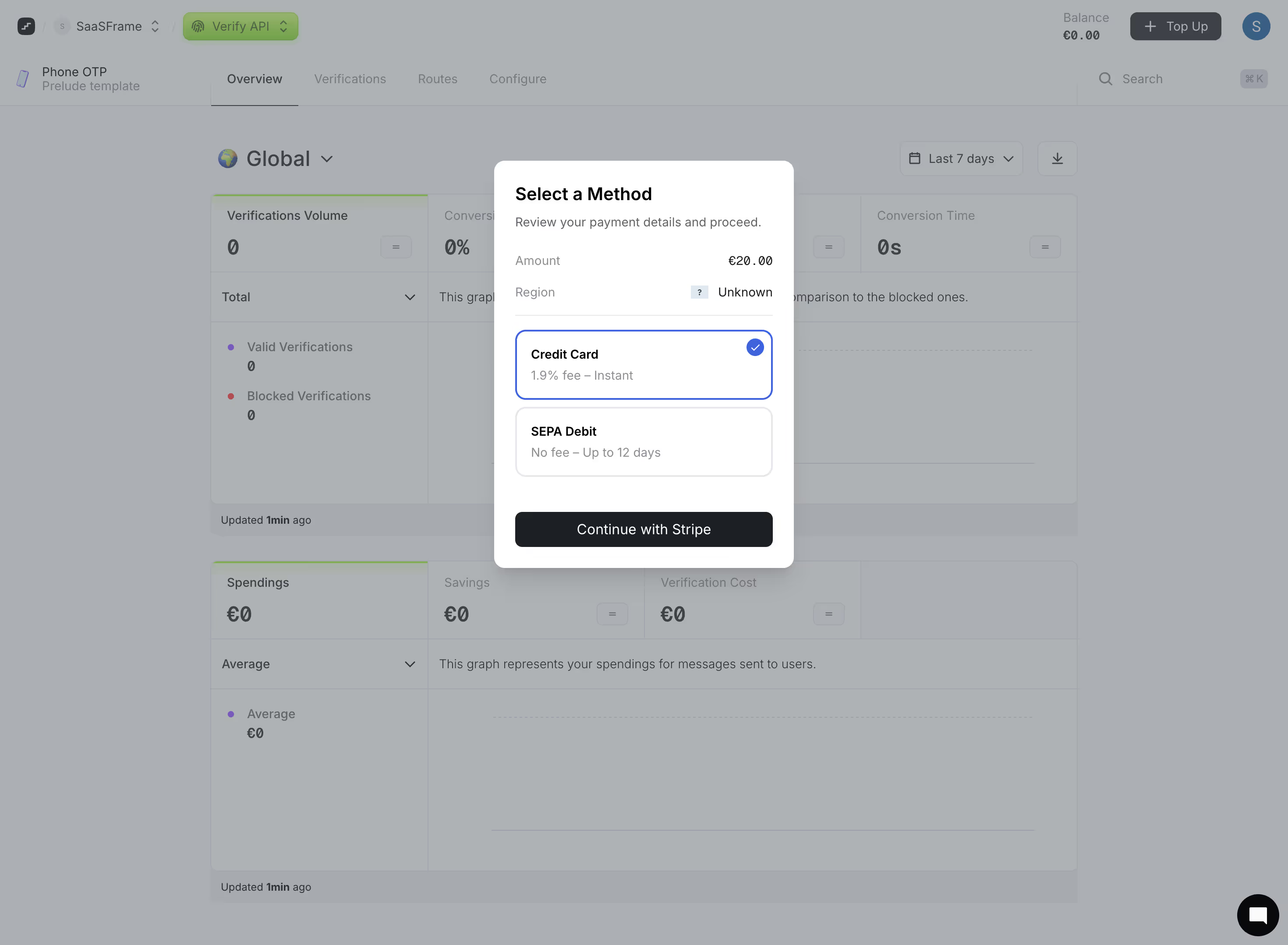
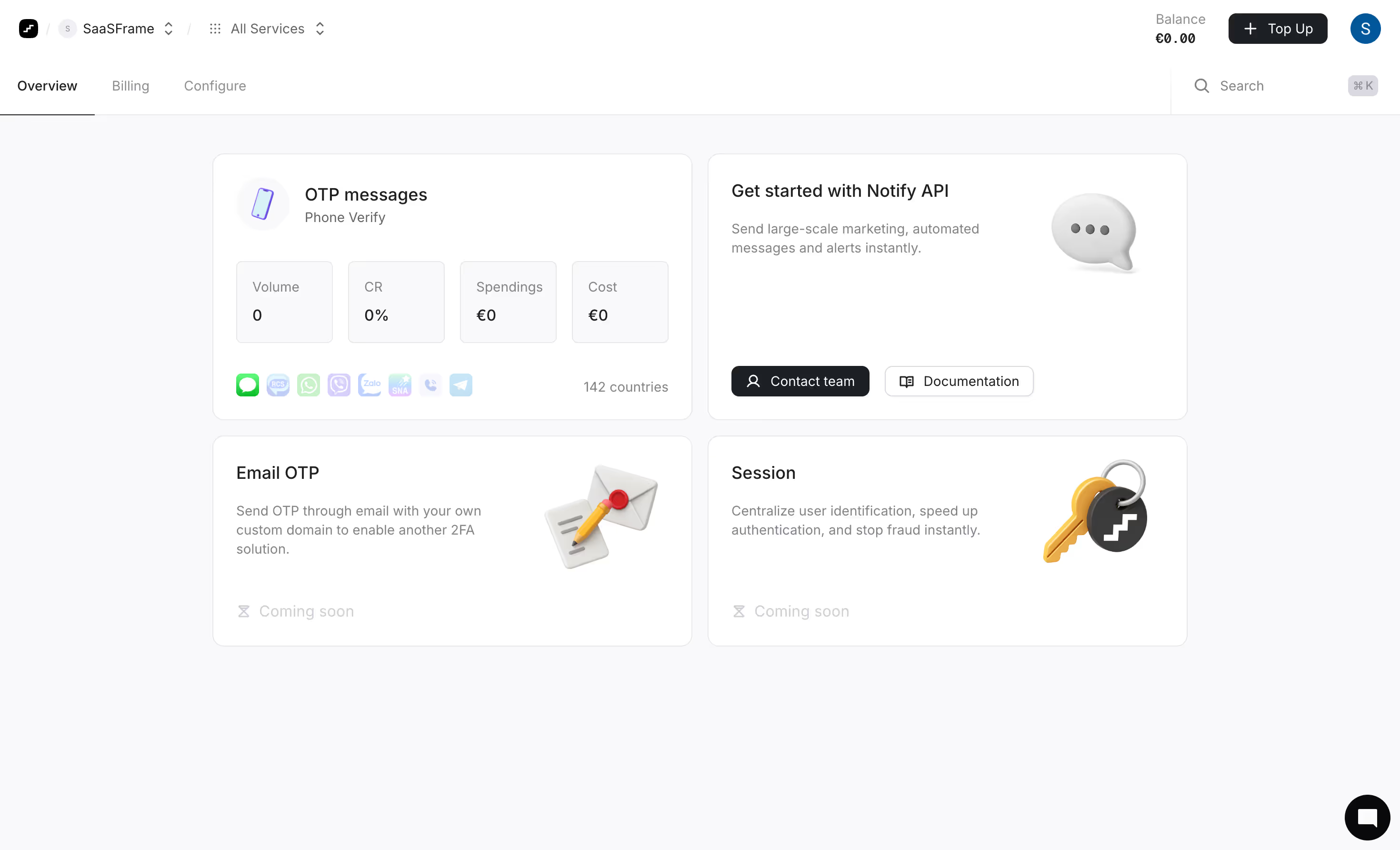
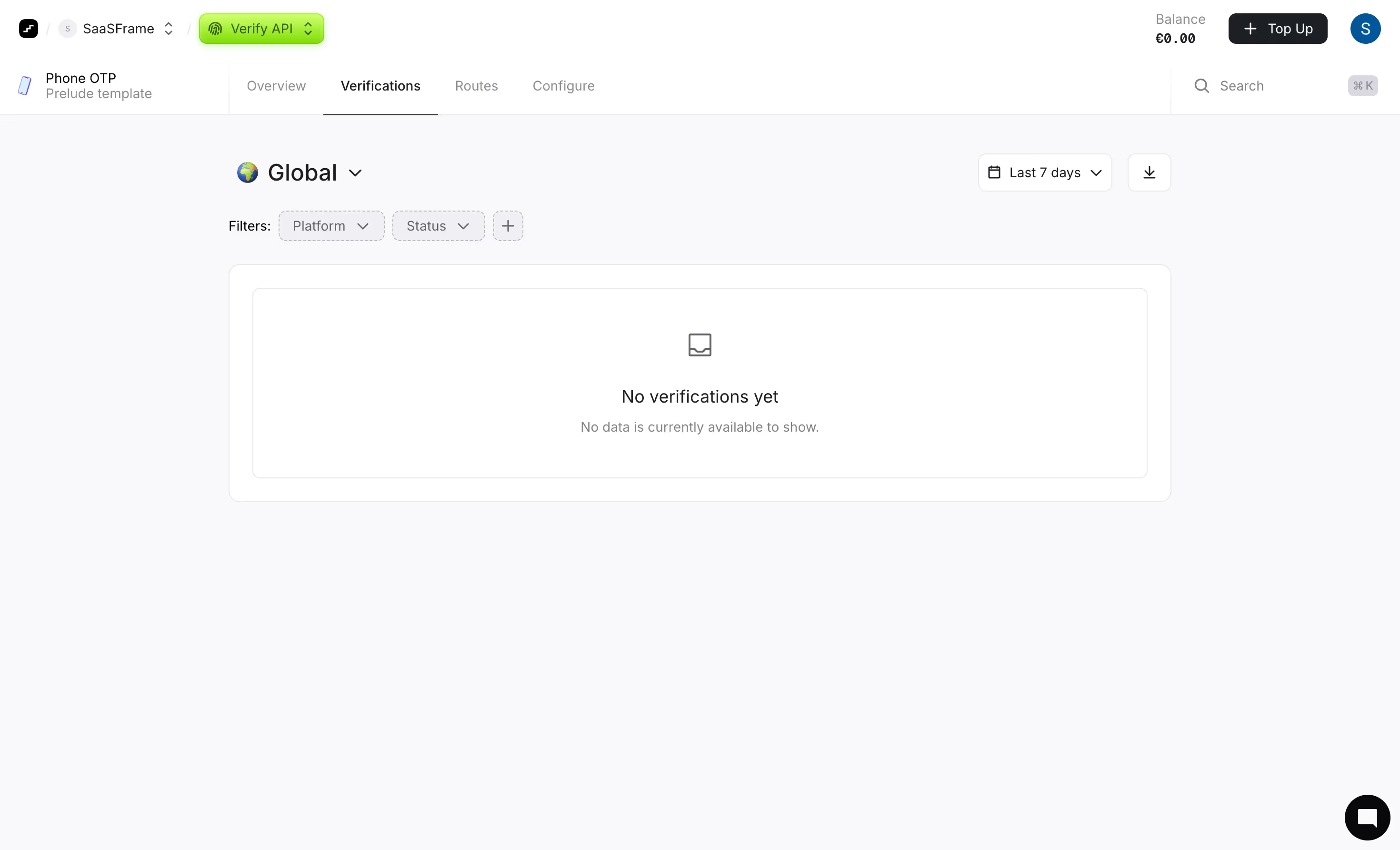
Product Interfaces

19
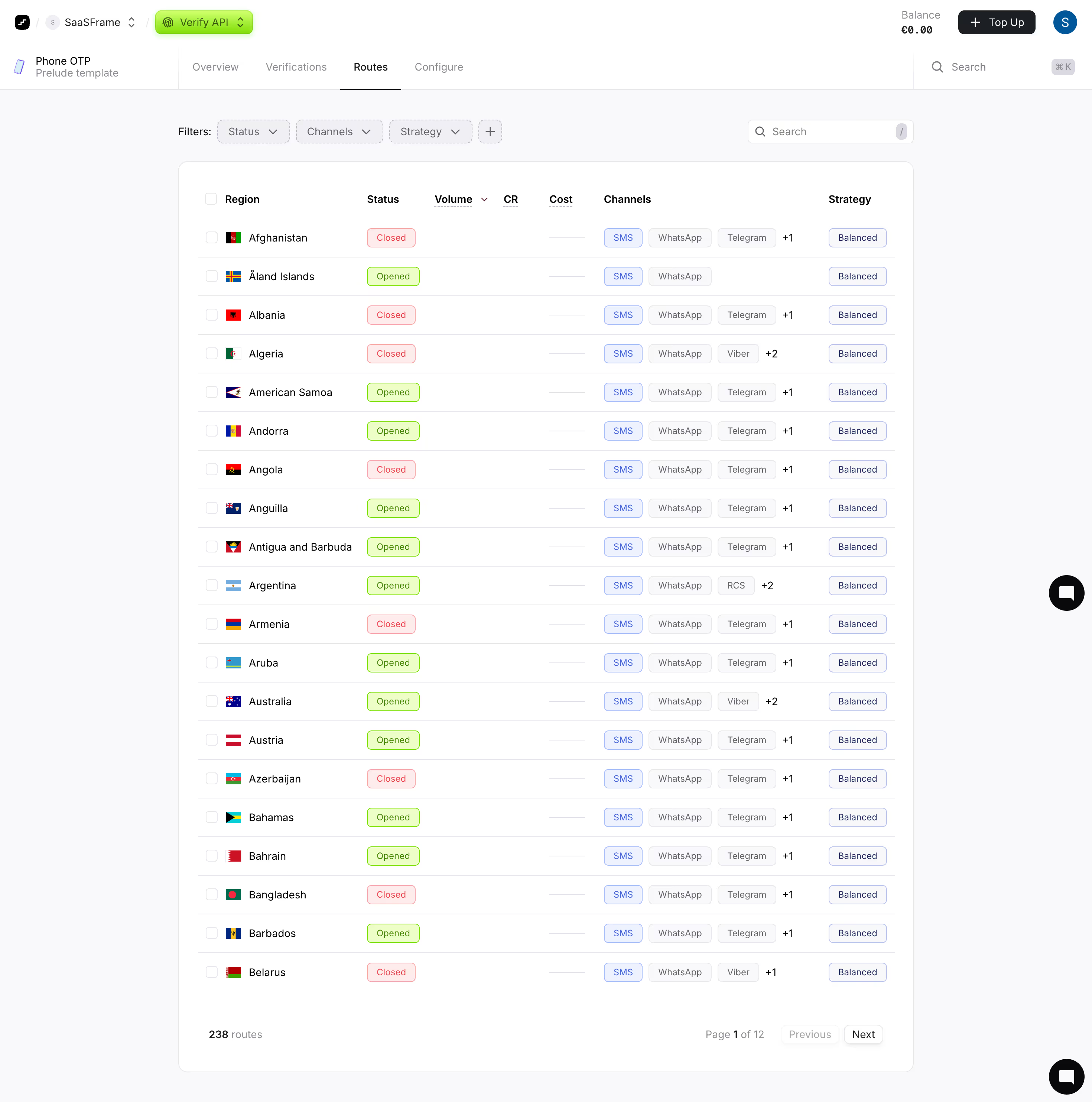
Abstract geometric logo composed of four colorful rounded shapes in red, pink, purple, blue, and green arranged in a stylized 'F'.
Figmaย fileย available
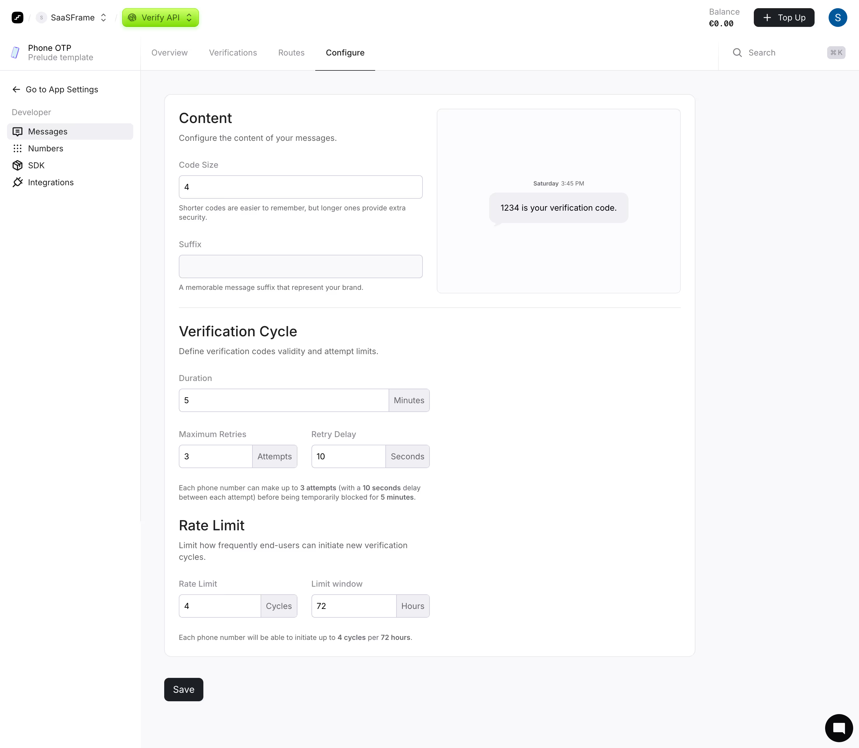
Abstract geometric logo composed of four colorful rounded shapes in red, pink, purple, blue, and green arranged in a stylized 'F'.
Figmaย fileย available
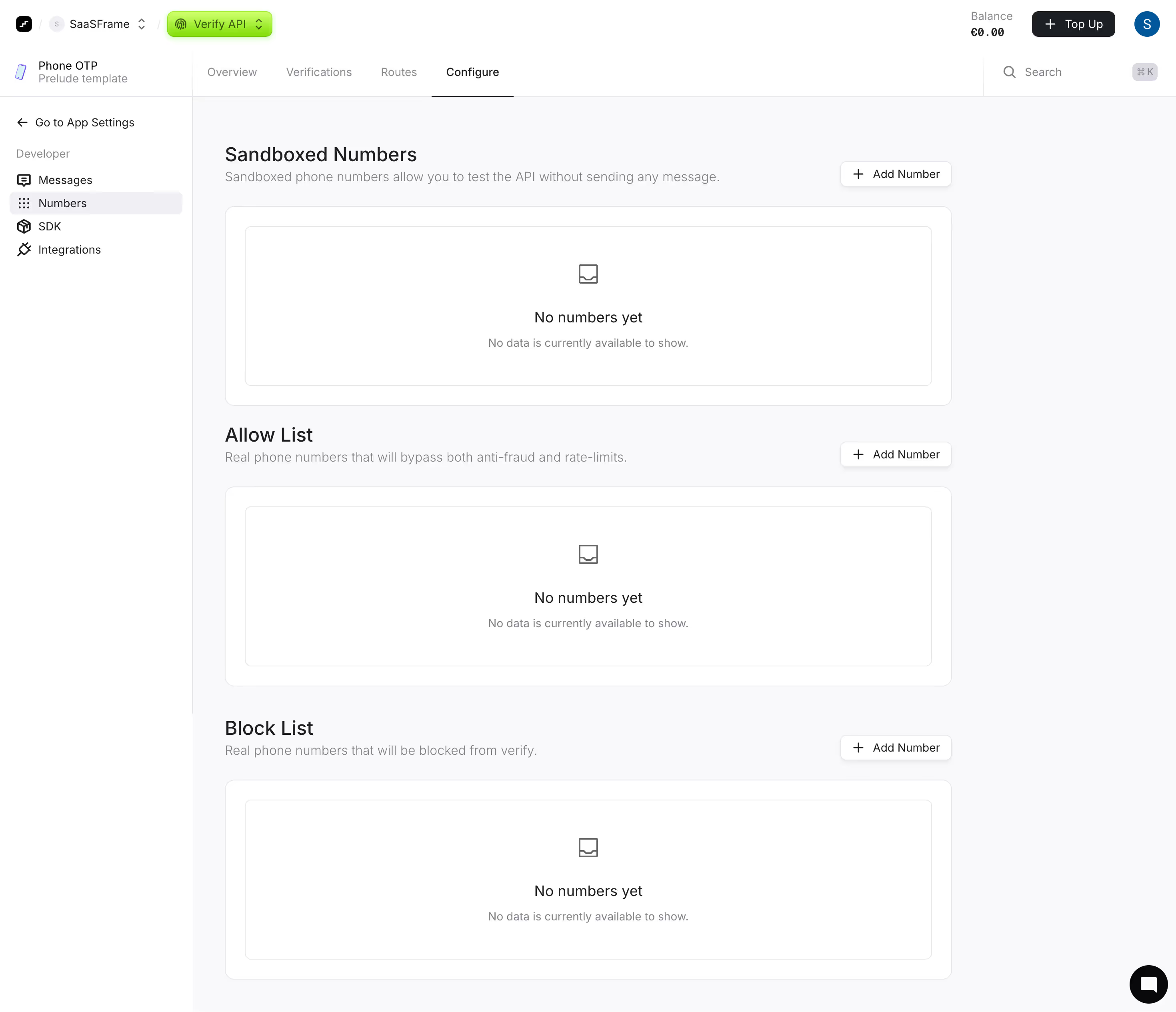
Abstract geometric logo composed of four colorful rounded shapes in red, pink, purple, blue, and green arranged in a stylized 'F'.
Figmaย fileย available
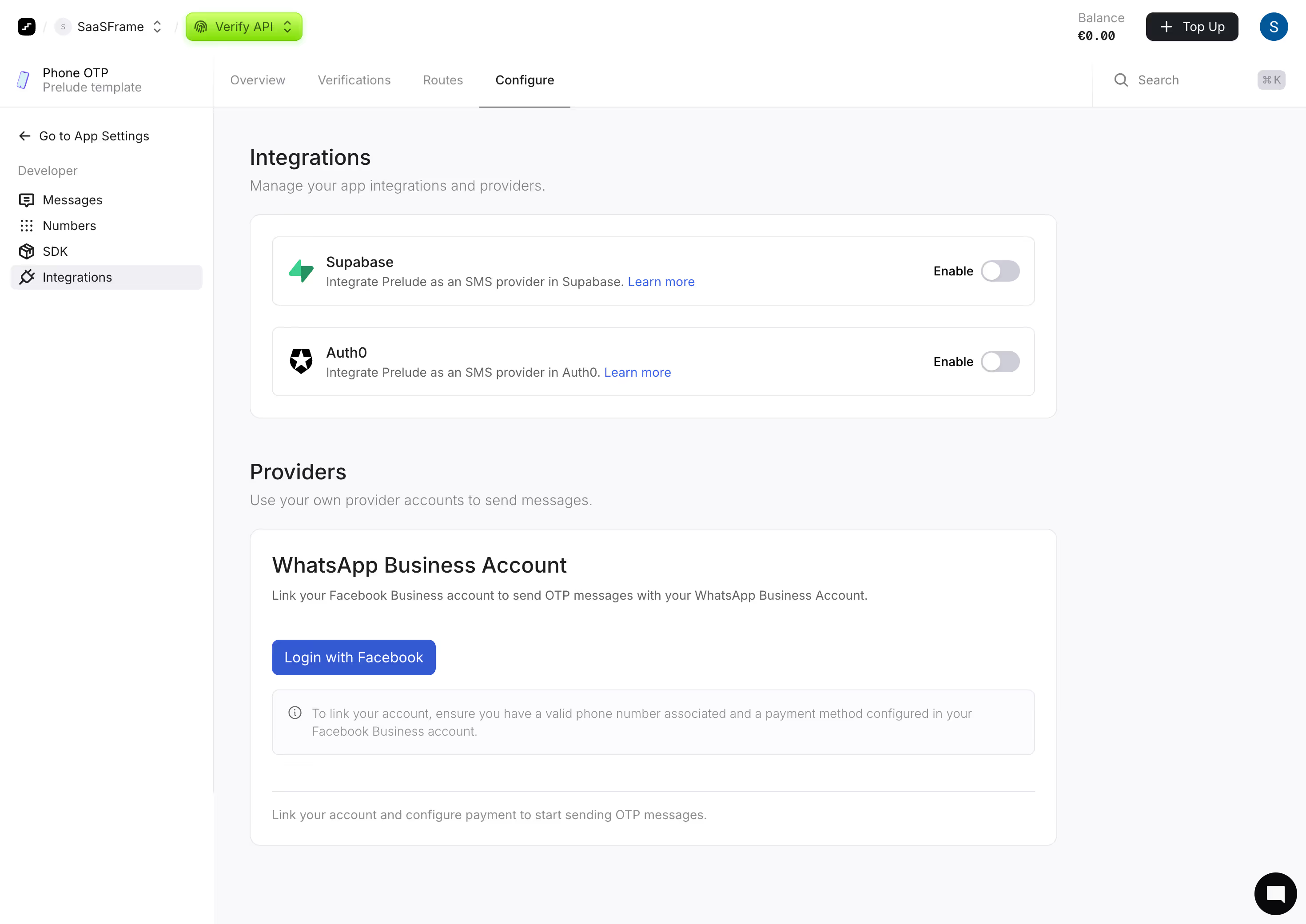
Abstract geometric logo composed of four colorful rounded shapes in red, pink, purple, blue, and green arranged in a stylized 'F'.
Figmaย fileย available
Abstract geometric logo composed of four colorful rounded shapes in red, pink, purple, blue, and green arranged in a stylized 'F'.
Figmaย fileย available
Abstract geometric logo composed of four colorful rounded shapes in red, pink, purple, blue, and green arranged in a stylized 'F'.
Figmaย fileย available
Abstract geometric logo composed of four colorful rounded shapes in red, pink, purple, blue, and green arranged in a stylized 'F'.
Figmaย fileย available
Abstract geometric logo composed of four colorful rounded shapes in red, pink, purple, blue, and green arranged in a stylized 'F'.
Figmaย fileย available
Abstract geometric logo composed of four colorful rounded shapes in red, pink, purple, blue, and green arranged in a stylized 'F'.
Figmaย fileย available
Abstract geometric logo composed of four colorful rounded shapes in red, pink, purple, blue, and green arranged in a stylized 'F'.
Figmaย fileย available
Abstract geometric logo composed of four colorful rounded shapes in red, pink, purple, blue, and green arranged in a stylized 'F'.
Figmaย fileย available
Abstract geometric logo composed of four colorful rounded shapes in red, pink, purple, blue, and green arranged in a stylized 'F'.
Figmaย fileย available
Abstract geometric logo composed of four colorful rounded shapes in red, pink, purple, blue, and green arranged in a stylized 'F'.
Figmaย fileย available
Abstract geometric logo composed of four colorful rounded shapes in red, pink, purple, blue, and green arranged in a stylized 'F'.
Figmaย fileย available
Abstract geometric logo composed of four colorful rounded shapes in red, pink, purple, blue, and green arranged in a stylized 'F'.
Figmaย fileย available
Abstract geometric logo composed of four colorful rounded shapes in red, pink, purple, blue, and green arranged in a stylized 'F'.
Figmaย fileย available
Abstract geometric logo composed of four colorful rounded shapes in red, pink, purple, blue, and green arranged in a stylized 'F'.
Figmaย fileย available
Abstract geometric logo composed of four colorful rounded shapes in red, pink, purple, blue, and green arranged in a stylized 'F'.
Figmaย fileย available
Abstract geometric logo composed of four colorful rounded shapes in red, pink, purple, blue, and green arranged in a stylized 'F'.
Figmaย fileย available
Abstract geometric logo composed of four colorful rounded shapes in red, pink, purple, blue, and green arranged in a stylized 'F'.
Figmaย fileย available
Abstract geometric logo composed of four colorful rounded shapes in red, pink, purple, blue, and green arranged in a stylized 'F'.
Figmaย fileย available
Abstract geometric logo composed of four colorful rounded shapes in red, pink, purple, blue, and green arranged in a stylized 'F'.
Figmaย fileย available

๐Ÿ”’ Get SaaSFrame Pro to see 16 more product intefaces from Prelude

Emails

0
No items found.
No items found.

๐Ÿ”’ Get SaaSFrame Pro to see 3 more emails from Prelude

No items found.
No items found.

Prelude โ€” Design System Overview

Source & Stack \- URL: \- Framework: Framer (meta-generator: Framer 1a21bd5 / Framer d22cd96) \- Assets: Hosted on framerusercontent.com \- Analytics: Google Tag Manager (GTM-TX2DW9P5)

Visual Identity Prelude presents a dark-mode-first aesthetic consistent with security/infrastructure SaaS. The palette is built around deep near-black backgrounds with high-contrast white text and a distinctive green accent used for trust signals and CTAs.

Typography \- Primary font: Inter (inferred โ€” Framer default for B2B SaaS; no custom font declarations visible in parsed output) \- Display / Hero: Large, bold weight (700โ€“900), mixed-case with italic emphasis on key words (e.g., Five products, one platform) \- Body: Regular weight, ~16โ€“18px, high line-height for readability \- Code blocks: Monospace (system mono stack), used in integration examples \- Stat callouts: Extra-large numerals (95%, 99%, 30%) functioning as display type

Color Philosophy Dark background (#0A0A0A / near-black) with white (#FFFFFF) foreground. A bright green accent (#00FF88 range) signals success, trust, and primary actions. Muted grays create card/surface layers. Border colors are subtle (rgba white ~10โ€“15% opacity).

Spacing & Layout \- Generous section padding (~80โ€“120px vertical) \- Max content width ~1200px, centered \- 12-column grid with ~24px gutters inferred from typical Framer layouts \- Card components use ~24โ€“32px internal padding with rounded corners (~12โ€“16px radius)

Component Defaults \- Buttons: Filled primary (green/white on dark), outlined ghost secondary; rounded pill or ~8px radius \- Cards: Dark surface (#111 / #161616) with subtle border, medium border-radius \- Code blocks: Dark surface with syntax highlighting, monospace font \- Badges/Pills: Small rounded labels for categories (News, Engineering, etc.) \- Navigation: Sticky top bar, transparent-to-dark on scroll, horizontal link groups \- Stat blocks: Large number + short descriptor label, often in a horizontal row

Dark / Light Mode Site operates in dark mode only โ€” no light mode toggle or prefers-color-scheme adaptation observed. All surfaces, text, and imagery assume a dark canvas.

:root { / === TYPOGRAPHY === / --font-sans: 'Inter', -apple-system, BlinkMacSystemFont, 'Segoe UI', sans-serif; --font-mono: 'JetBrains Mono', 'Fira Code', 'Courier New', monospace;

--font-size-xs: 0.75rem; / 12px / --font-size-sm: 0.875rem; / 14px / --font-size-base: 1rem; / 16px / --font-size-md: 1.125rem; / 18px / --font-size-lg: 1.25rem; / 20px / --font-size-xl: 1.5rem; / 24px / --font-size-2xl: 2rem; / 32px / --font-size-3xl: 2.5rem; / 40px / --font-size-4xl: 3.5rem; / 56px / --font-size-5xl: 4.5rem; / 72px /

--font-weight-regular: 400; --font-weight-medium: 500; --font-weight-semibold: 600; --font-weight-bold: 700; --font-weight-black: 900;

--line-height-tight: 1.2; --line-height-normal: 1.5; --line-height-loose: 1.7;

/ === SPACING SCALE === / --space-xxs: 4px; --space-xs: 8px; --space-sm: 12px; --space-md: 16px; --space-lg: 24px; --space-xl: 32px; --space-2xl: 48px; --space-3xl: 64px; --space-4xl: 96px; --space-5xl: 128px;

/ === COLOR TOKENS === / / Backgrounds / --color-bg-base: #080808; --color-bg-surface: #111111; --color-bg-elevated: #1a1a1a; --color-bg-subtle: #222222;

/ Foregrounds / --color-fg-primary: #FFFFFF; --color-fg-secondary: rgba(255, 255, 255, 0.65); --color-fg-tertiary: rgba(255, 255, 255, 0.40); --color-fg-disabled: rgba(255, 255, 255, 0.25);

/ Accent โ€” Green (trust/CTA) / --color-accent: #00E87A; --color-accent-hover: #00FF88; --color-accent-subtle: rgba(0, 232, 122, 0.12); --color-accent-fg: #080808;

/ Borders / --color-border: rgba(255, 255, 255, 0.10); --color-border-strong: rgba(255, 255, 255, 0.18); --color-border-accent: rgba(0, 232, 122, 0.30);

/ Semantic / --color-success: #00E87A; --color-warning: #F5A623; --color-error: #FF4D4D; --color-info: #4DA6FF;

/ === BORDER RADIUS === / --radius-xs: 4px; --radius-sm: 6px; --radius-md: 8px; --radius-lg: 12px; --radius-xl: 16px; --radius-2xl: 24px; --radius-full: 9999px;

/ === SHADOWS === / --shadow-sm: 0 1px 3px rgba(0, 0, 0, 0.4); --shadow-md: 0 4px 16px rgba(0, 0, 0, 0.5); --shadow-lg: 0 8px 32px rgba(0, 0, 0, 0.6); --shadow-glow-accent: 0 0 24px rgba(0, 232, 122, 0.20);

/ === TRANSITIONS === / --transition-fast: 150ms ease; --transition-base: 250ms ease; --transition-slow: 400ms ease; --transition-spring: 350ms cubic-bezier(0.34, 1.56, 0.64, 1);

/ === LAYOUT === / --layout-max-width: 1200px; --layout-content-width: 960px; --layout-nav-height: 64px; --layout-gutter: 24px; --layout-section-padding-y: 96px; }

/ Dark mode is the default โ€” no light mode variant observed /

Color Tokens

Token Value Usage
--color-bg-base #080808 Page background
--color-bg-surface #111111 Card / panel backgrounds
--color-bg-elevated #1a1a1a Modals, dropdowns
--color-bg-subtle #222222 Hover states, dividers
--color-fg-primary #FFFFFF Headings, primary text
--color-fg-secondary rgba(255,255,255,0.65) Body copy, descriptions
--color-fg-tertiary rgba(255,255,255,0.40) Captions, placeholders
--color-accent #00E87A CTAs, success, trust badges
--color-accent-hover #00FF88 Accent hover state
--color-accent-fg #080808 Text on accent backgrounds
--color-border rgba(255,255,255,0.10) Default borders
--color-border-strong rgba(255,255,255,0.18) Emphasized borders

Spacing Tokens

Token Value Notes
--space-xxs 4px Icon gaps, tiny nudges
--space-xs 8px Inline padding
--space-sm 12px Button padding-y
--space-md 16px Base unit
--space-lg 24px Card padding, gutters
--space-xl 32px Section sub-elements
--space-2xl 48px Card-to-card gaps
--space-3xl 64px Large section gaps
--space-4xl 96px Section vertical padding
--space-5xl 128px Hero vertical padding

Typography Tokens

Token Value Usage
--font-sans Inter, system-ui, sans-serif All UI text
--font-mono JetBrains Mono, Fira Code, monospace Code blocks
--font-size-base 1rem / 16px Body default
--font-size-md 1.125rem / 18px Large body
--font-size-xl 1.5rem / 24px Subheadings
--font-size-2xl 2rem / 32px Section headings
--font-size-4xl 3.5rem / 56px Page titles
--font-size-5xl 4.5rem / 72px Hero display
--font-weight-bold 700 Headings
--font-weight-black 900 Display / hero
--line-height-tight 1.2 Headings
--line-height-normal 1.5 Body

Border Radius Tokens

Token Value Usage
--radius-sm 6px Small badges, inputs
--radius-md 8px Default buttons
--radius-lg 12px Cards
--radius-xl 16px Large cards, panels
--radius-full 9999px Pill buttons, tags

Shadow Tokens

Token Value Usage
--shadow-sm 0 1px 3px rgba(0,0,0,0.4) Subtle lift
--shadow-md 0 4px 16px rgba(0,0,0,0.5) Cards
--shadow-lg 0 8px 32px rgba(0,0,0,0.6) Modals
--shadow-glow-accent 0 0 24px rgba(0,232,122,0.20) Accent glow on hover

Framework: Framer (confirmed via meta-generator: Framer 1a21bd5 and Framer d22cd96 across multiple pages). All assets served from framerusercontent.com. No custom build pipeline or CSS framework detected โ€” styling is Framer-generated.

Theme support: Dark mode only. No prefers-color-scheme media query or light/dark toggle observed. The entire visual system assumes a dark canvas.

Data source confidence: Medium-high. Colors, typography scale, and layout inferred from visual content structure, heading hierarchy, stat callout sizing, and code block styling visible in the parsed HTML. Direct CSS file access was blocked (proxy allowlist restriction in the sandbox environment); no raw stylesheet was parsed. Token values are calibrated estimates based on Framer conventions and visual analysis.

Notable patterns: \- Heavy use of large numeric stat callouts (95%, 99%, 30%) as visual anchors โ€” requires display-weight type at ~4โ€“5rem \- Italic + bold mix in section headings for editorial emphasis (Five\* products, one\* platform) \- Green accent (#00E87A) used exclusively for trust/success signals and primary CTAs โ€” never decorative \- Monospace code blocks on homepage and product pages (SDK integration examples in Node.js, Go, Python, Kotlin, Ruby, curl) \- Testimonial carousel pattern with logo + quote + customer name \- Compliance badges (SOC 2 Type II, ISO 27001, GDPR-ready, Built in Europe) rendered as small pill labels โ€” consistent with security-brand SaaS \- Navigation: Minimal sticky top bar; Log In (ghost) + Sign Up (filled) + Book a Demo (accent/outlined) โ€” three-tier CTA hierarchy \- Footer: Multi-column link grid with 5 sections (Solutions, Pricing, About us, Resources, Socials)

Monthly

$14 /month

Billed $14 monthly
Browse all screens & flows
Filter and search screens & flows
Bookmark items
Access Figma files
Access mobile versions
Join now

Quarterly

$12 /month

Billed $36 quarterly
Browse all screens & flows
Filter and search screens & flows
Bookmark items
Access Figma files
Access mobile versions
Join now

Yearly

$10 /month

Billed $120 yearly
Browse all screens & flows
Filter and search screens & flows
Bookmark items
Access Figma files
Access mobile versions
Join now

Ask For A Quote

For teams with specific billing and compliance needs
Get A Quote
Pay by invoice
Multi-annual billing
Compliance process
No automatic renewal

Biggest SaaS library.

Browse website pages, product interfaces and emails from a growing library of hundreds of SaaS.
Abstract red geometric shape with diagonal lines forming a diamond on a black background.Black and white 3D cube with a bold letter N on the front face, representing the Notion app logo.White lowercase 'fs' letters on a pink and orange gradient background.White uppercase letter S on a blue and purple gradient background.A purple icon consisting of two vertically overlapping circles on a light lavender background.White circle with three diagonal white stripes in lower left corner on a gradient blue background.

Desktop & mobile versions.

Switch from desktop to mobile versions to see how the best designers make websites responsive.
Attio website homepage with navigation links, headline 'Customer relationship magic,' a CRM dashboard screenshot, call-to-action buttons, and logos of companies like CocaCola, OpenAI, and Pallet.Attio homepage showing the tagline 'Customer relationship magic' with a description about flexible, data-driven CRM, buttons for 'Start for free' and 'Talk to sales', and a screenshot of a sales pipeline interface with a play button.

Access the Figma files.

You like a design? Download the Figma file of any website page you see on SaaSFrame.

Advanced filtering.

Use filters to find the design or copywriting inspiration that you need in seconds.
Thank you! Your submission has been received!
Oops! Something went wrong while submitting the form.

Let it flow.

Discover the user journey of the best SaaS with interfaces organized in flows.
Mercury banking dashboard showing account balances, recent transactions, and a menu for moving money with options to pay, add funds, request payment, or transfer between accounts.
Payment interface showing recipient selection with options to add or invite a recipient and a list of recently paid recipients including Jason Green (Contractor) and Aliyah McMahon (Vendor).
Payment method selection screen for 'Payment to Jason Green' showing options ACH, Check, Wire, and selected International Wire with details and navigation buttons.
International wire payment interface showing $120 USD to Jason Green with options to send wire as SHA for free or OUR for $15, sending from Ops/Payroll account with balance $1,374,471.14, with navigation buttons Go Back and Next.
Confirmation screen showing a recurring international wire payment setup to pay $120 monthly to Jason Green on the 27th, with dates for April 27, May 26 noting May 27 is a weekend, and June 27, no end date, and buttons to view payments or make another payment.
Mercury banking dashboard showing account balances, recent transactions, and a menu for moving money with options to pay, add funds, request payment, or transfer between accounts.

Save design inspirations.

Bookmark screens and flows so you can find them any time you need it.
โŒ˜
B
BOOKMARK DESIGN
Start your design
research
Web form titled 'Create a new order' for selecting journey type, origin, destination, departure and return dates, passengers, and class with a 'Find available flights' button.Three software interface screenshots: Surfe CRM LinkedIn integration, Linear product management tool, and Mercury banking dashboard.Three side-by-side website screenshots showing a login page for Copperx, a team collaboration platform with bright yellow background, and an AI-powered developer platform with space-themed graphics.Three website screenshots showing a design tool and distribution dashboard for design tokens, promoting ease and automation.Three side-by-side website screenshots showing a login page for Copperx, a team collaboration platform with bright yellow background, and an AI-powered developer platform with space-themed graphics.

How do you process payment?

SaaSFrame subscriptions are sold on Lemon Squeezy, a secured online selling platform for creators.

What about future updates and versions?

SaaSFrame gets updated all the time! Every new update and version will immediately be made available to all SaaSFrame users.

Can you send me an invoice?

You can generate an invoice on your Lemon Squeezy portal once you purchased SaaSFrame. You will find the link in the order confirmation email.

How can I cancel my membership subscription?

You can cancel your membership subscription at any moment on your profile page.โ€

Can I get a refund?

If you're not satisfied, you can ask for a refund within 7 days. Just send me an email at antoine[at]unmake[dot]io

I have another question.

You can send me an email at antoine[at]unmake[dot]io, I'll be happy to help with any questions.













