.webp)

Atlas


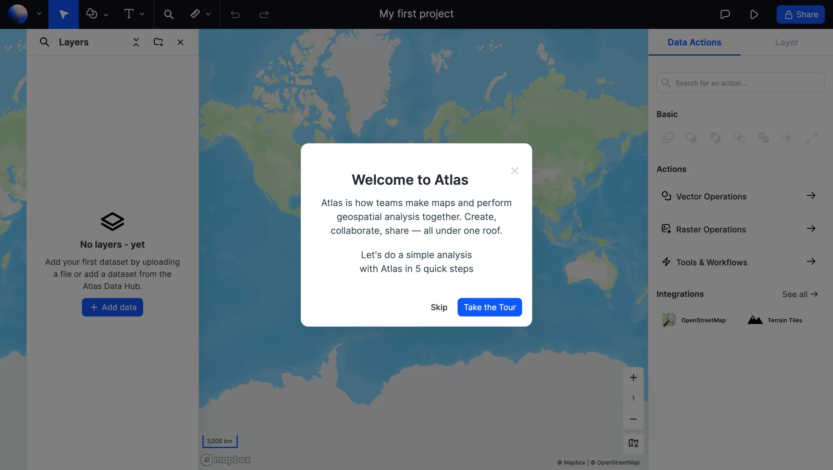




Atlas Design System Overview
Stack \- Framework: Gatsby 5.14.1 (React-based SSG) \- Deployment: Static site with CDN-hosted assets (cdn.atlas.co) \- No public design token library detected; tokens inferred from visual analysis
Typography \- Primary typeface: Clean sans-serif (system-ui / Inter-class font) \- Hierarchy: Large bold hero headings (~56–72px), section headings (~32–40px), body (~16px) \- Font weight range: 400 (body) → 700 (headings/CTAs) \- Line height: relaxed (~1.5–1.6) for body, tighter (~1.1–1.2) for display text \- Letter spacing: slightly tight on headings (−0.02em), normal on body
Color Philosophy \- Light-first UI with white (#FFFFFF) as the primary surface \- Accent: vivid blue (primary CTA, links, highlights — approx #3B6EF6 / #2563EB-range) \- Supporting: near-black for text (#0F1117 / #111827), mid-greys for secondary text and borders \- Subtle blueish tint used for highlight overlays (image: highlight-blueish.png) \- Dark sections used sparingly for contrast breaks (footer, dark feature panels) \- Customer logos rendered in greyscale/muted on white backgrounds
Spacing \- Base unit: 4px (4pt grid) \- Section vertical padding: 80–120px \- Card/component gap: 24–32px \- Inline element spacing: 8–16px \- Max content width: ~1200px centered with horizontal padding of 24–48px
Component Defaults \- Buttons: pill or slightly rounded (border-radius ~8px), solid fill for primary, outlined for secondary \- Cards: white background, subtle box-shadow, 8–12px border-radius \- Navigation: sticky top bar, white background, logo left / nav center / CTAs right \- Badges/tags: small rounded pills with muted background (e.g., "Navi" announcement bar) \- Tables: clean striped or bordered rows, used extensively on pricing page \- Toggle: billing period toggle (monthly/annually) — pill-style switch
Layout \- Single-column marketing layout with max-width constraint \- Hero: full-width, centered text, paired with product screenshot/video \- Feature sections: alternating image+text two-column grid \- Pricing: horizontal card grid (4 columns on desktop) \- Footer: multi-column link grid on dark/light background \- Responsive: mobile-first with viewport-fit=cover
Dark / Light Mode \- Light mode only on marketing site (theme-color: #FFFFFF) \- App likely supports dark mode (logo-light.svg / logo-dark.svg naming convention observed) \- No prefers-color-scheme CSS detected on public pages
:root { / === Brand Colors === / --color-primary: #3B6EF6; / Blue CTA / links / --color-primary-hover: #2554D6; / Darkened primary on hover / --color-primary-light: #EEF2FF; / Tinted blue background /
/ === Neutrals === / --color-bg: #FFFFFF; / Page background / --color-surface: #F9FAFB; / Elevated surface / section bg / --color-surface-alt: #F3F4F6; / Alternate section / card bg / --color-border: #E5E7EB; / Default border / --color-border-light: #F0F1F3; / Subtle dividers /
/ === Text === / --color-text-primary: #111827; / Near-black body/heading text / --color-text-secondary: #6B7280; / Secondary / caption text / --color-text-tertiary: #9CA3AF; / Placeholder / disabled / --color-text-inverse: #FFFFFF; / Text on dark/colored bg /
/ === Semantic === / --color-success: #10B981; / Green for completed states / --color-warning: #F59E0B; / Amber for medium-priority / --color-danger: #EF4444; / Red for high-priority / error / --color-info: #3B82F6; / Info blue /
/ === Typography === / --font-family-base: 'Inter', system-ui, -apple-system, sans-serif; --font-size-xs: 0.75rem; / 12px / --font-size-sm: 0.875rem; / 14px / --font-size-md: 1rem; / 16px / --font-size-lg: 1.125rem; / 18px / --font-size-xl: 1.25rem; / 20px / --font-size-2xl: 1.5rem; / 24px / --font-size-3xl: 1.875rem; / 30px / --font-size-4xl: 2.25rem; / 36px / --font-size-5xl: 3rem; / 48px / --font-size-6xl: 3.75rem; / 60px /
--font-weight-regular: 400; --font-weight-medium: 500; --font-weight-semibold: 600; --font-weight-bold: 700;
--line-height-tight: 1.2; --line-height-snug: 1.375; --line-height-normal: 1.5; --line-height-relaxed: 1.625;
--letter-spacing-tight: -0.02em; --letter-spacing-normal: 0em; --letter-spacing-wide: 0.05em;
/ === Spacing (4px base grid) === / --space-1: 0.25rem; / 4px / --space-2: 0.5rem; / 8px / --space-3: 0.75rem; / 12px / --space-4: 1rem; / 16px / --space-5: 1.25rem; / 20px / --space-6: 1.5rem; / 24px / --space-8: 2rem; / 32px / --space-10: 2.5rem; / 40px / --space-12: 3rem; / 48px / --space-16: 4rem; / 64px / --space-20: 5rem; / 80px / --space-24: 6rem; / 96px / --space-32: 8rem; / 128px /
/ === Border Radius === / --radius-sm: 4px; --radius-md: 8px; --radius-lg: 12px; --radius-xl: 16px; --radius-2xl: 24px; --radius-full: 9999px; / Pills / avatars /
/ === Shadows === / --shadow-xs: 0 1px 2px rgba(0, 0, 0, 0.05); --shadow-sm: 0 1px 3px rgba(0, 0, 0, 0.10), 0 1px 2px rgba(0, 0, 0, 0.06); --shadow-md: 0 4px 6px rgba(0, 0, 0, 0.07), 0 2px 4px rgba(0, 0, 0, 0.06); --shadow-lg: 0 10px 15px rgba(0, 0, 0, 0.08), 0 4px 6px rgba(0, 0, 0, 0.05); --shadow-xl: 0 20px 25px rgba(0, 0, 0, 0.08), 0 10px 10px rgba(0, 0, 0, 0.04);
/ === Layout === / --container-max: 1200px; --container-padding: clamp(1.5rem, 5vw, 3rem); --nav-height: 64px;
/ === Transitions === / --transition-fast: 150ms ease; --transition-base: 250ms ease; --transition-slow: 400ms ease; }
/ Dark mode — app shell only (not confirmed on marketing site) / @media (prefers-color-scheme: dark) { :root { --color-bg: #0F1117; --color-surface: #1A1D27; --color-surface-alt: #23263A; --color-border: #2D3149; --color-border-light: #1E2035; --color-text-primary: #F9FAFB; --color-text-secondary: #9CA3AF; --color-text-tertiary: #6B7280; --color-text-inverse: #111827; --color-primary-light: #1E2A5E; } }
Color Tokens
| Token | Value | Usage |
|---|---|---|
| color-primary | #3B6EF6 | CTA buttons, links, active states |
| color-primary-hover | #2554D6 | Hover state for primary |
| color-primary-light | #EEF2FF | Tinted blue highlight bg |
| color-bg | #FFFFFF | Page / modal background |
| color-surface | #F9FAFB | Section alternates, cards |
| color-surface-alt | #F3F4F6 | Nested surfaces |
| color-border | #E5E7EB | Card borders, dividers |
| color-text-primary | #111827 | Headings, body copy |
| color-text-secondary | #6B7280 | Captions, meta, secondary |
| color-text-tertiary | #9CA3AF | Placeholder, disabled |
| color-success | #10B981 | Completed tasks, positive |
| color-warning | #F59E0B | Medium priority, alerts |
| color-danger | #EF4444 | High priority, errors |
| color-text-inverse | #FFFFFF | Text on colored surfaces |
Spacing Tokens
| Token | Value | px equiv |
|---|---|---|
| space-1 | 0.25rem | 4px |
| space-2 | 0.5rem | 8px |
| space-3 | 0.75rem | 12px |
| space-4 | 1rem | 16px |
| space-6 | 1.5rem | 24px |
| space-8 | 2rem | 32px |
| space-10 | 2.5rem | 40px |
| space-12 | 3rem | 48px |
| space-16 | 4rem | 64px |
| space-20 | 5rem | 80px |
| space-24 | 6rem | 96px |
| space-32 | 8rem | 128px |
Typography Tokens
| Token | Value | Usage |
|---|---|---|
| font-family-base | Inter, system-ui, sans-serif | All text |
| font-size-xs | 0.75rem / 12px | Labels, badges |
| font-size-sm | 0.875rem / 14px | Captions, nav secondary |
| font-size-md | 1rem / 16px | Body default |
| font-size-lg | 1.125rem / 18px | Lead text |
| font-size-xl | 1.25rem / 20px | Sub-headings |
| font-size-2xl | 1.5rem / 24px | Section labels |
| font-size-3xl | 1.875rem / 30px | H3 headings |
| font-size-4xl | 2.25rem / 36px | H2 headings |
| font-size-5xl | 3rem / 48px | H1 (section heroes) |
| font-size-6xl | 3.75rem / 60px | Hero display |
| font-weight-regular | 400 | Body |
| font-weight-medium | 500 | Nav, labels |
| font-weight-semibold | 600 | Sub-headings |
| font-weight-bold | 700 | Headings, CTAs |
| line-height-tight | 1.2 | Display / hero type |
| line-height-normal | 1.5 | Body |
| letter-spacing-tight | -0.02em | Large headings |
Border Radius Tokens
| Token | Value | Usage |
|---|---|---|
| radius-sm | 4px | Inputs, small badges |
| radius-md | 8px | Buttons, cards |
| radius-lg | 12px | Feature cards |
| radius-xl | 16px | Large panels |
| radius-2xl | 24px | Hero image containers |
| radius-full | 9999px | Pills, avatars, tags |
Shadow Tokens
| Token | Value | Usage |
|---|---|---|
| shadow-xs | 0 1px 2px rgba(0,0,0,0.05) | Subtle lift |
| shadow-sm | 0 1px 3px rgba(0,0,0,0.10) | Cards, dropdowns |
| shadow-md | 0 4px 6px rgba(0,0,0,0.07) | Floating panels |
| shadow-lg | 0 10px 15px rgba(0,0,0,0.08) | Modals, popovers |
| shadow-xl | 0 20px 25px rgba(0,0,0,0.08) | Hero screenshots |
Layout Tokens
| Token | Value | Usage |
|---|---|---|
| container-max | 1200px | Max content width |
| container-padding | clamp(1.5rem, 5vw, 3rem) | Horizontal page gutter |
| nav-height | 64px | Sticky nav bar height |
Framework: Gatsby 5.14.1 (React SSG). Static marketing site with CDN video/image assets hosted at cdn.atlas.co.
Theme Support: Light mode only confirmed on marketing site. Logo naming convention (logo-light.svg) implies a paired logo-dark.svg exists, suggesting the product app supports dark mode. No prefers-color-scheme CSS detected on public pages — dark mode tokens above are inferred/extrapolated for the app shell.
Data Confidence: Medium-High. CSS variables and exact hex values could not be extracted directly (no public CSS bundle URLs found; Gatsby inlines critical CSS and code-splits the rest). All tokens are inferred from: \- Visual analysis of homepage, product, and pricing pages \- theme-color: #FFFFFF meta tag \- Color usage in screenshots (field operations UI showing green/amber/red priority badges) \- Standard Gatsby + Tailwind-like design patterns \- Inter font family is highly likely given the geometric sans-serif rendering
Notable Patterns: \- Announcement banner ("Navi — Introducing the AI GIS") uses a pill badge — consistent with rounded tag components \- Priority system in the app UI uses semantic red/amber/green (High/Medium/Low), suggesting a structured status token set \- Customer logo strip uses greyscale treatment with horizontal marquee/scroll animation \- Pricing table uses a 4-column grid with feature comparison rows — component-heavy layout \- CTA buttons appear in two variants: solid blue (primary) and outlined/ghost (secondary) \- Section backgrounds alternate between white and light-grey to create visual rhythm without heavy borders \- Product screenshots are displayed in browser/device mockup frames with large border-radius and xl shadows \- The AI chat interface (Navi) uses a floating panel with rounded corners and soft shadow — consistent with --radius-xl + --shadow-lg \- Footer uses a multi-column link grid, likely on a white or very light grey background (not dark) \- Mobile-first responsive with viewport-fit=cover for notched devices
Biggest SaaS library.


.webp)


.webp)

Desktop & mobile versions.


Access the Figma files.


Advanced filtering.
Let it flow.





Save design inspirations.
research




How do you process payment?
SaaSFrame subscriptions are sold on Lemon Squeezy, a secured online selling platform for creators.
What about future updates and versions?
SaaSFrame gets updated all the time! Every new update and version will immediately be made available to all SaaSFrame users.
Can you send me an invoice?
You can generate an invoice on your Lemon Squeezy portal once you purchased SaaSFrame. You will find the link in the order confirmation email.
How can I cancel my membership subscription?
You can cancel your membership subscription at any moment on your profile page.
Can I get a refund?
If you're not satisfied, you can ask for a refund within 7 days. Just send me an email at antoine[at]unmake[dot]io
I have another question.
You can send me an email at antoine[at]unmake[dot]io, I'll be happy to help with any questions.