 SaaSFrame
Bento Grid
Master the 2026 design trend with SaaS Bento Grid layouts. Learn how to organize diverse product features into a cohesive, modular grid that looks stunning on both desktop and mobile devices.
Website sections 51



Product screens 1

Bento Grid: design guide
A bento grid presents several related product messages as cards of different sizes in one section. Decide the story first, size cards by importance, show a real product behaviour in each card, write headings that work without the visuals and keep styling consistent across cards.
In the libraryas of November 2026
- Examples
- 52
- SaaS products
- 45
- Last added
- Nov 2026
Most common inLanding Page 41About Page 2Enterprise Page 2Use Cases 2AI Page 1
A bento grid presents several related product messages in a compact arrangement of cards with different sizes. The strongest examples use that variation to explain a hierarchy: a major capability receives room for a meaningful demonstration, while a supporting benefit fits into a smaller panel. The pattern works when every card contributes to one coherent story and the layout remains understandable beyond the desktop composition.
Folk and Makelog illustrate different uses of this structure. Folk organizes contact automation into acquisition and maintenance tasks. Makelog combines integrations, release progression, AI assistance, and a pricing destination. Studying their differences helps separate a purposeful product overview from a collection of visually attractive boxes.
What story should the bento grid tell?
Begin with the question the section should answer. Is the visitor learning what the product does, discovering how its capabilities connect, or finding a route into a specific workflow? A bento grid can support each objective, but it needs a clear emphasis. If the only organizing idea is that the cards fit neatly together, the section may look polished while leaving the product unclear.
Write the main message and each card's contribution in plain text before designing the grid. Remove cards that repeat the same claim or require substantial explanation outside the section. A useful grid usually contains a few distinct messages that can stand alone and also make sense together.
Decide whether the section is an overview or a navigation system. An overview can use noninteractive illustrations; a navigation system needs recognizable links and destinations. Mixing these roles is possible, but the visitor should not have to click every card to discover which ones are actionable.
Use size to reflect importance and evidence
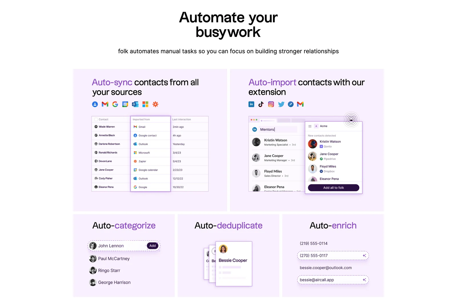
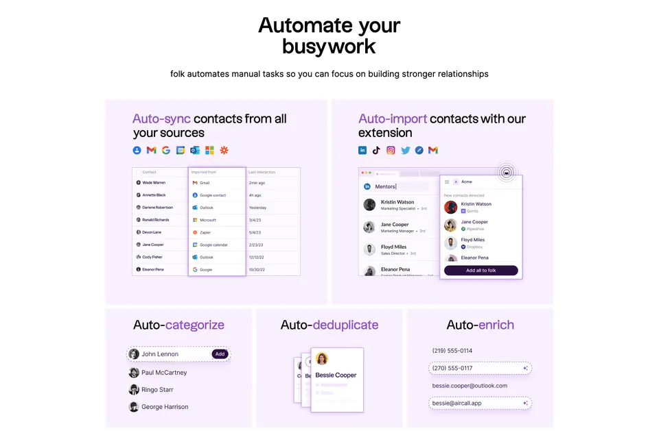
Folk's section introduces contact automation with two broad cards for syncing contacts and importing them through an extension. Below them, three smaller cards cover categorization, deduplication, and enrichment. The layout gives the two acquisition routes more demonstration space while treating maintenance tasks as concise supporting capabilities.
This is a useful reason for unequal card sizes. A table of imported contacts needs more horizontal room than an overlapping pair of profile cards illustrating deduplication. The content determines the area, rather than a predetermined mosaic forcing every feature into a decorative shape.
Check whether the largest card communicates the most important or hardest-to-explain idea. If its size reflects only an attractive illustration, visitors may overestimate the importance of that feature. Use visual priority to support your actual product narrative, and make the remaining cards sufficiently legible to retain their own meaning.
Show a specific product behavior inside each card
Folk pairs its contact-sync message with service logos and a contact table that includes an imported-from column. Its extension card combines source platforms with a browser-like contact capture. These details provide clues about how information enters the product, rather than relying solely on a generic promise of automation.
The smaller cards follow the same principle at a reduced scale: lists suggest categorization, overlapping profiles suggest duplicate records, and highlighted contact details suggest enrichment. Each illustration supports the adjacent heading. The section does not need a full application screenshot to make the relationship understandable.
Choose details that explain the benefit without pretending the marketing composite is an interactive interface. A staged table, simplified browser window, or animated diagram can illustrate a workflow, but it should not create a false expectation that its controls work on the page. Avoid miniature interface text that becomes unreadable at the actual display size.
Keep mixed messages coherent
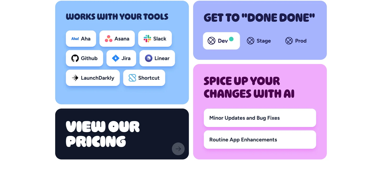
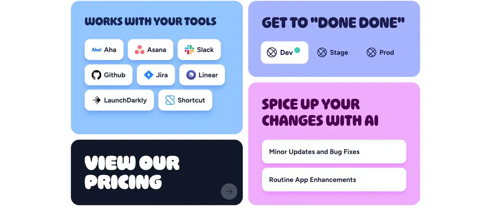
Makelog's grid contains a large panel of tool logos, a smaller development-stage illustration, an AI writing panel, and a dark pricing card. These cards do different jobs: showing compatibility, explaining release progression, suggesting a writing benefit, and offering a commercial next step.
The grid can accommodate those roles because the cards use short headings and distinct visual demonstrations. However, mixed messages need a stronger editorial check than a set of parallel feature descriptions. Ask whether a first-time visitor can explain why these four ideas belong together and what they say about the product.
A pricing destination is not another capability. Its dark treatment and arrow help separate it from the explanatory panels in the capture. When including a conversion card in a feature grid, preserve that distinction. Do not make every feature look like a purchase button or hide the commercial action inside an illustration with no clear label.
Write headings that survive without their illustrations
A card heading should establish the message quickly. Folk uses action-oriented automation labels, giving each panel a task. Makelog uses a more expressive brand voice, including a heading about getting work fully done. Both approaches can work, but playful copy requires enough surrounding detail to resolve its meaning.
Read the headings as a list. If they all sound interchangeable, they probably describe vague benefits rather than specific capabilities. If one requires internal product vocabulary, add a short supporting line or choose a more familiar phrase. Keep the amount of explanatory copy consistent with the card's role and available space.
Do not bury essential qualifications in tiny text at the bottom of a card. A compatibility promise should lead to clear information about what is supported. An AI assistance claim should describe the task being assisted. Use the grid to start understanding, then provide an appropriate destination for details that cannot fit responsibly within it.
Make interaction consistent and discoverable
Decide which part of a card is interactive. A whole-card link offers a generous target, but it should have one unambiguous destination. A card with several unrelated links needs separate controls and cannot behave as a single large link without creating confusion.
Use visible labels, arrows, or button treatments where navigation is intended, and provide a clear focus state. The Makelog pricing panel visibly includes an arrow; the static capture does not establish how the complete card behaves. Treat that as a visual cue to evaluate, then verify interaction separately in your implementation.
Avoid hover effects that imply action on decorative cards. If all cards lift or brighten on hover but only one navigates, users must guess. For interactive demonstrations, explain what can be manipulated and preserve a useful fallback. Do not let a lightweight marketing interaction trap keyboard focus or interrupt the page's normal reading order.
Plan the mobile reading order independently
A desktop bento grid may have two broad cards above three smaller ones, or columns with vertically stacked panels. On a narrow screen, the same arrangement usually becomes a sequence. That sequence needs editorial intent: the main capability should appear before supporting detail, and a conversion card should arrive at a meaningful point.
Use a logical document order that remains sensible when cards stack. Avoid relying on visual rearrangement to rescue content that reads poorly in the underlying structure. Check whether a tall illustration pushes the next heading several screens away, and crop or simplify decorative details rather than shrinking the entire card until its content is illegible.
Test long headings, translated copy, zoomed text, and missing image states. Cards should grow when text needs more room. A fixed-height tile that clips its description can destroy the message even when the outer grid remains perfectly aligned. Compactness is valuable only while the content stays usable.
Use motion and color to support comprehension
Both captures use distinct colored panels, making the cards easy to separate. Folk uses related purple tones for a unified automation section; Makelog gives different messages different backgrounds and reserves a dark panel for pricing. Color can establish rhythm and hierarchy, but the content still needs readable contrast and a clear relationship to the section heading.
Do not make color the only way to distinguish a feature or state. The development-stage illustration in Makelog also uses labels for Dev, Stage, and Prod. Similar labeling matters whenever a card depicts progress, status, or a comparison.
If illustrations animate, keep their movement purposeful and avoid requiring animation to understand the claim. Offer a stable state when reduced motion is preferred. Several simultaneous looping demos can distract from the headings and increase page weight. Choose the one movement that explains a useful transition, rather than making every card compete for attention.
Check whether the grid earns its complexity
- Does the section answer one clear product question?
- Does each card add a distinct message?
- Do larger cards deserve their priority and space?
- Does each illustration support its own heading?
- Are navigation cards visibly different from decorative panels?
- Does the reading order work when the layout becomes a single column?
- Can text expand without being clipped?
- Are status and meaning understandable without color or motion?
- Do linked details clarify compatibility, availability, or important limitations?
Compare the grid with a simple list during design review. If the list communicates the same ideas more clearly, the layout may be adding complexity without a benefit. If the cards make the relationships easier to scan and the demonstrations easier to remember, the bento structure is doing useful work.
Frequently asked questions about bento grids
When should a SaaS website use a bento grid?
Use one for a compact overview of related capabilities that benefit from short visual demonstrations. Choose a more linear section when the visitor must understand a strict sequence, read substantial explanation, or compare many values across consistent rows.
Should every bento card be clickable?
No. Cards can explain a product without navigating anywhere. Establish a consistent interaction rule and make actionable cards recognizable. A clear link is more useful than a grid that makes visitors experiment to discover which panels respond.
How many cards belong in a bento section?
Use the number needed to tell the section's story without repeating claims. Begin with a small set of distinct messages and test how it reads on mobile. Add a card only when its content improves understanding, rather than filling an empty space in the composition.
Browse SaaS bento grid examples on SaaSFrame to compare card hierarchy, product demonstrations, conversion placement, and responsive reading order.