 SaaSFrame
Modal
Focus user attention with versatile SaaS Modal patterns. From small confirmation dialogues to full-screen 'Slide-overs,' find the best way to present content over your main UI.

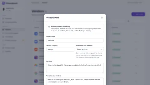
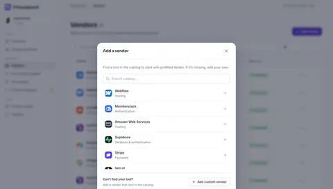
Index of all 525 Modal examples
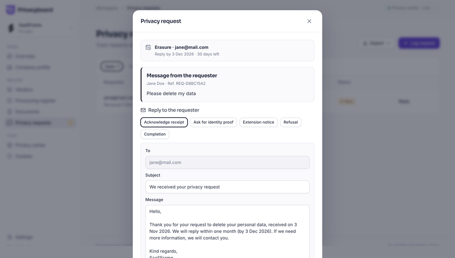
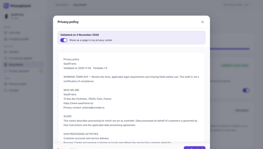
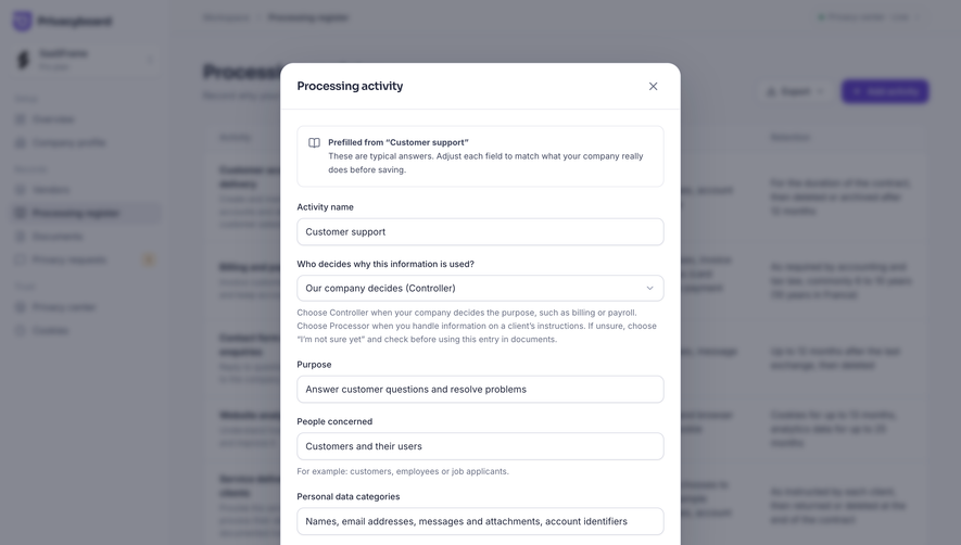
- Privacyboard Choose a processing activity template
- Privacyboard Edit vendor details
- Privacyboard Choose a vendor from the catalog
- Moss Choose a payment method
- Moss Add a payment card
- Moss Set a monthly spend limit
- Moss Compare subscription plans
- Moss Save your new project key
- Moss Create a project API key
- Moss Confirm index deletion
- Moss Add a website crawl source
- Moss Preview a sample index dataset
- Moss Choose data for a new index
- Dub API key created
- Dub Create an API key
- Dub Create a link tag
- Dub Create a short link
- Pangram Referral rewards
- Pangram Invite friends
- Pangram Add API credits
- Pangram Delete API key
- Pangram API key created
- Pangram Gmail integration plans
- Pangram Delete image result
- Pangram Share detection result
- Tines AI Model & Spend Settings
- Tines Member Access Permissions
- Tines Member Profile & Roles
- Tines Command Palette
- Tines Skill Access Settings
- Tines Skill Definition Editor
- Tines Anthropic Connector Setup
- Tines Onboarding Blocker Summary
- Tines Access Approval Review
- Lightspark Enforce SSO Domain
- Lightspark Invite Team Member
- Lightspark Edit Profile Name
- Lightspark Command Palette
- Lightspark Issue Virtual Card
- EigenPal API key created
- EigenPal Create an API key
- EigenPal Add a webhook endpoint
- EigenPal Welcome to EigenPal
- Hugging Face Open a new pull request
- GraphCMS Review AI-generated content
- GraphCMS Move content entry modal
- GraphCMS Edit digital asset modal
- ReflexAI Create simulation dialog
- Cloudflare Create A Dashboard
- Cloudflare Register Domain Via API
- Lightdash Search Modal
- Profound Content Templates
- Claude Add Connector
- Claude Create New Project
- Claude Search Modal
- Dust Add Connection
- Prelude Invite Team Members
- Prelude Checkout
- Prelude Add Number
- Prelude Generate Key
- Unkey Create Identity
- Unkey Create New Permission
- Unkey Create New Role
- Unkey Delete API
- Unkey Edit External ID
- Unkey Disable Key
- Unkey Delete Key
- Unkey Manage Role And Permissions
- Unkey Create New API
- Visitors Add Project
- Visitors Delete
- Visitors Upgrading
- Visitors Setup Tracking
- FullEnrich Enrich Work Email
- FullEnrich New Enrichment
- Huly Add Schedule
- Hume AI New Voice Set Up
- Hume AI Generating New Voice
- Hume AI Voice Design
- Reducto Extract Document
- Reducto Split Document
- Reducto Parse Document
- Atlas Add Widget
- Atlas Add Dataset
- Atlas Welcome Screen
- Wise Review & Confirm Conversion
- Wise Select Conversion Amount
- Wise Select Conversion Amount
- Wise Convert Money
- Wise Send Payment Request
- Wise Request Money
- Wise Add Money With Card
- Wise Add Money
- Wise Enter Password
- Wise Confirm & Send Money
- Wise Select Transfer Recipient
- Wise Search Transfer Recipient
- Wise Add Transfer Recipient
- Wise Select Transfer Frequency
- Wise Schedule A Transfer
- Wise Schedule A Transfer
- Wise Send A Payment
- Wise Popup Modal
- Pitch Upgrade Prompt
- Pitch Import Presentation
- Pitch Search Modal
- Pitch Exporting PDF Presentation
- Pitch Export Presentation
- Pitch Sharing Link Created
- Pitch Create New Sharing Link
- Pitch Share Externaly
- Pitch Invite Collaborators
- Pitch Product Tour
- Pitch Product Tour
- Pitch Product Tour
- Pitch Product Tour
- Pitch Product Tour
- Pitch Welcome Screen
- Customer.io CSV Import Review
- Customer.io Add A Contact
- Customer.io Campaign Setup Success
- Customer.io Campaign Review
- Customer.io Campaign Goals Settings
- Customer.io Campaign Review
- Checkout.com Set Up API Keys
- Checkout.com Add Chart To Board
- Checkout.com Create New Board
- Checkout.com Generating Report
- Checkout.com Create New Report
- Superlist Delete Account Confirmation
- Superlist Invite Team Members
- Superlist Upgrade prompt
- GoFundMe Redirection To Third-Party App
- GoFundMe Checklist Successfully Completed
- GoFundMe Account Setup
- GoFundMe Edit Profile Picture
- GoFundMe Setup Profile Picture
- GoFundMe Copy Foundraiser Share Link
- GoFundMe Foundraiser Share Modal
- Steep Account Setup
- Steep Account Setup
- Wiza Create A List
- Wiza Invite Team Members
- OpenAI Add Payment Details
- OpenAI Create New Assistant
- OpenAI Create New Assistant
- OpenAI API Key Created
- OpenAI Create API Key
- OpenAI Information Modal
- OpenAI Enter Code
- OpenAI Phone Number Verification
- Mintlify Remove Custom Domain
- Latitude Share Project
- Latitude Create New Project
- Latitude Welcome Screen
- Intercom Set Workflow Live Confirmation
- Intercom Add Chatbot Content
- Intercom Use AI Assistant Modal
- Intercom Search Actions Modal
- Oku Delete Account Confirmation
- Oku Feedback Modal
- Oku Bring Your Friends
- Oku Remove From Library Confirmation
- Uvodo Add A Team Member
- Stripe Verification Completed
- Uvodo ID Verification
- Uvodo Uvodo Create Virtual Card
- Uvodo Uvodo Success
- Uvodo Uvodo Create A Link
- Uvodo Uvodo Create A Link
- Remote Referral Link Ready
- Remote Approve Time Off
- Remote Time Off Request
- Remote Employee Product Onboarding
- Remote Employee Product Onboarding
- Remote Employee Product Onboarding
- Remote Welcome Screen
- Remote Send Employee Invite
- Remote Add A New Hire
- Remote Add A New Hire
- Remote Add A New Hire
- Remote Welcome Screen
- Remote Email Address Verification
- FlowMapp Checkout
- FlowMapp Upgrade Plan
- FlowMapp Export Flowchart
- FlowMapp Invite Team Members
- FlowMapp Invite Team Members
- Hyperline Cancel Subscription
- Hyperline Cancel Subscription Confirmation
- Hyperline Create A New Customer
- Hyperline Select Product Category
- Copperx Add Customer
- Copperx Customers Import Mapping
- Copperx Import Customers
- Copperx Add Crypto Address Error
- Copperx Add Crypto Address
And 325 more in the library.
Modal: design guide
A modal is a focused dialog that appears above an application and requires users to address or dismiss it before interacting with the underlying interface. In SaaS products, modals often support a short task, a consequential decision, or a transition that benefits from keeping the original resource nearby. Their value is focus; their cost is interruption.
Good modal design defines a clear purpose, an understandable action, and a safe way to leave. It also manages focus, scrolling, validation, and the return to the underlying task. This guide analyzes captured dialogs from Clay, Pitch, and GoFundMe to compare a compact sharing interaction, a denser configuration task, and a completion handoff. The screenshots show visible dialog structures; they do not establish actual focus containment, backdrop behavior, or current implementation details.
Choose a modal only when the interruption serves the task
A modal is appropriate when the user needs to complete a bounded interaction while retaining the context of the page behind it. Sharing the current resource, confirming a consequence, or configuring a short creation task can fit that pattern. A long workflow with many dependencies may need its own page.
Ask what the user must stop doing and why. If the content is a routine status update that does not require a decision, inline feedback may be sufficient. If users need to compare several resources while editing, a nonblocking panel may serve them better. Blocking the rest of the product should be a deliberate interaction choice rather than an automatic response to limited layout space.
Also distinguish a modal from a popover. A popover can expose a small contextual choice without necessarily blocking the application. A modal restricts interaction to its own task. A dimmed backdrop suggests emphasis visually, but the implemented interaction must match the intended behavior.
Clay keeps a short sharing task close to the contact
The captured Clay Share Contact screen places a compact dark dialog above a dimmed contact profile. The dialog has a Share heading, a contact identity chip, an email field with an Invite button, two controls describing audience and information scope, and a Copy Link action. The underlying contact remains recognizable behind the dialog.
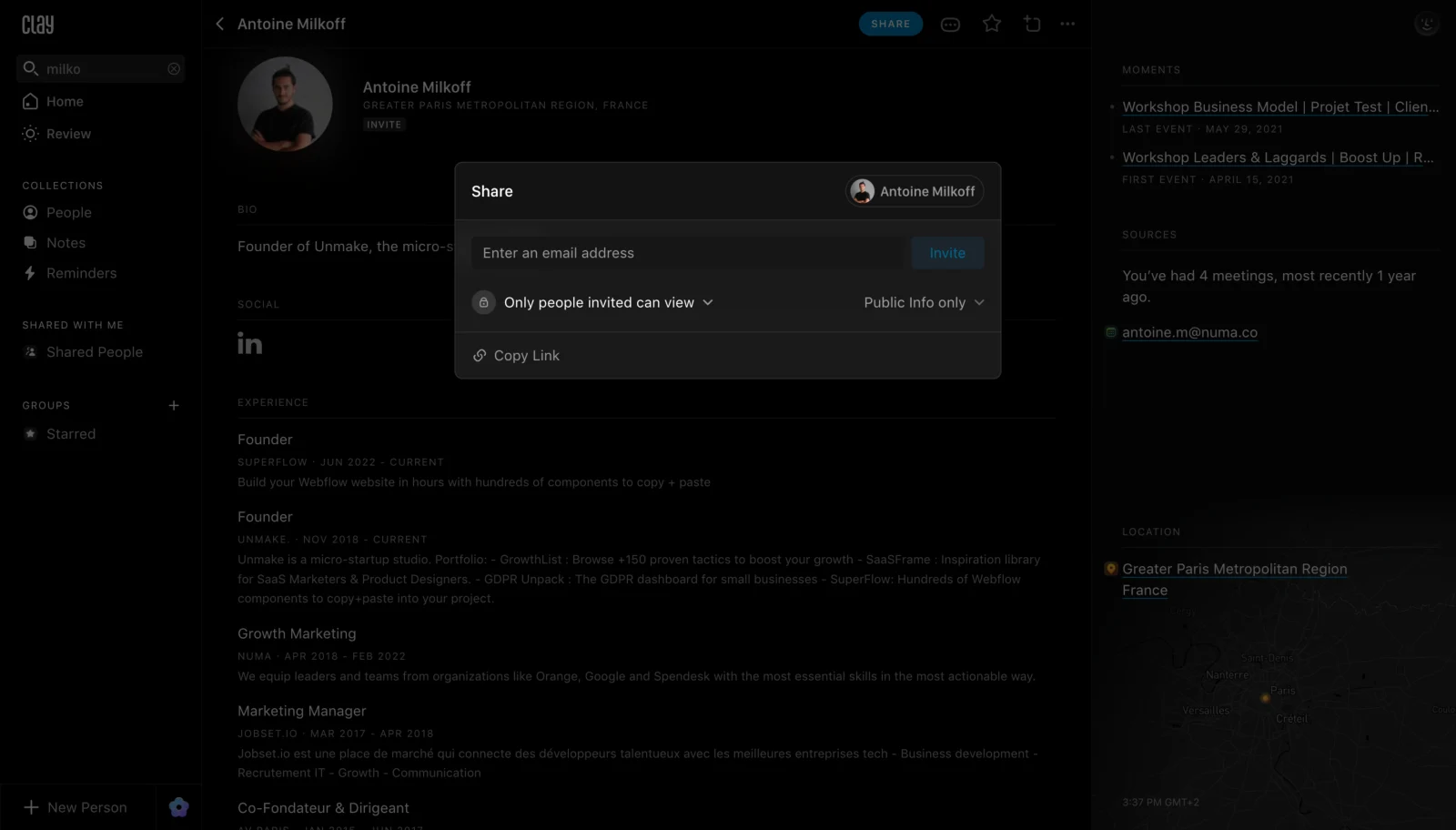
The identity chip is useful because the dialog's heading alone is generic. Users can confirm which contact the operation affects without reading the entire background profile. When adapting this approach, name the target inside the dialog when the action has consequences for access or content.
The field, invitation action, scope controls, and link action have different effects. A compact modal can hold them together, but their save rules need to be explicit. Does changing a scope apply immediately, require another action, or only affect a new link? The screenshot shows the choices, not that behavior.
No obvious close icon is visible in this capture. That is a reason to inspect the implemented exit routes, not proof that users cannot leave. A product should provide an accessible, discoverable dismissal mechanism rather than relying on a background click that some users cannot perform.
Pitch's link configuration exposes the limits of a denser dialog
The Pitch Create New Sharing Link capture has a large New link dialog over a presentation editor. Analytics link and Basic link are presented as two choice cards, with Analytics link visibly selected. Link name and URL fields appear below, followed by preference controls. A bottom action area contains Fewer options and Create link. Back and close controls are visible near the title.
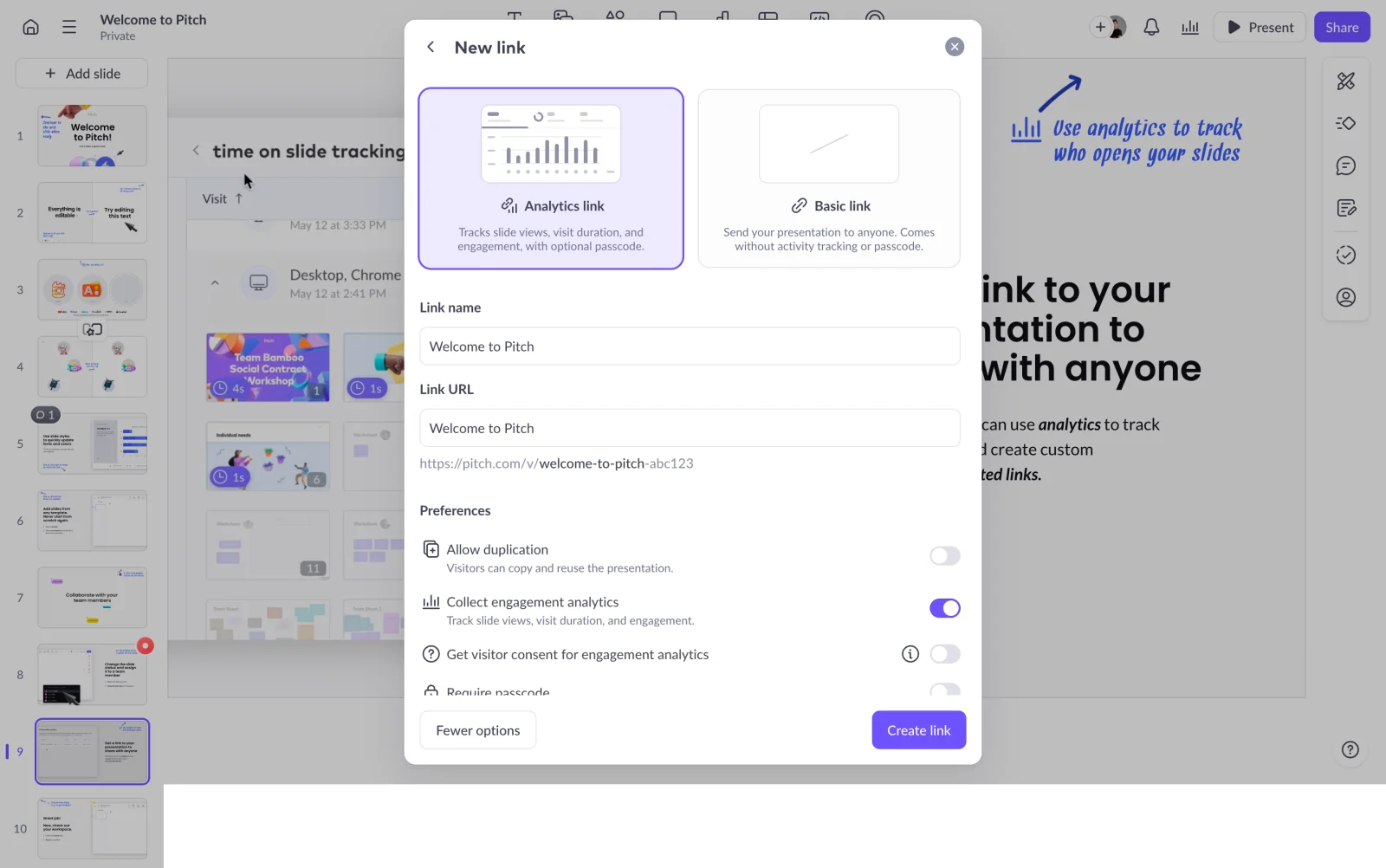
This example shows several layers of decision: link type, identification, and preferences. Choice-card descriptions explain the visible alternatives before the user reaches the fields. The separate Create link action names the commitment at the end rather than using a vague confirmation label.
The dialog is tall, and lower preference content is partially visible near the footer. That illustrates why a modal review must include scrolling and smaller viewports. Ensure that a persistent action area does not hide fields, validation messages, or focused controls. A user should be able to inspect every relevant preference before committing.
Back and close also have different meanings. Back may return to a prior dialog state, while close may exit the whole interaction. Define what happens to entered values in each case. The capture does not establish those transitions or whether changes are applied before Create link is selected.
For the access decisions inside this task, see Share. The modal's layout can focus attention, but it cannot make an unclear permission or analytics choice understandable by itself.
GoFundMe uses a completion dialog to hand off to another section
The GoFundMe Checklist Successfully Completed capture shows a centered dialog above a dimmed checklist. Its message is Section complete, supported by encouraging text and a small celebratory icon. Next section is the primary action, and a close icon is visible at the upper right. A 5 of 5 indicator remains visible in the background.
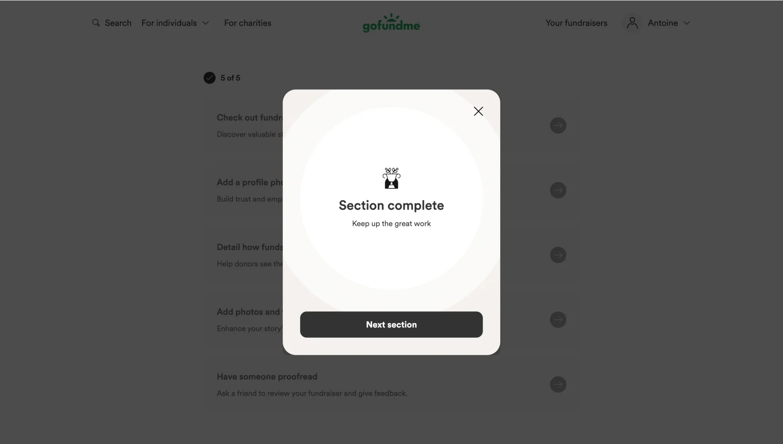
The wording sets an important boundary. Section complete is narrower than setup complete or fundraiser ready. The next action makes continuation explicit, while close offers a visible way to leave the handoff. The screenshot does not establish how checklist completion is validated.
Completion modals should earn their interruption. They can be useful when the next stage is otherwise unclear or when a meaningful milestone deserves acknowledgement. If every small action opens a dialog, users must repeatedly dismiss feedback to continue. Compare a modal with inline confirmation before choosing the level of interruption.
Name the target, consequence, and primary action
A dialog should answer what am I doing, to which resource, and what happens if I continue? The title can name the operation, supporting text can explain consequences, and the primary button can name the commitment. Avoid relying on a generic OK when the action creates, sends, changes access, or removes something.
For a destructive decision, explain the affected resource and practical consequence. A confirmation is useful when it helps users evaluate that consequence, not when it merely asks Are you sure? after every routine click. If the action can be reversed easily, an undo route may be more efficient.
Keep cancellation clearly separate from commitment. Visual hierarchy should help users find the action, while the labels remain understandable without styling. Do not use two nearly identical buttons when one saves a draft and another executes a persistent change.
Define dismissal and unsaved-work behavior before implementation
List every exit route: a close control, Cancel, Escape, a backdrop click, navigation, and possibly a back control within the dialog. Decide what each does to the draft and any changes already applied. The same visual close icon should not unpredictably save in one state and discard in another.
If leaving would lose meaningful work, preserve the draft where practical or explain the consequence. Avoid trapping users with no exit simply because validation is incomplete. A task can be required for a later operation without preventing someone from returning to the rest of the application.
Backdrop dismissal requires particular care for forms. An accidental click should not silently discard a long configuration. For a short noneditable message, backdrop dismissal may be reasonable if other accessible exits remain available. Match the rule to the content and make it consistent.
For submission in progress, distinguish leaving the dialog from cancelling the underlying operation. Closing a visual surface may not stop an action already accepted by the server. Explain what can actually be cancelled and where users can inspect the result.
Keep validation and processing inside a coherent task state
Validate fields with specific feedback near the relevant control, and provide an overall explanation when several issues prevent submission. Preserve entered values after an error. A modal's limited space is not a reason to replace useful guidance with a generic failure banner.
When submission begins, show processing clearly and prevent unintended duplicate commitments. Do not close the dialog before the product can communicate whether the action was accepted. If the outcome is uncertain, explain that uncertainty and provide a way to inspect task status instead of encouraging a blind retry.
After success, update the underlying resource coherently. A created link should become available, an invitation should have an understandable state, and a completed section should lead to the next relevant view. Keep the outcome visible long enough to confirm what happened without adding another unnecessary blocking dialog.
Avoid stacking dialogs into an opaque workflow
A small secondary picker may be necessary inside a task, but several stacked modals can obscure the original context and complicate closing behavior. Prefer a clear internal transition, inline expansion, or a dedicated page when the interaction grows into a substantial workflow.
When a dialog has several internal states, distinguish Back from Cancel. Back should return within the task and retain appropriate values; Cancel should exit according to the defined draft rule. Show enough context to explain the state change rather than presenting an unrelated title over the same backdrop.
If users need a sequence of dependent inputs, compare Wizard. A modal can contain a short sequence, but the need for progress, review, and resume may justify a larger dedicated surface. Do not let an initially small dialog grow into a hidden application inside the application.
Make focus and keyboard behavior match true modality
W3C's modal dialog pattern guidance describes focus moving into the dialog, staying within it while open, and returning to a logical location after dismissal. It also explains labeling the dialog and providing a visible close control. Match semantic modality to actual behavior.
Choose initial focus according to the task. A simple input dialog may begin at the first field. A long explanation may need focus at the heading or beginning so users can read the context. A consequential confirmation should not automatically encourage the irreversible action solely because it is visually prominent.
When a dialog closes, return users to the triggering control or another logical next location. If the trigger disappears because the task completed, define a useful fallback. Keep focus from landing on the page background or an unrelated control.
The screenshots show dimmed backgrounds, but they cannot establish focus containment, Escape handling, accessible names, or whether background controls are inert. Validate those behaviors directly in an implementation rather than treating the overlay as proof of accessibility.
Handle scrolling, small screens, and interruptions
Size the dialog to its content and viewport. Long forms need a clear scrollable area and an action region that does not cover the last field. Preserve the ability to read instructions while entering data. Check that validation does not move a focused control behind a footer.
On mobile, a full-screen presentation may be more usable than a small centered box. The software keyboard reduces available height, and users need a reachable exit and submission route. Test long labels, large text, and landscape orientation rather than shrinking the desktop design.
Prevent competing page and dialog scrolling from becoming disorienting. If the background remains visible, keep its position stable so users return to the same work. During session expiry or connection loss, preserve the dialog's draft and explain the recovery path.
Review the modal through the complete interruption cycle
- Purpose: Does blocking the page help the current task?
- Context: Can users identify the affected resource inside the dialog?
- Commitment: Does the primary action name its consequence?
- Exit: Are close, cancel, back, and backdrop rules coherent?
- Draft: Is entered work preserved or its loss explained?
- Errors: Can users locate and correct issues without starting over?
- Focus: Is keyboard movement predictable during and after the dialog?
- Space: Are all fields and actions reachable with zoom or a mobile keyboard?
- Outcome: Does success update the underlying task clearly?
Test opening, partial editing, cancellation, validation failure, submission, and return to the page. Observe whether users can explain what was changed and what remains unsaved. Frequent dismissal is not automatically evidence that the dialog is effective; it may reveal that the interruption is unnecessary.
Frequently asked questions about SaaS modal design
When should a modal be replaced with a page?
Consider a page when the task is long, requires substantial comparison, has several dependencies, or needs a durable route for resuming. A modal is strongest for a bounded interaction that benefits from retaining the original resource context.
Should clicking outside a modal close it?
Choose according to consequence and draft state. A short message can tolerate easy dismissal, while an editable form needs protection from accidental loss. Provide a visible accessible exit regardless of whether backdrop dismissal is supported.
Should every successful action open a confirmation modal?
No. Use inline feedback when a blocking interruption adds little. GoFundMe's captured completion dialog provides a named next-section handoff; that is a more specific purpose than merely showing success after every action.
Can a modal contain a long form?
It can, but scrolling, validation, keyboard height, and draft recovery become more demanding. Pitch's captured configuration illustrates the density tradeoff. Reconsider the surface when users need too much information or too many steps to complete the task comfortably.
How is a modal different from a popover?
A modal blocks interaction with the underlying interface until addressed or dismissed. A popover can offer a contextual choice without that full restriction. Choose based on the required behavior and implement focus and semantics accordingly.
Compare Clay's compact task, Pitch's denser configuration, and GoFundMe's handoff by the interruption each introduces. A reliable modal helps users complete one clear interaction and return to their work with the outcome understood.