 SaaSFrame
🔍 Search
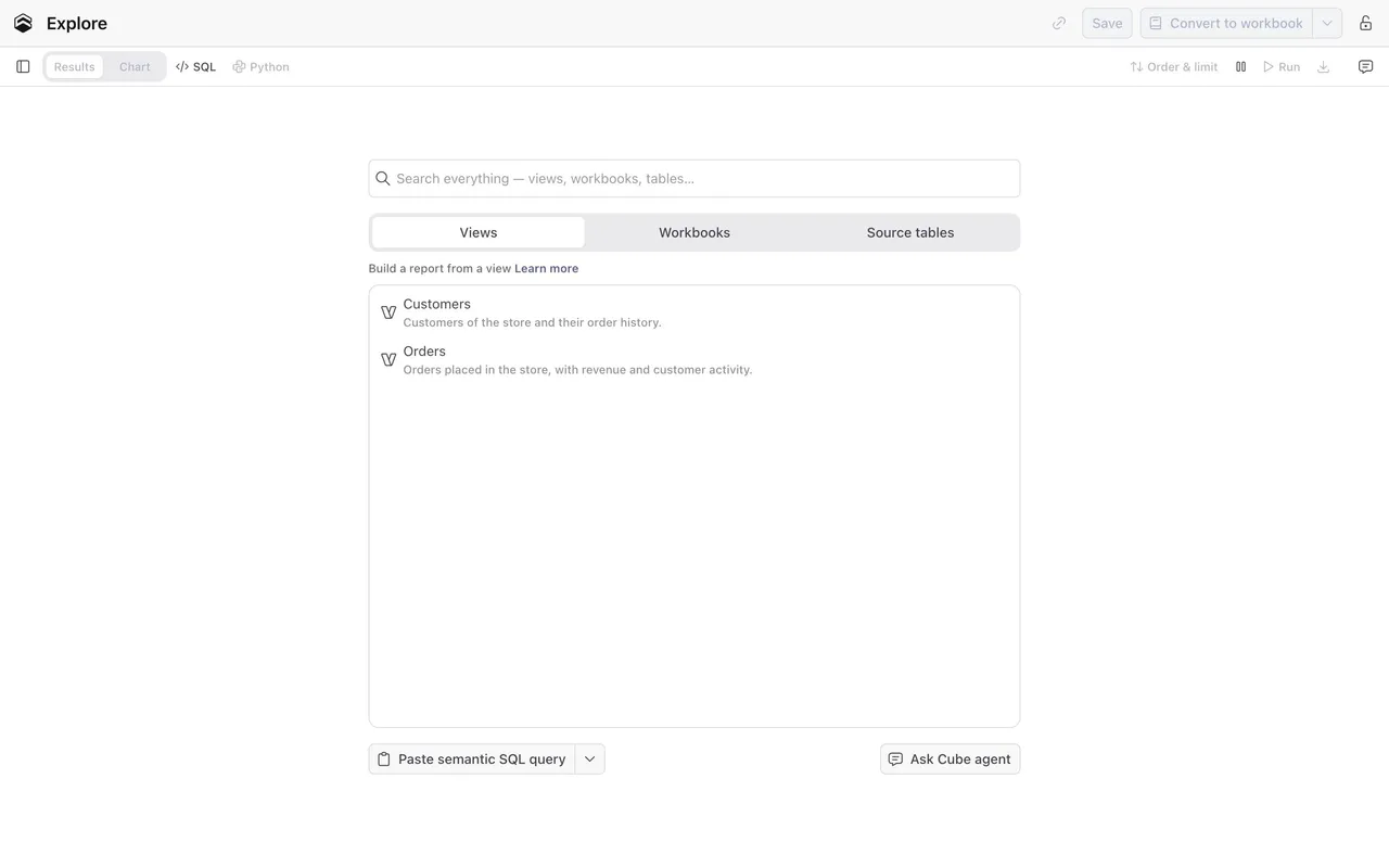
Improve navigation with lightning-fast SaaS Search Modals and Command Palettes. These examples showcase 'CMD+K' interfaces, filtered search results, and recent history logs that help users find anything in your app instantly.




Index of all 34 Search examples
- Rox Search Palette
- Unabyss Integrations Search
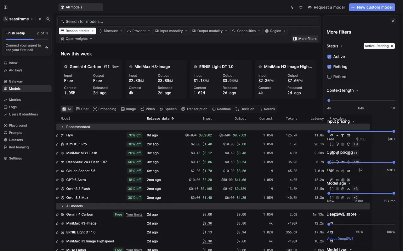
- Respan Model Catalog
- Datashake Social Search
- Datashake Search Modal
- Tines Command Palette
- Lightspark Command Palette
- Hugging Face Browse AI models
- Lightdash Search Modal
- Claude Search Modal
- Pitch Search Modal
- Intercom Search Actions Modal
- Intercom Use AI Assistant Modal
- Frame Search Modal
- Frame Search Modal
- Zeda.io Search Modal
- Mixpanel Search Modal
- MonSpark Search Modal
- Assembly Search Modal
- Assembly Search Modal
- Current Search Modal
- Reflect Search Modal
- Reflect Search Modal
- Height Search Modal
- Klu Search Modal
- Klu Search Modal
- Klu Search Modal
- Cycle Search Modal
- Cycle Search Results
- Skiff Search
- Skiff Search Results
🔍 Search: design guide
Short answer
A SaaS search modal lets users find a record or destination without leaving their current context. Define what is searchable, separate search results from commands, show enough context to choose the right record, group results by type and make keyboard navigation predictable.
In the libraryas of November 2026
- Screens
- 36
- SaaS products
- 25
- Last added
- Nov 2026
Common patternsModal 26Search 20Keyboard Shortcuts 13Text Input 12List View 8
A SaaS search modal helps users find an object or destination without leaving the current working context. It can combine record results, product navigation, and commands, but those categories need clear treatment. The goal is to shorten a meaningful route through the product while preserving predictable selection behavior.
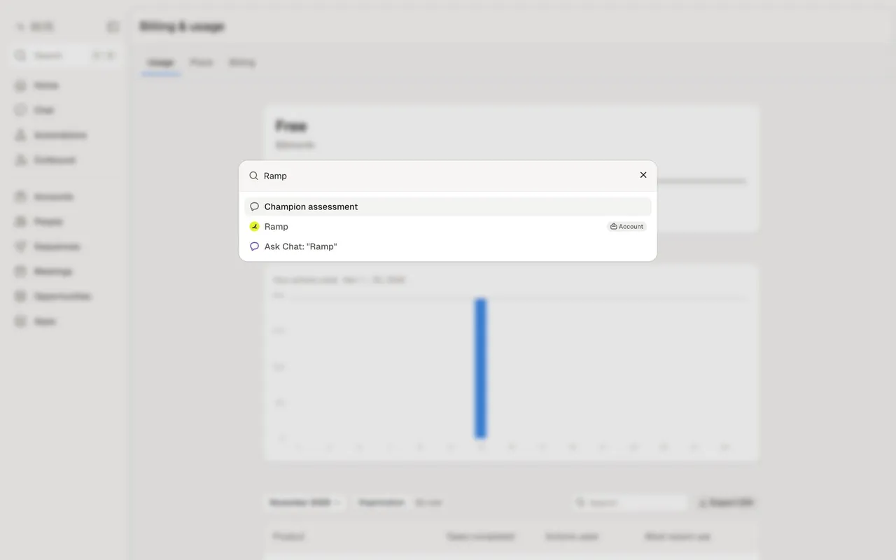
The SaaSFrame references show a filtered search surface, a CRM result preview, and a command palette. These illustrate related but distinct models. A search modal should not be evaluated only by how quickly it opens or how visually compact its result list appears.
What can users search for?
Users need to know whether they are searching the whole product, the current workspace, one object type, or a selected view. State the relevant scope near the input or through recognizable controls.
A query can match record names, content, identifiers, and settings. Explain the categories where they affect interpretation. A result with the same title as another object needs enough context to distinguish the destination.
Keep permission boundaries in the results. Search should not expose confidential names or previews merely because the underlying record is indexed. The visible result set needs to follow the viewer's actual access.
Distinguish search from command execution
Search retrieves something to inspect. A command performs an action or navigates directly. They can coexist in one modal, but their result types and consequences should be recognizable.
Use clear labels and grouping. A record result can show object identity and context; a command can show an action verb and destination. Do not make a destructive command look like an ordinary document link.
Choose the initial content deliberately. Recent objects, common destinations, and suggested commands answer different needs. An empty-query state should support orientation rather than display an arbitrary collection of options.
Study search with filters and result categories
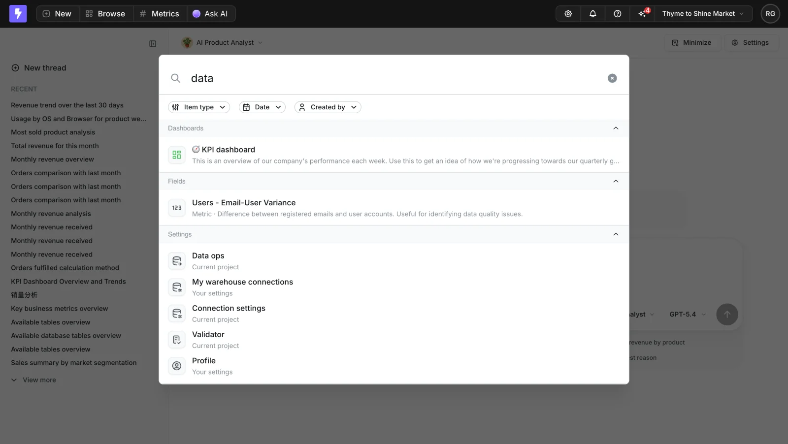
The Lightdash capture shows a query within a modal and provides filters for item type, date, and creator. Results include analytical objects and settings-related destinations, with descriptive text where relevant.
This helps users narrow a broad search space while maintaining the current product screen behind the modal. Descriptions can communicate the purpose of a dashboard or metric beyond its title.
When adapting the model, make active filters visible and explain the current result scope. A query that returns no records under a creator filter is different from a product-wide absence. Provide a route to broaden or clear the criteria.
Show enough context to choose the right record
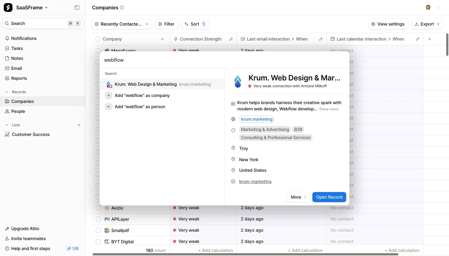
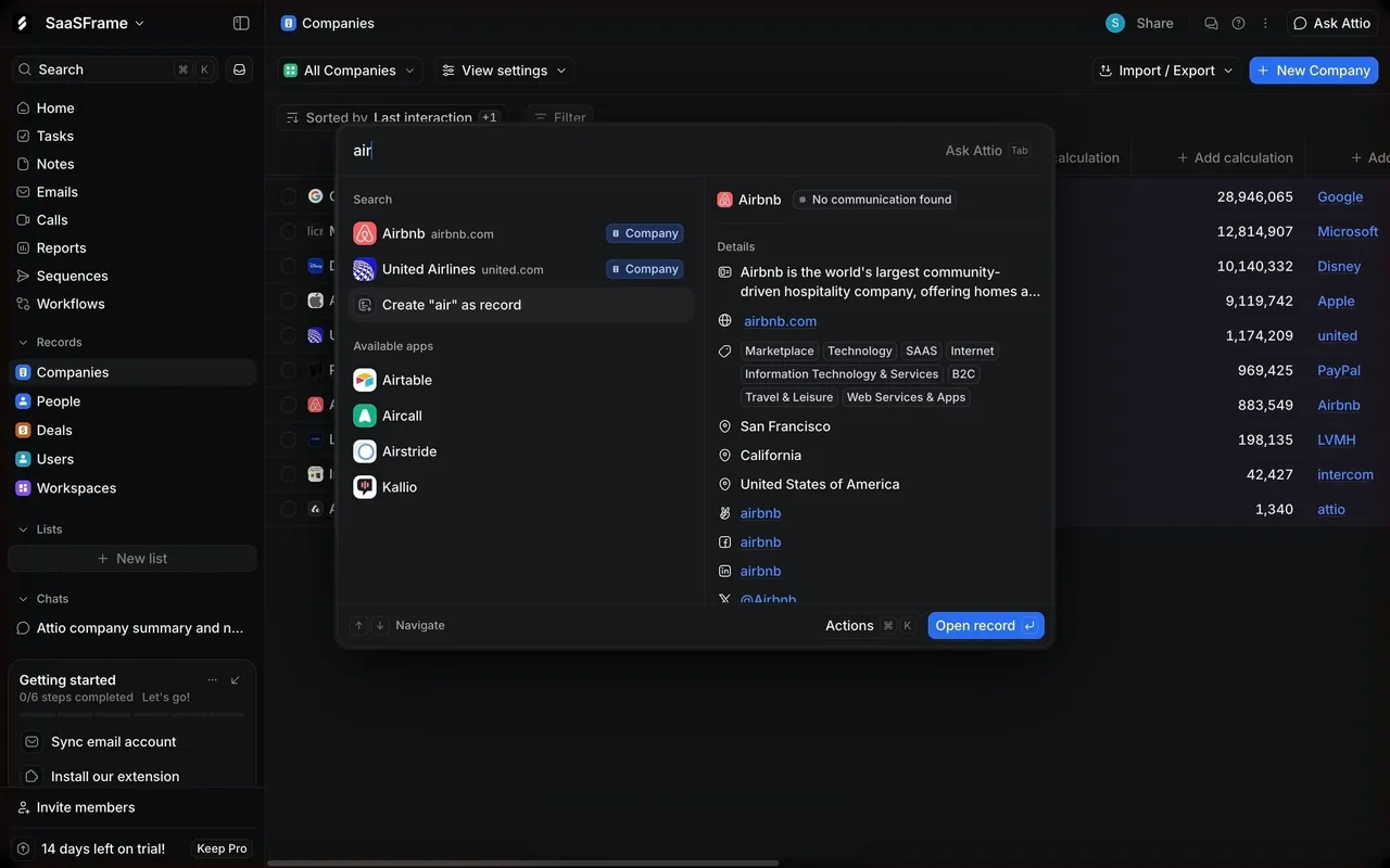
The Attio search-results capture pairs a result list with a preview of the selected company. The preview includes identifying and contextual information, while the list also offers creation routes using the entered query.
A preview can reduce unnecessary navigation when users need to distinguish similar records. It should correspond to the currently selected result and remain clearly separate from a committed navigation action.
Creation shortcuts introduce a different consequence. Adding a company or person is not simply choosing a search result. Label those routes so users do not create a duplicate object while trying to open an existing one.
Use a command palette for recognizable destinations
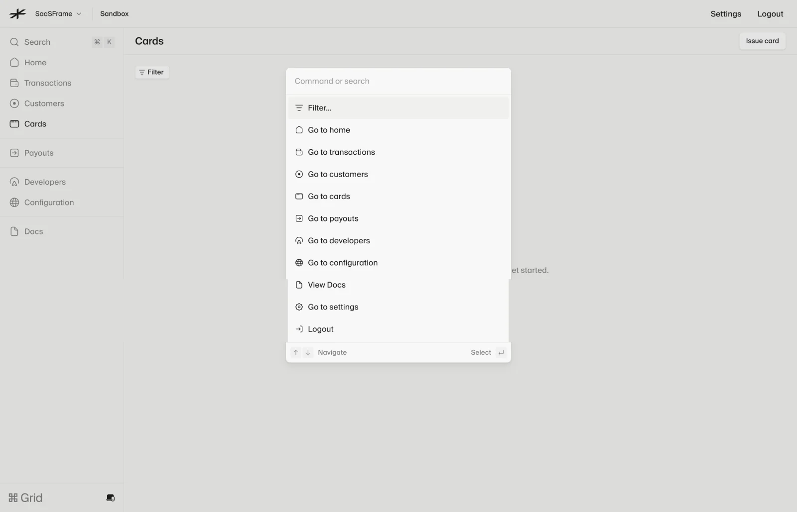
The Lightspark capture presents a command-or-search input and a list of navigation routes such as home, transactions, customers, cards, and settings. Keyboard guidance appears at the bottom.
This supports rapid movement through the product. The items use destination labels rather than pretending every row is a matched data record. The surrounding sandbox context remains visible behind the palette.
When adapting the structure, make command scope clear. Logging out or running an operation is different from navigating to a page. Consequential actions may need their own review stage rather than execute immediately from a generic result row.
Make keyboard selection predictable
Opening, typing, moving through results, selecting, and dismissing need a coherent keyboard path. Show visible focus or active selection and keep it aligned with the action that Enter will perform.
Do not move selection unexpectedly when delayed results arrive. A user may already be about to commit. Preserve a stable target where practical or make the update clear enough to avoid accidental navigation.
Escape behavior should be understandable. It may clear a substate or close the modal, but users should not have to press it repeatedly without knowing what changed. Return focus to a relevant place on dismissal.
Handle result updates without mixing states
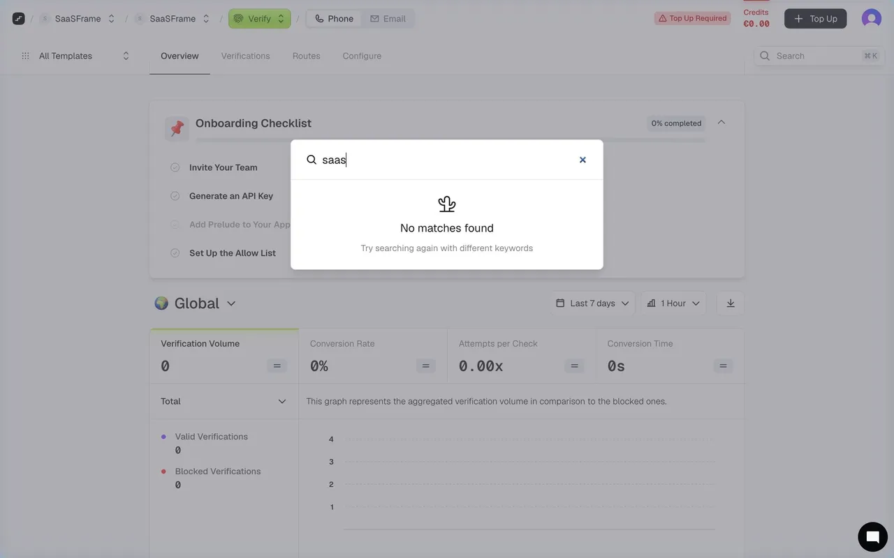
Searching is often asynchronous. Identify when results are loading and avoid displaying an old query's records as though they match the new one. A short delay can otherwise produce confident selection of the wrong destination.
Preserve the query after a recoverable failure. Distinguish no matches from an unavailable search service. The first state can invite broader terms; the second needs a useful recovery explanation.
If results are partial or limited, explain the boundary where it matters. A small modal may show a subset with a route to a fuller result page. Do not imply that the visible list is exhaustive when it is not.
Make matching and relevance inspectable
A result description can explain why an item appears when the title does not contain the query. Highlighting may help, but it should not turn every snippet into a visually noisy block.
Use object context such as type, workspace, path, or owner when it supports selection. Recency and popularity can help ranking, but they should not imply authority or correctness by themselves.
Keep similar names distinguishable. A metric, dashboard, and setting with related terminology may all match, yet lead to different work. Result grouping and accessible labels can make those differences clear.
Preserve navigation context after selection
Opening a result should lead to the intended object and relevant context. If users return, consider preserving their query and filters when that supports continued investigation.
A preview panel may let users inspect several results without leaving. Keep preview selection separate from opening the object, and provide an obvious commitment action when necessary.
For unavailable or deleted objects, handle the transition honestly. A result that disappears between search and selection should produce an understandable message rather than a generic empty page.
Keep the modal usable on small screens
A desktop modal can become a full-screen search surface on mobile. Preserve the input, active filters, and result identity without making the on-screen keyboard hide essential controls.
Preview layouts may need a separate detail stage at narrow widths. Do not compress a two-column result-and-preview structure until both parts are unreadable. The underlying selection model should remain consistent.
Use adequate target sizes and text wrapping for long titles. Important distinctions should not vanish behind truncation. Assistive technology needs understandable result names and state updates.
Validate finding, deciding, and recovering
Ask users to find a known object, distinguish two similar results, narrow a broad query, and return to their original work. Then test a query with no matches and a failed search response.
Include different permissions, long titles, large result sets, delayed updates, and mixed command-and-record lists. Observe whether users can predict what Enter or a click will do.
Measure successful destination finding and time to correct selection alongside search frequency. Repeated searches can indicate a useful shortcut or an information architecture that is difficult to navigate.
Frequently asked questions about search modals
Is a search modal the same as a command palette?
They can share an interface, but retrieving records and executing commands are different tasks. Distinguish result types and their consequences.
Should the modal show results before typing?
Recent objects or useful destinations can provide a good starting point. Choose them according to the task and label their role clearly.
How should no results appear?
Preserve the query and active filters, explain that no matches were found, and provide an appropriate way to broaden the search. Service failure needs a separate state.