Generate a new design based on this screen using your own content.
Thank you! Your submission has been received!
Oops! Something went wrong while submitting the form.
# Design from Reference: Visitors Realtime Map
Create an original, high-fidelity visual design inspired by the reference. Prioritize composition, typography, colors, spacing, and component styling over technical implementation.
## Reference
- **Product:** Visitors
- **Category:** Empty
- **Screenshot:** https://cdn.prod.website-files.com/5e9dc792e1210c5325f7ebbc/6acc0f655d6cd572f289cb76_6acc0e51abaeae850906f865_cms-b1305806e3f984f2dbdf2a86-v3.webp
Analyze the screenshot first. If inaccessible, request it rather than guessing.
## Content
{{content.instructions}}
{{content.data}}
Preserve essential messaging and factual accuracy. Adapt structure and copy length for visual balance; never invent product claims.
## Visual Design
Use this context to reproduce the reference's visual language: layout, typography, colors, spacing, borders, radii, and distinctive elements. The screenshot takes priority if descriptions conflict.
## Direction
{{preferences.fidelityInstructions}}
## Output
{{output.instructions}}
Deliver a polished, cohesive design with precise alignment, hierarchy, and spacing. Produce the requested visual artifact, not just a description. If unsupported, explain the limitation.
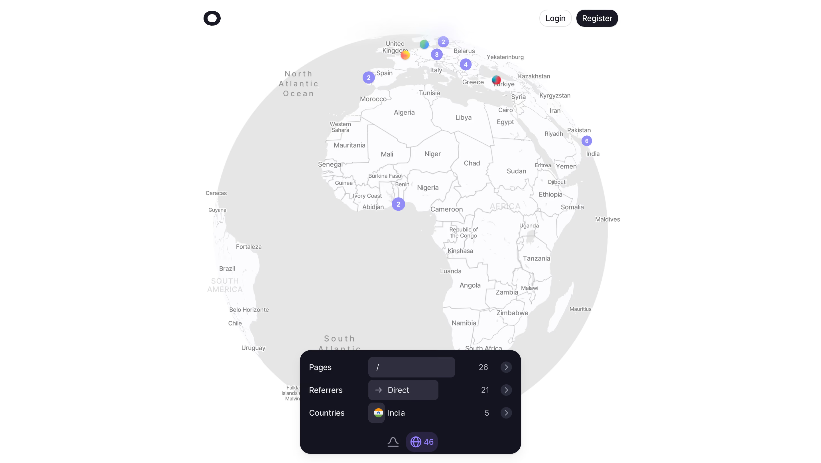
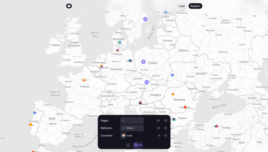
First thing you notice is that massive interactive globe dominating the viewport. It's not decorative fluff. The clustered data points with numbered badges immediately tell you this is a real-time analytics tool. Each colored dot corresponds to visitor geography, and the varying cluster sizes give you a sense of scale without reading a single number.
The Floating Dashboard Sells It
That bottom overlay card is doing heavy lifting. Pages, referrers, countries. Three rows, dead simple. The dark card against the light map creates strong contrast and draws your eye down naturally. The "46" globe icon and the minimal tab system keep it tight. No visual noise.
Restrained but Confident
The header is barely there. Logo left, two buttons right. "Login" is ghost, "Register" is solid black. Classic hierarchy. Typography is clean and neutral throughout. The color palette leans monochrome with just enough color in the map markers and country flags to feel alive. What stands out most is the confidence in whitespace. They let the product speak instead of stuffing the hero with headlines and CTAs.