.webp)

ParityDeals


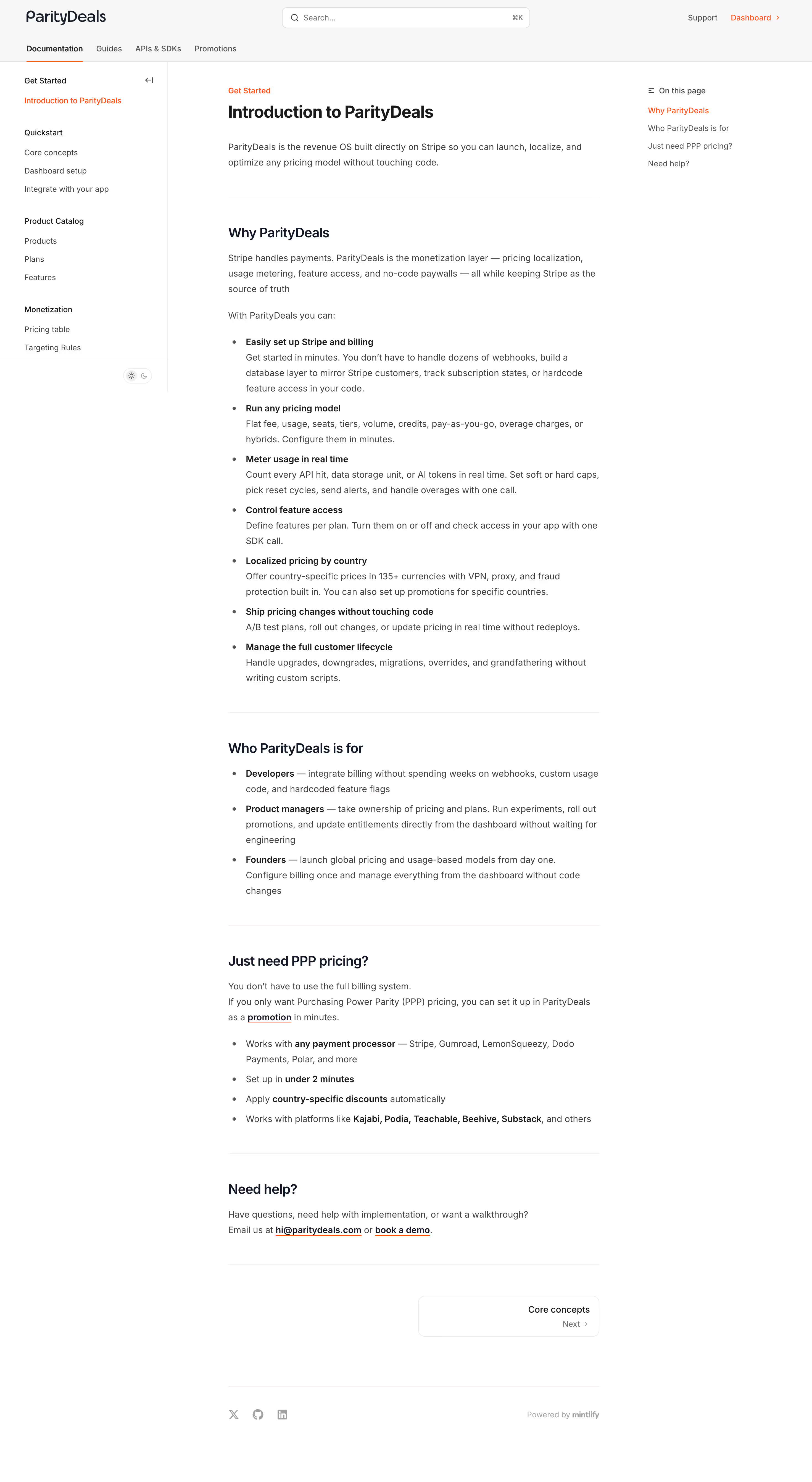
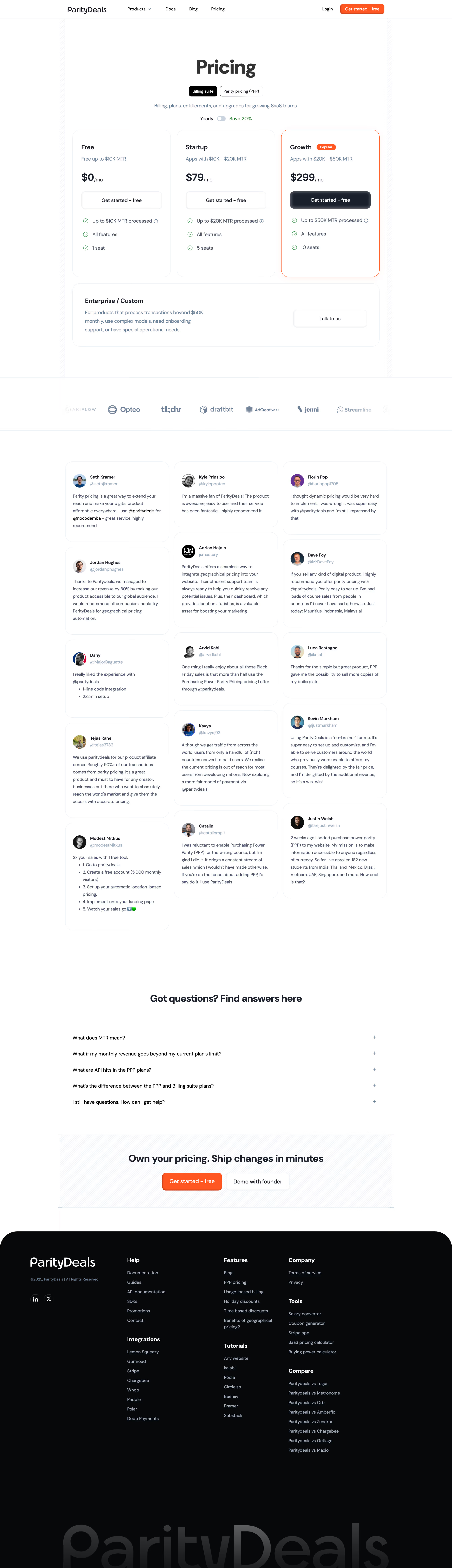
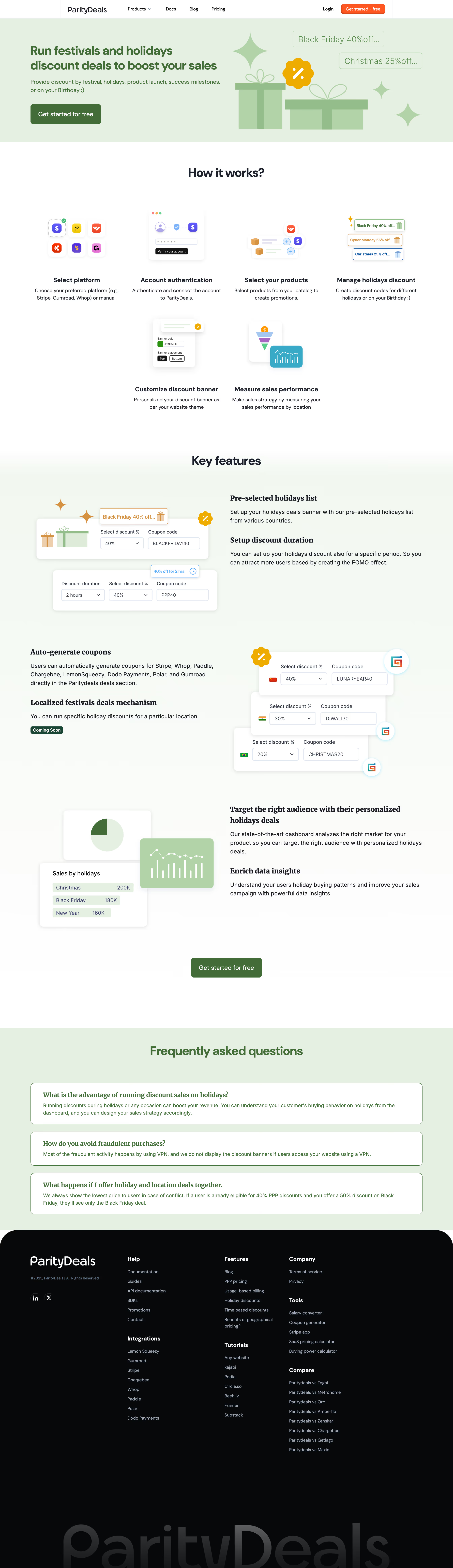
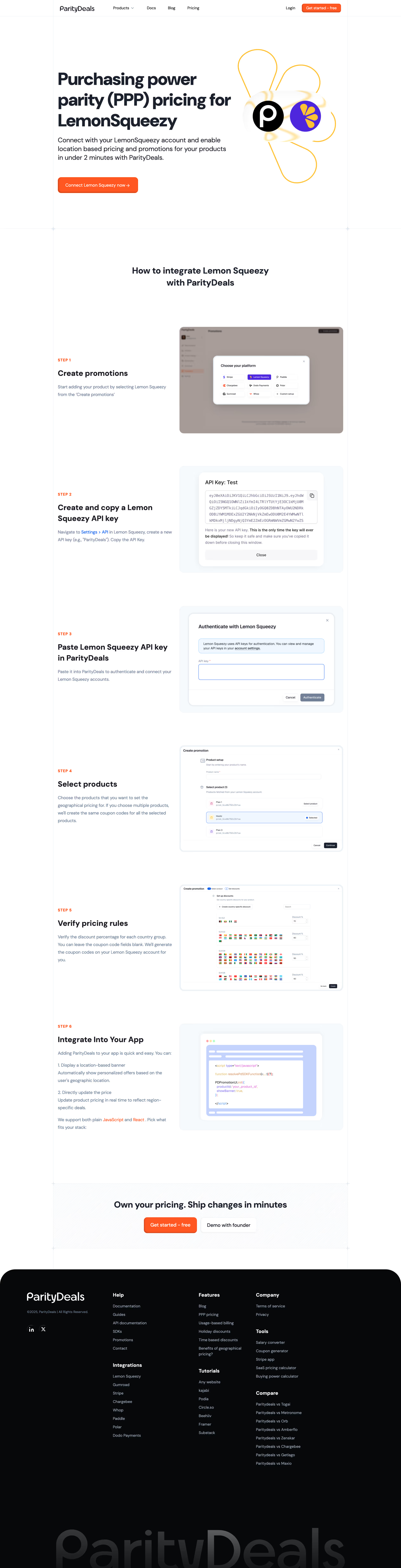

ParityDeals — Design System Overview
Source
\- URL:
Typography \- Font family: System sans-serif stack (Inter or similar geometric sans); no custom webfont detected in page source \- Headings: Bold weight (700–800), large display sizes (48–72px on hero), tight letter-spacing \- Body: Regular weight (400), ~16px base, relaxed line-height (~1.6) \- Labels/caps: Uppercase small tracking labels used for section intros (e.g. "GLOBAL REACH", "FRAUD PROTECTION") \- CTA buttons: Medium weight (500–600), 14–16px
Color Philosophy \- Light-mode only site (meta-theme-color: #fff) \- Primary background: white (#ffffff) \- Brand accent: Green — used for CTAs, highlights, success indicators (approx. #22c55e / emerald-green family) \- Dark text on white: near-black (#0f172a or #111827) \- Muted/secondary text: gray (~#6b7280) \- Section dividers: light gray (#f3f4f6 or #f9fafb) for alternating backgrounds \- Badge/pill elements: light green tint background with dark green text
Spacing \- Base unit: 4px (Tailwind-style 4px grid) \- Section vertical padding: 80–120px \- Component gap: 24–48px \- Content max-width: ~1200px centered
Border Radius \- Buttons: fully rounded (pill) — ~9999px \- Cards: medium rounded — ~12–16px \- Badges/tags: fully rounded pill
Shadows \- Cards: subtle drop shadow (soft, low opacity) \- No heavy elevation; flat-first design with border outlines on some cards
Layout \- Single-column centered hero, transitioning to 2–3 column grids \- Sticky top navigation bar \- Full-width section backgrounds (white / light-gray alternating) \- Footer: multi-column link grid
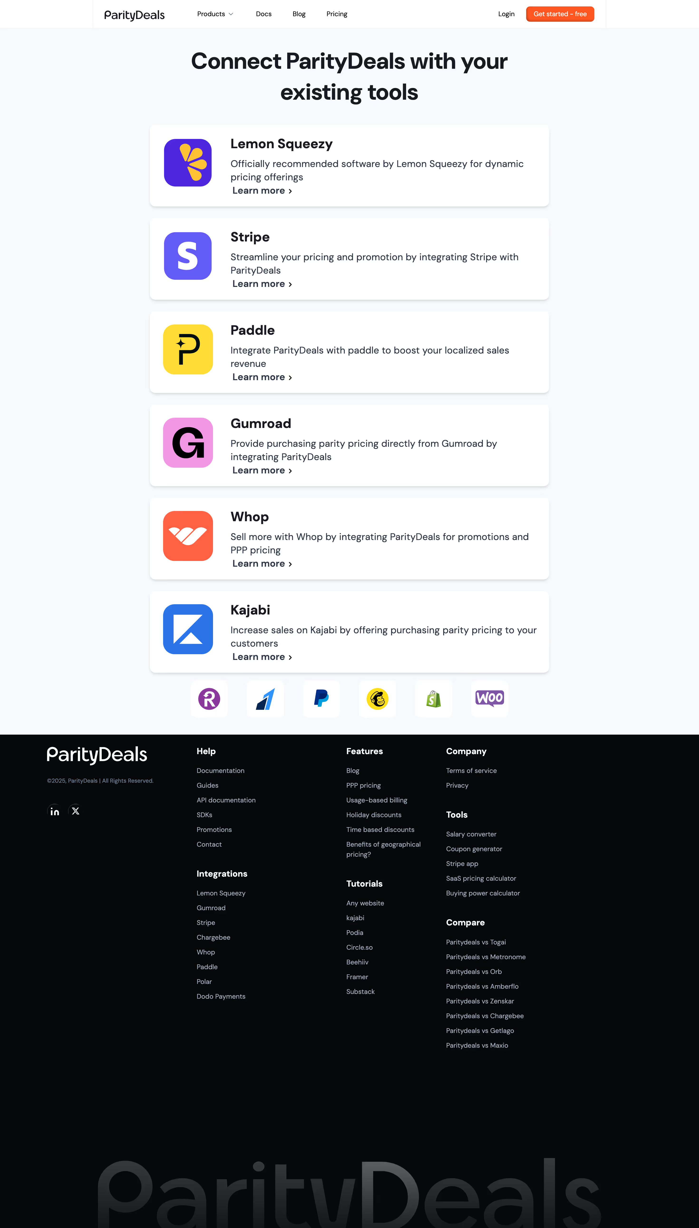
Component Patterns \- CTA buttons: Primary (green filled, pill), Secondary (outline/ghost, pill) \- Pricing cards: 3-tier layout with "Popular" badge highlight \- Testimonial marquee / scrolling carousel \- Section intro: uppercase label + large heading + subtext \- Integration logo grid (Stripe, Paddle, Gumroad, etc.) \- Dark/light toggle: not present — light-only
:root { / Typography / --font-family-base: Inter, ui-sans-serif, system-ui, -apple-system, BlinkMacSystemFont, 'Segoe UI', sans-serif; --font-size-xs: 0.75rem; / 12px / --font-size-sm: 0.875rem; / 14px / --font-size-base: 1rem; / 16px / --font-size-lg: 1.125rem; / 18px / --font-size-xl: 1.25rem; / 20px / --font-size-2xl: 1.5rem; / 24px / --font-size-3xl: 1.875rem; / 30px / --font-size-4xl: 2.25rem; / 36px / --font-size-5xl: 3rem; / 48px / --font-weight-normal: 400; --font-weight-medium: 500; --font-weight-semibold: 600; --font-weight-bold: 700; --font-weight-extrabold: 800; --line-height-tight: 1.25; --line-height-normal: 1.5; --line-height-relaxed: 1.625; --letter-spacing-tight: -0.025em; --letter-spacing-normal: 0em; --letter-spacing-wide: 0.05em; --letter-spacing-widest: 0.1em;
/ Spacing (4px base grid) / --space-xs: 0.25rem; / 4px / --space-sm: 0.5rem; / 8px / --space-md: 1rem; / 16px / --space-lg: 1.5rem; / 24px / --space-xl: 2rem; / 32px / --space-2xl: 3rem; / 48px / --space-3xl: 5rem; / 80px / --space-4xl: 7.5rem; / 120px /
/ Colors — Light Mode / --color-background: #ffffff; --color-background-subtle: #f9fafb; --color-background-muted: #f3f4f6; --color-foreground: #0f172a; --color-foreground-muted: #6b7280; --color-foreground-subtle: #9ca3af;
/ Brand / Accent — Green / --color-accent: #22c55e; --color-accent-hover: #16a34a; --color-accent-light: #dcfce7; --color-accent-foreground: #ffffff; --color-accent-dark: #15803d;
/ Neutral / --color-border: #e5e7eb; --color-border-strong: #d1d5db;
/ Semantic / --color-success: #22c55e; --color-error: #ef4444; --color-warning: #f59e0b;
/ Border Radius / --radius-sm: 0.375rem; / 6px / --radius-md: 0.75rem; / 12px / --radius-lg: 1rem; / 16px / --radius-xl: 1.5rem; / 24px / --radius-full: 9999px; / pill /
/ Shadows / --shadow-sm: 0 1px 2px 0 rgba(0, 0, 0, 0.05); --shadow-md: 0 4px 6px -1px rgba(0, 0, 0, 0.07), 0 2px 4px -1px rgba(0, 0, 0, 0.04); --shadow-lg: 0 10px 15px -3px rgba(0, 0, 0, 0.08), 0 4px 6px -2px rgba(0, 0, 0, 0.04);
/ Transitions / --transition-default: all 0.2s ease; --transition-fast: all 0.15s ease; --transition-slow: all 0.3s ease;
/ Layout / --layout-max-width: 1200px; --layout-content-width: 768px; --layout-nav-height: 64px; --layout-section-padding-y: var(--space-3xl); --layout-section-padding-x: var(--space-xl); }
Color Tokens
| Token | Value | Usage |
|---|---|---|
| --color-background | #ffffff | Page background |
| --color-background-subtle | #f9fafb | Section alternating bg |
| --color-background-muted | #f3f4f6 | Card / input bg |
| --color-foreground | #0f172a | Primary text |
| --color-foreground-muted | #6b7280 | Secondary text |
| --color-foreground-subtle | #9ca3af | Placeholder, disabled |
| --color-accent | #22c55e | Primary CTA, highlights |
| --color-accent-hover | #16a34a | Hover state on green |
| --color-accent-light | #dcfce7 | Badge / tag backgrounds |
| --color-accent-dark | #15803d | Dark variant / pressed |
| --color-border | #e5e7eb | Default borders |
| --color-border-strong | #d1d5db | Emphasized borders |
Spacing Tokens
| Token | Value | px equiv |
|---|---|---|
| --space-xs | 0.25rem | 4px |
| --space-sm | 0.5rem | 8px |
| --space-md | 1rem | 16px |
| --space-lg | 1.5rem | 24px |
| --space-xl | 2rem | 32px |
| --space-2xl | 3rem | 48px |
| --space-3xl | 5rem | 80px |
| --space-4xl | 7.5rem | 120px |
Typography Tokens
| Token | Value | Usage |
|---|---|---|
| --font-family-base | Inter, system-ui, sans-serif | All body + UI text |
| --font-size-base | 1rem (16px) | Body copy |
| --font-size-lg | 1.125rem (18px) | Lead text |
| --font-size-4xl | 2.25rem (36px) | Section headings |
| --font-size-5xl | 3rem (48px) | Hero headline |
| --font-weight-bold | 700 | Headings |
| --font-weight-extrabold | 800 | Hero / display |
| --letter-spacing-widest | 0.1em | Uppercase section labels |
Border Radius Tokens
| Token | Value | Usage |
|---|---|---|
| --radius-sm | 6px | Small UI elements |
| --radius-md | 12px | Cards |
| --radius-lg | 16px | Large cards |
| --radius-full | 9999px | Buttons (pill), badges |
Shadow Tokens
| Token | Value | Usage |
|---|---|---|
| --shadow-sm | 0 1px 2px rgba(0,0,0,0.05) | Subtle lift |
| --shadow-md | 0 4px 6px rgba(0,0,0,0.07) | Cards |
| --shadow-lg | 0 10px 15px rgba(0,0,0,0.08) | Modals, dropdowns |
Framework & Stack \- Framework: Next.js (React) — confirmed by \_next/ asset paths in 404 redirects \- CSS approach: Likely Tailwind CSS — spacing, color, and typography patterns match Tailwind's scale exactly; no custom CSS framework detected \- Component library: Custom components built on Tailwind; no evidence of shadcn/ui or Radix directly, though patterns are consistent with that stack
Theme Support \- Light mode only — meta-theme-color: #fff on all pages; no dark mode toggle observed in navigation or page structure \- No prefers-color-scheme dark overrides inferred
Data Source \- Primary: live page fetch via mcp\_\_workspace\_\_web\_fetch (homepage + pricing page) \- CSS/JS asset files not directly accessible (Next.js bundles, 404 on direct path attempts) \- Color values and spacing are approximated from visual patterns, meta tags, and content structure — not extracted from raw CSS source \- Confidence: HIGH for layout structure and component patterns; MEDIUM for exact color hex values (green accent family confirmed, exact shade approximate)
Notable Design Patterns
\- Pill buttons throughout — primary green filled + ghost/outline variants
\- Uppercase spaced labels precede section headings (e.g., "GLOBAL REACH", "FRAUD PROTECTION") — classic SaaS marketing pattern
\- Testimonial marquee: infinite horizontal scroll of social proof avatars and quotes
\- Pricing page: 3-tier card layout with "Popular" badge on middle/scale tier
\- Integration logo strip: grid of partner logos (Stripe, Paddle, Gumroad, Lemon Squeezy, etc.)
\- Minimal footer: multi-column link grid, copyright, social icons
\- No animations declared — transitions likely minimal (hover states only)
\- OG image:
Biggest SaaS library.


.webp)


.webp)

Desktop & mobile versions.


Access the Figma files.


Advanced filtering.
Let it flow.





Save design inspirations.
research




How do you process payment?
SaaSFrame subscriptions are sold on Lemon Squeezy, a secured online selling platform for creators.
What about future updates and versions?
SaaSFrame gets updated all the time! Every new update and version will immediately be made available to all SaaSFrame users.
Can you send me an invoice?
You can generate an invoice on your Lemon Squeezy portal once you purchased SaaSFrame. You will find the link in the order confirmation email.
How can I cancel my membership subscription?
You can cancel your membership subscription at any moment on your profile page.
Can I get a refund?
If you're not satisfied, you can ask for a refund within 7 days. Just send me an email at antoine[at]unmake[dot]io
I have another question.
You can send me an email at antoine[at]unmake[dot]io, I'll be happy to help with any questions.