 SaaSFrame
Blog Cards
Drive traffic to your content with high-click SaaS Blog Card designs. See how to balance thumbnails, tags, and reading times to create a visually engaging feed that encourages deep exploration of your resources.



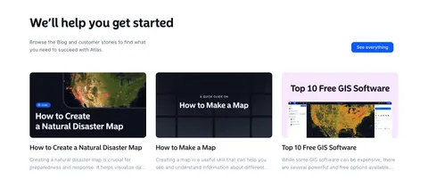
Blog Cards: design guide
Blog cards help visitors choose a piece of content before they commit to opening it. A card needs to communicate the topic, the value of reading, and the kind of destination behind the link. Good design makes these decisions easy to scan without turning every preview into a miniature article.
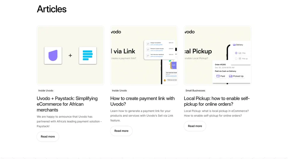
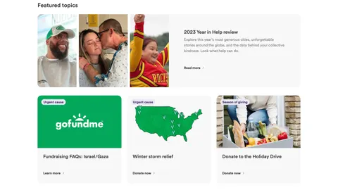
Uvodo and GoFundMe show two useful arrangements. Uvodo uses three parallel article previews with categories and summaries. GoFundMe combines a prominent featured topic with smaller cards that lead to different kinds of action. The contrast helps explain how card hierarchy and link labels should follow editorial intent.
Define what the content section is helping visitors find
A homepage article section, a blog index, and a related-content module may use similar cards, but they serve different needs. The homepage introduces useful or timely material. The blog index supports discovery across a larger archive. Related content helps someone continue from a topic they are already reading.
Choose the card information according to that role. A homepage may need a concise benefit and a clear route to the full archive. A large index may need categories, dates, and filters. A related-content module may need stronger topic relevance than visual variety.
Do not select articles solely because they are the newest. A product tutorial, customer guide, or evergreen explanation may be more useful to the page's audience than a recent company announcement. Establish an editorial rule for the section so the arrangement remains intentional as new content is published.
Use a consistent card anatomy for comparable articles
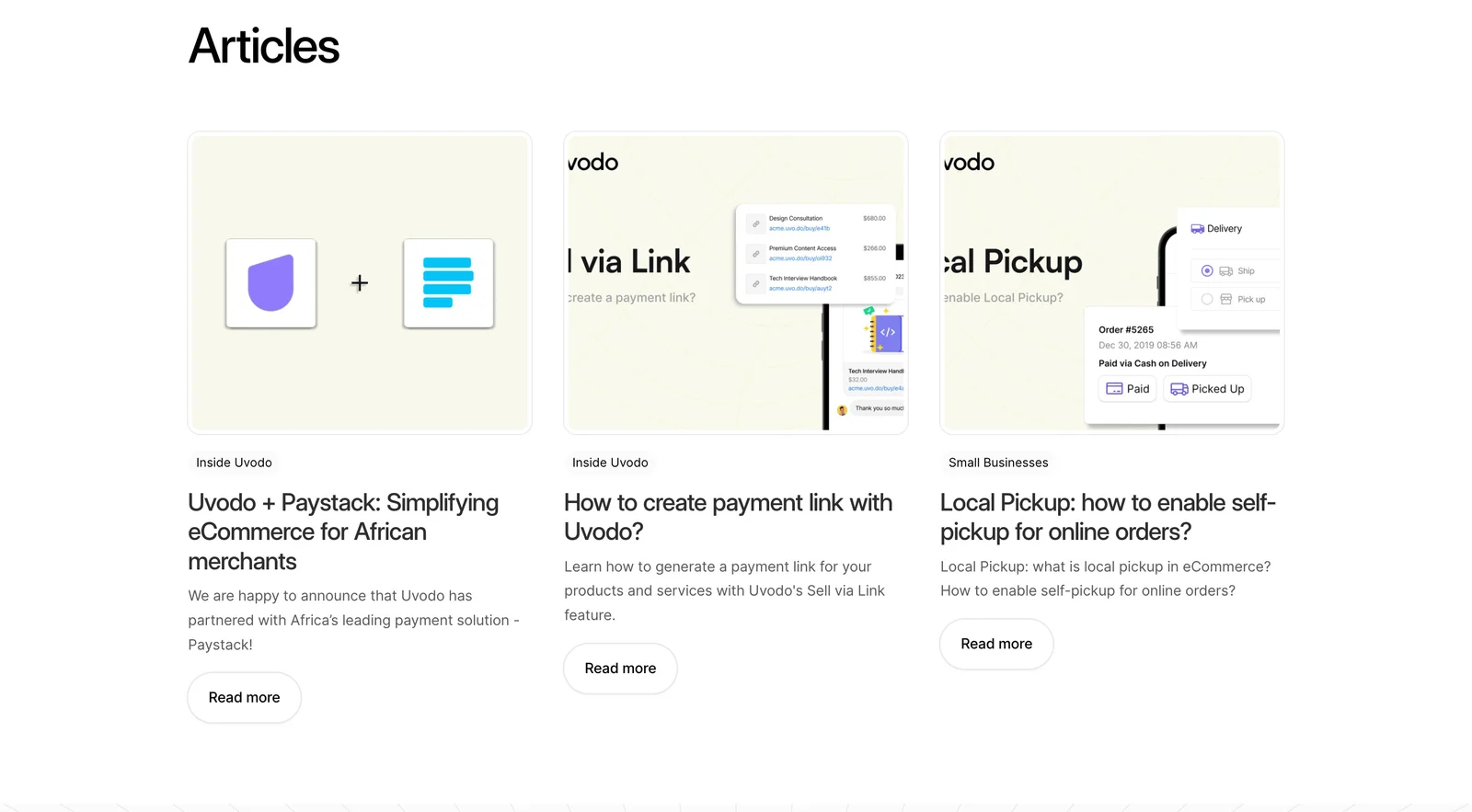
Uvodo's cards follow a consistent sequence: illustration, category, title, summary, and Read more action. The visible topics include a payment partnership, creating a payment link, and enabling local pickup. This structure lets a visitor compare the topics without learning a different layout for each item.
The summaries add information beyond the titles. The payment-link card explains the kind of workflow the article teaches, while the local-pickup card clarifies its subject with practical questions. That extra context helps distinguish a how-to article from an announcement.
Keep the anatomy stable, but allow text to wrap naturally. The longer title in the first card uses more lines than its neighbors. Do not solve that difference by clipping meaningful words or shrinking one title's font. Use flexible height and a considered alignment rule so each preview remains readable.
Create a featured tier only when there is a reason
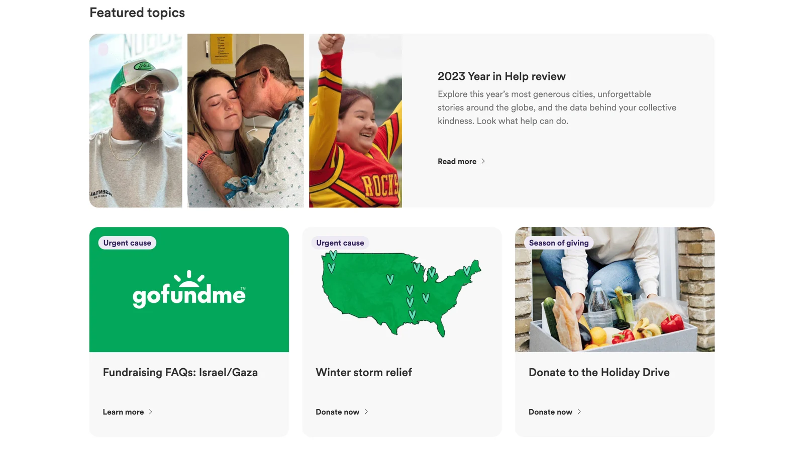
GoFundMe gives a year-in-review topic a wide top card, combining a photo montage with a title, summary, and Read more action. Three smaller cards underneath cover other featured topics. The layout creates an editorial priority rather than presenting every destination with equal weight.
A featured tier can highlight a major report, launch, guide, or story. Choose it because the content deserves attention for this audience, and review the selection regularly. A large stale feature can crowd out more useful articles even when the smaller cards keep updating.
Keep the difference between tiers understandable. The featured card may have more imagery or a longer summary, but it should still behave like a recognizable content preview. Avoid a composition so different that visitors mistake it for an advertisement unrelated to the article collection.
Write titles and summaries that help a reader choose
A title should identify the topic or question with enough specificity to distinguish the article. A summary should add the useful detail that the title cannot carry: what the reader will learn, which situation it covers, or what kind of material is inside.
Do not repeat the title in the summary with slightly different wording. That consumes space without improving the decision. Likewise, a teaser that withholds the topic may increase curiosity while attracting readers who do not find what they expected.
Use the same editorial standard across cards. If one preview is a tutorial and another is a news announcement, make the difference clear through category and copy. Keep time-sensitive claims dated or maintained where necessary. The card should describe the actual destination, including whether it is an article, report, event, or another resource.
Match action labels to the destination
Uvodo uses repeated Read more actions for its article previews. GoFundMe's smaller cards include Learn more and Donate now, reflecting different destination intentions. This is a useful reminder that a visually unified content section can contain more than one type of action.
Do not label an action Read more if it opens a contribution flow, registration form, or download gate without explanation. The visible label should establish what happens next. If the entire card is linked, make its accessible name identify the content rather than rely on a repeated generic phrase.
Avoid several competing links to the same destination within a small card unless they serve a clear purpose. A linked title and a secondary action can work, but keyboard users should not have to traverse redundant stops without gaining information. Keep nested interactive controls out of a whole-card link structure.
Choose images that support recognition
Uvodo uses product-focused illustrations and interface fragments that relate to its topics. GoFundMe combines photography, a brand graphic, and a map-like illustration. Each approach can help a visitor recognize the subject before reading the complete title.
Set an image ratio that works for the content, then review crops rather than assuming every asset will fit. Text baked into an image can be cut off, become unreadable, or duplicate the visible title. Prefer imagery that remains useful when cropped and keep essential information in real text.
Use alt text according to the image's role. An image that adds meaningful context needs a useful description. A decorative thumbnail next to a fully descriptive linked title may not need to repeat that title. Avoid treating a thumbnail's embedded interface as a functioning part of the page.
Use metadata deliberately
Categories help when they explain a meaningful distinction, such as product news, tutorials, or customer stories. Dates help when freshness matters. Authors can support editorial identity or expertise. Reading time may help a visitor estimate the commitment. None of these elements needs to appear on every card automatically.
Keep metadata secondary to the title but readable. If category labels are interactive filters, make that behavior clear and avoid confusing them with the article's main link. If a date indicates an update rather than original publication, use a label that explains the difference where it matters.
Maintain category names as the archive grows. A collection of overlapping labels can make discovery harder than a small set of consistent topics. When a card appears in several contexts, keep its title and core description accurate rather than rewriting it into an unrelated promise for each module.
Preserve usability in responsive grids
A three-column desktop row becomes a longer sequence on mobile. Preserve an intentional order, place the most relevant content early, and check how much space each image consumes. A large thumbnail should not force visitors through several screens before they can identify the available topics.
Allow long titles and translated text to expand. Use spacing and layout rules to preserve separation rather than hard-coded heights that clip summaries. If a featured card changes from side-by-side to stacked, keep the title and action near enough to its image that the card remains one recognizable object.
Provide visible focus and comfortable targets. Hover styling can reinforce a link, but the destination must remain recognizable on touch devices and with keyboard navigation. Test missing images and slow loading: the text preview should remain useful while the image arrives, and reserved image space can prevent disruptive shifts.
Review the editorial and interaction quality together
- Does the section have a clear discovery purpose?
- Does each title identify a distinct topic?
- Does the summary add useful information?
- Is the featured article still relevant enough to deserve priority?
- Do categories and dates help the decision?
- Do action labels accurately describe the destination?
- Are linked areas consistent and free of nested controls?
- Do images remain meaningful after cropping?
- Can long text grow without clipping?
- Does the mobile order reflect editorial priority?
Measure more than card clicks. Check whether readers engage with the destination and whether the article fulfills the preview's promise. A high click rate followed by immediate exits may indicate an ambiguous title or a mismatch between the card and the page. Use those findings to refine copy as well as layout.
Plan the empty and partial states of the module. If only two relevant articles exist, do not fill the third slot with unrelated content solely to complete a row. If an article becomes unavailable, remove or replace the card and keep the surrounding layout flexible. A CMS-driven module should handle varying content counts without inventing editorial relevance.
For sections with mixed actions, review the promise of the section heading as well. A heading such as Articles suggests reading destinations, while Featured topics can accommodate a broader mix. The GoFundMe capture uses that broader framing. If a SaaS resource section includes tutorials, templates, and event registration, give visitors a small format label and an accurate action instead of presenting all three as identical blog posts. Consistent containers do not require identical destination language.
Before launch, open every linked destination from the finished module. Check that the title, image, and summary still match the page, and that any gate or download expectation is disclosed. This simple editorial review catches mismatches that layout inspection alone cannot reveal.
Frequently asked questions about blog cards
Should the whole blog card be clickable?
It can provide a generous target when the card has one destination. Use an implementation with a clear accessible name and visible focus. If the card also contains category filters or other distinct actions, keep those controls separate rather than placing them inside one large link.
Do cards need excerpts?
Use an excerpt or summary when the title alone does not explain the value or format of the content. A concise, specific summary is often useful for tutorials and reports. Short announcements may need less text, especially in a compact module.
Should a homepage show the latest or best articles?
Choose according to the section's purpose. Latest articles support freshness; curated articles support relevance and product understanding. A mix can work if the hierarchy makes the selection clear and someone maintains the featured content.
Browse SaaS blog card examples on SaaSFrame to compare preview anatomy, editorial hierarchy, image treatment, and destination labels.