.webp)

Visitors


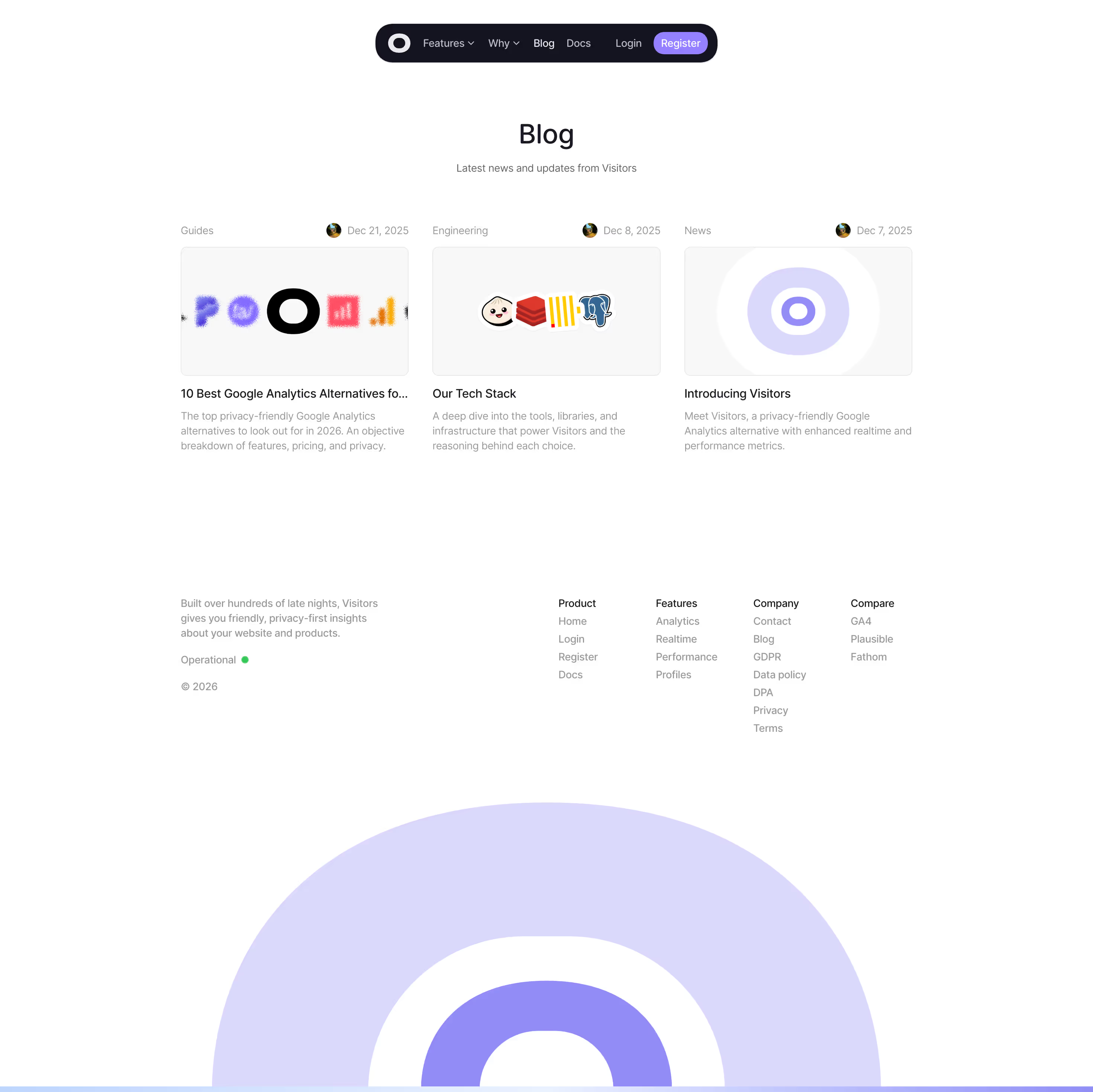




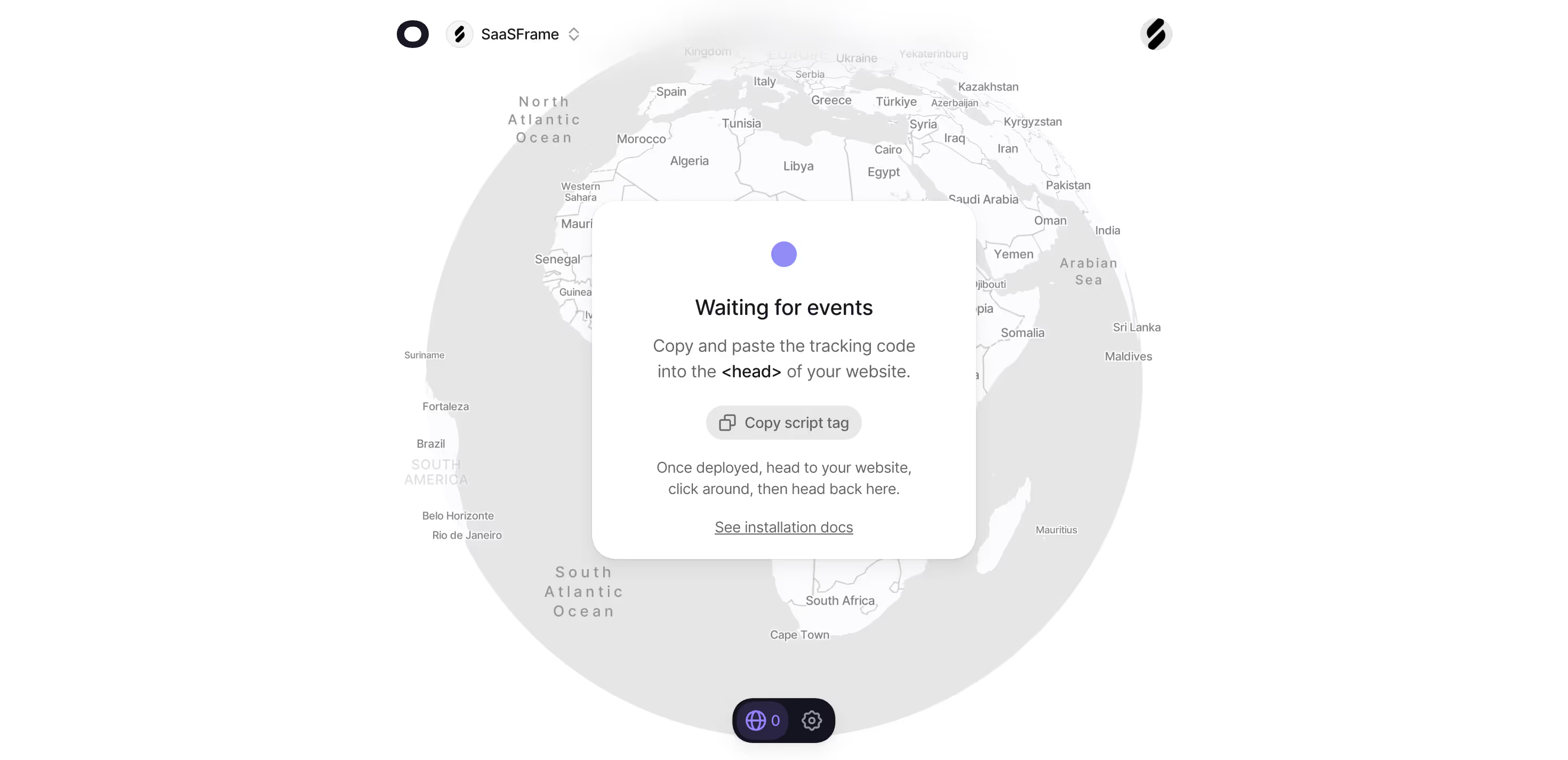
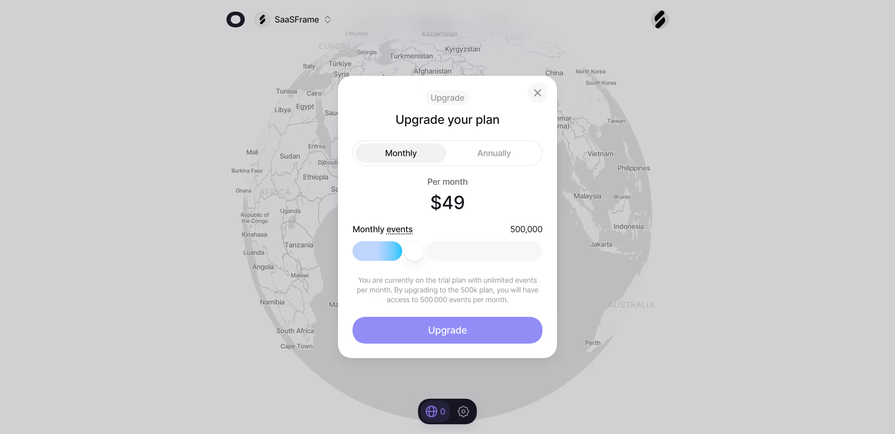
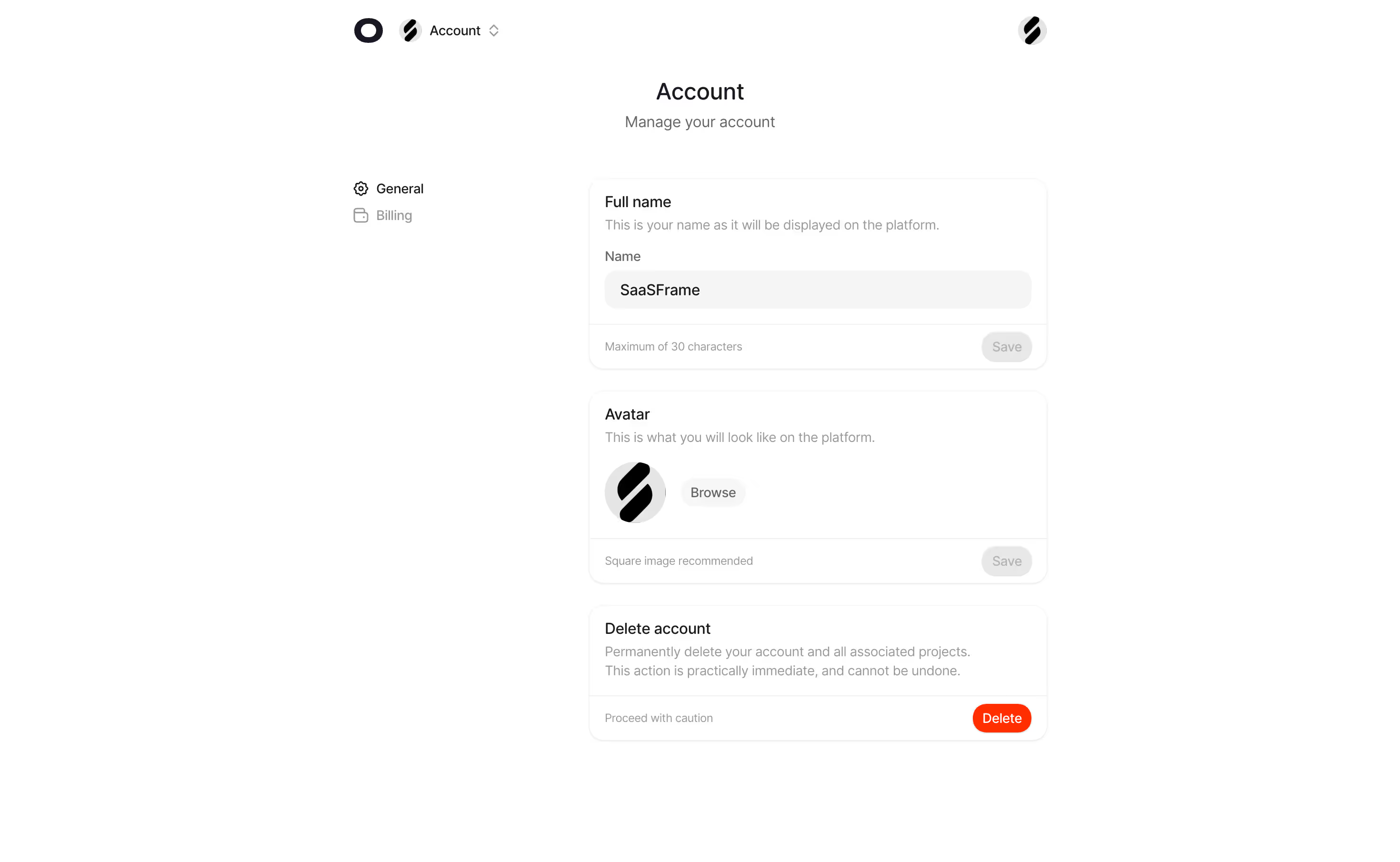
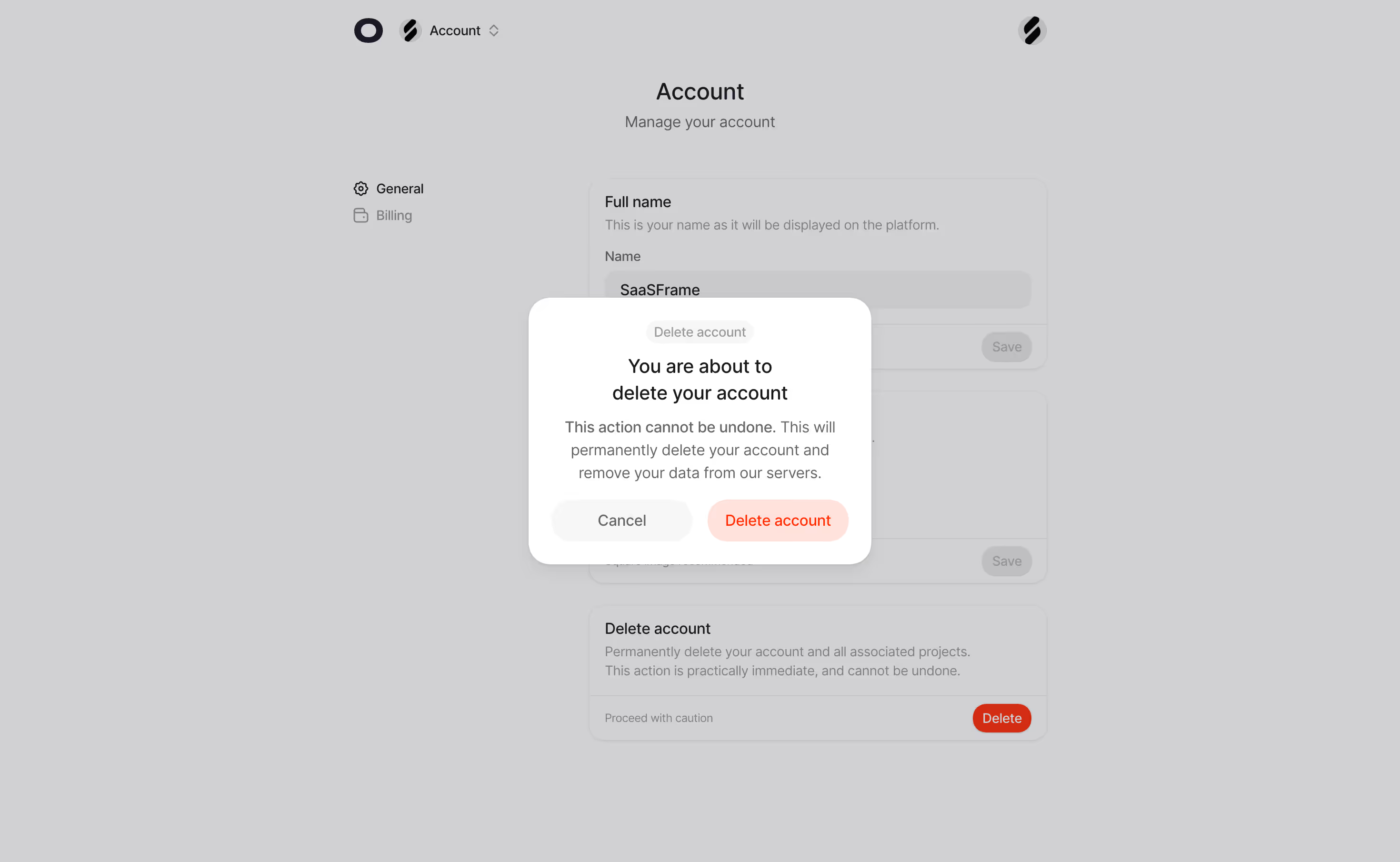
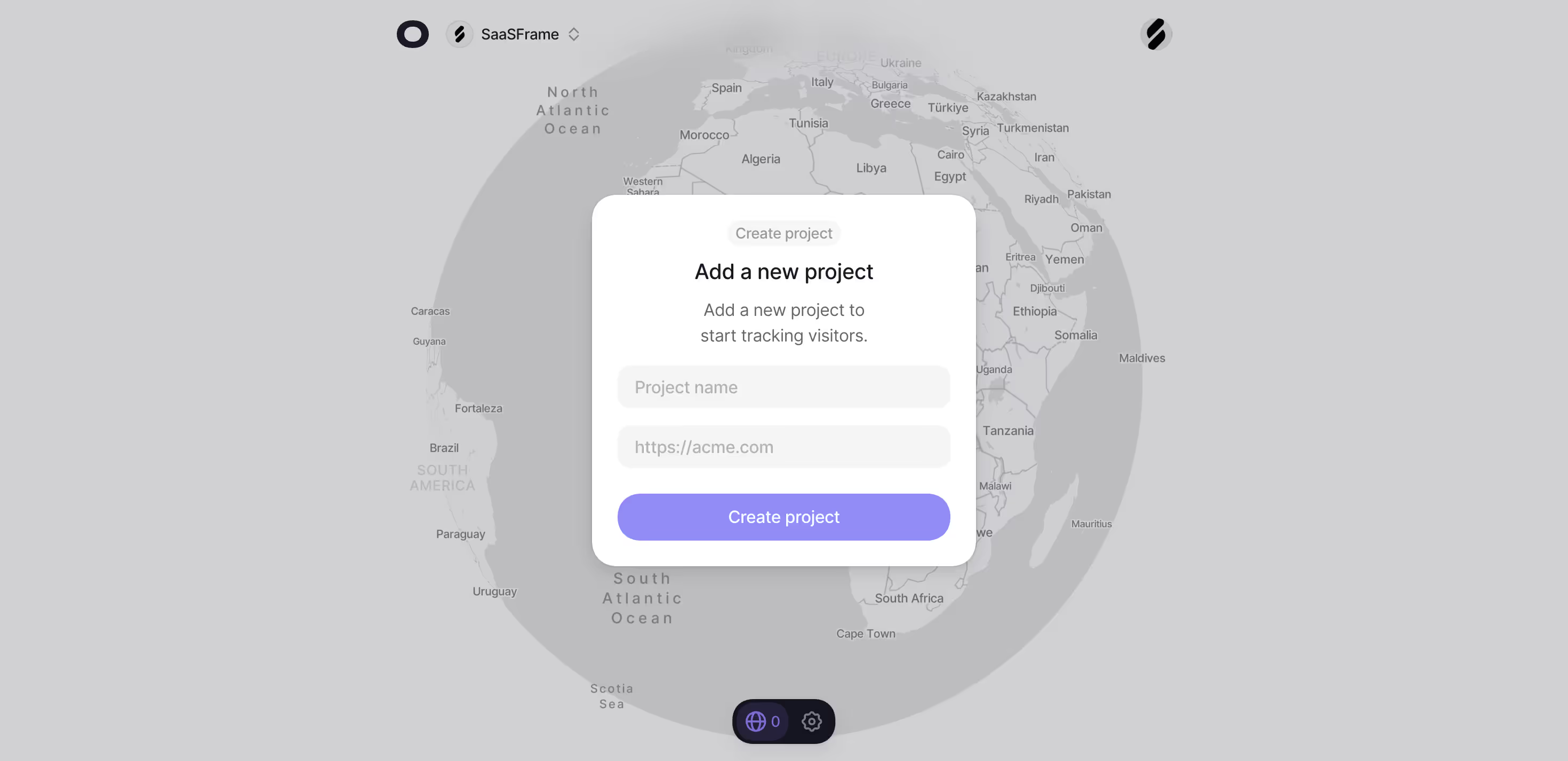
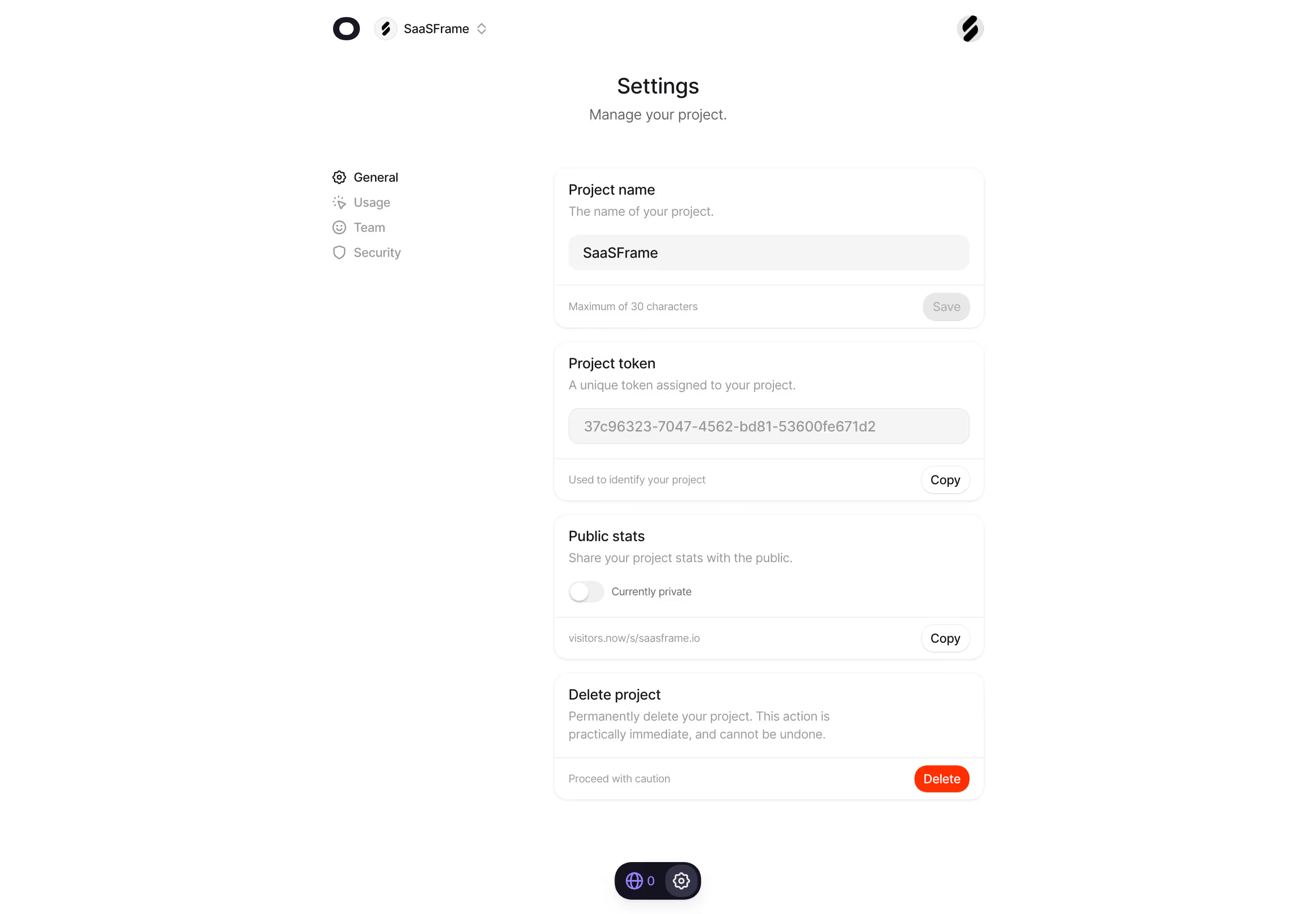
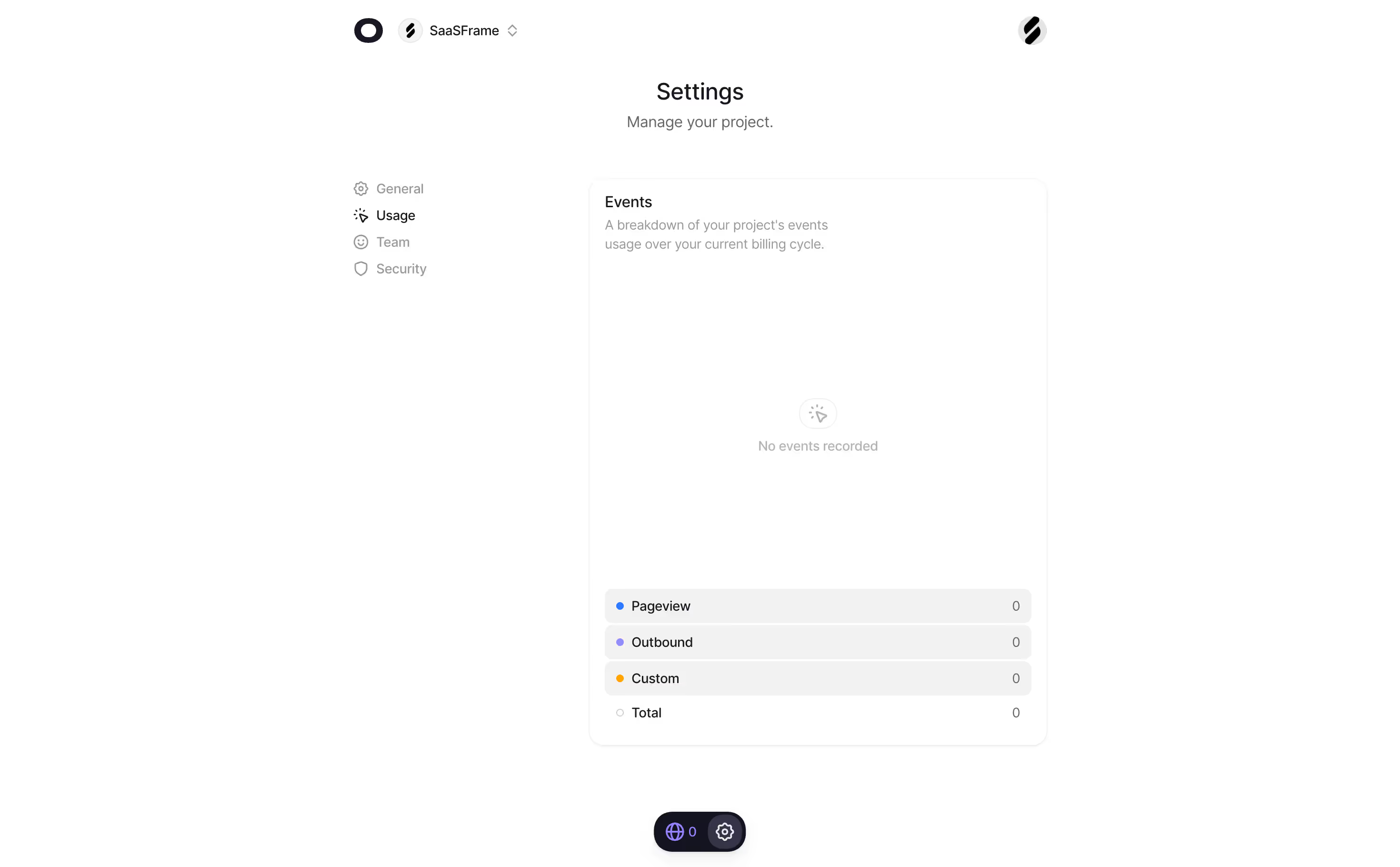


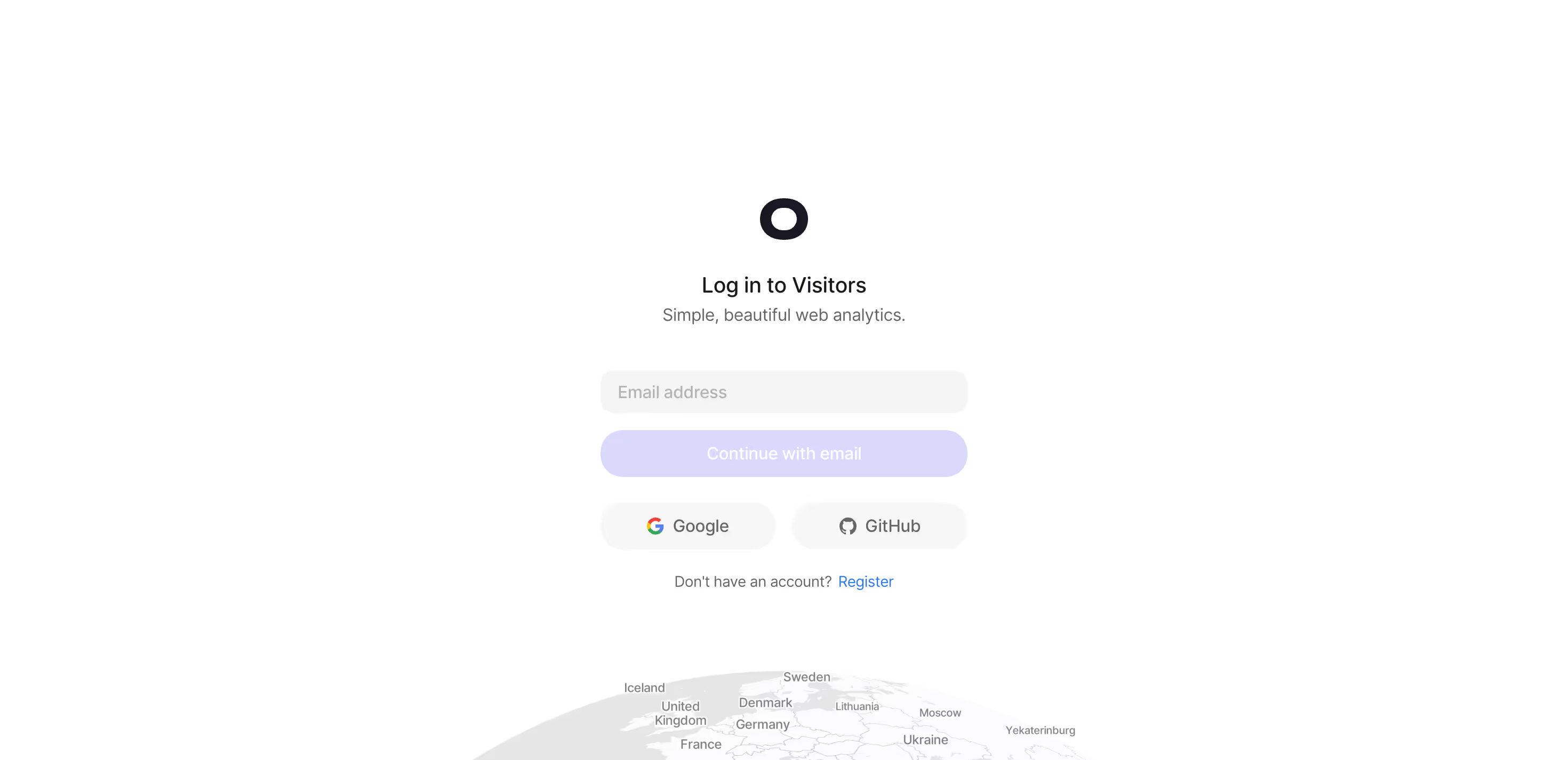
Visitors.now — Design System Overview
Source & Stack
\- URL:
Typography \- Primary font: System-UI / sans-serif stack (clean, modern, no obvious custom font detected in markup) \- Headings: Large, bold, tight letter-spacing — hero H1 is display-weight \- Body: Regular weight, comfortable line-height (~1.6) \- Scale: Display hero → H2 section headers → H3 card titles → small metadata labels \- Tone: Minimal, high-contrast, reader-friendly
Color Philosophy \- Dark-first UI — dashboard screenshots and product imagery show a dark interface \- Marketing site: Light/neutral background with dark text \- Accent: Blue/purple-ish primary CTA (inferred from analytics SaaS conventions and OG imagery) \- Brand neutral: No heavy color branding — lets data visualizations carry color \- Success/positive: Green tones for revenue and growth indicators \- Semantic colors: Green = revenue/positive, neutral grays for metadata
Spacing \- Section padding: Generous vertical rhythm (~80–120px between major sections) \- Card gaps: ~24–32px grid gaps \- Content max-width: ~1100–1280px centered container \- Compact components: Tight padding in data tables and comparison grids
Component Defaults \- Buttons: Rounded (pill or large-radius), solid primary + ghost outline variants \- Cards: Subtle border or shadow, low-contrast background lift \- Navigation: Minimal top nav — logo left, login/register right \- Tables: Clean comparison table with checkmark indicators \- Badge/pill: Small rounded labels (e.g. "new" badge on announcement) \- Pricing: Single-tier slider-based event count selector
Layout \- Grid: Single-column hero → feature alternating sections → comparison table → pricing → FAQ → CTA \- Responsive: Mobile-first with viewport-fit=cover \- Footer: 4-column link grid (Product, Features, Comparison, Company) \- Dashboard previews: Full-width screenshot mockups embedded in sections
/ ============================================ Visitors.now — Inferred CSS Custom Properties Source: Rendered HTML analysis (no direct CSS access) Confidence: Medium — based on visual patterns ============================================ /
:root { / --- Brand Colors --- / --color-primary: #4F6EF7; / CTA blue — inferred from analytics SaaS pattern / --color-primary-hover: #3D5CE5; --color-accent: #6366F1; / Indigo accent for highlights /
/ --- Neutrals (Light mode / Marketing site) --- / --color-bg: #FFFFFF; --color-bg-subtle: #F9FAFB; --color-bg-muted: #F3F4F6; --color-border: #E5E7EB; --color-border-subtle: #F3F4F6;
/ --- Text --- / --color-text-primary: #111827; --color-text-secondary: #6B7280; --color-text-muted: #9CA3AF; --color-text-inverse: #FFFFFF;
/ --- Semantic --- / --color-success: #10B981; / Revenue / positive metrics / --color-success-subtle: #D1FAE5; --color-warning: #F59E0B; --color-error: #EF4444;
/ --- Typography --- / --font-sans: ui-sans-serif, system-ui, -apple-system, BlinkMacSystemFont, 'Segoe UI', Roboto, 'Helvetica Neue', Arial, sans-serif; --font-mono: ui-monospace, 'Cascadia Code', 'Source Code Pro', Menlo, Consolas, 'Courier New', monospace;
--text-xs: 0.75rem; / 12px / --text-sm: 0.875rem; / 14px / --text-base: 1rem; / 16px / --text-lg: 1.125rem; / 18px / --text-xl: 1.25rem; / 20px / --text-2xl: 1.5rem; / 24px / --text-3xl: 1.875rem; / 30px / --text-4xl: 2.25rem; / 36px / --text-5xl: 3rem; / 48px /
--font-weight-normal: 400; --font-weight-medium: 500; --font-weight-semibold: 600; --font-weight-bold: 700;
/ --- Spacing --- / --space-1: 0.25rem; / 4px / --space-2: 0.5rem; / 8px / --space-3: 0.75rem; / 12px / --space-4: 1rem; / 16px / --space-5: 1.25rem; / 20px / --space-6: 1.5rem; / 24px / --space-8: 2rem; / 32px / --space-10: 2.5rem; / 40px / --space-12: 3rem; / 48px / --space-16: 4rem; / 64px / --space-20: 5rem; / 80px / --space-24: 6rem; / 96px /
/ --- Border Radius --- / --radius-sm: 0.25rem; / 4px / --radius-md: 0.5rem; / 8px / --radius-lg: 0.75rem; / 12px / --radius-xl: 1rem; / 16px / --radius-2xl: 1.5rem; / 24px / --radius-full: 9999px; / pill /
/ --- Shadows --- / --shadow-sm: 0 1px 2px 0 rgb(0 0 0 / 0.05); --shadow-md: 0 4px 6px -1px rgb(0 0 0 / 0.07), 0 2px 4px -2px rgb(0 0 0 / 0.05); --shadow-lg: 0 10px 15px -3px rgb(0 0 0 / 0.08), 0 4px 6px -4px rgb(0 0 0 / 0.05); --shadow-xl: 0 20px 25px -5px rgb(0 0 0 / 0.08), 0 8px 10px -6px rgb(0 0 0 / 0.04);
/ --- Layout --- / --container-max: 1280px; --container-pad: 1.5rem; --section-gap: 5rem; / 80px vertical between sections / }
/ Dark mode — Dashboard / App shell / [data-theme="dark"], .dark { --color-bg: #0A0A0F; --color-bg-subtle: #111118; --color-bg-muted: #1A1A24; --color-border: #2A2A38; --color-border-subtle: #1E1E2C;
--color-text-primary: #F9FAFB; --color-text-secondary: #9CA3AF; --color-text-muted: #6B7280;
--shadow-sm: 0 1px 2px 0 rgb(0 0 0 / 0.3); --shadow-md: 0 4px 6px -1px rgb(0 0 0 / 0.4), 0 2px 4px -2px rgb(0 0 0 / 0.3); --shadow-lg: 0 10px 15px -3px rgb(0 0 0 / 0.5), 0 4px 6px -4px rgb(0 0 0 / 0.3); }
Design Tokens Reference — Visitors.now
Color Tokens
| Token | Value | Usage |
|---|---|---|
| --color-primary | #4F6EF7 | Primary CTA buttons, links |
| --color-primary-hover | #3D5CE5 | Button hover state |
| --color-accent | #6366F1 | Indigo highlights, active states |
| --color-success | #10B981 | Revenue metrics, positive data |
| --color-success-subtle | #D1FAE5 | Success backgrounds |
| --color-warning | #F59E0B | Warning states |
| --color-error | #EF4444 | Error states |
| --color-bg | #FFFFFF / #0A0A0F | Page background |
| --color-bg-subtle | #F9FAFB / #111118 | Section backgrounds |
| --color-bg-muted | #F3F4F6 / #1A1A24 | Card backgrounds |
| --color-border | #E5E7EB / #2A2A38 | Default borders |
| --color-text-primary | #111827 / #F9FAFB | Body text |
| --color-text-secondary | #6B7280 / #9CA3AF | Metadata, labels |
| --color-text-muted | #9CA3AF / #6B7280 | Placeholders, captions |
Spacing Scale
| Token | Value | px |
|---|---|---|
| --space-1 | 0.25rem | 4px |
| --space-2 | 0.5rem | 8px |
| --space-3 | 0.75rem | 12px |
| --space-4 | 1rem | 16px |
| --space-6 | 1.5rem | 24px |
| --space-8 | 2rem | 32px |
| --space-12 | 3rem | 48px |
| --space-16 | 4rem | 64px |
| --space-20 | 5rem | 80px |
| --space-24 | 6rem | 96px |
| --section-gap | 5rem | 80px |
| --container-max | 1280px | Max layout width |
Typography
| Token | Value | Notes |
|---|---|---|
| --font-sans | System UI stack | No custom webfont detected |
| --font-mono | System mono stack | Code blocks in docs |
| --text-xs | 0.75rem / 12px | Labels, badges |
| --text-sm | 0.875rem / 14px | Small body, metadata |
| --text-base | 1rem / 16px | Default body |
| --text-lg | 1.125rem / 18px | Large body |
| --text-xl | 1.25rem / 20px | Card headings |
| --text-2xl | 1.5rem / 24px | Section sub-headings |
| --text-3xl | 1.875rem / 30px | H2 section titles |
| --text-4xl | 2.25rem / 36px | H1 desktop |
| --text-5xl | 3rem / 48px | Hero display |
| --font-weight-bold | 700 | Headings |
| --font-weight-semibold | 600 | Sub-headings, CTAs |
| --font-weight-medium | 500 | UI labels |
| --font-weight-normal | 400 | Body text |
Border Radius
| Token | Value | Usage |
|---|---|---|
| --radius-sm | 0.25rem / 4px | Badges, chips |
| --radius-md | 0.5rem / 8px | Inputs, small cards |
| --radius-lg | 0.75rem / 12px | Cards, panels |
| --radius-xl | 1rem / 16px | Large cards, modals |
| --radius-2xl | 1.5rem / 24px | Dashboard widgets |
| --radius-full | 9999px | Pill buttons, avatars |
Shadows
| Token | Value | Usage |
|---|---|---|
| --shadow-sm | 0 1px 2px rgb(0 0 0/5%) | Subtle lift |
| --shadow-md | 0 4px 6px rgb(0 0 0/7%) | Cards, dropdowns |
| --shadow-lg | 0 10px 15px rgb(0 0 0/8%) | Modals, popovers |
| --shadow-xl | 0 20px 25px rgb(0 0 0/8%) | Feature callouts |
Framework: Next.js (App Router) — confirmed by /blog/, /docs/ routing structure, meta-viewport: width=device-width, initial-scale=1, viewport-fit=cover, and installation guides referencing React, Next.js, Vue, Nuxt, SvelteKit, Astro, Angular.
Styling approach: Tailwind CSS strongly inferred — system-UI font stack, utility-first spacing multiples of 4, no custom webfonts loaded, Next.js + Tailwind is the dominant pattern for this product category.
Theme support: Dual-mode — light marketing site with dark product dashboard. Dashboard screenshots show a deep dark (#0A0A0F range) UI; marketing pages use white/light gray backgrounds. Likely uses data-theme or .dark class toggling.
Typography: No external font import detected in fetched HTML (no Google Fonts link, no Typekit). All headings and body text use the OS system-UI stack. The hero uses large bold display type (~48px+) with tight tracking.
Color philosophy: Minimal, data-forward palette. Brand color is a blue-indigo CTA; green is reserved exclusively for revenue/success signals. No loud decorative colors — the product data drives visual interest.
Notable patterns: \- Pill-shaped primary CTA buttons ("Start 14 day free trial") \- Ghost/outline secondary button variant ("See demo") \- Small rounded new badge/pill on announcement link \- Comparison table uses checkmark icons (no numeric scoring) \- Pricing uses a slider for event volume selection — single plan tier \- Footer: 4-column link grid, minimal branding \- Brand logos in grayscale/muted treatment \- Interactive 3D globe feature (Three.js or similar WebGL) \- Real-time WebSocket data shown in UI
Data source confidence: Medium. Analysis based on rendered HTML from web fetch (homepage, blog, docs, feature pages). No direct access to compiled CSS/JS bundles. CSS custom property values are inferred from visual patterns, Next.js + Tailwind conventions, and dashboard screenshot imagery described in alt text. Values should be verified against actual stylesheet before production use.
Biggest SaaS library.


.webp)


.webp)

Desktop & mobile versions.


Access the Figma files.


Advanced filtering.
Let it flow.





Save design inspirations.
research




How do you process payment?
SaaSFrame subscriptions are sold on Lemon Squeezy, a secured online selling platform for creators.
What about future updates and versions?
SaaSFrame gets updated all the time! Every new update and version will immediately be made available to all SaaSFrame users.
Can you send me an invoice?
You can generate an invoice on your Lemon Squeezy portal once you purchased SaaSFrame. You will find the link in the order confirmation email.
How can I cancel my membership subscription?
You can cancel your membership subscription at any moment on your profile page.
Can I get a refund?
If you're not satisfied, you can ask for a refund within 7 days. Just send me an email at antoine[at]unmake[dot]io
I have another question.
You can send me an email at antoine[at]unmake[dot]io, I'll be happy to help with any questions.