.webp)

OpenAI









Stack
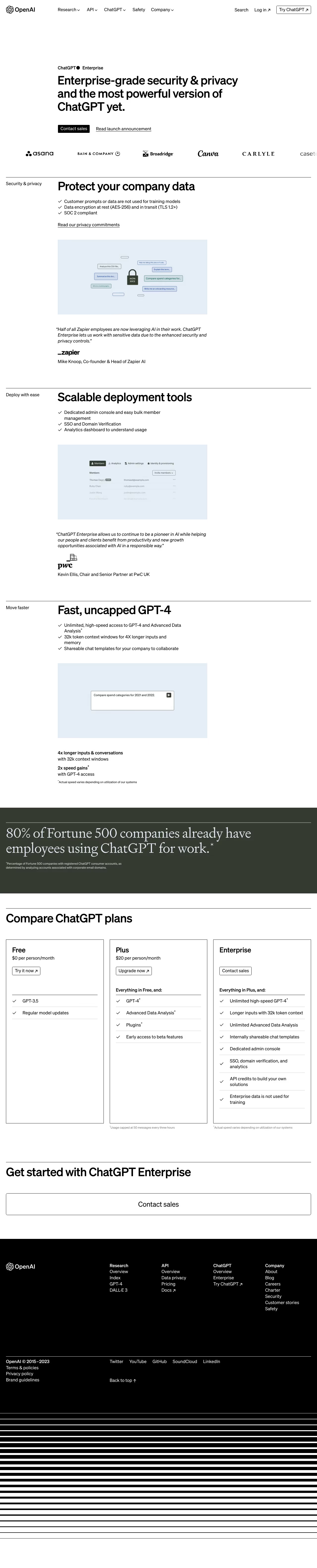
OpenAI's marketing site (openai.com) is a server-rendered Next.js application delivered via Vercel. Content is managed through Contentful CMS (evident from images.ctfassets.net image URLs). Assets are served as WebP via Contentful's image transformation pipeline with responsive w= query parameters (e.g. w=3840 for retina). No public design-token file or Storybook instance is exposed, so token values below are inferred from visual inspection and published brand guidelines.
Typography
OpenAI uses a custom sans-serif typeface family called Söhne (by Klim Type Foundry), supplemented by Söhne Mono for code snippets and technical content. The fallback stack is system-ui, -apple-system, sans-serif. The type scale is tightly controlled:
- Display / Hero: 56–80px, weight 500 (medium), tracking −0.02em, line-height 1.1
- H1: 40–48px, weight 500, tracking −0.01em, line-height 1.15
- H2: 28–32px, weight 500, tracking −0.01em, line-height 1.2
- H3: 20–24px, weight 500, line-height 1.3
- Body / Large: 18px, weight 400, line-height 1.6
- Body: 16px, weight 400, line-height 1.6
- Caption / Label: 12–14px, weight 400–500, letter-spacing 0–0.02em
- Code: Söhne Mono, 14px, weight 400
Color Philosophy
OpenAI's palette is intentionally minimal and high-contrast. The primary language is black-on-white (light mode) with a fully inverted dark mode as the default hero experience. Accent color usage is restrained — the brand green (#10A37F, the ChatGPT green) appears sparingly for interactive states such as links and CTA buttons. Secondary accent hues (teal, warm orange, pink) appear only in editorial artwork and photography, never in UI chrome. The system supports both light and dark themes.
- Light mode: white background, near-black text, subtle gray borders and dividers
- Dark mode: true black (
#000000) background, white text — used prominently for hero sections - Brand accent: ChatGPT green
#10A37Ffor links, hover states, primary CTAs - Secondary surface: light gray
#F4F4F4for card backgrounds in light mode - Muted text:
#6E6E80(gray-500 equivalent) for captions, metadata, and secondary labels
Spacing
OpenAI follows an 8-point spacing grid. Common spacings:
- Base unit: 8px
- Component padding (tight): 8px / 12px
- Component padding (default): 16px / 20px
- Component padding (loose): 24px / 32px
- Section vertical rhythm: 64px / 80px / 96px
- Page max-width: 1280px with auto horizontal margins
- Content column (prose): ~720px max-width for readable measure
Component Defaults
- Buttons (primary): Black fill, white text, border-radius 9999px (pill), padding 12px 24px, font-size 16px weight 500. Hover: slight opacity or dark gray fill.
- Buttons (secondary / outline): Transparent fill, 1px black border, same pill radius. Dark mode: white border, white text.
- Cards: border-radius 12px, 1px border
#E5E5E5in light mode, overflow hidden, subtle box-shadow or none. - Navigation: Fixed top bar, white/black background matching theme, 64px height, blur backdrop on scroll.
- Links: Underline on hover, color inherits accent green for interactive contexts.
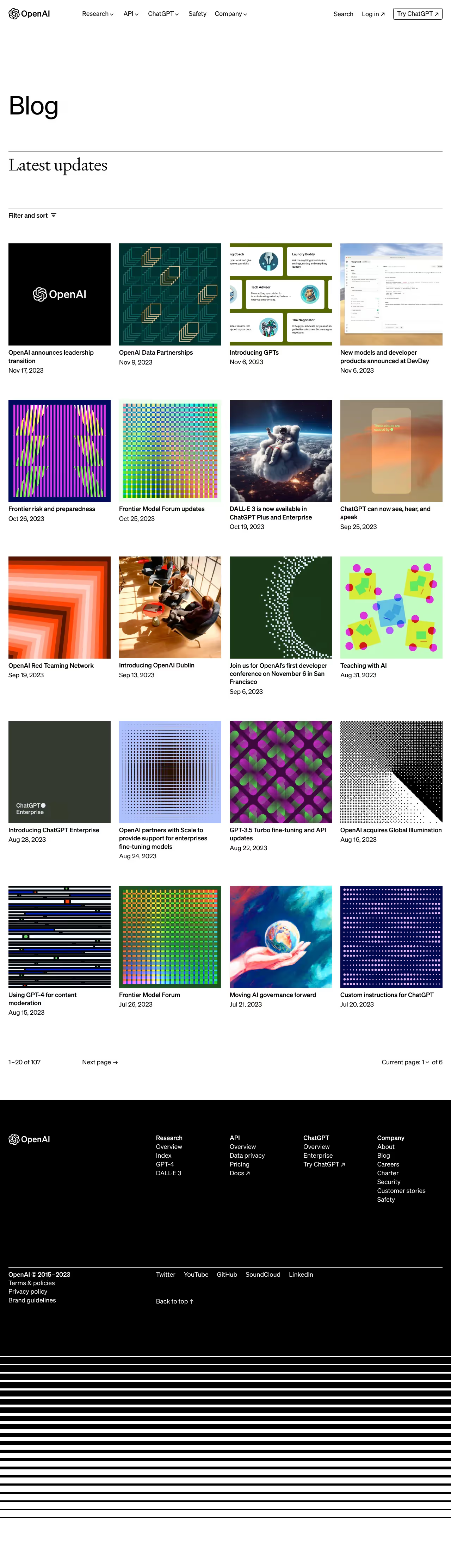
- Images: All editorial images served as 1:1 or 16:9 aspect ratio squares with object-fit cover, corner radius matching card.
- Dividers: 1px solid, color
#E5E5E5light /#2D2D2Ddark. - Code blocks: Söhne Mono, dark background
#1A1A1A, no border, border-radius 8px, padding 16px.
Layout
The site uses a 12-column CSS Grid with a 1280px container and 24px gutters. Sections alternate between full-bleed (edge-to-edge background color) and contained content blocks. Card grids use a 3-up or 4-up layout on desktop, collapsing to 1-up on mobile. The hero section on the homepage is full-viewport-height with vertically centered content. Navigation is a standard horizontal top bar on desktop and a slide-in drawer on mobile.
/\* ============================================================
   OpenAI Design System — CSS Custom Properties
   Source: inferred from openai.com visual inspection
   and published brand references (July 2026)
   ============================================================ \*/

:root {
  /_ --- Brand Colors --- _/
  --color-brand-green:       #10A37F;   /_ ChatGPT / primary accent _/
  --color-brand-green-hover: #0D8A6D;   /_ darker on hover _/

  /_ --- Neutral Palette (light mode defaults) --- _/
  --color-bg-primary:        #FFFFFF;
  --color-bg-secondary:      #F4F4F4;   /_ card / surface background _/
  --color-bg-tertiary:       #EBEBEB;   /_ subtle divider background _/

  --color-text-primary:      #0D0D0D;   /_ near-black _/
  --color-text-secondary:    #353535;
  --color-text-muted:        #6E6E80;   /_ captions, metadata _/
  --color-text-inverse:      #FFFFFF;

  --color-border-default:    #E5E5E5;
  --color-border-strong:     #CCCCCC;

  /_ --- Interactive --- _/
  --color-link:              #10A37F;
  --color-link-hover:        #0D8A6D;
  --color-focus-ring:        rgba(16, 163, 127, 0.4);

  /_ --- Typography --- _/
  --font-family-sans:        'Söhne', system-ui, -apple-system, sans-serif;
  --font-family-mono:        'Söhne Mono', 'Menlo', 'Consolas', monospace;

  --font-size-display:       clamp(48px, 6vw, 80px);
  --font-size-h1:            clamp(32px, 4vw, 48px);
  --font-size-h2:            clamp(24px, 3vw, 32px);
  --font-size-h3:            clamp(18px, 2vw, 24px);
  --font-size-body-lg:       18px;
  --font-size-body:          16px;
  --font-size-sm:            14px;
  --font-size-xs:            12px;
  --font-size-code:          14px;

  --font-weight-regular:     400;
  --font-weight-medium:      500;
  --font-weight-semibold:    600;

  --line-height-tight:       1.1;
  --line-height-heading:     1.2;
  --line-height-body:        1.6;

  --letter-spacing-display:  -0.02em;
  --letter-spacing-heading:  -0.01em;
  --letter-spacing-body:     0em;
  --letter-spacing-label:    0.01em;

  /_ --- Spacing (8pt grid) --- _/
  --space-1:   4px;
  --space-2:   8px;
  --space-3:   12px;
  --space-4:   16px;
  --space-5:   20px;
  --space-6:   24px;
  --space-8:   32px;
  --space-10:  40px;
  --space-12:  48px;
  --space-16:  64px;
  --space-20:  80px;
  --space-24:  96px;

  /_ --- Border Radius --- _/
  --radius-sm:   4px;
  --radius-md:   8px;
  --radius-lg:   12px;
  --radius-xl:   16px;
  --radius-pill: 9999px;

  /_ --- Shadows --- _/
  --shadow-sm:  0 1px 2px rgba(0,0,0,0.06);
  --shadow-md:  0 4px 12px rgba(0,0,0,0.08);
  --shadow-lg:  0 8px 24px rgba(0,0,0,0.10);
  --shadow-xl:  0 16px 48px rgba(0,0,0,0.12);

  /_ --- Layout --- _/
  --container-max-width:     1280px;
  --container-padding-x:     24px;
  --content-max-width:       720px;    /_ readable prose column _/
  --nav-height:              64px;
  --grid-columns:            12;
  --grid-gap:                24px;

  /_ --- Motion --- _/
  --duration-fast:    150ms;
  --duration-base:    250ms;
  --duration-slow:    400ms;
  --easing-default:   cubic-bezier(0.4, 0, 0.2, 1);
  --easing-spring:    cubic-bezier(0.34, 1.56, 0.64, 1);
}

/_ --- Dark Mode Overrides --- _/
@media (prefers-color-scheme: dark) {
  :root {
    --color-bg-primary:     #000000;
    --color-bg-secondary:   #111111;
    --color-bg-tertiary:    #1A1A1A;

    --color-text-primary:   #FFFFFF;
    --color-text-secondary: #D1D1D1;
    --color-text-muted:     #8E8EA0;

    --color-border-default: #2D2D2D;
    --color-border-strong:  #444444;

    --shadow-sm:  0 1px 2px rgba(0,0,0,0.4);
    --shadow-md:  0 4px 12px rgba(0,0,0,0.5);
    --shadow-lg:  0 8px 24px rgba(0,0,0,0.6);
    --shadow-xl:  0 16px 48px rgba(0,0,0,0.7);
  }
}

/_ --- Forced dark (data attribute) --- _/
[data-theme="dark"] {
  --color-bg-primary:     #000000;
  --color-bg-secondary:   #111111;
  --color-bg-tertiary:    #1A1A1A;
  --color-text-primary:   #FFFFFF;
  --color-text-secondary: #D1D1D1;
  --color-text-muted:     #8E8EA0;
  --color-border-default: #2D2D2D;
  --color-border-strong:  #444444;
}
Color Tokens
| Token | Value | Usage |
|---|---|---|
| --color-brand-green | #10A37F | Primary CTA buttons, links, focus rings, ChatGPT brand accent |
| --color-brand-green-hover | #0D8A6D | Hover/pressed state for brand green elements |
| --color-bg-primary | #FFFFFF / #000000 | Page background (light / dark) |
| --color-bg-secondary | #F4F4F4 / #111111 | Card surfaces, sidebar backgrounds |
| --color-bg-tertiary | #EBEBEB / #1A1A1A | Code block backgrounds, subtle fills |
| --color-text-primary | #0D0D0D / #FFFFFF | Body text, headings |
| --color-text-secondary | #353535 / #D1D1D1 | Sub-headings, secondary prose |
| --color-text-muted | #6E6E80 / #8E8EA0 | Captions, timestamps, metadata labels |
| --color-border-default | #E5E5E5 / #2D2D2D | Card borders, dividers, input outlines |
| --color-border-strong | #CCCCCC / #444444 | Emphasized borders, selected states |
| --color-focus-ring | rgba(16,163,127,0.4) | Keyboard focus outline |
Spacing Tokens
| Token | Value | Usage |
|---|---|---|
| --space-1 | 4px | Icon gaps, micro nudges |
| --space-2 | 8px | Base grid unit, tight padding |
| --space-3 | 12px | Button vertical padding, list item gaps |
| --space-4 | 16px | Default component padding, card inner |
| --space-5 | 20px | Input height offset, medium gaps |
| --space-6 | 24px | Grid gutter, section inner padding |
| --space-8 | 32px | Large component gaps, hero sub-elements |
| --space-10 | 40px | Section inner vertical padding |
| --space-12 | 48px | Desktop nav height buffer, medium section gaps |
| --space-16 | 64px | Standard section vertical padding |
| --space-20 | 80px | Large section vertical padding |
| --space-24 | 96px | Hero section top/bottom breathing room |
Typography Tokens
| Token | Value | Usage |
|---|---|---|
| --font-size-display | clamp(48px, 6vw, 80px) | Hero display headline |
| --font-size-h1 | clamp(32px, 4vw, 48px) | Page-level H1 |
| --font-size-h2 | clamp(24px, 3vw, 32px) | Section heading H2 |
| --font-size-h3 | clamp(18px, 2vw, 24px) | Sub-section heading H3 |
| --font-size-body-lg | 18px | Lead paragraph, feature descriptions |
| --font-size-body | 16px | Default body text |
| --font-size-sm | 14px | Secondary labels, card metadata |
| --font-size-xs | 12px | Captions, legal text, footnotes |
| --font-size-code | 14px | Code snippets (Söhne Mono) |
| --font-weight-regular | 400 | Body, captions |
| --font-weight-medium | 500 | Headings, button labels, nav items |
| --font-weight-semibold | 600 | Strong emphasis, tag labels |
| --line-height-tight | 1.1 | Display and H1 headlines |
| --line-height-heading | 1.2 | H2 and H3 |
| --line-height-body | 1.6 | Body paragraphs |
| --letter-spacing-display | -0.02em | Display / Hero text |
| --letter-spacing-heading | -0.01em | H1 and H2 |
| --letter-spacing-label | 0.01em | Tag labels, small caps |
Border Radius Tokens
| Token | Value | Usage |
|---|---|---|
| --radius-sm | 4px | Tags, badges, small chips |
| --radius-md | 8px | Code blocks, tooltip containers |
| --radius-lg | 12px | Cards, modal containers, media thumbnails |
| --radius-xl | 16px | Large feature cards, hero image containers |
| --radius-pill | 9999px | All buttons, input fields, tag pills |
Shadow Tokens
| Token | Value | Usage |
|---|---|---|
| --shadow-sm | 0 1px 2px rgba(0,0,0,0.06) | Subtle lift for inline chips and badges |
| --shadow-md | 0 4px 12px rgba(0,0,0,0.08) | Card hover state, dropdown menus |
| --shadow-lg | 0 8px 24px rgba(0,0,0,0.10) | Modal and dialog overlays |
| --shadow-xl | 0 16px 48px rgba(0,0,0,0.12) | Floating panels, feature highlight cards |
Framework & Infrastructure: The site is built with Next.js (React SSR/SSG), deployed on Vercel, with content managed through Contentful headless CMS. All editorial images are delivered via the Contentful Images API (images.ctfassets.net) in WebP format with responsive w= sizing parameters up to 3840px for HiDPI displays.
Theme Support: OpenAI's site supports both light and dark modes. The homepage hero defaults to a dark (black) experience with white text, while content sections switch to a light background. Theme switching is handled via CSS custom property overrides keyed to prefers-color-scheme media query and a data-theme attribute on the root element. The dark hero pattern is a deliberate brand choice, not just an accessibility accommodation.
Notable Design Patterns:
- Pill buttons everywhere: All CTA and navigation buttons use
border-radius: 9999px, creating a distinctly rounded, friendly pill shape that contrasts with the otherwise minimal aesthetic. - Black-and-white restraint: The primary UI palette is strictly monochromatic. The ChatGPT brand green (
#10A37F) is the only color used in interactive UI elements — all other color appears exclusively in editorial photography and generative artwork thumbnails. - Söhne typeface: OpenAI's use of Klim Type Foundry's Söhne (a reworking of Akzidenz-Grotesk) gives the site a distinctly humanist yet technical character, reinforcing the brand's positioning at the intersection of science and accessibility.
- Full-bleed media sections: Many homepage sections use full-viewport-width background colors alternating between black and white, creating strong visual rhythm without decorative elements.
- No decorative icons: UI navigation uses text labels only — no icon-only navigation buttons in the top bar. Icons appear only inside specific product UI screenshots.
- Content-first card grid: News, research, and story cards are consistently 1:1 square imagery with minimal text overlay, maintaining visual uniformity at scale.
- Backdrop blur nav: The sticky navigation bar applies a backdrop-filter blur as the page scrolls, preserving legibility over hero imagery without an opaque background.
Data Confidence: Token values are derived from visual inspection of openai.com (fetched July 2026), cross-referenced with OpenAI's published brand materials and ChatGPT interface patterns. OpenAI does not publish a public design token file or Figma community kit, so specific hex values and spacing figures carry medium-to-high confidence rather than being directly extracted from source CSS. The typeface identification (Söhne) is high-confidence based on widely documented brand references. Exact pixel values for spacing and radius should be validated against browser DevTools inspection before use in production implementations.
Biggest SaaS library.


.webp)


.webp)

Desktop & mobile versions.


Access the Figma files.


Advanced filtering.
Let it flow.





Save design inspirations.
research




How do you process payment?
SaaSFrame subscriptions are sold on Lemon Squeezy, a secured online selling platform for creators.
What about future updates and versions?
SaaSFrame gets updated all the time! Every new update and version will immediately be made available to all SaaSFrame users.
Can you send me an invoice?
You can generate an invoice on your Lemon Squeezy portal once you purchased SaaSFrame. You will find the link in the order confirmation email.
How can I cancel my membership subscription?
You can cancel your membership subscription at any moment on your profile page.
Can I get a refund?
If you're not satisfied, you can ask for a refund within 7 days. Just send me an email at antoine[at]unmake[dot]io
I have another question.
You can send me an email at antoine[at]unmake[dot]io, I'll be happy to help with any questions.