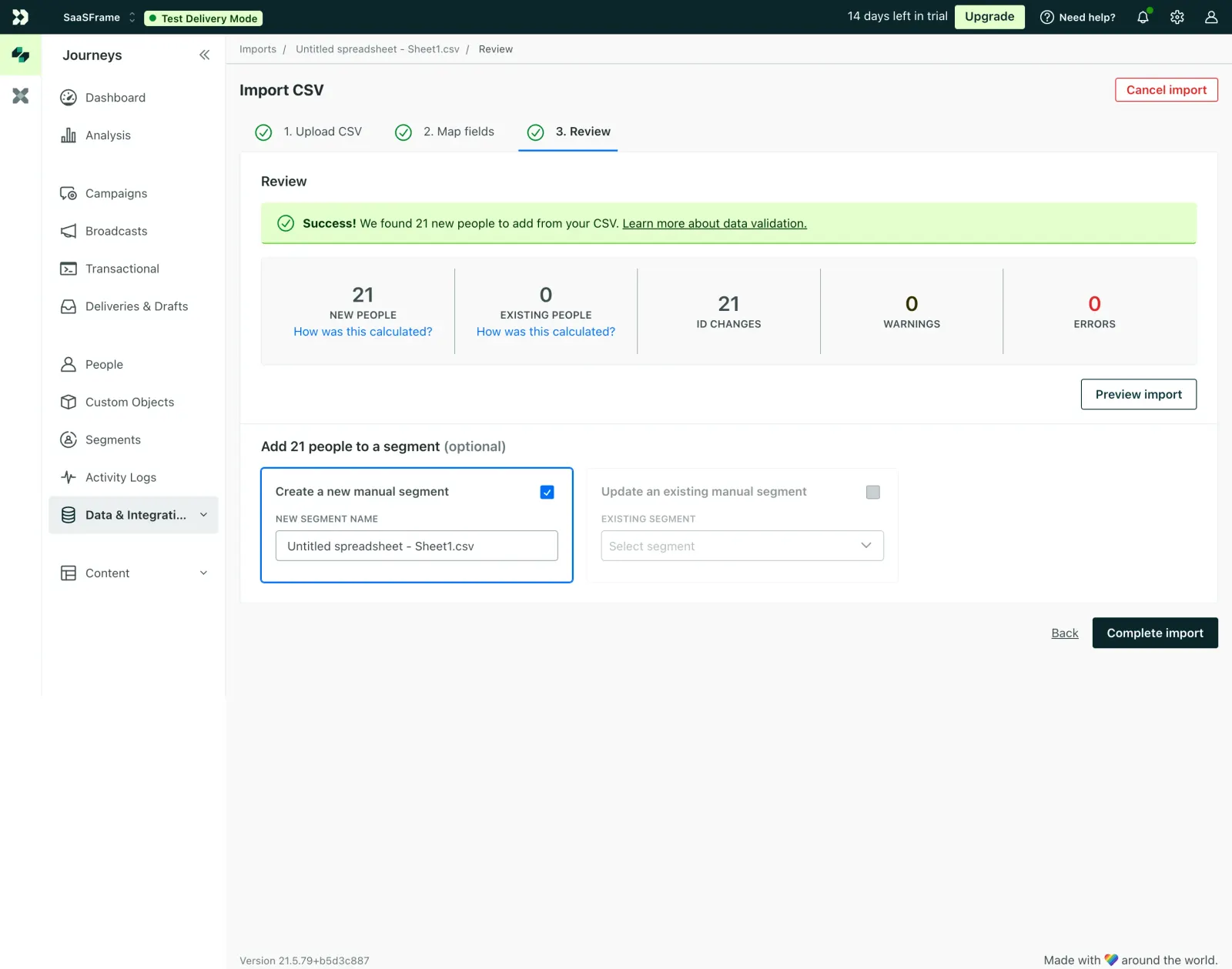
The green success banner grabs you first. It's doing the heavy lifting here, immediately telling users their upload went through. That bright green on a light green background is satisfying without being obnoxious. The stats row below it is smart. Five metrics laid out horizontally with big bold numbers and muted labels. Zero errors in red, 21 new people in black. You get the full picture in about two seconds.
Guided Without Being Annoying
The three-step progress indicator up top keeps things grounded. All checkmarks filled in green. You know exactly where you are. The segment creation section at the bottom uses a subtle blue border to highlight the active selection, and the checkbox is doing just enough to show state. Typography is restrained throughout. Small caps for labels, clean sans-serif for everything else.
What Makes It Stand Out
That "Complete import" button sits confidently in the bottom right, dark and prominent. The whole page feels like it respects your time. No clutter, no unnecessary decoration. Customer.io clearly prioritized function here and it shows.
 SaaSFrame
 Customer.ioCustomer engagement for tech-savvy marketers