 SaaSFrame
Pricing
Display your tiers with clarity using SaaS Pricing patterns. Explore monthly/yearly toggles, currency switchers, and tiered card layouts designed to minimize price friction.
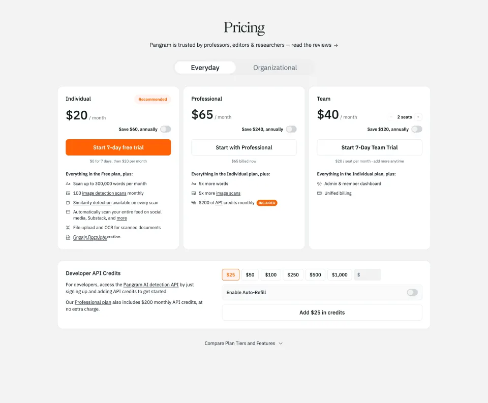

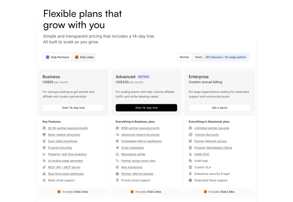

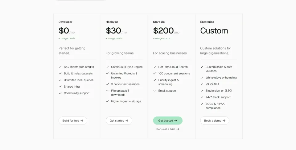

Pricing: design guide
A SaaS pricing section helps visitors understand the offer, estimate the relevant cost, and choose a next step. A strong design connects the amount to its billing unit, distinguishes plan limits, and makes the action predictable. Its value is clarity: a visitor should know what they are evaluating before they start a trial or contact the team.
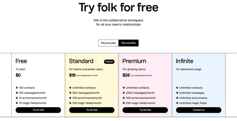
Folk and Popwork illustrate different offer structures. Folk shows several plans with a billing-period selector and parallel usage limits. Popwork presents a starting price, an inline trial form, and a separate enterprise route. The captured amounts and conditions are historical design evidence, not current purchase information.
Choose a structure that reflects the offer
Begin with how the product is actually sold. A single offer can use one price panel and a clear explanation of scope. Several tiers may need parallel cards. Usage-based pricing may need an estimator and a definition of the charged unit. A custom enterprise offer needs an explicit route to discuss requirements.
Do not force every business model into three cards. An artificial tier can create unnecessary comparison, while a single starting price can conceal important choices if the product has materially different plans. The visual structure should help visitors understand the commercial model rather than simplify it beyond recognition.
Identify the decision the section should support. Some visitors need to estimate cost; others need to determine whether a capability is included. Pricing cards can summarize the offer, while a detailed comparison or FAQ can resolve deeper questions. Keep these roles connected without asking one small card to carry every condition.
Pair the price with its unit and billing period
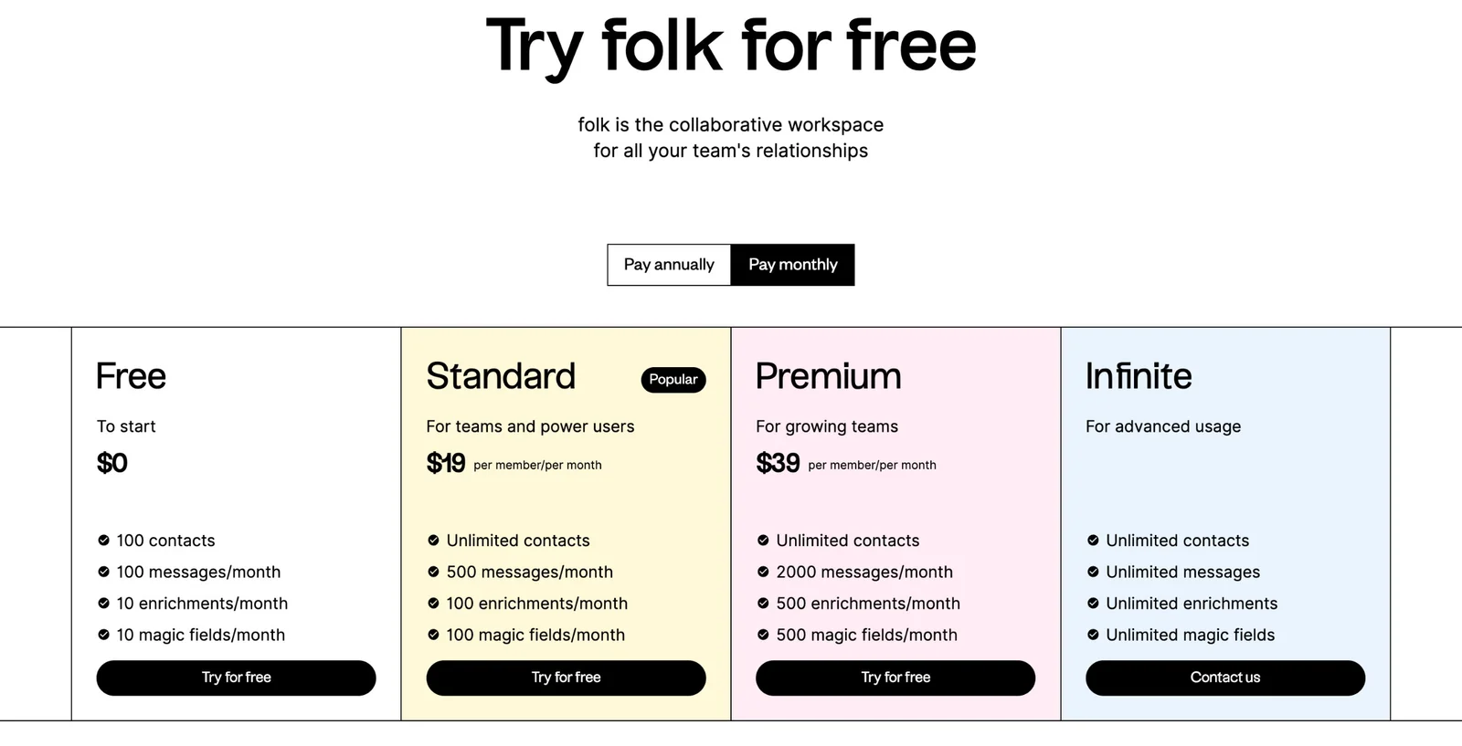
Folk places a monthly or annual selector above its plan columns and labels the visible paid amounts per member per month. This connects the figure to both a seat unit and a time unit. The selected period is visually distinct, giving the visitor an initial clue about which offer is being displayed.
Keep that relationship explicit in your own design. An amount per person per month can differ from the total charged to a team and from an annual payment commitment. If a monthly equivalent is shown for annual billing, explain the billing arrangement nearby rather than relying on a toggle label alone.
Use consistent currency and formatting across plans. When visitors can change currency or period, update all dependent labels together and keep the selected state accessible. A static capture cannot demonstrate that behavior; the live implementation needs a separate check for coherence after each change.
Explain plan differences through meaningful limits
Folk's columns use parallel rows for contacts, messages, enrichments, and other usage allowances. This makes the main differences visible without requiring visitors to compare unrelated feature lists. The higher custom offer uses a contact action rather than a displayed self-serve amount.
Choose differences that affect the visitor's decision. A plan card should explain who it suits and what capacity or capability changes. Avoid long lists of features that are identical across every tier if they obscure the limits that actually distinguish the offers.
Define unfamiliar usage terms in supporting content. A visitor may understand contacts but not a product-specific enrichment or field operation. If usage resets periodically, state the period. If limits behave differently after they are reached, make the next destination explain that behavior before purchase or setup.
Use a starting price without hiding the conditions
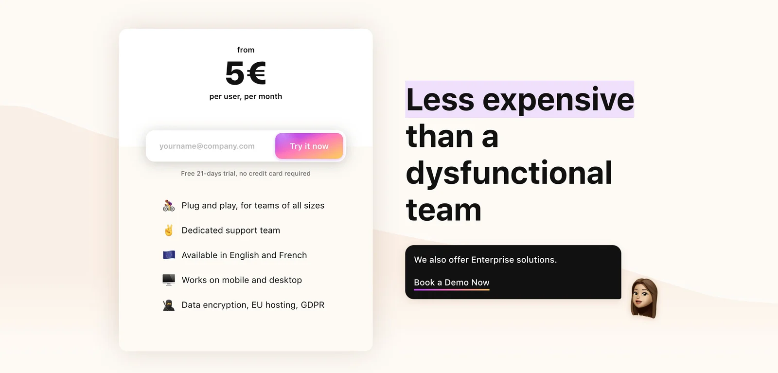
Popwork's capture emphasizes a starting amount per user per month rather than a multi-tier comparison. The panel places an email field and trial action beneath the price, followed by visible trial conditions. A separate dark panel offers an enterprise demo route.
This can be a compact way to present a straightforward entry offer while acknowledging a different buying path for larger needs. The word from signals that the displayed amount is a starting point, so the linked flow should make the relevant conditions clear.
Do not use a starting-price label as a substitute for explaining the pricing basis. Visitors still need to know what affects the amount, whether there are minimums, and what scope the offer covers. Keep the estimate understandable before asking for contact details. A low headline amount without meaningful context can attract attention while leaving the actual decision unresolved.
Make trial, purchase, and sales actions distinct
Folk's visible self-serve plans use Try for free, while the custom offer uses Contact us. Popwork combines an inline trial entry with a separate demo destination. These labels suggest different next steps and help visitors choose according to their readiness.
Keep the action promise accurate. A trial action should lead to the stated trial experience; a purchase action should establish the selected plan and billing terms; a contact action should explain what conversation or form comes next. Avoid presenting a sales gate as immediate product access.
Place important trial expectations near the action. If a card is required, access is limited, or billing begins after a defined period, explain the relevant condition clearly. When the trial ends, visitors should understand the transition. Do not rely on a later screen to correct a misleading impression created in the pricing section.
Use recommendations with a clear basis
Folk marks one plan Popular and gives its column a distinct background. A recommendation can reduce the effort of scanning several similar offers, but it should not overwhelm the actual differences. The visitor still needs to determine whether that plan fits their usage and requirements.
Choose labels that accurately describe the recommendation. Popular refers to adoption; Best for teams refers to a suitability claim; Recommended refers to a suggestion. These labels are not interchangeable. Keep the supporting reason understandable and avoid inventing social proof to make a tier feel safer.
Do not make lower or higher plans difficult to select. A recommendation should guide attention while preserving choice. Keep all prices and actions readable, and avoid using color alone to convey which tier is emphasized. A visitor with a small team or specialized needs may reasonably choose another offer.
Keep supporting claims relevant and maintained
Pricing sections often include support, availability, language, or security statements to help visitors assess value. Popwork's capture includes several such lines beneath its trial entry. These can reduce uncertainty, but they need owners and supporting detail when the claim is consequential.
Distinguish a plan entitlement from a general product statement. If a support level changes by tier, make that visible. If a capability depends on region, configuration, or another requirement, provide a clear route to the relevant information. A short benefit line should not imply more than the maintained product policy supports.
Use an FAQ or comparison for questions that genuinely need more explanation. Do not bury the main price basis or key restriction inside a collapsed answer. The section should provide the essential offer, while supporting content resolves the remaining edge cases and definitions.
Adapt pricing cards and forms to small screens
A four-column pricing row becomes a longer sequence on mobile. Preserve the plan order and make each card self-contained enough to understand without remembering a header several screens above. Keep the amount, unit, main differences, and action visually associated.
Billing selectors need visible focus and a clear selected state. Inline email forms need a label, readable error message, and confirmation that does not disrupt the rest of the pricing content. Test longer translations and zoomed text before relying on fixed card heights.
For detailed comparison, choose a responsive model that preserves feature-to-plan relationships. A horizontally scrollable table can work when the labels remain clear; stacked plan details can work when repeated labels remain consistent. Do not shrink the entire section until the figures and conditions become too small to read.
Review the offer from selection through confirmation
- Does the structure match the actual pricing model?
- Is each amount paired with a currency, unit, and period?
- Are annual commitments distinguished from monthly equivalents?
- Do plan differences address meaningful usage or capability needs?
- Are unfamiliar limits defined?
- Do trial and purchase labels predict the next step?
- Are custom offers clearly separated from self-serve offers?
- Is any recommendation accurately labeled?
- Do supporting claims have maintained sources?
- Does the selected offer remain clear throughout the next flow?
Test with realistic scenarios, such as a small team choosing a period or a larger team needing a particular capability. Ask visitors to estimate the cost and explain what happens after clicking. Their reasoning reveals missing units and hidden assumptions that a visually polished mockup can conceal.
Keep the pricing source consistent across cards, comparison tables, checkout, and in-product upgrade screens. A change to one surface can create conflicting expectations elsewhere. Review the complete offer after an update, including labels, trial copy, and custom-plan routes. The design is only as clear as the information behind it.
Frequently asked questions about SaaS pricing sections
Should pricing show monthly or annual amounts first?
Choose a default that fits the offer and audience, then clearly expose the selected period. If an annual commitment is represented by a monthly equivalent, explain that billing arrangement. The visitor should not need to infer the commitment from a smaller toggle label.
Is a single starting-price panel enough?
It can work for a simple entry offer when the pricing basis and conditions are clear. If several plans differ materially, provide a comparison or another route to understand those choices. A starting amount should not hide the model that determines the actual cost.
Where should enterprise pricing appear?
Give it a recognizable place alongside or near the self-serve offer when it is relevant. Explain who the route is for and what happens next. A demo or contact action is useful when the offer depends on requirements that need discussion.
Browse SaaS pricing section examples on SaaSFrame to compare plan cards, billing selectors, trial forms, and enterprise paths.