 SaaSFrame
Call to Action
Convert visitors into users with high-converting SaaS CTA patterns. From sticky 'Get Started' buttons to high-contrast hero actions, discover the psychology of buttons that drive clicks.




Call to Action: design guide
A SaaS call to action section turns product understanding into a clear next step. It combines a reason to act with a control that accurately describes the destination. The design succeeds when the visitor can predict what will happen, judge whether the step fits their readiness, and take it without unnecessary uncertainty.
Folk and Artboard Studio show different levels of visual emphasis. Folk uses a concise product statement and a small trial button surrounded by open space. Artboard Studio uses a large benefit headline, product imagery, and a bright trial action. Comparing them helps separate useful emphasis from unsupported urgency or complexity.
Choose the next step before writing the button
Begin with the action the visitor is ready to take at this point in the page. Starting a trial, creating an account, booking a demo, and reading a guide are different commitments. Choose one primary step that follows from the surrounding explanation.
Do not start with a generic button label and decide its destination later. The section's heading, supporting copy, and control should describe the same experience. If the visitor still needs basic product understanding, a demo or deeper explanation may be more useful than immediate signup.
Define what success means beyond the click. A trial invitation should lead to an understandable trial entry. A demo invitation should lead to a clear booking or request flow. The call to action is a handoff, so evaluate the destination as part of the design rather than treating the button as an isolated conversion element.
Use a concise product statement when context is already established
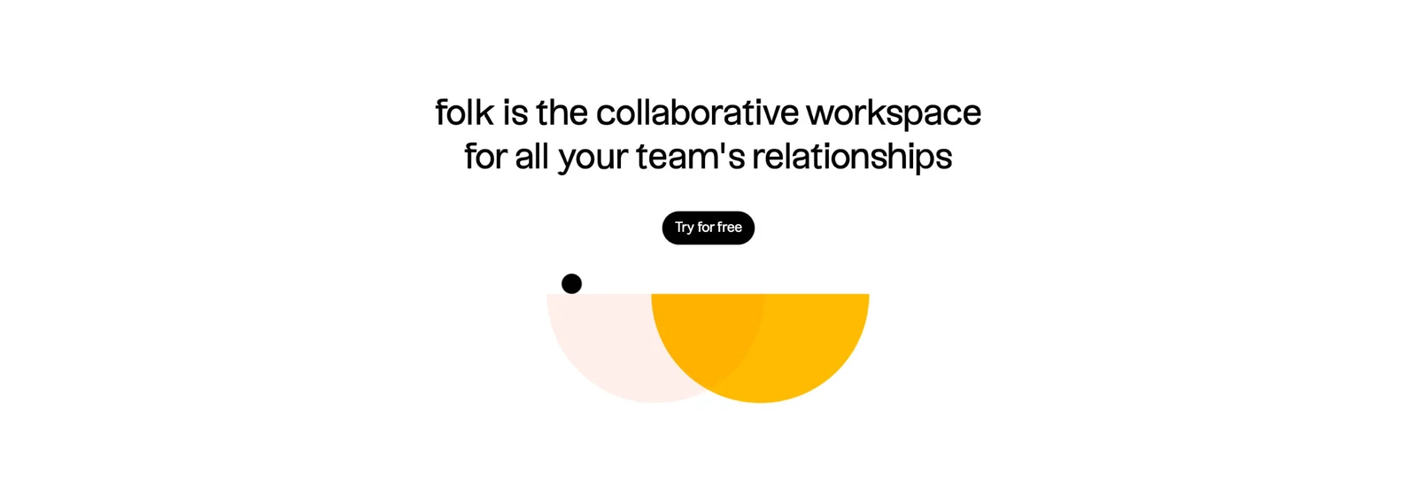
Folk's section states the product's role as a collaborative workspace for team relationships, then offers Try for free. The limited content and generous whitespace keep the action clear without adding another large feature explanation. Decorative shapes support the visual identity without carrying essential information.
This approach can work near the end of a page that has already explained the product. The section reinforces the core promise and offers a next step. It does not need to repeat every capability or add a long list of reassurance statements.
Check whether the product statement is specific enough for its placement. If visitors reach the section without understanding the main workflow, a broad summary may not resolve their questions. Use the earlier page content to establish meaning, and let the final invitation build on that understanding.
Use product imagery when it reinforces the action
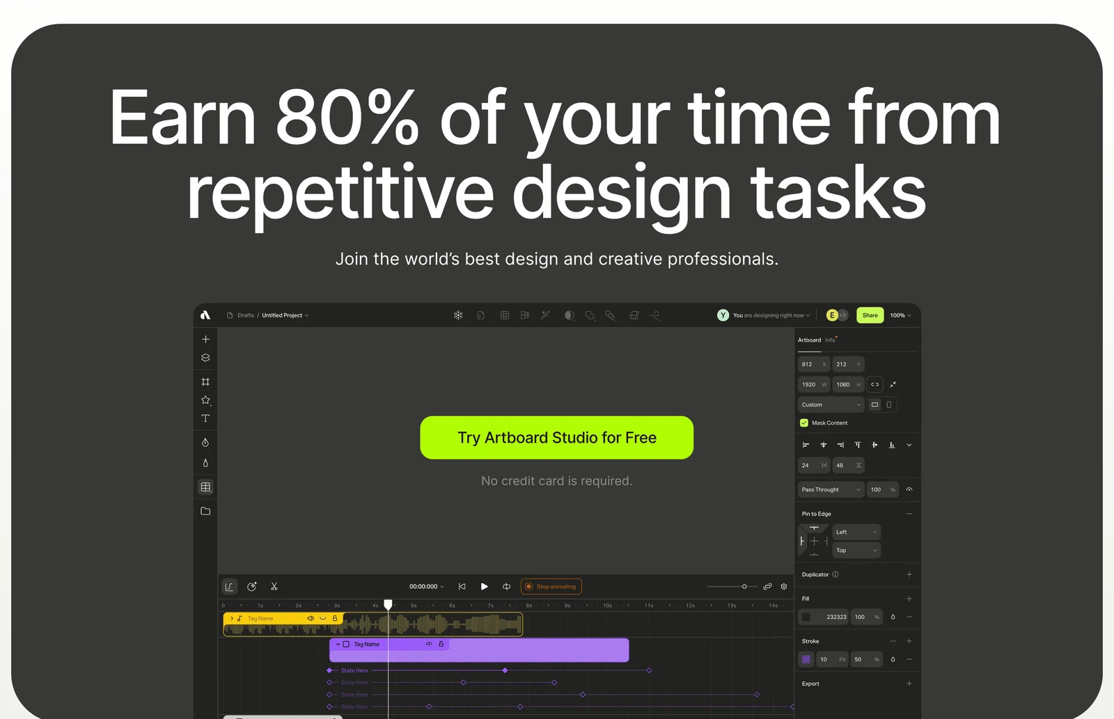
Artboard Studio places a prominent trial button within a large product-editor composition. The surrounding interface gives the invitation a product context, while the bright control stands out from the dark panel. A nearby note addresses whether a credit card is required in the captured offer.
This composition can help connect an abstract benefit to the tool someone will try. However, an overlaid marketing button should remain recognizable as the page's action rather than a control inside the depicted editor. Use placement, styling, and text to make that distinction clear.
The headline includes a quantified time-saving claim. A strong number can draw attention, but its accuracy requires a maintained basis and relevant conditions. The historical capture demonstrates the design treatment, not proof of the outcome. Do not reuse a persuasive percentage without the evidence needed to support it.
Write action labels that predict the destination
A useful label names the action and, when needed, the object or experience. Try for free establishes a different expectation from Buy now, Book a demo, or View examples. Keep the label aligned with the actual flow.
If the next step is a request rather than immediate access, say so. A label that promises to start using the product should not silently lead to a sales form. If the action requires choosing a plan or completing setup, make that expectation clear through nearby copy or the destination's opening state.
Avoid clever labels that obscure commitment. The heading can carry brand voice while the button remains practical. Repeated actions across a page should use consistent wording when they lead to the same experience. Different destinations need different labels so visitors can choose intentionally.
Place reassurance near the relevant uncertainty
Trial invitations often raise questions about payment details, duration, setup, or access. A short note near the action can reduce that uncertainty when it accurately describes the offer. Artboard Studio's visible card-requirement note is an example of this placement.
Choose reassurance based on real friction, not a generic checklist. If the audience worries about implementation, a relevant setup explanation may matter more than another free-trial phrase. If the next step is a demo, explain what the conversation covers and how the request works.
Keep important conditions visible and maintained. A trial statement should not contradict pricing, signup, or confirmation screens. If access changes after a period or requires a particular plan, make the relevant transition understandable. Concise copy is useful only when it preserves the meaning of the commitment.
Balance one primary action with useful alternatives
A clear primary action helps visitors identify the intended next step. A secondary action can support another legitimate readiness level, such as learning more before trying or speaking with the team instead of self-service signup.
Use hierarchy to distinguish the alternatives. A quieter text link or secondary button can remain accessible without competing equally with the main action. Do not add several unrelated destinations merely because the section has space.
Keep each alternative relevant to the same decision. A trial and a demo may represent two paths into evaluation. A newsletter subscription and a purchase button serve different intentions and may belong in separate sections. Group actions when their relationship is clear, rather than making the visitor interpret a miscellaneous menu.
Place the invitation where the page has earned it
A call to action can appear early for visitors who already know the product and later for those who need explanation. Repetition can be useful when a long page serves both groups, but each instance should arrive at a meaningful point.
Do not interrupt every feature section with the same large invitation. That can compete with the explanation visitors need to decide. Use smaller contextual links during exploration and a stronger final section after the main evidence has been presented.
Keep the surrounding content connected. A final action after a case study can acknowledge the relevant workflow; an action after pricing can retain the selected offer. The destination should preserve important context rather than reset the visitor into a generic flow.
Make the control and handoff accessible
Use a link for navigation and a button for an in-page action or submission. Give the control a clear accessible name, visible focus, and enough target space. Do not rely only on color or animation to make the action discoverable.
On mobile, keep the heading, explanation, action, and conditions associated. A large illustration should not push the button away from its promise. Long translated labels need room to wrap or grow without clipping, and zoomed text should not overlap the control.
If clicking begins a request or creates an account, show loading and prevent confusing duplicate actions while preserving useful feedback. If the destination fails, provide a retry or another relevant route. The visitor should understand whether the step succeeded, rather than repeatedly clicking an unresponsive control.
Review the complete promise-to-action path
Consider how the invitation reads for someone who arrives directly at this part of the page through an anchor or shared link. The section can remain concise while naming the product or action clearly enough to stand on its own. Folk's product statement provides that context; a button with no surrounding explanation would need the earlier page content much more heavily.
Also check whether the visual composition suggests interactivity beyond the real button. A detailed editor image can attract clicks on depicted controls. Keep the actual page action distinct, and avoid hover effects on the image that make the whole illustration appear usable. The invitation should lead to the product experience without pretending the preview already is that experience.
- Does the section offer a next step suited to visitor readiness?
- Does the heading provide a clear reason to act?
- Does the button label accurately predict the destination?
- Are measurable benefit claims supported?
- Are relevant trial or commitment conditions nearby?
- Does a secondary action serve a clear alternative intent?
- Is placement connected to the surrounding explanation?
- Does the destination preserve context?
- Can keyboard and mobile users find and activate the control?
- Is success or failure understandable?
Measure destination completion as well as clicks. A prominent button may attract attention while leading to abandonment if the next screen asks for an unexpected commitment. Observe the handoff and ask visitors what they expected before clicking. This helps distinguish a label problem from a destination problem.
Test the section without its decorative imagery. The product statement and action should still make sense. Then review the visual hierarchy at the actual page size: too little contrast can hide the button, while excessive emphasis can make surrounding conditions disappear. The invitation should be noticeable and interpretable at the same time.
Maintain repeated call to action sections together. If the trial offer or destination changes, update all relevant instances and verify that they promise the same experience. A footer invitation, hero action, and feature-level link should not lead to contradictory versions of the offer.
Frequently asked questions about call to action sections
Should a SaaS page have only one call to action?
Use one clear primary action at each decision point. A page can repeat it or offer a relevant secondary path when visitors have different readiness levels. Avoid presenting several equally prominent actions without explaining their relationship.
Is a stronger benefit headline always better?
A specific, credible reason to act is useful. A more dramatic claim is not necessarily clearer or more trustworthy. Choose wording the product can support and keep quantified promises connected to evidence and conditions.
Where should the final call to action appear?
Place it after the page has addressed the main evaluation questions. It can reinforce the product's core value and offer a clear next step. Ensure that visitors who need another route can still find relevant information or help.
Browse SaaS call to action examples on SaaSFrame to compare promise, button language, product imagery, reassurance, and destination handoffs.