.webp)

Huly


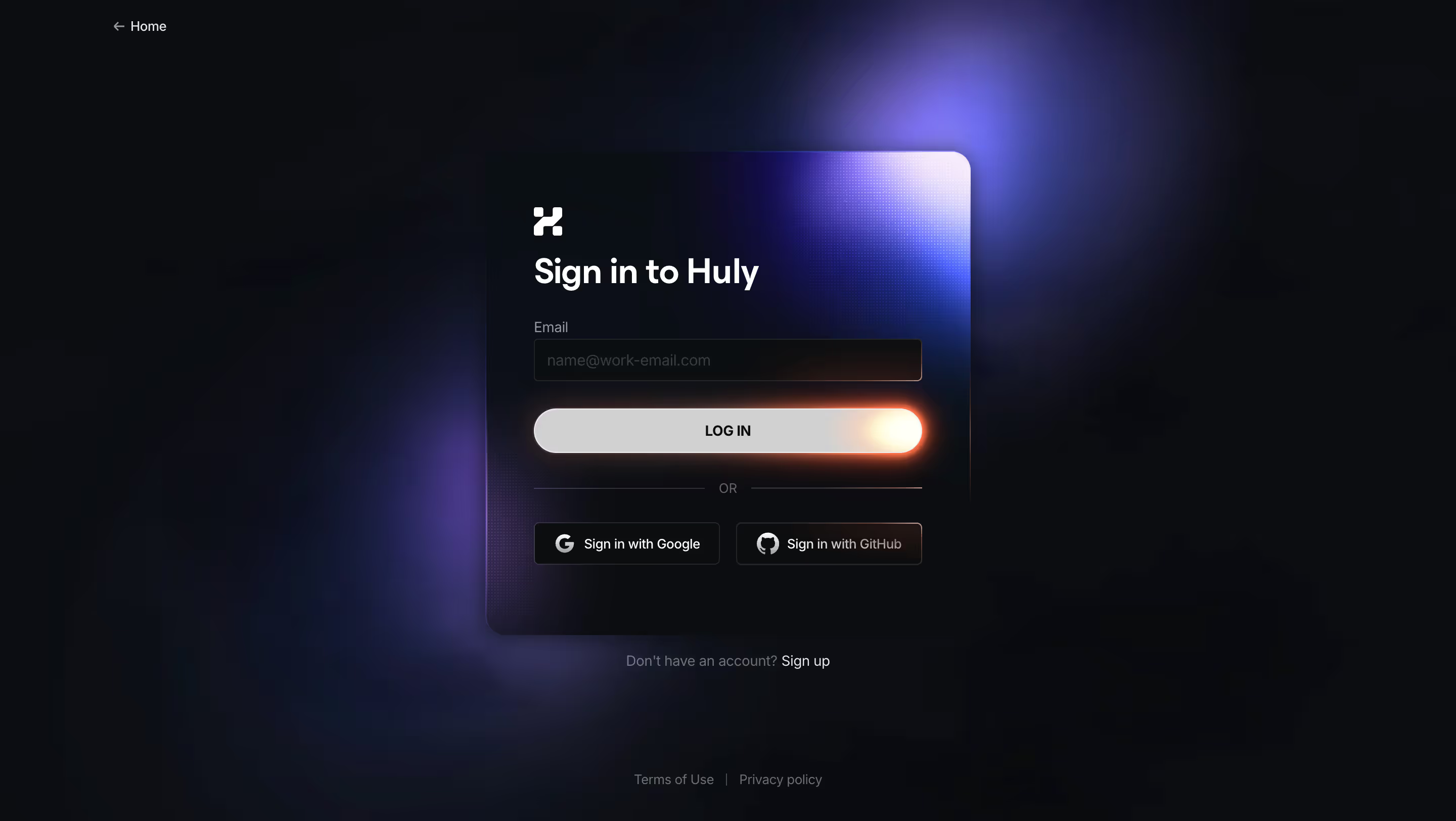


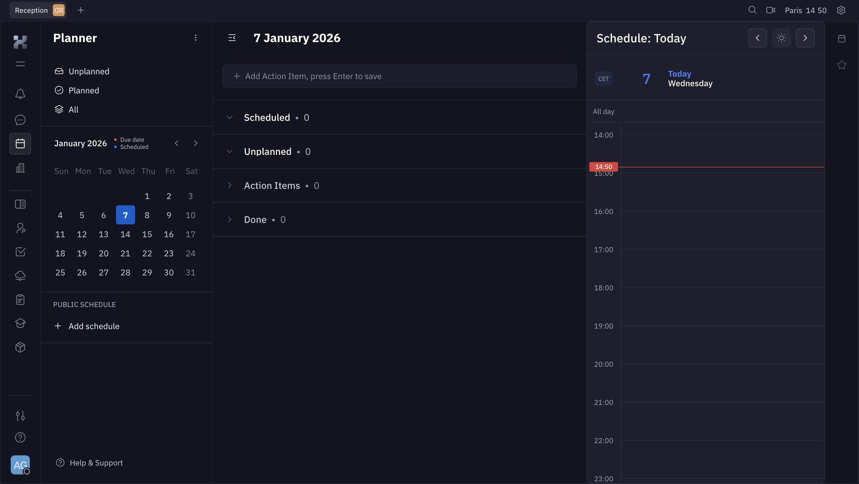
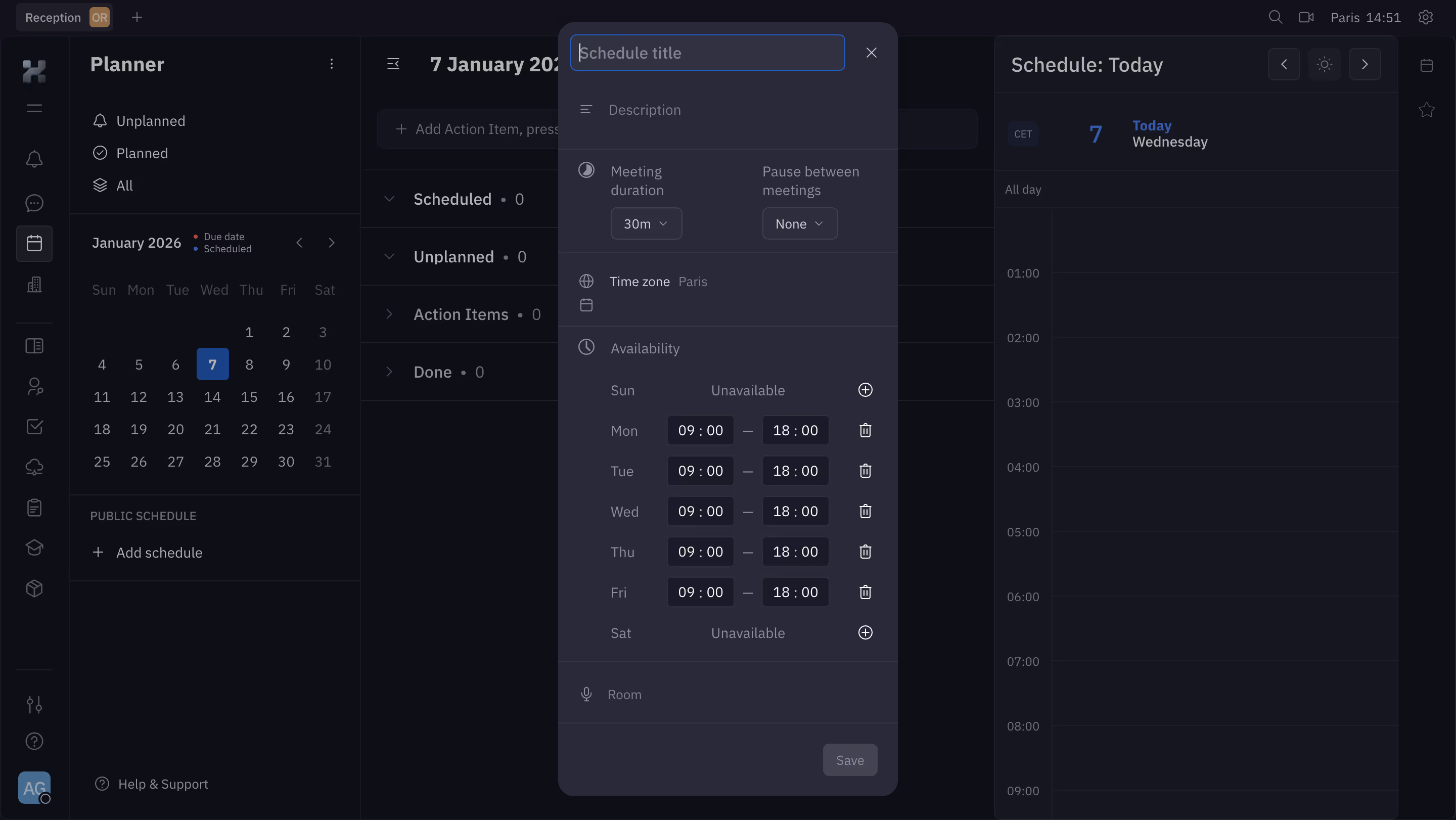


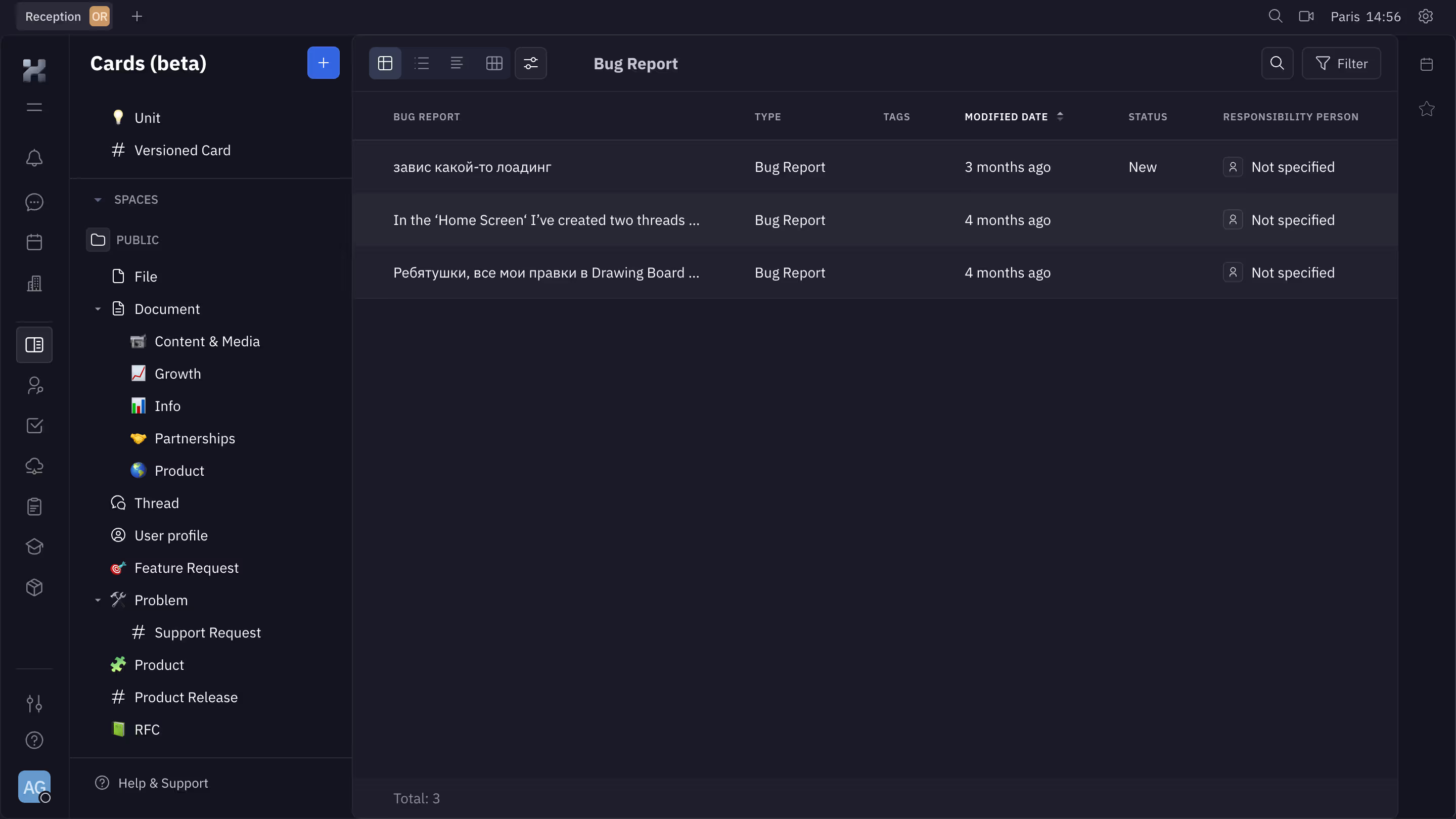
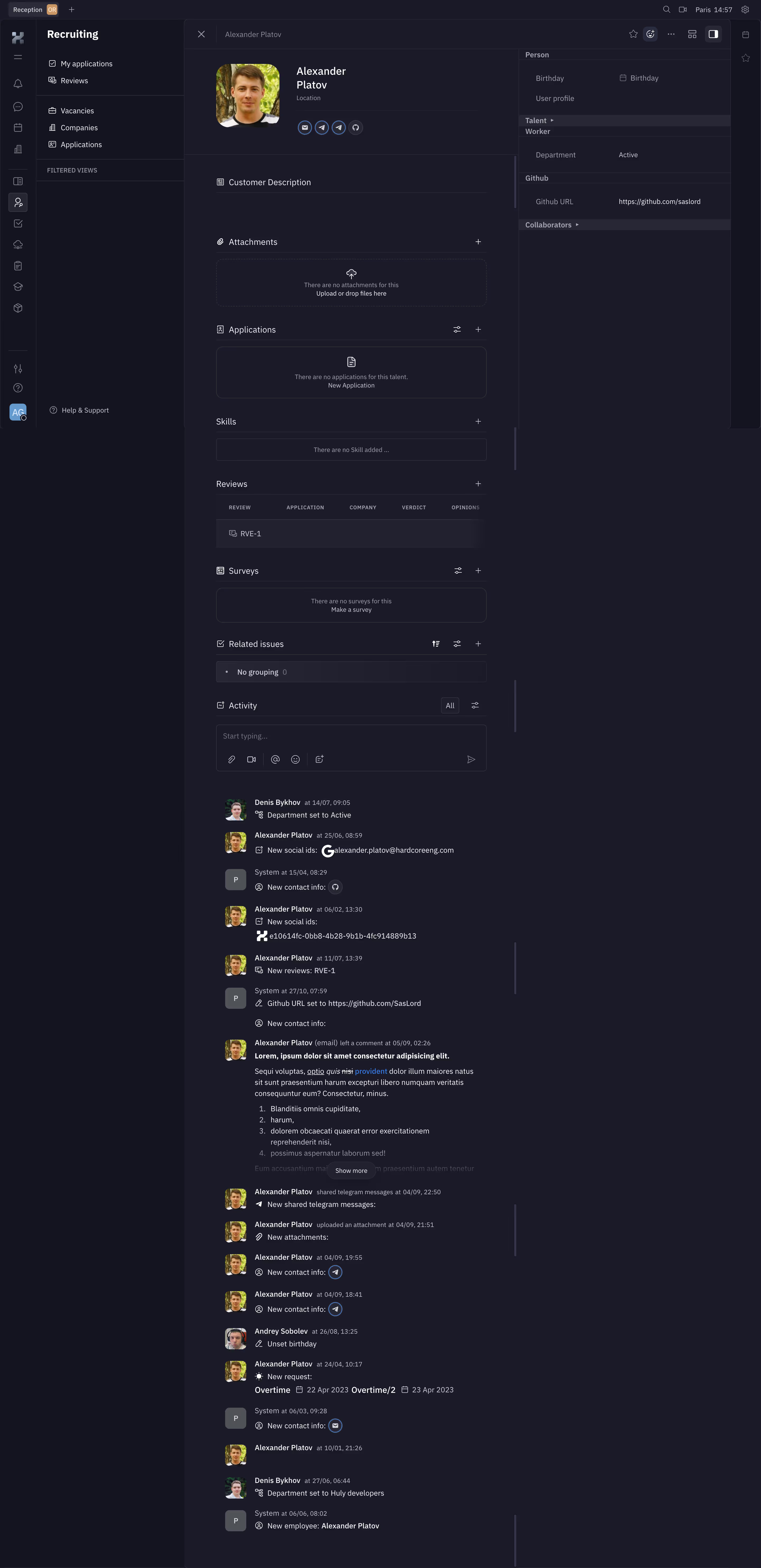
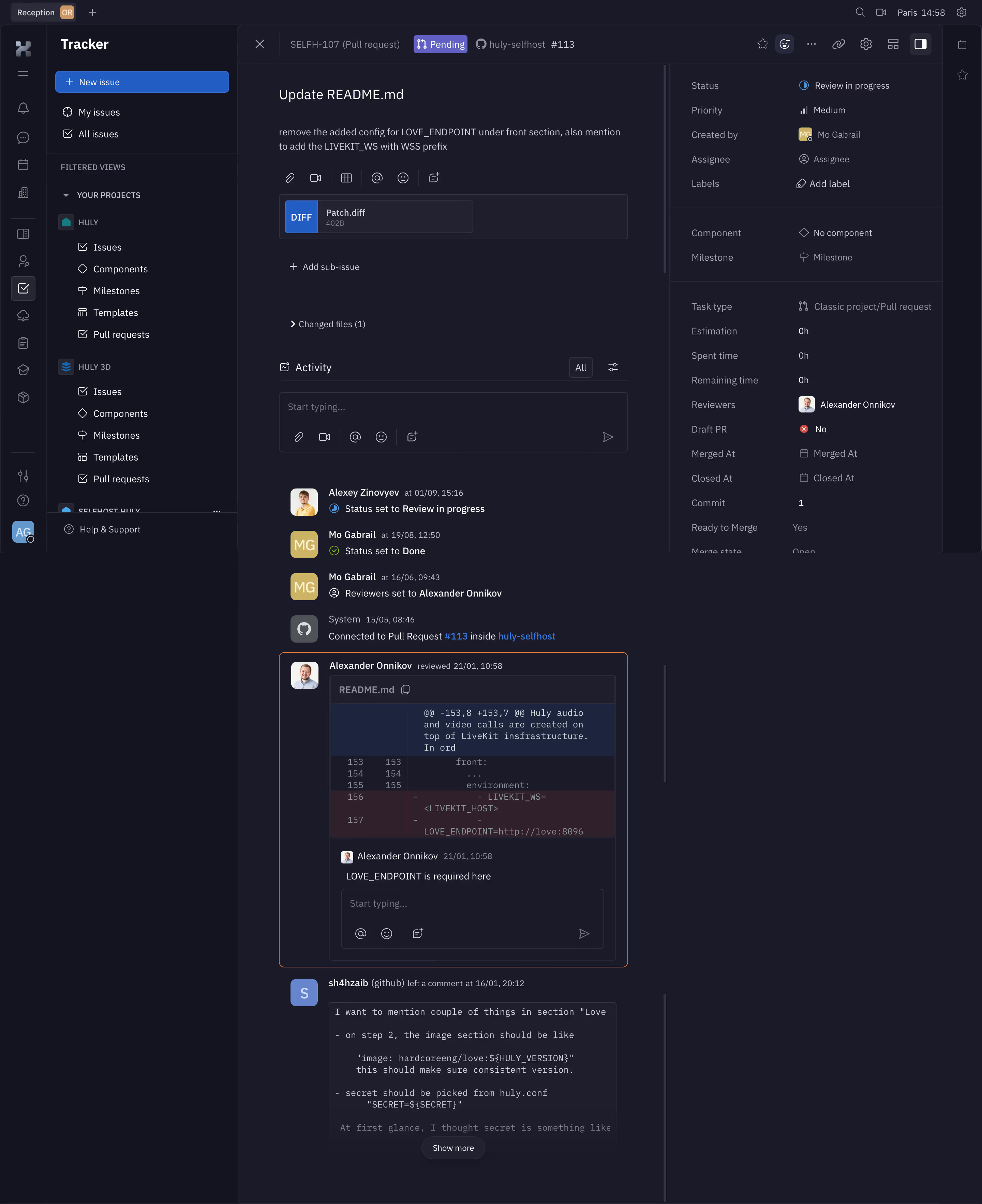
Huly Design System
Stack \- Framework: SvelteKit (Svelte components throughout) \- Styling: SCSS with CSS custom properties; no utility-class framework \- Theme engine: Custom @hcengineering/theme package — toggling theme-light / theme-dark classes on \- Font sizes: Two modes — normal-font (16px base) and compact-font (14px base), stored in localStorage
Color Philosophy \- Deep dark-first aesthetic: primary background #161719 (dark) / #F1F1F4 (light) \- Website chrome uses near-black #090a0c (theme-color meta tag) \- 24-color named palette (Firework → Porpoise) covering reds, pinks, purples, blues, greens, oranges, grays \- Separate avatar-color palette (24 pastel HSL values) for user identity \- Alpha blending is pre-computed against background rather than CSS opacity, ensuring accurate perceived color
Typography \- System font stack (no custom web font declared in source) \- Two font-size tiers: 16px normal / 14px compact, user-selectable \- Text hierarchy via weight and opacity variants rather than many size steps \- Responsive breakpoints: xs 480px, sm 680px, md 760px, lg 1024px, xl 1208px
Spacing & Layout \- Component-level spacing defined inline; no global spacing scale found in theme package \- Sidebar navigator (vertical by default), collapsible, floating on mobile \- Panel system with resizable separators (SeparatedItem / DefSeparators) \- Responsive device store tracks portrait/mobile/twoRows states
Component Defaults \- Button kinds: primary, secondary, positive, negative, regular, ghost, icon, no-border, link, link-bordered, dangerous, list, contrast, stepper, attention, warning \- Button sizes: inline, x-small, small, medium, large, x-large \- Icon sizes: inline, tiny, card, xx-small, x-small, smaller, small, medium, large, x-large, 2x-large, full \- Popups, tooltips, modals managed via a centralized popup/panel system \- Modern component variants (ModernButton, ModernDialog, ModernEditbox) alongside legacy
Dark / Light Mode \- System-default mode supported (theme-system reads prefers-color-scheme) \- Class toggled on : theme-dark or theme-light plus font-size and emoji class \- Palette definitions ship separate light (whitePalette) and dark (darkPalette) arrays
/ ============================================================ HULY DESIGN SYSTEM — CSS CUSTOM PROPERTIES Source: hcengineering/platform, packages/ui & packages/theme ============================================================ /
/ --- Dark theme (default app shell) --- / .theme-dark { / Backgrounds / --background-primary: #161719; / main app bg / --background-secondary: #1C1D20; / sidebar / panel bg / --background-surface: #22242A; / card / modal surface / --background-overlay: #2A2C32; / hover / elevated /
/ Text / --text-primary: #FFFFFF; --text-secondary: rgba(255,255,255,0.60); --text-tertiary: rgba(255,255,255,0.40); --text-disabled: rgba(255,255,255,0.24);
/ Borders / --border-default: rgba(255,255,255,0.09); --border-subtle: rgba(255,255,255,0.05); --border-strong: rgba(255,255,255,0.18);
/ Brand / Accent (Slate Blue) / --accent-primary: #5E6AD2; --accent-primary-hover: #6B77DB; --accent-primary-muted: rgba(94,106,210,0.15);
/ Semantic / --color-error: #EB5757; / Flamingo / --color-warning: #F2994A; / Sea Buckthorn / --color-success: #60B96E; / Fern / --color-info: #47BDF6; / Summer Sky /
/ Named palette samples (dark variants) / --palette-firework: #D15045; --palette-orchid: #8862D9; --palette-arctic: #8BB0F9; --palette-sky: #4CA6EE; --palette-turquoise: #58B99D; --palette-grass: #83AF12; --palette-sunshine: #D29840; --palette-cloud: #A1A1A1;
/ Scrollbars / misc / --scrollbar-thumb: rgba(255,255,255,0.12); --scrollbar-track: transparent; }
/ --- Light theme --- / .theme-light { / Backgrounds / --background-primary: #F1F1F4; --background-secondary: #FFFFFF; --background-surface: #FFFFFF; --background-overlay: #E8E8EC;
/ Text / --text-primary: #1A1A1A; --text-secondary: rgba(0,0,0,0.60); --text-tertiary: rgba(0,0,0,0.40); --text-disabled: rgba(0,0,0,0.24);
/ Borders / --border-default: rgba(0,0,0,0.09); --border-subtle: rgba(0,0,0,0.05); --border-strong: rgba(0,0,0,0.18);
/ Brand / Accent / --accent-primary: #5E6AD2; --accent-primary-hover: #4D59C4; --accent-primary-muted: rgba(94,106,210,0.10);
/ Semantic / --color-error: #EB5757; --color-warning: #F2994A; --color-success: #60B96E; --color-info: #47BDF6;
/ Named palette samples (light variants) / --palette-firework: #C03B2F; --palette-orchid: #6A3ACF; --palette-arctic: #5A8FF6; --palette-sky: #1F90EA; --palette-turquoise: #429E84; --palette-grass: #60810E; --palette-sunshine: #C1811F; --palette-cloud: #878787;
--scrollbar-thumb: rgba(0,0,0,0.12); --scrollbar-track: transparent; }
/ --- Shared root values --- / :root { / Typography / --font-size-base: 16px; / normal-font mode / --font-size-compact: 14px; / compact-font mode /
/ Radius / --radius-xs: 2px; --radius-sm: 4px; --radius-md: 6px; --radius-lg: 8px; --radius-xl: 12px; --radius-2xl: 16px; --radius-full: 9999px;
/ Accent (Slate Blue — invariant) / --color-slate-blue: #5E6AD2;
/ Named semantic colors / --color-flamingo: #EB5757; --color-sea-buckthorn: #F2994A; --color-fern: #60B96E; --color-summer-sky: #47BDF6; --color-malibu: #5AADF6; --color-moody-blue: #7C6FCD; --color-crayon: #F2C94C; --color-cadet-grey: #95A2B3; --color-silver-sand: #BEC2C8; --color-platinum: #E2E2E2; }
Color Tokens
Named Semantic Colors | Token | Hex | Usage | |-------|-----|-------| | --color-slate-blue | #5E6AD2 | Primary accent / CTA | | --color-flamingo | #EB5757 | Error / destructive | | --color-sea-buckthorn | #F2994A | Warning / orange | | --color-fern | #60B96E | Success / green | | --color-summer-sky | #47BDF6 | Info / sky blue | | --color-moody-blue | #7C6FCD | Violet accent | | --color-crayon | #F2C94C | Yellow highlight | | --color-cadet-grey | #95A2B3 | Muted text/icons |
Background Tokens (Dark) | Token | Hex | Role | |-------|-----|------| | --background-primary | #161719 | App shell bg | | --background-secondary | #1C1D20 | Sidebar bg | | --background-surface | #22242A | Cards, modals | | --background-overlay | #2A2C32 | Hover, elevated |
Background Tokens (Light) | Token | Hex | Role | |-------|-----|------| | --background-primary | #F1F1F4 | App shell bg | | --background-secondary | #FFFFFF | Sidebar bg | | --background-surface | #FFFFFF | Cards, modals | | --background-overlay | #E8E8EC | Hover, elevated |
24-Color Palette (dark variant shown) | Name | Hex | Name | Hex | |------|-----|------|-----| | Firework | #D15045 | Watermelon | #DB877D | | Pink | #EF86AA | Fuchsia | #EB5181 | | Lavender | #DC85F5 | Mauve | #925CB1 | | Heather | #7B86C6 | Orchid | #8862D9 | | Blueberry | #6260C2 | Arctic | #8BB0F9 | | Sky | #4CA6EE | Cerulean | #5195D7 | | Waterway | #1467B3 | Ocean | #167B82 | | Turquoise | #58B99D | Houseplant | #46A44F | | Crocodile | #709A3F | Grass | #83AF12 | | Sunshine | #D29840 | Orange | #D27540 | | Pumpkin | #BF5C24 | Cloud | #A1A1A1 | | Coin | #939395 | Porpoise | #758595 |
Typography Tokens | Token | Value | Notes | |-------|-------|-------| | Base font size (normal) | 16px | normal-font localStorage key | | Base font size (compact) | 14px | compact-font localStorage key | | Font family | System default | No custom web font declared | | Weight — primary | 400 | Body copy | | Weight — medium | 500 | UI labels | | Weight — semi-bold | 600 | Headings, emphasis |
Spacing Scale | Step | Value | Usage | |------|-------|-------| | 2xs | 2px | Micro gaps | | xs | 4px | Tight padding | | sm | 8px | Component inner padding | | md | 12px | Standard gap | | lg | 16px | Section padding | | xl | 24px | Panel padding | | 2xl | 32px | Page-level spacing |
(Scale inferred from component patterns; not declared as explicit tokens in theme package)
Border Radius Tokens | Token | Value | Usage | |-------|-------|-------| | --radius-xs | 2px | Badges, tags | | --radius-sm | 4px | Inputs, small buttons | | --radius-md | 6px | Buttons, cards | | --radius-lg | 8px | Panels, modals | | --radius-xl | 12px | Large cards | | --radius-2xl | 16px | Overlays | | --radius-full | 9999px | Chips, avatars, pills |
Shadow / Elevation Tokens | Level | Value | Usage | |-------|-------|-------| | Low | 0 1px 4px rgba(0,0,0,0.20) | Dropdowns, tooltips | | Mid | 0 4px 16px rgba(0,0,0,0.30) | Modals, panels | | High | 0 8px 32px rgba(0,0,0,0.40) | Floating panels |
(Shadow values inferred from design patterns; not exposed as named CSS vars in repo)
Breakpoints | Name | Width | Notes | |------|-------|-------| | xs | 480px | Mobile portrait | | sm | 680px | Mobile landscape | | md | 760px | Tablet | | lg | 1024px | Desktop | | xl | 1208px | Wide desktop | | xxl | unlimited | Max width |
Button Variants | Kind | Notes | |------|-------| | primary | Filled accent | | secondary | Outlined | | ghost | Transparent | | negative / dangerous | Destructive red | | positive | Success green | | link / link-bordered | Text-style | | icon | Icon-only | | contrast / attention / warning | Special states |
Framework & Architecture \- Built entirely in SvelteKit with a monorepo (Rush + PNPM workspaces) \- Custom theme package @hcengineering/theme handles all dark/light switching \- No CSS utility framework (no Tailwind, no UnoCSS); pure SCSS + CSS custom properties \- Components are Svelte SFCs; styling scoped inside each component
Theme Support \- Three user-selectable modes: Light, Dark, System (follows OS preference) \- Mode stored in localStorage key theme; applied as class on element \- Font size also user-selectable (normal 16px / compact 14px); stored as localStorage key fontsize \- Emoji style configurable (system default vs Noto Color) \- 15+ languages supported via i18n (@hcengineering/platform locale system)
Data Confidence \- Background colors: HIGH — derived directly from defineAlpha() source which hardcodes #161719 (dark bg) and #F1F1F4 (light bg) \- Palette colors: HIGH — full 24-color palette extracted verbatim from colors.ts \- Semantic accent (#5E6AD2 Slate Blue): HIGH — exported as named constant SlateBlueColor \- Spacing / border-radius / shadow: MEDIUM — inferred from component patterns; no explicit token file found in SCSS \- Typography (font family, weights): MEDIUM — no font import found; system font assumed \- CSS variable names (--background-primary etc.): MEDIUM — naming conventions reconstructed; actual variable names in SCSS files returned empty (likely compiled differently)
Notable Patterns \- Alpha blending pre-computed: instead of CSS opacity, colors are mixed against the exact background color in JS before being written as hex — ensures consistent perceived color across surfaces \- Separate avatar color palettes (24 pastel HSL-derived colors) distinct from the task/label palette \- defaultBackground() utility returns gradient linear-gradient(90deg, #22242A, #161719) for dark and #FFFFFF for light \- Panel system uses resizable separators with stored size preferences \- Marketing site (huly.io) built on Next.js (separate repo); app platform on SvelteKit \- Website meta theme-color: #090a0c (near-black)
Biggest SaaS library.


.webp)


.webp)

Desktop & mobile versions.


Access the Figma files.


Advanced filtering.
Let it flow.





Save design inspirations.
research




How do you process payment?
SaaSFrame subscriptions are sold on Lemon Squeezy, a secured online selling platform for creators.
What about future updates and versions?
SaaSFrame gets updated all the time! Every new update and version will immediately be made available to all SaaSFrame users.
Can you send me an invoice?
You can generate an invoice on your Lemon Squeezy portal once you purchased SaaSFrame. You will find the link in the order confirmation email.
How can I cancel my membership subscription?
You can cancel your membership subscription at any moment on your profile page.
Can I get a refund?
If you're not satisfied, you can ask for a refund within 7 days. Just send me an email at antoine[at]unmake[dot]io
I have another question.
You can send me an email at antoine[at]unmake[dot]io, I'll be happy to help with any questions.