Sign Up
131
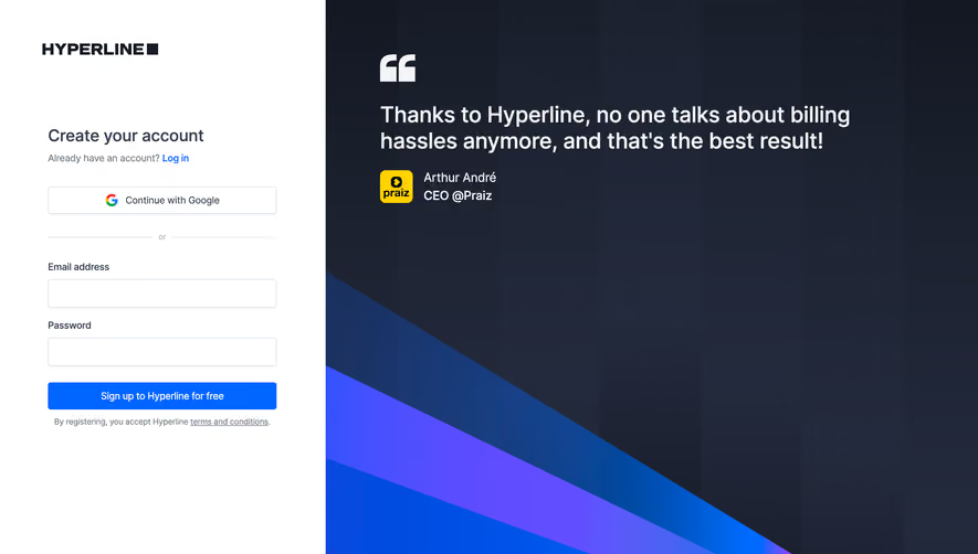
Capture new users with high-converting SaaS Signup patterns. Explore multi-step forms, social auth buttons, and value-proposition sidebars that reduce friction during registration.

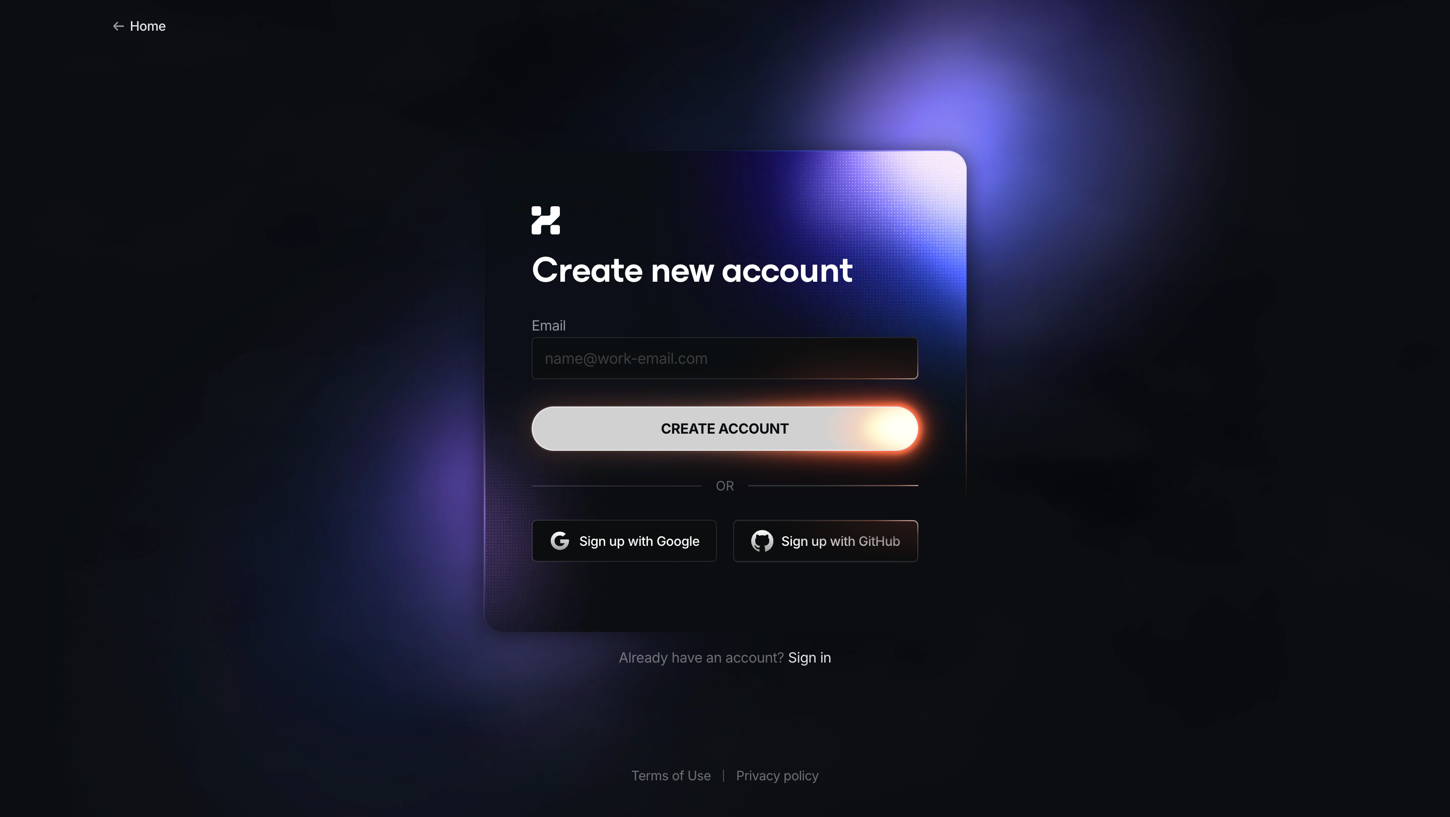
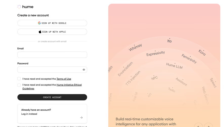
SaaS signup creates the identity and account context a person needs to start using a product. A good signup flow asks for the information required at that moment, explains what will be created, and leads to a useful first task. It should also distinguish a new account from joining an existing team: those journeys can share authentication fields while requiring very different setup.
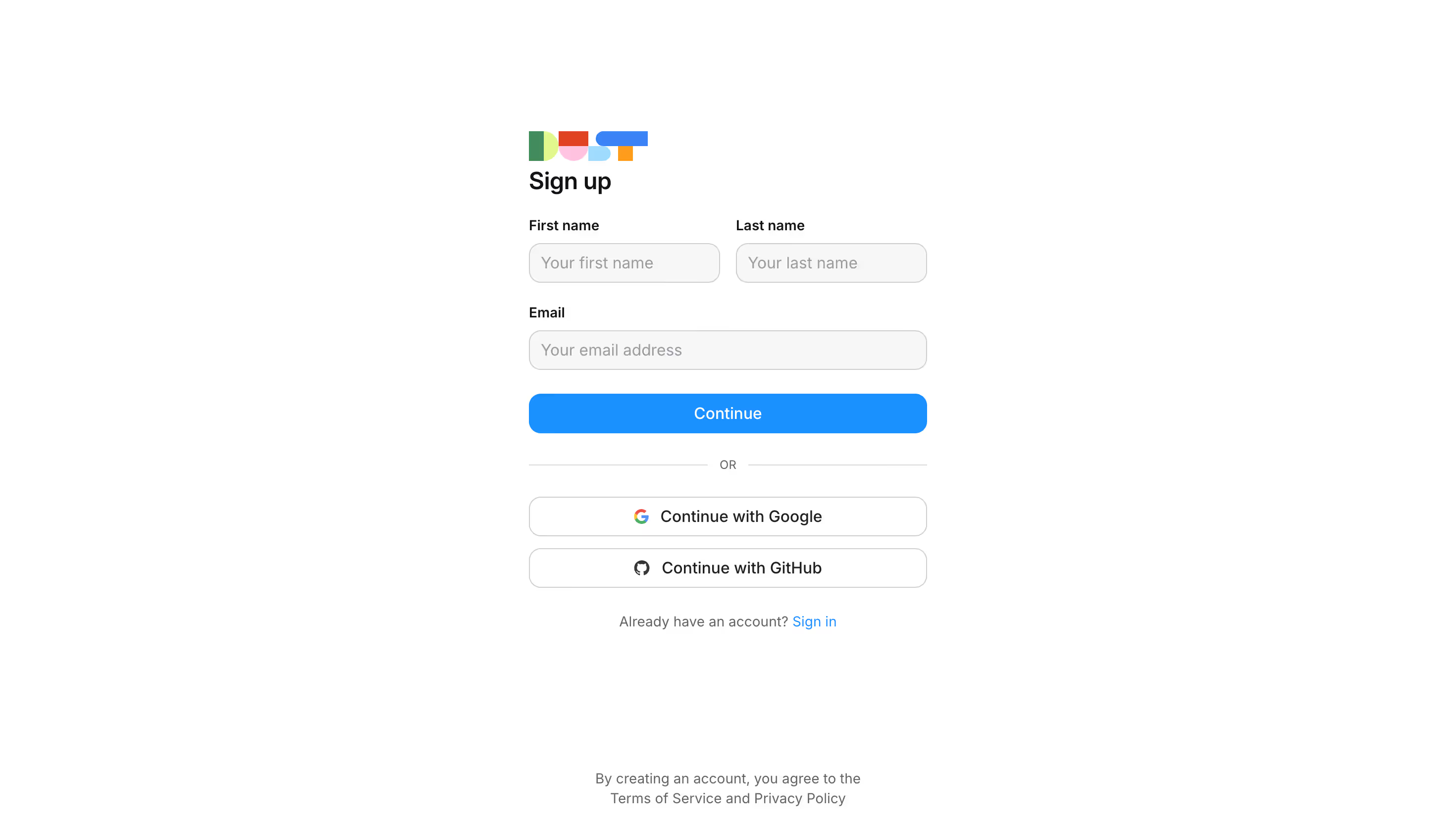
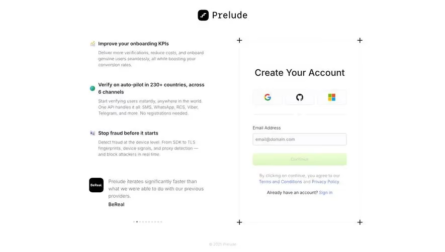
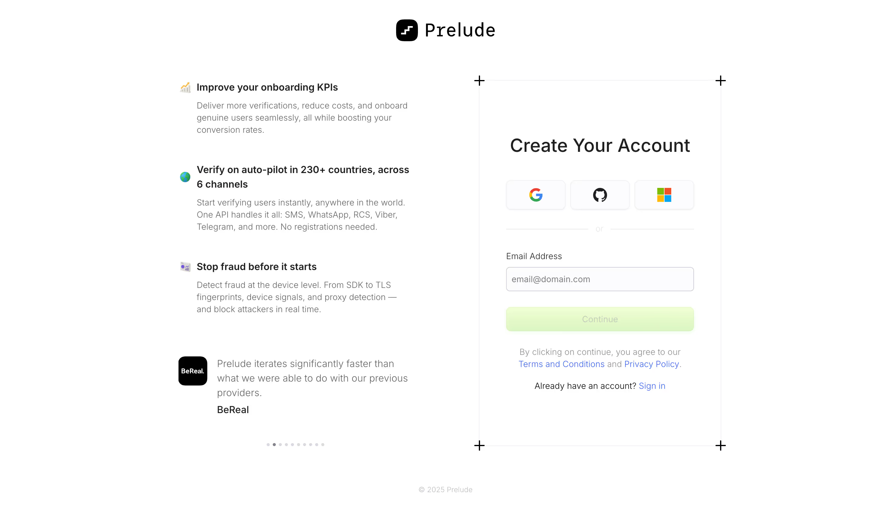
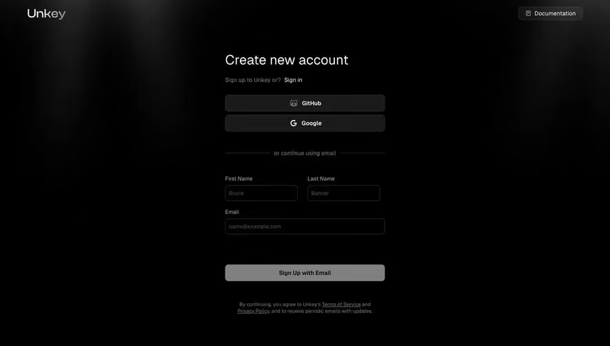
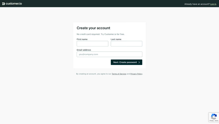
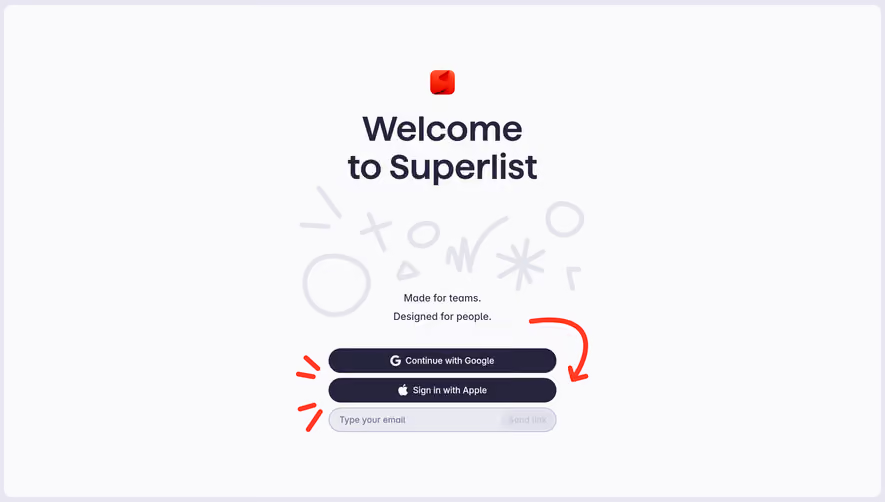
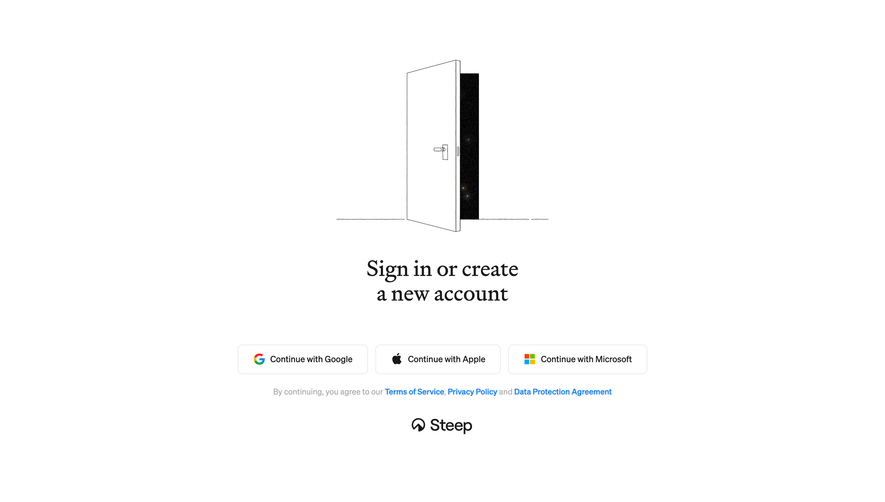
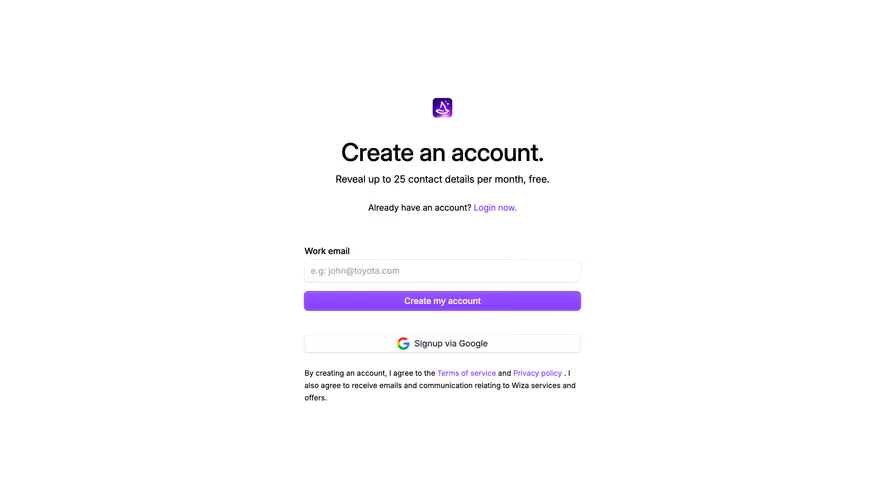
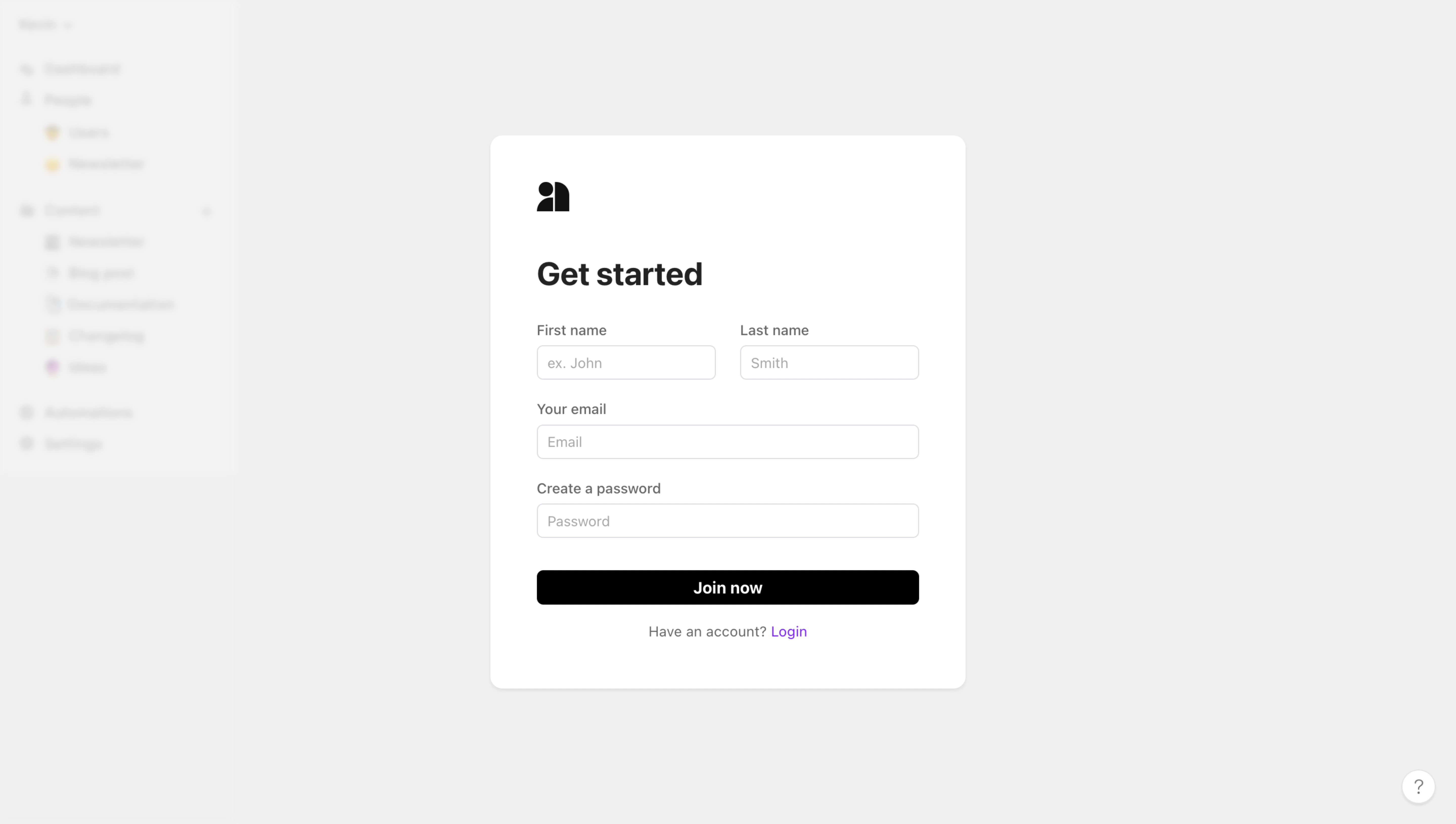
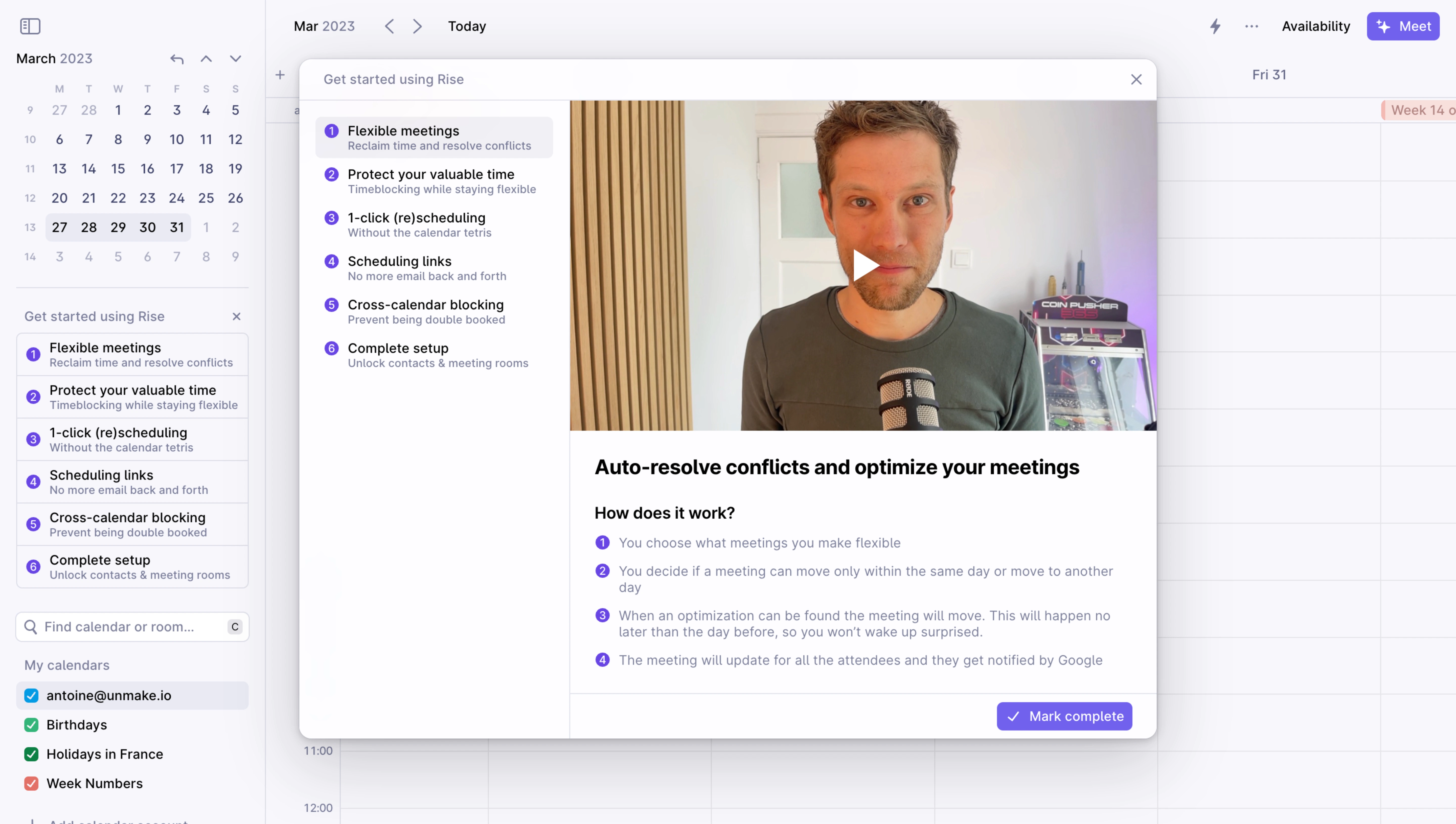
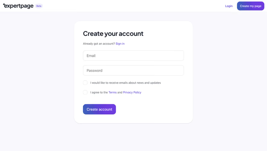
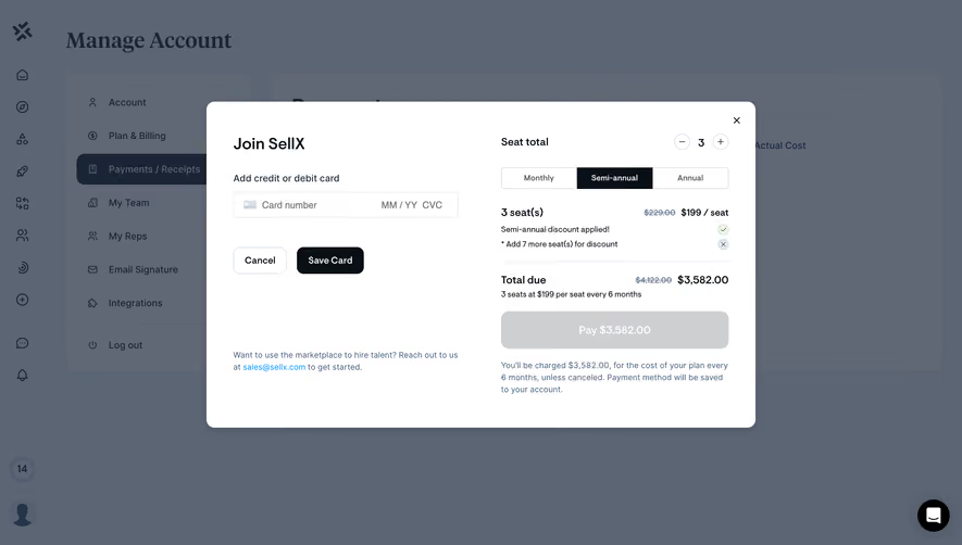
Slite, Reveal, and Fernand show three approaches in the screenshots below: several account-creation methods with a team-joining alternative, a minimal email-first entry, and an invitation-specific signup. Their visible differences provide a basis for choosing the flow that matches your product’s account model.
An individual identity, a workspace, and a paid subscription are separate objects. They may be established in one journey, but the interface should not imply that they are the same thing. Before designing fields, define which objects are created at each step and which actions the person is authorized to take.
A founder setting up a new company workspace may need to choose a name and invite colleagues. An invited employee may only need to establish their identity and accept access to an existing workspace. Asking both people to name a new company can create unnecessary work and duplicate organizations.
Use headings that identify the intended outcome. If signup starts a trial, explain the relevant trial conditions in the journey. If it creates a free account, ensure the later setup does not unexpectedly contradict that promise. The historical screenshots are examples of product messaging at capture time, not confirmation of current commercial terms.
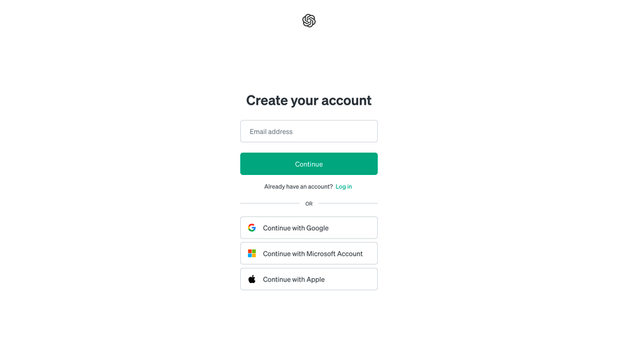
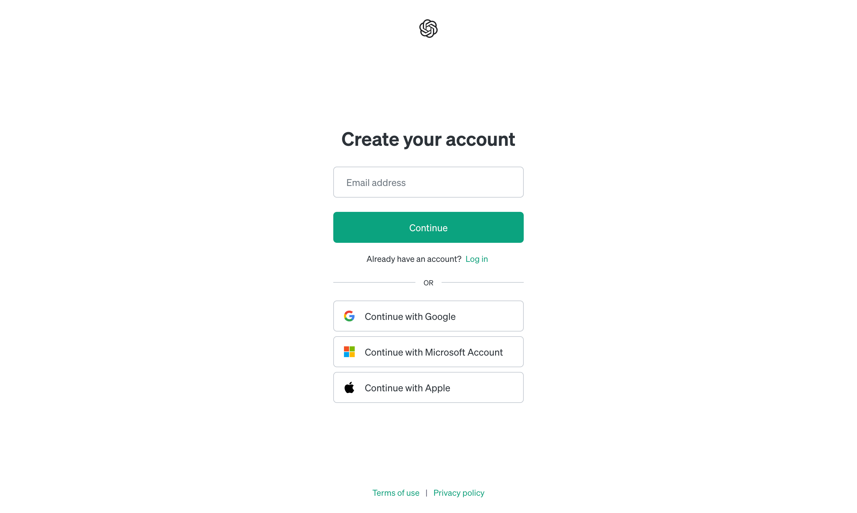
Slite’s capture offers Google, Apple, Slack, and email routes under an account-creation heading. Outside the main card, a separate link addresses people joining an existing team. That small piece of navigation acknowledges a major difference in intent.
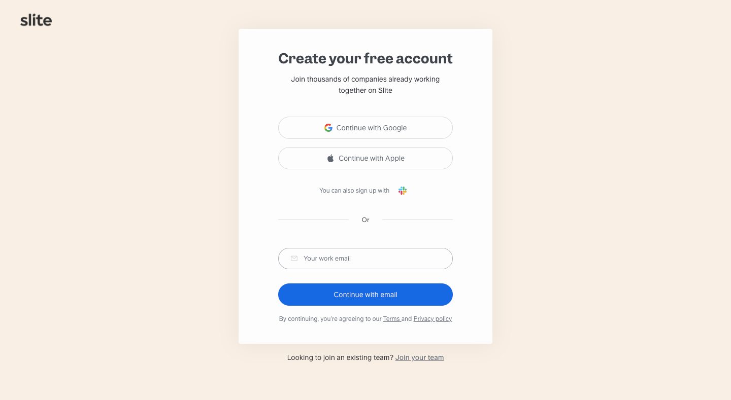
Consider who reaches the page from marketing, an invitation, or an internal recommendation. Someone with an invitation should retain that context through provider selection and email verification. Someone looking for an existing organization should not have to create a new workspace just to discover the right one.
Keep the alternative discoverable without competing with the primary task. A clear label such as joining a team can be more useful than sending everyone to a generic login page. Define what happens when the address is already registered or belongs to several workspaces.
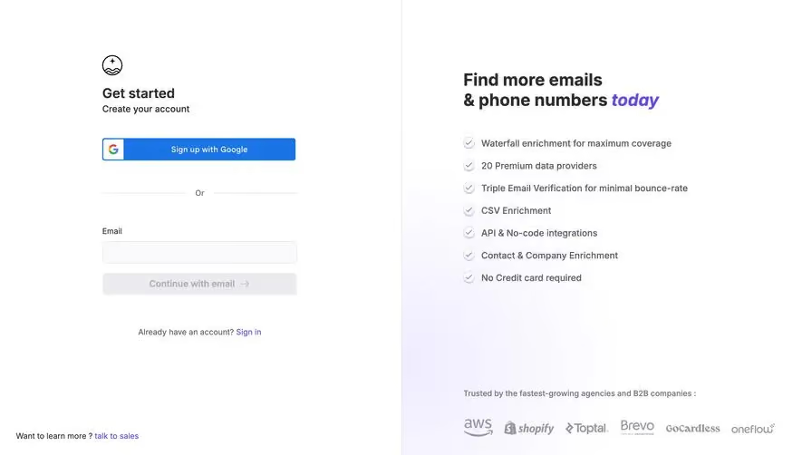
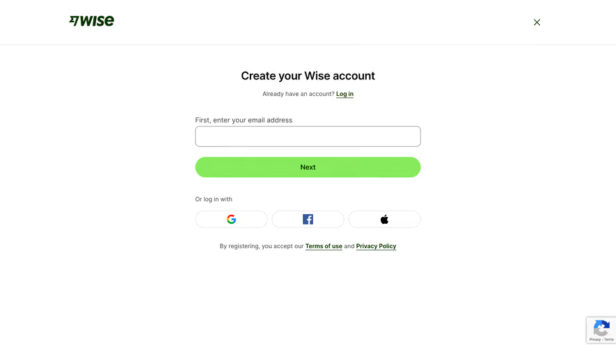
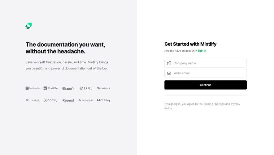
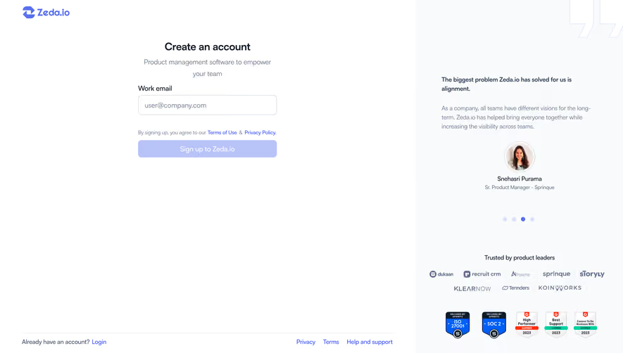
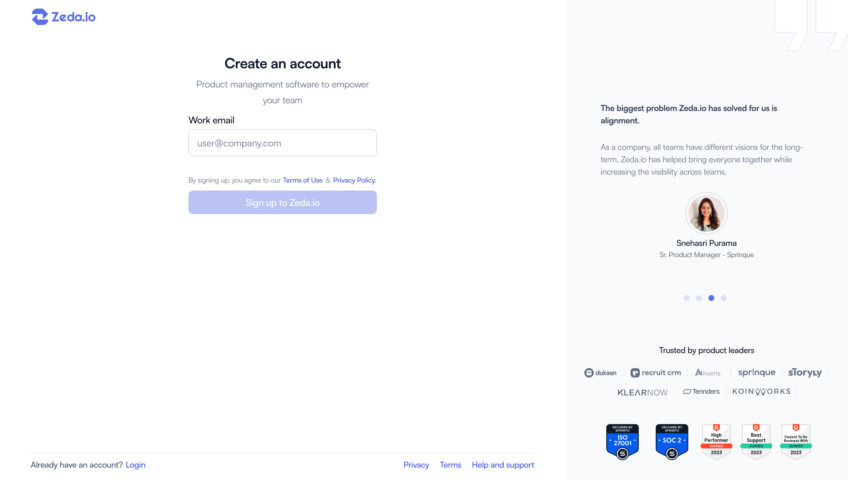
Reveal begins with a work-email field, a Next action, and a route for existing members. Its marketing message occupies the adjacent panel, while the form itself remains compact. The capture does not show later steps, so it cannot tell us how much total effort registration requires.
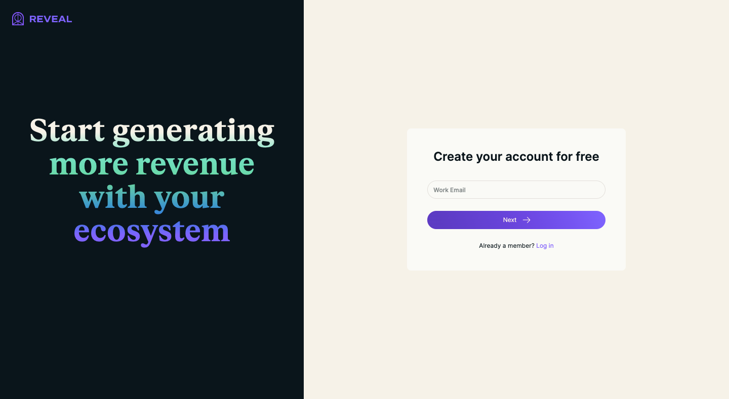
Progressive signup is useful when the next questions depend on the address, chosen method, or workspace context. It is less useful when it merely hides a long questionnaire behind an apparently effortless first step. Give people enough orientation to understand what remains, especially when setup will take more than a few moments.
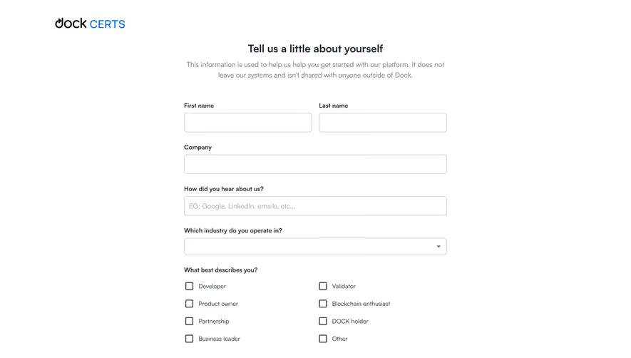
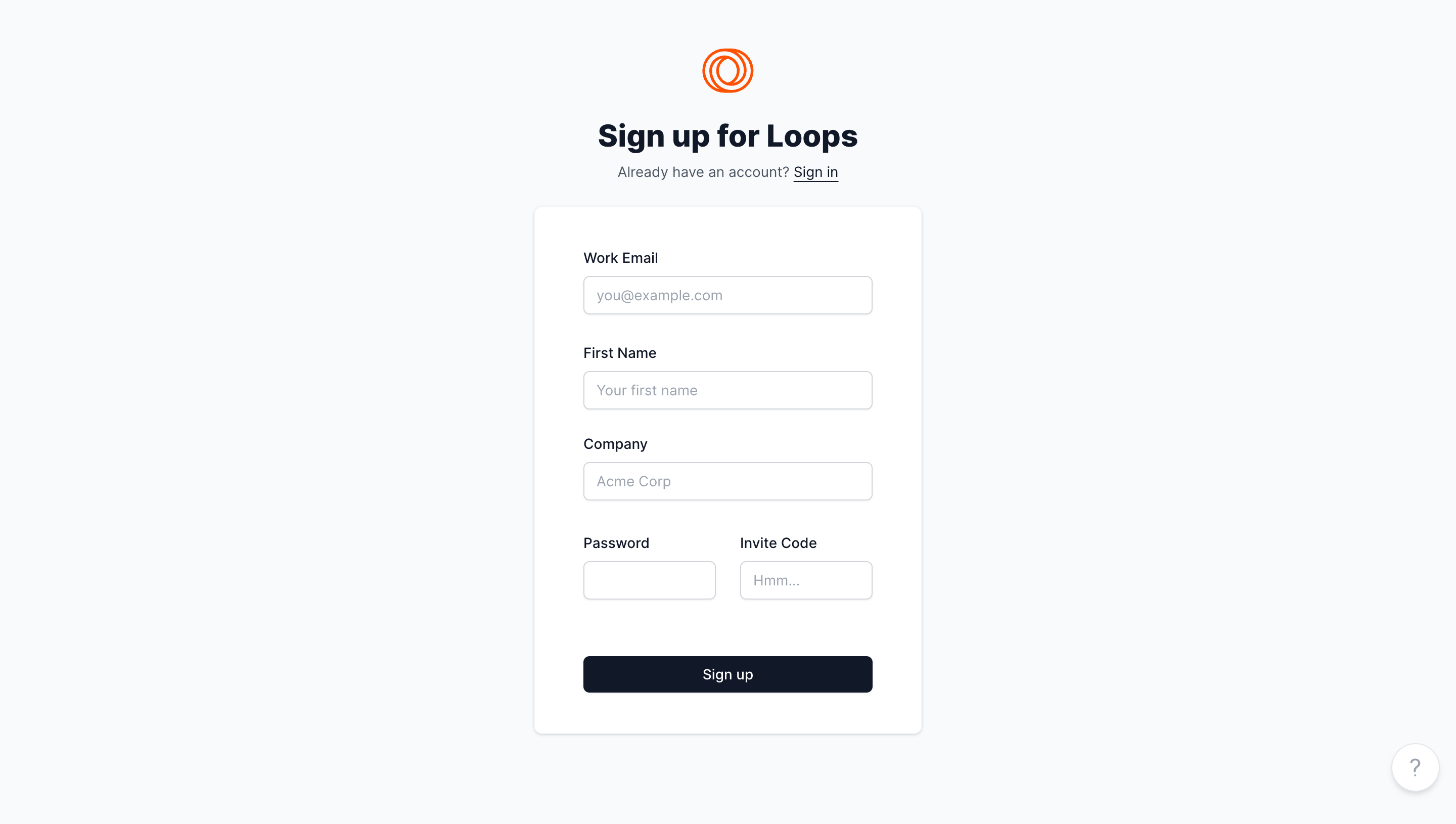
Ask why each field must be collected now. Contact identity may be necessary to establish access. Company size, job title, or a preference survey may be useful later. If a field is required only for internal qualification, evaluate whether it should block someone from reaching the first meaningful product task.
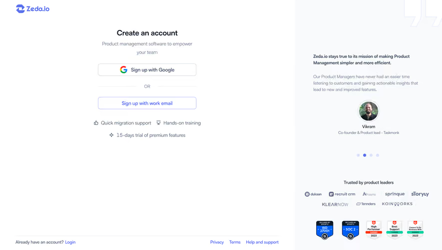
Provider signup can reduce password creation work, while email signup can offer a familiar route independent of a particular provider. The decision should account for how users will return, how organization policies are applied, and what happens when a provider account is unavailable.
Slite’s multiple options illustrate choice, but the screenshot alone does not establish which accounts are linked or what permissions each provider requests. Do not infer those behaviors from the logo. In your own implementation, define whether using a second method attaches to the same identity or creates another account.
Keep route labels consistent between signup and login. If people create an account through Google, they should be able to recognize that route when returning. Explain cancellation or a provider failure with a useful way back, preserving invitation or referral context where appropriate.
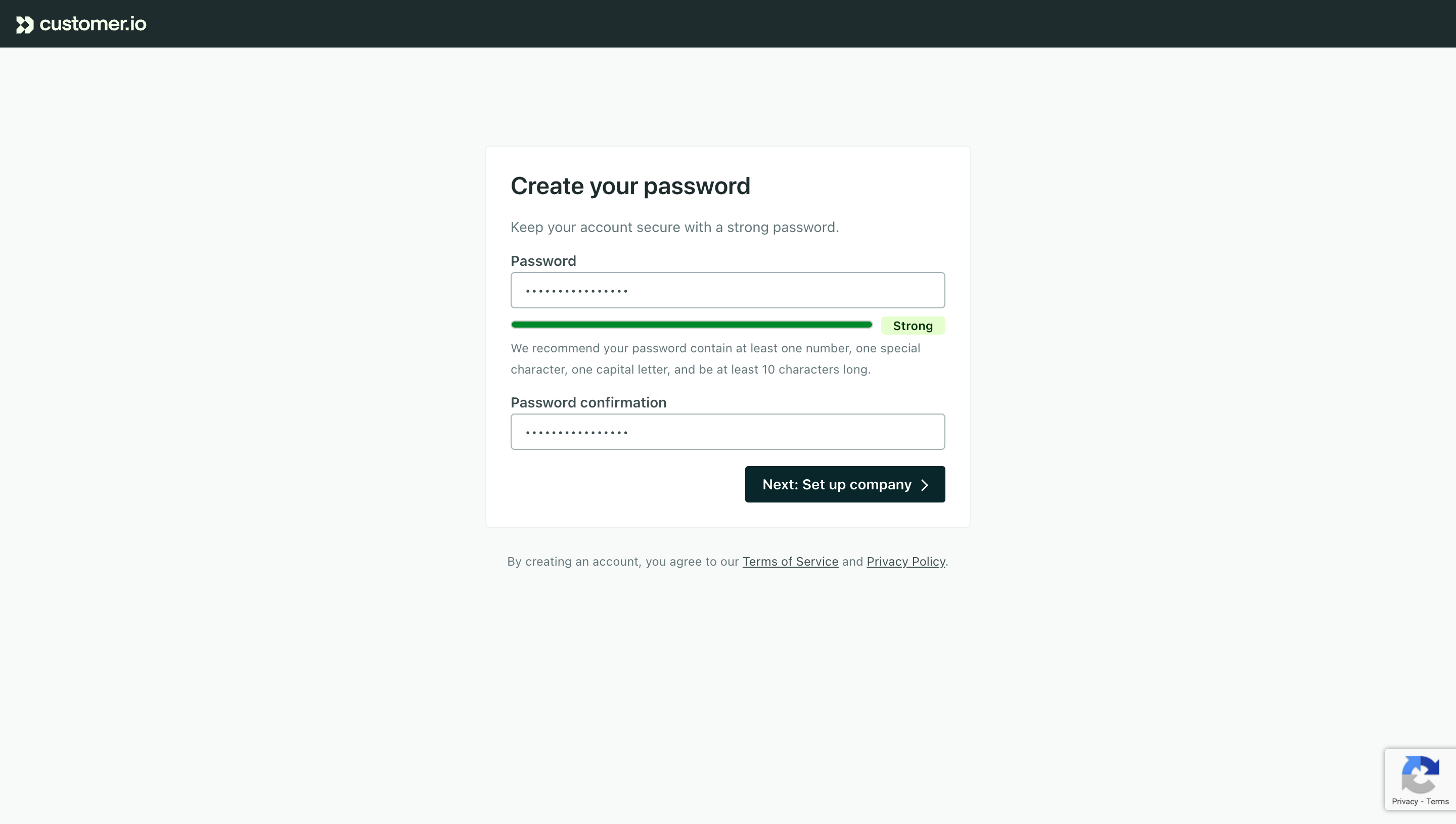
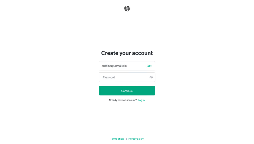
Fernand’s invitation screen names the team being joined and explains the product context before the credential fields. The email is already filled, while the person is asked to establish a password. Separate controls address acceptance of product terms and receiving product news.
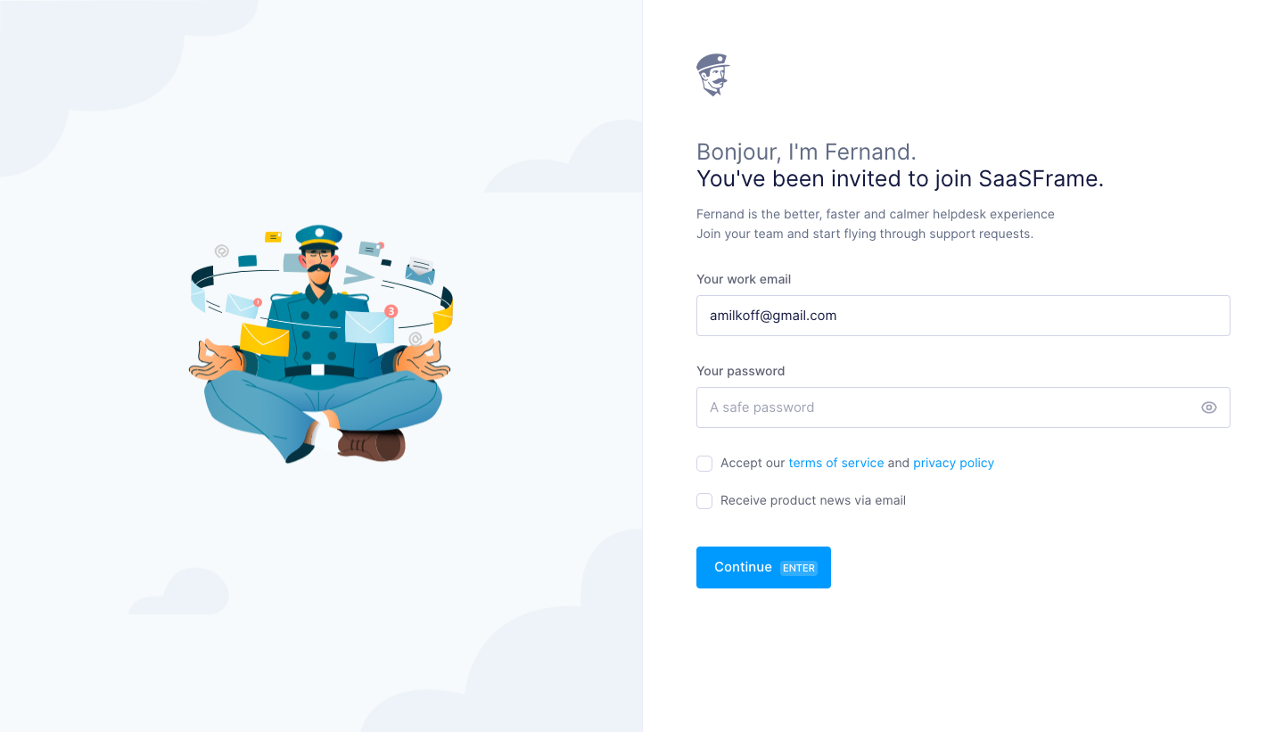
For an invitation journey, show enough context to help someone decide whether it is expected. The workspace name, inviter information where appropriate, and intended role can be useful. Avoid exposing sensitive organization information through an invitation that has not been validated.
Handle expired, revoked, already-accepted, and wrong-account invitations intentionally. A person may already have an account under another address. Provide the allowed correction or administrator route rather than silently creating a second identity. The screenshot’s prefilled email does not tell us whether it can be edited or how invitation validation works.
If signup includes terms acceptance, notification preferences, or product-news choices, label them separately according to their actual purpose. Fernand’s capture makes two distinct choices visible rather than combining them into one sentence. That separation helps users understand what they are agreeing to and what they are choosing to receive.
Use the wording and behavior required for your product and applicable policies, reviewed by the responsible team. Do not treat a historical checkbox as a ready-made legal implementation. The UX task is to make each choice understandable and to reflect its true effect.
Optional preferences should remain visibly optional. A person should not have to infer from trial and error whether declining news blocks account creation. Keep essential account messages distinguishable from elective communication choices.
Explain formatting and password requirements where they can be acted on. Show a useful correction message near the relevant field instead of returning an undifferentiated failure after submission. Preserve non-sensitive valid information so someone correcting one problem does not repeat the whole form.
Existing-account handling needs special care. The route should help legitimate returning users while respecting the product’s account-disclosure policy. A login option and recovery path can help without turning the signup form into a lookup tool for other people’s identities.
Distinguish validation from service failure. If the account could not be created because the service is unavailable, do not tell the person their email is invalid. If the result is uncertain after a network interruption, design a safe retry or sign-in route that avoids duplicate creation.
If an address must be verified before use, explain what was sent, where it was sent, and what verification unlocks. Keep address correction and resend options available according to policy. Separate a request accepted state from a verified state.
Verification should return people to the intended context. An invited user should continue toward the team they were joining. A new-workspace creator should proceed to the next necessary setup task. Do not lose those distinctions in a generic redirect after confirming the email.
The first useful task can vary by role. Installing tracking, importing data, creating a project, or responding to an assigned request may be appropriate in different products. Define that destination before adding onboarding questions, so the signup flow serves activation rather than merely accumulating profile data.
Use persistent labels, predictable keyboard navigation, supported autofill, and errors associated with their fields. Provider buttons need readable names rather than relying on logos alone. Password setup should work with password managers and paste.
Review the transition between steps, including focus placement and announced status changes. A person returning from a provider or verification email should know where they are and what remains. W3C’s accessible-authentication guidance is relevant to the credential and verification stages of the journey.
Test narrow screens, long workspace names, translated copy, and reloads during setup. A decorative panel that works on desktop should not push the form or invitation context out of reach on mobile. If progress cannot be resumed, explain what must be restarted and preserve safe information where possible.
No. It can simplify the first screen, but evaluate the total journey and the purpose of later questions. A short first step can still lead to unnecessary setup work.
Usually their immediate task is to join the workspace named in the invitation. Use a distinct route when a user also needs to create an independent workspace.
Collect them when they are useful for the user’s next task. Distinguish optional preferences from the information and choices required to establish the account.
Compare Log In for returning users, Verification for confirming contact access, Invite Team Members for collaboration invitations, and Onboarding Checklist for setup after signup.
Use the gallery to compare the account models behind the forms. For credential and verification accessibility, see W3C’s accessible-authentication guidance. The strongest signup reference is the one that matches what your user is trying to establish and what they need to do next.