 SaaSFrame
🗑 Delete Account
Handle sensitive actions with clear SaaS Delete and Archive UI examples. Learn how to use 'Soft Delete' confirmations, typing-to-confirm inputs, and warning colors to protect user data while maintaining a logical UX flow.
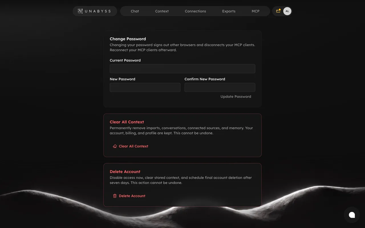

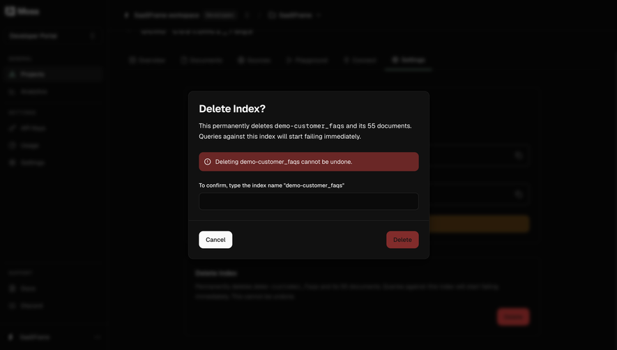

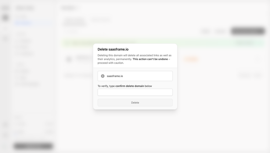

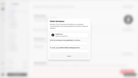
Index of all 33 Delete Account examples
- Dub Delete a workspace
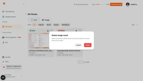
- Pangram Delete image result
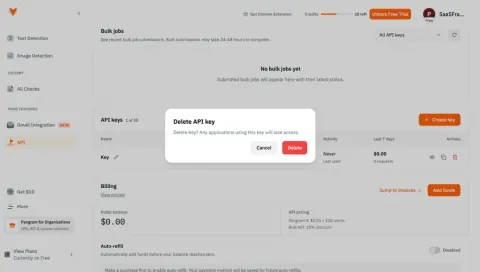
- Pangram Delete API key
- Visitors Delete
- Unkey Delete Key
- Unkey Disable Key
- Unkey Delete API
- Superlist Delete Account Confirmation
- Conduktor Delete Account
- Conduktor Delete Account
- Current Delete Workspace
- Dokably Delete Account
- Formcarry Delete Account Modal
- Luma Delete Account
- Pirsch Analytics Delete Account
- Height Delete Account
- Height Delete Account
- Height Delete Account
- Height Delete Account
- Height Delete Account
- SavvyCal Delete Account Modal
- Surfe Danger Zone
- Surfe Delete Account Modal
- Surfe Offboarding Form
- Vercel Delete Account
- Vercel Delete Account
- Vercel Delete Account
- Vercel Delete Account
- Vercel Delete Account
- Vercel Delete Account
🗑 Delete Account: design guide
Short answer
A SaaS account deletion flow helps users understand exactly what will be removed and what will stop working before they confirm. Name the object, surface dependencies such as subscriptions, data and team members, scale confirmation effort to the risk, distinguish deactivation from deletion and report the result honestly.
In the libraryas of November 2026
- Screens
- 33
- SaaS products
- 17
- Last added
- Nov 2026
Common patternsModal 19Delete 11Confirmation Dialog 10Text Input 7Alert 1
A SaaS deletion flow should help users understand exactly what they are removing, what will stop working, and which preparation is needed before they confirm. The interface must distinguish a reversible interruption from a permanent removal and connect the warning to the actual object.
The SaaSFrame references below cover personal-account deletion and key disabling. Comparing them is useful because visually similar danger dialogs can represent very different operations.
What exactly is being deleted?
Deleting an account is different from removing a workspace, a project, a team member, or an access key. Use the object's name in the heading and final action rather than relying on a generic confirmation question.
If the operation affects related objects, identify them explicitly. Users need to understand whether they are changing their personal identity, their membership in a team, or resources used by other people.
Keep the scope consistent from the settings entry point through the dialog and final feedback. A narrow entry label followed by a much broader confirmation creates an avoidable surprise.
Make the danger area recognizable
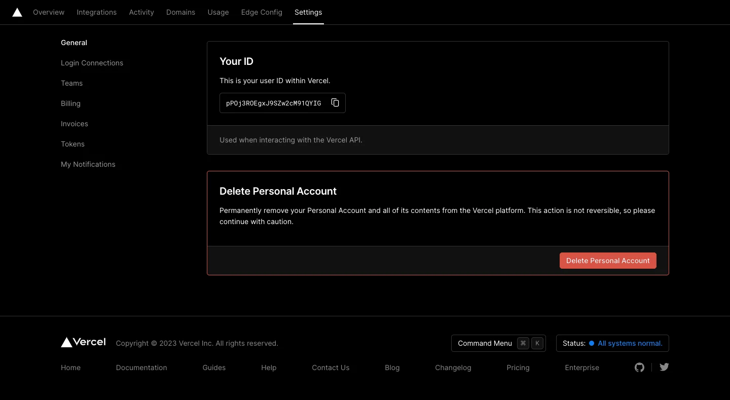
The Vercel settings capture places personal-account deletion in a distinct section with a red action and an explicit permanence warning. The surrounding page establishes that the task concerns the personal account.
A separate danger area can make exceptional actions easier to recognize. It should remain findable rather than being hidden behind an unrelated setting. Users leaving a product still need a coherent route.
Use warning treatment where the consequence justifies it. If every ordinary setting is visually urgent, the interface loses a useful distinction when a destructive action appears.
Surface dependencies before final confirmation
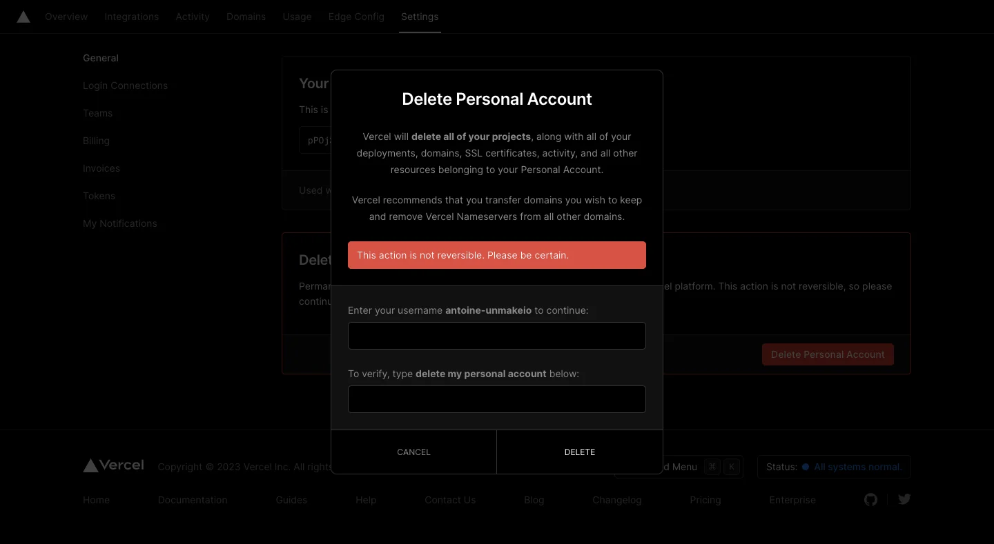
The Vercel dialog names affected resources, including projects, deployments, domains, and certificates. It also includes preparation guidance concerning domains before the typed confirmation controls.
This makes the confirmation a decision about consequences rather than a ritual. A domain or shared resource may need a separate action before deletion is appropriate. Place those dependencies before the final button.
The captured wording belongs to that historical interface. For your product, verify the real scope and preparation rules with the teams responsible for those operations. Do not borrow another product's resource list or make unsupported retention promises.
Choose confirmation effort deliberately
Typed confirmation can be appropriate when the action is consequential and difficult to undo. Asking for an object name or a clear phrase forces a more deliberate interaction than an ordinary click.
However, repeated typing is not a substitute for explaining scope. A user can reproduce a phrase without understanding the consequences. Keep the warning readable and the input instruction unambiguous.
Support paste, predictable validation, and a clear cancel route. Do not make cancellation harder than confirmation or treat a validation error as a completed operation.
Distinguish disabling from deleting
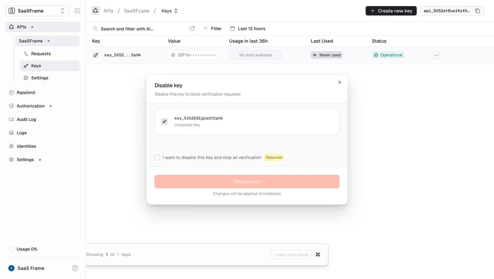
The Unkey reference shows a disable-key dialog with an acknowledgement checkbox and a warning about verification being blocked. Its visible action is disabling a key, not deleting the account.
That distinction is central to the design. A disable operation can stop access or processing while retaining the object. Its confirmation should describe the actual effect and any available reversal without implying permanent erasure.
Use precise verbs throughout related settings. Disable, revoke, archive, remove, and delete can have different consequences. Explain them through the object's lifecycle rather than treating them as interchangeable button labels.
Keep shared responsibility visible
For shared resources, identify whether other users or systems depend on the object. An administrator may be removing something that appears personal but supports a team workflow.
If ownership must be transferred first, make that requirement actionable. A blocked deletion should identify the dependency and lead to the relevant resolution rather than presenting an unexplained unavailable button.
Permission checks should also produce useful feedback. Someone who can see the setting but cannot perform the action needs an understandable route to the responsible role.
Preserve an exit and recovery route
Keep cancellation visible and predictable throughout the confirmation flow. Returning to settings should preserve enough context for users to review related data or complete preparation.
If the operation is reversible, state the actual recovery route and conditions. If it is permanent, avoid implying an undo action. A screenshot alone cannot establish either guarantee.
Consider interrupted requests and repeated submissions. After a timeout, tell users whether the result is confirmed or still unknown, and help them check the state before retrying.
Report the result honestly
Request accepted, removal scheduled, object disabled, and object deleted are different outcomes. Use the state the system has actually established in the success message.
A scheduled operation may need a date, a cancellation route, and an explanation of what remains accessible in the meantime. An immediate operation may need a safe destination after the original page becomes unavailable.
Avoid returning a deleted account to an authenticated surface with no explanation. The end of the journey should be as deliberate as the final confirmation.
Review the decision under realistic conditions
Test the flow with related resources, insufficient permissions, incomplete typed confirmation, cancellation, and an uncertain network result. Confirm that the visible descriptions match the implementation's actual scope.
Check keyboard focus and announcement of errors. Warning color alone should not communicate the operation's consequence.
Use SaaSFrame's deletion references to compare scope explanations and confirmation mechanisms. Adapt the decision structure to your own objects and dependencies.
Deletion flow questions
Should every delete action require typed confirmation?
No. Match the effort to the consequence and recovery options. Ordinary reversible removal may need less friction than permanent account deletion.
Is disabling a resource equivalent to deleting it?
No. Disabling changes availability or access, while deletion removes the object according to the product's rules. Use the actual operation name.
What should appear before the final action?
Identify the object, affected dependencies, consequence, and any required preparation. Confirmation should follow an informed decision.