 SaaSFrame
Calendar
Optimize scheduling with SaaS Calendar UI patterns. Explore day/week/month views, event drag-and-drop, and date-range pickers used by the most advanced productivity platforms.


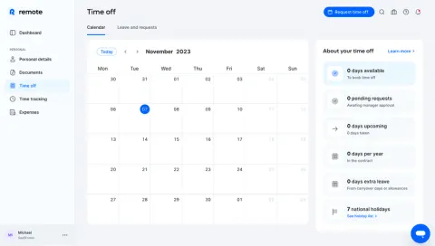
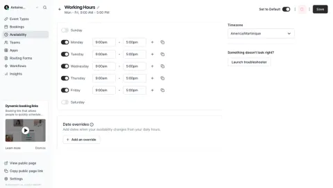
Index of all 28 Calendar examples
- Wise Schedule A Transfer
- Remote Time Off Calendar
- Cal.com Availabilities Settings
- Cal.com Booking Interface
- Cal.com Set Availabilities
- Rise Dark Mode Calendar
- Rise Working Hours Settings
- Rise Calendar
- Sellx Welcome Screen
- Duffel Create An Order
- Routine Calendar
- Routine Dashboard
- Livestorm Calendar View
- Livestorm Create New Event
- Cake Equity Add A Valuation
- Popwork Add An Objective
- Assembly Calendar
- Reflect Dashboard
- Daybridge aybrigde Event Details
- Daybridge aybrigde Create An Event
- SavvyCal User Onboarding
- SavvyCal User Onboarding
- Zencal Calendar Dashboard
- June User Onboarding
- Asana Dashboard
Calendar: design guide
A calendar interface places objects in time so users can understand sequence, duration, availability, and overlap. In SaaS products, it can support meetings, resource bookings, publishing schedules, tasks, or operational planning. The pattern is useful when the relationship between objects matters as much as the objects themselves.
A calendar is not simply a collection displayed inside date boxes. It needs a clear time frame, meaningful navigation, readable event representation, and a reliable path from overview to detail. Users should be able to understand what the calendar includes and which time conventions govern what they see.
Choose a time scale that answers the user's planning question
A month view supports broad orientation and distribution across dates. A week view can reveal durations and conflicts. A day view provides more room for a detailed schedule, while an agenda list can make sparse or crowded events easier to read. Choose the default according to the primary task.
Different scales can coexist, but switching should preserve meaningful context. A person selecting a date in a month view should not arrive at an unrelated week when changing modes. Make the current date range visible and provide a clear way to return to the present.
Distinguish this pattern from a date picker. A date picker collects a value; a calendar displays and manages objects in time. The two can share visual elements while serving different tasks. A full schedule should not inherit a date picker's interaction model without considering event navigation and editing.
Zencal presents a month overview with planning actions nearby
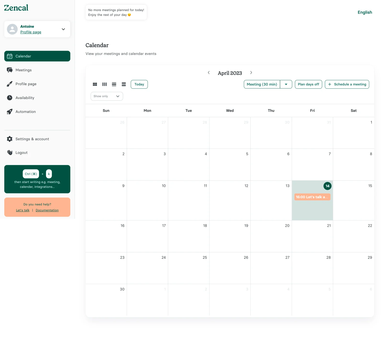
The Zencal screenshot shows an April 2023 month grid. Previous and next arrows sit beside the month heading. A Today button, several view icons, a Show only control, and planning actions appear above the grid. One date has a highlighted background and a meeting entry.
The layout separates orientation from action. The month heading and arrows explain the displayed period, while scheduling and days-off controls offer ways to change the calendar's contents. This distinction helps avoid making every date cell carry the entire creation workflow.
The view icons suggest alternate representations, but the captured image does not identify every icon's behavior. For your own interface, provide names or supporting explanations so that users do not have to decode a collection of small layout symbols.
The highlighted date and event label also demonstrate the space constraints of a month view. A brief event can fit, but a dense day needs a policy for overflow. Decide whether to show additional entries, an expandable count, or a route into a more detailed view.
Daybridge uses a time grid and a detail panel for complementary tasks
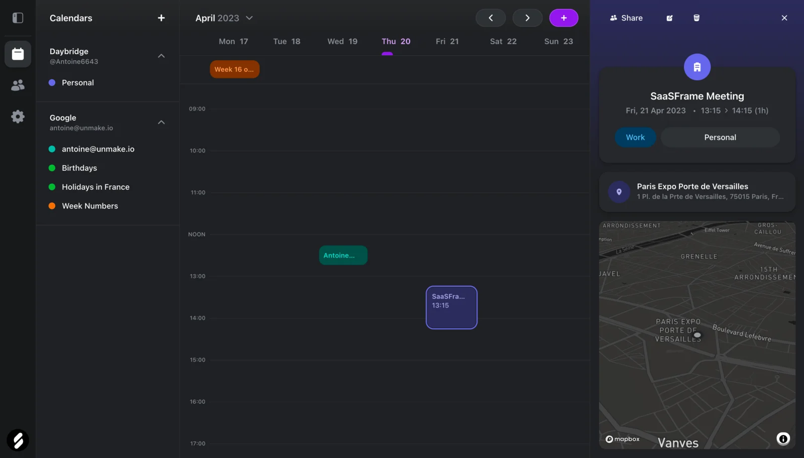
The Daybridge screenshot displays a week with dates across the top and hourly lines down the central area. Calendars and sources appear on the left. A selected meeting is outlined in the grid, and a right-side panel shows its title, date, time span, classification, and location with a map.
The grid and panel answer different questions. The grid shows where the event sits relative to the week. The panel provides information that would be difficult to fit inside a small time block. Keeping both visible can support inspection without replacing the schedule entirely.
The sidebar groups calendars under different sources with colored markers. That makes source membership part of the overview. In your product, clarify whether those controls toggle visibility, select a creation destination, or both. A color marker by itself cannot explain the rule.
The image is a captured layout, not proof of interaction. It supports the relationship between time placement and detailed inspection. It does not establish how selection, drag movement, sharing, or deletion behave.
Connect event creation to its visible time and destination
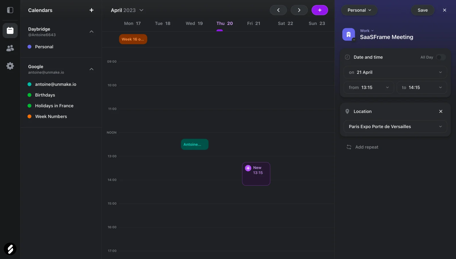
A second Daybridge capture shows event creation beside the same weekly schedule. The panel includes a calendar selector, title, date and time fields, an All Day control, location, and an Add repeat option. A new-event block is visible in the grid.
This combination can help users connect structured input to temporal placement. The date and time fields state the value precisely, while the grid locates it visually. In your implementation, verify that both representations remain synchronized as the person changes the event.
The creation destination deserves equal clarity. In a multi-calendar product, an event's calendar can determine visibility, ownership, and later editing access. Show the destination near the event's main information rather than treating it as an obscure advanced setting.
Define the save boundary. A draft block should not be mistaken for a committed event. After saving, make the result recognizable in the schedule and provide useful feedback if persistence fails. Preserve the entered information so that recovery does not require starting over.
Represent duration, overlap, and all-day events consistently
In a time grid, an event's position and size communicate information. Duration should correspond coherently to the displayed scale. Very short events may need a minimum visual size, but that treatment should not imply a different duration than the text states.
Overlapping events need a legible arrangement. Side-by-side blocks can support comparison, while dense clusters may need additional detail on demand. Test realistic overlap rather than only a week containing a few isolated events.
All-day and multi-day events should have a clear relationship to the hourly schedule. A separate area can prevent an all-day item from occupying every visible hour. For multi-day spans, communicate continuity across dates and ensure that the start and end are understandable.
Do not use color as the only source of identity or status. Titles, source labels, and meaningful markers can help distinguish events when colors are similar or difficult to perceive. Preserve those cues in selected, hovered, and unavailable states.
Make timezone and locale rules visible where mistakes matter
Scheduling often crosses locations. Decide which timezone the calendar displays and how users can identify it. An event's stored time and its rendered local time may differ, so the interface needs a clear convention when people coordinate across regions.
Be especially explicit during creation and rescheduling. A person entering a time should understand which zone governs it. If an event is shown in another viewer's local zone, explain that relationship in the relevant flow rather than requiring users to infer it from unexpected hours.
Locale affects date order, week start, and time notation. Use consistent conventions across the header, grid, form, and event details. Ambiguous numeric dates are particularly risky when users share schedules across locales.
Test date boundaries and seasonal clock changes in the supported scheduling system. The interface should present accurate values and meaningful validation. Do not assume that every calendar day has an identical relationship to elapsed hours.
Keep filtering and source visibility understandable
A calendar can appear empty because nothing is scheduled or because relevant sources are hidden. Show active visibility constraints and give users a way to recover the broader view. A blank grid should not automatically suggest that no events exist.
Separate source filters from creation defaults. Hiding a calendar does not necessarily mean that new events should be created elsewhere. If one control affects both, make that behavior explicit and test whether users understand it.
Search can complement the calendar for finding a known title without browsing dates. When a result opens, reveal its temporal context and destination. A calendar is a planning surface, but it should not force every retrieval task through sequential month navigation.
Provide alternatives to dragging and precise clicking
Dragging an event can make rescheduling feel direct, but it should not be the only way to change its time. Structured date and time fields provide a precise alternative and can support users who do not rely on pointer movement.
Keyboard users need to reach events, inspect details, and complete creation or editing. Define focus behavior across the grid and any associated panel. The visual geometry alone does not provide a usable navigation model.
Use understandable names for view switches and navigation controls. After moving to another date range, communicate the current period and keep focus in a sensible location. A user should not have to reconstruct the entire interface after every week change.
Adapt crowded and narrow views without concealing the schedule
A desktop week grid can become too compressed on a phone. A day or agenda view may provide a better narrow-screen representation. Preserve the selected date, filters, and relevant event context when changing layouts.
Plan for long titles and dense schedules. Truncation can support compactness, but users need an accessible way to read the full identity and time. An overflow indicator should explain how many additional events are hidden and where to inspect them.
Empty and loading states also matter. Reserve a coherent frame while events load, and distinguish unavailable data from a genuinely empty period. If synchronization with an external source fails, explain the affected source rather than making the entire calendar look silently complete.
Test planning tasks across the whole event lifecycle
Ask users to find a meeting, identify an overlap, create an event in the correct calendar, change its time, and return to the current date. Include a dense day and an event near a date boundary. These tasks reveal whether the interface supports temporal reasoning rather than just displaying attractive blocks.
Review failed saves, accidental rescheduling, and confusion about hidden calendars or timezones. Each problem may require a different fix. A larger grid will not resolve an unclear creation destination, and a new color palette will not resolve ambiguous time notation.
- Choose a default time scale based on the planning task.
- Keep the current period and return-to-today route clear.
- Connect event details with their temporal placement.
- Explain source visibility and creation destination.
- Handle overlap, all-day spans, and long titles.
- Provide precise alternatives to drag interactions.
- Test timezone, locale, and synchronization states.
Frequently asked questions about calendar interfaces
Should the default view be month or week?
Use month for broad distribution and week when duration or overlap is central. An agenda view can be useful for sparse schedules or narrow screens. Choose according to the primary planning question.
Does a calendar need drag-and-drop?
No. It can be a useful shortcut for rescheduling, but precise form controls remain important. The task should be completable without dragging.
How should an empty calendar be explained?
Distinguish no scheduled events from hidden sources, active filters, loading, and synchronization failure. Offer the relevant recovery or creation route for the actual state.
Explore calendar examples on SaaSFrame to compare time scales, event panels, source navigation, and planning controls in real SaaS products.