 SaaSFrame
Timeline
Showcase your roadmap or company history with SaaS Timeline patterns. These designs are perfect for demonstrating product velocity or long-term industry experience.
Website sections 16



Product screens 5

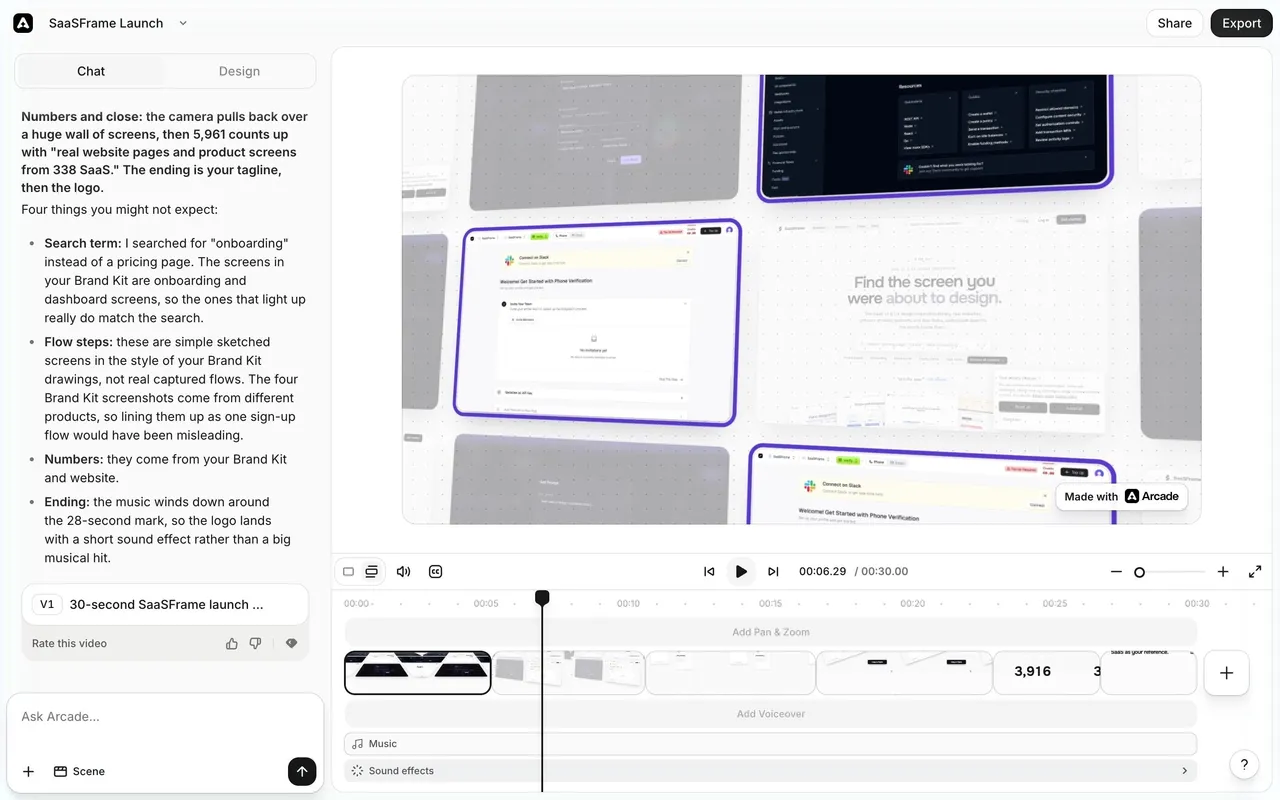
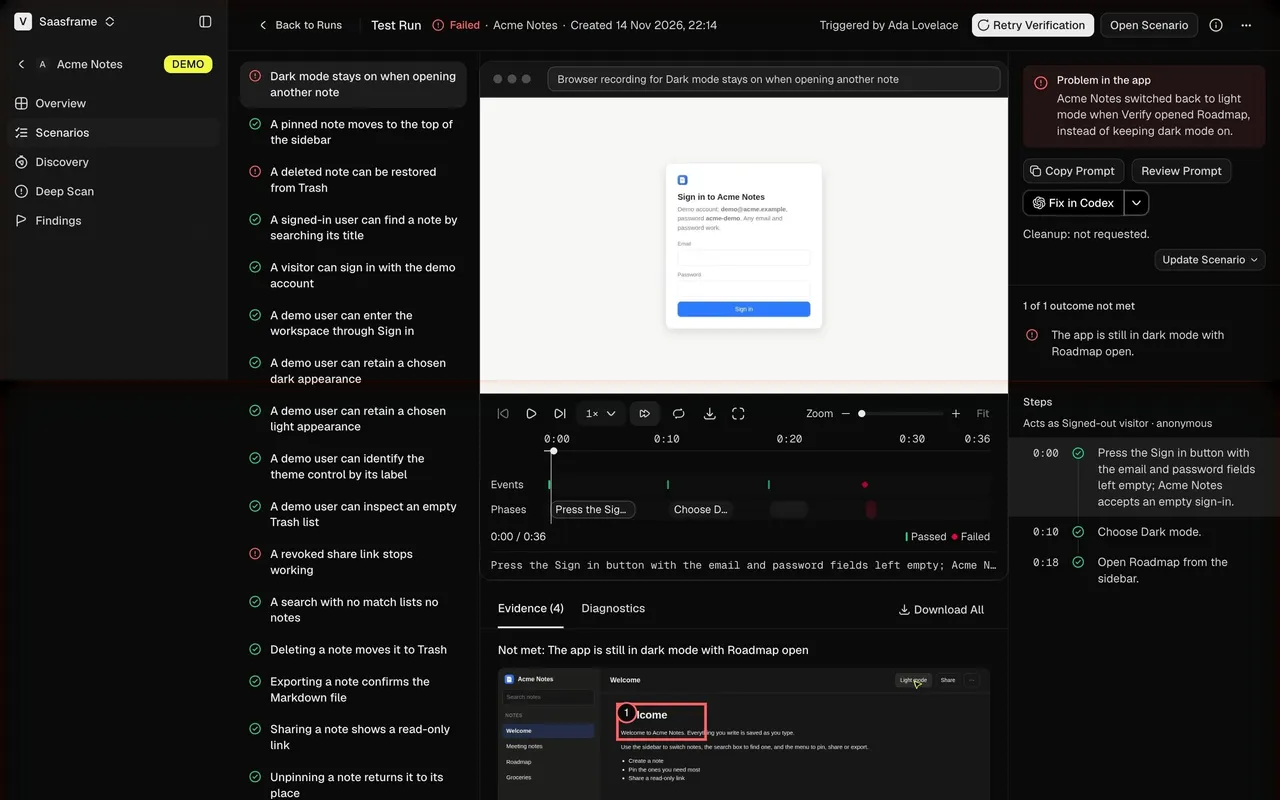
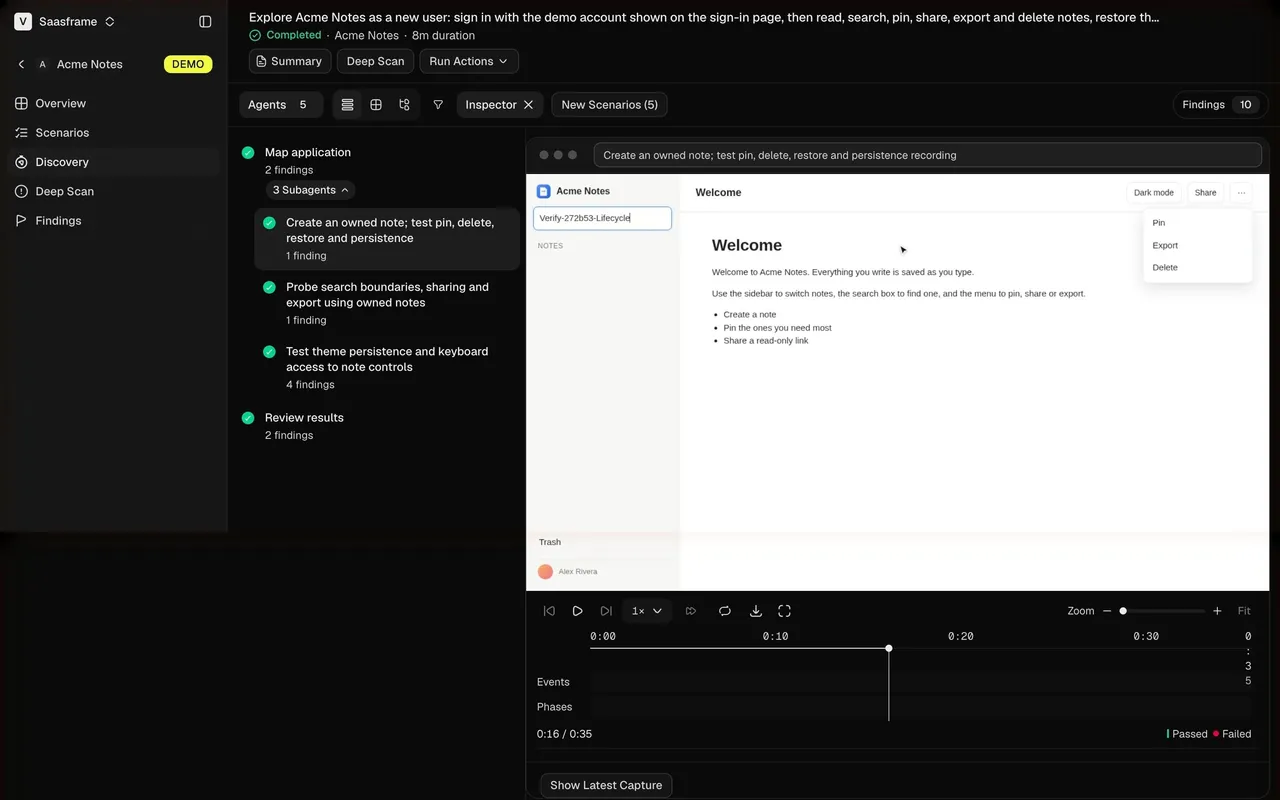
Index of all 5 Timeline examples
Timeline: design guide
A timeline connects events to time, such as company history, product milestones or dated changes. Decide what time adds to the story, choose ascending or descending order intentionally, write entries as meaningful changes and use images as context rather than decoration.
In the libraryas of November 2026
- Examples
- 21
- SaaS products
- 17
- Last added
- Nov 2026
Most common inAbout Page 12Text Editor 3Careers Page 2Details 2Chat 1
A SaaS timeline connects events to time. It can explain a company's history, show product milestones, or organize a sequence of dated changes. The pattern is useful when chronology contributes to understanding, rather than merely providing a decorative line between unrelated statements.
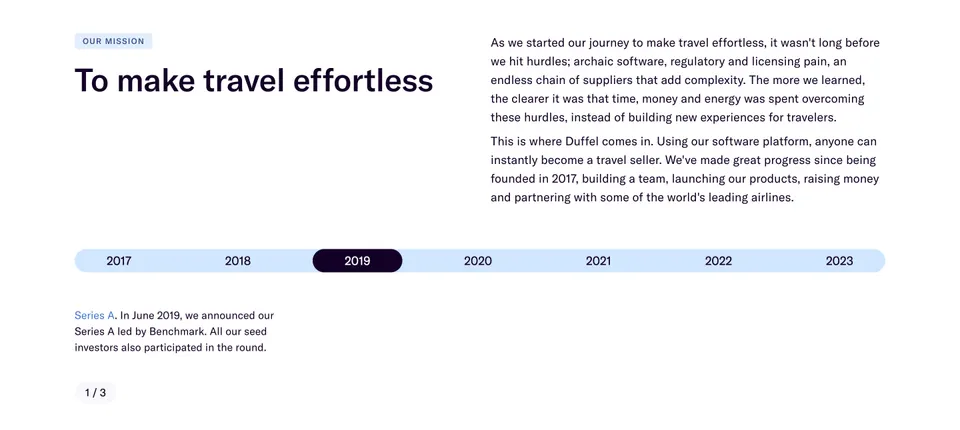
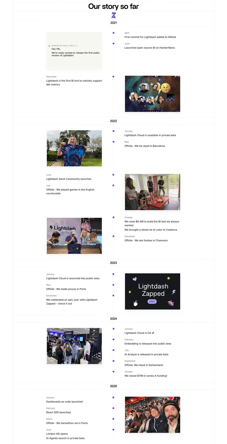
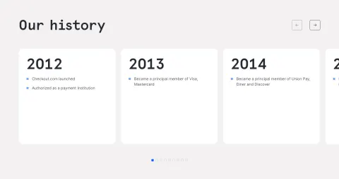
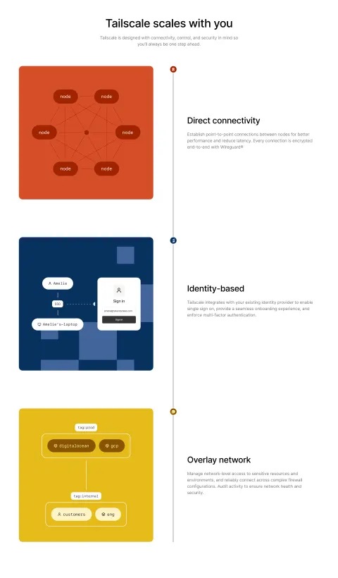
Duffel and Lightdash show different scales of company storytelling. Duffel uses a horizontal year selector with a focused event panel. Lightdash presents a long vertical history with years, months, text, and photographs. Comparing them helps explain how to choose density, navigation, and evidence without confusing chronology with task progress.
What does time contribute to the story?
Start with the question the chronology answers. A company history may explain how the product developed. A release timeline may help users understand when capabilities became available. An event history may need exact dates for operational context.
Choose events that support that purpose. A timeline should not include every internal occurrence merely because it has a date. Select milestones that help the visitor understand meaningful changes, then provide a deeper archive if completeness matters.
Keep the scope clear. Past events, current status, and planned work are different kinds of information. A history should not quietly blend them. If future items appear, label them and avoid presenting a plan as a completed milestone.
Use a year selector for a focused history panel
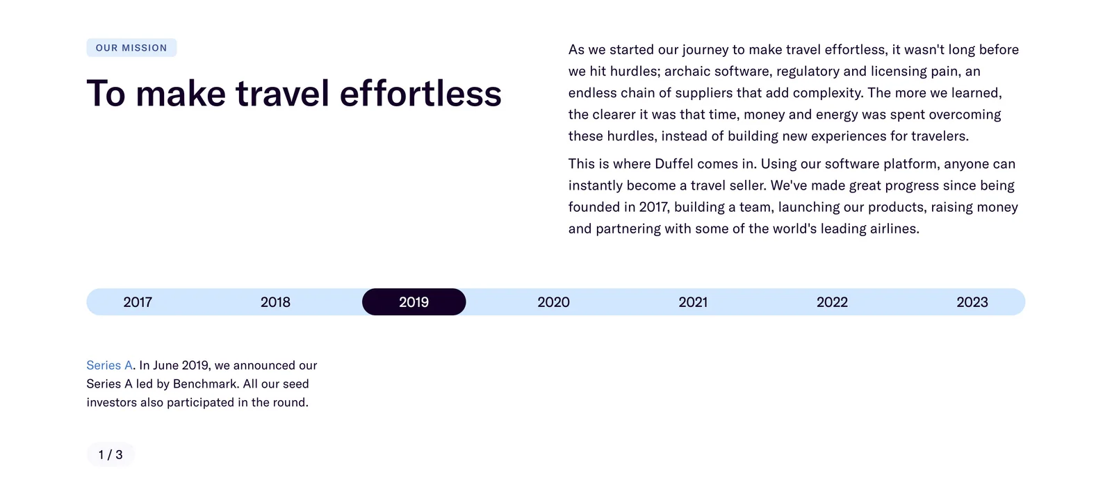
Duffel places a year selector below its company mission and narrative. One year is visibly selected, and the panel below describes a milestone. A small position indicator suggests more than one item within the selected period.
This structure keeps the visible history compact while allowing a focused event to receive attention. It can work when the page should establish a company story without exposing every milestone at once.
The capture does not demonstrate how year selection or event navigation behaves. In implementation, make the selected year clear, associate it with the displayed content, and explain the meaning of any position indicator. A reader should understand whether they are moving between years, events, or both.
Use a vertical timeline when the full sequence matters
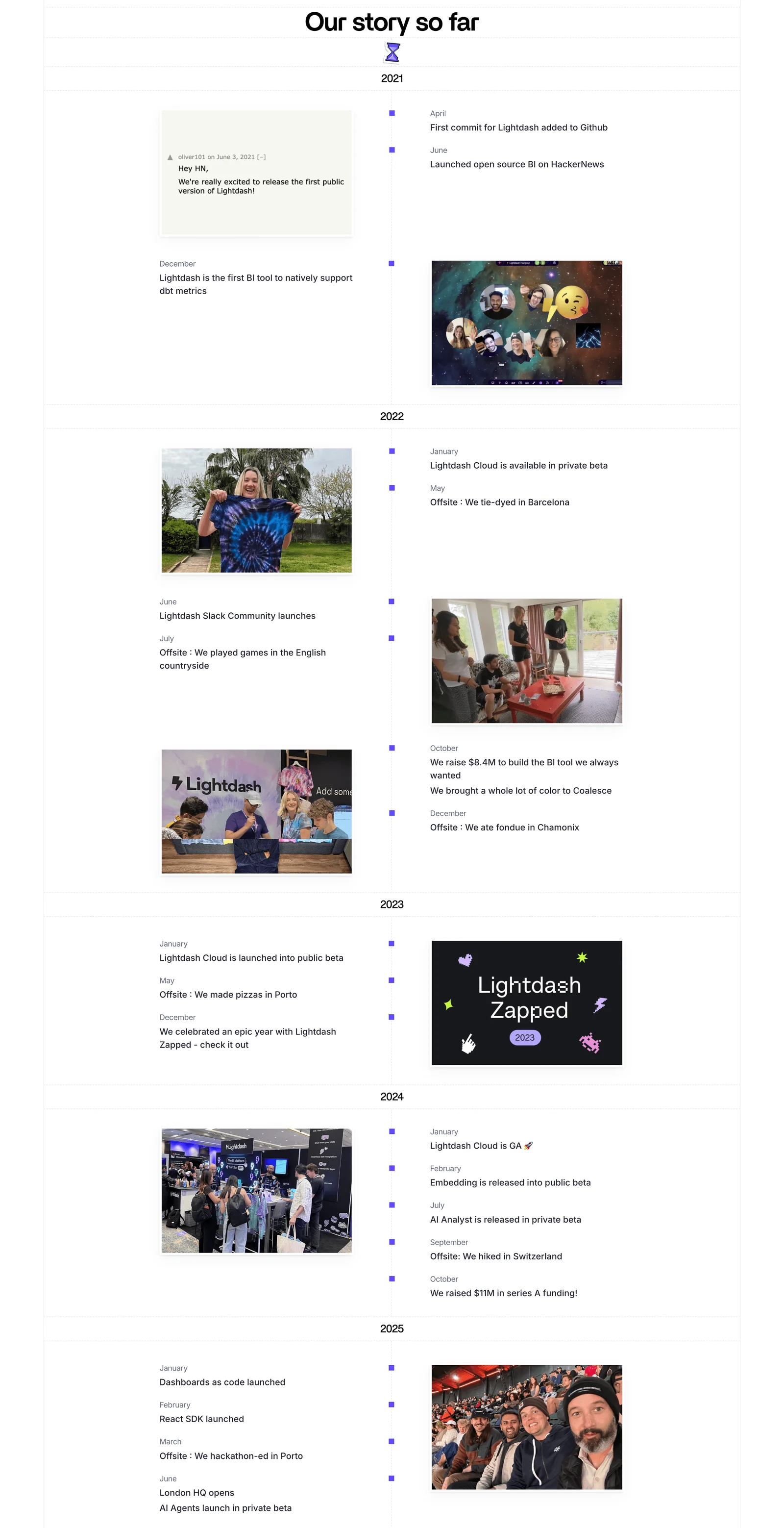
Lightdash exposes a multi-year sequence with year headings, month labels, milestone descriptions, and images. A central line and repeated markers connect the entries, while photographs and product-related visuals give the history texture.
This approach favors continuous reading. Visitors can see how product, company, and team events accumulate over time without changing a selected state. It also makes the scale of the history visible.
The tradeoff is length. A long vertical timeline can consume substantial page space, especially on mobile. Curate the entries, use clear year landmarks, and consider a summary or navigation aid when visitors need to locate a specific period. The line should support orientation rather than become the reason for an oversized page.
Choose ascending or descending order intentionally
An ascending history explains development from origins to the present. A descending activity or release history prioritizes the latest change. Both are valid, but they serve different reading goals.
Make the order apparent through dates and headings. Do not alternate direction between groups without a reason. If visitors can switch order or filter periods, keep the resulting state clear and avoid losing their context unexpectedly.
Use consistent date precision. A company milestone may need a month and year; an operational event may need a timestamp. Do not suggest exact sequencing when the source only establishes a broad period. Several events within one year can be grouped while retaining enough information to understand their order.
Write entries as meaningful changes
A timeline entry should say what happened and why it belongs in the story. A concise title or opening sentence can identify the event, followed by context when necessary. Avoid a series of dates with vague labels such as Progress or A big moment.
Keep the amount of text proportionate to the event. A major product launch may deserve an explanation and link, while an informal team event may need a short caption. Do not make every milestone equally long merely to preserve visual symmetry.
Preserve the distinction between historical claims and current facts. A past launch status or team arrangement can remain part of the history without describing today's product. Use past-tense wording where appropriate and keep any current-status destination separate.
Use images as context, not chronology substitutes
Lightdash's photographs and screenshots add concrete context to the milestones. They can show a product moment, a gathering, or a period in the company's story. The dates and text still carry the chronology.
Choose assets that relate to the adjacent entry and caption them when identification matters. A photo from a different event can create a misleading association even if it looks visually suitable. Keep approved source material and meaningful crop choices.
Do not place essential event information only inside an image. A screenshot may contain a date or announcement, but the timeline should state the relevant milestone in text. Provide appropriate alternatives for informative images and avoid redundant descriptions for decorative supporting assets.
Make navigation predictable in interactive timelines
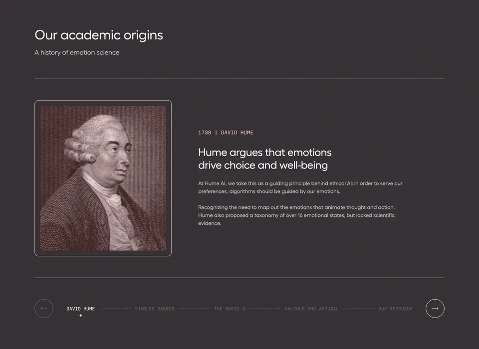
A year selector, event carousel, or expandable entry can reduce visible density. Each adds interaction that needs a clear model. Tell the visitor what is selected and what changes when they activate another control.
Use labeled controls with visible focus and accessible state. Long rows of years may need wrapping, scrolling, or another selection method on mobile. Ensure all periods remain reachable without precise dragging or pointer hover.
Preserve reading context when content changes. Avoid unexpectedly moving the page to the top or replacing the selected period with an unrelated default. If loading is required, show useful feedback and provide a stable fallback. A static list of core milestones can keep the history understandable if enhancement fails.
Adapt the line and content to narrow screens
An alternating desktop timeline can become a single-sided vertical sequence on mobile. Preserve a logical document order so the text is read chronologically even when visual columns change. Do not rely on left-right placement alone to communicate the sequence.
Keep dates close to their entries. A central line that separates a date from its description can become confusing when the layout stacks. Use clear grouping and enough spacing to identify which marker belongs to which event.
For a horizontal selector, avoid shrinking labels until they are unreadable. A scrollable strip can work if its interaction is discoverable and keyboard accessible. Large images should not push the next date far away without a clear association. Test zoomed text, long titles, and missing assets.
Review chronology, relevance, and maintenance
- Does time help explain the story?
- Is the scope clearly historical, current, or planned?
- Are selected milestones relevant to the purpose?
- Is the reading direction consistent?
- Do dates use an appropriate level of precision?
- Does every entry describe a meaningful event?
- Are images accurately associated with milestones?
- Are interactive selections and position indicators clear?
- Does mobile layout preserve chronological reading?
- Does someone own the accuracy and updates?
Test with a visitor looking for a particular milestone and another reading the story from the beginning. The first task reveals navigation problems; the second reveals whether the sequence is coherent. A visually elegant line can still fail both if dates are ambiguous or entries are poorly selected.
Maintain the history as the company evolves. Add new milestones intentionally rather than appending every announcement. Review older entries for broken links, outdated asset permissions, and wording that accidentally implies current status. Keep the source and date of each event available to editors.
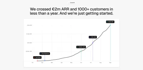
Consider the difference between narrative time and metric time. A growth chart can mark milestones along a measured axis, while a company story may use evenly spaced entries regardless of elapsed time. If spacing is not proportional, do not let the design imply a measured duration. State dates clearly and choose a chart when quantitative change is the actual subject.
Keep an event's supporting destination relevant. A launch entry can link to the original announcement or a maintained product explanation, but those are different contexts. Label the route so visitors know whether they are reading historical material or current details.
Frequently asked questions about timelines
Is a horizontal timeline better than a vertical one?
A horizontal selector can keep a short history compact and focus on one period. A vertical list exposes the sequence and supports continuous reading. Choose according to the amount of content and whether visitors need overview or detailed chronology.
Should a timeline include every company milestone?
No. Select events that support the section's purpose, and provide a deeper archive when completeness matters. Too many minor events can obscure the changes that explain the company or product.
How is a timeline different from a steps section?
A timeline ties events to dates or periods. A steps section explains actions in a process. A line and markers can appear in both, but their meaning should be clear so visitors do not confuse history with tasks to complete.
Explore SaaS timeline examples on SaaSFrame to compare dated milestones, year selectors, vertical stories, and responsive chronology.