 SaaSFrame
💵 Pricing Page
Maximize ARR with the most effective SaaS pricing page examples. This library showcases monthly/yearly toggles, feature comparison matrices, and "Most Popular" badge strategies. Learn how to present complex seat-based pricing with total clarity.
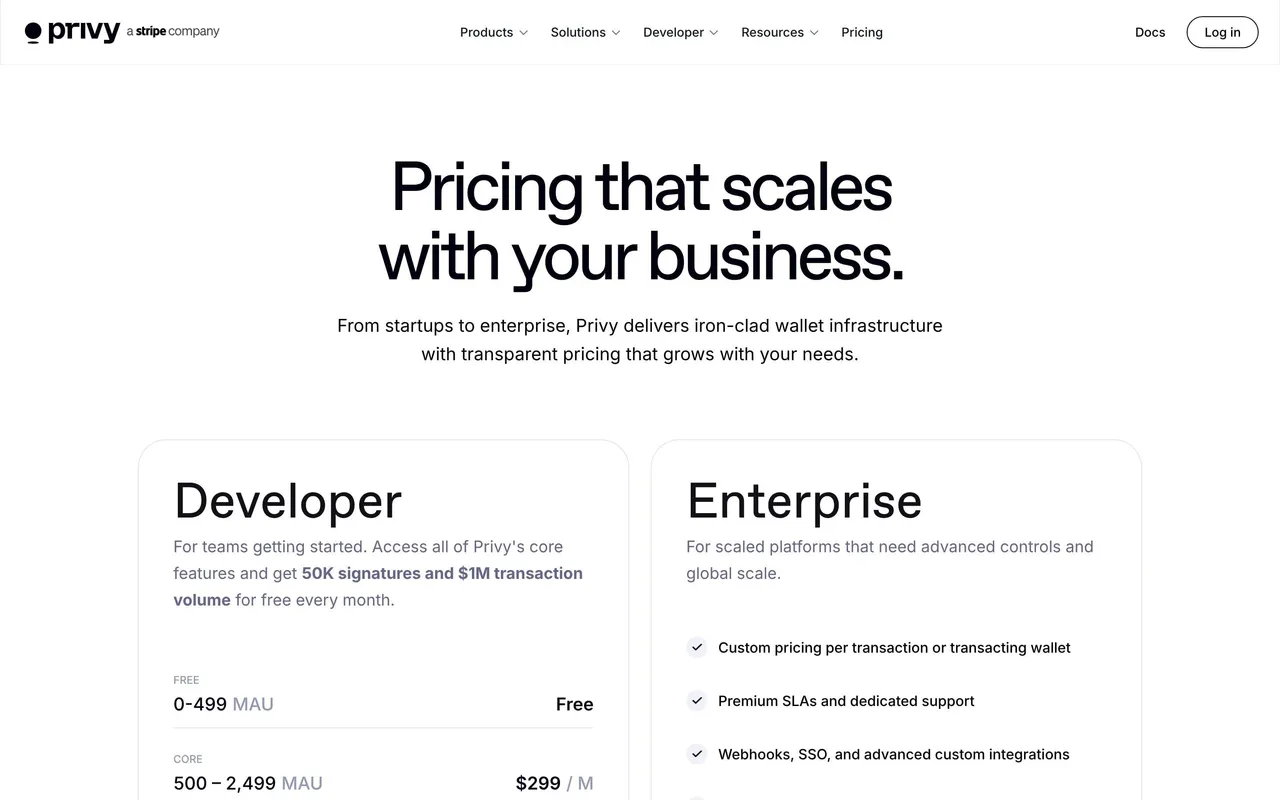

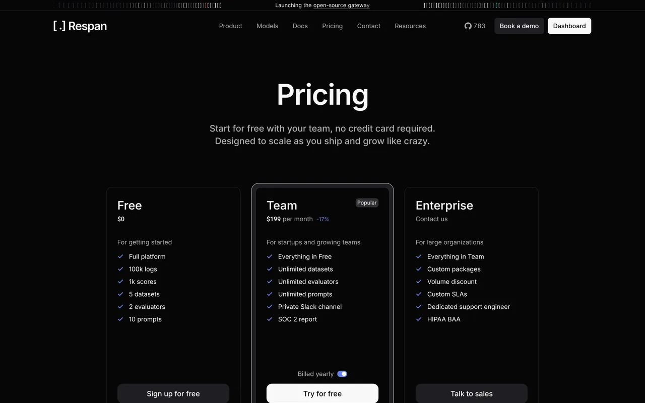



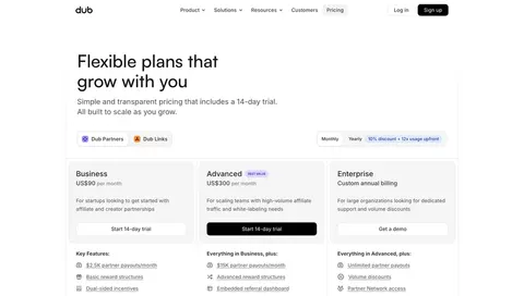
Index of all 245 Pricing Page examples
- Privacyboard Pricing Page
- Moss Pricing Page
- Dub Pricing Page
- Pangram Pricing Page
- Tines Pricing Page
- Glide Pricing Page
- Context.dev Pricing Page
- Hugging Face Pricing Page
- NewsCatcher Pricing Page
- NewsCatcher Pricing Page
- Cloudflare Pricing Page
- Koyeb Pricing Page
- Lightdash Pricing Page
- Profound Pricing Page
- Dust Pricing Page
- Searchable Pricing Page
- Hyperline Pricing Page
- ParityDeals Pricing Page
- Composer Pricing Page
- FullEnrich Pricing Page
- Prelude Pricing Page
- Paddle Pricing Page
- Forest Admin Pricing Page
- Huly Pricing Page
- Hume AI Pricing Page
- Peec AI Pricing Page
- Reducto Pricing Page
- Speakeasy Pricing Page
- Base44 Pricing Page
- Crisp Pricing Page
- Cluely Pricing Page
- Payhawk Pricing Page
- Atlas Pricing Page
- Linear Pricing Page
- Wise Pricing Page
- Customer.io Pricing Page
- Checkout.com Pricing Page
- Raycast Pricing Page
- Tailscale Pricing Page
- Superlist Pricing Page
- GoFundMe Pricing Page
- Steep Pricing Page
- GitBook Pricing Page
- Wiza Pricing Page
- OpenAI Pricing Page
- Mintlify Pricing Page
- Latitude Pricing Page
- Oku Pricing Page
- Uvodo Pricing Page
- Remote Pricing Page
- FlowMapp Pricing Page
- Hyperline Pricing Page
- Plain Pricing Page
- Mollie Payments Pricing Page
- CommandBar Pricing Page
- Outerbase Pricing Page
- Makelog Pricing Page
- Clay Pricing Page
- Vercel Pricing Page
- Klu Pricing Page
- Winden Pricing Page
- Cal.com Pricing Page
- Dock Pricing Page
- Asana Pricing Page
- Audienceful Pricing Page
- Vidzflow Pricing Page
- Webflow Pricing Page
- Swan Pricing Page
- Rise Pricing Page
- Albato Pricing Page
- Sellx Pricing Page
- Linear Pricing Page
- Threads Pricing Page
- Duffel Pricing Page
- Meiro Pricing Page
- Alloy Pricing Page
- Greenly Pricing Page
- Zeda.io Pricing Page
- Routine Pricing Page
- Deel Pricing Page
- Supabase Pricing Page
- Stripe Pricing Page
- Cake Equity Pricing Page
- Tona Pricing Page
- Linktree Pricing Page
- Livestorm Pricing Page
- Blobr Pricing Page
- Popwork Pricing Page
- Hopscotch Pricing Page
- Brevo Pricing Page
- Conduktor Pricing Page
- Current Pricing Page
- Contractbook Pricing Page
- Front Pricing Page
- Bucket Pricing Page
- Artboard Studio Pricing Page
- Folio Pricing Page
- Acquire Pricing Page
- Clay Pricing Page
- WorkOS Pricing Page
- Resend Pricing Page
- Ruul Pricing Page
- Folk Pricing Page
- Mercury Pricing Page
- Luma Pricing Page
- The.com Pricing Page
- Cohere Pricing Page
- Surfer SEO Pricing Page
- Pirsch Analytics Pricing Page
- Zencal Pricing Page
- Surfe Pricing Page
- Better Stack Pricing Page
- Twingate Pricing Page
- Nord VPN Pricing Page
- ChartMogul Pricing Page
- Blobr Pricing Page
- Lemon Squeezy Pricing Page
- Framer Pricing Page
- Wistia Pricing Page
- Figma Pricing Page
- Sketch Pricing Page
- Qatalog Pricing Page
- Beau Pricing Page
- Moderne Pricing Page
- June Pricing Page
- Kinsta Pricing Page
- GitBook Pricing Page
- Overflow Pricing Page
- Café Pricing Page
- Coherence Pricing Page
- Libeo Pricing Page
- Aircall Pricing Page
- Cycle Pricing Page
- Attio Pricing Page
- Specify Pricing Page
- Skiff Pricing Page
- Help Kit Pricing Page
- Sidebird Pricing Page
- MentionFunnel Pricing Page
- Senja Pricing Page
- Butter Pricing Page
- Fernand Pricing Page
- Highnote Pricing Page
- Crew Pricing Page
- Evervault Pricing Page
- Formcarry Pricing Page
- Logsnag Pricing Page
- Vercel Pricing Page
- Narrative BI Pricing Page
- Fiberplane Pricing Page
- Folk Pricing Page
- Arcade Pricing Page
- Officevibe Pricing Page
- Huspray Pricing Page
- Raycast Pricing Page
- Founderpath Pricing Page
- Stage Pricing Page
- Rally Pricing Page
- Dynaboard Pricing Page
- Boords Pricing Page
- Copy.ai Pricing Page
- Equals Pricing Page
- Teta Pricing Page
- Mapbox Pricing Page
- June Pricing Page
- Qovery Pricing Page
- Framer Pricing Page
- PlanetScale Pricing Page
- GitHub Pricing Page
- SavvyCal Pricing Page
- Placid Pricing Page
- Pitch Pricing Page
- Ludus Pricing Page
- Swell Pricing Page
- Air Pricing Page
- Typedesk Pricing Page
- Supernotes Pricing Page
- AhoyConnect Pricing Page
- Contractbook Pricing Page
- AND.CO Pricing Page
- MailerLite Pricing Page
- Intercom Pricing Page
- VideoAsk Pricing Page
- Shortcut lubhouse Pricing Page
- Overflow Pricing Page
- Teachable Pricing Page
- Airtable Pricing Page
- Artboard Studio Pricing Page
- Bubble Pricing Page
- Webflow Pricing Page
- GraphCMS Pricing Page
- Upflow Pricing Page
- Workable Pricing Page
- SeedLegals Pricing Page
- Buffer Pricing Page
- Hypercontext oapbox Pricing Page
- Numbro Pricing Page
And 45 more in the library.
💵 Pricing Page: design guide
Short answer
A SaaS pricing page helps visitors understand the commercial model and choose a plan, a trial or a sales conversation. Structure it around the buying question, keep plans few and audience-specific, make billing units explicit, summarise in cards and resolve differences in a table, and give usage-based pricing an estimator.
In the libraryas of November 2026
- Screens
- 245
- SaaS products
- 225
- Last added
- Nov 2026
Common patternsPricing 90Pricing Plan Comparison 27FAQ 21Footer 16Call to Action 14
Recently addedPrivyRespanVoiceflowPrivacyboardMoss
A SaaS pricing page helps a visitor decide whether the product fits their needs, how its commercial model works, and what to do next. The useful outcome is a well-understood choice: a plan, a trial, a usage estimate, or a conversation with sales. A row of attractive cards is only one possible part of that decision.
This guide examines pricing page design at the level of the complete experience. It connects audience positioning, billing units, plan differences, comparison, reassurance, and the transition into signup. The SaaSFrame captures are design references from particular moments in time; their displayed prices and packages should not be treated as current offers.
Which buying question should the pricing page answer?
Different commercial models create different questions. A team buying per-seat software needs to understand who counts as a paid user. An API buyer needs to estimate consumption and understand limits. An enterprise evaluator needs to establish fit, implementation needs, and the scope of a sales conversation. A single default card layout cannot answer all three equally well.
Write the questions your audience must resolve before committing. Those questions determine the information hierarchy. If the first uncertainty is which product to buy, separate products before presenting plans. If the main uncertainty is monthly volume, give usage estimation a clear place. If plans share most features, lead with the few differences that actually change the choice.
For a mixed self-service and sales-led product, make both routes understandable. A sales option can coexist with public pricing, but it should identify who needs it. “Enterprise” without any eligibility or capability context forces visitors to guess whether they belong there.
Use audience boundaries to make a small plan set meaningful
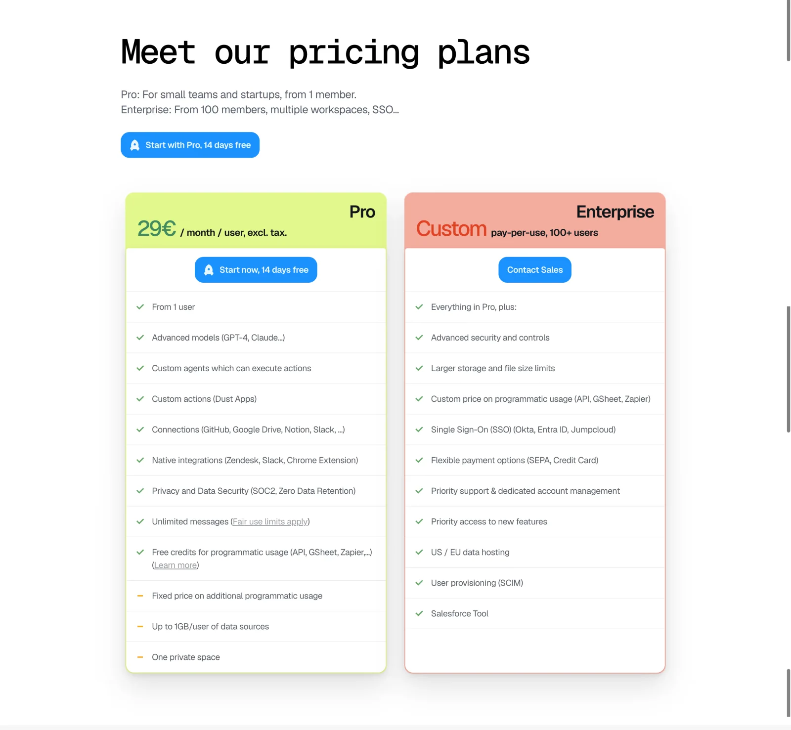
The Dust pricing capture presents a compact Pro and Enterprise comparison. The introductory copy identifies small teams and startups for Pro, while the Enterprise description references larger teams, multiple workspaces, and SSO. Each column then uses a different action: starting a trial or contacting sales.
This is a useful example of reducing comparison work through audience framing. The visitor does not have to inspect every feature before recognizing the broad distinction. The Enterprise column says that it includes the Pro offering and adds organizational capabilities, which creates a comprehensible relationship between the two packages.
The visible unit beside the Pro price matters as much as the number: the capture associates the amount with a month and a user, with tax wording nearby. When adapting this structure, preserve the billing explanation rather than borrowing only the colored cards. The screenshot establishes the page's visible presentation, not the eligibility rules or checkout behavior behind it.
Make the unit of value and the unit of billing explicit
A product may sell access by seat, workspace, project, transaction, request, credit, or a combination. Identify the chargeable unit beside the price. A monthly number without its unit can look comparable to another plan even when the actual cost scales differently.
Credits need a concrete translation into activity. Explain what consumes them, whether different actions consume different amounts, and what happens at the limit. Where a calculator or usage examples are available, place them near the decision rather than hiding the explanation in a FAQ. A visitor cannot estimate cost from an abstract credit count alone.
The Context.dev pricing reference illustrates a credit-oriented model with included allowances, overage information, and example activities. The Hume AI pricing reference shows another form of complexity: product-specific units such as characters and minutes in a comparison table. These approaches highlight why one generic “usage” row is often inadequate.
Distinguish package selection from capacity selection
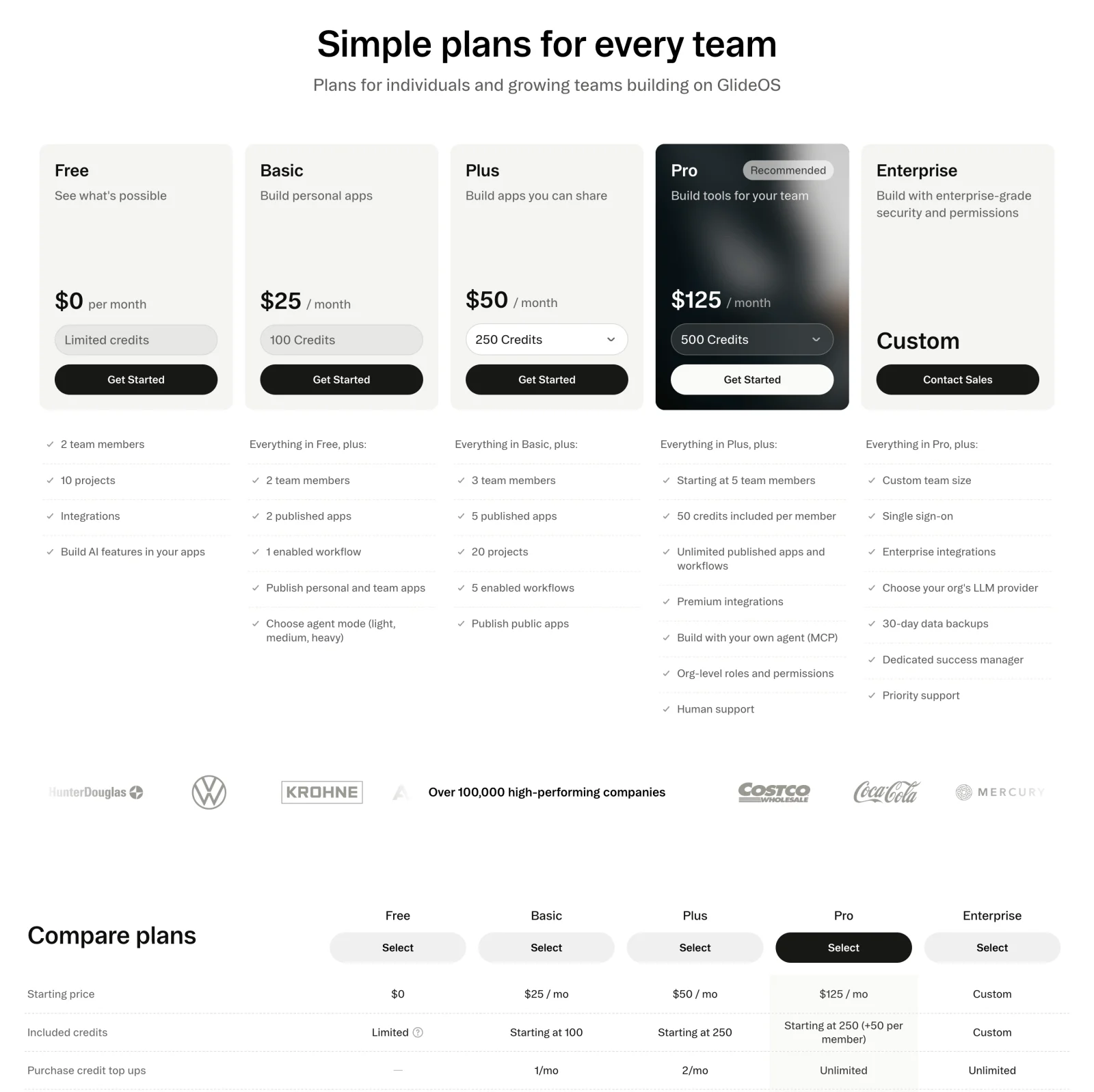
The Glide pricing capture combines named plans with visible credit allowances. Higher plans include controls for credit quantities, while the card descriptions distinguish personal apps, shared apps, team tools, and enterprise requirements. Below the cards, a comparison table expands the commercial differences.
The page therefore asks two related questions: which capability package fits, and how much capacity is needed? A visitor should be able to answer them independently. If increasing credits changes the price, show the resulting amount and billing basis clearly. If capacity can be purchased separately, explain the relationship to the base plan.
The recommended treatment on one card can help scanning, but the recommendation needs a plausible audience. A visually emphasized plan should not obscure the existence or limitations of the free route. The goal is to guide the choice rather than make every person choose the same package.
Keep headline pricing consistent with the actual commitment
A monthly equivalent and a monthly charge are different concepts. If a price is an annual commitment expressed per month, state that near the amount and make the billed total understandable. A billing toggle should change the relevant amounts, labels, and destinations together.
Discount labels need a clear basis. Explain the period or comparison that gives the discount meaning. An introductory offer is not necessarily the ongoing rate, and an annual saving is not necessarily a reduction in the next monthly payment. Avoid requiring arithmetic to identify the basic commitment.
Review tax treatment, currency, minimum seats, and required add-ons where they materially affect the decision. A qualification that changes the expected charge belongs near the price, not only in a long legal footer. Keep the public page and checkout aligned so the next step confirms the user's understanding.
Let cards summarize and tables resolve differences
Cards are useful for a short overview of audience, price, and decisive capabilities. A detailed comparison table serves people who need to inspect limits and feature availability. The table should add resolution rather than repeat the card copy line for line.
Choose row names that describe capabilities users recognize. Group related rows, distinguish included features from limits, and provide definitions where needed. An unexplained checkmark is less useful than a row that states exactly what is included. For limits, show the applicable quantity and unit rather than an icon alone.
Avoid a table that presents every minor feature as equally important. Highlight the differences that influence plan choice and make secondary detail available without overwhelming the overview. If most rows are identical, consider a shared “included in every plan” section and a smaller differences table.
Treat usage-based pricing as an estimate people can reason about
For metered products, help visitors map their expected workload to cost. Use examples that reflect the product's real billing model and state their assumptions. If an estimate excludes a particular service or variable cost, explain that boundary.
The Paddle pricing reference illustrates a transaction-oriented offer rather than a conventional per-seat ladder. The design emphasizes the billing formula, a custom pricing route, and included services. The relevant question is how the formula relates to the buyer's sales activity, not which card contains more checkmarks.
Describe the behavior at the limit: automatic overage, a hard stop, throttling, or a required upgrade. Those outcomes can affect operations more than the headline price. Spend controls and usage alerts can reduce uncertainty when available, but do not imply their existence unless the product actually supports them.
Place reassurance beside the decision it supports
Different objections need different evidence. A concern about implementation needs setup information. A concern about procurement needs organizational and commercial detail. A concern about trying the product needs an accurate explanation of the trial, payment requirements, and what happens afterward.
Customer logos can establish familiarity, while a relevant case study can explain how a comparable organization uses the product. Neither should substitute for a clear billing model. If a testimonial makes a quantitative claim, preserve the relevant context instead of treating it as a universal outcome.
The FAQ should answer genuine unresolved buying questions. Cancellation, plan changes, team growth, data handling, and limits can be useful subjects. Do not use a FAQ to conceal the core price or repeat obvious information already visible above it.
Make each CTA continue the same decision
The CTA should communicate whether the user is starting a trial, creating a free account, selecting a paid plan, or contacting sales. Similar labels can lead to different experiences, so choose wording that sets an accurate expectation.
Preserve the selected plan, billing interval, and quantity through signup when the flow supports those choices. Requiring the visitor to make the same decision again creates uncertainty about whether the first selection mattered. If eligibility must be verified, explain that before presenting the choice as complete.
For contact sales, give a sense of the next step. A form, scheduling page, and procurement inquiry are different experiences. The visitor should not discover after clicking that a supposedly immediate trial requires a lengthy qualification process.
Design mobile comparison and accessible controls deliberately
Desktop columns can become difficult to compare when stacked on mobile. Keep plan names and billing units visible, provide a usable route to detailed comparison, and avoid forcing users to remember several screens of feature lists. A dedicated comparison view can be more useful than a very wide horizontally scrolling table.
Billing toggles, quantity selectors, and calculators need clear labels and visible focus. Changing one control should not unexpectedly move the page or erase another selection. Provide understandable feedback when a price or estimate changes.
Tables need meaningful headings and coherent relationships between rows and columns. Do not rely only on color to indicate feature availability or the recommended plan. At increased text sizes, prices, qualifications, and actions should remain readable without overlapping.
Evaluate informed conversion rather than card clicks
Observe whether users can explain which plan fits, what they will pay, and what happens next. A high rate of CTA clicks can coexist with confusion that appears during signup, checkout, or a sales call. Measure completed appropriate outcomes and later correction or cancellation signals.
Test scenarios with a solo user, a growing team, a high-volume account, and an enterprise evaluator. Include annual versus monthly selection, unusual quantities, mobile comparison, and a return from signup. Verify that visible pricing and downstream behavior remain consistent.
When comparing design variants, change something tied to a specific uncertainty. A clearer billing unit or better explanation of limits is a more meaningful hypothesis than making one card brighter. Keep results grounded in your own audience rather than assuming a reference's visual treatment guarantees a lift.
Frequently asked questions about SaaS pricing pages
How many plans should a SaaS pricing page show?
Show the packages needed to represent meaningful customer differences. There is no universal requirement for three plans. Two clear routes can work better than several weakly differentiated packages, while a complex product may need product selection before plan comparison.
Should the page lead with cards or a comparison table?
Lead with the format that resolves the first buying question. Cards suit audience and package summaries. Tables suit detailed capability and limit comparison. Both can work together if each adds distinct information.
Which pattern guides support the page?
Review pricing toggles, pricing comparison, usage-based billing, and contact sales. Those guides explain individual interactions; use this category guide to connect them into a coherent buying journey.