 SaaSFrame
Skeleton Screen
Enhance perceived speed with SaaS Skeleton Screen patterns. These 'ghost' loaders provide a visual placeholder while content loads, making your app feel faster and more responsive.
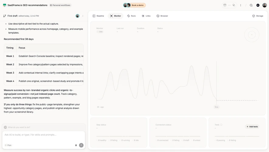

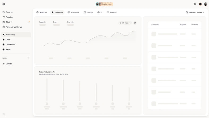
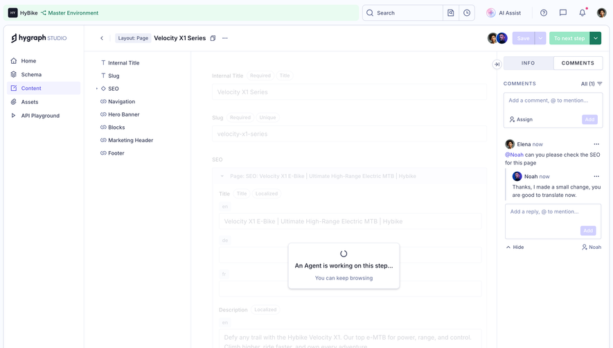

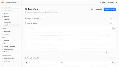
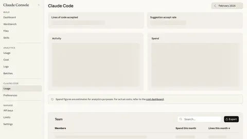
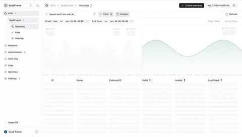
Index of all 23 Skeleton Screen examples
- Cloudflare Transfers List
- Claude Skeleton Screen
- Unkey Requests
- Customer.io Uploading CSV
- Checkout.com Payments Dashboard
- Superlist Empty Inbox
- OpenAI Loading Playground
- Latitude Empty Dashboard
- Hopscotch Dashboard
- Hopscotch Dashboard
- Current Dashboard
- Dokably Account Setup
- Dokably Account Setup
- Attio Customize Workspace
- Attio Loading Screen
- Specify User Onboarding
- Butter User Onboarding
- Wope Loading Dashboard
- Wope Loading volume trends
- Crew Loading dashboard
Skeleton Screen: design guide
Short answer
A skeleton screen reserves the layout of an interface while content loads, suggesting what will appear. Use it for predictable content areas, keep the stable interface around it, match placeholder shapes to the real hierarchy and distinguish loading from empty and failed states.
In the libraryas of November 2026
- Examples
- 27
- SaaS products
- 18
- Last added
- Oct 2026
Most common inLoading Screen 8Account Setup 7Dashboard 5Empty State 3Add & Edit 1
Recently addedTinesGraphCMSCloudflareClaudeUnkey
A skeleton screen reserves the structure of an interface while its content is being retrieved. Instead of showing only a generic loading symbol, it suggests where metrics, rows, images, or text will appear. The pattern is useful when the eventual layout is predictable and the waiting state can preserve orientation.
A skeleton is a promise about structure, not evidence of progress. It should not imply that a task is almost complete or that a particular value exists. Design the transition to real content, partial results, empty data, and failure as carefully as the placeholder itself.
When should a skeleton screen be used?
Choose this pattern when visitors benefit from recognizing the page's shape before its data arrives. A dashboard with known metric cards and a chart region is a reasonable candidate. A table with stable headers can show where rows will appear. An unpredictable result whose format is not yet known may need a simpler status message.
Do not replace every visible element with a placeholder. Persistent navigation, page titles, labels, and available controls can remain useful. The visitor should know which page they opened and which parts are still waiting.
Distinguish initial loading from a deliberate operation. Saving a configuration or submitting a payment usually needs a status related to that action. A page-shaped skeleton may obscure the fact that the visitor is waiting for an outcome rather than for ordinary content retrieval.
Preserve the stable interface around the waiting data
The Wope dashboard capture keeps the sidebar, page title, date selection, and metric labels visible. Within the performance area, muted shapes occupy the value and chart regions. Additional placeholders appear in lower table-like sections while their labels remain available.
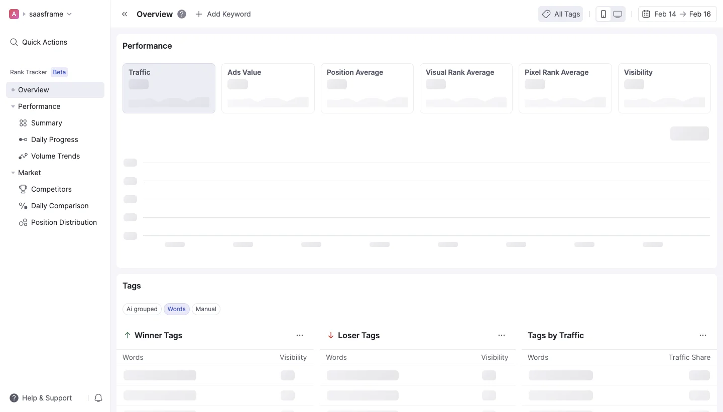
This separation helps visitors recognize the destination before the data arrives. The skeleton follows the structure of the content rather than turning the entire page into an undifferentiated gray surface. The still image does not reveal the duration of loading, animation, request strategy, or final data transition.
When adapting the pattern, retain stable information only when it is actually valid for the current context. A page title from the previous selection should not remain beside placeholders for a different dataset without explanation. The shell and the waiting content need to describe the same destination.
Match placeholders to the information hierarchy
In the Wope volume-trends capture, the table headers remain readable while repeated muted blocks occupy row cells. The layout communicates the tabular structure and the relationship between several monthly columns. The surrounding navigation still identifies the selected section.
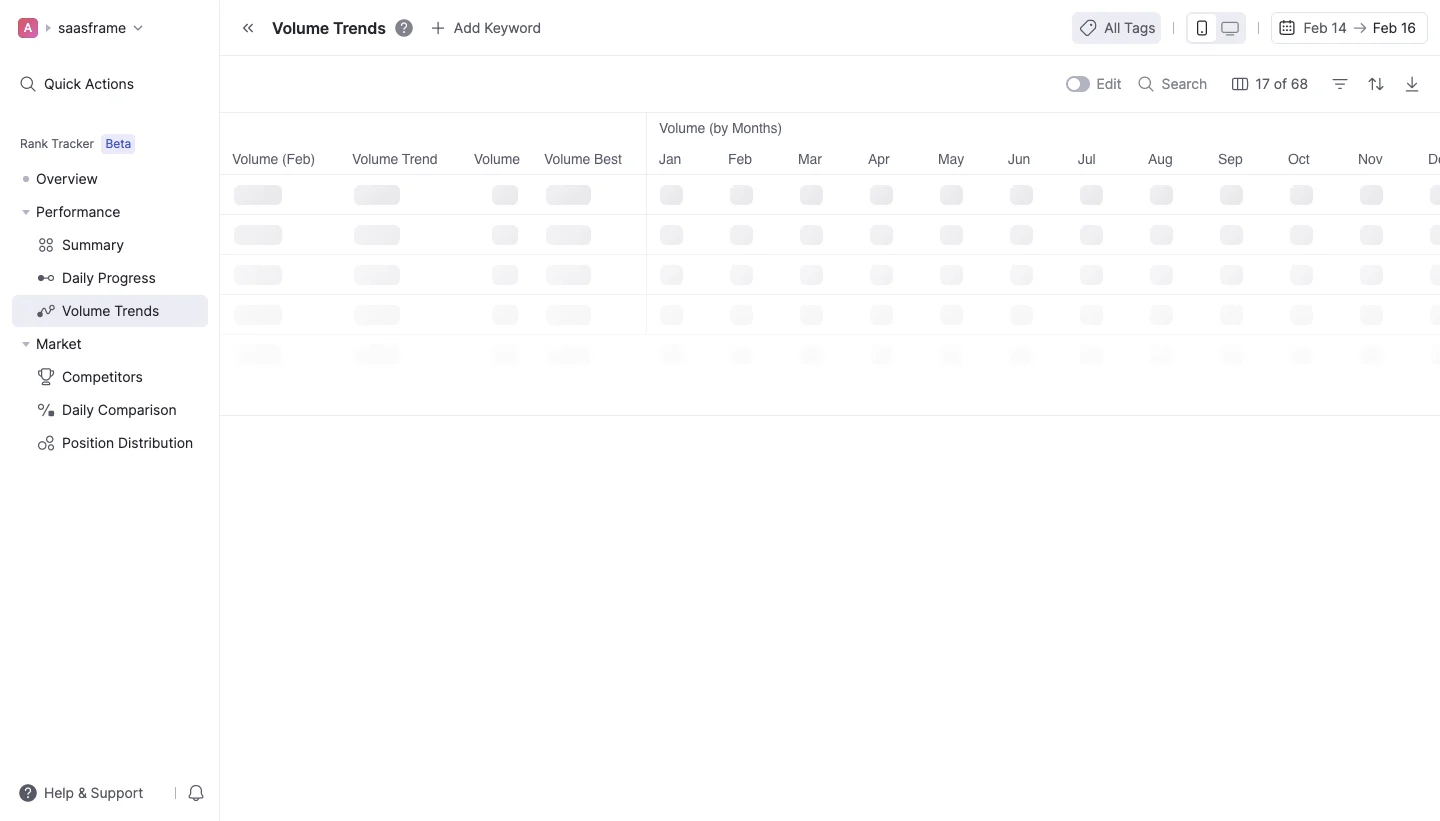
The placeholder sizes roughly distinguish values from larger content regions without pretending to display the values themselves. This is more informative than using a single large rectangle for the whole table. Yet a skeleton should not become a detailed fake dataset that visitors could mistake for real results.
Choose shapes that preserve the main hierarchy and approximate space. A short value placeholder, a line for text, and a larger image area can be sufficient. Fine-grained decoration adds complexity without necessarily making the eventual content easier to understand.
Reserve space without predicting unsupported results
A placeholder can reduce layout movement by allocating space for expected content. That allocation should be based on a plausible structure rather than a fabricated result count. If the number of records is unknown, avoid suggesting that a fixed set of rows is the actual returned set.
Use a stable content region when possible, but allow real text and variable data to fit. A skeleton that is much shorter than the eventual content may still cause a substantial jump. A rigid fixed-height region can create clipping or excessive blank space after loading.
Review the transition at realistic screen widths and with long content. The goal is to preserve orientation, not to force the final interface to match an idealized placeholder exactly. Keep the visitor's focused control and current reading position usable when content appears.
Distinguish loading from empty and failed states
A skeleton means the result is not yet available. An empty state means the request completed without the relevant content. A failure means something prevented retrieval or processing. These states need different explanations and next actions.
Do not leave placeholders indefinitely when the request has already failed. Replace the affected region with a clear account of the problem and an appropriate retry or alternative. If there are no records, explain that result rather than continuing to imply that rows are on their way.
Keep failure local when other content is available. A dashboard with several independent regions can preserve completed data while one panel explains its problem. Removing the whole page because a secondary request failed makes the waiting model less informative.
Handle partial results without confusing completeness
Some content may arrive before other content. Decide whether each region can become useful independently or whether the result needs to appear together to preserve meaning. A headline metric and its denominator may need a coordinated update; an unrelated resource card may not.
If partial content appears, make any remaining waiting state recognizable. Avoid a mixture that looks complete while critical values are still missing. A small status near the affected region can clarify why a comparison or chart is not yet ready.
Preserve consistency when visitors change filters during loading. The final content should correspond to the latest valid context, not an earlier request that happened to finish later. A skeleton cannot solve this problem by itself; it only presents the state the implementation actually manages.
Use motion sparingly in waiting interfaces
Shimmering or pulsing can distinguish a placeholder from a disabled field, but repeated motion across a large page can be distracting. Consider whether a static treatment plus a clear status provides enough information.
Respect reduced-motion needs and keep the content structure useful when animation is disabled. Do not rely on animation as the sole indication of loading. The visitor should understand the waiting state from its context and readable status.
The Wope screenshots show muted placeholders, not their movement. They cannot establish that a shimmer exists or that it affects perceived speed. Evaluate your actual animation in context rather than attributing behavior or performance benefits to a still capture.
Keep interaction aligned with available information
Some controls can remain usable during loading, such as navigation or a filter that starts a new request. Others depend on the missing content, such as an action on a specific record. Make that distinction clear and avoid controls that appear to operate nonexistent placeholder rows.
If a control is temporarily unavailable, explain the relevant condition when necessary. Do not disable the entire application simply because one region is waiting. Preserve ways to leave, change context, or recover from a slow request.
Avoid moving focus automatically when the skeleton disappears. A visitor may be using another available control while content loads. The transition should not unexpectedly pull them into the newly available panel or reset their place in the interface.
Present loading meaningfully beyond the visual shapes
Decorative placeholder blocks should not create a long sequence of meaningless items in the reading experience. Provide a concise status for the affected region and communicate completion or failure appropriately. Someone should not have to inspect blank pseudo-rows to understand what is happening.
Keep persistent headings and labels available when they help identify the region. The status should distinguish which content is waiting if several panels load independently. Avoid repeated announcements that interrupt navigation every time a small placeholder changes.
On mobile, match the structure the visitor will actually receive. A desktop-shaped skeleton can misrepresent a stacked final layout. Review text zoom, narrow widths, and the relationship between placeholders and controls so the waiting page remains coherent.
Test slow and interrupted requests rather than only fast success
Check initial load, partial completion, repeated filter changes, long waits, empty results, and failure. Review whether the placeholder is replaced by the correct state in each case. A skeleton that looks good for a fraction of a second may become confusing when it remains visible much longer.
Ask visitors what they believe is loading and whether any values are already real. If they mistake placeholder shapes for a zero value or unavailable feature, strengthen the distinction. Also assess whether the final transition preserves orientation.
Explore the SaaSFrame skeleton-screen collection to compare dashboard and table placeholders. Study how persistent labels frame the waiting regions, then design the complete state lifecycle for your own data.
Questions to settle before using a skeleton screen
Is a skeleton always better than a spinner? No. It helps when the expected structure is useful and predictable. A concise status can be clearer when the result shape is unknown or the visitor is waiting for an action outcome.
Should every element become a placeholder? Keep valid, stable context available where possible. Navigation, headings, and labels can help visitors understand the destination while only the missing data waits.
What should happen if loading never completes? Define a recoverable failure or unavailable state. Do not leave an indefinite skeleton as the only explanation; preserve completed content and offer an appropriate next step.