 SaaSFrame
Announcement Bar
A site-wide banner used for launches, promotions, maintenance notices, or other timely messages.


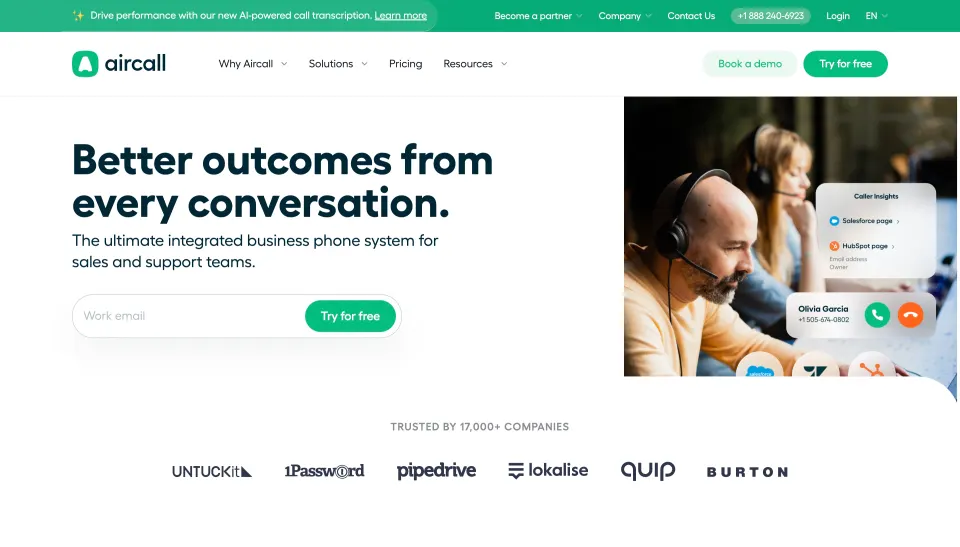

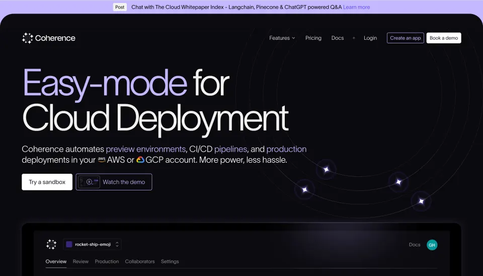

Announcement Bar: design guide
An announcement bar gives a timely message a persistent place near the top of a website. It can draw attention to an event, resource, release, or service update while leaving the main page available. Its value depends on relevance, concise context, and a clear route to act or dismiss it.
This pattern is different from a transient toast inside a product workflow. A marketing announcement usually applies to the page or audience more broadly and may remain visible across navigation. Design it as a deliberate part of the page hierarchy rather than an extra strip that every team can fill independently.
Decide why this message deserves top-level visibility
Use the bar for information that matters across the current page or set of pages. A conference invitation may fit a broad audience. A narrowly targeted feature notice may be more useful near the relevant feature explanation. The placement should reflect the message's reach.
Avoid treating the announcement bar as permanent overflow for copy that does not fit elsewhere. When the message has no timely or contextual reason to occupy the top of the page, it can become background noise. Define when it should appear, who should see it, and when it should be retired.
Keep one clear message whenever possible. Rotating several announcements adds hidden content and timing questions. If several notices are essential, consider whether they belong in a more structured notification area instead of competing within one narrow strip.
Connect the message with a specific next action
The Lattice capture places a conference announcement above the main navigation. The bar includes the event identity, two regional date references, a registration action, and a close symbol at the far edge. The layout gives the promotional message its own band without replacing the navigation beneath it.
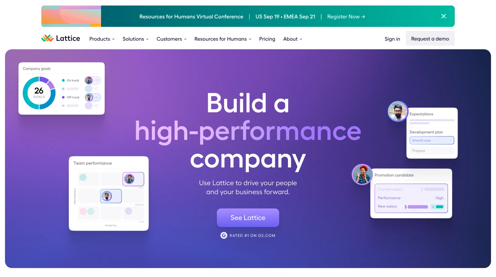
The action is closely related to the message: visitors can move from understanding the event invitation to registration. The screenshot records historical event copy and the presence of a close affordance. It does not verify current event dates, registration availability, or what happens after closing the bar.
When adapting the pattern, include the minimum context needed to decide whether the action is relevant. An event name alone may not explain format or timing. A button alone may not explain why the visitor should leave the page they came to read.
Place the bar in a hierarchy that preserves navigation
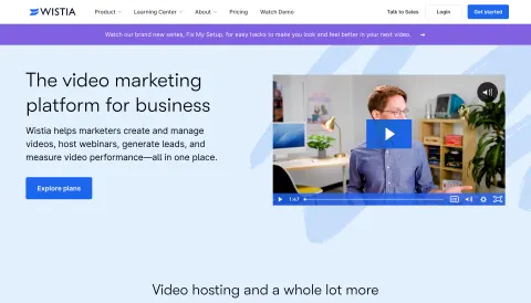
The Wistia capture uses a purple announcement band below the navigation and above the hero. It introduces a video series and provides a directional action cue. The main navigation remains visually separate, while the band bridges the header and the page's product message.
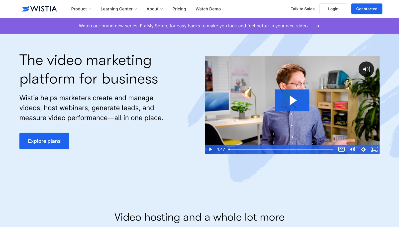
This placement differs from the Lattice example without changing the basic purpose of the pattern. Both arrangements make the announcement visible near the entry point. The better position depends on header structure, message priority, and the space needed to preserve the visitor's primary navigation.
Do not assume that being near the top means the bar must remain fixed while scrolling. A static screenshot cannot prove sticky behavior. Decide whether persistence helps the task and test the combined height of navigation, announcement, and other fixed elements on small screens.
Write one complete, concise proposition
A useful announcement identifies what is available, why it matters, and what to do next. It should not require the visitor to open a link merely to discover the basic topic. Replace vague prompts such as exciting news with a specific description of the resource or change.
Keep the action label aligned with the destination. Register, read the update, and watch the series create different expectations. If the entire bar is clickable, make that behavior clear without introducing confusing nested actions. If only a button or link is interactive, ensure it is easy to identify.
Avoid compressing important qualifications into unreadable fine print. If the message requires substantial explanation, the bar can summarize it and link to detail. It should not carry a complicated offer whose essential conditions disappear at a narrow width.
Give dismissal a defined meaning
If a close control appears, decide what closing the bar means: hiding it for the current page, the session, or a longer period. The visitor should not encounter the identical notice immediately on every navigation after dismissing it unless there is a clear reason.
A materially new announcement may need its own visibility state. Avoid reusing a dismissal rule that hides unrelated future messages, or resetting dismissal so frequently that the close action feels ineffective. Make the behavior match the communication purpose.
Closing should not unexpectedly move keyboard focus to the beginning of the page or leave it on an element that no longer exists. Preserve a sensible next location and ensure the remaining header stays usable. The visible close symbol in the Lattice capture is a design affordance, not proof of these behaviors.
Separate promotion from consequential notices
A promotional resource invitation and a service interruption require different levels of urgency and detail. They may share a banner shape, but the message, status, destination, and dismissal expectations should reflect their consequences.
Do not use alarming visual treatment for a routine marketing announcement. Likewise, do not hide an important operational notice among rotating promotional messages. The visitor should understand whether the bar offers optional exploration or explains something that affects their task.
If several message systems exist, define which takes priority. Cookie notices, service alerts, navigation, and promotional bars can accumulate at the top or bottom of a page. Review the combined experience instead of approving each component in isolation.
Make timing and targeting maintainable
Assign an owner and an expiration condition to each announcement. Event bars need to change when registration closes or the event ends. Release announcements need a review process as the news becomes routine. A permanent outdated bar can undermine confidence in the rest of the page.
When targeting by region, role, or account state, make sure the message and destination agree. A visitor should not see a region-specific invitation that leads to an unavailable route without explanation. Avoid personalization whose apparent relevance is not supported by reliable context.
Consider the experience of returning visitors. Repeated exposure may be useful for an upcoming event, but it should not defeat a deliberate dismissal. The announcement's lifecycle should be part of the publishing process rather than an afterthought once the visual design is complete.
Preserve readable content and controls on mobile
Allow the message to wrap naturally when necessary. A single-line desktop bar can become a tiny-text strip or an overflowing sentence on a phone. Keep the action and close control available without covering the message or forcing horizontal page scrolling.
Maintain enough separation between the action and dismissal target that visitors can choose intentionally. A small close symbol squeezed beside a link is easy to activate accidentally. Long translated labels and text zoom should not make either control inaccessible.
Check sticky headers in real viewport conditions. An announcement plus navigation can occupy a substantial part of a small screen. Focused fields, anchor destinations, and hero actions should remain visible rather than hidden beneath fixed bands.
Communicate the announcement without relying on color
Use readable text, adequate contrast, and clear link styling. A bright band may attract visual attention, but its meaning should remain understandable without that color cue. If an icon adds urgency or category information, support that meaning with words.
Make the close control's purpose explicit to assistive technology and ensure it works by keyboard. Links should identify the resource or action they open. Repeated generic labels can be ambiguous when someone navigates through a page's links independently of the layout.
Avoid unnecessary interruption on every page load. A static marketing bar can be available in the reading order without forcing an immediate announcement that competes with the user's navigation. More consequential status changes may need a different communication strategy appropriate to the actual behavior.
Verify the lifecycle as well as the destination
Test the bar before and after its scheduled end, after dismissal, across navigation, and on a return visit. Check that the destination matches the wording and remains available. Review situations where a message is replaced by another announcement.
Ask visitors to explain the message and identify whether it affects their current task. If they mistake a promotion for a warning, adjust the wording and treatment. If the bar blocks the main action or becomes invisible clutter, reconsider its prominence.
Explore the SaaSFrame announcement-bar collection to compare placement above and below navigation, message density, and action treatments. Adapt the hierarchy to your audience, then define the dismissal and expiration behavior that the screenshot cannot establish.
Questions to settle before adding an announcement bar
Should every bar be dismissible? Decide according to purpose and consequence. Optional promotion often benefits from dismissal; a consequential notice may need a different treatment. In either case, keep the remaining page usable.
Should the bar stay visible while scrolling? Only when continued access helps enough to justify the occupied space. Test the full fixed-header stack, especially on narrow screens and with text zoom.
How often should the announcement change? Follow the lifecycle of the message rather than an arbitrary rotation schedule. Assign an owner, an end condition, and a useful destination so the bar remains relevant and accurate.