 SaaSFrame
API Section
Showcase your technical capabilities with professional SaaS API pattern designs. From code-snippet previews to technical flowcharts, see how to present your developer-first features to technical decision-makers.



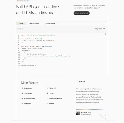
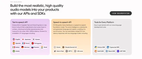
API Section: design guide
An API section on a SaaS website shows developers what they can build and where to start. Pair a short code example with its visible outcome, make documentation the obvious next step, separate API access from ready-made integrations and choose code that proves the product claim.
In the libraryas of November 2026
- Examples
- 16
- SaaS products
- 16
- Last added
- Oct 2026
Most common inLanding Page 13Developers Page 1Integrations Page 1Pricing Page 1
Recently addedPangramMossMollie PaymentsAnchorSpeakeasy
An API section on a SaaS website helps visitors understand what they can build and where to begin exploring the developer experience. It sits between a product promise and the technical documentation. A strong section gives enough concrete evidence to make the promise meaningful, then directs the appropriate audience toward maintained implementation details.
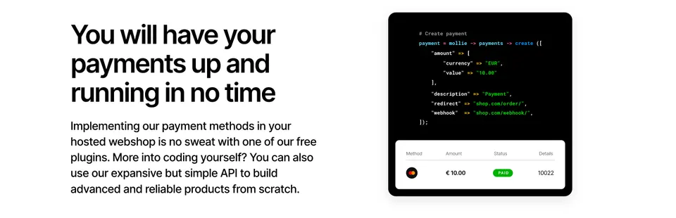
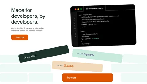
The Mollie Payments and Anchor captures show two approaches: a payment example paired with a visible result, and a developer-focused panel with a prominent documentation link. The lessons here concern presentation and navigation. The code shown in historical screenshots is illustrative evidence of those designs, rather than current implementation guidance.
Who is the API section for?
A website API section may serve developers assessing implementation, product managers assessing possibilities, and buyers checking whether the product fits an existing system. These readers need different amounts of detail, but they all benefit from a clear statement of what the API enables.
Start with the main capability and the next useful step. If the product supports a custom workflow, name that workflow. If it also offers a prebuilt route, distinguish the two. A developer should not have to read a broad marketing paragraph to determine whether the page leads to documentation or to a sales form.
Keep the section's scope manageable. It does not need to explain every endpoint or replace reference documentation. Its job is to establish relevance, demonstrate a representative interaction, and make deeper information easy to reach. Choose evidence that helps a reader evaluate that initial fit.
Connect a code example to a visible outcome
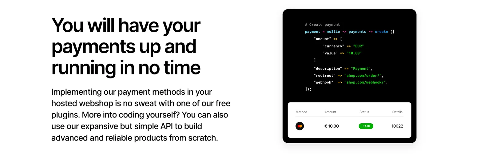
Mollie places a code illustration above a compact transaction row showing a method, amount, status, and details. The composition connects a technical request with a recognizable product outcome. A visitor who is not ready to read the code can still understand that the example concerns creating and tracking a payment.
This relationship is more informative than a decorative terminal filled with unrelated syntax. When designing a similar section, choose one representative operation and show the object or result it produces. The example should reinforce the adjacent claim and avoid suggesting that a single short snippet explains the entire production workflow.
Keep the result clearly illustrative. A completed status in a marketing image does not establish processing speed, reliability, or handling of failure. Those details belong in maintained product information and documentation. The useful design lesson is the visual connection between an operation and its result.
Make documentation a recognizable next step
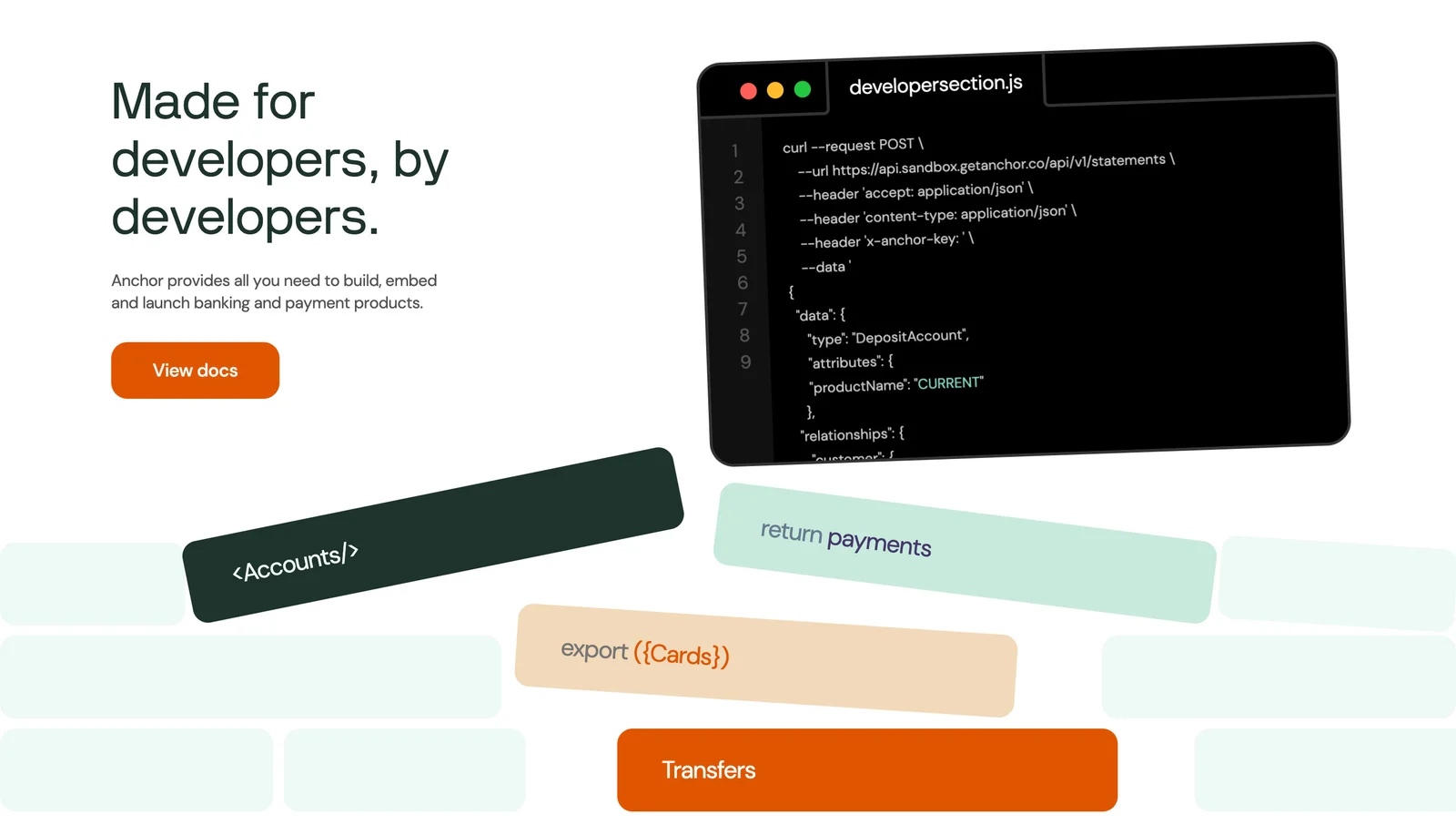
Anchor's section directly addresses developers and includes a conspicuous View docs action. Its code panel and surrounding capability labels provide context, while the button gives readers a clear route to more precise information. The section avoids requiring a visitor to infer whether the technical illustration is itself a link.
Use a destination label that describes what is available. View docs suggests documentation; Try a sandbox suggests an environment where someone can experiment; Talk to an expert suggests a conversation. These promises should lead to the corresponding experience.
If documentation requires an account or approval, explain that expectation before the click when it materially affects the visitor. If there are several documentation areas, route the visitor to the relevant starting point rather than an unstructured directory. A technical audience values being able to evaluate the product with minimal navigation uncertainty.
Separate developer routes from prebuilt integrations
Mollie's adjacent copy distinguishes plugins for an existing webshop from an API for a custom build. This matters because a visitor seeking a ready-made integration and a developer building a custom workflow have different needs. Both may belong in the same section, but their routes should remain understandable.
Name the available approaches in familiar terms. A prebuilt connector, an SDK or library, and a direct API integration are not interchangeable promises. The landing page can explain the purpose of each without attempting to document its implementation.
Provide a clear destination for each approach if the section invites comparison. Avoid a single generic Get Started action that sends everyone through the same path regardless of intent. When constraints affect which route is suitable, summarize those constraints or link to a comparison that helps the visitor choose.
Choose code that supports the product claim
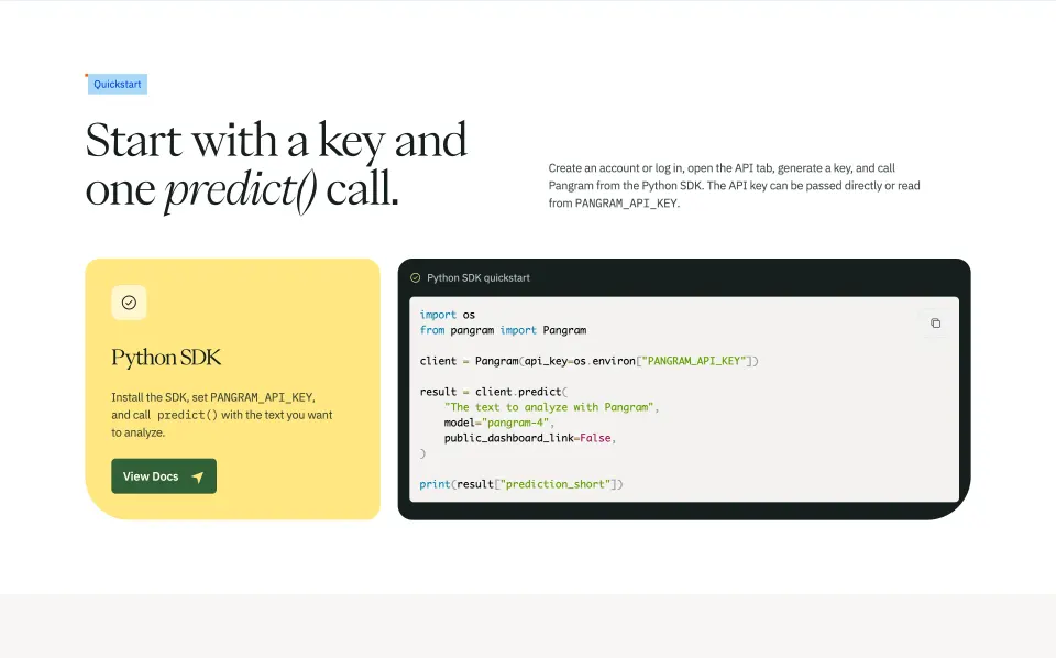
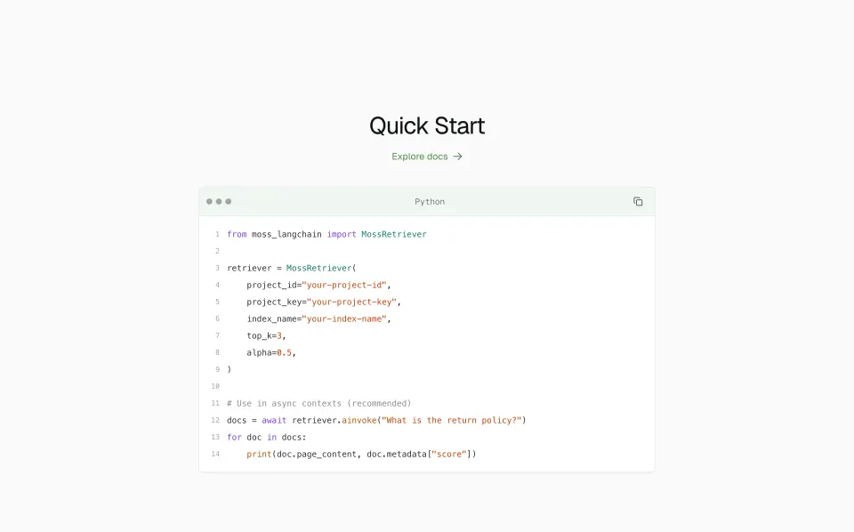
The snippet should correspond to a representative task, not merely display impressive-looking syntax. A request that creates an object, retrieves useful information, or initiates a workflow can make the product's role easier to understand. Use readable formatting and a title or caption that explains the operation.
Decide whether the example is a decorative image, selectable sample, or interactive demonstration. If it is copyable, it needs to be maintained and reviewed as actual technical content. If it is illustrative, do not add a copy control that implies it is ready to run. Keep placeholder values recognizable and avoid exposing real credentials or sensitive information.
Do not use a short example to imply that all setup, authentication, error handling, and operational concerns disappear. The marketing section can remain concise while linking to a complete starting guide. Any technical instructions or current API claims should be checked against the product's official documentation before publication.
Show capability breadth without creating a logo wall
Anchor surrounds its code panel with labels related to accounts, payments, cards, and transfers. These labels suggest areas a developer might explore while keeping the main documentation action prominent. They provide breadth without asking the reader to inspect a long endpoint list.
Use capability labels that describe meaningful product areas. A cluster of internal resource names may be precise but unfamiliar to someone evaluating the product. Pair technical vocabulary with plain-language context when needed.
Keep supporting labels secondary to the section's main message. If every capability becomes equally bold, the reader may lose the primary workflow. Where a label is interactive, make its destination clear and distinguish it from decorative text. A static visual motif can suggest breadth, but it should not look like a set of controls unless visitors can use it.
Set expectations beyond the happy-path example
A representative success example is useful, but developers also need to know where to find information about prerequisites, supported environments, limits, errors, and ongoing operation. The API section need not explain all of these topics; it should make the path to them obvious.
Choose links that answer the first evaluation questions. A quickstart can explain setup, a reference can describe individual operations, and a support destination can clarify assistance. If a capability is restricted by plan, region, approval, or availability, make that distinction discoverable before the visitor invests substantial implementation effort.
Avoid unsupported adjectives such as effortless or universally compatible when the product requires meaningful work. Explain the useful route instead: available tooling, an example operation, and where the complete instructions live. Accurate expectations support a more durable developer relationship than a simplified promise that breaks during setup.
Keep technical visuals readable and accessible
Code illustrations often contain small text on dark backgrounds. At mobile sizes, a desktop screenshot can shrink into an unreadable texture. Preserve the section's meaning with a readable heading and explanation, then adapt the code panel or provide a text-based alternative when the code itself carries essential information.
If the sample is live text, provide sufficient contrast, sensible wrapping or controlled horizontal scrolling, and a keyboard-accessible copy action where appropriate. Do not rely only on syntax colors to explain what matters. Copy feedback should be visible and should not steal focus from the reader.
Decorative perspective effects, such as the angled Anchor panel, can reinforce a visual style but reduce readability. Use them for illustration rather than critical instructions. Test zoomed text, narrow screens, and missing image states. A developer should still understand the promise and find the documentation when the visual treatment is unavailable.
Review the section as an entry to the developer journey
Make the transition to documentation continuous with the section. If the marketing example concerns creating a payment, the linked starting page should make that workflow easy to locate. A visitor should not arrive at a large reference tree with no indication of where the example fits. Use a meaningful entry page or anchor, and check that its naming matches the language used in the overview.
Review the example when the underlying product changes. A decorative code image can outlive a real API update because it is less visible to documentation maintainers. Give the asset an owner and keep its source editable. Even when it is not intended to run, outdated resource names or capabilities can mislead a developer's initial assessment. The section and documentation should describe the same product model.
- Does the heading say what someone can build?
- Is the representative operation relevant to that promise?
- Does the visual explain an outcome rather than only show syntax?
- Are prebuilt and custom routes clearly distinguished?
- Does the primary action accurately describe its destination?
- Are account or approval requirements discoverable?
- Is copyable code maintained as technical content?
- Can readers reach setup, reference, and support information?
- Does the section remain useful on mobile and with images unavailable?
Evaluate the journey beyond the first click. A high documentation click rate is encouraging only if visitors can find the relevant guide and understand how to begin. Observe a developer assessing one representative task, and use their questions to improve the handoff between the marketing section and the documentation.
Frequently asked questions about API sections
Does every SaaS API section need a code sample?
No. A clear workflow illustration and documentation link can be more useful when the audience is mixed or the operation is difficult to explain in a short snippet. Include code when it makes the product's role more concrete and can be presented accurately.
Should the main action be signup or documentation?
Choose based on the visitor's immediate need. Documentation often helps developers evaluate fit before committing. A sandbox or signup can be useful when it enables a meaningful next step, but explain any requirements and avoid blocking basic evaluation unnecessarily.
How much technical detail belongs in the section?
Include enough to identify the capability, show a representative interaction, and set realistic expectations. Keep detailed setup and reference material in maintained documentation, with clear links from the section. The website overview should help readers choose the right path into that material.
Browse SaaS API section examples on SaaSFrame to compare code presentation, visible outcomes, developer messaging, and documentation calls to action.