 SaaSFrame
Calculator
Engage prospects with interactive SaaS ROI and Pricing Calculators. These patterns demonstrate how to provide personalized value by letting users estimate their savings or costs directly on your marketing page.






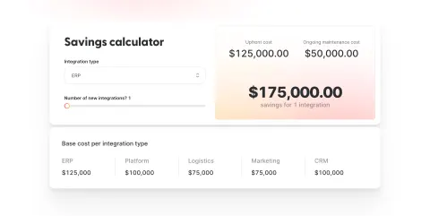

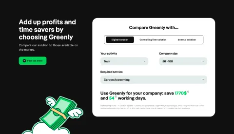
Calculator: design guide
A calculator turns a general product claim into a scenario someone can examine. Instead of asking visitors to believe that a service saves time, costs less, or produces a useful outcome, it lets them supply assumptions and inspect the resulting estimate. The design challenge is to make that relationship understandable without presenting a prediction as a promise.
The strongest calculator interfaces connect three things: an input the visitor recognizes, a result that answers their question, and an explanation of how the two relate. More controls do not automatically make the estimate more credible. A short, transparent model can be more useful than an elaborate form whose assumptions remain hidden.
Start with the decision the result should support
Define what the visitor will do differently after seeing the number. A fundraising calculator helps someone estimate net proceeds. A usage calculator helps a team understand which plan fits its volume. A time-saving calculator can help someone decide whether a workflow is worth investigating. Each requires a different output, even when all three use numeric fields.
Write the question before designing the interface: what would I receive, what would I pay, or what capacity would I need? Then identify the smallest set of inputs that materially changes the answer. Avoid collecting company size, job title, and email just because those fields might help sales. An unrelated qualification step makes a calculation feel like a disguised lead form.
Separate an exploratory estimate from a checkout quote. If the displayed result depends on assumptions that have not yet been confirmed, say so beside the result. The visitor should not have to discover that distinction only after choosing the next action.
Make the relationship between inputs and outputs visible
The GoFundMe capture presents a short sentence with editable-looking fundraising amount and donor-count values on the left, and net proceeds on the right. A divider separates the two. Smaller labels identify a starting fee and a transaction fee. The composition puts the consequence beside the assumptions instead of burying it below a long form.

The useful design lesson is the sentence structure: visitors can understand the scenario before interpreting the controls. The image records one displayed calculation, not a verified current fee schedule or evidence of how those controls behave. Reuse the relationship, rather than copying the historical amounts into a new product.
This compact format suits a calculation with few variables. It becomes harder to follow when every word contains a menu or numeric input. For a more complex model, group fields by meaning and preserve a clear result area. The visitor should always know which values they supplied and which values the system calculated.
Expose intermediate values when they explain the result
The Wise capture uses a card with a sending amount and currency above a recipient amount and currency. Between them, it shows fee rows, a subtotal, and a conversion-rate line. The result is supported by a visible arithmetic sequence. A separate comparison action and a primary sending action appear below it.

That breakdown helps explain why the received amount differs from the entered amount. It also provides places to clarify individual assumptions without overwhelming the headline result. The historical numbers, rate wording, arrival text, and savings statement in the capture should not be treated as current financial information.
Choose intermediate values that answer likely questions. A storage estimator may need the assumed number of files and average file size. A staffing estimator may need working hours and utilization. Showing every implementation detail is unnecessary; omitting a variable that substantially changes the result makes the output harder to trust.
Label units, periods, and boundaries before calculation
Numbers become ambiguous quickly. Does a volume refer to a day, a month, or a billing year? Is a percentage entered as 20 or 0.2? Are hours per employee or for the whole team? Put the unit in the visible label or beside the value, and keep it visible after the visitor enters data.
Use defaults that illustrate a plausible scenario without pretending to know the visitor's circumstances. When an assumption is adjustable, make that adjustment discoverable. When it is fixed, explain it. A default hourly rate should not silently become evidence that a customer will save a particular amount.
Define sensible boundaries for each input. Explain a minimum or maximum in the language of the model rather than merely reporting an invalid number. If zero means no activity, decide whether that is a valid scenario. If the model cannot handle a negative value, preserve the person's entry while giving a specific correction. Formatting should help interpretation without unexpectedly changing the underlying value.
Choose controls according to precision and comparison
An editable number field works well when visitors already know a precise quantity. A slider helps explore a range, but it should have a visible value and a practical way to enter an exact amount when precision matters. A select control suits a short set of distinct scenarios, such as monthly versus annual volume.
Keep related controls close enough to understand together. Changing a currency can affect which amounts are meaningful; changing a period can affect both volume and total. Avoid a layout in which one assumption sits at the top of the page and its dependent result is far below the viewport.
For instant recalculation, preserve the visitor's position and avoid dramatic layout shifts. For a calculation that requires a deliberate request, use a clearly labeled calculate action. The right choice depends on response time, complexity, and how often people compare scenarios. A static screenshot alone cannot establish which interaction strategy a captured product uses.
Treat uncertainty as part of the output
A useful estimate does not need false precision. If the model relies on uncertain inputs, consider a range or rounded value and explain what drives it. A result with two decimal places can look definitive even when its largest assumption is an approximate time-saving percentage.
Distinguish user-supplied data, fixed assumptions, and externally retrieved values. If a retrieved value has an effective time, show it where that time affects interpretation. If it cannot be refreshed, provide an unavailable state rather than presenting an old result as a new one.
Explain limitations in plain language beside the relevant output. A sentence about excluded costs is often more helpful than a vague disclaimer at the bottom of the page. This is a design principle, not a substitute for domain-specific review when the calculator informs consequential financial or other regulated decisions.
Preserve scenarios through errors and next steps
An error should not erase the inputs that produced it. Identify the affected field, explain the correction, and keep the rest of the scenario intact. When an external calculation fails, distinguish that failure from a problem with the visitor's data. Give a retry path without making someone rebuild their assumptions.
When someone changes an input, avoid leaving an apparently current result that actually belongs to the previous scenario. Use a clear updating state or mark the old estimate appropriately. If several changes can trigger overlapping requests, the final displayed result must correspond to the latest complete set of inputs.
Carry the scenario into the next step where useful. A plan comparison can preserve volume; a sales request can summarize assumptions; a checkout can explain which values will be confirmed. Do not imply that an estimate is guaranteed merely because the interface offers a primary action beside it.
Make calculation usable without visual inspection alone
Every input needs a persistent label, a meaningful unit, and a discoverable error message. Group related assumptions so their connection is understandable when someone moves through fields sequentially. Ensure a keyboard user can operate every control, including currency menus and range inputs.
Present the result as readable text rather than only a chart or decorative counter. If the interface updates automatically, communicate the meaningful new result without repeatedly interrupting someone who is still entering a number. The aim is to support comparison, not to announce every keystroke as a completed calculation.
On smaller screens, keep the input-to-result relationship coherent. Stacking a result below the fields can work, but a very long form may need a concise summary near the calculation action. Avoid a fixed result panel that covers focused fields or makes fee explanations inaccessible.
Review comprehension before optimizing conversion
Ask test participants to explain the result in their own words and identify the assumptions that most affect it. A completed form is weak evidence if the visitor cannot tell whether the number is monthly, annual, guaranteed, or illustrative. Test realistic scenarios, unusual inputs, and unavailable external data.
Check arithmetic separately from presentation. Review rounding, boundary values, changing units, and the correspondence between displayed subtotals and totals. Also check whether the next action preserves the scenario. A persuasive calculator that produces inconsistent numbers creates a larger problem than a plain interface with honest limitations.
Explore the SaaSFrame calculator collection to compare compact sentence-based calculators, detailed breakdowns, and pricing estimators. Choose a reference whose model resembles your decision, then adapt its information hierarchy to your own assumptions.
Questions to settle before shipping a calculator
Should results be gated behind an email form? Consider whether the gate prevents the visitor from evaluating the calculation they came to use. If contact details are necessary for a follow-up, explain that purpose and consider showing a useful estimate before requesting them.
Should a calculator update instantly? Instant updates suit quick, local calculations and repeated comparison. An explicit action can be clearer when inputs require validation or the calculation is slow. In either case, make the status of the displayed result unambiguous.
How much methodology should be visible? Show enough to explain the main drivers and limitations. Place concise assumptions beside the output and offer deeper explanation when useful. The visitor should be able to distinguish their inputs from the model's assumptions without reading an entire technical document.