 SaaSFrame
Multi-Factor Authentication
Prioritize security with SaaS MFA patterns. Explore UI for SMS codes, authenticator apps, and recovery keys that keep user accounts safe without over-complicating the login.



Index of all 32 Multi-Factor Authentication examples
- Wise Multi-Factor Authentication
- Wise Multi-Factor Authentication Setup
- Wise 2FA Phone Number Already Used
- Wise Multi-Factor Authentication Setup
- Wise Multi-Factor Authentication Setup
- GoFundMe Multi-Factor Authentication Challenge
- GoFundMe Multi-Factor Authentication Setup
- OpenAI Enter Code
- Uvodo Uvodo Phone Verified
- Hyperline Verification
- Copperx Verification
- Sandhill Markets Verification
- Albato Verification
- Plausible Analytics Verification
- Stripe Account Setup
- Stripe Verification
- Arc Invite Team Members
- Arc Setup MFA
- Arc Setup MFA
- Arc Choose MFA Method
- Hopscotch Verification
- Assembly Verification
- Dokably Verification
- Front Verification
- Lettria Verification
- Logbook Verification
- Cycle Verification
- The Org Verification
- Narrative BI Email Verification
Multi-Factor Authentication: design guide
Browse MFA interface examples and learn how to design method selection, authenticator setup, verification challenges, and recovery paths that help users protect their accounts without losing access.
What makes an authentication flow multi-factor?
Multi-factor authentication (MFA) requires proof from at least two different factor categories: something a person knows, something they have, or something they are. A password followed by a code from an enrolled authenticator app is a familiar example. Two-factor authentication (2FA) is MFA using exactly two factors.
The number of screens is not what makes a flow multi-factor. Confirming an email address during signup, entering a passwordless login code, and completing an MFA challenge can all use similar-looking inputs while serving different purposes. When reviewing an example, identify what the user has already proved and what the next step adds.
For interface designers, the pattern spans four jobs: enrolling a method, completing a challenge, managing enrolled methods, and recovering access. A polished code-entry screen solves only one part of that journey.
Explain the method before asking users to commit
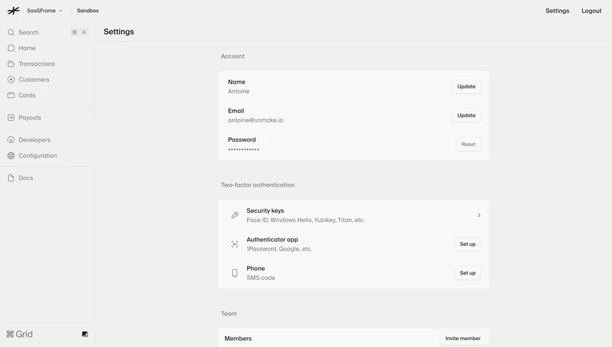
Method selection should help people predict the next action. An authenticator app requires setup; SMS requires an accessible phone number; a security key requires a supported device and interaction. Name the method, explain what the user needs, and expose restrictions before they select it.
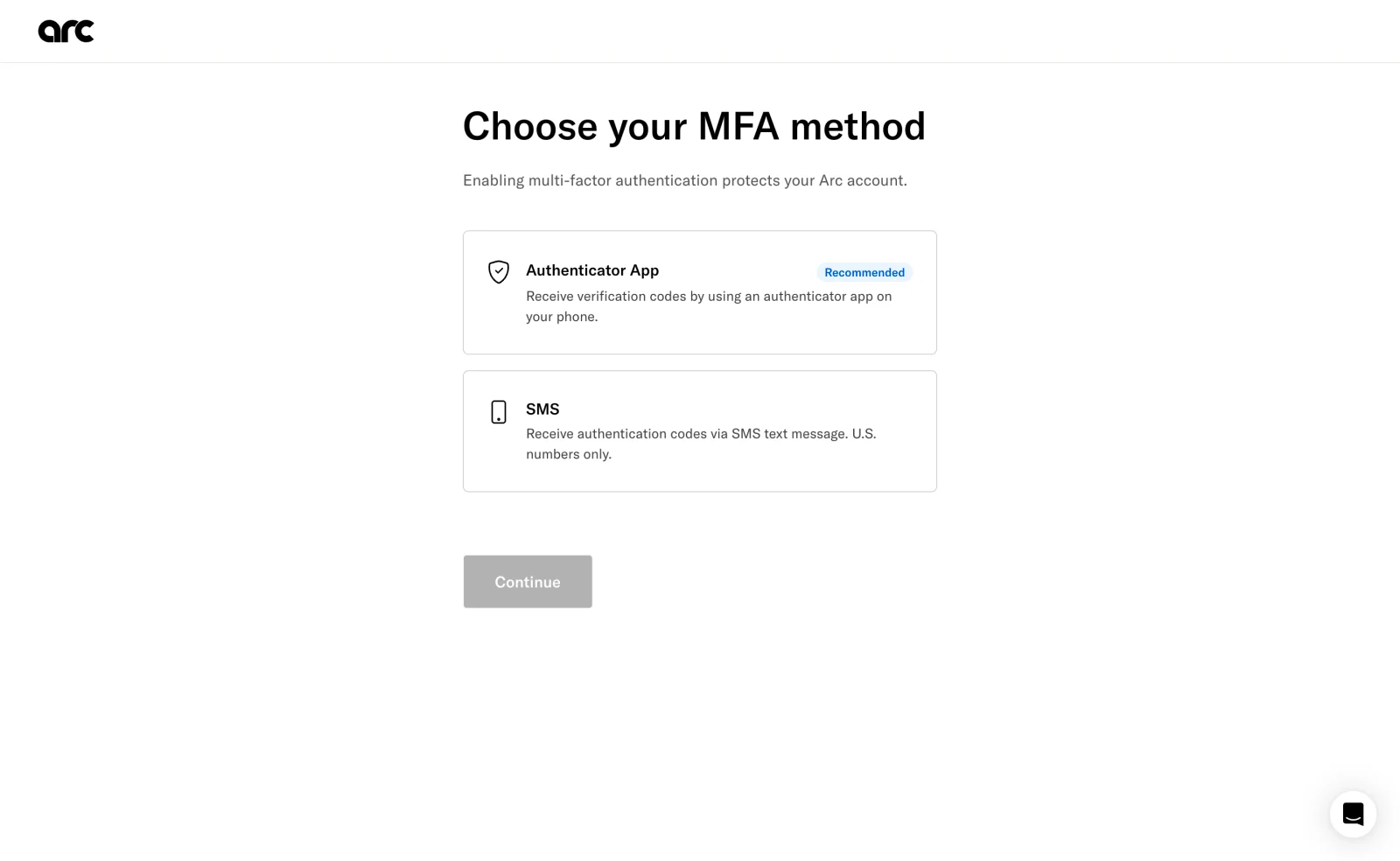
The useful detail is the restriction appearing at the point of choice. Discovering it after entering a number would create avoidable rework. The recommendation also gives the options a hierarchy, but a label alone leaves the reason unclear. A short explanation of the recommendation would make that guidance easier to trust.
The screen visibly lists two methods. That does not establish which other methods the product supports today, or how its authentication works behind the interface. Treat library captures as records of design decisions, rather than current security specifications.
Separate connecting an authenticator from proving it works
Enrollment asks users to move between your product and another app or device. Explain that transition explicitly: open the authenticator, add the account, then return with the generated code. A QR code helps on desktop, but should not be the only route when the user is already on their phone or cannot scan it.
Arc’s setup capture includes app-store links, a scan instruction, and a manual setup alternative. It also shows a loading indicator where the QR code would be expected. That state exposes a design dependency: users need understandable progress and a usable alternative when the preferred setup route is unavailable.
After connecting the method, ask the user to complete a challenge before showing enrollment as finished. The completion screen should name the enabled method and explain the next recovery step. Scanning a QR code and successfully using the resulting authenticator are different milestones.
Make code entry clear before making it decorative
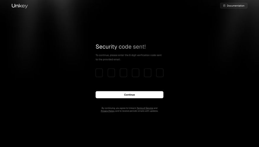
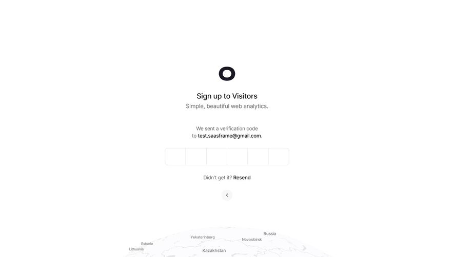
A code-entry screen needs to answer three questions: where does the code come from, which account or destination does it relate to, and what should the user do if it does not arrive?
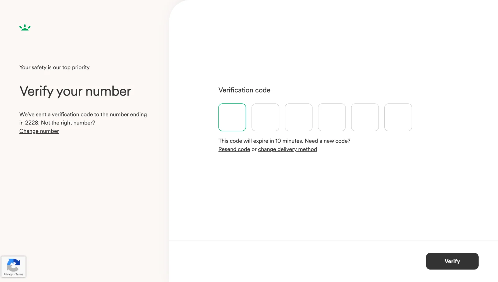
The destination context helps users diagnose the problem before requesting another message. The alternative actions distinguish a delay from an incorrect number or an unusable delivery channel. Its visible expiration message also establishes a time expectation. The screenshot does not reveal the factors that preceded this step, so it illustrates challenge design without proving the full flow qualifies as MFA.
Six separate boxes make code length visible, but the implementation still needs to accept a complete pasted code, support autofill where available, and allow correction without awkward focus jumps. A screenshot cannot establish whether those interactions work. Evaluate them in the product rather than inferring usability from appearance.
Authenticator-generated codes need different guidance from delivered codes. Asking someone to “resend” a code makes sense for a message, but not for a code that their authenticator generates locally. Match the help text to the actual method.
Give every failure a useful next action
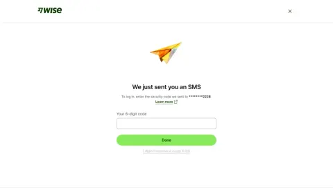
Expired codes, incorrect codes, delivery delays, and unavailable authenticators are different problems. Error text should explain what the user can do next without revealing sensitive account details unnecessarily.
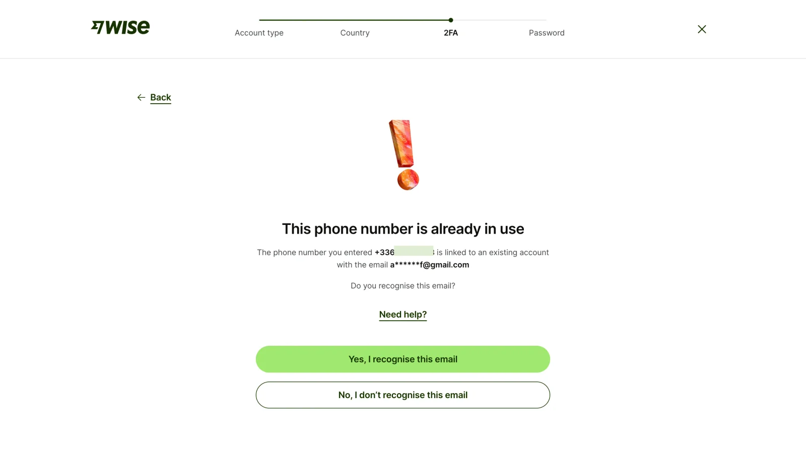
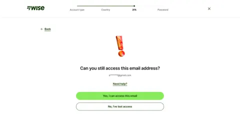
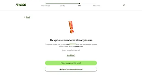
The interface offers a decision rather than leaving the user with an error banner. That is a useful principle to adapt. However, displaying even a masked account identifier creates a privacy tradeoff. The appropriate disclosure depends on what has already been verified and on the product’s threat model; the screenshot alone cannot establish whether the disclosure is safe in context.
Write an error-state inventory alongside the happy path. For each state, specify what stays entered, whether a retry is possible, which alternate method is available, and when support is appropriate. Resend controls should communicate waiting states and confirmation after a request instead of inviting repeated clicks.
Treat recovery as part of enrollment
People replace phones, lose devices, and lose access to their usual methods. Introduce recovery while they can still authenticate. Explain where backup codes should be stored, how they are used, and whether using or regenerating them changes their validity.
Avoid making a generic support link the only visible answer to lost access. Offer the recovery routes your product actually supports and make the outcome understandable. Changing a factor, disabling MFA, and recovering an account deserve deliberate confirmation because each changes how access is protected.
The captures discussed here do not establish a complete recovery flow. Use them for method selection and challenge design, then review recovery separately before adopting the overall journey.
A remembered device needs an explicit boundary
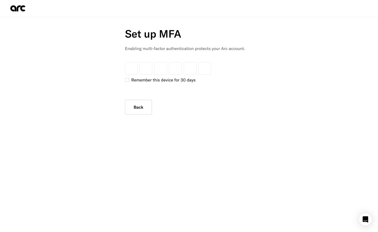
A visible duration gives users a more concrete choice than a vague promise to remember them. Still, the interface should explain what will be remembered and discourage the option on shared devices. Remembering a device and staying signed in are separate behaviors; their wording should reflect the actual policy.
The capture also shows an opportunity to improve guidance: the code boxes are prominent, while the nearby text does not explicitly identify the source of the code. Visual simplicity should preserve the instruction that lets someone finish the task.
Distinguish familiar code flows from phishing-resistant methods
Method selection is a security decision as well as an interface decision. Authenticator-app and SMS codes are familiar, but manually entered OTPs are not phishing-resistant. NIST also distinguishes email-address validation from authentication and prohibits email as an out-of-band authenticator in its guidance. These distinctions matter when naming and explaining examples. [1]
For passkeys and security keys, design around the actual browser or device prompt rather than forcing the experience into an OTP template. Explain what action is needed, provide an appropriate cancellation path, and coordinate fallback choices with the product’s security requirements. A familiar-looking interface is not evidence of equivalent protection.
Questions to ask when comparing MFA UI examples
Use the gallery to compare entire journeys, not just the shape of the input. Can users understand the recommended method? Can they complete enrollment on their current device? Does the challenge identify the code source? Can they correct an error and regain access if their usual method is unavailable?
For an implementation review, also test keyboard navigation, accessible field labels, full-code paste, error announcements, and the behavior after the final digit. Do not assume that segmented inputs or automatic submission improve the experience until those interactions have been checked.
Is a verification code always MFA?
No. A code can validate a contact address or act as a single login method. MFA depends on the combination of distinct factor categories used to authenticate the user.
Should code verification submit automatically?
Automatic submission can remove an action, but it needs a visible loading state, protection against duplicate submission, and a clear correction path after failure. An explicit Verify button can provide more control. Test the choice with keyboard, paste, and autofill interactions.
What should happen when the usual method is unavailable?
Show the alternate authentication or recovery routes that the product supports. Explain the next step and preserve useful context; requesting another code cannot solve the loss of the device that generates it.
Explore related authentication patterns
Compare MFA with Verification, login flows, and Magic Link Authentication to distinguish similar interfaces with different purposes. Use Error State examples to examine how products guide users when the expected path fails.
Reference
[1] NIST SP 800-63B-4: Authentication and Authenticator Management, sections on out-of-band authenticators and phishing resistance. Security guidance informs the distinctions above; screenshot analysis concerns visible interface decisions.