.webp)

Mintlify








Stack
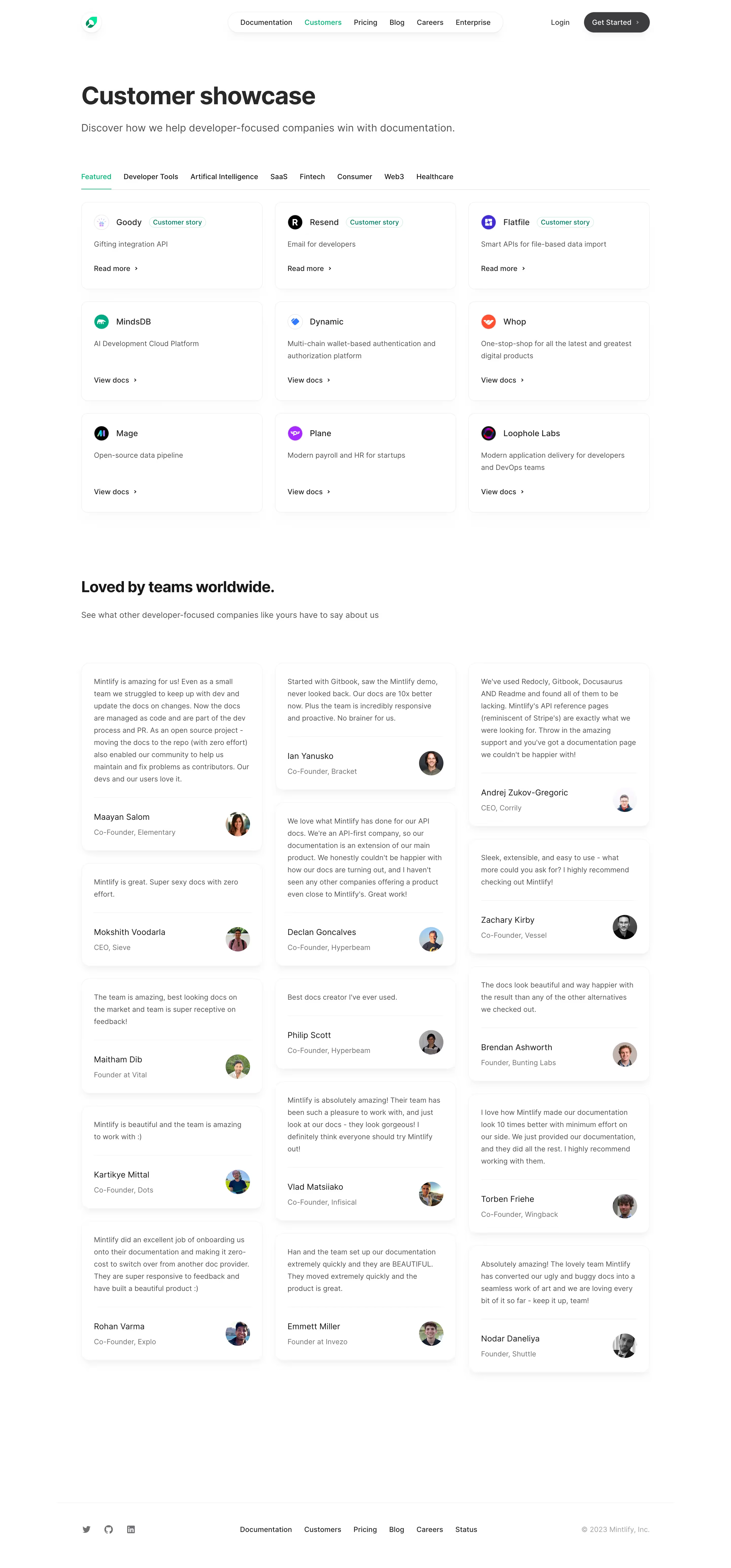
Mintlify is a Next.js (App Router) application styled with Tailwind CSS. The marketing site (mintlify.com) and the documentation renderer share the same design language. Component logic is authored in React/TSX; icons are served from Font Awesome, Lucide, or Tabler depending on customer configuration. Code highlighting uses Shiki. The platform ships nine named layout themes (mint, maple, palm, willow, linden, almond, aspen, sequoia, luma), each of which varies spacing rhythm, sidebar style, and typographic weight while sharing a single underlying token system.
Typography
The default body font is Inter (Google Fonts). Each theme may substitute its own default — the Linden theme, for example, uses a monospace stack for a retro terminal aesthetic. Heading and body fonts are independently configurable via docs.json. The type scale observed across the marketing site and docs renderer follows Tailwind's fluid scale:
- Display / hero:
text-4xl(≈ 2.25 rem / 36 px),font-medium,tracking-tight - Section headings:
text-2xl–text-3xl,font-semibold - Card titles / subheadings:
text-base,font-medium - Body / prose:
text-base(1 rem / 16 px), Tailwindprose prose-gray - Captions / eyebrow labels:
text-sm(0.875 rem / 14 px),font-semibold, uppercase-styleeyebrowutility - Small utility text:
text-xs(0.75 rem / 12 px)
Line-height follows Tailwind defaults (1.5 for body, 1.25 tight for headings). Font weights in use: 400 (regular), 500 (medium), 600 (semibold). Variable-font weights (e.g. 550) are supported for custom font configurations.
Color Philosophy
Mintlify's color system is built around a single primary brand color that customers supply as a hex code. The platform generates a full tonal ramp from that seed and applies it to interactive elements (links, buttons, badges, focus rings). The platform's own default primary is #0D9373 (a vivid teal-green), with light-mode emphasis at full saturation and a lighter tint (#55D799) for dark-mode emphasis. Separate dark and light color overrides let customers tune button states independently. Gray is used structurally: gray-900/zinc-50 for headings, gray-500/zinc-500 for body copy, gray-200/gray-400 for muted labels. Dark mode inverts background and text using dark: Tailwind variants throughout; backgrounds shift from near-white to near-black (#0F172A slate-900 level). Both modes are supported simultaneously via a toggle; default mode follows the OS (appearance.default: "system").
Spacing
Spacing is entirely Tailwind-based. Common patterns observed:
- Section vertical padding:
py-16(4 rem) on mobile,lg:py-48(12 rem) on desktop - Card gaps:
gap-x-6(1.5 rem),gap-y-4(1 rem) - Content max-width containers:
max-w-3xl mx-autofor prose,max-w-xlfor subtitles - Inline padding:
px-4(1 rem) default,lg:px-0at large breakpoints - Component internal padding:
pb-8(2 rem) for card bottom,mt-4/mt-5for tight stacking - Background decoration offset:
-top-14(-3.5 rem) for SVG bleeds
Component Defaults
- Cards: rounded corners (
rounded-2xl= 1 rem radius), hover scale transform (group-hover:scale-105 transition-all duration-100), no visible border by default, image-led with title and description below - Buttons (primary): filled with
colors.darkhex, hover states driven by the same token; border-radius follows theme default (typicallyrounded-lg= 0.5 rem) - Buttons (secondary/ghost): outlined or ghost style for secondary CTAs
- Accordions: expand/collapse with URL hash sync; title + optional icon + optional description;
defaultOpenboolean prop - Code blocks: Shiki-powered with theme configurable per mode; defaults to
system(light/dark auto-switch) - Badges: small inline labels, color-coded (red for required, etc.)
- Callouts/Notes: icon-prefixed alert blocks
- Images: separate light/dark sources via
className="block dark:hidden"/"hidden dark:block"pattern
Layout
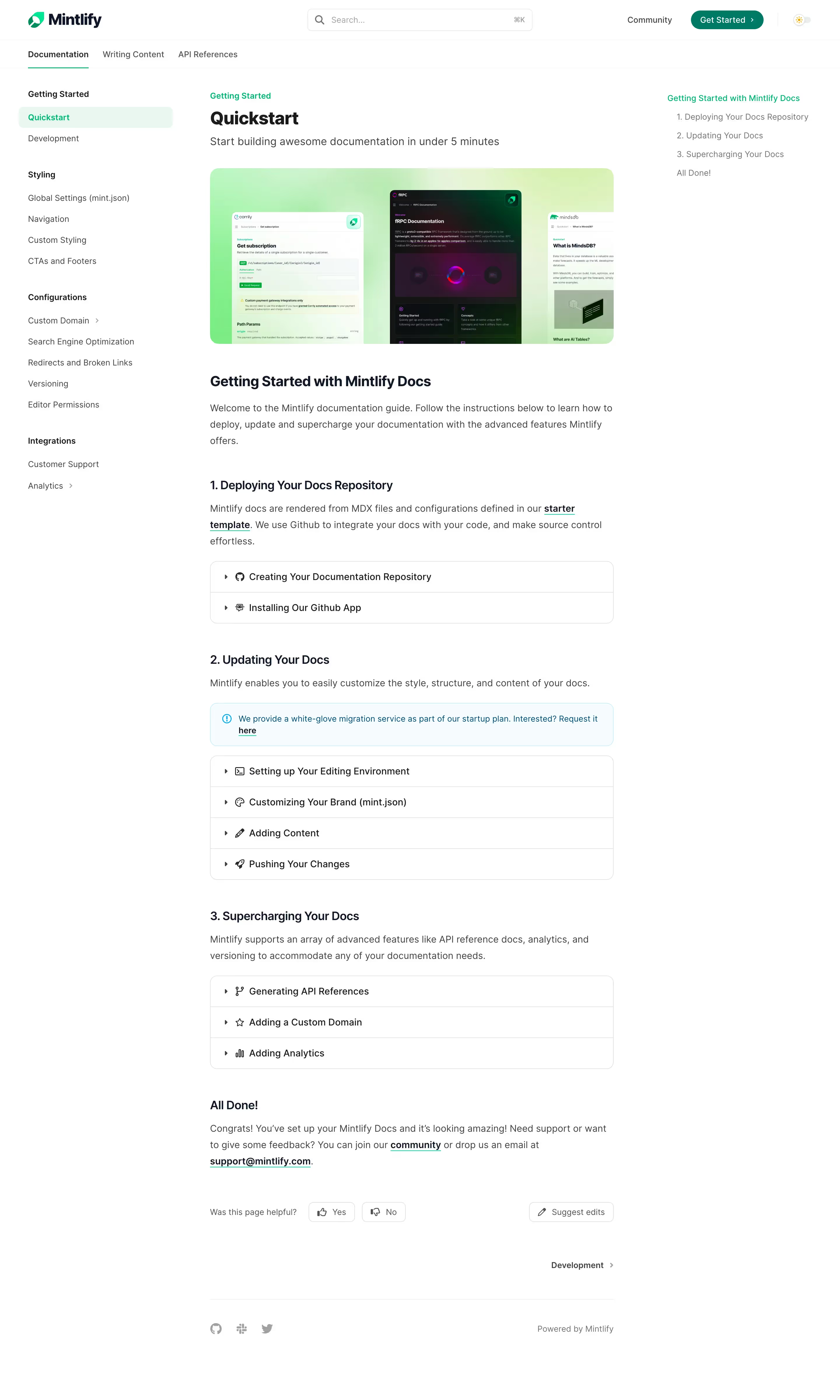
The marketing site uses a full-width canvas with centered content columns. Documentation themes use a classic three-column layout (sidebar navigation / main content / right-side TOC), though this varies by theme — Sequoia and Willow prioritize content width at the expense of sidebars. The grid system is Tailwind's 12-column responsive grid, typically collapsing from sm:grid-cols-2 to single-column on mobile. The prose utility class governs all markdown-rendered content. Navigation is sticky top by default. Theme-specific layout choices include card-based nav (Almond), wide-canvas minimal (Sequoia), and sidebar-heavy complex navigation (Aspen).
/\*
- Mintlify Design System — CSS Custom Properties
- Source: docs.json color API + Tailwind config inference
- The platform generates these at build time from customer-supplied hex seeds.
 \*/

:root {
  /_ === Brand / Primary (default Mintlify green) === _/
  --color-primary:        #0D9373;  /_ Primary emphasis, links, focus rings (light mode) _/
  --color-primary-dark:   #0D9373;  /_ Button fills, hover states (both modes) _/
  --color-primary-light:  #55D799;  /_ Emphasis color in dark mode _/

  /_ === Neutral / Gray scale (Tailwind gray) === _/
  --color-gray-50:        #F9FAFB;
  --color-gray-100:       #F3F4F6;
  --color-gray-200:       #E5E7EB;
  --color-gray-300:       #D1D5DB;
  --color-gray-400:       #9CA3AF;
  --color-gray-500:       #6B7280;  /_ Body text, muted labels _/
  --color-gray-600:       #4B5563;
  --color-gray-700:       #374151;
  --color-gray-800:       #1F2937;
  --color-gray-900:       #111827;  /_ Headings (light mode) _/

  /_ === Zinc scale (used in dark mode text) === _/
  --color-zinc-50:        #FAFAFA;  /_ Heading text in dark mode _/
  --color-zinc-500:       #71717A;  /_ Body text in dark mode _/

  /_ === Background === _/
  --color-bg-light:       #FFFFFF;
  --color-bg-dark:        #0F172A;  /_ Slate-900 level _/

  /_ === Semantic alert colors === _/
  --color-green-500:      #22C55E;
  --color-green-600:      #16A34A;  /_ Accent links (light) _/
  --color-green-800:      #166534;  /_ Accent link hover (light) _/
  --color-green-400:      #4ADE80;  /_ Accent links (dark) _/
  --color-red-500:        #EF4444;  /_ Required badge _/

  /_ === Typography === _/
  --font-family-body:     'Inter', ui-sans-serif, system-ui, -apple-system, sans-serif;
  --font-family-mono:     ui-monospace, SFMono-Regular, 'Cascadia Code', Consolas, monospace;
  --font-size-xs:         0.75rem;   /_ 12px _/
  --font-size-sm:         0.875rem;  /_ 14px _/
  --font-size-base:       1rem;      /_ 16px _/
  --font-size-lg:         1.125rem;  /_ 18px _/
  --font-size-xl:         1.25rem;   /_ 20px _/
  --font-size-2xl:        1.5rem;    /_ 24px _/
  --font-size-3xl:        1.875rem;  /_ 30px _/
  --font-size-4xl:        2.25rem;   /_ 36px _/
  --font-weight-regular:  400;
  --font-weight-medium:   500;
  --font-weight-semibold: 600;
  --font-weight-bold:     700;
  --line-height-tight:    1.25;
  --line-height-normal:   1.5;
  --letter-spacing-tight: -0.025em;

  /_ === Spacing (Tailwind 4px base unit) === _/
  --space-1:   0.25rem;   /_  4px _/
  --space-2:   0.5rem;    /_  8px _/
  --space-3:   0.75rem;   /_ 12px _/
  --space-4:   1rem;      /_ 16px _/
  --space-5:   1.25rem;   /_ 20px _/
  --space-6:   1.5rem;    /_ 24px _/
  --space-8:   2rem;      /_ 32px _/
  --space-10:  2.5rem;    /_ 40px _/
  --space-12:  3rem;      /_ 48px _/
  --space-14:  3.5rem;    /_ 56px _/
  --space-16:  4rem;      /_ 64px _/
  --space-24:  6rem;      /_ 96px _/
  --space-48:  12rem;     /_ 192px _/

  /_ === Border Radius === _/
  --radius-sm:   0.125rem;  /_  2px _/
  --radius-md:   0.375rem;  /_  6px _/
  --radius-lg:   0.5rem;    /_  8px — default button/card radius _/
  --radius-xl:   0.75rem;   /_ 12px _/
  --radius-2xl:  1rem;      /_ 16px — prominent cards (ThemeCard, HeroCard) _/
  --radius-full: 9999px;    /_ pill badges _/

  /_ === Shadows === _/
  --shadow-sm:  0 1px 2px 0 rgba(0,0,0,0.05);
  --shadow-md:  0 4px 6px -1px rgba(0,0,0,0.1), 0 2px 4px -2px rgba(0,0,0,0.1);
  --shadow-lg:  0 10px 15px -3px rgba(0,0,0,0.1), 0 4px 6px -4px rgba(0,0,0,0.1);

  /_ === Transitions === _/
  --transition-fast:   100ms ease;
  --transition-normal: 150ms ease;
  --transition-slow:   300ms ease;

  /_ === Layout === _/
  --max-width-prose:    48rem;   /_ max-w-3xl — content column _/
  --max-width-subtitle: 36rem;   /_ max-w-xl  — subtitle / subhead _/
  --sidebar-width:      16rem;   /_ 256px — typical docs sidebar _/
}

/_ === Dark mode overrides === _/
.dark {
  --color-bg:            #0F172A;     /_ Main background _/
  --color-text-heading:  #FAFAFA;     /_ zinc-50 _/
  --color-text-body:     #71717A;     /_ zinc-500 _/
  --color-text-muted:    #9CA3AF;     /_ gray-400 _/
  --color-primary:       #55D799;     /_ primary-light becomes the emphasis color _/
  --color-green-link:    #4ADE80;     /_ green-400 for accent links _/
  --color-green-hover:   #86EFAC;     /_ green-300 for link hover _/
}
Color Tokens
| Token | Value | Usage |
|---|---|---|
--color-primary | #0D9373 | Links, focus rings, primary emphasis (light mode) |
--color-primary-light | #55D799 | Primary emphasis in dark mode |
--color-primary-dark | #0D9373 | Button fills and hover states across both modes |
--color-gray-900 | #111827 | Heading text (light mode) |
--color-gray-500 | #6B7280 | Body/muted text (light mode), captions |
--color-gray-200 | #E5E7EB | Borders, dividers |
--color-zinc-50 | #FAFAFA | Heading text (dark mode) |
--color-zinc-500 | #71717A | Body text (dark mode) |
--color-bg-light | #FFFFFF | Page background (light mode) |
--color-bg-dark | #0F172A | Page background (dark mode) |
--color-green-600 | #16A34A | Accent/CTA links (light mode) |
--color-green-400 | #4ADE80 | Accent/CTA links (dark mode) |
--color-red-500 | #EF4444 | Required field badge |
Spacing Tokens
| Token | Value | Usage |
|---|---|---|
--space-1 | 0.25rem (4px) | Micro gap, icon padding |
--space-2 | 0.5rem (8px) | Tight inline spacing |
--space-4 | 1rem (16px) | Default horizontal page padding |
--space-6 | 1.5rem (24px) | Card column gap |
--space-8 | 2rem (32px) | Card bottom padding, section gap |
--space-10 | 2.5rem (40px) | Theme grid row gap |
--space-12 | 3rem (48px) | Large section vertical padding |
--space-16 | 4rem (64px) | Section vertical padding (mobile) |
--space-48 | 12rem (192px) | Hero vertical padding (desktop) |
Typography Tokens
| Token | Value | Usage |
|---|---|---|
--font-family-body | Inter, system-ui | All body text (default; overridable per theme) |
--font-family-mono | ui-monospace, SFMono-Regular | Code blocks, Linden theme body |
--font-size-sm | 0.875rem (14px) | Eyebrow labels, captions, small UI text |
--font-size-base | 1rem (16px) | Body prose, card descriptions |
--font-size-lg | 1.125rem (18px) | Subtitle / hero subheading |
--font-size-2xl | 1.5rem (24px) | Section headings (mobile) |
--font-size-3xl | 1.875rem (30px) | Section headings (desktop) |
--font-size-4xl | 2.25rem (36px) | Hero / page title |
--font-weight-medium | 500 | Hero title, card titles |
--font-weight-semibold | 600 | Section headings, eyebrow labels |
--letter-spacing-tight | -0.025em | Large headings (tracking-tight) |
Border Radius Tokens
| Token | Value | Usage |
|---|---|---|
--radius-lg | 0.5rem (8px) | Default button radius, small cards |
--radius-xl | 0.75rem (12px) | Input fields, secondary cards |
--radius-2xl | 1rem (16px) | Feature/theme cards (prominent UI) |
--radius-full | 9999px | Pill badges, avatar circles |
Shadow Tokens
| Token | Value | Usage |
|---|---|---|
--shadow-sm | 0 1px 2px rgba(0,0,0,0.05) | Subtle card lift |
--shadow-md | 0 4px 6px -1px rgba(0,0,0,0.1) | Dropdown menus, floating elements |
--shadow-lg | 0 10px 15px -3px rgba(0,0,0,0.1) | Modals, elevated panels |
Framework: Next.js (App Router) + Tailwind CSS + React. The codebase is open source at github.com/mintlify/mint, though raw CSS files in the repo returned empty during this analysis (likely gated or the repo structure differs from the live build). All token values above are inferred from the live site markup, Tailwind class patterns observed in the JSX source fragments, and the official docs.json settings API documentation.
Theme system: Mintlify ships nine named layout themes (mint, maple, palm, willow, linden, almond, aspen, sequoia, luma). Each theme shares the same underlying token layer but varies sidebar layout, font defaults, and component chrome. Customers configure visual identity through a docs.json file rather than writing CSS directly — supplying hex codes for primary, light, and dark color variants, and optionally a Google Fonts or self-hosted font family.
Dark / light mode: Full bidirectional support. Mode defaults to OS preference (appearance.default: "system") with an optional toggle that can be hidden (appearance.strict: true). Dual-source images are loaded via the dark:hidden / block dark:hidden Tailwind pattern — every hero and logo ships a separate light and dark SVG/PNG variant. Color roles flip: headings go from gray-900 to zinc-50; body text from gray-500 to zinc-500; backgrounds from white to approximately #0F172A (Tailwind slate-900).
Data confidence: High for layout structure, Tailwind class patterns, type scale, spacing rhythm, and brand color system — all directly observed in rendered HTML and JSX fragments. Medium-high for specific hex values (primary green #0D9373 and light variant #55D799 are taken directly from the official docs.json example). Low for internal CSS variable names — the raw stylesheet was inaccessible; CSS property names above are inferred/normalized from the Tailwind utility classes observed.
- Notable patterns:
- Hover interactions rely almost entirely on Tailwind's
group/group-hover:pattern withscale-105transforms — no custom animation keyframes observed - All interactive accent colors (links, chevrons, badges) reference the same primary color token, ensuring perfect brand consistency with zero extra configuration
- Background decorations (gradient, grid, windows) are optional SVG overlays with negative top offset, creating the bleed effect without affecting document flow
- Icon library is customer-selectable (Font Awesome default, Lucide, or Tabler) — only one library is active per project
- Code block theming is Shiki-based with per-mode theme support (e.g.
github-light/github-dark) - Prose content uses Tailwind's
prose prose-gray dark:prose-invertutility classes — no custom prose CSS observed
Biggest SaaS library.


.webp)


.webp)

Desktop & mobile versions.


Access the Figma files.


Advanced filtering.
Let it flow.





Save design inspirations.
research




How do you process payment?
SaaSFrame subscriptions are sold on Lemon Squeezy, a secured online selling platform for creators.
What about future updates and versions?
SaaSFrame gets updated all the time! Every new update and version will immediately be made available to all SaaSFrame users.
Can you send me an invoice?
You can generate an invoice on your Lemon Squeezy portal once you purchased SaaSFrame. You will find the link in the order confirmation email.
How can I cancel my membership subscription?
You can cancel your membership subscription at any moment on your profile page.
Can I get a refund?
If you're not satisfied, you can ask for a refund within 7 days. Just send me an email at antoine[at]unmake[dot]io
I have another question.
You can send me an email at antoine[at]unmake[dot]io, I'll be happy to help with any questions.