 SaaSFrame
Steps
Guide users through your process with SaaS Step and Timeline patterns. These visual cues are perfect for explaining '1-2-3' onboarding or complex implementation phases.




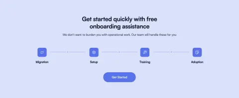
Steps: design guide
A SaaS steps section explains a process in a clear order. It helps visitors understand how they move from a starting point to a useful outcome, often before they enter the product. The strongest examples name meaningful actions, explain what each stage contributes, and avoid hiding important setup behind an overly simple numbered promise.
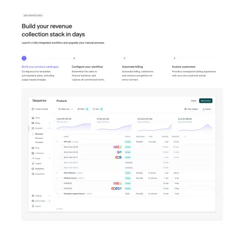
Sequence and Spendesk show two approaches: four stages paired with a product screenshot, and three concise stages connected by arrows. These are marketing explanations rather than evidence of a live progress tracker. The distinction matters because an informational sequence and an interactive task flow need different behavior.
Define the beginning, outcome, and scope
Start by naming the process the section explains. Is it initial setup, a repeated workflow, or a path from evaluation to use? Establish the starting conditions and the point at which the process produces something useful.
Choose stages at a consistent level. A list that mixes account creation, an entire implementation, and a single click can make the process look shorter without explaining it. Each stage should represent a meaningful action or phase that a visitor can understand.
Keep the scope explicit. If the section summarizes a larger process, say enough to establish that role and link to complete instructions where needed. A short overview can be useful without pretending that every requirement fits into three numbered items.
Pair stages with a relevant product view
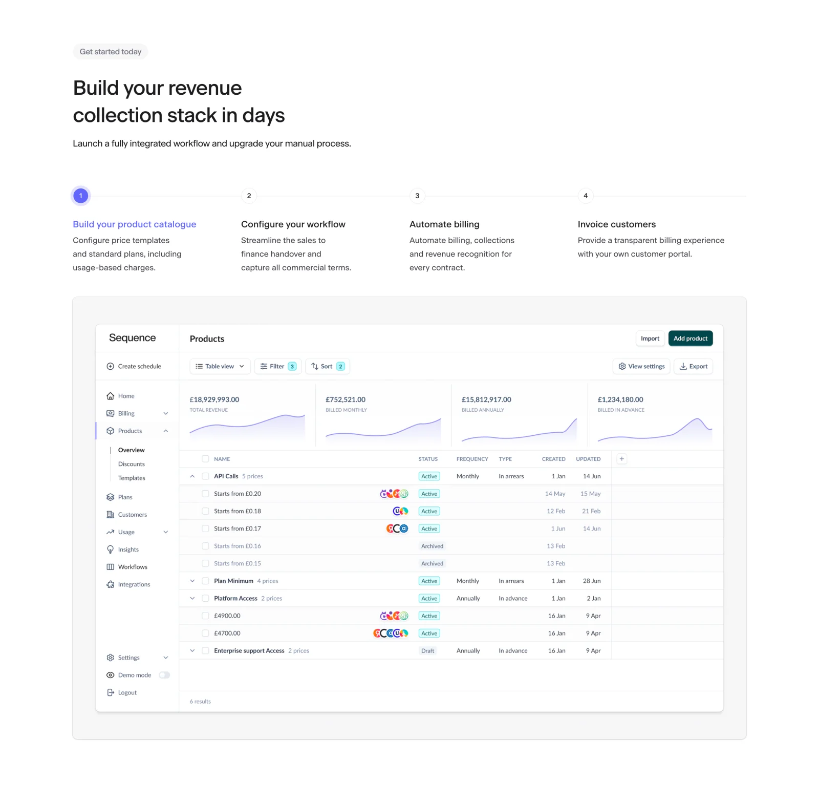
Sequence presents four stages: building a product catalog, configuring a workflow, automating billing, and invoicing customers. The first stage is visually emphasized, and the screenshot below shows a product catalog. That alignment connects the selected visual emphasis to a concrete product area.
The image helps the visitor understand what the first stage contains rather than leaving the action entirely abstract. A product view can make a process overview more tangible when it corresponds to the relevant stage.
The capture does not prove whether selecting another stage changes the screenshot. If your design uses interactive stage selection, define that behavior and test it. If the section is static, avoid cues that make the visitor expect a control that does not respond.
Use concise stages when the sequence itself is enough
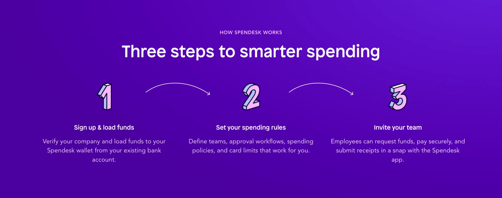
Spendesk uses three large numbers and arrows to establish order. Each stage has a title and a short explanation. The visible sequence moves from signup and initial funding to spending rules and team invitation.
The descriptions add important context: the first stage includes verification, the second names configuration, and the third explains what invited employees can do. These details make the process more informative than a simple Signup, Configure, Use list.
A concise sequence works when each stage can be summarized accurately. Do not copy the three-step shape if your process has additional dependencies that materially affect the visitor's effort. The number of stages should follow the explanation rather than a decorative component's fixed count.
Write each stage as a meaningful action
Use an action-oriented title that identifies what changes. Build a catalog, define rules, or invite a team gives the reader a concrete task. A vague label such as Experience the power does not explain a stage.
The supporting sentence should clarify the task's scope or contribution. It can name the information needed, the objects configured, or the result that enables the next stage. Avoid repeating the title without adding detail.
Keep titles parallel so visitors can scan the sequence. Similar grammar and length improve comparison, but do not remove meaningful distinctions merely to make every item fit one line. Long translated titles should remain readable in the final layout.
Show dependencies without oversimplifying them
A numbered sequence implies order. Use it when that order is real or useful for understanding. If stages can happen independently, a feature list or workflow diagram may be more accurate than a strict progression.
Explain important prerequisites in the relevant stage or linked detail. Verification, administrator access, an external account, or data preparation may affect whether someone can continue. A marketing summary can remain concise while making those dependencies discoverable.
Distinguish the visitor's actions from work the system or another team performs. A stage called Automate billing may include user configuration before automation begins. State the practical contribution so the reader does not infer that the product completes every task without input.
Separate informational steps from task progress
An explanatory steps section describes a process. A progress indicator tells a person where they are in an active task. They may share numbers and lines, but their meaning differs.
Do not use completed-state checkmarks or disabled-stage styling in a marketing overview unless the state is explicitly illustrative. Visitors should not believe the page is tracking their real progress when it is only describing a workflow.
If the section is part of an active setup, it needs current, complete, incomplete, and possibly error states tied to real task data. It also needs a defined navigation model and recovery. Those concerns belong to the task flow rather than a static page sequence.
Make stage interaction visible when offered
If a stage changes an illustration or explanation, use a recognizable selection control with an exposed state. Keep the selected stage and its panel associated. A visitor should understand what changed after activation.
Provide keyboard access and visible focus. Avoid relying on pointer hover to reveal essential content. For an auto-advancing demonstration, allow the reader to pause or use a stable presentation when motion is reduced.
Keep the information available if the interaction does not load. A sequence whose titles remain visible but whose descriptions disappear without JavaScript may fail to explain the process. Design the static content and enhanced behavior as a coherent experience.
Adapt the sequence to narrow screens
A horizontal row often becomes a vertical list on mobile. Preserve the intended order and keep each number, title, and description together. Connecting lines or arrows should remain secondary to the text.
Do not shrink several columns into a narrow row simply to retain the desktop composition. Readable descriptions are more valuable than maintaining a perfect horizontal line. If the sequence scrolls horizontally, make that behavior discoverable and ensure keyboard users can reach all content.
For a paired screenshot, review how the visual stacks with the stages. A large image should not separate the selected stage from its explanation. Crop or simplify interface detail when it becomes unreadable, and keep essential process information in page text.
Review the process for realistic understanding
Review the selected-stage styling as part of the explanation. Sequence's first stage uses color and a prominent marker, while Spendesk gives all three stages similar emphasis. The first model can focus attention on one example; the second can communicate the full sequence at once. Choose the hierarchy that matches the content, and do not use emphasis that implies completion or availability unless that state is real.
For a process involving several roles, name the handoff when it affects understanding. A configuration stage may belong to an administrator, while later use belongs to the wider team. The section can establish those responsibilities in concise descriptions. If every title addresses the same reader despite a role change, visitors may misunderstand what they personally need to do.
Keep timing claims tied to evidence. A headline that promises setup in days or minutes should reflect the actual scope and conditions. The numbered summary can support an approachable presentation, but it cannot establish how long the work takes.
- Is the process's beginning and outcome clear?
- Are stages at a consistent level of detail?
- Does the order reflect actual dependencies?
- Does each title name an action?
- Does each description add useful scope?
- Are important prerequisites discoverable?
- Is informational sequencing distinct from real task progress?
- Does any interactive stage have a clear state?
- Can the mobile sequence be read without horizontal compression?
- Does the next destination provide the promised continuation?
Ask visitors to explain what they would need to do first and what would happen afterward. Their answer reveals whether the section communicates actual effort or merely a reassuring number of steps. If they omit a prerequisite that affects setup, clarify the relevant stage or its supporting link.
Review the section when the product workflow changes. New verification, data preparation, or configuration requirements can make an old sequence inaccurate. Update the titles, descriptions, illustration, and destination together. A selected-stage image should not continue showing a removed interface simply because it matches the page's visual style.
Choose a next step that follows the explanation. A setup overview may lead to a trial or implementation guide; a repeated-workflow overview may lead to a relevant demo. Keep the action separate from the numbered stages if those stages are informational rather than clickable tasks.
Where the process branches, consider whether one linear sequence remains sufficient. A short note can acknowledge an alternate route, while a more complex choice may need separate sequences or a workflow explanation. Do not flatten a meaningful branch into a universal path that only fits some visitors.
Frequently asked questions about steps sections
Should a process always have three steps?
No. Use the number of meaningful stages needed to explain the process accurately. A short sequence is easy to scan, but important dependencies should not disappear merely to fit a familiar layout.
Should the stages be clickable?
Only when interaction provides useful detail or changes a relevant demonstration. Make that behavior visible and accessible. Informational stages can remain static when the sequence is already clear.
How is a steps section different from a progress indicator?
A steps section explains a process to a visitor. A progress indicator reflects the state of an active task. Keep those meanings distinct so illustrative styling does not imply real completion or current progress.
Explore SaaS steps section examples on SaaSFrame to compare stage labels, dependencies, paired screenshots, and responsive sequence layouts.