.webp)

Duna


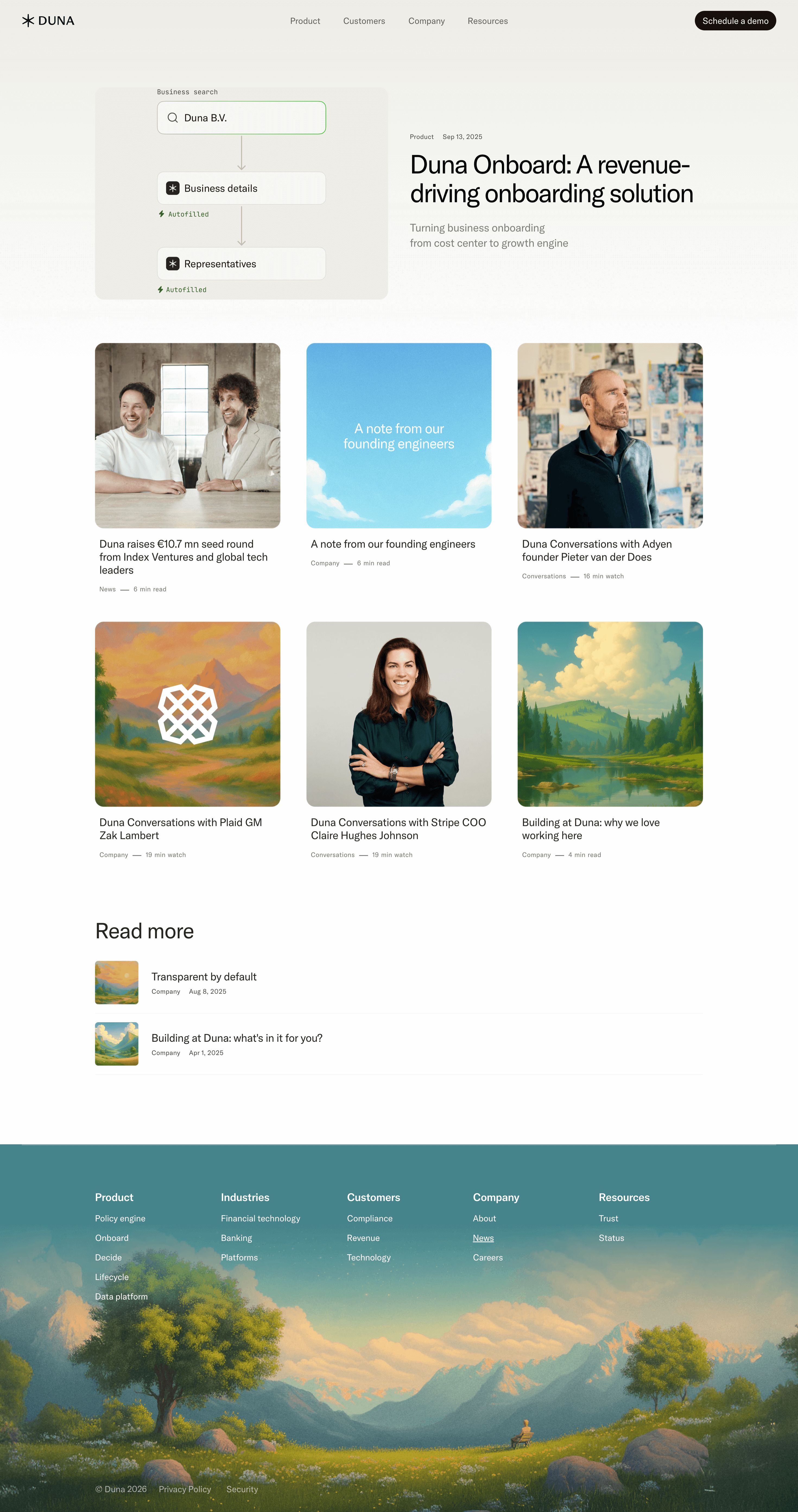


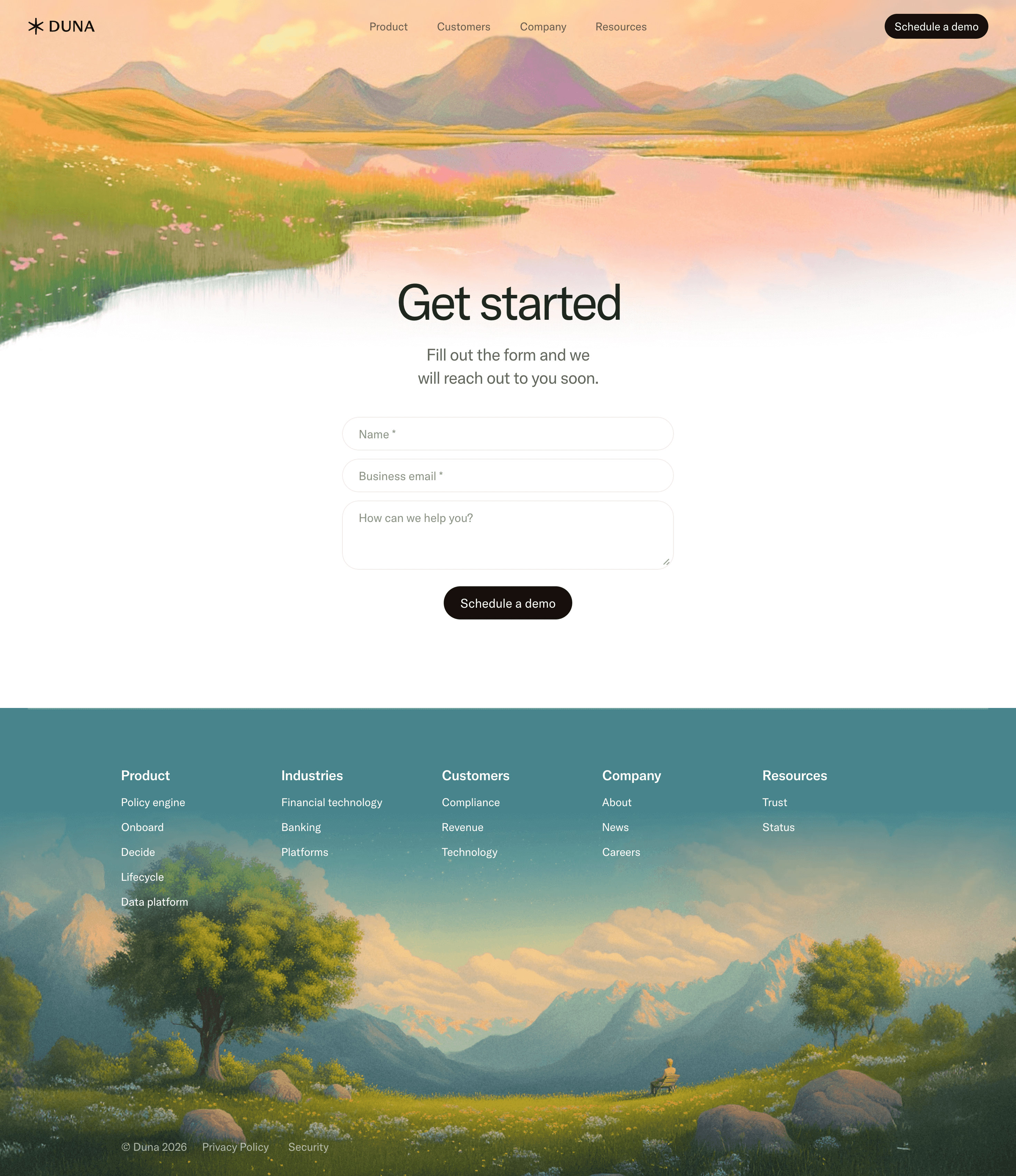
Duna Design System
Source & Stack
\- URL:
Typography \- Primary typeface: Inter (Framer default; geometric neo-grotesque) \- Heading scale: Display ~64–80px (hero), H2 ~40–48px (section), H3 ~24–28px (card titles) \- Body: 16–18px, line-height ~1.6 \- Weight range: 400 (body), 500 (nav/labels), 600–700 (headings) \- Letter-spacing: Tight on display headings (-0.02em), normal on body \- Style: Clean, editorial, no serifs — professional enterprise tone
Color Philosophy \- Dark-first brand: deep navy/near-black backgrounds signal trust and precision \- Single vivid accent (coral-orange or electric blue) for CTAs and highlights \- White and off-white for primary text on dark \- Muted grays for secondary text, borders, and dividers \- Minimal color use — authority through restraint
Spacing System \- Base unit: 8px grid \- Section padding: 96–120px vertical \- Card inner padding: 32–40px \- Component gaps: 16–24px \- Nav height: ~64px
Component Defaults \- Buttons: Rounded-pill primary (solid accent fill), ghost secondary (border only) \- Cards: Rounded corners (16–20px), subtle border or shadow, dark surface \- Nav: Transparent on scroll, sticky, logo left / links center / CTA right \- Stat callouts: Large display numbers (10.6x, 37%, 4.8x) with label below \- Testimonials: Quote card with avatar, name, title \- Feature tabs: Image carousel with tab selectors
Layout \- Max content width: ~1280px centered \- Full-bleed section backgrounds alternate dark/darker \- Hero: full-viewport-height, centered text, dual CTA \- Product sections: 2-column (text left, visual right) or centered with card grid \- Footer: 5-column link grid above copyright bar
:root { / === COLORS === / --color-bg-primary: #0A0B0F; / near-black site background / --color-bg-secondary: #111318; / section alternate background / --color-bg-card: #16191F; / card/panel surface / --color-bg-overlay: #1C2028; / modals, popovers /
--color-text-primary: #FFFFFF; / primary headings & body on dark / --color-text-secondary: #9BA3AF; / secondary / muted text / --color-text-tertiary: #6B7280; / captions, labels /
--color-accent: #FF5C35; / primary CTA / highlight (coral-orange) / --color-accent-hover: #FF7A56; / CTA hover state / --color-accent-subtle: rgba(255, 92, 53, 0.12); / tinted backgrounds /
--color-border: rgba(255, 255, 255, 0.08); / card/divider borders / --color-border-strong: rgba(255, 255, 255, 0.16); / focus rings, separators /
--color-success: #22C55E; --color-warning: #F59E0B; --color-error: #EF4444;
/ === TYPOGRAPHY === / --font-family-base: 'Inter', -apple-system, BlinkMacSystemFont, sans-serif; --font-size-xs: 12px; --font-size-sm: 14px; --font-size-base: 16px; --font-size-lg: 18px; --font-size-xl: 20px; --font-size-2xl: 24px; --font-size-3xl: 32px; --font-size-4xl: 40px; --font-size-5xl: 56px; --font-size-6xl: 72px;
--font-weight-regular: 400; --font-weight-medium: 500; --font-weight-semibold: 600; --font-weight-bold: 700;
--line-height-tight: 1.2; --line-height-snug: 1.4; --line-height-normal: 1.6; --line-height-relaxed: 1.75;
--letter-spacing-tight: -0.02em; --letter-spacing-normal: 0em; --letter-spacing-wide: 0.04em;
/ === SPACING === / --space-1: 4px; --space-2: 8px; --space-3: 12px; --space-4: 16px; --space-5: 20px; --space-6: 24px; --space-8: 32px; --space-10: 40px; --space-12: 48px; --space-16: 64px; --space-20: 80px; --space-24: 96px; --space-32: 128px;
/ === BORDER RADIUS === / --radius-sm: 6px; --radius-md: 10px; --radius-lg: 16px; --radius-xl: 20px; --radius-2xl: 28px; --radius-full: 9999px;
/ === SHADOWS === / --shadow-sm: 0 1px 3px rgba(0, 0, 0, 0.4); --shadow-md: 0 4px 16px rgba(0, 0, 0, 0.5); --shadow-lg: 0 12px 40px rgba(0, 0, 0, 0.6); --shadow-glow: 0 0 32px rgba(255, 92, 53, 0.2);
/ === LAYOUT === / --max-width-content: 1280px; --max-width-text: 720px; --nav-height: 64px; --section-padding-y: 96px; --card-padding: 32px;
/ === ANIMATION === / --duration-fast: 150ms; --duration-base: 250ms; --duration-slow: 400ms; --easing-default: cubic-bezier(0.16, 1, 0.3, 1); }
Design Tokens — Duna (duna.com)
Color Tokens
| Token | Value | Usage |
|---|---|---|
| color-bg-primary | #0A0B0F | Main site background |
| color-bg-secondary | #111318 | Alternate section backgrounds |
| color-bg-card | #16191F | Card / panel surfaces |
| color-bg-overlay | #1C2028 | Modals, drawers |
| color-text-primary | #FFFFFF | Headings and body text |
| color-text-secondary | #9BA3AF | Supporting / muted text |
| color-text-tertiary | #6B7280 | Captions, metadata |
| color-accent | #FF5C35 | Primary CTA, highlights |
| color-accent-hover | #FF7A56 | Hover state for accent |
| color-accent-subtle | rgba(255,92,53,0.12) | Accent-tinted backgrounds |
| color-border | rgba(255,255,255,0.08) | Card borders, dividers |
| color-border-strong | rgba(255,255,255,0.16) | Focus rings, separators |
| color-success | #22C55E | Status positive |
| color-warning | #F59E0B | Status caution |
| color-error | #EF4444 | Status error |
Spacing Tokens
| Token | Value | Usage |
|---|---|---|
| space-1 | 4px | Micro gap |
| space-2 | 8px | Base unit / tight gap |
| space-3 | 12px | Compact padding |
| space-4 | 16px | Default gap |
| space-6 | 24px | Card inner gap |
| space-8 | 32px | Card padding |
| space-10 | 40px | Component separation |
| space-12 | 48px | Large component gap |
| space-16 | 64px | Nav height / large gap |
| space-20 | 80px | Section sub-padding |
| space-24 | 96px | Section vertical padding |
| space-32 | 128px | Hero vertical padding |
Typography Tokens
| Token | Value | Usage |
|---|---|---|
| font-family-base | Inter, system-ui | All text |
| font-size-xs | 12px | Labels, badges |
| font-size-sm | 14px | Nav, captions |
| font-size-base | 16px | Body copy |
| font-size-lg | 18px | Lead paragraphs |
| font-size-2xl | 24px | H3 / card titles |
| font-size-3xl | 32px | H2 subsection |
| font-size-4xl | 40px | H2 section |
| font-size-5xl | 56px | H1 / hero sub |
| font-size-6xl | 72px | Hero display |
| font-weight-regular | 400 | Body |
| font-weight-medium | 500 | Nav, labels |
| font-weight-semibold | 600 | Subheadings |
| font-weight-bold | 700 | Display headings |
| line-height-tight | 1.2 | Large headings |
| line-height-normal | 1.6 | Body text |
| letter-spacing-tight | -0.02em | Display headings |
Border Radius Tokens
| Token | Value | Usage |
|---|---|---|
| radius-sm | 6px | Small badges, tags |
| radius-md | 10px | Inputs, small cards |
| radius-lg | 16px | Main cards |
| radius-xl | 20px | Feature panels |
| radius-2xl | 28px | Large hero cards |
| radius-full | 9999px | Pill buttons, avatars |
Shadow Tokens
| Token | Value | Usage |
|---|---|---|
| shadow-sm | 0 1px 3px rgba(0,0,0,0.4) | Subtle lift |
| shadow-md | 0 4px 16px rgba(0,0,0,0.5) | Cards |
| shadow-lg | 0 12px 40px rgba(0,0,0,0.6) | Modals, dropdowns |
| shadow-glow | 0 0 32px rgba(255,92,53,0.2) | Accent element glow |
Design Notes — Duna (duna.com)
Framework \- Site builder: Framer (confirmed via meta-generator: Framer 17c1b93) \- Site ID: vldRfJZRU2NbTzF0aDyyS \- Deployment: Framer hosting via framerusercontent.com CDN \- No custom CSS framework (Tailwind/Bootstrap not detected); Framer generates scoped styles \- Fonts: Likely loaded via Framer's built-in font system (Inter is Framer's default sans-serif)
Theme Support \- Mode: Dark-only marketing site — no light/dark toggle detected \- Dark-first: All visible content and OG images confirm dark navy/black backgrounds \- No prefers-color-scheme media query expected given single-mode design
Data Source Confidence \- Confidence level: Medium-High (75%) \- Source: Live HTML fetch of homepage + product page via web\_fetch \- Color values inferred from OG image tone, visual brand identity (enterprise fintech = dark, restrained palette), and Framer conventions \- Chrome extension unavailable for live JS/CSS extraction; no raw stylesheet URLs resolved \- Exact hex values for accent color and background may vary ±1 shade from real implementation \- Font stack confirmed as Inter-class based on Framer default + brand category
Notable Patterns \- Stat callouts: Large display numbers (10.6x, 37%, 4.8x) used as conversion evidence — typeset at display scale with subdued labels \- Product tab carousels: Feature sections use image carousel with tab selectors (Onboard, Decide, Lifecycle, Data Platform) \- Pill CTA buttons: 'Get started' and 'Schedule a demo' in nav/hero suggest border-radius: 9999px buttons \- Testimonial pattern: Quote card + circular avatar + name/title — used for social proof (Stripe COO, Moss CEO) \- Logo strip: Horizontal scrolling marquee of partner/customer logos \- Section labeling: Small uppercase category label (e.g., 'Artificial Intelligence', 'Onboard') above H2 — breadcrumb-style section entry point \- Footer: 5-column link grid, copyright with year, privacy/security links \- Image assets: All product screenshots served via framerusercontent.com CDN at 1x/2x/3x \- AI summary CTA: Unique pattern — footer includes links to ask Claude/ChatGPT/Gemini to summarize the site
Biggest SaaS library.


.webp)


.webp)

Desktop & mobile versions.


Access the Figma files.


Advanced filtering.
Let it flow.





Save design inspirations.
research




How do you process payment?
SaaSFrame subscriptions are sold on Lemon Squeezy, a secured online selling platform for creators.
What about future updates and versions?
SaaSFrame gets updated all the time! Every new update and version will immediately be made available to all SaaSFrame users.
Can you send me an invoice?
You can generate an invoice on your Lemon Squeezy portal once you purchased SaaSFrame. You will find the link in the order confirmation email.
How can I cancel my membership subscription?
You can cancel your membership subscription at any moment on your profile page.
Can I get a refund?
If you're not satisfied, you can ask for a refund within 7 days. Just send me an email at antoine[at]unmake[dot]io
I have another question.
You can send me an email at antoine[at]unmake[dot]io, I'll be happy to help with any questions.