
Thank you! Your submission has been received!
Oops! Something went wrong while submitting the form.
Get SaaSFrame Pro
Monthly
$18
Quarterly
$48
Yearly
$180
Upgrade to access this feature
Browse all screens & flows
Filter and search screens & flows
Access Figma files
Access mobile versions
Bookmark screens & flows
Join now
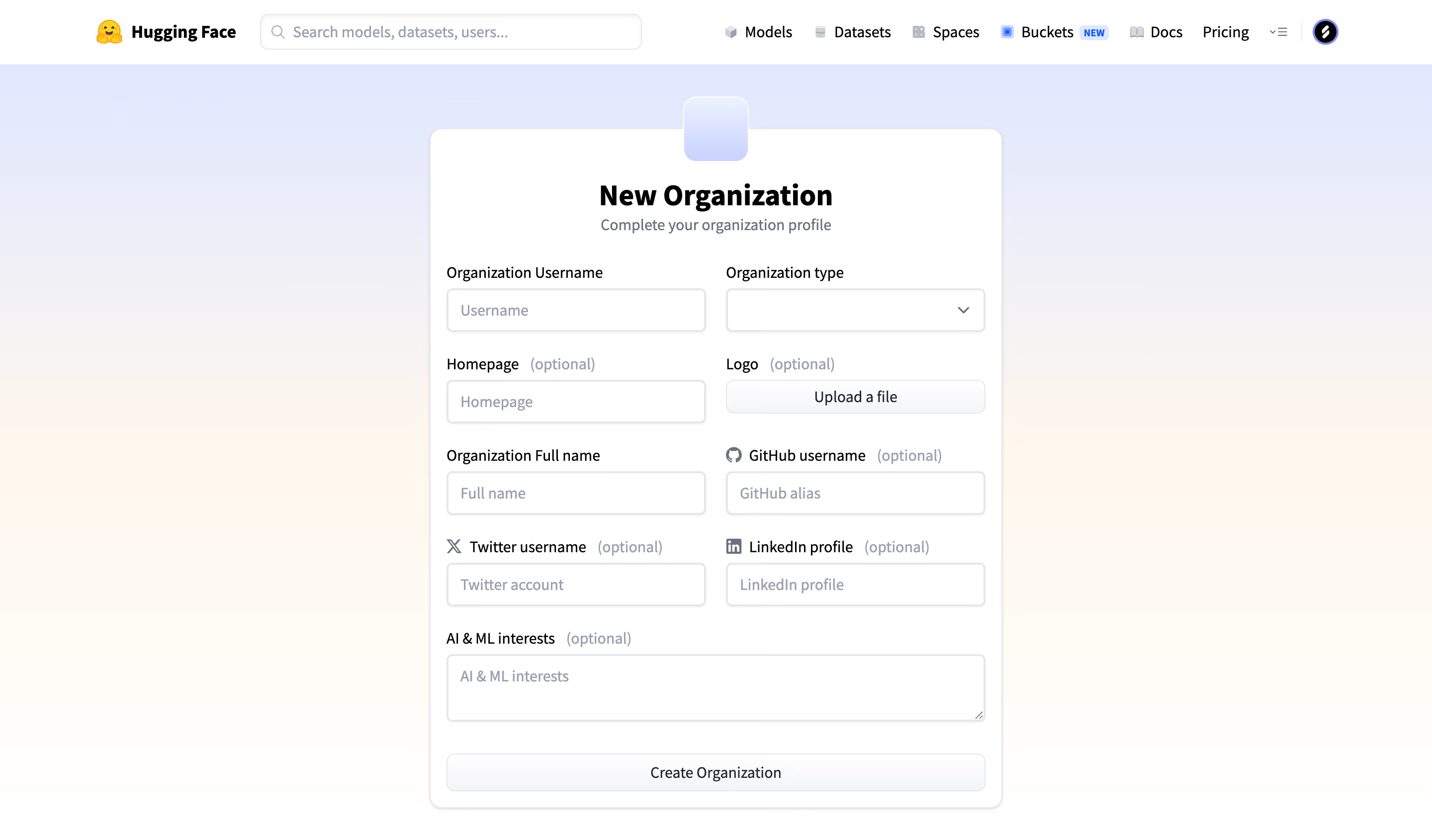
Hugging Face Create an organization

Hugging Face
The AI community building the future
Designed by
No items found.

Bookmark
Bookmark

Design with AI
Thank you! Your submission has been received!
Oops! Something went wrong while submitting the form.
# Design from Reference: Hugging Face Create an organization
Create an original, high-fidelity visual design inspired by the reference. Prioritize composition, typography, colors, spacing, and component styling over technical implementation.
## Reference
- **Product:** Hugging Face
- **Category:** Add & Edit
- **Screenshot:** https://cdn.prod.website-files.com/5e9dc792e1210c5325f7ebbc/6acad09051f927271bf81da7_6acad023ea3fca0cd7326562_cms-4012b15b67fa07685cbe81b9.webp
Analyze the screenshot first. If inaccessible, request it rather than guessing.
## Content
{{content.instructions}}
{{content.data}}
Preserve essential messaging and factual accuracy. Adapt structure and copy length for visual balance; never invent product claims.
## Visual Design
### Overall aesthetic
- **Style:** Centered organization-profile form over a soft lavender-to-cream background.
- **Character:** White raised card, compact black headings, conventional outlined fields, muted optional labels, and neutral actions.
- **Decoration:** Small pale-lavender square overlaps the card’s top edge; the page otherwise relies on restrained form geometry.
### Page composition
- **Capture and scale:** 2880 × 1690 image px. CSS estimates assume a 2× capture, approximately 1440 × 845 CSS px; scale is unverified.
- **Global header:** Brand and search left, product/documentation/pricing navigation right, with compact account/menu utilities.
- **Form card:** Approximately 576px wide, centered beneath the header, with rounded corners and subtle shadow.
- **Intro:** Centered New Organization heading and profile-completion subtitle.
- **Field grid:** Two columns for username/type, homepage/logo upload, full name/GitHub, and Twitter/LinkedIn.
- **Final fields:** Full-width AI/ML interests textarea, then full-width Create Organization action.
- **State:** All inputs are empty; no dropdown, upload, or creation result is shown.
### Information hierarchy
- **Task heading:** Bold central title identifies organization creation.
- **Field importance:** Optional annotations are gray and subordinate to black field labels.
- **Identity first:** Organization username/type and full name establish the profile, with web/social fields as supporting metadata.
- **Final action:** Broad neutral button spans the bottom of the form.
- **Global context:** Header search and product navigation remain separate from the profile task.
### Typography
- **Family:** Neutral sans serif; exact identity is unverified.
- **Title:** Approximately 28px bold with 34px line-height.
- **Subtitle:** Approximately 16px regular in slate gray.
- **Labels / input:** Approximately 14–16px, with optional markers in lighter gray.
- **Action labels:** Approximately 14–16px medium.
- **Header:** Approximately 14px medium/semibold.
- **Precision:** CSS sizes and weights are visual estimates.
### Colors & surfaces
- **Card / fields:** Sampled #FFFFFF.
- **Warm background tones:** Sampled #FFF8EE, #FFF9F0, #FFFAF3, and #FFFAF2.
- **Near-white transition:** Sampled #FFFDF9 and #FFFEFC.
- **Upper gradient:** Pale lavender/blue transitions into warm cream below.
- **Text roles:** Black title/labels, slate secondary text, and blue-gray placeholders/optional markers.
- **Boundaries:** Pale-gray outlines and subtle shadows distinguish fields and card.
- **Sampling:** Listed colors describe measured gradient pixels, not verified CSS stop values.
### Components
- **Card shell:** Approximately 576 × 684px, 12px radius, thin pale outline, and soft shadow.
- **Top tile:** Approximately 64px square with rounded corners, pale-lavender gradient, and white outline.
- **Two-column fields:** Approximately 260px each with about 20px gap.
- **Text inputs / selector:** Approximately 44px high, white fill, thin gray border, 5–6px radius, and subtle inset/outer shadow.
- **Type selector:** Right chevron with no visible options.
- **Upload control:** Neutral pale button in the logo position, approximately 34px high.
- **Social labels:** Small service icons precede GitHub, Twitter, and LinkedIn labels.
- **Interests textarea:** Full-width outlined field approximately 66px high with resize grip.
- **Creation action:** Full-width pale neutral rectangle around 38px high with thin outline and rounded corners.
- **State limits:** No validation, selected organization type, uploaded file, or created organization is visible.
### Visual rhythm
- **Grid consistency:** Paired fields align labels and control heights across four rows.
- **Vertical spacing:** Approximately 24–28px separates field groups.
- **Intro spacing:** Heading/subtitle form a compact centered block above the left-aligned fields.
- **Width transition:** Two-column details give way to full-width textarea and action, creating a clear finish.
### Responsive
- **Observed state:** Desktop only; mobile behavior is unverified.
- **Grid recommendation:** Stack field pairs on narrow screens while retaining label/control association.
- **Card recommendation:** Use fluid width with 16–24px viewport gutters.
- **Header recommendation:** Collapse secondary navigation and keep search/account access usable.
- **Form recommendation:** Preserve readable optional annotations and adequate touch targets.
### Adaptation guidance
- **Preserve:** Centered profile card, explicit optional fields, calm gradient background, and consistent two-column form.
- **Starting geometry:** Approximately 576px card, 260px fields, 20px column gap, 44px controls, and 12px card radius under the unverified 2× assumption.
- **Content fidelity:** Define actual required fields and organization types from product requirements.
- **Implementation recommendation:** Provide accessible upload/select controls, validation, focus, and clear creation feedback.
- **State fidelity:** Do not infer permissions, saved data, or successful organization creation from the empty form.
Use this context to reproduce the reference's visual language: layout, typography, colors, spacing, borders, radii, and distinctive elements. The screenshot takes priority if descriptions conflict.
## Direction
{{preferences.fidelityInstructions}}
## Output
{{output.instructions}}
Deliver a polished, cohesive design with precise alignment, hierarchy, and spacing. Produce the requested visual artifact, not just a description. If unsupported, explain the limitation.


Category
Patterns
Tech Stack

Added on
September 21, 2026
Similar screens





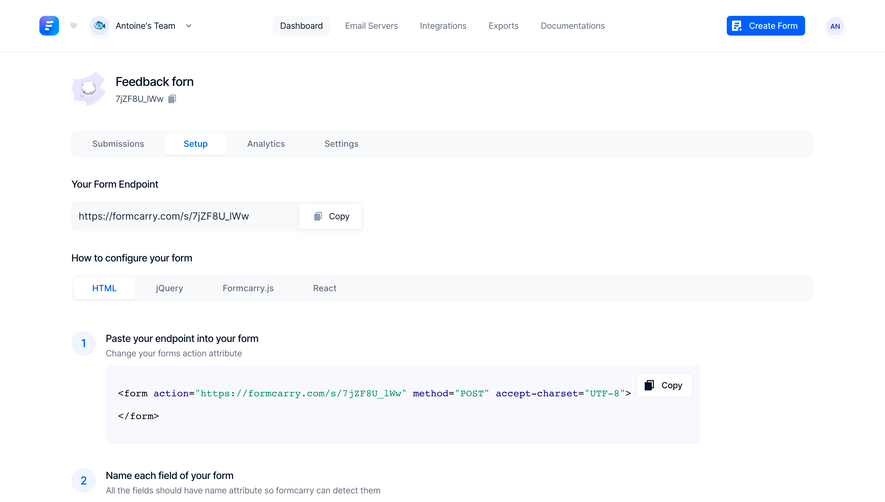

Upgrade to SaaSFrame Pro now to see similar examples.
Monthly
$18 /month
Billed $18 monthly
Browse all screens & flows
Filter and search screens & flows
Search text in screenshots
Access Figma files
Access mobile versions
Join now
Quarterly
$16 /month
Billed $48 quarterly
Browse all screens & flows
Filter and search screens & flows
Search text in screenshots
Access Figma files
Access mobile versions
Join now
Yearly
$15 /month
Billed $180 yearly
Browse all screens & flows
Filter and search screens & flows
Search text in screenshots
Access Figma files
Access mobile versions
Join now