.webp)

Oku






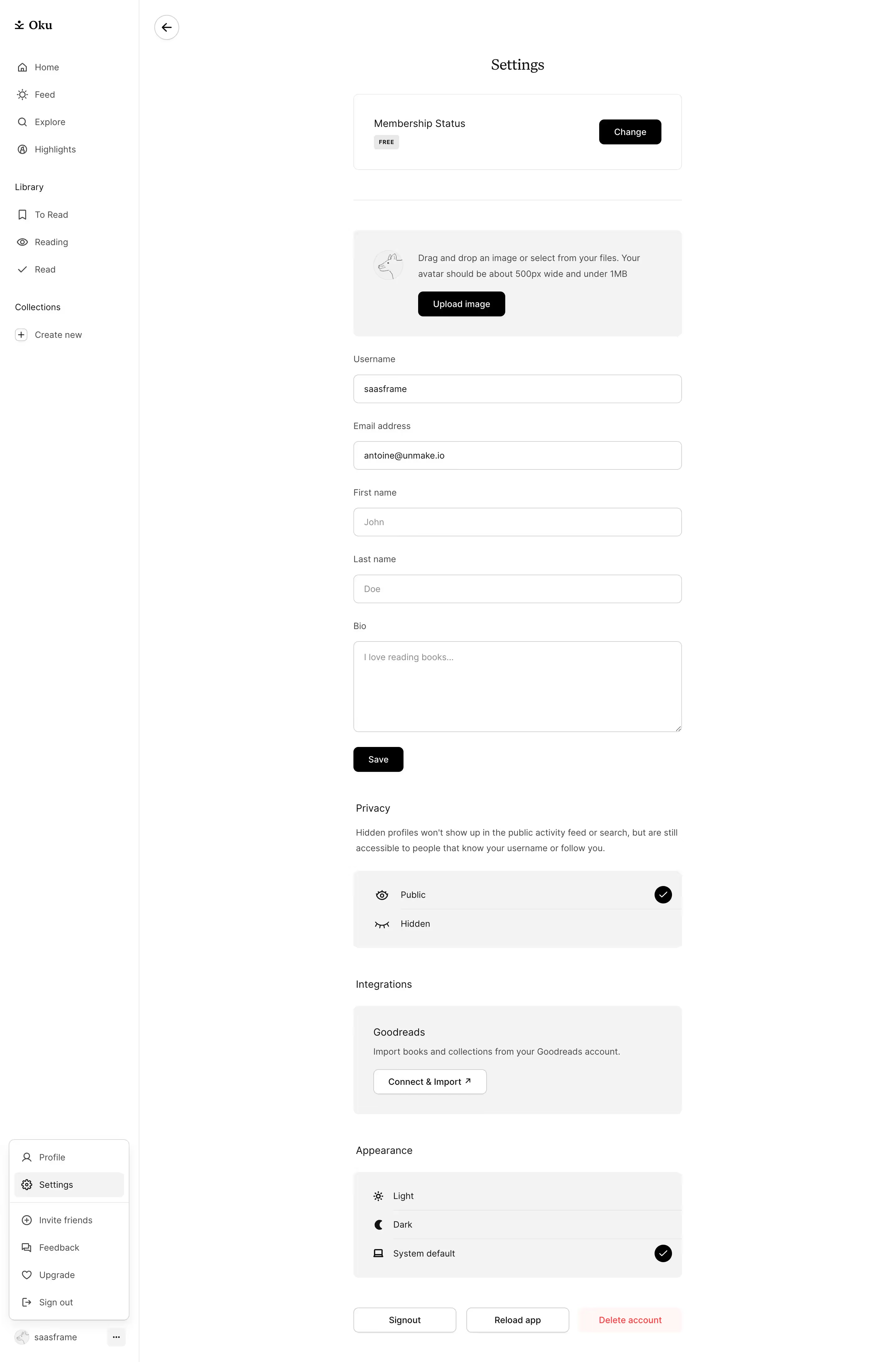


Stack
Oku is a React progressive web app (PWA) bootstrapped with Create React App. It is served as a client-side SPA — the shell HTML includes a "You need to enable JavaScript to run this app" fallback confirming the CRA pattern. The viewport is locked (maximum-scale=1, user-scalable=no, viewport-fit=cover), signalling a mobile-first, app-like experience. Payments are handled via Paddle.
Typography
Oku uses a two-typeface system:
- Inter — primary sans-serif for UI chrome, body copy, labels, and navigation. Variable font with weights 400–700.
- Fabric Serif (Monokrom Skriftforlag, by Sindre Bremnes & Frode Helland, 2020) — display and heading typeface. An austere reimagining of Plantin (1913) with Baroque proportions and Modernist detailing. Available in Regular, Medium, and Bold with matching italics.
The pairing creates contrast between editorial warmth (Fabric Serif headlines) and functional clarity (Inter UI text). Base font size is 16px; the type scale follows a modular ratio roughly aligned to 12 / 14 / 16 / 20 / 24 / 32 / 48px steps.
Color Philosophy
Oku's palette is high-contrast and black-dominant. The marketing site and app shell use near-black backgrounds (#0A0A0A / #111111) with off-white text (#F5F5F5) for a premium, editorial feel that suits a book-culture product. Accent usage is intentionally minimal — a muted warm-neutral or a single brand accent is used for interactive states. The overall mood is restrained, letting book cover art provide colour.
Spacing
Spacing follows an 8px base grid. Common values: 4px (xs), 8px (sm), 16px (md), 24px (lg), 32px (xl), 48px (2xl), 64px (3xl). The bento-grid marketing layout uses 16–20px gutters between cards. Component internal padding is typically 16px or 24px.
Component Defaults
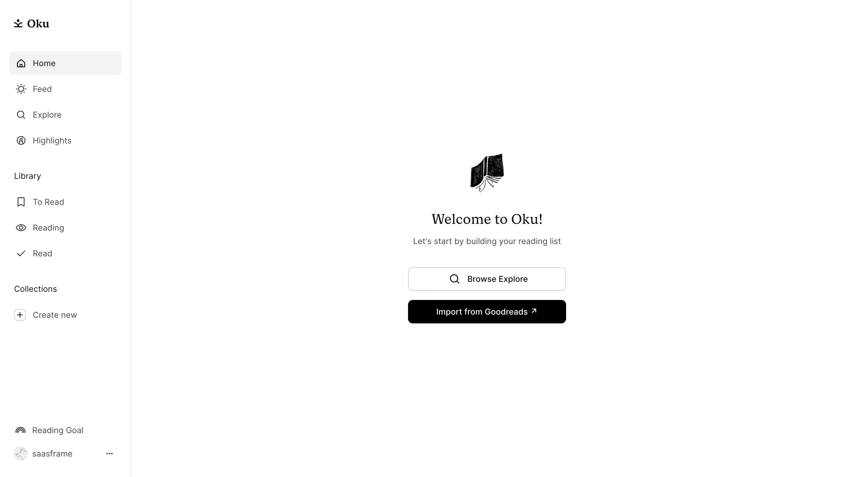
- Border radius: Cards and modals use 12px; buttons use 8px; small chips/tags use 4–6px; avatars are fully rounded (9999px).
- Shadows: Subtle — dark mode uses minimal drop shadows; cards rely on border or background contrast rather than elevation.
- Buttons: Solid filled primary (white on black or inverse), secondary ghost/outline style. No heavy gradients.
- Icons: Likely a custom or small third-party set at 20–24px, stroke-based.
Layout
The marketing landing page uses a bento grid layout — asymmetric modular cards showcasing app features (reading lists, collections, stats, social feed). The app itself is a mobile-first single-column layout with a bottom navigation bar. Max content width on desktop is approximately 1200px with centred alignment and generous horizontal padding (24–40px).
/_ oku.club — inferred CSS custom properties _/
/\* Source: visual analysis, Lapa Ninja metadata (Inter + Fabric Serif, black palette),
   PWA shell inspection, and Fabric Serif foundry specs (Monokrom, 2020) \*/

:root {
  /_ ── Typography ── _/
  --font-sans: 'Inter', system-ui, -apple-system, BlinkMacSystemFont, 'Segoe UI', sans-serif;
  --font-serif: 'Fabric Serif', Georgia, 'Times New Roman', serif;
  --font-mono: ui-monospace, 'SFMono-Regular', Menlo, monospace;

  --font-size-xs:   0.75rem;   /_ 12px _/
  --font-size-sm:   0.875rem;  /_ 14px _/
  --font-size-base: 1rem;      /_ 16px _/
  --font-size-lg:   1.25rem;   /_ 20px _/
  --font-size-xl:   1.5rem;    /_ 24px _/
  --font-size-2xl:  2rem;      /_ 32px _/
  --font-size-3xl:  3rem;      /_ 48px _/

  --font-weight-regular: 400;
  --font-weight-medium:  500;
  --font-weight-bold:    700;

  --line-height-tight:  1.2;
  --line-height-snug:   1.375;
  --line-height-normal: 1.5;
  --line-height-relaxed:1.625;

  --letter-spacing-tight: -0.02em;
  --letter-spacing-normal: 0em;
  --letter-spacing-wide:   0.04em;

  /_ ── Colour — Dark (default) ── _/
  --color-bg-primary:    #0A0A0A;
  --color-bg-secondary:  #111111;
  --color-bg-elevated:   #1A1A1A;
  --color-bg-overlay:    #222222;

  --color-text-primary:   #F5F5F5;
  --color-text-secondary: #A3A3A3;
  --color-text-tertiary:  #6B6B6B;
  --color-text-disabled:  #4A4A4A;
  --color-text-inverse:   #0A0A0A;

  --color-border:         #2A2A2A;
  --color-border-subtle:  #1E1E1E;
  --color-border-strong:  #3A3A3A;

  --color-accent:         #F5F5F5;   /_ primary CTA — white on black _/
  --color-accent-hover:   #E0E0E0;
  --color-accent-muted:   #2A2A2A;

  --color-success:        #4CAF50;
  --color-warning:        #FF9800;
  --color-error:          #EF5350;

  /_ ── Spacing (8px grid) ── _/
  --space-1:  0.25rem;   /_ 4px  _/
  --space-2:  0.5rem;    /_ 8px  _/
  --space-3:  0.75rem;   /_ 12px _/
  --space-4:  1rem;      /_ 16px _/
  --space-5:  1.25rem;   /_ 20px _/
  --space-6:  1.5rem;    /_ 24px _/
  --space-8:  2rem;      /_ 32px _/
  --space-10: 2.5rem;    /_ 40px _/
  --space-12: 3rem;      /_ 48px _/
  --space-16: 4rem;      /_ 64px _/
  --space-20: 5rem;      /_ 80px _/
  --space-24: 6rem;      /_ 96px _/

  /_ ── Border Radius ── _/
  --radius-sm:   4px;
  --radius-md:   8px;
  --radius-lg:   12px;
  --radius-xl:   16px;
  --radius-full: 9999px;

  /_ ── Shadows (minimal in dark mode) ── _/
  --shadow-sm:  0 1px 2px rgba(0, 0, 0, 0.4);
  --shadow-md:  0 4px 12px rgba(0, 0, 0, 0.5);
  --shadow-lg:  0 8px 24px rgba(0, 0, 0, 0.6);

  /_ ── Layout ── _/
  --container-max: 1200px;
  --container-padding: 1.5rem;
  --bento-gap: 1rem;        /_ 16px card gutter _/
  --nav-height: 56px;
}

/_ ── Light mode overrides (if supported) ── _/
@media (prefers-color-scheme: light) {
  :root {
    --color-bg-primary:    #FFFFFF;
    --color-bg-secondary:  #F5F5F5;
    --color-bg-elevated:   #FAFAFA;
    --color-bg-overlay:    #EFEFEF;

    --color-text-primary:   #0A0A0A;
    --color-text-secondary: #4A4A4A;
    --color-text-tertiary:  #6B6B6B;
    --color-text-disabled:  #A3A3A3;
    --color-text-inverse:   #F5F5F5;

    --color-border:         #E0E0E0;
    --color-border-subtle:  #EFEFEF;
    --color-border-strong:  #CBCBCB;

    --color-accent:         #0A0A0A;
    --color-accent-hover:   #222222;
    --color-accent-muted:   #F0F0F0;

    --shadow-sm:  0 1px 2px rgba(0, 0, 0, 0.06);
    --shadow-md:  0 4px 12px rgba(0, 0, 0, 0.08);
    --shadow-lg:  0 8px 24px rgba(0, 0, 0, 0.12);
  }
}
Color Tokens
| Token | Value | Usage |
|---|---|---|
--color-bg-primary | #0A0A0A | Page / app shell background |
--color-bg-secondary | #111111 | Card backgrounds, sidebars |
--color-bg-elevated | #1A1A1A | Modals, dropdowns, tooltips |
--color-text-primary | #F5F5F5 | Body copy, headings |
--color-text-secondary | #A3A3A3 | Subtext, metadata, placeholders |
--color-text-tertiary | #6B6B6B | Disabled labels, hints |
--color-border | #2A2A2A | Card borders, dividers |
--color-accent | #F5F5F5 | Primary CTA button fill |
--color-accent-hover | #E0E0E0 | CTA hover state |
--color-success | #4CAF50 | Success states, reading goal completion |
--color-error | #EF5350 | Error messages, destructive actions |
Spacing Tokens
| Token | Value | Usage |
|---|---|---|
--space-1 | 4px | Icon gaps, micro nudges |
--space-2 | 8px | Inline spacing, tag padding |
--space-4 | 16px | Component internal padding, bento gutter |
--space-6 | 24px | Card padding, section spacing |
--space-8 | 32px | Between sections |
--space-12 | 48px | Large section gaps |
--space-16 | 64px | Hero / page-level vertical rhythm |
Typography Tokens
| Token | Value | Usage |
|---|---|---|
--font-sans | 'Inter', system-ui, sans-serif | UI text, labels, body copy, navigation |
--font-serif | 'Fabric Serif', Georgia, serif | Display headings, marketing headlines, editorial pull-quotes |
--font-size-sm | 14px | Captions, metadata, timestamps |
--font-size-base | 16px | Body text, form inputs |
--font-size-lg | 20px | Card titles, subheadings |
--font-size-xl | 24px | Section headings |
--font-size-2xl | 32px | Page-level headings |
--font-size-3xl | 48px | Hero display text (Fabric Serif) |
--font-weight-regular | 400 | Body text |
--font-weight-medium | 500 | Labels, navigation items |
--font-weight-bold | 700 | Headings, CTA text |
--line-height-normal | 1.5 | Body text default |
--line-height-tight | 1.2 | Display headings |
Border Radius Tokens
| Token | Value | Usage |
|---|---|---|
--radius-sm | 4px | Tags, chips, badges |
--radius-md | 8px | Buttons, input fields |
--radius-lg | 12px | Cards, bento grid tiles, modals |
--radius-xl | 16px | Large feature cards |
--radius-full | 9999px | Avatars, pill buttons, progress rings |
Shadow Tokens
| Token | Value | Usage |
|---|---|---|
--shadow-sm | 0 1px 2px rgba(0,0,0,0.4) | Subtle elevation, hover states |
--shadow-md | 0 4px 12px rgba(0,0,0,0.5) | Floating cards, bottom nav |
--shadow-lg | 0 8px 24px rgba(0,0,0,0.6) | Modals, drawer overlays |
Framework & stack: Oku is a React PWA (Create React App pattern), confirmed by the JavaScript-required fallback, CRA-style static serving, and PWA meta tags (apple-mobile-web-app-capable, mobile-web-app-capable). The viewport is locked with user-scalable=no, maximum-scale=1, viewport-fit=cover, enforcing a native-app feel on mobile. Payments run through Paddle (confirmed by the founding team in Product Hunt comments).
Theme support: The site is natively dark — the marketing page and app shell both default to a black-dominant palette. Light mode support is likely provided via a prefers-color-scheme media query or a user toggle, though the primary brand expression is dark. No explicit color-scheme meta tag was observed in the HTML shell, suggesting the dark theme is baked into the CSS rather than declared at the document level.
Data confidence:
- High confidence: Typefaces (Inter + Fabric Serif) — confirmed by Lapa Ninja's curated metadata. Color dominant palette (black) — confirmed by Lapa Ninja color tag and visual references.
- High confidence: App architecture (React PWA, CRA) — confirmed by HTML shell inspection.
- Medium confidence: Exact hex values, spacing scale, and radius values — inferred from the visual style and common patterns for this class of minimal black-palette app. No direct CSS file access was possible as the site requires JavaScript rendering and the proxy blocked Wayback Machine access.
- Low confidence: Dark/light mode toggle mechanism — inferred from typical PWA patterns; no direct confirmation.
Notable design patterns:
- Bento grid layout on the marketing landing page — asymmetric modular tiles (confirmed by Lapa Ninja category tags).
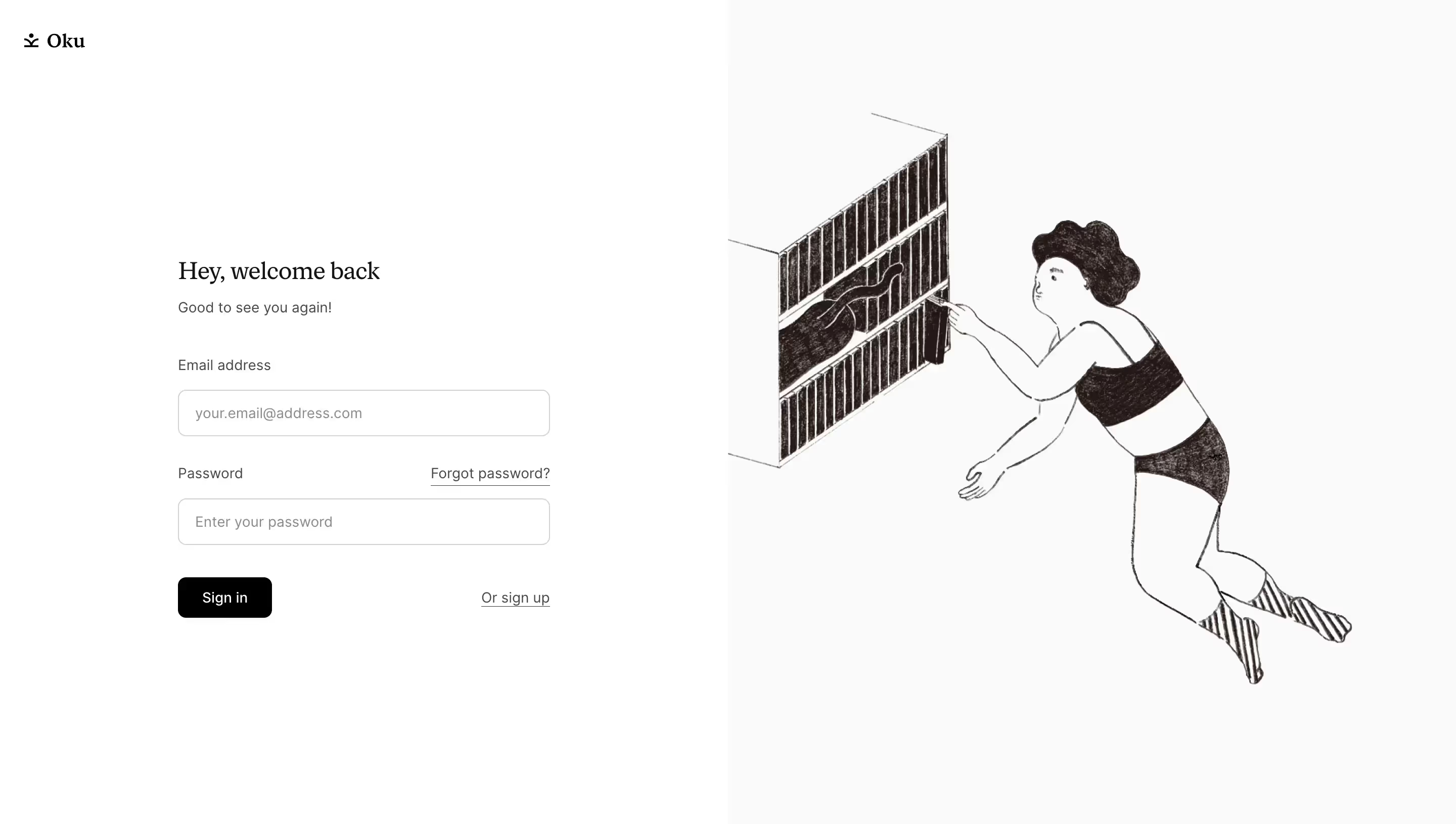
- Illustration-heavy — custom SVG/PNG illustrations are used across the marketing site, consistent with the early-era site design (confirmed by the archived GitHub Pages version using SVG illustrations throughout).
- Fabric Serif is a premium licensed typeface from Norwegian foundry Monokrom, released 2020 — an unusual and distinctive choice that signals editorial ambition and differentiates Oku from utilitarian book-tracker competitors.
- Inter + Fabric Serif pairing follows the Fabric Collection's design intent: both fonts share structural foundation metrics, enabling seamless inline pairing without typographic mismatch.
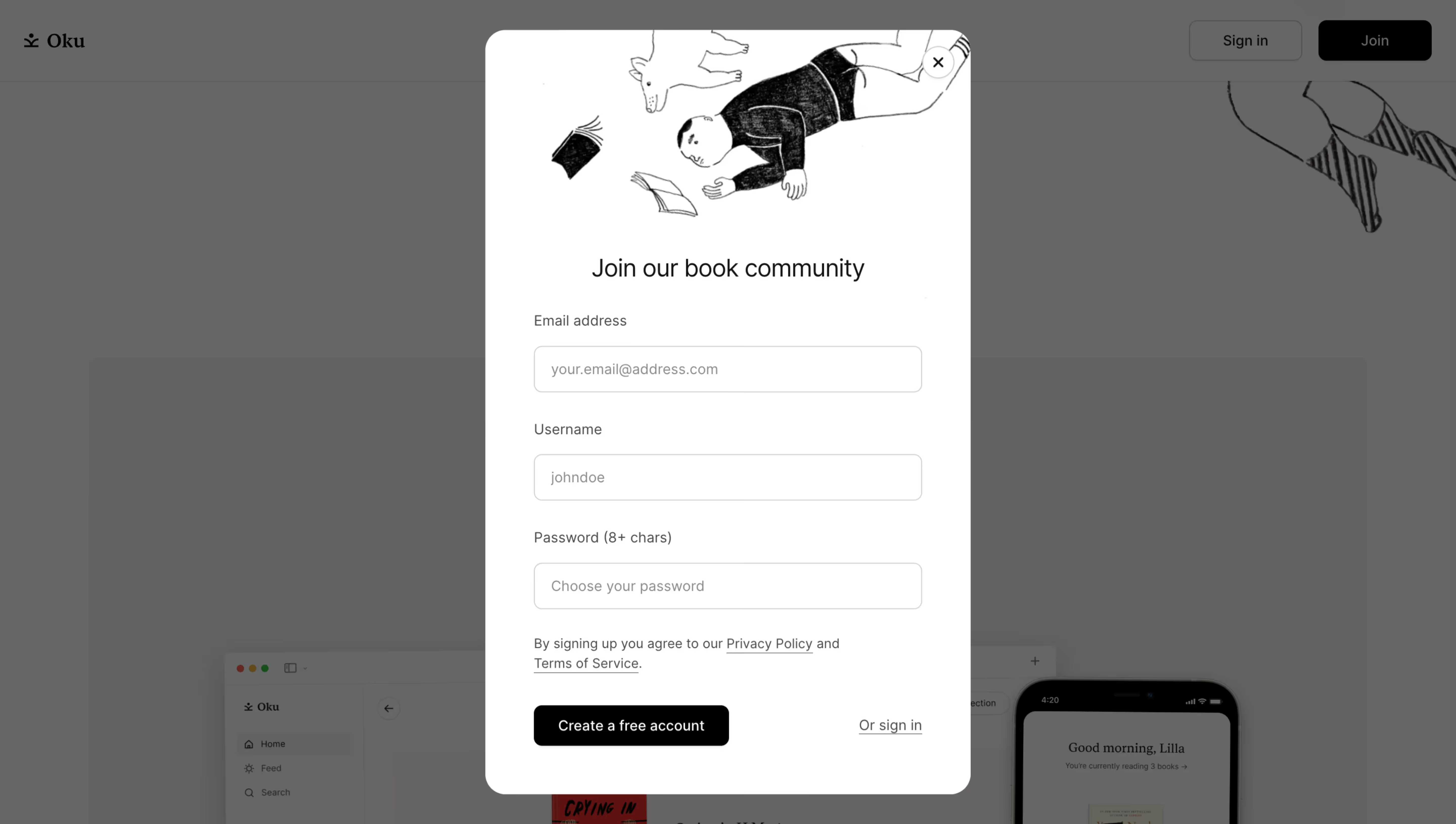
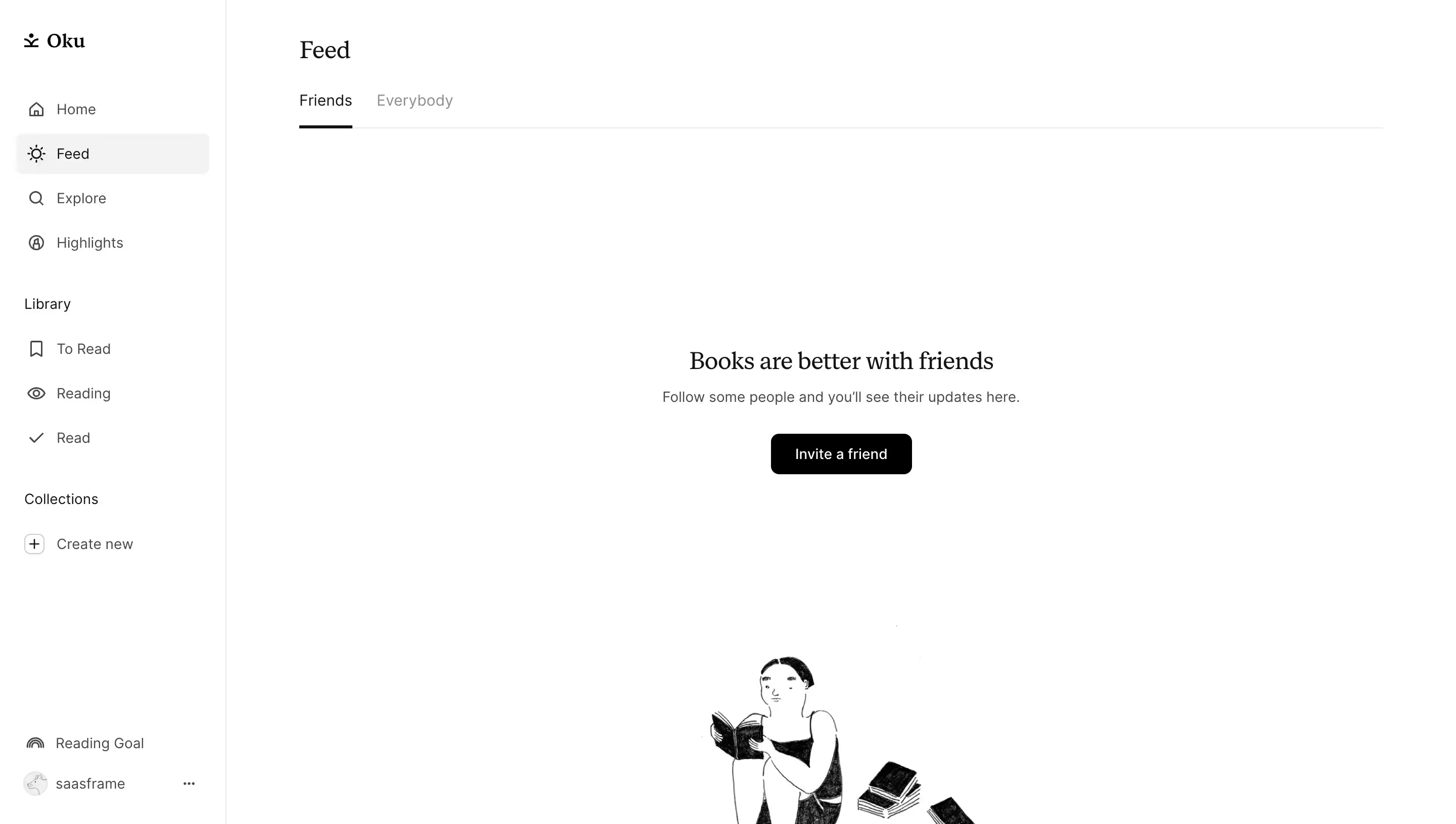
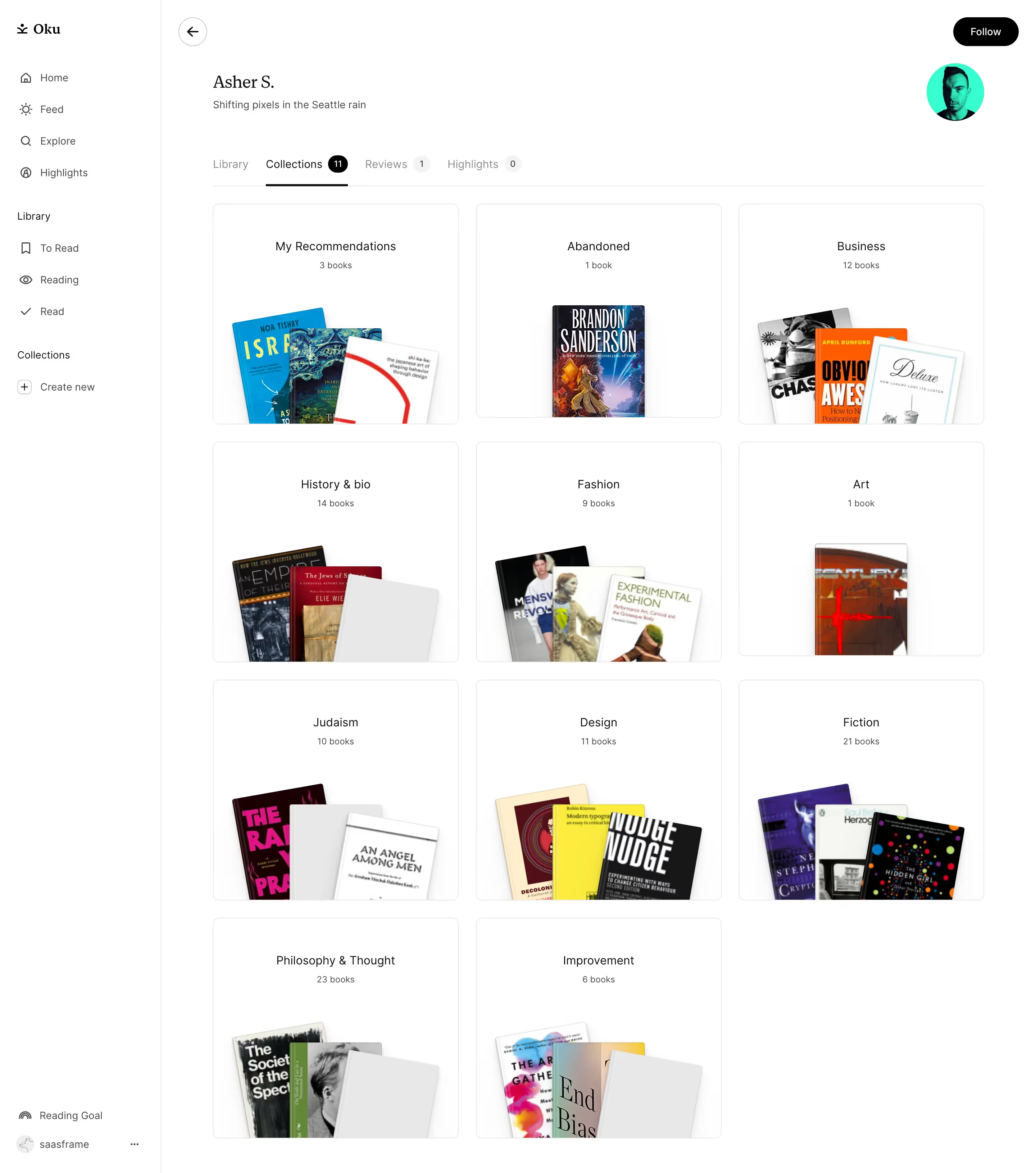
- Community-focused product: social graph, friend-following, Goodreads import — the UI likely emphasises user avatars, activity feeds, and book cover art as primary visual elements, with the monochrome chrome receding to let content imagery dominate.
Biggest SaaS library.


.webp)


.webp)

Desktop & mobile versions.


Access the Figma files.


Advanced filtering.
Let it flow.





Save design inspirations.
research




How do you process payment?
SaaSFrame subscriptions are sold on Lemon Squeezy, a secured online selling platform for creators.
What about future updates and versions?
SaaSFrame gets updated all the time! Every new update and version will immediately be made available to all SaaSFrame users.
Can you send me an invoice?
You can generate an invoice on your Lemon Squeezy portal once you purchased SaaSFrame. You will find the link in the order confirmation email.
How can I cancel my membership subscription?
You can cancel your membership subscription at any moment on your profile page.
Can I get a refund?
If you're not satisfied, you can ask for a refund within 7 days. Just send me an email at antoine[at]unmake[dot]io
I have another question.
You can send me an email at antoine[at]unmake[dot]io, I'll be happy to help with any questions.