 SaaSFrame
Features
Showcase your product's power with diverse SaaS Feature patterns. From icon grids to 'feature-walk' layouts, find the best way to explain your software's core functionality to prospective users.
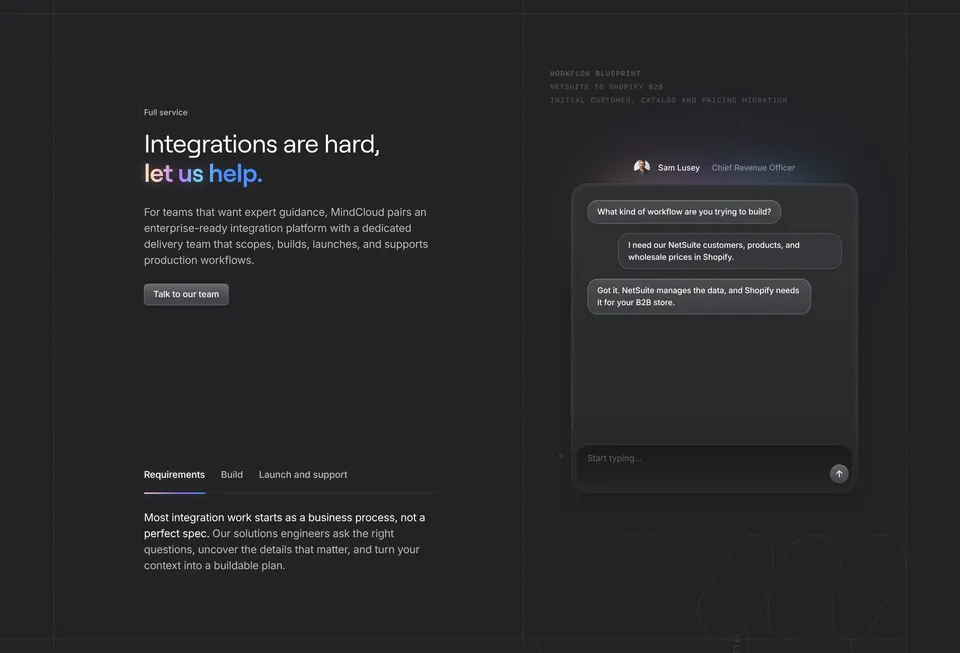

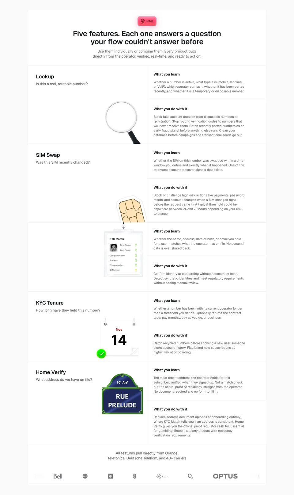

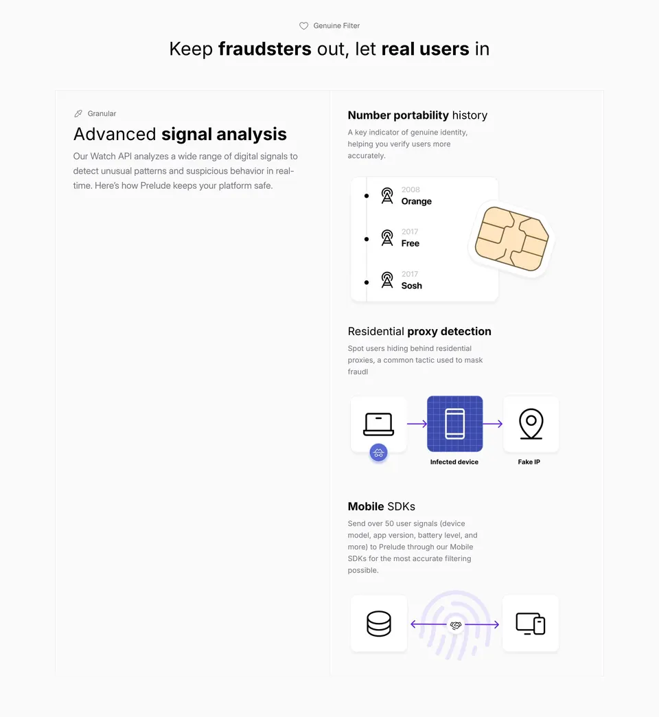
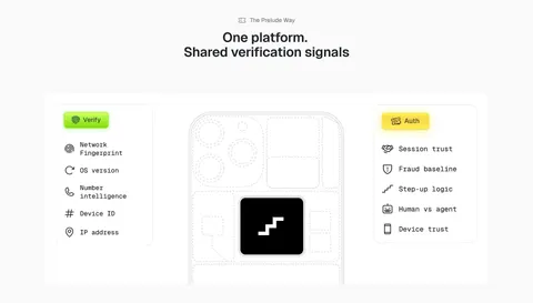
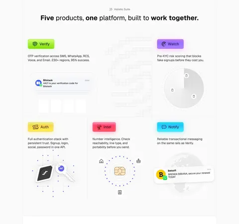
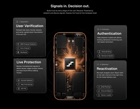
Features: design guide
A feature section on a SaaS website explains one capability through a real task and a concrete demonstration. Answer one question per section, tie the heading to a visible workflow, show the smallest useful piece of interface, explain what the product contributes and offer a next step that matches the visitor's understanding.
In the libraryas of November 2026
- Examples
- 154
- SaaS products
- 84
- Last added
- Nov 2026
Most common inLanding Page 119Features Page 12Use Cases 8Enterprise Page 6Integrations Page 2
A SaaS feature section explains a capability through a meaningful task and a concrete demonstration. Its purpose is to help visitors understand what the product contributes to their work, rather than make them memorize an inventory of functions. The strongest sections connect an outcome-oriented heading, a concise explanation, and a visual that shows the relevant behavior.
Popwork and Duffel illustrate two scales of feature presentation. Popwork focuses on preparation for one-to-one meetings. Duffel introduces several parts of a travel product suite with separate panels. The examples show how to balance depth, breadth, and navigation without turning the page into a miniature product manual.
Which question should a feature section answer?
Start with what the visitor should understand after reading. A focused section might explain how a team prepares for a meeting. A broader section might distinguish several products within a suite. These goals need different levels of detail and different visual structures.
Write the intended understanding before choosing the layout. If the section tries to introduce the entire product, demonstrate a workflow, list every benefit, and drive purchase at once, its main message can become difficult to identify. Give each section a defined role in the page's explanation.
Use feature names when they are already familiar, but lead with a recognizable task when the name requires product knowledge. The visitor should be able to connect the capability to their own work without translating internal terminology. A clear question also helps determine which details to leave for a deeper page.
Connect the heading to a visible workflow
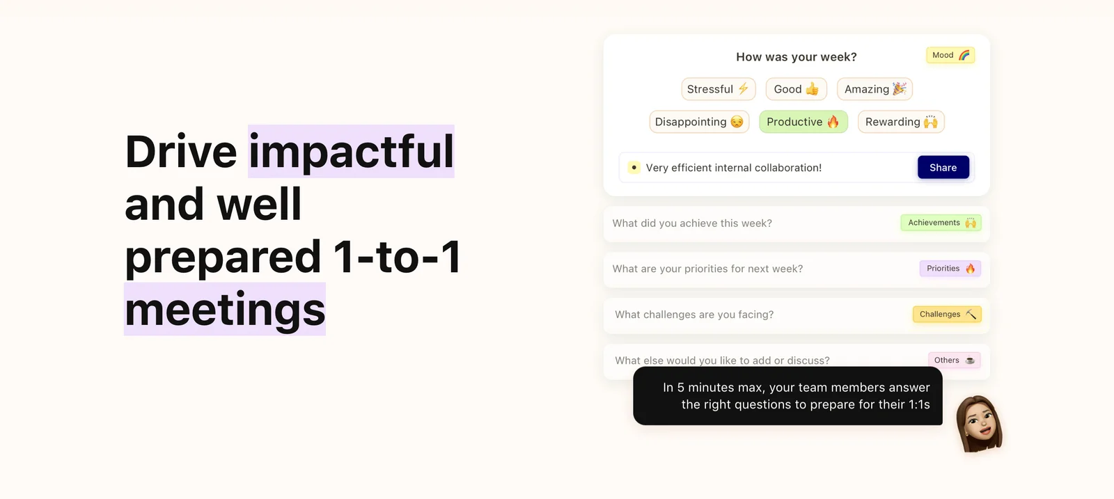
Popwork pairs its heading about well-prepared one-to-one meetings with a panel of questions. The illustration includes a mood prompt and rows for achievements, priorities, challenges, and other discussion. These elements make the preparation task concrete: team members contribute structured information before a conversation.
The visual supports the heading rather than merely showing the application's frame. A visitor can recognize the input that helps prepare the meeting even without understanding the rest of the product. This is a useful principle for feature storytelling: show the part of the interface that explains the task.
The captured panel is a marketing composition, so its visible buttons do not establish live behavior. Describe what the image shows without claiming that a particular interaction or completion time has been tested. If the page uses a real interactive demo, evaluate that experience separately from the static illustration.
Use a suite overview to distinguish product areas
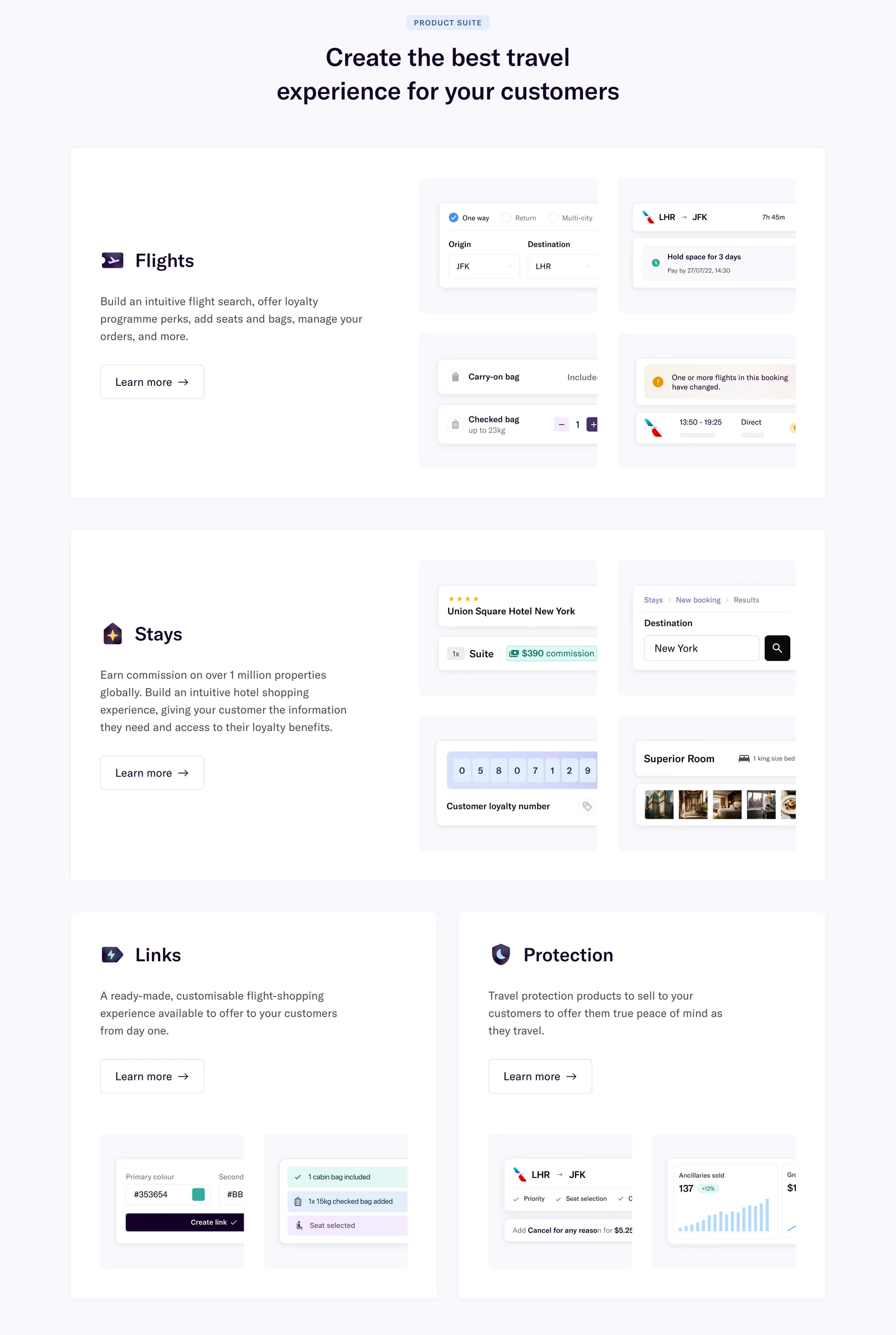
Duffel gives Flights and Stays large panels, then presents Links and Protection in smaller supporting cards. Each product area has a name, concise explanation, representative interface fragments, and a Learn more action. The hierarchy helps visitors recognize the suite's main areas while retaining paths into details.
This structure is different from Popwork's focused workflow. It supports orientation across several capabilities rather than explaining one task deeply. A suite overview needs clear boundaries so visitors can understand which product area addresses which need.
Use parallel panel anatomy while allowing different visual sizes when the content justifies them. A main product may need room for several meaningful examples; a supporting product may need only a concise introduction. Avoid assigning size only according to internal sales priority if that distorts the visitor's understanding of how the suite fits together.
Show the smallest useful demonstration
A full application screenshot can contain more detail than a feature section needs. Select the objects and controls that establish the task: a question set, a search field, an option, a result, or a handoff. Simplify surrounding chrome when it does not add information.
Duffel uses several interface fragments to suggest search, booking options, status, loyalty, and related tasks. These pieces support the product-area descriptions without requiring a visitor to inspect a complete dashboard. Popwork's question panel similarly isolates the preparation experience.
Keep simplified visuals honest. Do not remove an essential prerequisite or qualification simply to make the workflow look easier. If the demonstration compresses several steps, clarify the complete process in supporting content. The section should improve understanding, not create an expectation that the real product cannot meet.
Write copy that explains the product contribution
Pair a clear heading with a short explanation of what the feature does and why that matters in the task. Avoid broad adjectives that could describe almost any software. The visitor needs a concrete relationship between the capability and their situation.
Use verbs that name the work: prepare, search, organize, share, review, or configure. Add a relevant object or outcome. A claim about better collaboration becomes more useful when the section explains what people contribute, where they see it, and how it supports the next conversation.
Keep the explanation proportionate to the evidence. A feature can support a process without guaranteeing a business result. If you include time, coverage, or availability claims, maintain their source and relevant conditions. Historical interface illustrations should not be used as current specification evidence.
Choose a next step that matches the visitor's understanding
A feature section can lead to a detailed product page, an example, documentation, a demo, or signup. Choose the action according to what the reader needs next. Duffel's individual Learn more actions preserve the distinction between product areas rather than sending every visitor to one undifferentiated path.
Use a specific destination when several actions appear together. The accessible name should identify the feature or product area, not only repeat a generic label. If the entire panel is linked, keep its interaction model consistent and avoid nesting other controls inside the link.
A focused feature section does not always need an immediate conversion button. If the page is still building understanding, the next section may provide the appropriate continuation. Add an action when it helps the visitor advance, rather than placing a repeated signup button beside every illustration.
Sequence feature sections into a coherent page
Several sections should build an explanation, not repeat the same pattern with unrelated headings. Start with the core job, then introduce supporting workflows, differentiated capabilities, or important requirements. Use an order that reflects how visitors understand the product.
Alternate visual placement when it improves rhythm, but keep reading order sensible. A left-right pattern should not force the underlying document into a confusing sequence. On mobile, the heading, explanation, visual, and action need to stay associated when columns collapse.
Reduce repeated claims. If every section promises speed, simplicity, and collaboration, the page may be saying less than its length suggests. Let each feature demonstrate a distinct contribution. A compact suite overview can introduce breadth, while selected deeper sections explain the most important workflows.
Keep product visuals accessible and responsive
Interface fragments often contain small text. At narrow widths, shrinking the whole illustration can make its meaningful details unreadable. Crop or adapt the demonstration so its primary idea survives, and keep the essential explanation in real page text.
Use useful alt text for a visual that adds information. Describe the task or relationship it illustrates rather than listing every decorative control. If an image is purely decorative beside a complete explanation, avoid redundant narration. Do not make essential content depend on animation or hover.
For interactive demos, provide visible focus, clear boundaries, and predictable reset behavior. Keep the page usable when the demo fails to load. Respect reduced-motion preferences and avoid several simultaneous animated panels competing with the headings. The feature explanation should remain understandable in a stable state.
Review the relationship between promise and proof
Review the demonstration at the size visitors will actually see. A detailed composition can be clear in the design file and become ambiguous in a narrow content column. Identify the one object or transition the image must communicate, then check that it remains visible. Remove secondary fragments when they compete with that purpose rather than scaling everything down equally.
For a suite overview, check the boundaries between products. A visitor should understand whether the panels describe separate offers, related modules, or capabilities of one account. Use supporting copy or a linked overview to explain that relationship. Otherwise, a polished group of feature panels can leave the commercial and operational structure unclear.
Also inspect the surrounding page for repeated terminology. If a capability is named differently in navigation, pricing, and the feature section, readers may assume these are separate things. Consistent naming helps the illustration, explanation, and next destination reinforce one another.
- Does the section answer one clear product question?
- Does the heading name a task or meaningful capability?
- Does the visual support that exact message?
- Are product areas distinct in a suite overview?
- Does simplified imagery preserve important context?
- Does the copy explain the product's contribution?
- Are measurable or availability claims maintained?
- Does the next destination preserve feature context?
- Does the mobile sequence remain understandable?
- Can the explanation work without animation or images?
Test by asking visitors to describe the capability in their own words and identify where it would fit in their work. If they remember the visual style but cannot explain the task, improve the demonstration or copy. If they infer unsupported behavior from a mockup, clarify the representation and the supporting details.
Maintain the section when the product changes. A screenshot may continue to look attractive after a workflow has been redesigned. Review the illustration, heading, explanation, and linked destination together so they describe the same experience. Keep the source asset editable and assign an owner to claims that depend on current product behavior.
Frequently asked questions about feature sections
Should a feature section use a full screenshot?
Use a full screenshot when the surrounding context helps explain the task. Use a focused crop or composition when a smaller part of the interface communicates the capability more clearly. Keep critical details readable at the actual display size.
How many features should a landing page explain?
Explain the capabilities needed to understand the product's main value and relevant differences. A suite overview can establish breadth, while a few deeper sections demonstrate important workflows. Avoid extending the page with repetitive claims.
Does every feature need a call to action?
No. Add an action when there is a useful next destination or setup path. A section can also lead naturally into further explanation on the same page. Repeated buttons should not distract from understanding the product.
Explore SaaS feature section examples on SaaSFrame to compare workflow demonstrations, suite overviews, supporting copy, and contextual next steps.