Celebrate user milestones with impactful SaaS Success and Completion UI designs. From 'Task Complete' animations to confetti effects and next-step suggestions, see how to use positive reinforcement to build user habits.
Browse 45 real SaaS Success with modern UI patterns and conversion strategies.
We sell SaaSFrame licenses on Gumroad, a secured online selling platform for creators.
What about future updates and versions?
SaaSFrame gets updated all the time! Every new update and version will immediately be made available to all SaaSFrame users.
I didn't receive my licence key, what should I do?
The licence key required to create your SaaSFrame account is send by Gumroad once you made your purchase. If this email is blocked by your email client, send me an email at antoine[at]unmake[dot]io so I can resend the licence key.
Can you send me an invoice?
You can generate an invoice on Gumroad once you purchased SaaSFrame. You will find the link in the order confirmation email.
Can I get a refund?
If you're not satisfied, you can ask for a refund within 7 days. Just send me an email at antoine[at]unmake[dot]io
Success Design Guide
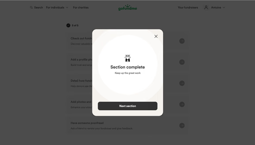
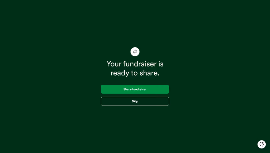
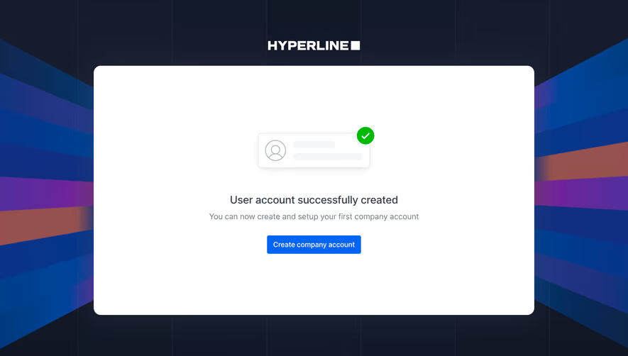
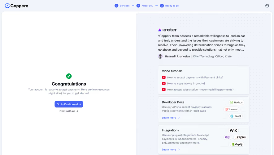
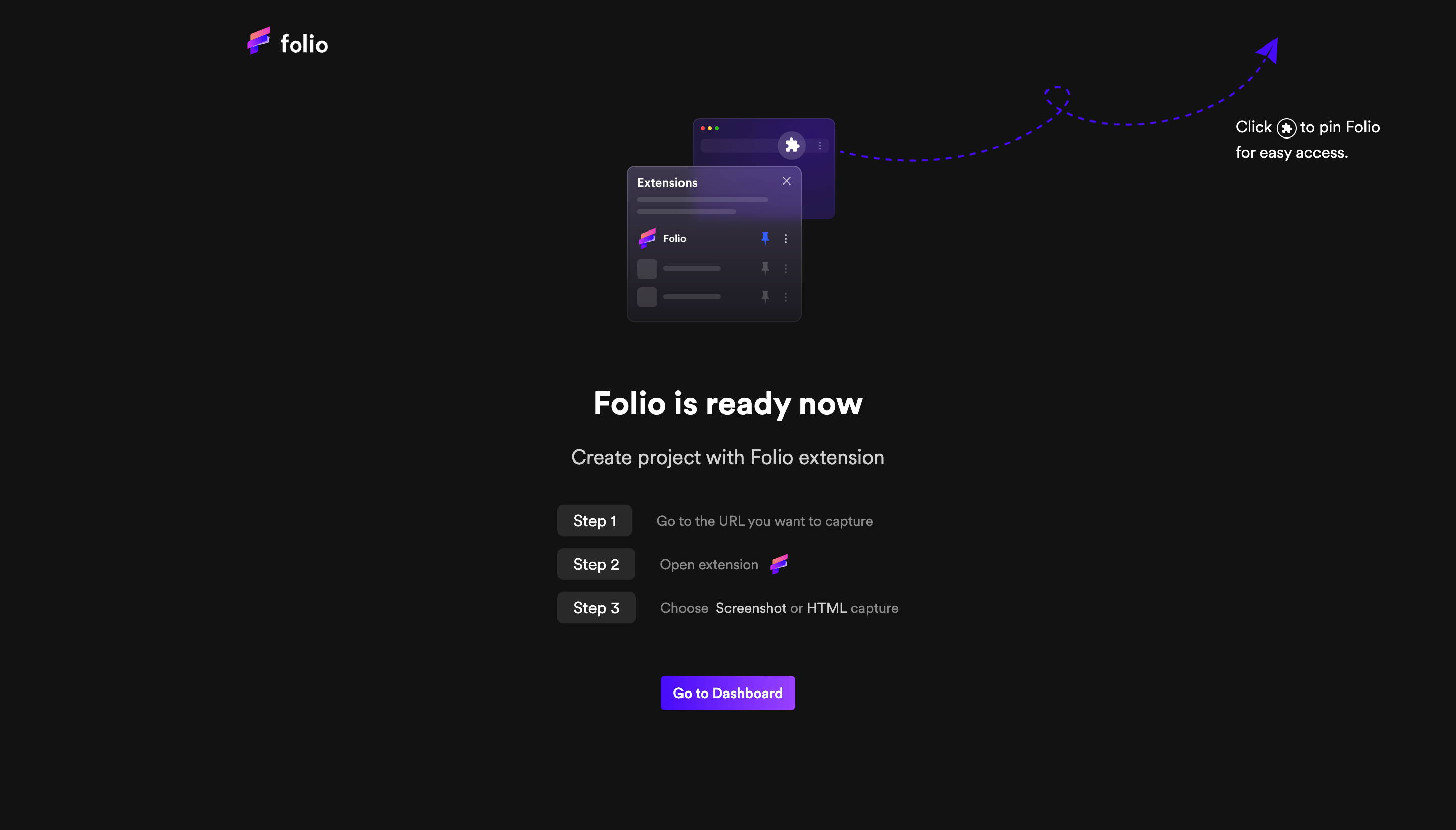
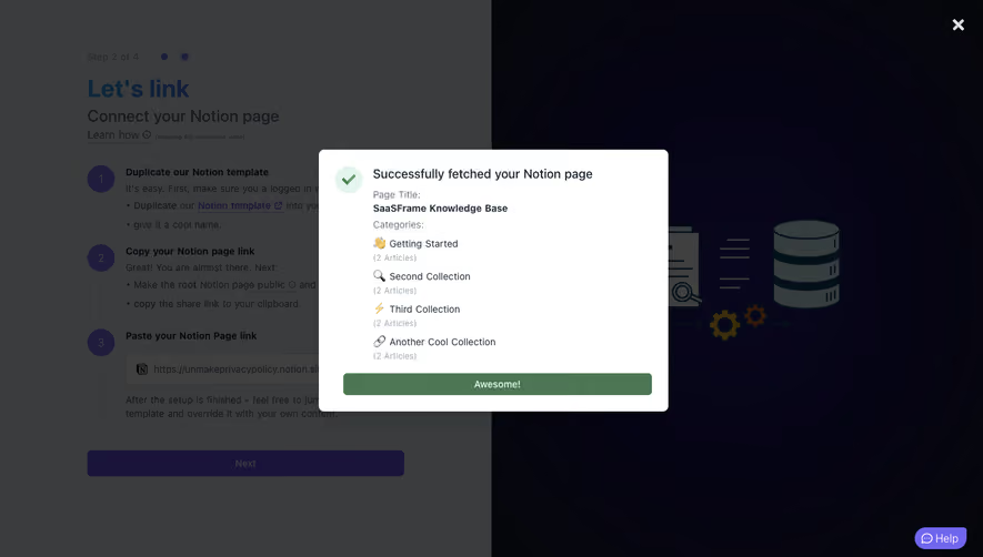
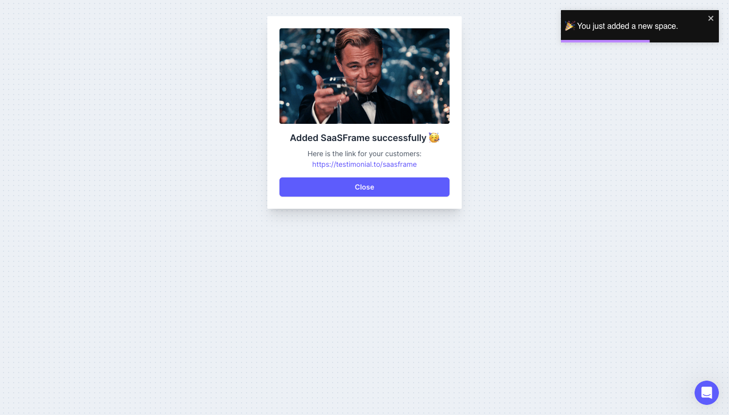
A SaaS success screen confirms an operation the system has completed and helps the user continue. It may acknowledge account creation, a saved object, or a completed setup step. The message should explain the actual result rather than merely display celebratory artwork.
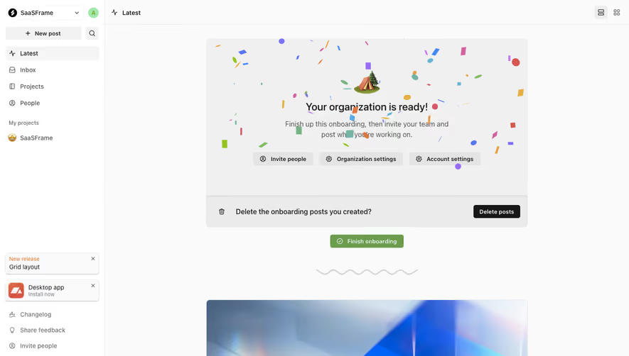
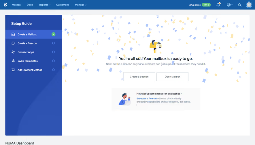
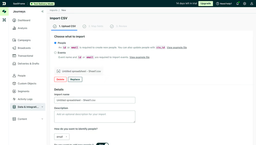
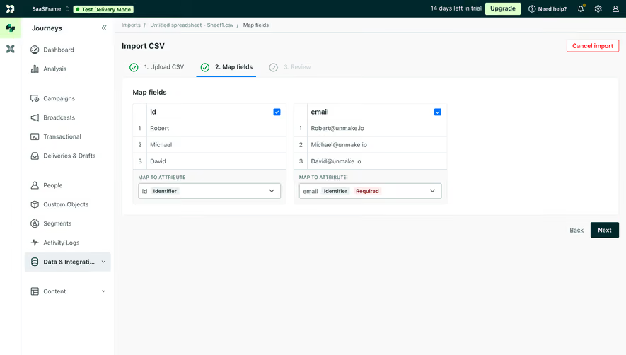
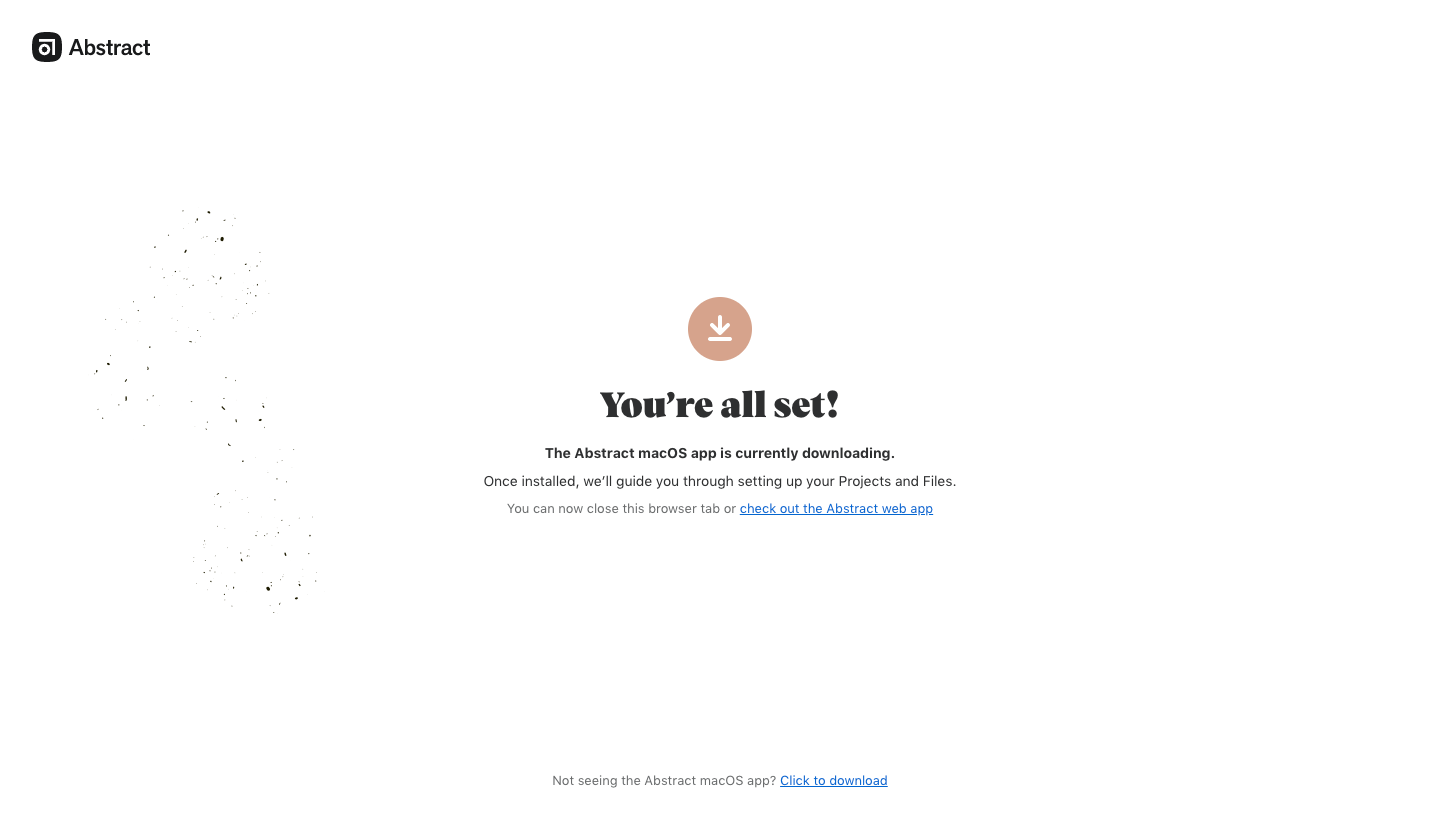
The SaaSFrame references show an onboarding welcome and an application-download handoff. These illustrate why success has a scope: one part of the journey can be complete while useful work remains. A positive heading should not make every downstream dependency appear resolved.
Define the event being confirmed
Identify what the system knows succeeded. A submitted request, saved record, completed payment, and activated service are different events. Use wording that matches the confirmed state.
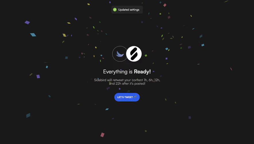
Avoid broad language when the result is narrower. A message saying everything is ready may be misleading if an integration or download remains incomplete. Explain what is complete and what happens next.
Keep the target recognizable. When users create several similar objects or work across accounts, the success message should identify the object or workspace involved.
Choose the amount of interruption deliberately
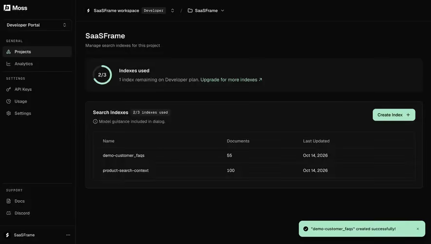
A short save may need inline feedback or a toast. A major setup milestone may benefit from a dedicated screen. The presentation should reflect the user's need to understand the result, not a universal preference for celebration.
Do not interrupt every small action with a modal. Repeated low-value success screens can make familiar work slower. Conversely, a fleeting toast may be insufficient when users need a receipt, generated file, or important next action.
Preserve the original task context where practical. Success is a handoff, not necessarily a destination the user wants to revisit.
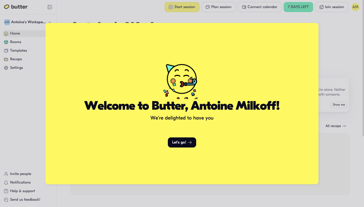
The Butter capture presents a large welcome panel over the product's home interface, with a next action leading onward. The underlying workspace and session-related navigation remain visible.
This can acknowledge entry into a new environment while keeping the product context recognizable. The panel gives one clear continuation route instead of several competing actions.
When adapting this approach, identify the milestone accurately. Being welcomed into a workspace does not establish that the user has created a session or configured every feature. The message should support the next task without claiming a broader outcome.
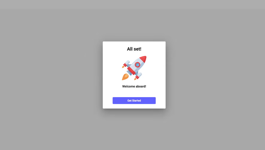
The Abstract capture uses an all-set message while explaining that a macOS application is downloading. It offers a route to the web app and a fallback download link if the file is not appearing.
This makes the remaining handoff visible rather than hiding it beneath the success heading. The account journey can be complete while installation remains the user's next task.
For similar flows, distinguish initiated downloads from confirmed installation. A browser page can explain the intended transfer, but it should not imply that a separate application is ready merely because a download started.
Make the next action specific
A success screen should help users decide what to do next. Open the created object, continue setup, view a receipt, or return to the original task are recognizable actions. A generic continue label may need nearby explanation.
Choose the main action according to the original intent. A user who created a report likely wants to inspect it; an invited member likely wants to reach the shared workspace. Do not route everyone to a marketing page after product success.
Keep optional recommendations secondary. A successful milestone is a useful moment for further guidance, but unrelated promotions can obscure the actual result and next step.
Provide access to the resulting artifact
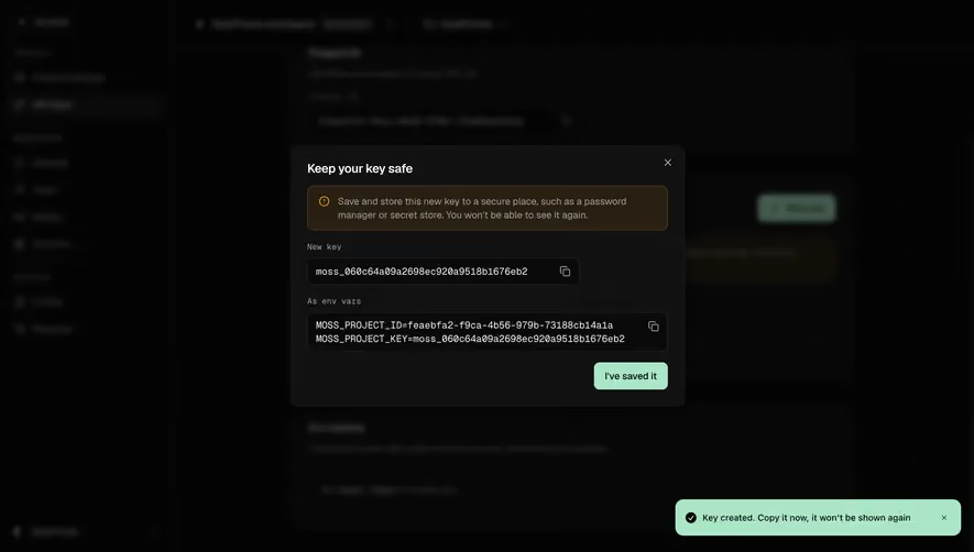
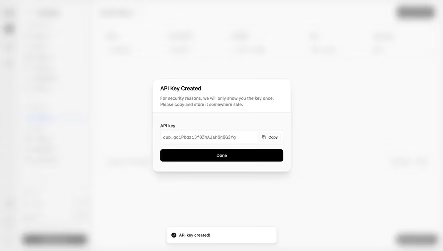
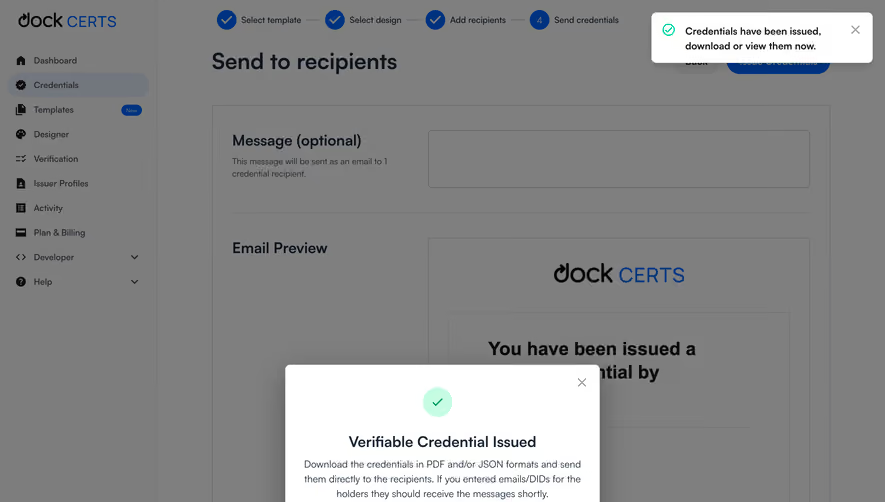
If an operation creates a file, link, credential, or record, make the result usable. A confirmation without a retrieval route can leave the user uncertain about where their work went.
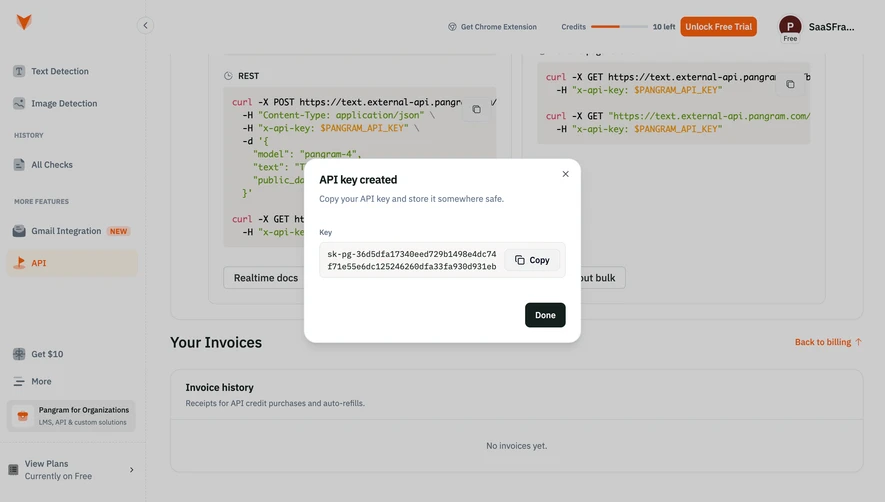
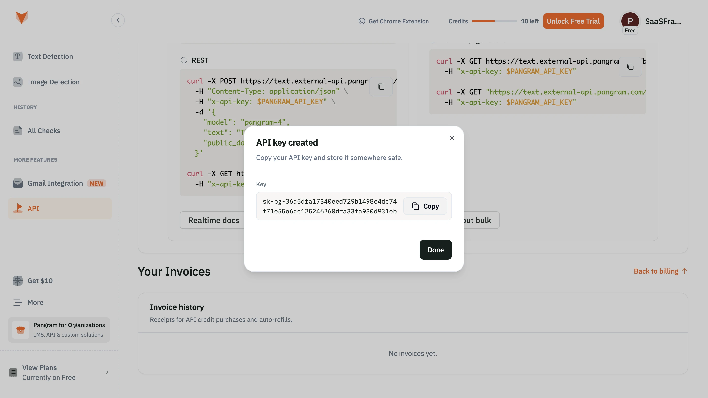
For one-time sensitive material, design a clear handling step without exposing secrets in ordinary history or public examples. Copying and storing the result may be part of the task, while simply dismissing the modal may not be sufficient.
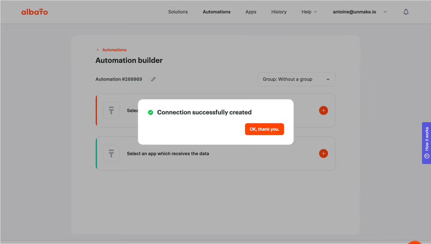
Use feedback that matches the action. Copying a result confirms clipboard activity; it does not confirm that another person received it. Download initiation does not establish that the file was successfully opened.
Keep pending work out of the success state
Asynchronous operations often have several stages. A request accepted by the server can still be processing. Show the pending state and identify where users can find its status.
If part of the operation succeeds and part fails, present the mixed result honestly. A large checkmark should not hide rejected records or incomplete configuration. Provide a useful route to the exceptions.
The loading screen guide covers those waiting states. Transition to success only when the event being described is confirmed.
Offer correction or undo when useful
A user may notice an error immediately after saving. An edit or undo route can support recovery without requiring navigation through several screens. Explain the action's scope and any relevant limitation.
Do not promise reversibility the product cannot provide. An irreversible operation may need a clear receipt or status rather than an undo control. The success message should follow the actual lifecycle.
For shared changes, identify the affected scope. A personal setting and a workspace-wide change can produce similar success feedback while affecting different people.
Preserve result visibility after dismissal
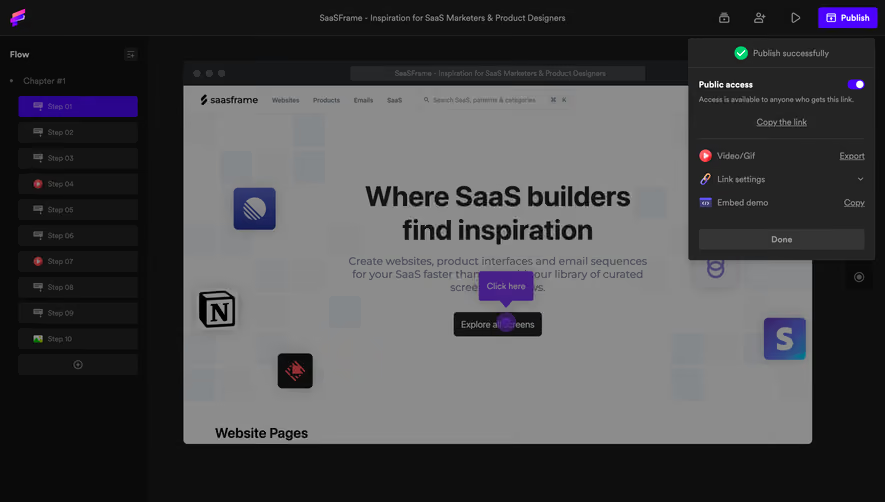
Important outcomes should remain findable after a temporary message closes. A created object should appear in its collection or detail view. A transaction should have an appropriate account route. A generated file should not vanish with a toast.
If active filters hide the new result, explain that relationship. Users can otherwise mistake a successful creation for a failed operation because the list appears unchanged.
Use history or notifications where the task warrants them, but keep their meaning consistent with the original success message. A durable entry should describe the same confirmed event.
Keep celebration accessible and proportionate
Artwork and animation can mark a milestone, but they should not carry essential information. Use readable text and a clear action. Respect reduced-motion preferences where animation is used.
A modal or dedicated screen needs a predictable keyboard path. Focus should move to a useful place after continuation or dismissal. A disappearing message should not leave users stranded in the page.
On small screens, prioritize the result and next action over large visual effects. A success state is most useful when people can understand and use it quickly.
Test result comprehension and continuation
Ask users what completed, what remains, and where the result can be found later. Those answers reveal whether the positive state actually communicates the operation.
Test delayed processing, partial success, duplicate submission, failed downloads, hidden newly created records, and returning navigation. Include users who scan the message quickly.
Measure successful continuation rather than success-screen views alone. A celebration that users repeatedly revisit may reflect uncertainty about whether the underlying task finished.
Frequently asked questions about success screens
Does every successful action need a full screen?
No. Use the amount of feedback needed to explain the result and support continuation. Small routine actions often need less interruption.
Is a request accepted the same as completed?
No. An accepted request may still be processing. Confirm the event the system actually knows occurred.
What should users be able to do after success?
Find the result and take the next relevant action. Provide correction or recovery where the product supports it.