 SaaSFrame
Team
Humanize your brand with SaaS Team and Founder patterns. From professional headshots to quirky 'Meet the Team' grids, see how to build a personal connection with your visitors.




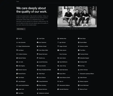
Team: design guide
A SaaS team section introduces the people behind the product and gives visitors useful context about how the company works. It can support product evaluation, recruiting, and a broader company story. The design should make identities and roles understandable without treating a portrait grid as proof of product quality.
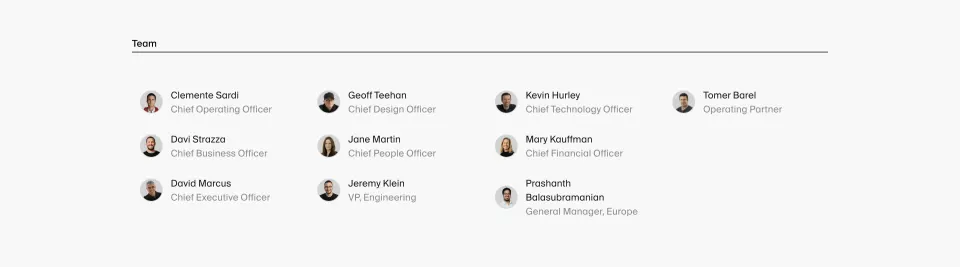
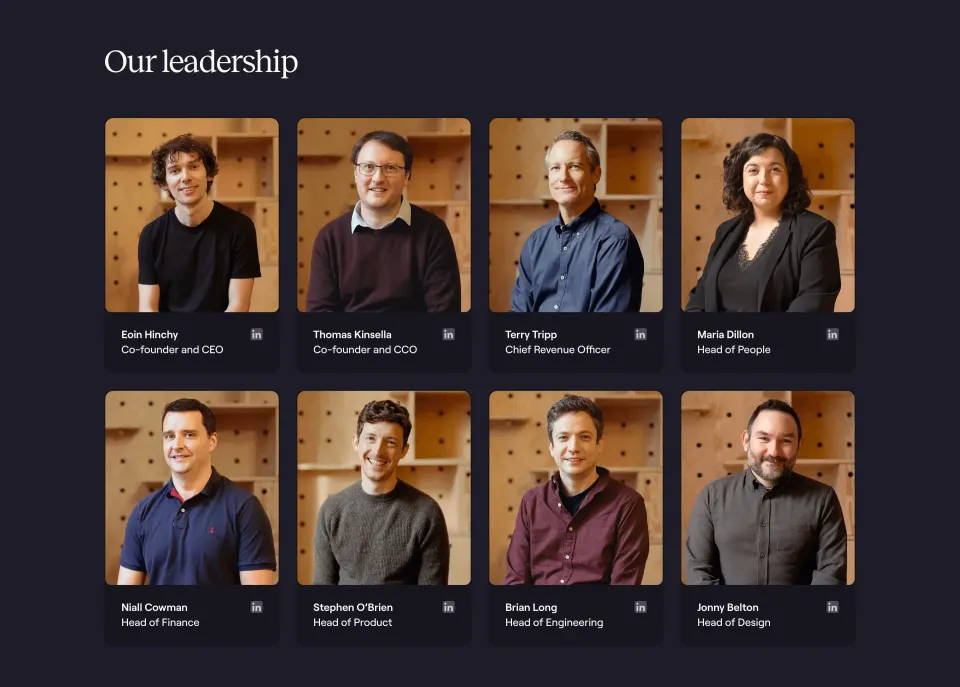
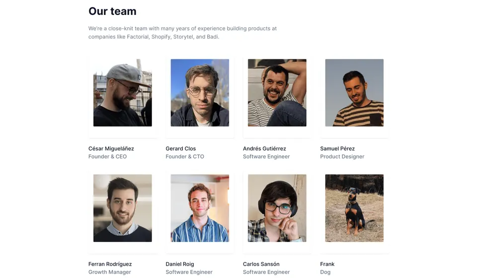
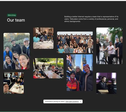
Latitude and Linear show two approaches. Latitude uses a compact directory of portraits, names, and roles. Linear combines a team statement, a founder photograph, a recruiting action, and a larger name directory. Their historical captures demonstrate layout choices rather than establish current personnel or roles.
Choose the section's purpose and scope
Start with why a visitor needs the team information. A prospective customer may want to understand the company behind the product. A candidate may want to see the working culture and route to open roles. A company page may need to explain the founders' background and the wider team.
Choose a scope that fits that purpose. A small company can introduce everyone in a compact grid. A larger organization may need a leadership section, department groups, or a concise company narrative rather than dozens of large cards. Make the scope explicit so visitors do not mistake a selected group for the complete organization.
Keep the team section distinct from customer testimonials and advisor lists. Employees, founders, advisors, investors, and customers have different relationships to the company. Clear labels prevent the visual similarity of portraits and names from implying that every person has the same role.
Use a portrait directory when individual roles matter
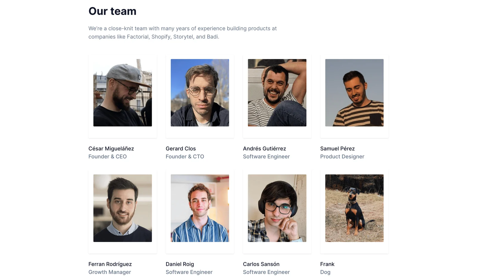
Latitude gives each visible team member a portrait, name, and role beneath a short introduction. The grid makes the people easy to scan while establishing how they contribute. The roles distinguish founders, engineering, design, and growth rather than leaving visitors to infer responsibilities from names alone.
The last visible entry is a dog, explicitly labeled as such. This adds personality without disguising it as a professional role. Similar informal details can support a company voice when they remain clearly separated from information visitors rely on.
Use consistent card structure while allowing natural portrait variation. The goal is recognizable identity, not identical facial expressions or backgrounds. Keep names in text rather than embedded in the image so they remain searchable, readable, and available if the portrait does not load.
Combine a company narrative with a larger directory
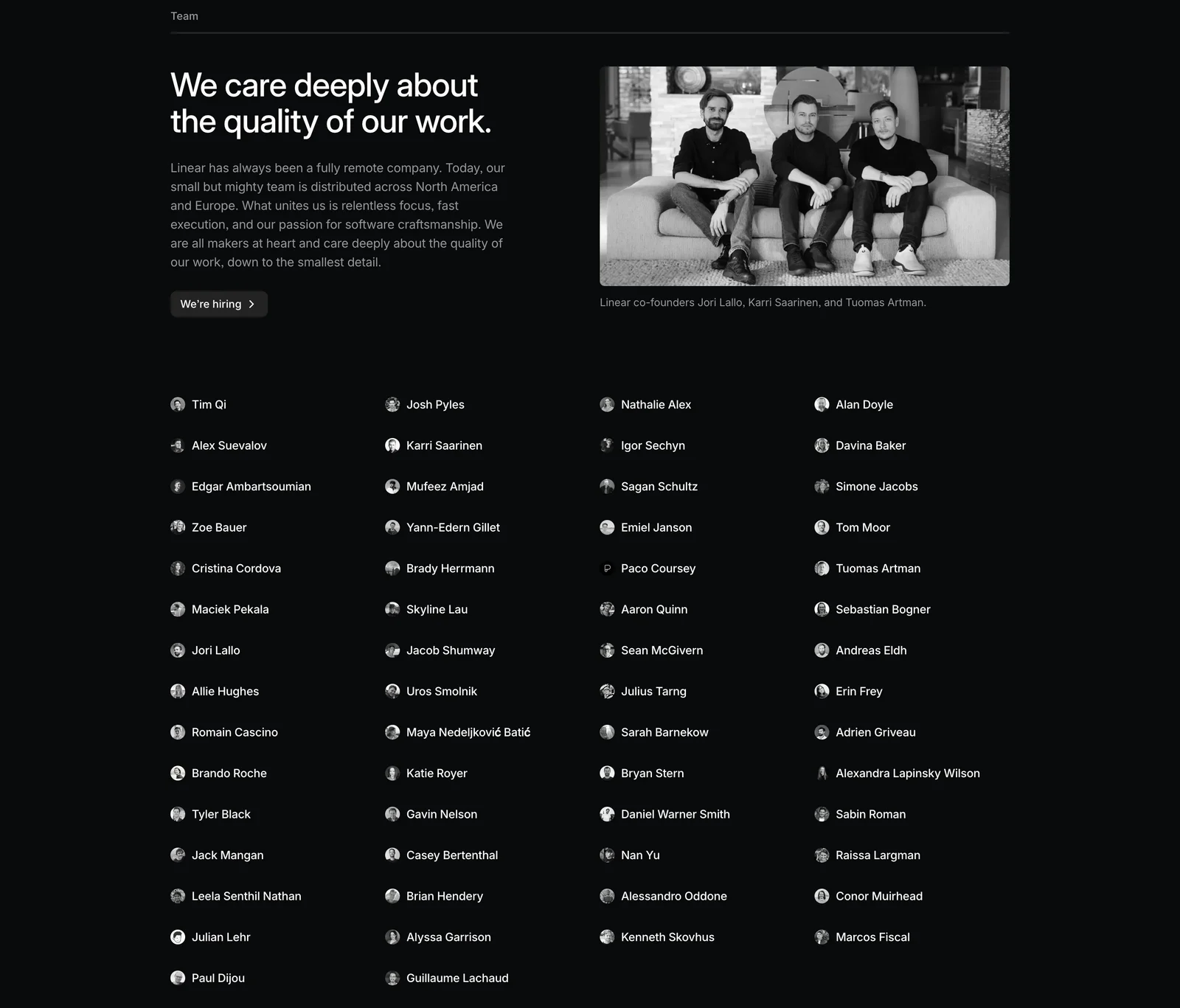
Linear leads with a statement about the quality of its work and supporting copy about how the team operates. A founder photograph and caption provide a focal point, while a compact directory below introduces many more people. A hiring action gives candidates a relevant next step.
This approach separates the narrative from the directory. Visitors can understand the company's stated working approach without reading every name, and those interested in the people can explore the larger collection. The compact names and small portraits accommodate scale more efficiently than large cards would.
Make the relationship between the featured photo and wider directory clear. A founder photograph should be captioned as that group rather than imply it represents every employee. The surrounding copy should explain the scope and avoid relying on the visual alone to establish organizational structure.
Write introductions that provide concrete context
A useful team introduction explains relevant background or working practice. It might describe how people collaborate, where expertise comes from, or what kind of product work the company values. Avoid broad statements that could apply to nearly any organization.
Keep past experience separate from current affiliation. Latitude's captured introduction mentions previous product-building experience at other companies. Such context can be useful, but it should not imply that those organizations endorse the current product or employ the displayed team.
Use claims that can be maintained. Statements about remote work, geography, team size, and roles can change. The section should accurately describe the company at the relevant time, and historical information should be framed accordingly. An attractive company story needs the same content ownership as product copy.
Choose role detail according to the visitor's need
A name-only directory can introduce breadth, but it provides little information about responsibilities. A role label makes an individual card more useful for understanding the organization. A longer biography can explain expertise when that context materially affects the page's purpose.
Do not add lengthy biographies to every card automatically. They can turn a quick introduction into an extensive directory that overwhelms the company page. Consider linked profiles or expandable detail when a visitor genuinely needs more information.
Keep titles understandable. Internal abbreviations may be familiar within the team but confusing to outsiders. If several roles have similar names, use a short description or grouping to clarify their relationship. Do not use role prominence to imply authority or expertise beyond what the approved information establishes.
Use photography consistently and respectfully
Portraits can support recognition and make the section feel personal. Choose crops that preserve the person's face clearly, keep aspect ratios consistent, and avoid stretching images to match the grid. Different backgrounds can coexist when the overall spacing and framing remain coherent.
Use images and identity details with appropriate permission and an agreed scope. Do not invent biographies or substitute unrelated portraits to fill a missing card. If a person does not want a photograph displayed, provide a respectful alternative that keeps the directory structure useful.
For a group image, add a caption when identification matters. Linear's capture names the founders under the photograph. A group photo without context may communicate atmosphere but does not establish who is shown. Keep the text sufficient to understand the image's role.
Provide relevant routes to recruiting or further context
A hiring action fits a team section when candidates are part of the intended audience. Make its destination explicit: open roles, a careers page, or a recruiting overview. Keep the route maintained so a broad invitation does not lead to an outdated or empty page without explanation.
If individual profiles link elsewhere, make the behavior consistent and the destination recognizable. A portrait should not look like a link unless it is interactive. Avoid mixing unrelated social and contact controls into every card if those routes do not support the section's purpose.
Keep direct contact details limited to what is intentionally public and useful. A team introduction does not need to become a personal contact directory. Provide the company's relevant contact route when visitors need help, rather than expecting them to choose an employee from the grid.
Adapt directories to mobile and accessible reading
A four-column portrait grid can become a long single-column sequence. Consider whether two columns remain readable or whether the section needs a more compact mobile treatment. Preserve names and roles at a comfortable size instead of shrinking the whole desktop arrangement.
A large name directory needs a logical reading order. Columns that look balanced visually should not create a confusing sequence for keyboard or screen-reader users. Use semantic grouping and clear headings when the organization is divided into categories.
Portrait alt text should serve the context without redundantly repeating every nearby label. If names and roles are already present, the image may be primarily supporting identity. Linked cards need visible focus, descriptive accessible names, and comfortable targets. Test long names, diacritics, translated titles, and missing images.
Review accuracy and scope before publication
For recruitment-focused pages, connect the team narrative to concrete working information at the destination. A statement about craftsmanship or remote collaboration can introduce the culture, while the careers page explains expectations and available roles. Keep the section from implying that a photograph alone represents the experience of every person in the organization.
When a directory includes linked profiles, check whether those profiles remain useful and intentionally public. A social account or personal website may change independently of the company page. Review the links during personnel updates and avoid presenting a personal destination as a company support route. The directory should help visitors understand the team without creating an accidental channel for operational requests.
- Does the section's purpose determine its scope?
- Are founders, employees, advisors, and other relationships distinguished?
- Are names and roles accurate and approved?
- Does the introduction provide concrete company context?
- Are past affiliations separate from current roles?
- Do portraits use consistent crops without distortion?
- Are group photos captioned where needed?
- Do recruiting and profile links match their labels?
- Can the directory be read comfortably on mobile?
- Does someone own personnel updates and asset permissions?
Maintain the directory when people join, leave, or change responsibilities. Review the narrative at the same time, because team size or working practices may also change. A person should not remain presented in a current role simply because their portrait is part of a carefully balanced grid.
Evaluate comprehension with visitors from the intended audience. Ask a prospective candidate what the section tells them about working there, or ask a customer what it tells them about the company behind the product. If they can only recall faces or famous previous employers, the section may need clearer context.
Consider performance for larger directories. Reserve image space to reduce disruptive shifts, use appropriate image sizes, and avoid loading oversized portraits for tiny thumbnails. The page should remain readable while images load. For very large organizations, a selective narrative and maintained directory destination may be more useful than embedding every person on one page.
Frequently asked questions about team sections
Should a SaaS website show every employee?
Choose a scope that fits the audience and can be maintained. A small team can show everyone; a larger company may use selected groups or a separate directory. Label the scope clearly rather than implying a partial selection is complete.
Are informal entries appropriate?
They can support personality when they are clearly labeled and do not obscure professional information. Keep playful details proportionate to the section's purpose. Visitors should still understand who works on the product and how to learn more.
Does every team member need a biography?
No. Names and roles may be enough for an overview. Add biographies when expertise or background matters to the visitor, and consider separate profiles for deeper information. Avoid making a compact introduction unnecessarily long.
Explore SaaS team section examples on SaaSFrame to compare portrait grids, company narratives, role labels, and recruiting paths.